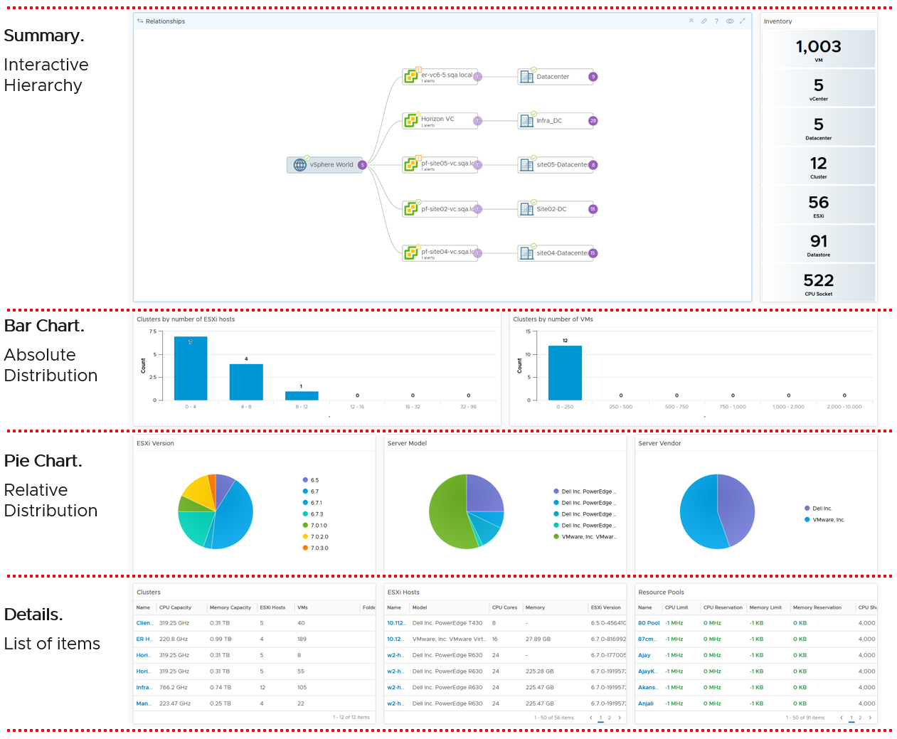
The Art of Dashboard
Part 2 Chapter 2
Design Consideration
To a few of us who love visualizing information with VCF Operations, we see the dashboard as a canvas. Granted, the widgets have limitation but that’s part of the art 😊
Creating dashboards is an art as you need to balance many conflicting requirements, such as:
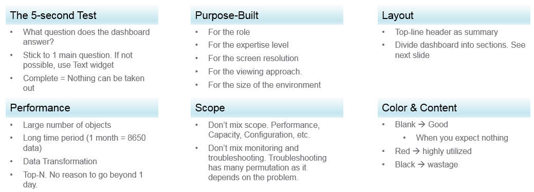
Can the dashboard be understood within 5 seconds? If yes, you buy yourself a few more minutes. The user understands what the dashboard does, and is willing to spend more time mastering it. To pass this test, think of which information, object, metric can you take away from the dashboard? See the KISS Principle, because an uber-dashboard that tries to please everyone and cover all scenarios will end up not being used.
Begin with the end in mind. The purpose dictates the dashboard design. 2 dashboards can have an identical target role, purpose, and use case (e.g. performance), but if the size of the environment differs, the 2 dashboards will be different. An environment with 50,000 VMs is managed differently with an environment of 500 VMs.
A good dashboard answers a set of questions. So jot down the questions. Be specific, including the metric and how it needs to be visualized.
A small environment with 100 VMs in just 8 hosts in 1 cluster (hence 1 data center, 1 vCenter) needs less dashboards than an environment with 10,000 VM spread over 800 ESXi hosts, 100 clusters, 10 data centers and 3 vCenter Servers.
Product wise, the dashboard feature in VCF Operations complement its built-in pages. Each page is hand coded HTML with precision. For customers who need to customize and personalize the information, we’ve provided out of the box dashboards that complement the existing page.
Design Methodology
This section introduces us to a few considerations surrounding dashboard design. We will walk through a method where we are able to understand the user, the activity, the workflow and the other aspects needed to understand the context before we start.
When we create dashboards that are used by others in our team we have to consider a few aspects that are helpful in making information useful, usable and delightful.
| Who | Begin with the end in mind. Who are actually using the dashboards you create? What specific role and persona is going to use it? Start by creating a list of all users who would be accessing and using information in the dashboard Against this list mention the kind of information they would find useful for the specific persona. |
|---|---|
| What | What is the type of activity (granular vs. high level) they will perform? List next to the task if the information needs to be granular or high level. Sometimes users are looking for just a KPI number, sometimes they are looking for trends. Sometimes users might want to interact with the information, create drill downs etc. The complexity of the activity will help you identify if you need a complex widget or a simple one. |
| How | How (workflow) will they use the dashboard? List down what happens after they view the information, do they need to use another application, another visualization. Plan accordingly and place navigation to enable this to happen. |
| When | How often (hourly, daily, weekly, monthly, quarterly) will they use the dashboard? Think about the usage of the dashboard, is it a frequent use case needed for daily use to perform work, or is it for monitoring on an irregular basis. |
| Why | Why (outcome) do they need the dashboard? Also list down outcomes from the dashboard usage. What is the usefulness of using the dashboard and what goals or outcomes the user is likely to achieve. |
Once we get this information we can better design dashboards based on the needs of the users. One way could be to plot it on a grid to understand the impact better. Let’s start with a grid like this one.
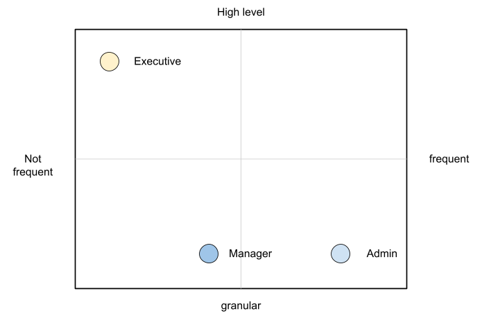
An executive might use the dashboard less frequently and the type of tasks they would perform could be high level. If you make a dashboard that is very granular and requires a lot of effort the executive might not have the time to use the dashboard.
A manager might use the dashboard once a week, or on a monthly timeline, might need information on both granular or high-level.
Similarly an admin agent might use it on a daily basis and might need information at times that needs a lot of effort and at other times just a metric number would do.
Once you have reached a visualisation like this, you can better judge. If it needs to be a single dashboard or multiple based on the persona. What items should you prioritise and what kind of complexity is necessary based on the timeframe and time available with the stakeholder
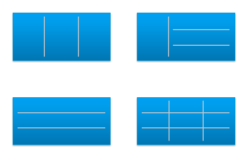
Clean Layout
Divide the screen into sections visually. This makes the dashboard easier to read. Here are some examples of how you can divide the screen.
Example 1
Here is a good example of layout from Brock Peterson. Notice how simple it is. It is clear that it has 4 layers as layout is consistent among them.
Example 2
You should also play with Dark Mode, and see how that looks. The following shows a clean layout in dark mode. Notice how [Dale Hassinger](https://www.linkedin.com/in/dale-hassinger-5712301b/) has arranged this dashboard well.
Visually, he has designed the layout “top down”, making it easier to see.
Another technique is to create 2 sections: summary and detail.
-
The summary section is typically placed at the top of the dashboard. It gives the big picture.
-
The detail section is placed below the summary section. It lets you drill down into a specific object. For example, if it’s a VM performance, you can get the detail performance of a specific VM.
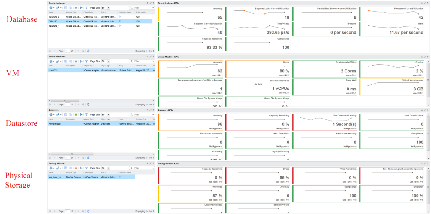
This detail section is also designed with quick context switch, as you may want to check the performance of multiple objects during performance troubleshooting. Take for example VM performance. The dashboard gives you all the VM-specific information and allows you to see the KPIs without changing screens. You can move from one VM to another and view the details without opening multiple windows.
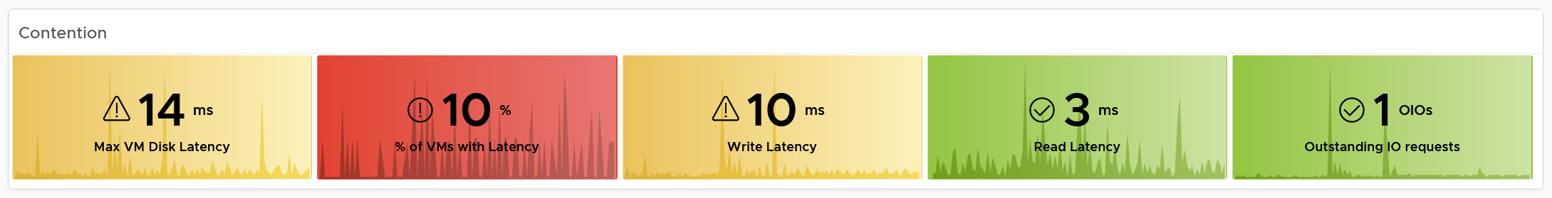
Color as Meaning
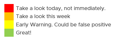
It’s easier to see color than read numbers, if the color has meaning. There are many occasions in operations that you just need to know if things are good or bad first, before diving into the actual raw value. Color is also easier at a glance, especially if you have read hundreds of numbers inside a large table.
Here is the color I recommend:
| Green –> Yellow–> Orange –> Red | Green means good, and gradually getting worse as it moves toward red. Typically used in performance monitoring and compliance.
|
|---|---|
| Dark Grey –> Green … Red | We use dark grey in Capacity as wastage (unused) is a bigger issue than over utilization. It’s important to show wastage as it can also impact performance. For performance dashboard, you should consider using red to convey that oversized is bad for performance. |
| Blue | Neutral color. Used when it does not have any meaning. |
| Grey | System error. The data is missing due to collection error. Typically happens in heat map. We use a color instead of white as white is hard to read. |
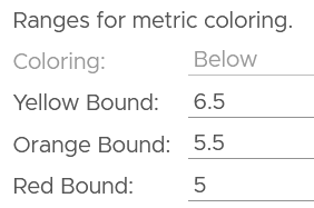
Threshold
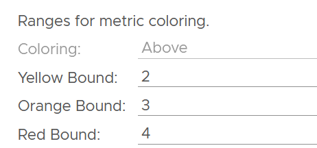
At which point do you change the color? This is where threshold comes in.
Try to make the scale easy to remember by adopting a consistent scale
-
Yellow = 2x Green
-
Orange = 2x Yellow
-
Red = 2x Orange
The above also results in red being 8x green.
The above does not work when the scale is small. For example, in Horizon, a user typically has 1 – 4 desktops. It’s rare for users to go beyond that. So in this case, your threshold is as follow:
Gradient
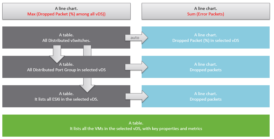
Gradient can be handy in widget where relative comparison among many objects is important. In the following example, the widget is answering the question about the severity of imbalance among vSAN disk groups. What’s your conclusion if you solely rely on the color?
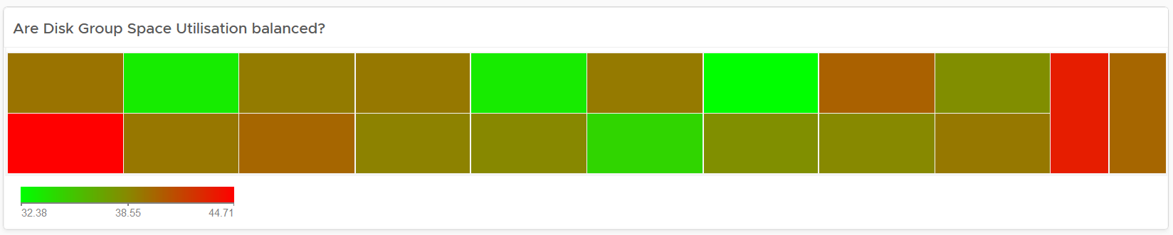
Oh no, they are not balanced. Let’s initiate rebalancing, which can potentially move Terabytes of data!
But wait! We only care about unbalanced when they are significant. Minor unbalance is expected. In fact, if they are perfectly identical, it would be strange.
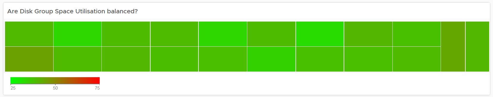
The problem with the above widget is utilization should only turn red when it reaches 75%.
After fixing the 2 preceding problems, we have a meaningful heat map.
Example Implementation
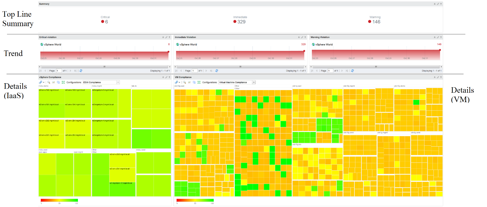
In the Compliance dashboard below, color is used to quickly show the various level of compliance. If all you see is Green, there is no need to look at the numbers & texts!
Last but not least, think of users who may not be able to distinguish all the colors. Provide alternative way for them so the functionality is not lost.
Past vs Present
Think of what timeline you need to show, as there are use case for both the present and the past. The past useful when the present data does not tell the full picture as it depends on the time you login and see it. If you login at 8 am in the morning to see what’s happening over night, then the value at 8:00 am is not answering your question.
The past is harder to visualize as it has >1 data points. Ideally, you show the data as a line chart so you can see the trend. Showing a single data such as the maximum or average can miss critical information such as “is it trending upwards or downwards” and “how long did the peak last?”. The problem with line chart is it takes up screen real estate.
If you need to show a lot of objects or metrics, then you need to summarize. As covered in Leading Indicator, you may need to show 2 numbers, especially if one of them is an average.
Summary 🡪 List 🡪 Detail
In large environment, you manage a large number of items (e.g. K8 pods, AWS EC2). This means you need a way to summarize the information, so you can work with a subset of the group. Within this subset, you need to know which particular item to work on.
The flow Summary 🡪 List 🡪 Detail is one common technique to achieve the above.
Summary
The summary shows the overall picture, not a subset.
There are 2 techniques of visualizing:
-
Number oriented. Useful when the absolute value matters.
-
Non number oriented. Useful when relative values of the numbers matter, as the numbers form a set.
The number-oriented uses a scoreboard. I find scoreboard is a good way to start, especially if the numbers are suitable for color coding.
Based on the scoreboard, you may want to drill down to a subset of the environment. Take note that the drill down is based on the object owning the metric.
The non number oriented uses a distribution chart, such as bar chart or pie chart.
List
The View List widget is a table that lists all the objects. Use a filter if the number of items is large.
Having a filter also helps the dashboards scalability as showing tens of thousands of objects will impact the dashboard performance. It also improves usability as you can use progressive disclosure, and draw user attention to the big picture first.
Detail
At the detail level, you deal with a single item, such as a Horizon session. If the item has large numbers of metrics to show, you need a way to see them before plotting the trend chart. I found the Scoreboard the most suitable as it can be color coded and supports drills down to see the trend chart.
Interaction
Interaction allows you to build interaction within the widgets. So it is intra-dashboard, while navigation is inter-dashboard. Take advantage of the interaction & navigation, but keep them consistent so they are not too complex.
Logically design the dashboard first using any drawing tools so you can see the flow of information. I typically use PowerPoint, as shown in the following example.
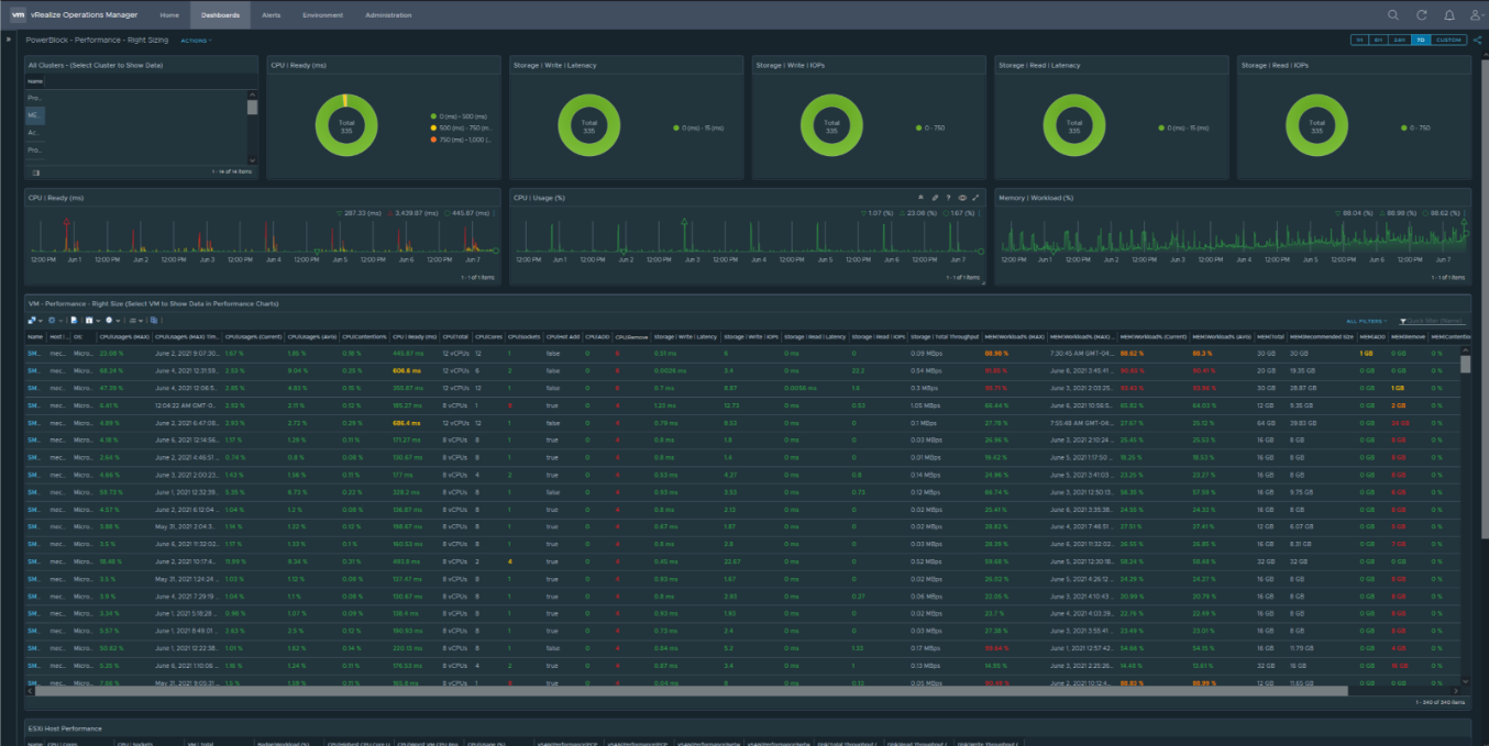
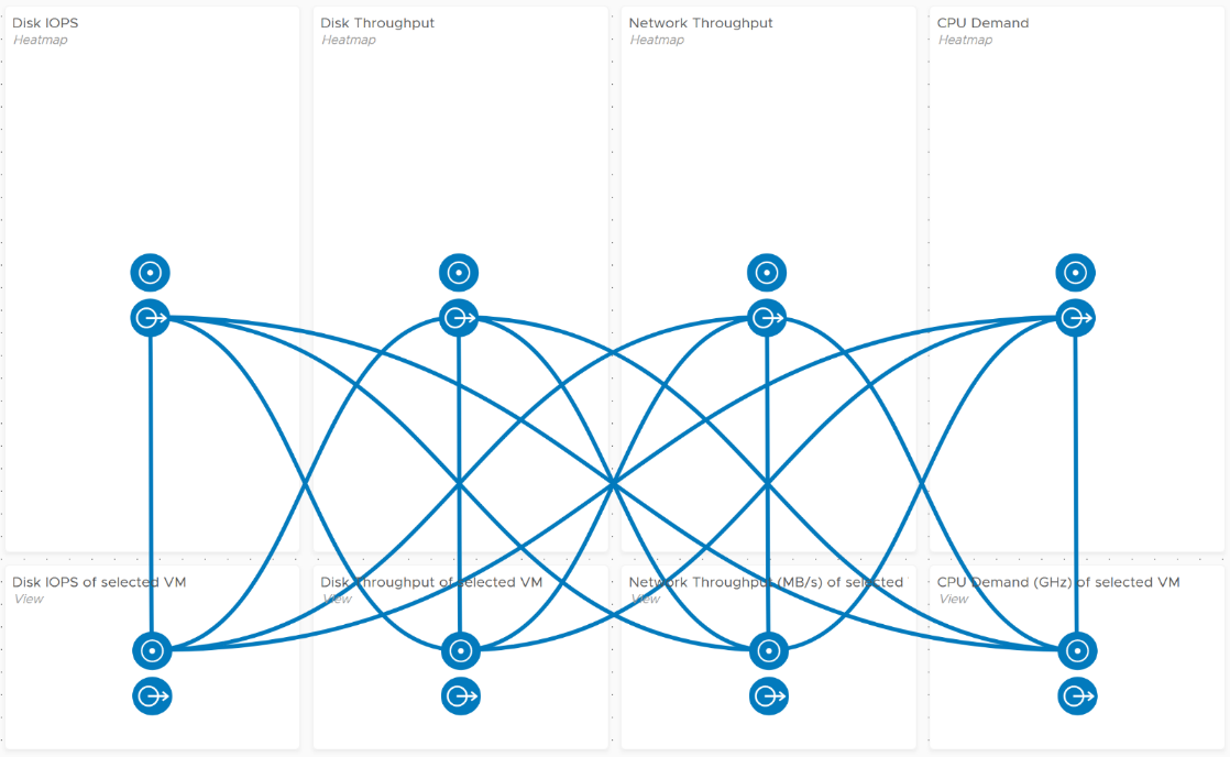
A rich interaction will increase the functionality of the dashboard. Aim for a symmetrical interaction as it’s easier for the dashboard consumer to understand. The following shows 4 heat maps driving 4 line charts in a 4x4 combination. It looks complicated in the screenshot below but feels natural when actually used.
Use progressive disclosure to minimize information overload and ensure the webpage loads fast. On the other hand, so long your browser session remains, it remembers your last selection.
Widgets
Keep the variants of widgets minimal, as it improves usability, especially when you have multiple dashboards or a dashboard with many widgets. You notice that I mostly use the same set of widgets in all the dashboards I have created.
The following lists the widgets I use:
| Scoreboard | Headline or Banner or Summary. To get attention to the key point, I use large text, space out the content and apply a gradient to make it stand out. I may even use color. Object Property. To show relevant configuration of an object, I use small font. I keep the visual plain and simple. Many metrics per object. Being more compact than health chart, it’s handy if you have more metrics than screen real estate. |
|---|---|
| Bar Chart | Absolute distribution. The actual value of each bucket is important to you. I find manual bucket size useful when the bucket range values is important. |
| Pie Chart | Relative distribution. The relative size of each slice is important to you. Look for patterns in the result, such as the number of slices shown matches your design or desired outcome. |
| List | Object List is good for one-time, disposable dashboards as it’s convenient. I use View List for permanent dashboard as it has more features, especially the data transformation and parent values. |
| Heat Map | Use it if there are many objects, and you only need to see the present value. So it’s suitable for capacity, configuration, live NOC, and not suitable for performance (where you need to see trend over time and data older than 5 minutes) |
| Health Chart | Where the color is more important than the value. |
| Trend Chart | I use View Trend Chart as my main line chart. I rarely or do not use other forms of line chart, such as Metric Chart. I rarely use the threshold for visual reason. The thresholds make the chart hard to read. |
| Top N | A table listing for top N numbers within the specified period. |
| Alert List | Use to show relevant alert. For example, for performance, I only show performance alerts as the full alert is available in the object summary page. |
| Relationship | I use the Advance version of the widget as it’s visually more polished and meets all my requirements. I do not use the simpler version. |
| Text Display | I use it as a “Read Me” to either explain the whole dashboard or certain part of it. |
Practitioners like [Dale Hassinger](https://www.linkedin.com/in/dale-hassinger-5712301b/) use a lot of Text Widget, because he creates custom web pages. It certainly makes a functioning and cool dashboard!
I rarely use the following
-
Metric Picker. I’d use it if as a designer I’m unsure of what metrics users will use.
-
Metric Chart. I’d use it if I need to have multiple line charts on a single widget. Using less widget helps simplify the overall dashboard look.
-
Object List. Use View List instead. Functionally it’s a superset.
-
Scoreboard Health. Use heat map instead.
Scoreboard
At the top of the dashboard, it’s useful to provide a banner or headline, giving the big picture or summary. For example, this is what I use for Inventory summary.
The above is not color coded as each number does not have a good or bad meaning. It’s visually less noisy also to have a neutral color.
The limitation is the number you see is the present number.
You can convey meaning by using color. There is also a line chart in the background of each box.
Take note that the background color is also based on this last value, not the average or peak of the monitoring period. Another limitation is the threshold
To see a trend chart, double click on it.
Gauge
This is a variant of scoreboard. It can show relative comparison. You can use another metric as the “total”. This means you do not have to create a super metric.
You can also change the color coding of the threshold based on percentage.
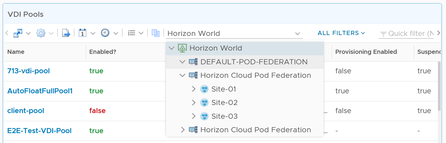
Table
A table is simply a list, where each row represents an object, and each column shows a single value. This enables us to list hundreds of rows, with ability to filter and sort. Each cell value can also be color coded.
View List also supports filter. The following screenshot shows Omnissa Horizon hierarchy, so you can drill down into specific area in the world of Horizon.
Aggregation
Table is good for details. However, as a summary, its main problem is how to give an insight over time as each cell can only hold 1 value. How to give an insight into what happens in the past? For example, how to see the performance in the last 1 week? There are 2016 datapoints in the last 7 days, which one do you pick to represent?
There are a few possible options for the values:
| Current | This could the present value or the last known value. It’s useful to show the present situation. However, this does not tell what happened 5 minutes ago. Its useful in capacity, compliance, configuration. It’s rather limited in performance. |
|---|---|
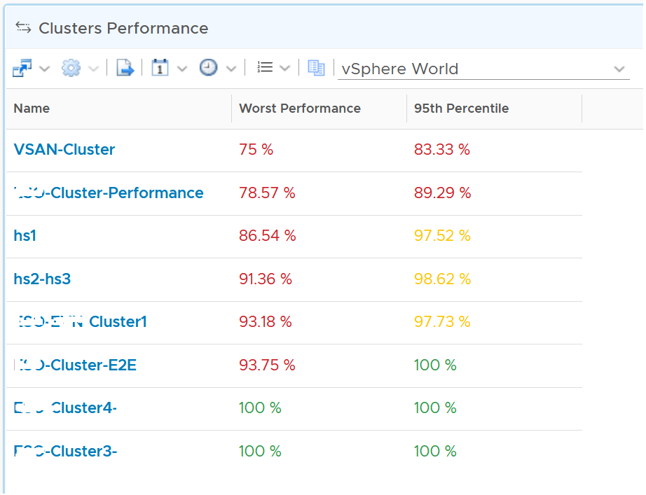
| Average | The average of the period. Average is a Lagging Indicator. By the time the average is bad, roughly 50% of the number is unlikely to be good. It is not suitable for proactive monitoring. |
| Worst | The worst of the period. This is suitable for daily average, as there are only 288 data points in 24 hours. If you find that results in outlier, then replace it with 99th percentile. As it only takes 1 peak to set this value, your chance of outlier is 7x higher in a week. It’s great for peak detection, but needs to be complemented with worst 5th percentile when looking at weekly or monthly period |
| Percentile | The worst 5th percentile number. This is a good midpoint between Average and Worst. For performance monitoring, the worst 5th percentile is a better summary than average. BTW, we use the org.apache.commons.math3.stat.StatUtils library. The number differ slightly to Microsoft Excel or Google Sheet in general as they use a different formula. |
From the above, we should choose worst and worst 5th percentile.
The following table implements the above concept.
Coloring
BTW, I vrealize that the threshold coloring works on string, so long it contains number. The following table shows that any version higher than 6.7 is green. The rest follows the logic shows next to this table.
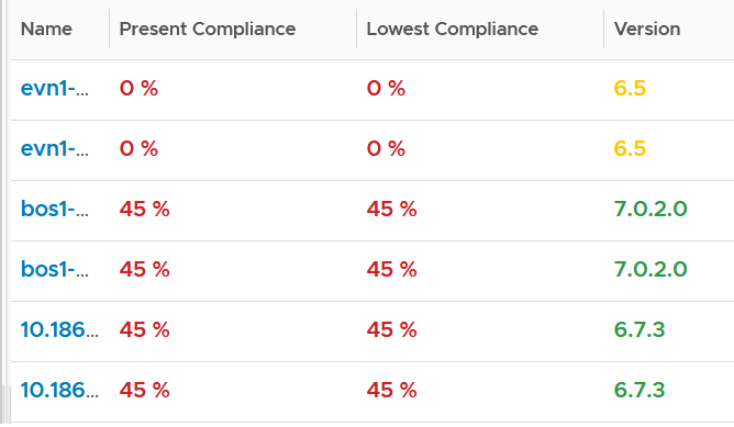
To do that, set the following:
It also works on text.
Yes, you do not have to specify every color!
You cannot specify the green color. What is not red is automatically shown as green.
Calendar Summary
By the way, a little trick from Robert Mesropyan. There are times where you need to hide the object name. To do that, export the view, and change the value below to true.
<Property name="hideObjectNameColumn" value="true"/>
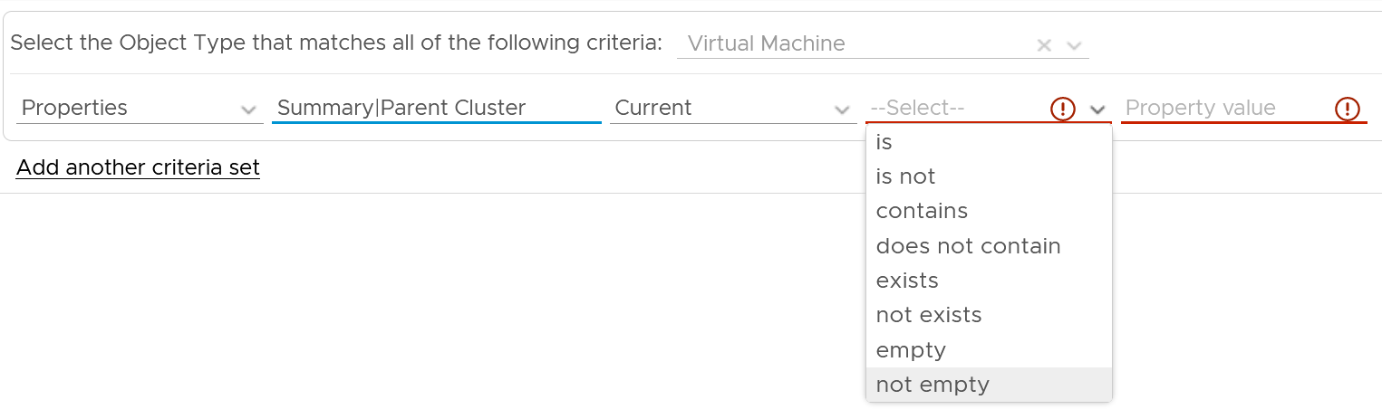
Empty or Exist
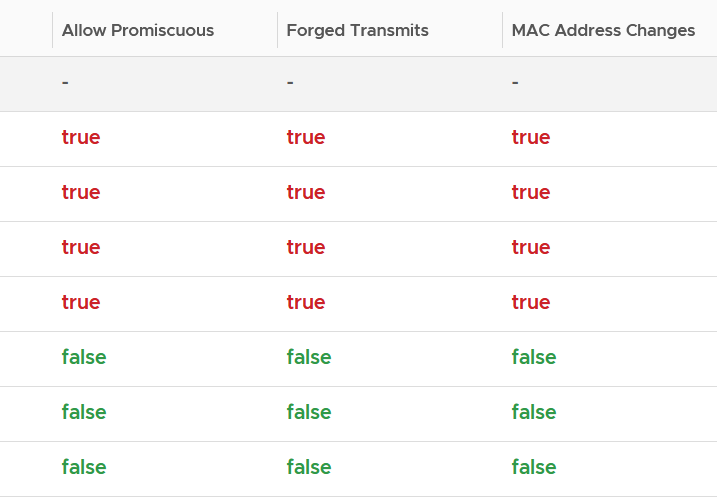
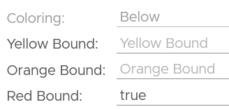
In configuration check, we can encounter a need to check for exception. This is where the Exist or Not Exist check and Empty and Not Empty check can come in handy.
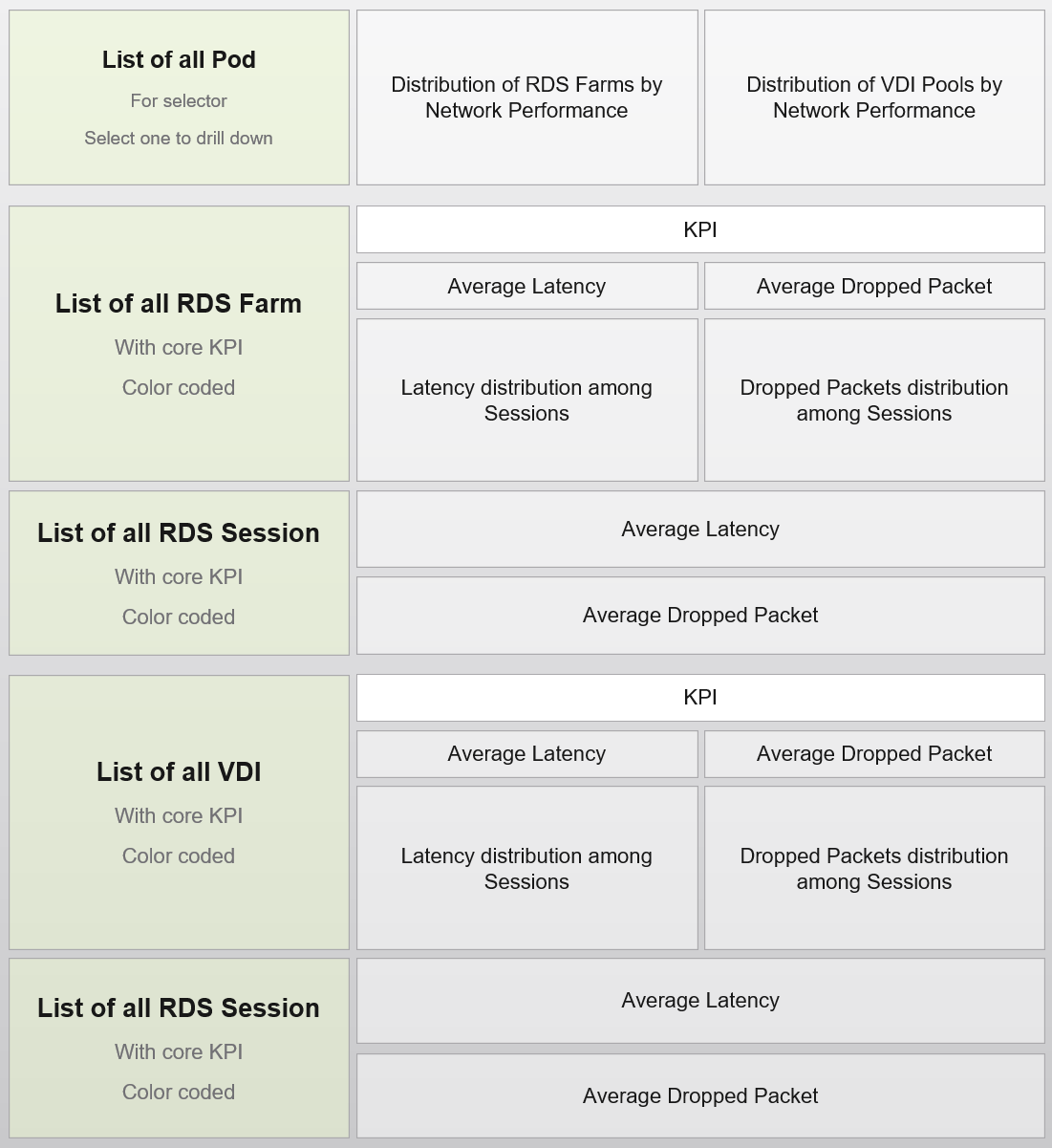
Distribution Chart
Distribution Charts can be used to give insight to a large dataset, as table will show too many rows.
There are 2 types of distribution charts:
-
Absolute distribution: bar chart.\
It’s called absolute as you care about the actual value of each bar.\
You also call about the order of how they are sequenced. The brackets are linear and follow a step up.
-
Relative distribution: pie chart and donut chart.\
It’s called relative as the number you care is in percentage or ratio. You care about how the numbers are relative to one another. You also do not care about the order they are displayed (the brackets are not in order)
The number of buckets on the chart should be balanced between the available screen estate, ease of use and functionality. Modify the buckets to either reflect your current situation or your desired ideal state.
The chart automatically starts with the largest slice. It ends with “Others”, which aggregates all the remaining buckets.
How does it work with a pie chart or donut chart?
Well, it starts at 12 o’clock, goes clockwise and end with “Others”.
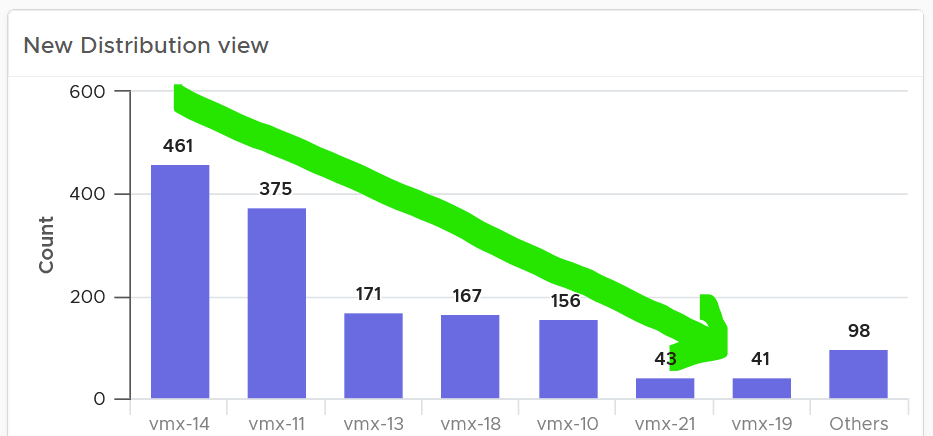
Bar Chart
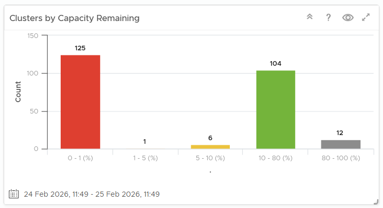
When the order matters, use bar chart to make sure each bucket is meaningful. Take the following as an example. It shows vSphere shared datastores by their capacity remaining. They are categorised into 5 buckets, from the lowest capacity remaining to the highest. Each bucket is given a color to convey a meaning. Can you guess why >80% is represented by grey, as opposed to even more green?
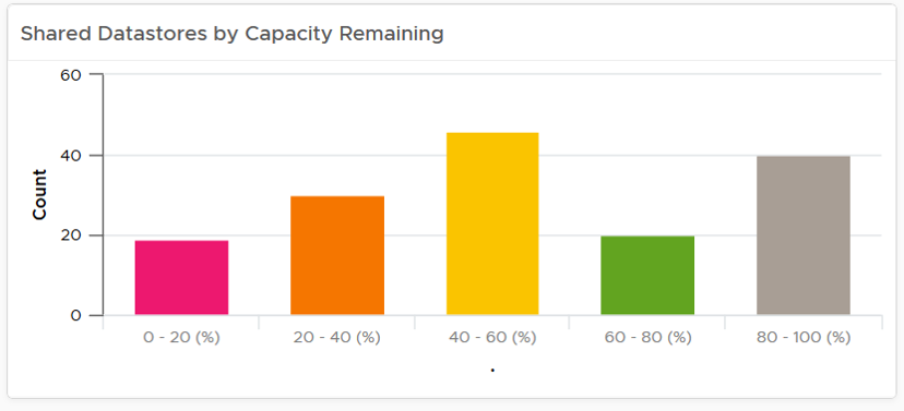
The reason has to do with the reason you bought the capacity in the first place. It’s to be consumed. If the capacity is not well used after months or even years, it’s a wastage. You overbought capacity.
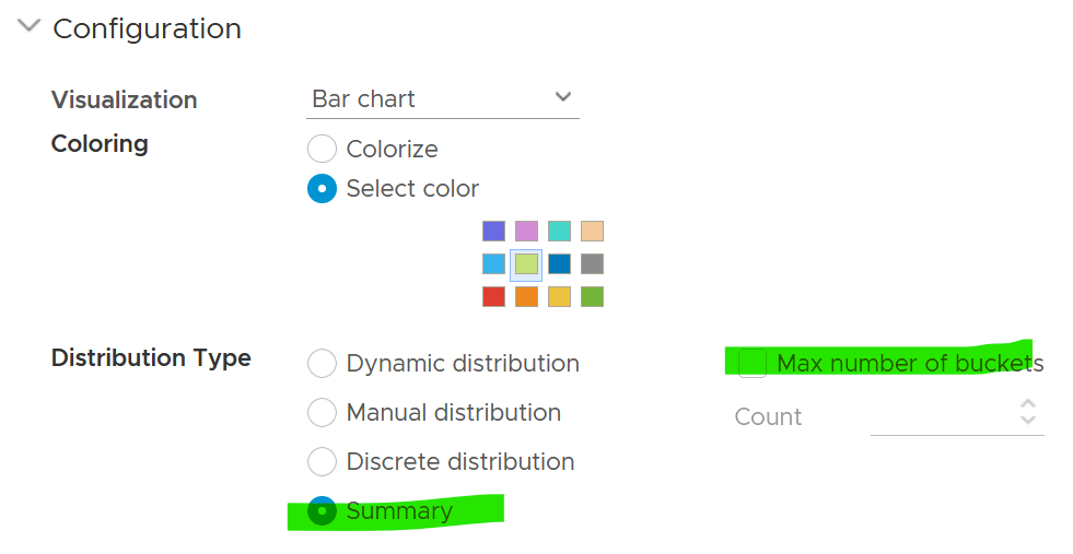
The bar chart is also better at showing the outlier. The following cluster has 79 VM. If you want to know their distribution by size, you can plot all VMs in order of their vCPU size.
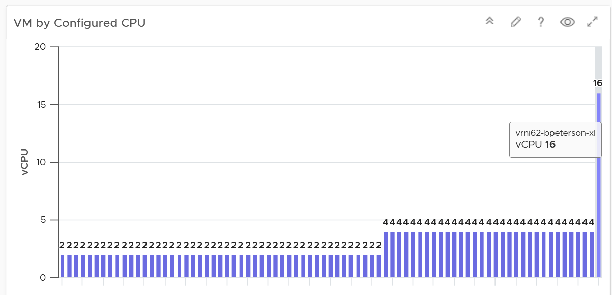
The distribution type is “Summary”, and leave the “Max number of buckets” blank.
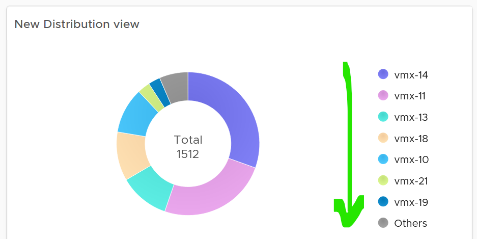
Pie Chart
When the number of variants matters, use pie chart as it does not have space constraint. It’s useful when you have an expectation of what is good or bad. See the following 2 widgets. They show the number of resource pools in a cluster. What does each pie chart tell you?
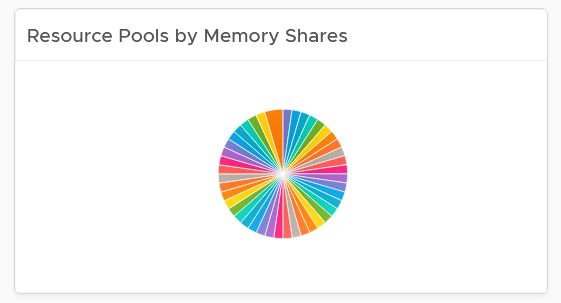
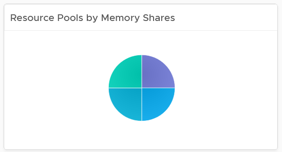
The first cluster has way too many resource pools. This alone will make performance management difficult.
The second cluster has 4 resource pools, but they are of equal share. What’s the point of having resource pool when they are the same share? It looks like a common mistake of using resource pool as folder.
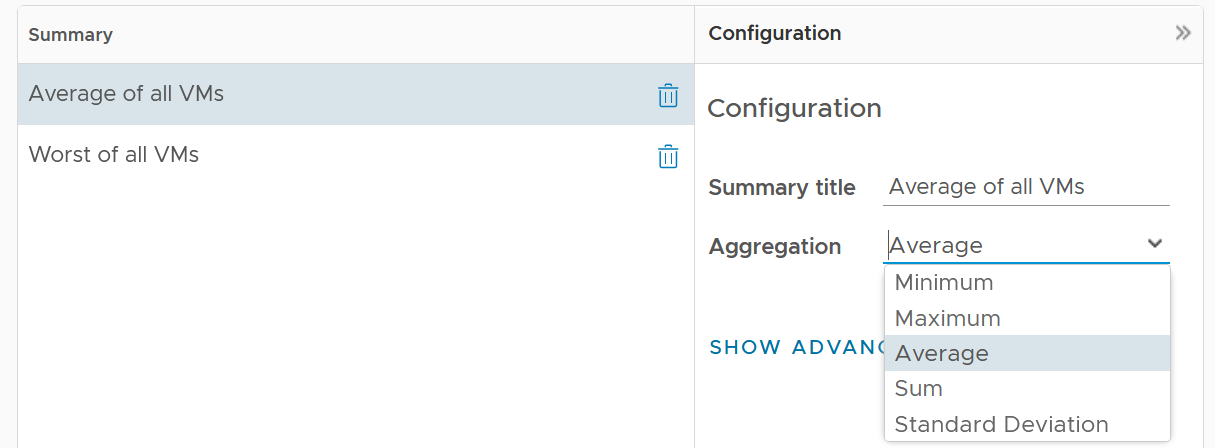
Summary
This widget can do 2-level of summary
-
First, the data is summarized over time.
-
Second, the data is summarized over members of the group.
The first summarization is optional. In the following example, it simply gets the VM configured size for each VM.
The widget then aggregates 3 numbers: the average size of all VMs, the largest size, and the smallest size.
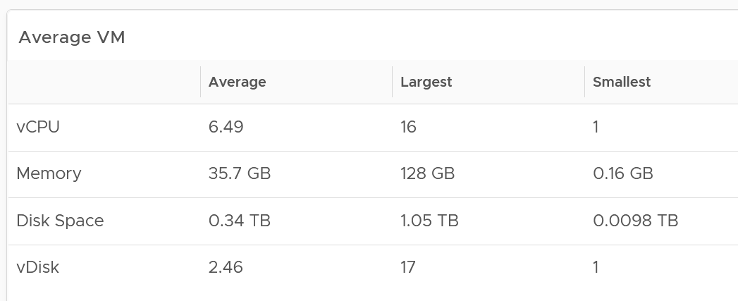
You can also add standard deviation to see the size of the distribution.
Advance Example
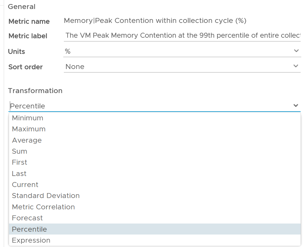
You can use the widget to perform advance analysis, such as baseline performance profiling.
In the example below, we first take the 95th percentile of each VM contention. This is then used as the input to get the overall average, and the worst, among all the VMs.
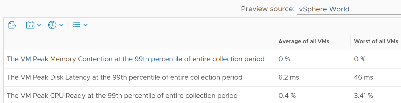
The 99th percentile is set on each row.
The 2 columns (average and worst) are actually summary
Limitation: there is no function such as count and percentile.
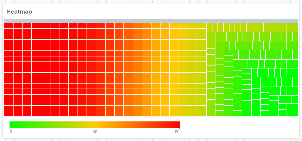
Heat Map
Heat Map lets you vary both the color and the size of each object. Fixing the size can be powerful as it shows a different meaning. From the following example, you can see that there are more red than orange + yellow combined. It also makes the overall layout neater, which is always a nice bonus.
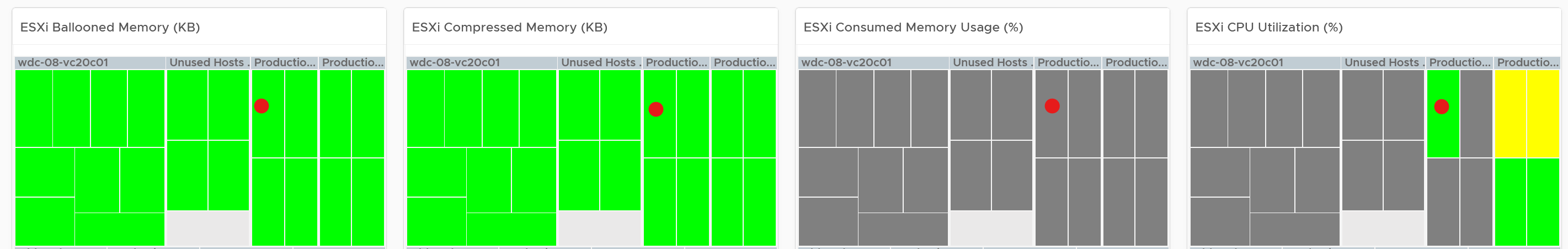
Fixing the size also enable you to use multiple heat map widgets together. The reason is the exact location and shape of each box is identical across widgets. In the following example, the red dot comes from the same ESXi host. This means you can see while this server across the 4 different metrics.
Top N
Top N is a simple list with visual. It is ideal when you need to convey the value before the object name. As you can see below, the presentation is more eye catching than View List table.
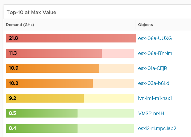
Relative to View List, Top-N has limitation on data transformation. By default, it will average the value. Since average is a lagging indicator, use the percentile function. As a bonus, the percentile is not locked in the design mode. Any user can change the percentile on the fly!
Limitations
Distribution charts (pie chart, donut chart, bar chart) have the following limitations:
-
“No data to display” does not imply that there is something wrong with VCF Operations data collection process. It might signify that none of the objects meets the filtering criteria of the widget, hence there is really nothing to display.
-
To see the content of a slice in a pie-chart or a bucket in a bar-chart, simply click on it. Note that the list cannot be exported.
-
The pie-chart and bar-chart cannot drive other widgets. For example, you cannot select one of the pie-slices or buckets, and expect it to act as a filter to a list or a table. What you can do, is to select one of the object in the slice. I use this technique to allow drill down. You can also click on the object name, which will take you to the object summary page. The page provides key configuration information, alongside other summary information.
-
You can apply a specific color in a pie chart or distribution chart for a specific numeric value, but not string value. For example, you can’t apply a red color to the value “Not Installed”.
The following widget can only show the present data:
-
Heat Map
-
Scoreboard
Log Insight. Unable to specify color in the bar chart. The color is automatically chosen. It can result in “red” in the legend being shown in green.
Implementation
Ok, enough of theory 😊 . How do you apply all those in real world operations management when there are many systems to manage and many roles are involved?
Architecting a suite of dashboards spanning a wide area is complex. To address this, begin with the end in mind. Different team in a large organisation are interested in different things. Once you have the standards, you can personalize as individuals within a team have specific ways of doing his or her job.
Each operation is like a fingerprint. While there are commonalities, each customer runs their operations a little differently. Hence it’s not possible to design one dashboard that meet every customer’s operational needs. A configuration that is important for one may not even be relevant for another. Tailor this dashboard to your unique environment. If needed, widgets can be collapsed or expanded allowing more relevant data to be displayed.
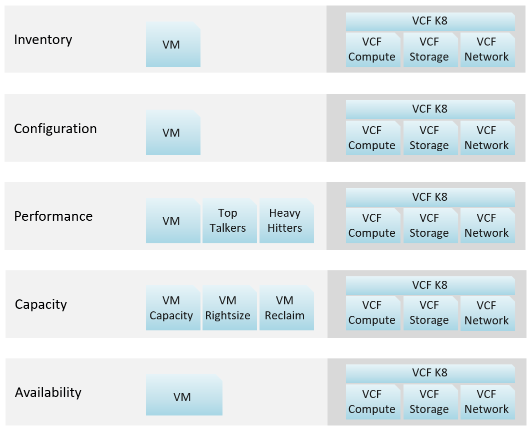
In VCF Operations, the primary role we target in our default dashboards is the VMware team. They are often called the Platform Team, especially if they run vSAN and own the Guest OS that runs on top of vSphere. The team supports the Level 1 Team and performs troubleshooting. That’s why the default dashboards span both monitoring and troubleshooting. They are interested in inventory, performance, availability and configuration.
| Role-based | Platform Team Capacity team: Capacity and Reclamation Compliance team: Compliance and Configuration IT Finance team: Cost and Price Level 1 team: Live NOC, Alerts, Availability, Security IT Leadership: Summary, long term, big picture. |
|---|---|
| Pillar-based | Develop the following set of dashboards, each cover a pillar of operations
|
| System-based | Each system has their own architecture; hence their observability varies. Popular systems are:
|
Overall Design
Once you consider all the above, you will come up with a suite of dashboards that work like one.
Explanation:
-
VCF Network = NSX + Distributed Switch
-
VCF Storage = vSAN + VMFS + RDM. We keep SRM separate as it's separate SKU.
-
VCF Compute = vSphere Cluster + ESXi + Resource Pool.
-
VCF K8 = vSphere Supervisor.
How about Kubernetes workload?
My take is they need their own set. Just like VDI needs their own set, as these 2 technologies have many object types.
You need to have some consistency for dashboards that covers, so users need not learn repeatedly. It will be confusing if each dashboard looks totally different from one another, considering they have the same objective. Apply some design standards for different pillars of operations. After all, performance is performance, whether it’s Kubernetes or Amazon Web Services is a matter of objects and metrics.
Multi-Dashboard
Dashboard to dashboard (D2D) navigation has to be part of your overall approach. You can drill down in the object hierarchy from one dashboard to another, or move laterally. Note that you cannot go up the parent hierarchy.
D2D capability also helps in avoiding a deep dashboard with many widgets that requires multiple pages of scrolling. They are harder to understand and may suffer from loading time.
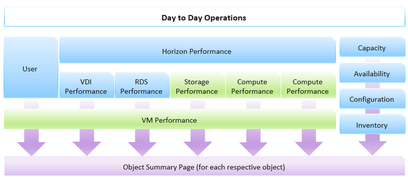
Create a set of dashboards that act like one system. This is the principle we use when creating the out of the box dashboards. The following shows an example for Horizon, a VDI solution. It integrates into existing vSphere dashboard by enabling drill down.
Focus on the pillars of operations, not objects.
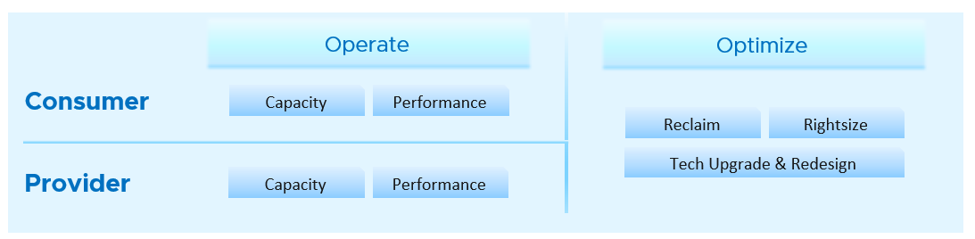
Let’s say you’re designing for Capacity management and Performance management, as they often go together. Look at the systems being managed and the major tasks. For the case of vSphere and vSAN, we can group the components into Consumer and Provider. For each, we need to keep the lights on (Operate) and improve (Optimize). Operate covers the capacity and performance management, while Optimize covers reclamation, rightsizing and upgrade. Optimize also applies to infrastructure. You adjust cluster size, upgrade ESXi, migrate from traditional array to vSAN. All these increase efficiencies, reduce cost, increase capacity, etc.
You may end up with something like this as your initial overall design.
Once you have an overall approach, you can plan your dashboards. Because vSAN has many metrics and components that need further check than a simple datastore, I need to give it its own set of dashboards. There is a drill down from Storage to vSAN as not all datastores are vSAN. By keeping them separate, you can also add physical array dashboards, so your Storage dashboard can drill down to both vSAN and array.
Take time to draw your multi-dashboard solution. I found it helps clarifying my thought. The following example shows an attempt to connect all products, not just vSphere and vSAN. It will be interesting to connect VCF, VMware Clouds on AWS, NSX, Horizon, vSAN and vSphere together!
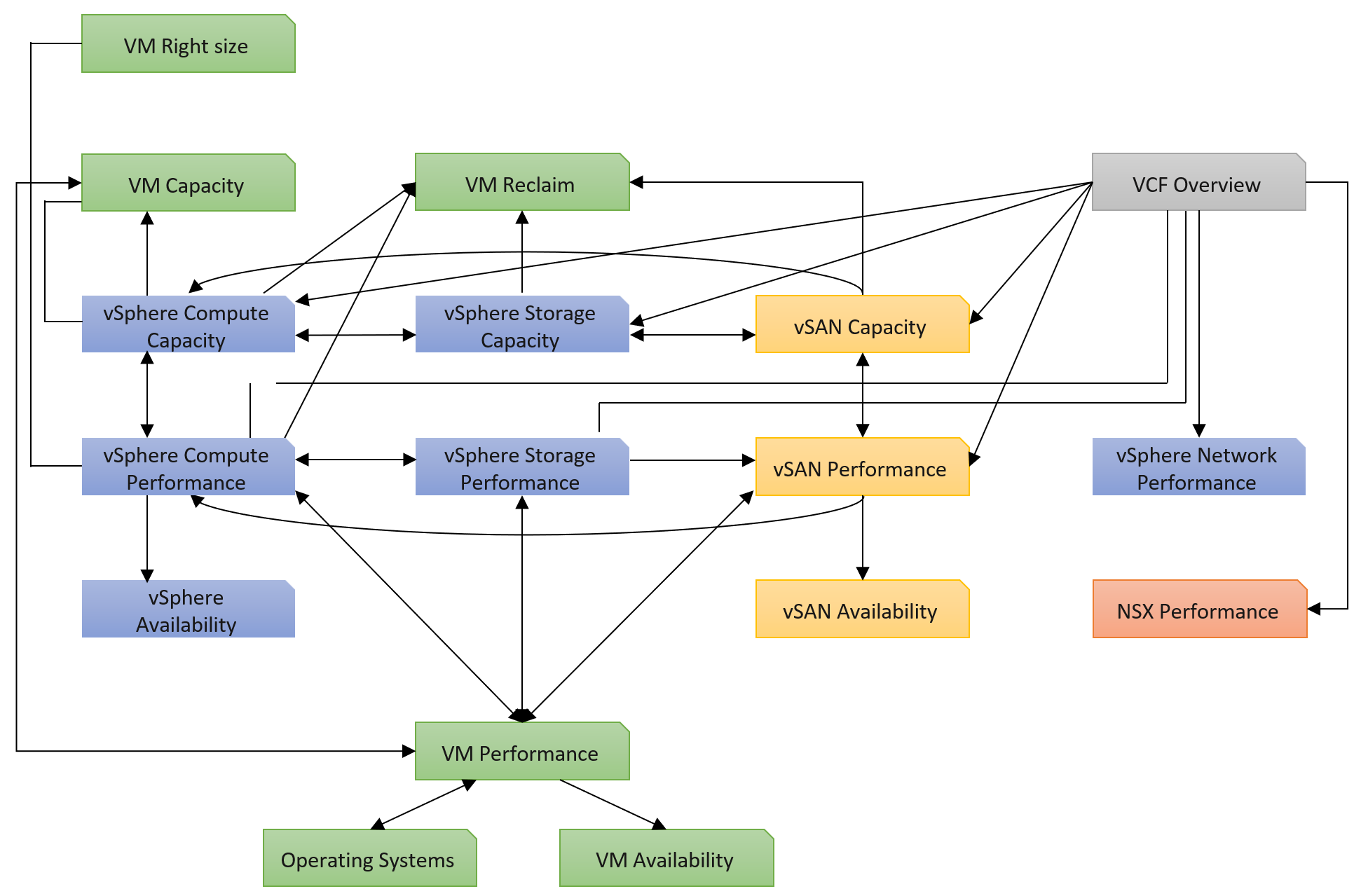
You can and should also organise by function, not just by VMware products. In the following example, I group them into 2 (Provider and Consumer). I added Optimization as the lines became too complex. By working at this logical level, it also helps me spot if there is inconsistency. Having gone multiple rounds, I ended up with something like this.
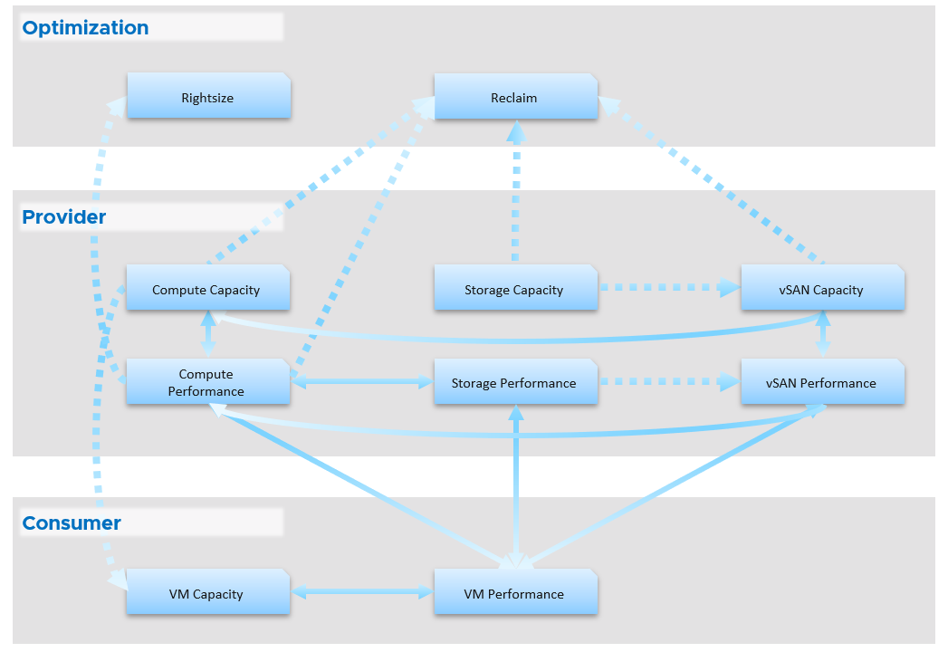
Notice something missing?
I do not have Network. I cover in Part 2 Chapter 5 Network Metric that the nature of network means its capacity model is largely a non issue. You focus more on performance as you do not tolerate network dropped in your data center. I plan to include Network Performance after I consider integrating NSX. If you have an idea on how to enhance the current dashboard, let’s collaborate!
From the above, why are ESXi and Resource Pool missing?
The reason is they are part of cluster. Instead of separate dashboard, I feel adding it into the cluster dashboard will increase usability. The drawback is it does not cover standalone ESXi.
Once you design the overall flow, you implement it on each dashboard. Here is an example, where this dashboard drills down into 6 other dashboards.
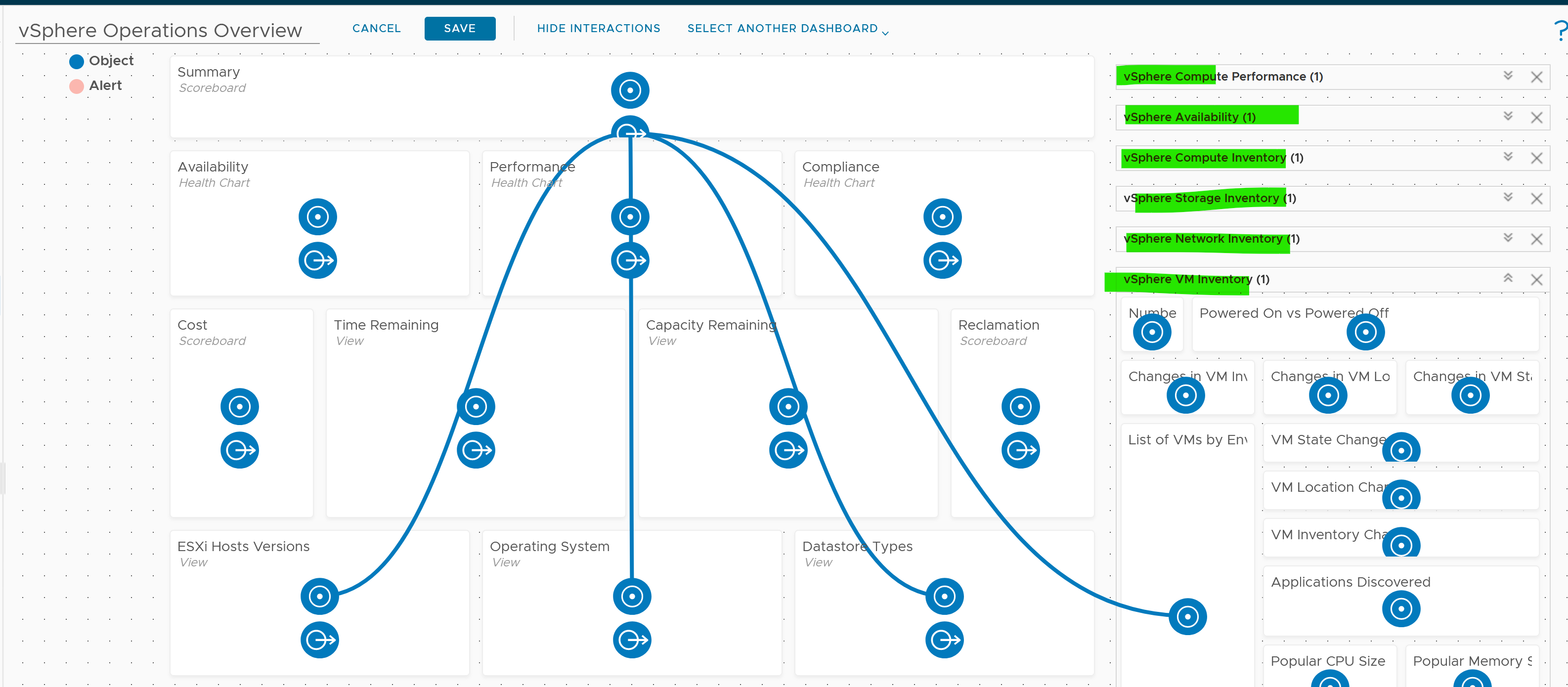
The screenshot shows the drilldown 1 dashboard at a time, hence I chose the last dashboard else the first 5 could not be captured.
Logical Design
I find it useful to design my dashboards in Microsoft PowerPoint before I implement them, especially if I need to design a suite of dashboards that work together with back-and-forth relationship. I find it helps me see the big picture, as I can see multiple dashboards on one screen and spot any inconsistency among them. It’s also faster to make changes.
Large Environment
The number of dashboards you will have depends on the size of the environment and the number of people managing it. An environment with 100 VMs in just 5 hosts and 1 cluster will need far fewer dashboards than a global environment with 100,000 VMs spread over 5,000 ESXi, 500 clusters, 20 data centers, and 15 vCenter Servers.
In a large environment, where you have many physical data centers and even more vSphere clusters, you will likely need to display the information per physical data center. There are several reasons for this:
-
Aggregating data at a global level, which spans many physical data centers, will hide too much information. Presenting data at such a level means you are getting an average of thousands of objects. If your environment is generally healthy (and it should be), the average will logically fall within a healthy range.
-
In most cases, the performance in a given physical data center is independent from that of other data centers. For example, your Singapore data center typically does not impact the performance of your London data center. An exception to this case is when you link your data center at the network (stretched L2) and storage layers (synchronous replication). From experience in troubleshooting such a scenario, we recommend you keep the physical layer independent from each other. Assuming your data centers are independent, it makes more sense to display the chart on a per data center basis.
-
VMs typically do not move from one physical data center to another (unless they are paired with storage replication and your network is stretched), so an imbalance among multiple data centers does not translate into a realistic rebalancing action.
Part 2 Chapter 3
The inventory dashboards aims to implement the inventory pages of VCF Operations.
Overall Design
The suite of dashboard works together as one integrated set. They also have similar design.
| Goals | Check if the inventory matches your expectation. Not just the count but also the change. |
|---|---|
| Cover all objects in VCF where inventory matters. | |
| Questions | What VMs do I have? Where are they located? What’s the changes I need to know? |
| Assumptions | To be used with configuration dashboards |
| Target Users | Platform Team |
| Usage frequency | Mostly ad hoc, on a need basis Daily for VM inventory changes. |
| Features | Visual relationship of objects. |
| Ability to traverse the inventory hierarchy quickly | |
| Show the hierarchy and count of objects in the hierarchy. Ideally, it shows the movement of the inventory. |
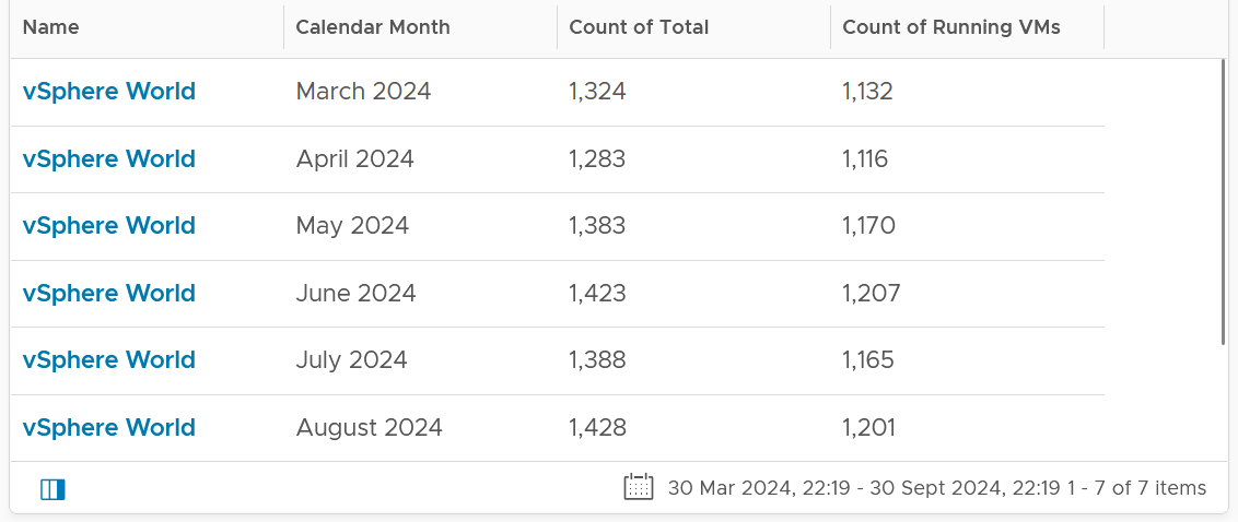
VM Inventory
VM is more volatile than infrastructure, so it’s important to track their changes.
Template is not counted as VM. From capacity point of view, it does not consume CPU and memory resources. From cost point of view, it does not have a price as it’s considered as part of IT asset.
The dashboard aims to answers questions such as:
-
What do we have in the environment? How does it change over time?
-
What’s the ratio between running and not-running VMs in the environment?
-
What’s the ratio between Windows and Linux in the environment? How does it map to your licensing and ELA?
-
Do you have to many variants of Windows OS and Linux OS? Too many different versions, editions, and updates can complicate operations.
-
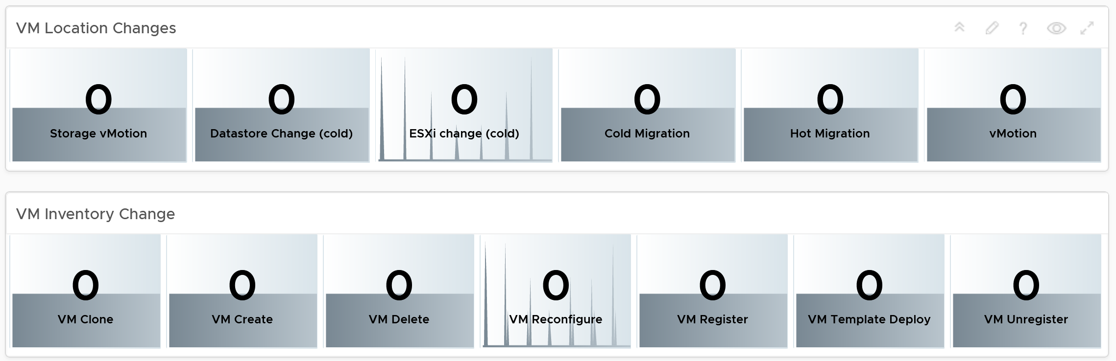
The dynamic nature of private cloud means change is constant. Is the volatility matching your expectation and business cycles? For VM, there are 3 types of changes (location, state and inventory). They are tracked in 3 separate health charts. Tailor the threshold accordingly for ease of report analysis.
-
How many VMs were deleted? How many were added?
-
Are you having many large VMs? Are the relative size of CPU and memory balance? A CPU intensive VM should have high CPU:Memory ratio, while a memory intensive VM should have lots of memory relative to its CPU.
-
What’s the average VM size? How does it compare to the largest size? What are the popular CPU size and memory size?
-
What are the largest VMs in your environment? Why do these VMs need that many resources? Is the list matching your expectations?
Summary section
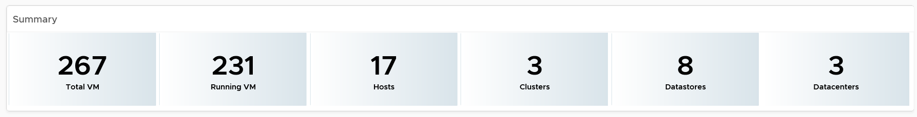
The summary section consists of 2 rows of widgets. It’s designed to help you see the big picture.
Check that these numbers are within your expectation.
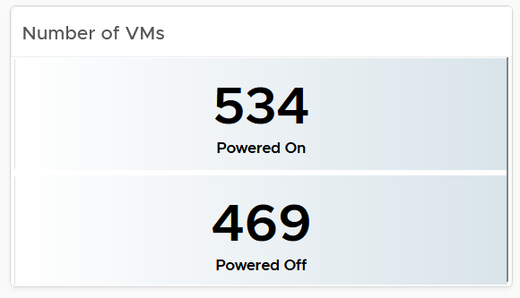
If the number of powered off VM is relatively high, navigate to the VM Reclamation dashboard to see if they can be deleted and taken off the systems.
Review if the numbers over time match your expectation. For example, if there was an activity last night that impacted the number of powered off VM, yet the actual number differs, perhaps the activity was not executed as per plan.
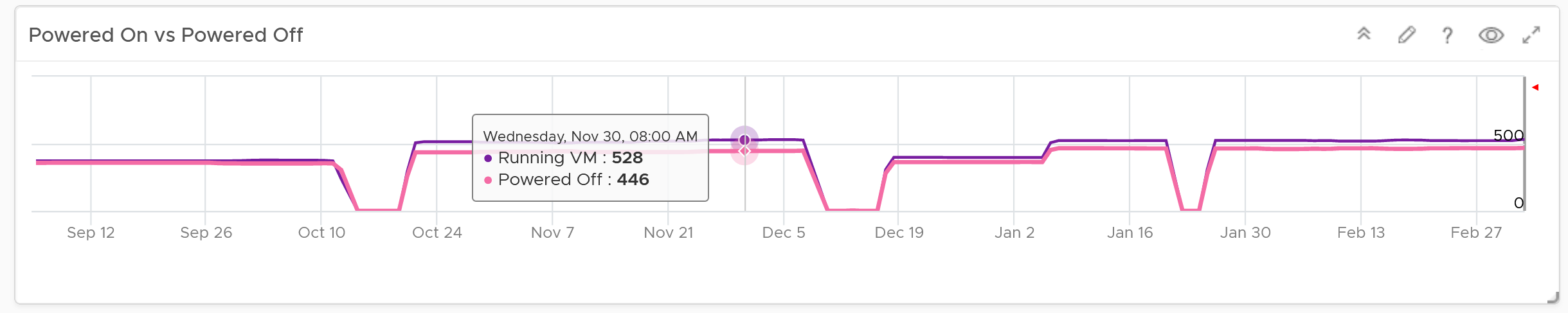
The 2nd row of widget consists of 3 charts. They summarize the overall movement of all the VMs in your environment. Make sure the amount and the pattern both match your expectation.
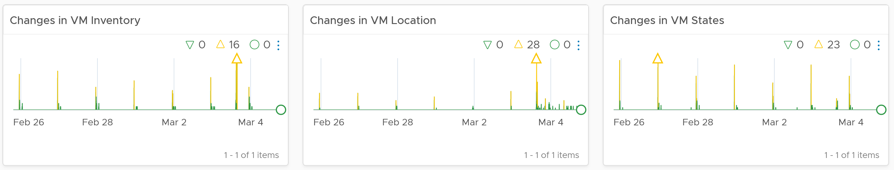
You should customize the thresholds, so it’s easier to see if the values exceed what’s acceptable in your day to day operations. The value is every 5 minutes, so if 100 changes of states is not something you can ignore, set the threshold of yellow, orange and red accordingly.
Detail section
The detail section has interaction where you can zoom into specific data center or clusters.
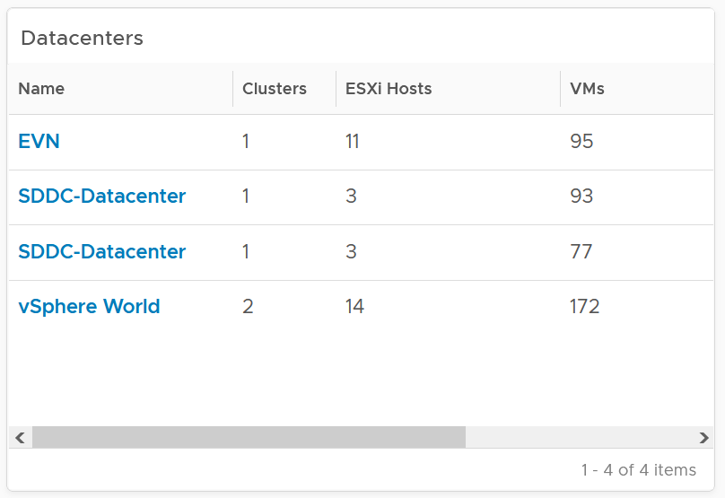
The first row is always the total. vSphere World object covers all the clusters, so its numbers are the summation of all clusters.
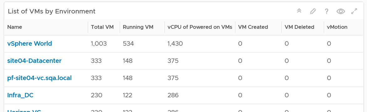
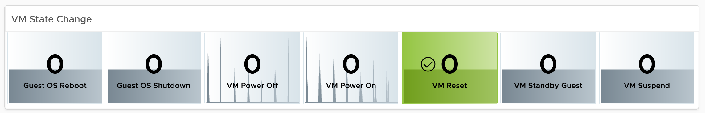
To see a trend, click on any of the row. The 3 sets of scoreboards will automatically show the details.
The first scoreboard is about the availability state. Try to customize the threshold so it’s easier to see at a glance. I’ve set the threshold for the VM Reset as that’s an abnormal operations.
When you customize, consider the steady clusters. They will have a lower threshold as there are relatively less changes or movement. If you set a threshold based on your busy customers, these small clusters will tend to show green.
The next 2 scoreboards cover the location change and inventory change. Again, customize accordingly.
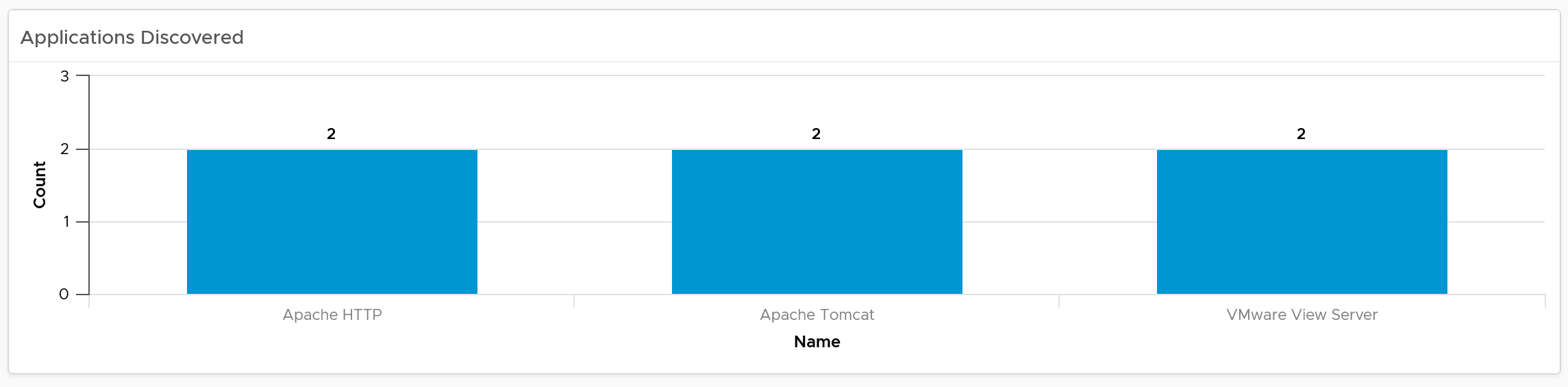
The dashboard lets you see the applications running inside the VM on any part of your environment. This can be handy if you have policy that certain applications should only run on certain clusters, for either cost or compliance reason.
Note: This requires Service Discovery adapter.
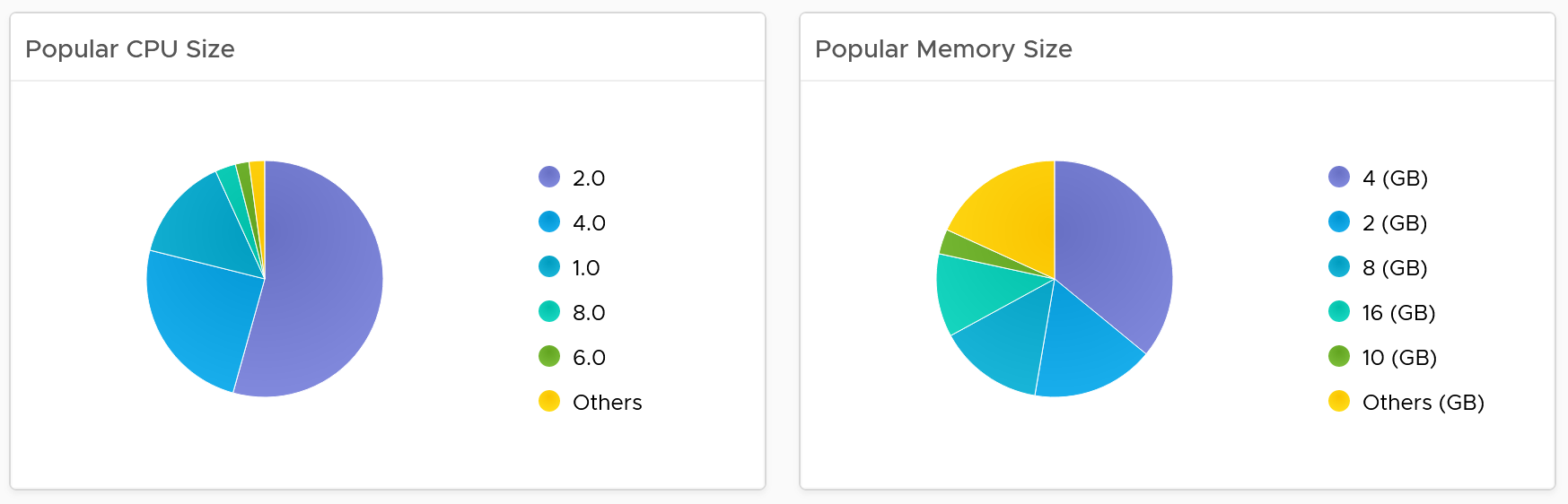
Popular VM Size
Since this is about inventory and not configuration, the following pie charts focus on the popular size (most common). If this was a configuration dashboard, we would have ordered them based on the configured size.
Make sure there is no odd sizes. They need to match your underlying CPU and memory.
Customize the pie charts if you need to see more than 5 sizes. I find 5 is a good balance since I can see the details in the next table below the pie charts).
Popular OS Distribution
The next pie chart shows the OS distribution, again sorted by the most popular.
They should match your expectation. For example, if you separate Windows and Red Hat into different clusters, then you expect not to see one of them when you select a particular cluster.
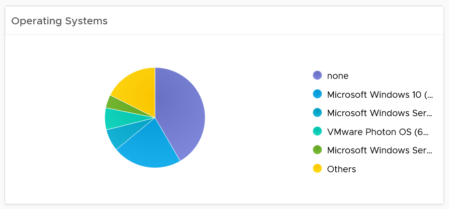
If you see the value “none” under Operating System, that means the VM does not have Tools. I chose the value from Tools instead of vCenter as that’s more accurate.
Virtual Disk
The last pie chart shows by the number of disks.
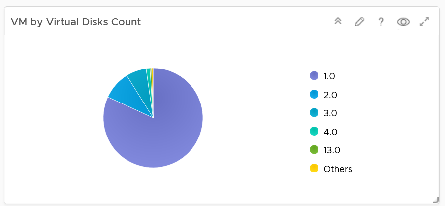
Since a VM needs to have at least 1 disk, I've excluded VM with just 1 virtual disk so those with many are more visible. You’re welcome.
Individual VM Section
The last section shows the individual VMs, and you can drill down to see its details. This is why I keep the pie charts to just show 5 as this table lets me sort in any columns.
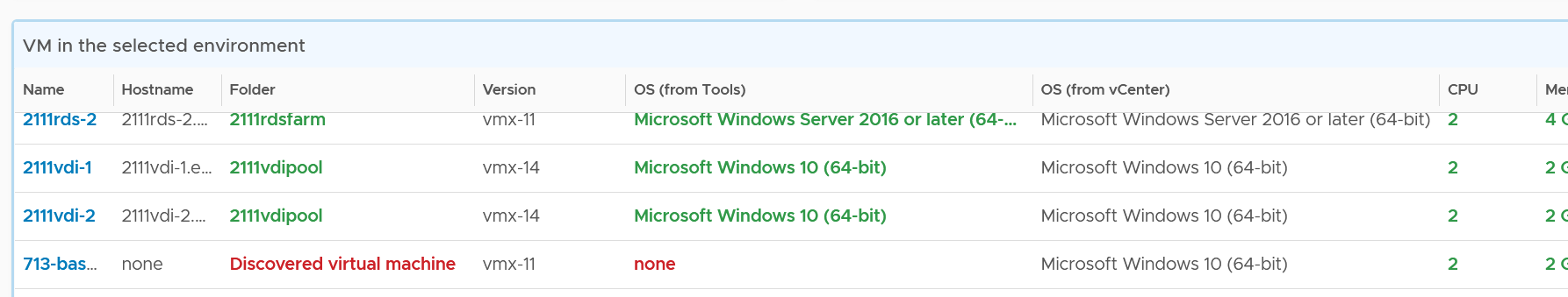
Select a VM, and you can drill down to see its capacity and performance.
Add or remove columns to suit your environment.
Customize the table further by color-coding the values. I’ve color coded the following:
-
VMs that are not properly placed in a folder. They will appear under the “Discovered virtual machine” folder.
-
VMs that are not reporting its operating system. They will report the value “none”.
-
VMs with large CPU, memory or disk. Tailor this to your environment.
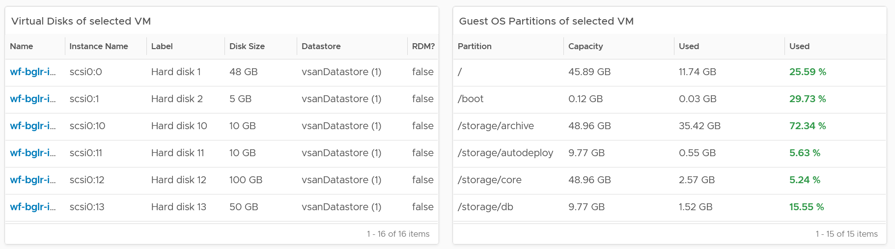
Select a VM, and its details of virtual disk, operating system partitions and network cards are automatically shown.
Limitation: It is not possible to see the mapping between virtual disk and partition. A partition or drive can spans multiple virtual disk, and a virtual disk can contain multiple partitions. This is why it’s best to keep the relationship simple (1:1).
vSphere Inventory
The dashboard aims to answers questions such as:
-
How are the VMs distributed across clusters?
-
What are the largest clusters in your environment? Which clusters have the most VM?
-
What are the largest datastore in your environment?
There are 3 dashboards
-
Compute
-
Storage
-
Network
They have a fairly similar design. The compute has more details because it has more things to manage.
The design has 4 sections, as shown in the following screenshot
If you think their design copies the Horizon Inventory dashboard, you’re right! That dashboard was basically the 2.0 of the vSphere inventory dashboards, so now you’re seeing vSphere delivers the 3.0.
They can also navigate to one another. The relationship widget below sports the navigation. Pick an object and then choose the dashboard navigation.
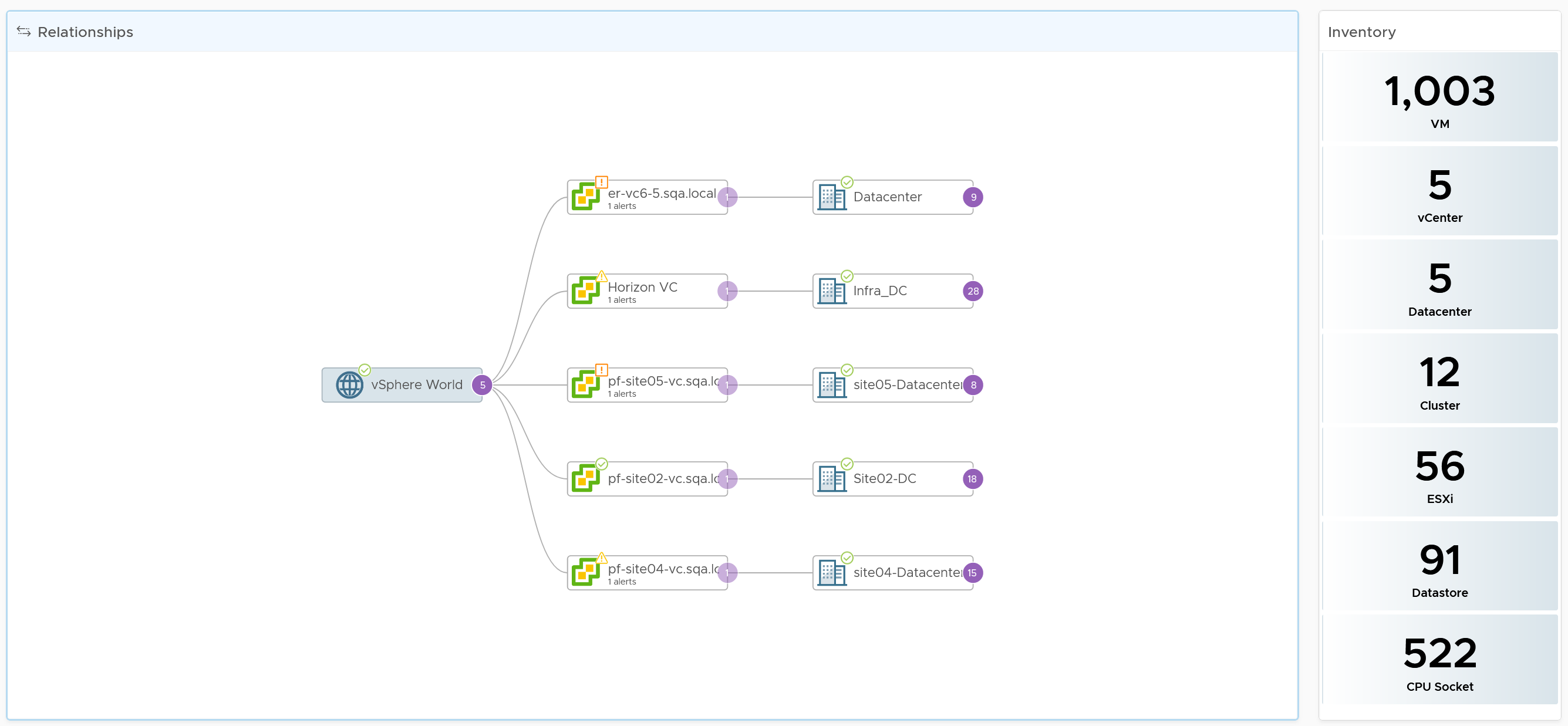
Compute Inventory
Let’s use the Compute Inventory dashboard to represent the 3 dashboards.
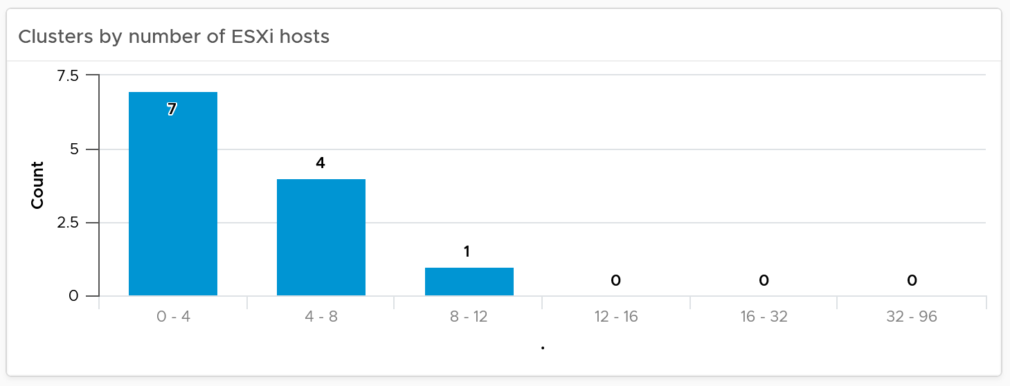
The next row is a set of distribution chart. Due to limited space, I’ve provided only 2 charts, focusing on the cluster object. Since this inventory and not configuration, we should focus on the count of members.
The next row is a set of pie charts. Let me know if you have improvements on what the top 3 things you want to be shown as pie charts.
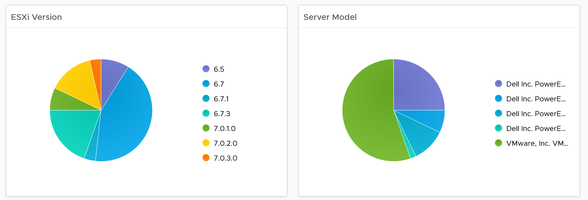
If you have larger screen real estate, add more pie chart for better insight into the type of items you have in your inventory.
Detail Section
The last row is always the lowest level of details, hence a table is chosen. For the compute inventory, we need to cover cluster, ESXi host and resource pools. That’s why you notice 3 tables, one for cluster, one for ESXi and one for resource pools.
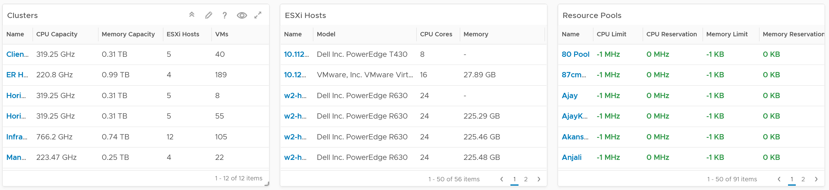
I added a navigation from the cluster table into the cluster performance and cluster capacity dashboard.
Customization tip
- A heat map showing clusters in the report scope. Size by the number of ESXi hosts, color by the number of VM. Alternatively, you fix the size and use the VM:Host ratio as the color.
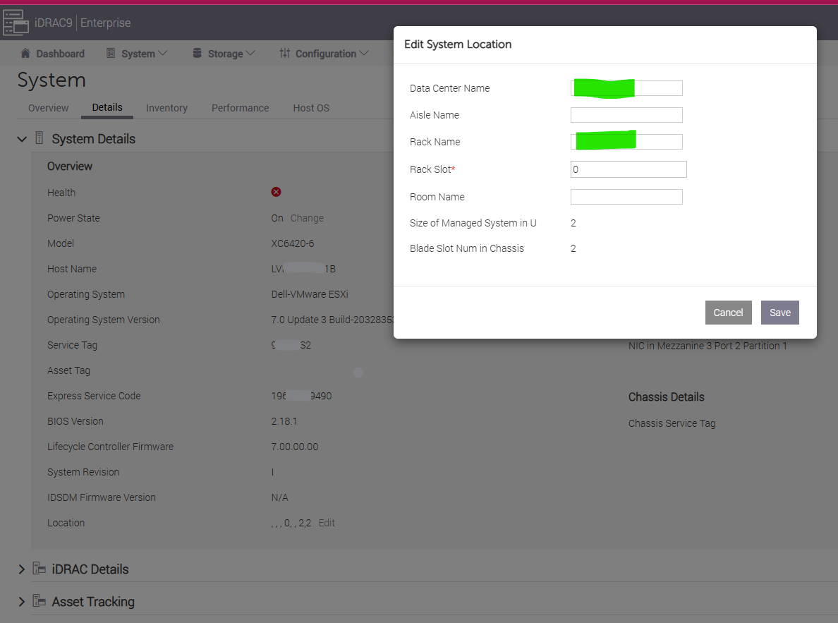
Hardware Integration
In large environment with hundreds of ESXi, it is useful to be able to locate the physical location. To do that, integrate the hardware management with VCF Operations.
Ensure the rack name is unique, as you will use it to create the rack object in VCF Operations.