Availability
Part 2 Chapter 7
The availability dashboards aims to implement the capacity concept covered in Availability Management chapter. They are rather limited, hence if you have something let’s collaborate!
VM Availability
Use the VM Availability dashboard to calculate the availability of the Guest OS. The availability of the Guest OS is calculated because the Guest OS might not be running even when the VM is powered on. There are two layers of Availability, that is, the Consumer layer and the Provider layer. This dashboard covers the Consumer layer. You can view VMs in the selected data center, uptime trend for a selected cluster, and so on.
Questions asked:
-
Overall availability over time.
-
What are causes of the availability? How many VMs affected by HA? How many were reset?
-
Tools availability. Which VMs have Tools not running? While technically “tools not installed” is a configuration issue, it impacts availability.
Design Consideration
The dashboard is designed to help check the availability (uptime in percentage) of VMs, as availability is typically a part of services provided by the IaaS provider.
This dashboard does not check the application up time. It is possible that the application (e.g. a database, web server) is down while the underlying Windows or Linus is up. Generally, the service provided by IaaS team is only until Windows or Linux. To check application level, use network ping or application specific agent (e.g. Telegraf).
How to Use
Start in Data centers widget by selecting one of the data centers listed.
-
In small environment, or if you want to see overall, you click the vSphere World object.
-
The above action will update other widgets automatically.
-
Think of creating a filter for this table that reflect your class of service. Group by the class of services such as Gold, silver, and bronze and default the selection to Gold. In this way, the monitoring is not cluttered with less critical workloads, and you can focus on the important VMs. One way to achieve this is by creating a VCF Operations custom group for each class of service
About the VMs by Uptime in the last 30 days bar chart
- It displays the average uptime of VMs grouped by their availability. The bucket distribution is designed to cater for a wide array of environment. If You are monitoring only production VMs, where uptime is expected to be near 100% all the time, edit the bucket to meet your operational need.
About the VMs in the Selected Data center table
-
It lists all VMs currently deployed to the data center. Average Uptime is displayed for the last 1 month of data. Expect this number to be 100% or near there for production VM.
-
Note that the Services column will be blank unless Service Discovery is enabled and services/processes were discovered on a specific VM.
-
The column VMs includes all VMs including powered off VMs.
Select a VM from the above table.
-
The remaining widgets will automatically show the detail of the selected VM.
-
Selected VM Uptime Trend displays the selected VM’s Guest Tool Uptime (%) across the last 30 days.
Expand the 2 collapsed widgets
-
If Guest OS services or processes are discovered inside a VM, their availability is analyzed. Service ‘state’ over time is displayed in Guest OS: Services.
-
The dashboard displays the process or services running inside the Guest OS. This requires the Service Discovery Management Pack.
-
The ESXi Host where the VM has run widget can show historical migration of the VM. This can be useful in determining the cause of a VM downtime.
Points to Note
-
The metric is only tracking the availability of VMware Tools, not the entire Guest OS. If Tools is not up, it assumes the Guest OS is down. To help you check that this is not a false negative, add a few line charts that shows sign of life. A good counter is IO metrics such as Disk IOPS, Disk Throughput and Network Transmit Throughput, because IO requires CPU processing. CPU Usage is not a reliable counter as work by VMkernel on the VM is charged to the CPU metrics.
-
VCF Operations 8.2 sports a new ping adapter. This means you can enhance the accuracy of the uptime measurement by creating a super metric that adds the ping information or checking the process (needs an agent, such as Telegraf).
-
Add a property widget that lists the selected VM properties to give you more context about the VM. In large environment, it is possible that the VM name alone may not be providing enough context.
vSphere Availability
There are two layers of Availability, that is, the Consumer layer and the Provider layer. The vSphere Availability dashboard covers the Provider layer. This dashboard includes a cluster and not an ESXi host because the cluster is operationally a single compute provider. This dashboard considers the N+1 design, where the cluster can withstand one host failure. Logically, a cluster with fewer hosts has a higher risk.
The dashboard is designed to help you analyze and report the uptime, as availability is typically part of official business SLA. It’s also often required in the monthly operational summary report.
The dashboard is not designed for live monitoring of the uptime. An NOC style of dashboard is better suited for that use case. Tools such as Aria Log Insight should also be leveraged as fault is typically preceded with soft errors.
How to Use
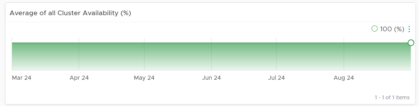
The first information shown is the average availability of all vSphere clusters in the environment. It’s a simple average, regardless of the clusters function.
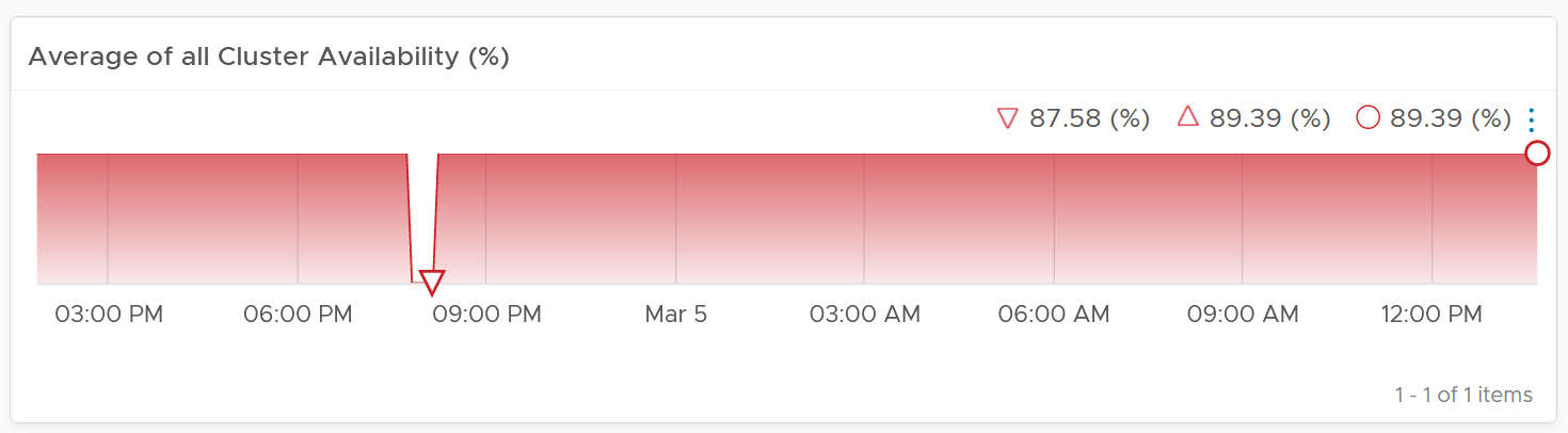
Ideally what you want is something like this:
The next health chart shows the count of ESXi hosts that are not available.
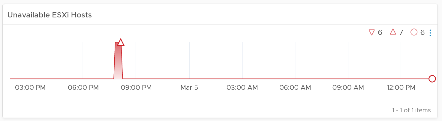
Adjust the threshold accordingly. By default, it’s using 1 for Yellow, 2 for Orange and 4 for Red.
Next is a table showing all vSphere Clusters.
In a very large environment, creating a filter for the list of clusters can make it more manageable. One is to group the clusters by their class of services. Group your clusters into Gold, silver, and bronze and default the selection to Gold. In this way, you can see your Gold clusters more easily.
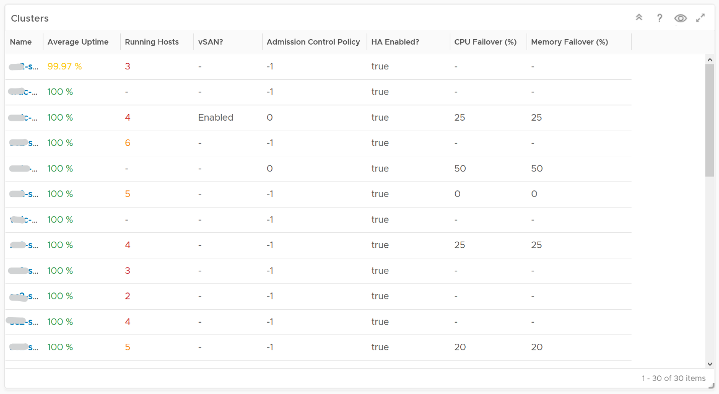
It is sorted by the lowest uptime, so your attention is drawn to the cluster with the lowest uptime in the last 1 month. The column is based on the average of the last 1 month as availability SLA is should be calculated per month (but reported much more frequently)
The metric used is Summary \ Cluster Availability (%), which assumes N+1 design. That means if there is 1 node failure, the metric is still showing 100%.
The column Running Hosts are color coded as logically a smaller cluster has higher risk. A single host failure results in relatively higher capacity degradation.
The column vSAN? Is added as hyper-converged means you need to consider both the compute part and the storage part.
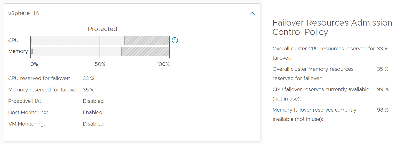
The Admission Control Policy is based on the property Cluster Configuration \ DAS Configuration \ Active. The mapping between code to name is
-
-1 = Disabled
-
0 = Cluster Resource percentage
-
1 = Slot Policy (Powered-on VMs)
-
2 = Dedicated Failover Hosts
The cluster failover percentage columns map to the following values in vCenter client UI.
Select a cluster from the above
-
The cluster uptime will be automatically plotted. It’s using 25%, 50%, and 75% as the threshold for red, orange and yellow respectively. The reason for low threshold is the 5 minute window. A complete 5 minute downtime is only 0.0116% when measured against a 30-day SLA. If the uptime was 100%, it will only go down to 99.9884%
-
The ESXi in the selected cluster table will be automatically filled up. For more context, you can add a property widget that lists the selected ESXi Host properties.
-
The 'Connected to vCenter' and 'Maintenance State' columns are not the average values, as both are string. However, they display the last state in the selected period. This allows you to go back to a specific point in time and view availability at that point.
About the “Datastore not available” list
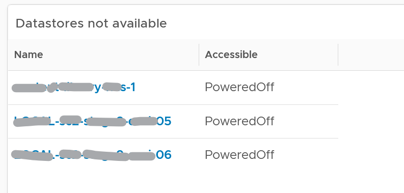
- It filters to only those datastores with status powered off. This covers both local and shared datastore. To add context, consider adding extra column such as the data center where it resides, and the datastore type (e.g. NFS, VMFS)
About the Port Group availability list
-
This lists port groups which at present has uptime of less than 100%.
-
To add context, consider adding extra column such as the data center where it resides, used number of ports and maximum number of ports
Points to Note
Consider adding vCenter Server availability and NSX components availability. This requires the VMware SDDC Health monitoring solution.