Role-based Contents
Part 2 Chapter 8
It is imperative to get other departments to use VCF Operations. Different persona have their own agenda and goals, so take time to sit down with the individuals and understand the why, not just the what.
IT Leadership Team
The most important persona or role is your boss. In large organisation, there can be multiple layers between you and your CIO. Each layer has their own needs. Understand the need of each individual. The nuance matters. Different managers are likely having slightly different requirements. Take time to understand the real needs behind the ask. Learn what questions need to be answered, what answers are expected, and what actions are taken based on the answer.
You also need to think of what you want from them, as they hold decision making authority. Show them problems that you can get help, which is budget and resource. Do this by showing data. By giving visibility into live environment to senior management, you prove that you do need additional hardware. If there is wastage to be reclaim, you also prove on where and how large the wastage is.
Think of what approval you need to do so you can do your work. How do you present the supporting information without burdening them with too many details?
General Requirements
| Summary | Generally, they want summary and the big picture, not details. Or at the very least, the big picture is presented first, and then drill down is provided. |
|---|---|
| As part of showing the big picture, trend should be included. Show the situation in the last few months, ideally coupled with projection. The data should be averaged out, so that a 5-minute spike should not show up. | |
| Exception. Things that they need their attention. Complete means nothing else can be taken out. Which information, object, metric can you take out while preserving the point? | |
| Offline | They prefer information to be emailed so they can access from anywhere easily. They may not want to login to VCF Operations. |
| They appreciate offline access as they tend to be mobile. Some may even ask for the information to fit on a mobile phone screen, or just a single screenshot. For off-line access, verify the screen size. A small screen of 7” can only display a small subset than say a 14” display. | |
| KISS | KISS. Keep it simple solution. Keep the interaction, clicking, zooming, sorting, etc. minimal. Use larger fonts, round numbers (law of significant figure). |
| UI that is easy to understand. So keep each dashboard to a specific question. Make sure the dashboard is easy to use. So keep the interaction, clicking, zooming, sorting, etc. minimal. | |
Can the dashboard be understood within 5 seconds? If yes, you buy yourself a few more minutes. Your IT Management has understood what the dashboard does, and is willing to spend more time appreciating its full capabilities. | |
| No technical info. Ideally, present in business terms, not IT jargons. Terminology such as datastore, distributed switch may need to be replaced with something suitable in your organization. | |
| Take note of the “size” of your dashboard. A dashboard that has many widgets and scrolls deep is harder to understand. |
If they ask for a self-service portal, then make it easy to access. They may not want to login to VCF Operations. If they do, they may forget their password, so the portal should not require a password.
Sample Requirements Analysis
The following table provides an example analyzis of 2 different IT leadership layers. Notice the 2 groups have a different set of requirements, resulting in 2 different approaches.
| Middle IT Management | Senior IT Leadership Team | |
|---|---|---|
| Users | John and Jill | Sam, Andy, and Julia |
| They will read on their laptop. They have access to VCF Operations but only login occasionally in a week. | They expect a 15-minute presentation (live environment), with a copy of the PDF on their inbox for future reference. | |
| Familiarity | High. They know the environment and context well | Low. They need explanation. |
| Focus | Keeping the lights on. | Last month review, especially compared against plan and SLA. Finalize next month plan. |
| Availability, Performance, Security. | Capacity and Cost. How to lower cost while increasing capacity. | |
| Authority | Medium-level changes. Budget up to ___. | Major IT decision that is strategic and long term. Represent IT to Business Leaders |
While you are clear on what they want from you, what do you want from them?
Having analyzed the requirements from each person, and from you to them, you develop the following approach:
| Middle IT Management | Senior IT Leadership Team | |
|---|---|---|
| On Mobile | Daily. First thing in the morning. Forward looking, not about the past. A simple summary. Fits into 1 screen. | Weekly. On Monday. 1 week ahead outlook. A simple summary. Fits into 1 screen. |
| On Desktop | Weekly. 2 pages. They will read all sections. | Monthly. 4 pages. They do not read all sections, as it will be presented to them. Done as part of overall operations review, which includes non VCF |
| Others | On demand login to dashboard. They can login and interact to get richer information. | You place a screen on the wall near their office. No interaction. It’s for at a glance look. |
Business Applications
This is likely the most important, both from their viewpoint and your viewpoint. It proves that your infrastructure is playing its part well.
The report should provide a summary for all the mission critical business applications. As they are of the same level of importance, the list should be grouped by the business units.
| Information | Description |
|---|---|
| Name | The business application name as per what the business or senior IT leaders call it. As business applications span multiple tiers, VM, and K8 Pod, you need to build the structure first in VCF Operations |
| Availability | Average uptime during the reporting period. This shows Actual Availability (%), not Operational Availability (%) as the end customers (which are typically external or public) do not care about your scheduled downtime. Majority of websites has 24 x 7 x 365 days availability expectation, even if your customers are not global. |
| Performance | It shows their average performance over the reporting period. As average can mask out poor performance at specific times, they may ask for worst number also. If there are many business applications, they may ask for the average of all of them. They may ask for the information to be presented over time, like stock market performance. |
| Compliance | This is configuration compliant to both security and master template. |
The above is one example. Another common example is infrastructure-centric report. As usual, understand the reason behind the ask. For example, they may not be familiar with the environment and inventory, and hence they ask for what you think is basic.
Operations Overview
This report summarizes what happened to VCF operations management.
-
Was it a busy week or month? Were the operations hectic and environment volatile with a lot of debates?
-
Was the environment well managed? Was the availability, performance, and compliance meeting the SLA?
| Information | Description |
|---|---|
| Inventory | Summary of the key inventory items. This can be absolute or relative. |
| Changes in the inventory. Was there a lot of items added or removed? | |
| Dynamics of the inventory. Was there a lot of settings changed? | |
| Configuration | Summary or important configuration that either they care, or you want to bring up to their attention |
| Capacity | Is there enough capacity? If not, when should action be taken? What was the change in capacity? |
| Performance | Ideally this is compared with SLA. |
Sample Dashboards
VCF Operations provide two example dashboards to get you started. They are designed for you to present live information to your senior management. They are not designed as self-service.
This dashboard is used by the Ops team to provide the overall picture to the IT Management team. This dashboard works together with the set of inventory dashboards. The inventory provides details on available resources and what is running on these resources.
It also works with the capacity summary dashboard, which provides details on the resources remaining capacity and time remaining to act.
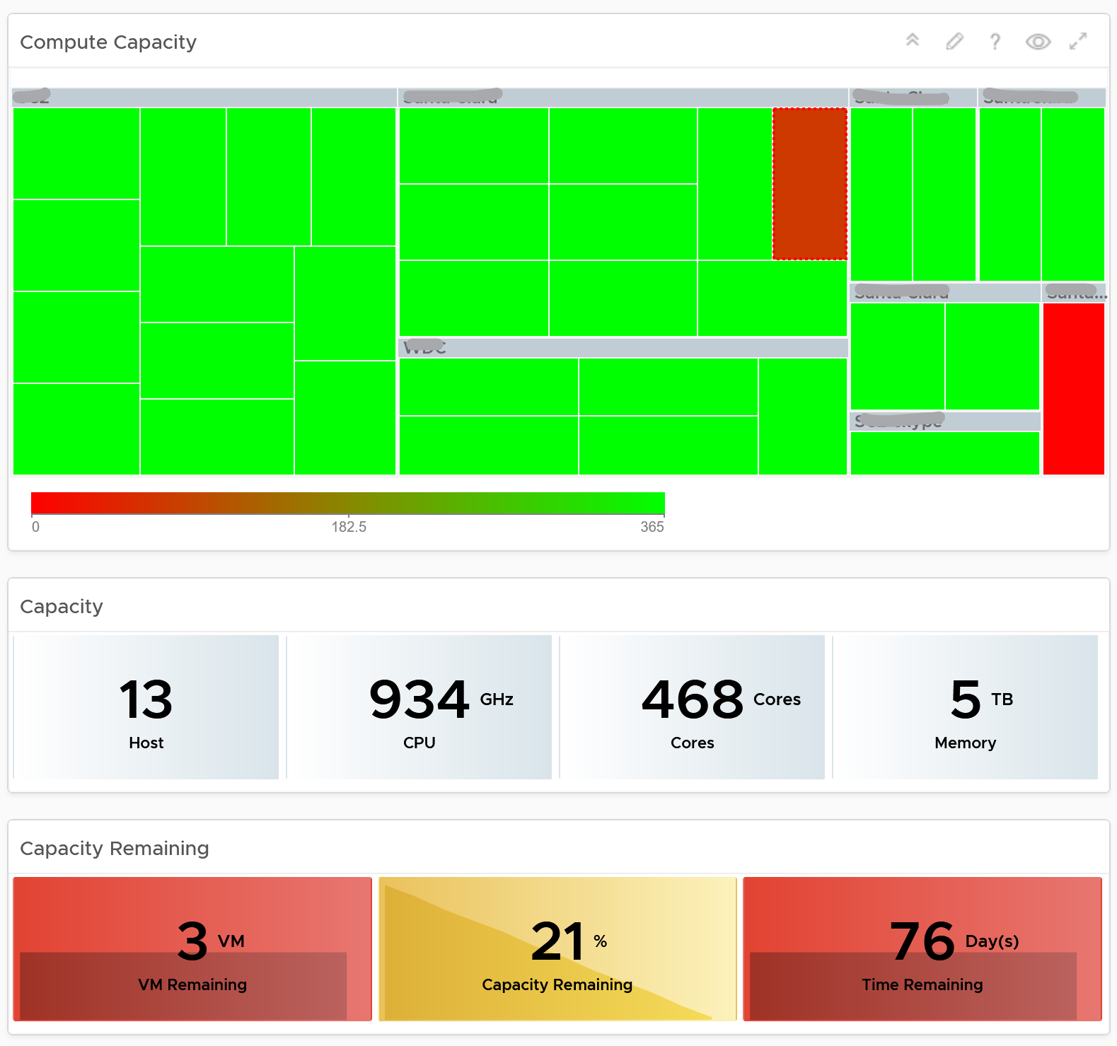
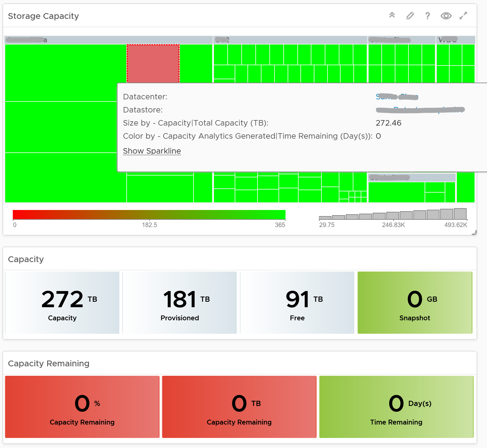
Capacity Summary
This dashboard is used by the Ops team to explain capacity to the IT Management team. It works together with the Inventory Summary dashboard. The inventory provides details on available resources and what is running on these resources. The capacity provides details on the remaining capacity and time.
See the Executive Summary Dashboards page for common design consideration among all the dashboards for IT senior management.
How to Use
The dashboard has 2 sections.
-
The top section provides summary at the vSphere World level.
-
The bottom section enables drill down into individual compute or storage capacity
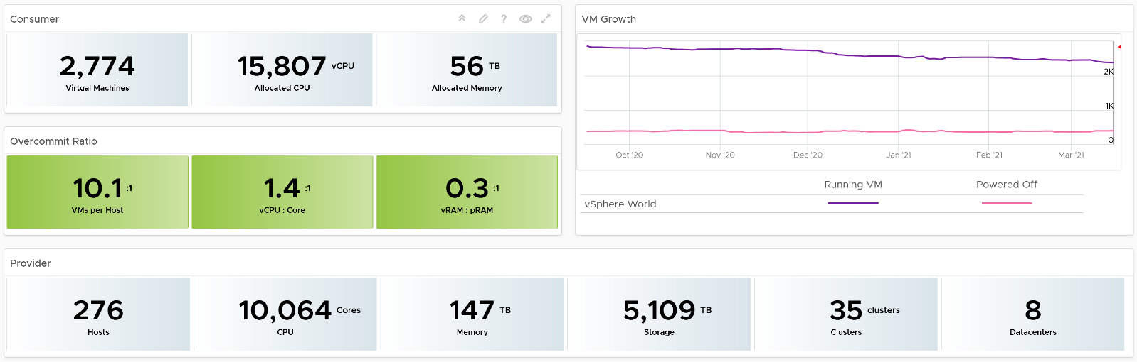
The weekly average of VM growth is displayed to provide holistic visibility of overall growth across all Data centers for both running and powered off workloads. If the increase in VM count is not accompanied by corresponding increase in utilization, these newly provisioned VMs are likely not yet used.
Overcommit Ratio highlights the efficiency gained by vSphere virtualization running multiple workloads on shared infrastructure. It is important to note that overcommitment needs to be further reviewed in conjunction with elevated resource contention (refer to contention dashboards) to understand the performance impact when running VMs competing for resources. In general, Overcommit is required to be financially more economical than the public cloud. As a reference, AWS typically overcommits CPU 2:1 by counting the hyper-threading and does not overcommit memory. Note: VCF Operations uses Physical CPU Cores not Logical Cores (Hyper-threading) for all CPU-based capacity calculations
The bottom part of the dashboard is split into 2 columns:
-
compute
-
storage.
Network is not added due to its nature. It’s an interconnect, not nodes, so capacity is much harder to compute.
The dashboard uses the term compute (and not vSphere Cluster) and storage (and not vSphere datastore) to keep the visual simple.
The two columns have identical design. The heat map displays capacity by size and colored by time remaining. However, for compute the size of each box in the heat map is fixed as there is no single metric to represent the size. A cluster size can be measured in 4 different ways (No of ESXi Hosts, Total CPU GHz, Total CPU cores, and Total Memory).
Here is what the compute portion looks like. The heat map is interactive. By selecting one of the cluster, you can further drill-down to clearly understand remaining capacity and time (in days).
Here is what the storage portion looks like. They are designed to be similar
Points to Note
-
Capacity Remaining is not shown at the world level as it could be misleading, especially in global or large infrastructure. Clusters also tend to serve different purpose, and they are not interchangeable.
-
If you are using both on-prem and external cloud, for example, VMware on AWS, consider splitting the dashboard into 2 columns. You would need extra screen real estate though.
Level 1 Team
There are 2 dashboards for VM and 2 dashboards for infrastructure, covering the most common scenarios.
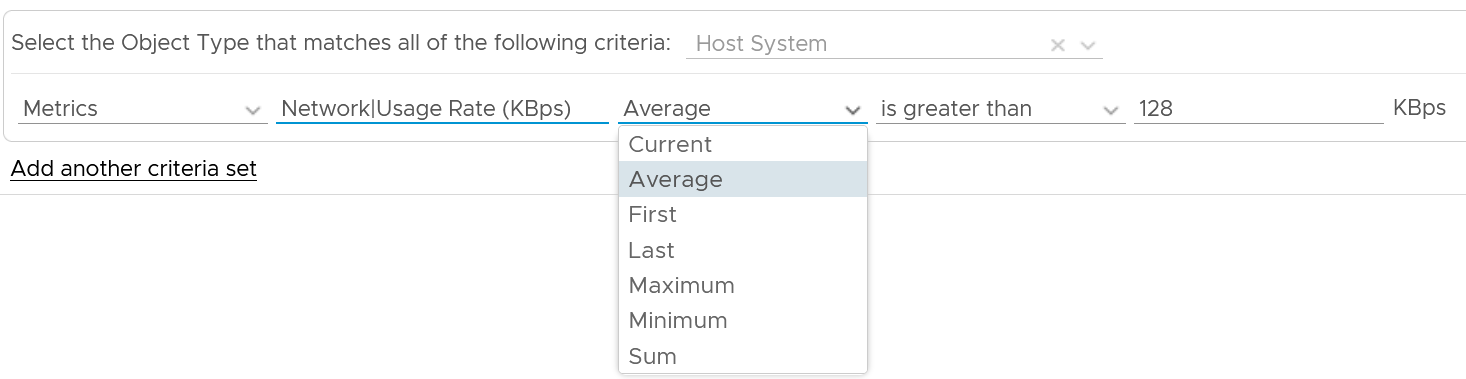
What information do you show? This is a tricky answer. For example, when something is down, it should be shown. But what if it’s part of planned downtime? A planned downtime can last hours, making the NOC screen displaying red for too long. This means you need to exclude them. Create a group called a planned down time, and move the object as part of the process.
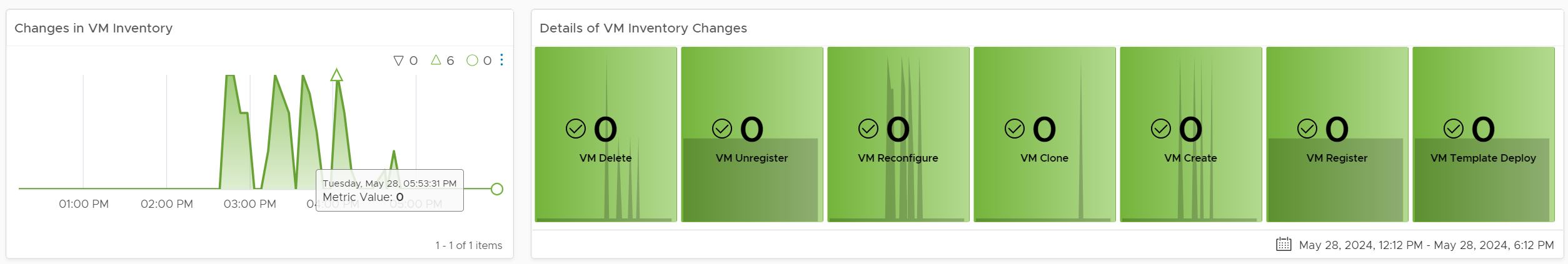
Live! vSphere VM Changes
The dashboard starts with a set of summary numbers at the top.
Make sure the numbers match your expectation. Set a threshold for each so it’s easier to see if their values change (drop or increase) to a level that is not within your comfort level.
The changes above is supported with details. There are 3 rows of detail information covering the 20 types of changes. This covers all the possible changes that could happen to a VM, hence providing a real time visibility into the movement or volatility.
Each of the 20 changes are unique. Ensure they match the approved change requests and expected changes of that day.
| Inventory Changes | VMs are added or remove, hence impacting count of inventory. Are VM are added or removed as per your expectation? If yes, are they done the right way (cloning vs free style creation vs template based deployment)? Are the changes matching our change window policy? Why do we have high count of VMs being unregistered or deleted? |
|---|---|
| Location Changes | VMs are moved to another host or datastore. This can be hot or cold migration. Hot migration is shown first as they likely impact performance as it changes both the compute and storage. A change of both parents at the same time is shown first as that’s a relatively more major change. Pay attention to the storage migration as they take the longest amount of time. If it takes longer than expected, something could be wrong. On the other hand, cold migration is typically an activity that should match change request as the VMs are shutdown. |
| State Changes | VMs power state change. Reset is the least desired, hence it’s shown first. It is used as last resort. Suspend and Power Off are least preferred, as these action should be done from within the Guest OS. Expect these numbers to be low. A high number of powered on VMs could lead to high demand. Typically, how many days passes before your New VMs becomes active? It can take days or weeks before the VMs usage grow to its “full size”. |
For each of the 3 types, the dashboard shows 2 widgets:
-
The first is a trend line. Make sure both the absolute amount and the pattern match your expectation.
-
The second is a scoreboard showing the present number of the each of change. The change is sorted from the least desired (most impactful to operations) to the least important.
Threshold Adjustment
The changes are color coded. Since your environment is likely different, adjust the threshold accordingly. Set a different threshold for each while keeping the variations minimal. Different numbers are needed because they are different events. Minimal variants are needed as they make it easier for the NOC room team.
Live! Heavy Hitter VMs
This dashboard helps you analyze the misuse of the shared infrastructure. This dashboard displays details of VMs misusing the shared infrastructure and if that has caused performance problems to the other VMs. The cause for excessive load might be due to security attacks, for example, denial of service, process runaway, or mass activation of agents.
Design Consideration
In shared environment, it is possible to have victim-villain problem. In the heat map, the villain VM is the one with the largest box size, while the victim is the one with red box. If a handful of VMs are dominating the shared infrastructure, their collective size will be highly visible on the dashboard.
There are 4 areas where a monster VM can impact its neighbours.
-
CPU.
-
Disk IOPS. Any VM with PVSCSI can generate very high IOPS. Since this hits the underlying physical storage, the view is grouped by Data Center, not Datastore or Cluster.
-
Disk Throughput. Applications with large block size (e.g. 4 MB) can consume bandwidth without generating high IOPS
-
Network. Network packet/second not shown as dashboard can’t support 5 columns. If you rearrange, it will look odd. It’s added in the trend chart
Memory is not needed as it’s rare for Guest OS to actively read/write from DIMM. It’s mostly cache. Think of it like disk space (passive).
Disk space is not shown for the same reason as memory.
How to Use
The dashboard starts with a set of summary numbers at the top.
Make sure the numbers match your expectation. Set a threshold for each so it’s easier to see if their values increase to a level that is not within your comfort level.
There are 4 heat maps, showing the 4 different loads that can be excessive. The heat map displays the relative value and not the absolute value. A VM does not generate a high load in the absolute term just because it has large configuration.
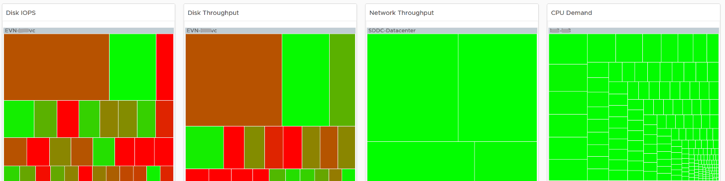
Each heat map has their own color threshold, reflecting the nature of the contention metrics used in each of them.
Remediation Action you should take: Check why the VMs are generating excessive load.
Interactive Section
For NOC Operator, who have access to mouse and keyboard on their desk, they can drill down by selecting one of the VM on the heat map. All the information below is automatically shown, giving user more detail about the VM.
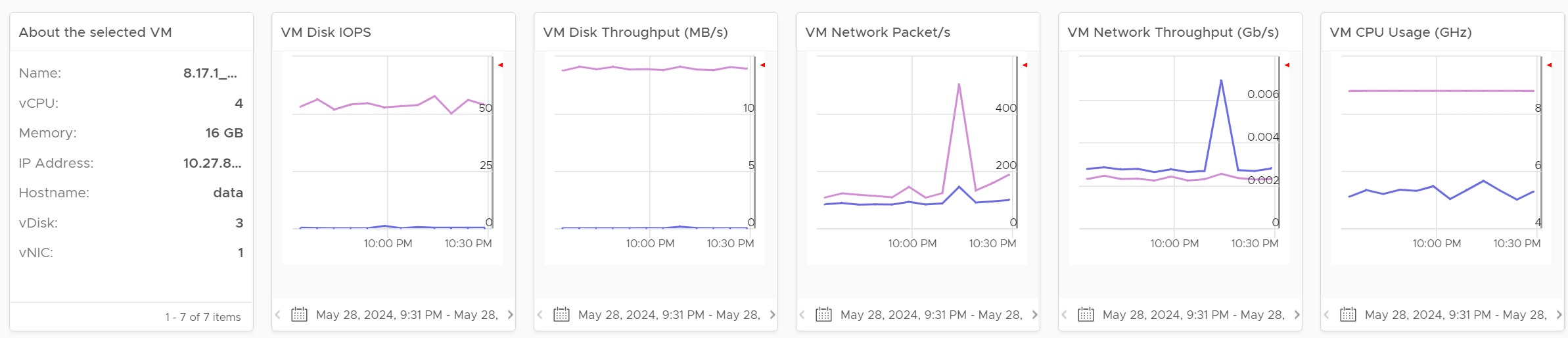
5 types of “hit” on the shared infrastructure are shown. For each, breakdown between read and write, transmit and receive, etc. are provided
Points to Note
Memory is not shown as it’s a form of storage. The memory metrics are space utilization, not speed. Think of disk space instead of IOPS. It can cause capacity problem on the shared ESXi host, but not performance problem to other VMs.
In a large environment, it might be difficult to view a small victim VM. Consider having multiple dashboards and rotate among them.
Cluster Dashboards
There are 2 dashboards working together:
| Live! Cluster Performance | This the primary dashboard for performance. It provides live information on whether the requests of the VMs are met by their underlying ESXi host, which is grouped by the compute clusters. |
|---|---|
| Live! Cluster Utilization | This secondary dashboard complements it by showing if the performance problem (read: contention) was caused by high utilization. |
The primary dashboard answers the question “Is our IaaS performing?”, while the secondary dashboard answers the question “Is our IaaS working hard?”.
The focus of performance is on population, not a single VM. This is not a single VM troubleshooting dashboard. We are looking at infrastructure problem, not a single VM problem. As the infrastructure counter is mathematically an aggregation of VM metrics, we need to pick the right roll up strategy. As the goal is to provide early warning, we’re not using average as the roll up technique, as it is too late as early warning. We use percentage of population exceeding a threshold. The threshold is set to be stringent so we can get early warning.
The 2 dashboards show a set of 4 heat maps side by side. They complement each other and should be used together. The location of each cluster and ESXi hosts within those clusters is identical in all heat maps. This fixed positioning enables viewers to compare if the problem is caused by memory contention, CPU ready or CPU Co-stop.
The size of each cluster and ESXi hosts has to be constant. Variable sizing creates a distraction, as the focus here is not capacity. Variable sizing can potentially result in small boxes, making it hard to read from a far.
Live! Cluster Performance
The dashboard starts with color coded trend chart.
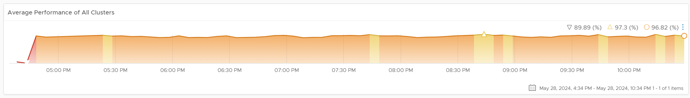
The number is the average of all clusters. If you have 10K VM, this is the average of 40K metrics as each VM has 4 (CPU, memory, disk, network). As a result, it takes a serious degradation to bring this number down. This number should match your business cycle if your environment is mostly virtualized.
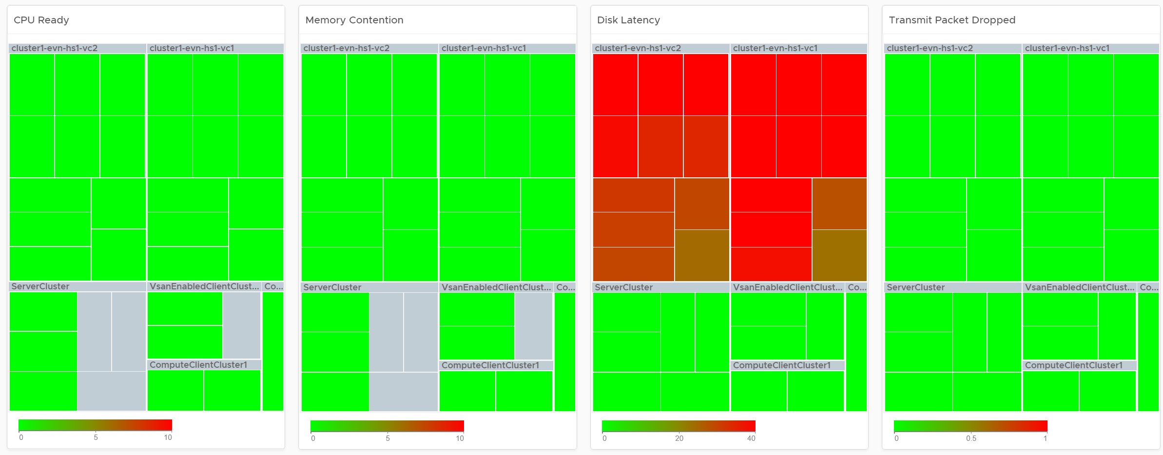
Look at the 4 heat maps and see if there is any color other than green. Since you have HA in the cluster, where at least 1 host can go down without impacting performance, that means no hosts should be running hot when there is no HA.
-
While each box is an ESXi, the counter is coming from all the VM in the host. It’s not taking ESXi level counter at all. The metrics used are % VMs facing CPU Ready, % VMs facing CPU Co-stop, % VMs facing RAM Contention.
-
The color is by percentage of VMs not being served well. We are not using Max among the VM as it's too extreme, placing too much focus on a single VM. On the other hand, we're not doing ESXi wide average, as that will be too late.
-
Green indicates that almost 100% of the VMs are getting the CPU and memory they are asking. The threshold is set such that if 10% of the VM population is not getting the resources they are asking, the heat map will turn full red.
-
Red indicates an early warning. Stringent thresholds are used to enable proactive attention & remediation operations. Because high standard is applied, it is possible that the heat map is showing red, but there is no complaint from VM owner yet.
-
Light grey likely means there is no VM running on the host, hence the metric is not computing.
Check if there is imbalance.
-
There are 2 types of imbalances: cluster imbalance and resource type imbalance
-
The ESXi hosts are grouped together by the cluster, so imbalance within a cluster can be seen easily. Cluster imbalance is a real possibility that is best monitored and not just assumed.
-
If the 4 heat maps are quite different, there is resource imbalance. For example, if the memory contention is mostly red, but the 2 CPU heat maps are green, that means you have imbalance between memory and CPU.
-
If a single ESXi host is displaying a different color across 3 heat maps, it indicates imbalance in the host.
Interactive Section
For NOC Operator, drill down by selecting one of the ESXi on the heat map.
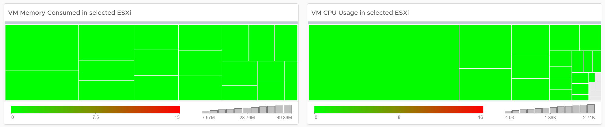
Memory Consumed is used, and not Guest OS metrics, as it better represents the footprint on the VM.
CPU Usage is shown, and not CPU Net Run, as it better represents the footprint on the VM.
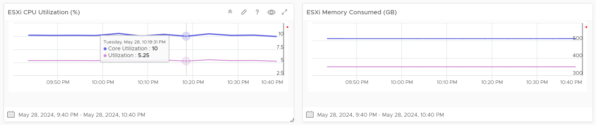
The “Trends of selected ESXi Host” will automatically show the performance metrics
It’s showing from all 3 heat maps, so you can correlate. To hide any metric, simply click on its name on the legend.
Live! Cluster Utilization
Use it to view the clusters and ESXi hosts within those clusters that are working excessively and are close to their physical limit. This dashboard displays ESXi hosts which have CPU or Memory saturation, and which can lead to performance issues for the VMs running on the host.
2 metrics for Memory are used as Consumed metric alone is not enough. It could be mostly cache or historical data. Balloon also persist (past data), but at least it gives an insight of ESXi under memory pressure.
The dashboard help answer the following questions:
-
Is the IaaS running very high utilization right now? If yes, which cluster? Within the cluster, which ESXi?
-
Do we size ESXi correctly, meaning balanced usage of CPU and Memory?
-
Are the clusters balanced? Are load distributed equally among member ESXi hosts?
-
Is all ESXi contributing? Light grey box indicates that the host is part of the cluster but there is no utilization. It is likely the host is in maintenance mode or is powered off.
How to Use
Unlike the heat maps in the Live! Cluster Performance dashboard, the 4 heat maps in this dashboard has a different scale, reflecting the different nature of the metrics.
Logically, memory is a form of storage. It acts as a cache to disk as it’s much faster. Hence a high utilization is better, as that means more data is being cached. The ideal situation is when ESXi Consumed metric is red but ESXi Ballooned metric is green. When Ballooned is red and Consumed is grey, it means it was likely high in the past but not anymore. The reason the ballooned stays red because the ballooned pages were never requested back.
Ballooned memory counter was chosen over the swapped or compressed memory metrics as it’s a better leading indicator. Because all 3 can co-exist at the same time, all 3 are shown in the line chart. Ballooned is shown in absolute amount and not percentage, as the higher the size the higher the chance it might impact a VM. If you feel using percentage is easier for your operations, create a super metric to translates the value.
Interactive Section
Quiz Time: why is the heat map showing grey and light grey?
The heat map is showing dark grey and light grey to convey wastage and data error, respectively. While the use case is performance, there is a need to educate that oversized VM cause performance issue.
Points to Note
If you have the screen real estate:
-
Add a Heat Map for Disk Latency. Use the counter “Percentage of Consumers facing Disk Latency (%)”. It is part of datastore object, not cluster, as a VM in a cluster can have disks across multiple datastores. Organize this storage performance by data center and not by cluster.
-
Add trend chart of Disk Throughput and Network Packet/second.
-
If your network is highly utilized, add a Heat Map to check the ESXi physical NIC Network Throughput.
Storage Team
Ask any Storage Team and Platform Team whether the collaboration between them can be improved by a mile, and you are likely to get a nod. One reason for this issue is there is lack of common visibility. You need to see the same thing if you want to collaborate. Storage Team do not get always get access vSphere. Even if they do, vCenter UI is not designed for Storage team. It is designed for VMware Admin.
VCF Operations and Log Insight can bridge that providing a set of read-only, purpose-built dashboards, that answer common questions such as:
-
When a VM Owner complains, can we agree if it’s a storage issue within 1 minute? This will help reducing the ping pong game between VM Owner, vSphere Admin, and Storage Admin.
-
Is the Storage serving all the VMs well? If not, who are affected, when and how bad? Read or Write? The answer has to be tier based, as Tier 1 VM expects lower latency than Tier 3.
-
What’s the total demand hitting the array? Are they growing fast and becoming a risk? Who are the heavy hitters among the VMs?
-
When & where are we running out of capacity? How much disk space can be reclaimed? From which VMs?
-
What have we got? Are they consistently configured?
The questions above cover the main areas of SDDC Operations, such as performance, capacity, configuration and availability. They enable joint troubleshooting, capacity planning, performance monitoring. For better collaboration, add physical array monitoring into VCF Operations and Log Insight, so you can analyze physical arrays and fabrics, and then correlate back with vSphere.
The dashboards should provide overall visibility to Storage team. They give insight into the SDDC by showing relevant objects by:
-
quickly showing the summary of key information.
-
showing VM, datastore, datastore clusters, compute cluster, and data center. It shows their relationship, which you can interact and drill down.
-
showing all the VMs, where they are located, how much space they are allocated, and how they are using it.
-
Showing physical arrays inventory and how they map into vSphere.
Storage Heavy Hitters
Interpreting IOPs and throughput metrics depends on your underlying physical storage capability. For visibility into this hardware layer, add physical storage arrays and physical network switches metrics to the dashboard.
See the Network Top Talkers dashboard as they basically have the same design. The main difference is we show IOPS and throughput. They are related, so use both to gain insight, they should display a similar pattern. If not, that indicates varying block sizes. For example, a throughput spike without an accompanying IOPs spike indicates large block sizes.
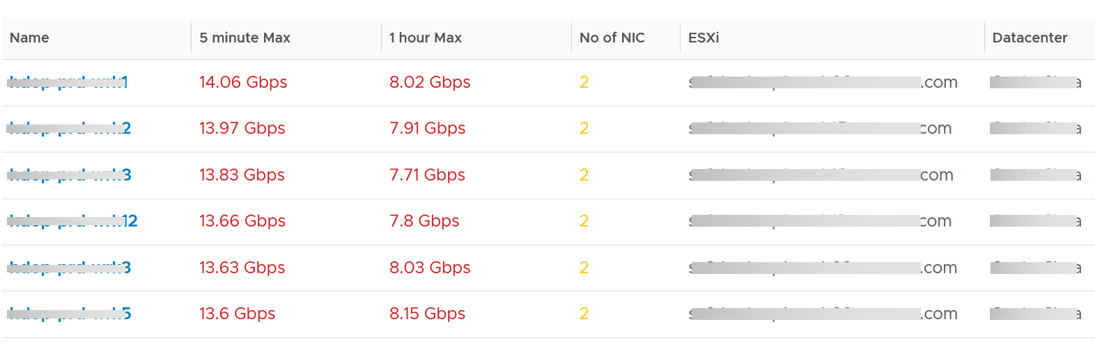
About the “Which VMs hit storage the hardest” table
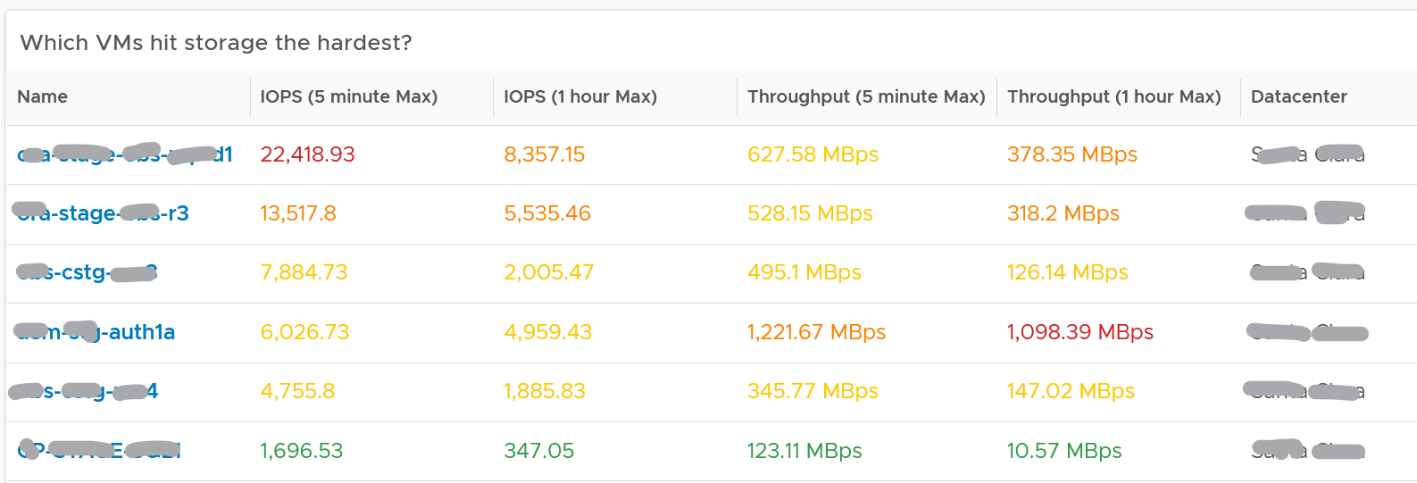
The table shows the most demanding VM. You can identify the villain VM and compare their demands with the capabilities of the underlying IaaS. Knowing the infrastructure capability is important, because different class of SSD have different IOPS and throughput capabilities.
After identifying the villain VM, talk to the VM owners if the numbers are excessive during peak hours and identify the reasons behind the excessive usage. You must ensure that they do not create a hot spot, for example, vSAN cluster with >100 disk can handle numerous IOPS but if the VM objects are only on a few disks, those disks can become a hot spot.
Network Team
Similar to the problem face between Storage Team and Platform Team, VMware Admin needs to reach out to Network Team. A set of purpose-built dashboards will enable both teams to look at issue from the same point of view.
The network covers both the physical and virtual environment
The dashboards must answer the following basic questions for Network Team:
-
What have I got?
-
This
-
What is the virtual network configuration? What are the networks, and how big are they?
-
We have NSX, Distributed Virtual Switches, Distributed Port Group, Data center, Cluster, ESXi, etc. How are they related? Distributed Switch does not span beyond vSphere Data Center. So data center is a logical choice to start analysing the relationship.
-
Who are the consumers of my network? Where are they located?
-
-
Are they healthy?
-
Do we have any errors in our networks? Which port groups see packets dropped? If there is problem, which VMs or ESXi, are affected?
-
Do we have too many special packets? Broadcast, multicast and unknown packets. Who generates them and when?
-
The two primary metrics are bandwidth and latency. Bruce Davie explains both in this book[^11], specifically this page, that the two metrics work together. The reason is some applications are latency sensitive, while others are bandwidth hungry.
-
-
Are they optimized?
- Just because something is healthy does not mean they are optimized. Look for opportunity to right size.
Once Network Admin know what they are facing, they are in better position to analyze:
-
Performance
- When VM Owner thinks Network is the culprit, can both Network Team and Platform verify that quickly?
-
Configuration
-
Is the configuration consistent across objects of the same kind? Do they follow best practice?
-
What are the virtual networks, and how do they map into the physical top-of-rack switches?
-
-
Capacity
-
Is any VM or ESXi near its peak in network? Which VXLAN is the busiest? Does it match their expectation?
-
Who are the top consumers for each physical data center? What’s their workload pattern?
-
How is the workload distributed in this shared environment?
-
Which networks are not being used? Why? Could we decommission them as they could become security risk?
-
Network Top Talkers
Use the Network Top Talkers dashboard to monitor network demand in your IaaS. In a shared environment, a few VMs generating excessive activity can impact the entire data center. While a single VM might not cause a serious problem, a few of them can. Understanding high demand helps you monitor IaaS and allows you to plan capacity.
Network throughput, disk throughput, and disk IOPS can spike as their physical limit is generally very high per VM. This means that IaaS has enough capacity for all workloads and performs well until VMs start consuming abnormally high amounts of network and disk bandwidth.
The dashboard shows the big picture, while allowing you to see the individual VM. It is important to see the VM utilization in the larger context.
The dashboard begins by showing the current workload. This is the total network load (received and transmit) from all vSphere environments monitored by VCF Operations. The idea is to give you an indicator on how hard the overall load is.
Select a data center from the data centers list.
-
The columns show the number of clusters, ESXi Hosts and VM for each Data center. The VM count includes powered off VM. If you need to show only the running VM count, edit the widget.
-
If you want to see from all Data center, select the vSphere World row.
-
Upon selection, the Total Demand line chart and the Top Talkers table will be automatically filled up.
About the Total Demand line chart:
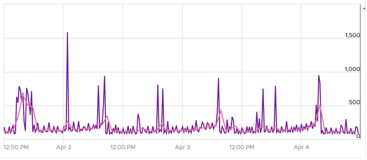
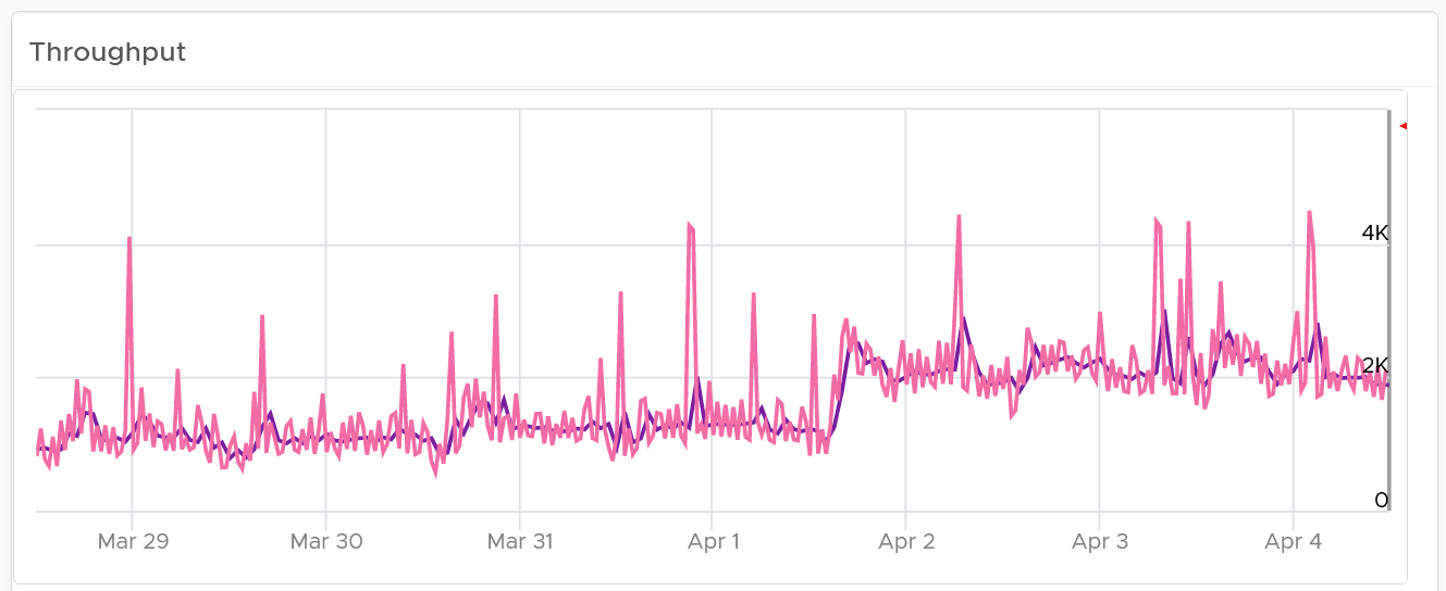
This shows the total throughput (received and transmit) in the selected data center.
It shows both the 5-minute peak and the hourly average into 1 line chart. You would expect that the 5-minute peak is much higher than the hourly average, indicating it is just a short burst. You can click on the metric name to hide the corresponding line chart.
About the Top Talkers table:
The table shows the most demanding VM. To help you focus on the VMs that hit the network hard, VMs that are not hitting the network hard are filtered out. The threshold used is 1 Megabyte/second sustained in the last collection cycle. You can change the filter to average of all time if that makes more sense to you.
You can identify the villain VM and compare their demands with the capabilities of the underlying IaaS. Knowing the infrastructure capability is important so you know the absolute limit.
After identifying the villain VM, talk to the VM owners if the numbers are excessive during peak hours and identify the reasons behind the excessive usage. You must ensure that they do not create a hot spot, for example, vSAN cluster with >100 disk can handle numerous IOPS but if the VM objects are only on a few disks, those disks can become a hot spot.
Migration Team
Workload migration from one infrastructure to another need to be tracked and monitored.
| Migration Sign Off | Purpose is to get a sign off from VM Owner. |
|----|----|
| Migration Tracking | Purpose is to show overall progress of a long migration project to senior IT leaders |
Migration Sign Off
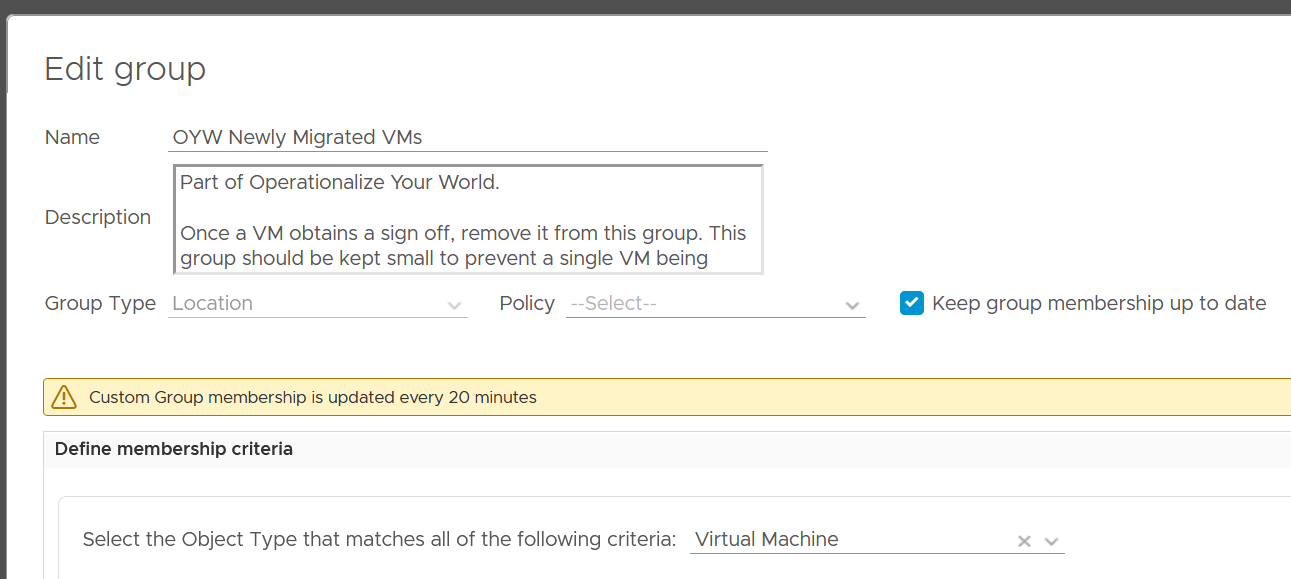
Since we do not know which VMs are being migrated, we need to use VCF Operations group. Since the dashboard needs to know the group ID, I need to create the group in advance. You have to import the group, and not create your own. If you do, then you need to modify the dashboard to use yours.
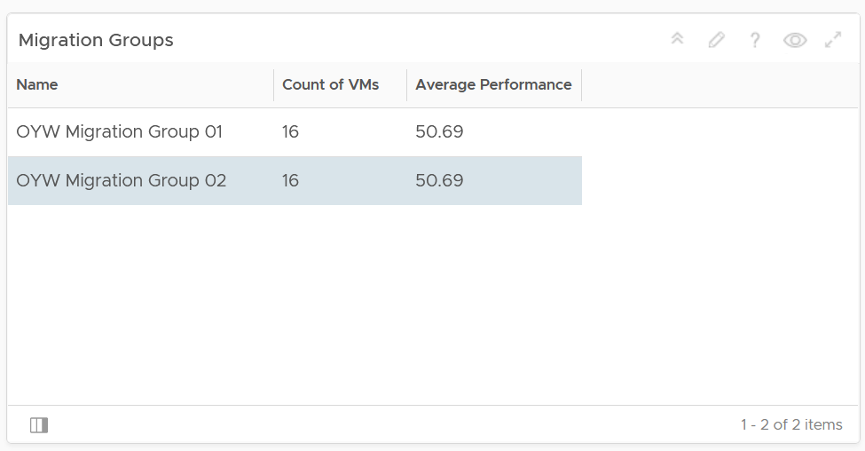
Migration Groups
The purpose of the groups is to get a sign off from VM Owner, preferably a bulk sign off if you’re migrating a large number of VMs in one migration window.
Create 1 group for each batch. Batch means VMs that will be migrated together. Ideally they are from the same owner or they have high dependency.
Create the group as early as possible. In this way, you get the longest historical data. This can be useful if there are many VMs with monthly or quarterly workload.
Make sure the group members do not change when comparing Before and After, as it makes comparison invalid. This includes any configuration change at both application and infrastructure level. For example, if after migration the workload increases due to whatever reason, it’s unfair to compare with before migration as it’s no longer apple to apple.
Have a deadline to minimize risk of changes. I recommend 1 week as your migration schedule is probably over the weekend. This enables you to move on and focus on the next batch.
Avoid very large group. Keep it below 100 VM. A large group can mask details. For example, a group of 1000 VM can have 50 VM performing worse. If the remaining VMs are performing better, the average number may not reveal that.
The group KPI is simply the average of its VM KPIs. Expect this to remain good or improve post migration.
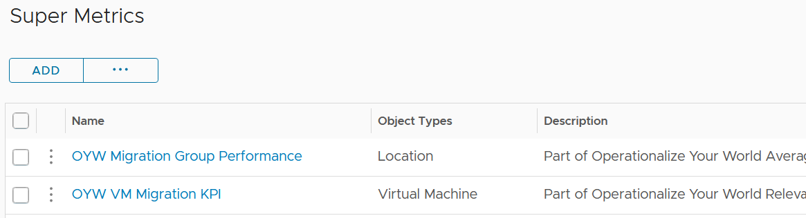
The following screenshot shows the group. Notice the Group Type is Location. That’s the object type used in the super metric.
The group needs to have super metrics to summarize the overall performance.
The following screenshot shows the 2 super metrics used.
-
The super metric “Migration Group Performance” is simply the average of the “VM Migration KPI”. Average is a suitable function as it represents all the members VM in the group.
-
The super metric “VM Migration KPI” takes a subset of the VM KPI metrics. It excludes the utilization metrics as they can create confusion when comparing before and after.
Migration KPI (%)
How do you compare the performance of a VM since there are many metrics? One way is to plot multiple line charts per VM.
This is time consuming since there are at least 9 metrics to check:
-
Guest OS CPU Run Queue
-
Guest OS Disk Queue Length
-
Guest OS RAM page-out rate
-
VM CPU Co-Stop
-
VM CPU Ready
-
VM CPU Overlap
-
VM Memory Contention
-
VM Disk Latency
-
VM Network Dropped Transmitted Packet
Notice the above focuses on contention. No consumption metrics are used as their values are expected to go up.
The group KPI is simply the average of its VM KPIs. Expect this to remain good or improve post migration.
The solution is to create a metric. It’s basically the same KPI used to calculate VM Performance (%) minus the consumption metrics.
To be Migrated VMs
This is an optional group as it does not involve VM Owner.
This group only contains VMs that are scheduled for the next migration window. Do not put VMs that are not going in the next schedule, as their load changes the group value.
If the VMs in the group are going to multiple destination, then you need to create 1 group per destination.
Once a VM is migrated, remove it from this group.
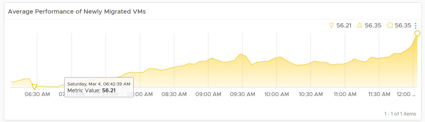
Summary Section
The dashboard section starts with a list of all the migration VM groups.
To see a group details, select the row. All the other widgets will be automatically refreshed.
The first thing to check is the health chart. As we need something to show over time that the migration is successful, we pick a color coded chart. The chart shows the average performance of all VMs in the group. You should expect the value to be same or better after migration.
In migration, you want to have visibility into the application of services. I added a bar chart to show the services discovered by the Service Discovery adapter.
Ideally, install Telegraf agent so you have process-level metrics.
Detail Section
We need to use 2 separate tables due to limitation. You need to set the 2 dates manually as different migration groups have different migration dates.
The tables list all the VMs in the selected migration group, along with their relevant contention metrics, consumption metrics and business context.
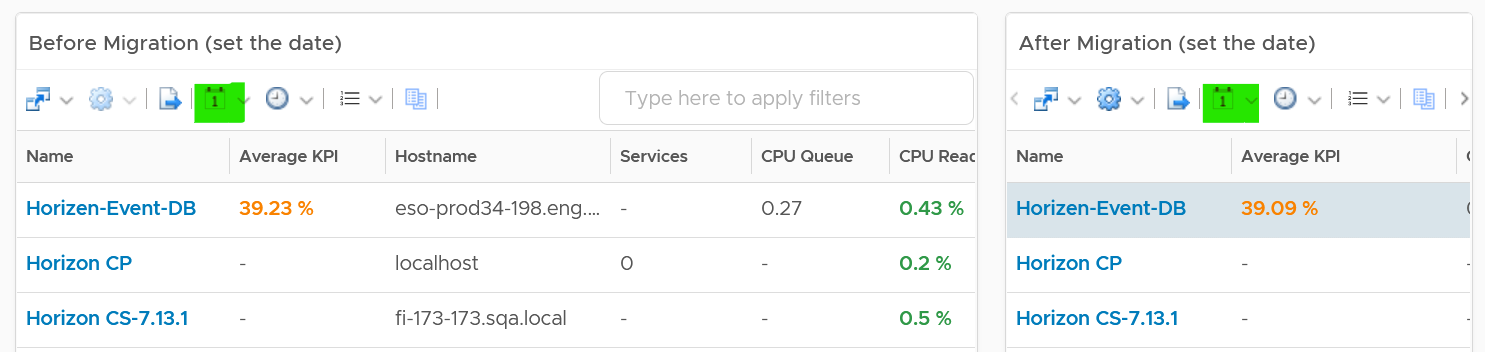
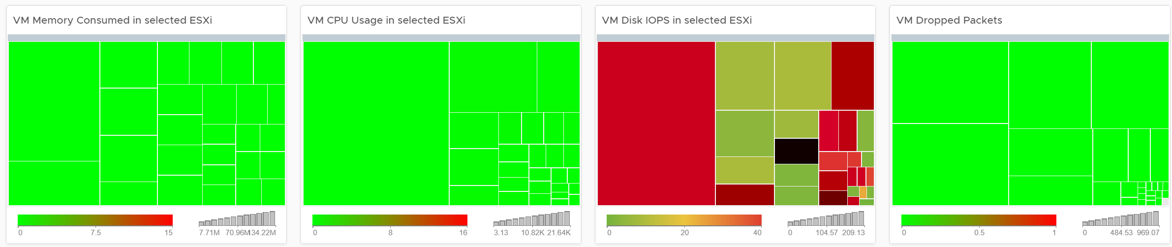
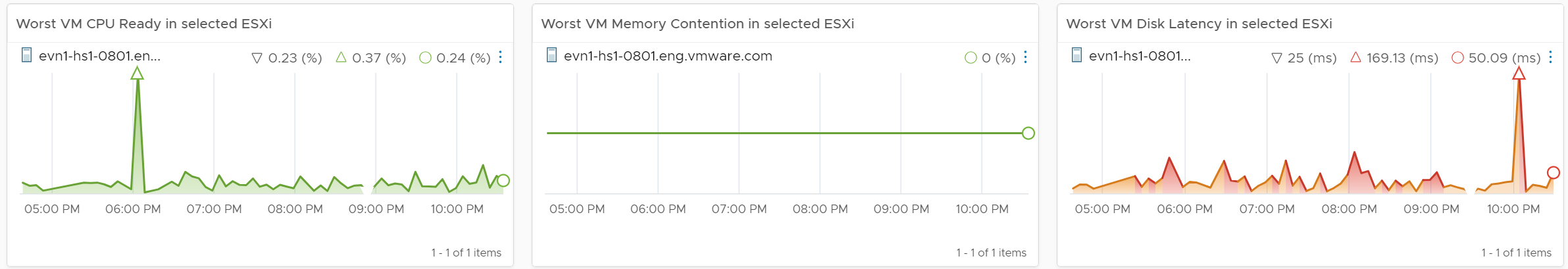
CPU Ready, CPU Co-Stop and Memory Contention should go down, unless the numbers are already very good to begin with. The numbers are taken at 20-second average, so they report much higher number than the 5-minute average. Any numbers less than 2% is not something to worry about. Disk Latency and Disk Queue should remain low even with more IOPS, assuming the new DC has much better storage subsystem. CPU Context Switch could go up if the CPU Usage goes up, as there are more threads or execution to be done. CPU Queue could go up if the CPU Usage goes up. So long the value is less than 3 per vCPU, there is no need to add more vCPU | 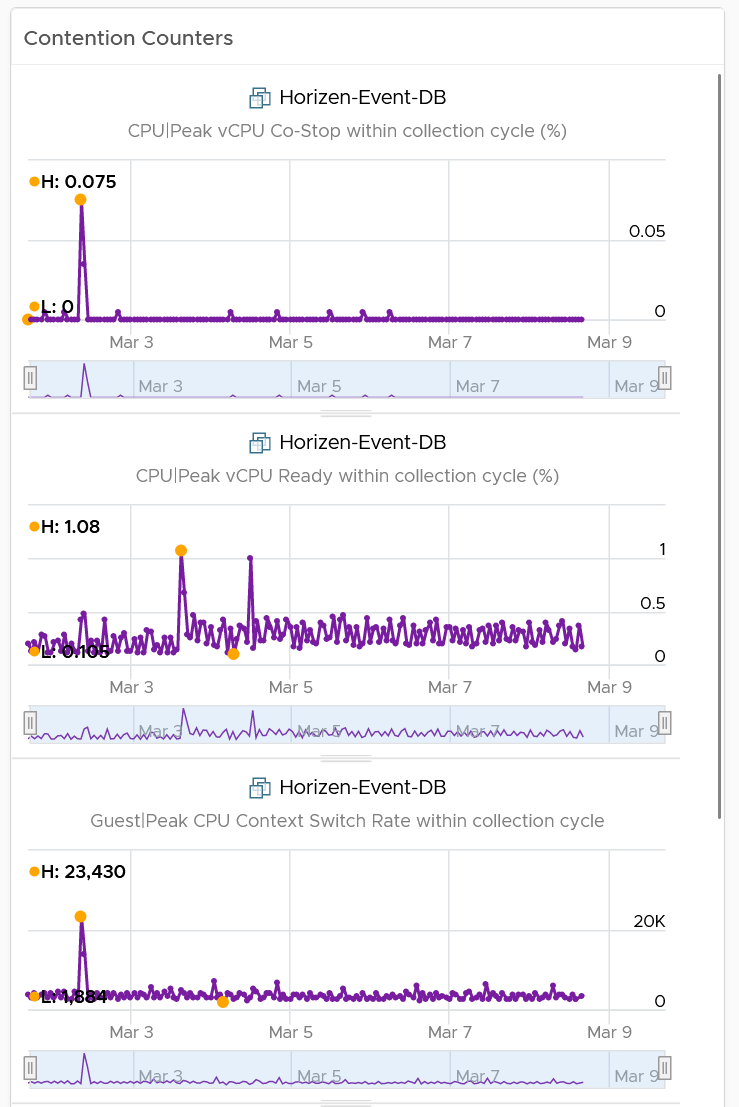 |
|---|---|
I added a set of consumption metrics as we expect the consumption to go up. For CPU, we need to use GHz and not percentage as the 2 data centers could use a different CPU speed. CPU Usage could be tricky to compare if the new data center uses a different CPU architecture, meaning 1 GHz in the old DC does not equate to same amount of CPU processing with 1 GHz in the new DC. For memory, we have to use the one inside Guest OS. The counter at VM level is not relevant. For details, refer to the memory chapter. For disk, we use both IOPS and throughput. For network, we use network throughput. You can add packets per second if you think the behaviour changes. | 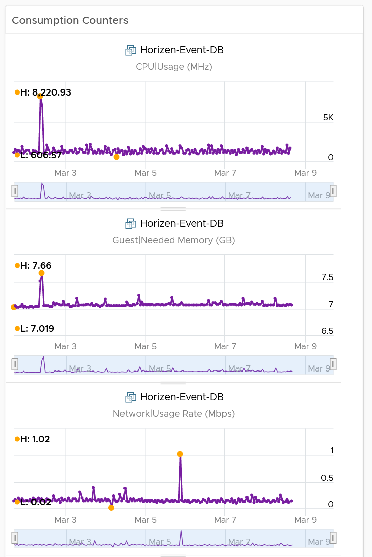 |
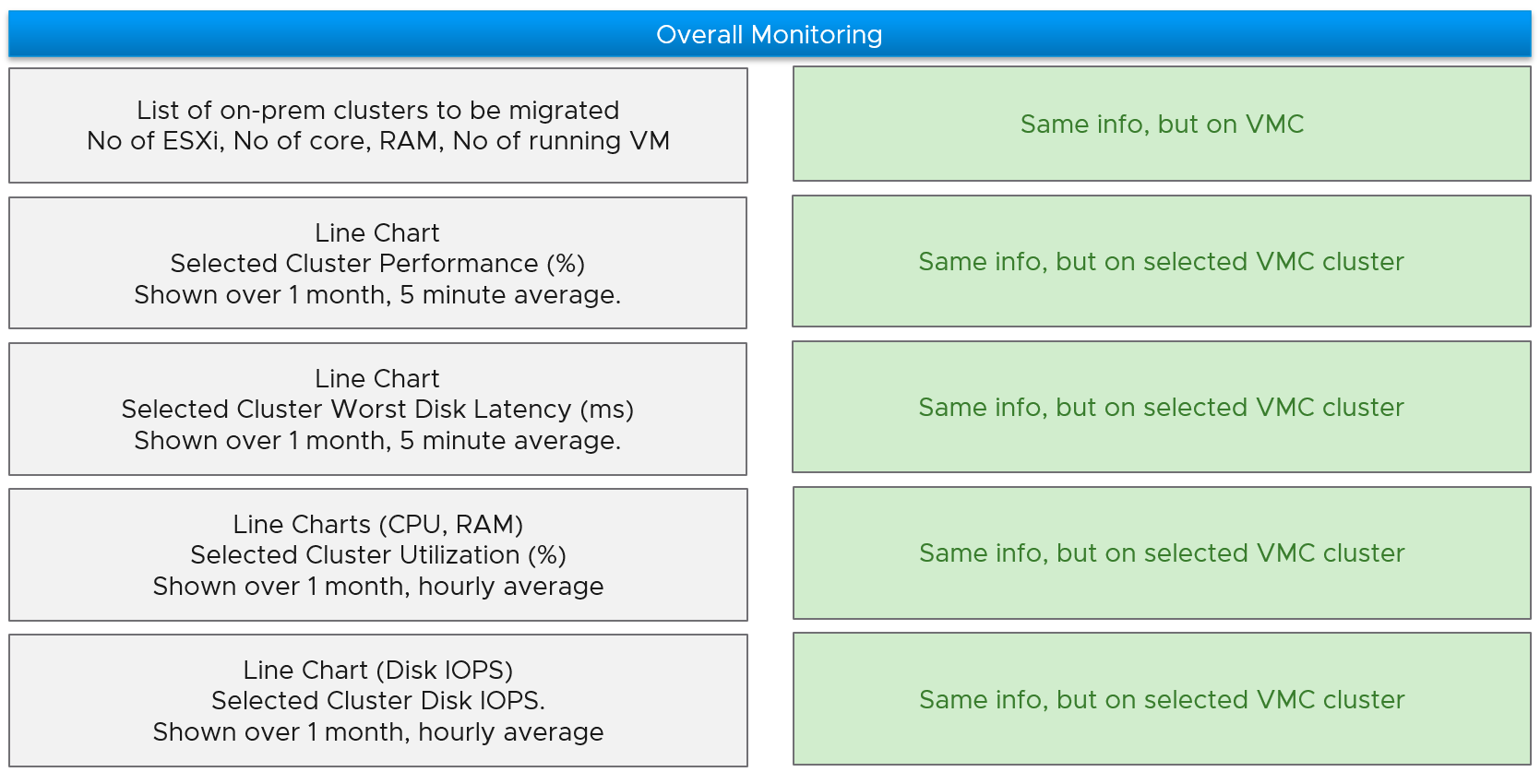
Migration Tracking
The dashboard should compare both data centers. The layout should be 2 equal columns (Old DC and New DC). This is relevant in the case of 1:1 migration and a huge chunk of the VMs in the old DC are being migrated. If the old DC will continue having new VMs, then the comparison will be invalid.
The first row shows a summary
-
Number of running VM. This shows you the overall progress. You expect the number on the old DC to go down over time. I exclude powered off VMs as you may not be keen on migrating them.
-
Overall CPU Utilization. You should expect the number in the new DC to go up while the number in the old DC to go down
-
Overall Memory Utilization
-
Overall Disk IOPS
-
Overall Disk Throughput
-
Overall Network Throughput
-
Overall Network Packets/second.
The second row shows the list of clusters
- If you select a cluster, you can drill down into its performance and capacity.
The third row shows the list of VMs
- If you select a VM, you can drill down into its performance and capacity.
The fourth row shows the list of datastores
- If you select a datastore, you can drill down into its performance and capacity.
The following table shows a sample design of a comparison dashboard. It has two identical columns, allowing you to do show before vs after comparison.