Performance
Part 2 Chapter 4
The performance dashboards aims to implement the concept covered in Performance Management chapter.
Overall Design
The suite of dashboards works together as one integrated set. They also have similar design.
| Goals | Monitor performance |
|---|---|
| Troubleshoot performance | |
| Questions | Examples of questions answered by the dashboards: |
| Are the VMs performing well? If not, which pods are affected by what problems (CPU, Disk, RAM, Network)? | |
| Is the VM performance caused by IaaS not serving it, or by contention within the Guest OS? | |
| Are the VMs running high utilization? If yes, which VMs, how high, and what resource (CPU, RAM, Disk, Network)? | |
| Are they really high relative to the underlying IaaS capacity? That can cause strain in the shared infrastructure. | |
| Assumptions | They are designed for both day-to-day operations (proactive monitoring), and ad-hoc reactive troubleshooting. As a result, it’s an advanced dashboard, not designed for Level 1 Support. |
| Target Users | VMware Administrators or Architects |
| Usage frequency | Daily for monitoring. This is to encourage daily usage, as what happens beyond 24 hours ago may be practically irrelevant from performance troubleshooting viewpoint. Hence the views are set to show data in the last 8 - 24 hours. |
| Ad hoc for troubleshooting. Designed to be used within the day of the performance issue, or at most the next day. | |
| Features | Color coded. Each of the color is according to the best practice of that counter. If you are unsure of what suitable numbers to set for your environment, profile the metrics. The Guest OS Performance Profiling dashboard provides an example of how to profile metrics. We also document the steps in Baseline Profiling section of the book. |
| Design to see trend over time, and go back to any point in time. This is important as by the time you have the chance to look at the problem, 5 minutes have passed, or the problem is no longer happening |
There are 2 types of performance troubleshooting
-
Consumer. You focus on a single VM, container or application. Other consumers do not have a problem, or they are independent.
-
Provider. You focus on the shared infrastructure as the problems impact many consumers. It could be hitting them at random, meaning different VMs/Applications got hit at different time.
At the infrastructure layer, we care whether it serves everyone well. Make sure that there is no contention for resource among all the VMs in the platform. Only when the infrastructure is clear from contention can we troubleshoot a particular VM. If the infrastructure is having a hard time serving majority of the VMs, there is no point troubleshooting a particular VM. Notice all the previous sentences are about the VM. Yes, the infrastructure metrics are not that relevant.
Logically split the dashboard into 3 parts:
| Contention | This should be the first part, and most visible. |
|---|---|
| Consumption | Once you determine there is contention, use the Utilization portion to see if the contention is caused by very high utilization. When utilization exceeds 100%, performance can be negatively impacted especially when queue developed inside the Windows or Linux. By default, VCF Operations has a 5-minute collection interval. For 5 minutes, there may be 300 seconds worth of data points. If a spike is experienced for a few seconds, it may not be visible if the remaining of the 300 seconds is low utilization. |
| Configuration | Only include the relevant settings that can impact performance |
This separation keeps each dashboard simple, while emphasizing the concept of contention as the primary counter for performance. You will notice in the dashboard design that contention is color coded, while utilization is not.
Take note that health chart is not ideal when the metrics do not have a “ceiling”, meaning we don’t know what “high value” is, as 100% is hard to define. Example of such metrics are disk IOPS and CPU context switch. If your operations team has a standard that utilization should not exceed a certain threshold, you can add that threshold value into the line chart. The threshold line will help less technical teams as they can see how the real value compares with the threshold.
For large vSphere environment, group the VM by clusters of the same class of service (e.g. Gold), so you can see the profile for each environment. I find the Data Center as good boundary. In general, storage, network and compute do not extend beyond a vSphere Data Center object. Performance problems tend to be isolated in a single physical environment, unless the WAN link connecting the 2 data centers are causing the problem. A performance problem in country A typically does not cause performance problem in country B, especially if they share little in common.
The dashboards share the same design principles, hence they are intentionally designed to be similar. It will be confusing if each dashboard looks totally different from one another, considering they have the same objective. To avoid repeating the explanation, read the VM Performance dashboard before reviewing others.
IaaS Performance Profiling
Why does this chapter begin with this dashboard? Why not start with VM performance dashboard?
Because you want to be proactive. Optimize your environment then it becomes easier to manage.
While performance is about what the VM experience, you can see it from VM perspective or the IaaS perspective.
VM Perspective
We covered how to baseline performance in PART 1 Chapter 2. So in this section, we will go straight into the dashboard.
Metrics to Use
Now that you know how to profile, what metrics do you choose?
| CPU | We chose CPU Ready. It’s good enough to represent the 4 types of CPU contention metrics as we’re taking 20-second peak. I don’t think it’s worth the extra effort to include Co-stop, Overlap and Other Wait. You need to wait for 3 months as you need to create the super metric first. |
|---|---|
| Memory | We chose VM Memory Latency as that’s the only true measurement of performance. |
| Disk | We chose VM Disk Latency. For profiling purpose, there is no need to split Read and Write. Overall is good enough as the improvement will be across the board. |
There is no need to do network as you should not have dropped packets in the data center.
When you have time, profile the following metrics
-
CPU Overlap. I expect the value to be <1%, with >90% of them below 0.25%.
-
CPU Other Wait. I expect the value to be <1%, with >90% of them below 0.25%. Read the documentation of this metric as there is a false positive.
Metrics not to Use
You do not need to profile utilization metrics. For contention metrics, you do not have to profile less important metrics.
| CPU Run Queue | These are Windows or Linux level metrics. They are application dependent, meaning not something the IaaS platform controls. |
|---|---|
| CPU Context Switch | |
| CPU Usage Disparity | This is also application dependent. |
| CPU Co-stop | This typically happens when the VM is oversized. |
| Disk Outstanding IO | This is impacted by IOPS, which is not something the IaaS platform control |
| Disk Queue Length | This depends on the storage driver. I recommend you use PVSCSI |
| Free Memory | It depends on the application. Certain applications such as JVM and DB manage their own memory, not something Windows or Linux can control. |
| Page-in rate | |
| Page-out rate | |
| VM Balloon | Not a VM performance counter, but an ESXi capacity counter. |
| VM Compressed | |
| VM Swapped |
Summary
How to summarize from millions of datapoints?
Here is the technique I use:
After that, we take the average and worst value among these VMs.
The following screenshot provides an example.
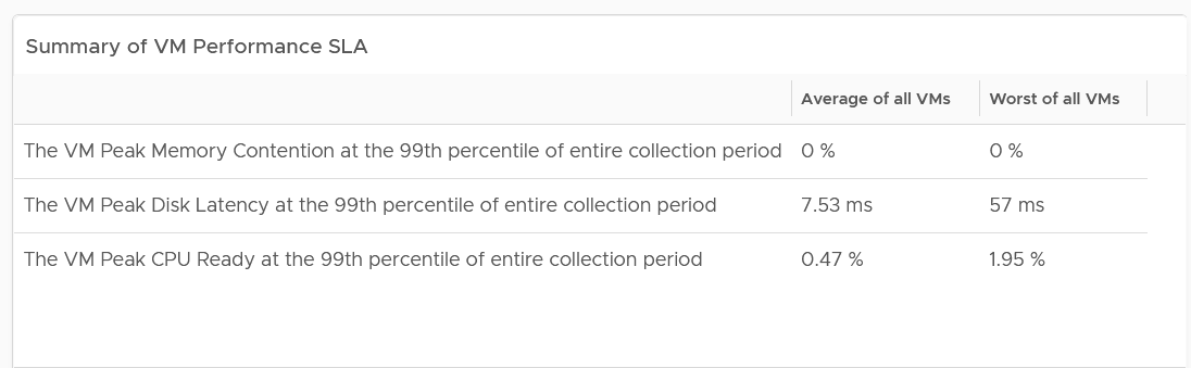
The 2 summary numbers become your Before Optimization numbers. Once you optimize the environment, revisit this table and take the new value.
The average columns should be fairly good. The worst of all them should not be too bad.
Here is my guidance:
| Average of all VMs | Worst of all VMs | ||
|---|---|---|---|
| CPU | Low: | < 2% | < 5% |
| Normal: | 2 – 6% | 5 – 15% | |
| High: | > 6% | > 15% | |
| Memory | Low: | < 1.5% | < 4% |
| Normal: | 1.5 – 4.5% | 4 – 12% | |
| High: | > 4.5% | > 12% | |
| Storage | Low: | < 10 ms | < 50 ms |
| Normal: | 10 – 30 ms | 50 – 150 ms | |
| High: | > 30 ms | > 150 ms |
The guidance is set with High = 3x Low.
The normal range is the widest range, and most environmental will fall here. Naturally, your gold cluster should be closer to the low range, while your bronze cluster will be closer to the high range. If your bronze cluster is showing very good performance, you can put more VMs to lower the overall cost per VM.
Likely, you see that the average is good but the worst is bad.
That means majority of the VMs are being served well, but there is a small percentage that are not getting served. You want to investigate which segment of your IaaS is not performing. It could be due to some configuration, or lack of capacity.
Details
If the summary is good, then there is no need to see the details.
What if the numbers are worse than expected?
One way is to use a bar chart. Design the buckets to represent the ranges from good to bad.
Generally speaking, for environment where performance is number 1, you want the value to be in the green to yellow range since you’re taking the 99th percentile. For environment where cost is number 1, you likely have to lower expectation of your customers.
The following table shows the recommended buckets for CPU and memory.
| Green | Yellow | Orange | Red |
|:------:|:------:|:-------:|:------:|
| 0 – 4% | 4 – 8% | 8 – 16% | > 16% |
Depending on the result, adjust the bucket accordingly. For example, if your environment performance is worse than the above, yet nobody complains, you can adjust the above buckets to something like this:
| Green | Yellow | Orange | Red |
|:------:|:-------:|:--------:|:------:|
| 0 – 6% | 6 – 12% | 12 – 24% | > 24% |
For disk latency, I recommend the following:
| Green | Yellow | Orange | Red |
|:---------:|:----------:|:-----------:|:---------:|
| 0 – 25 ms | 25 – 50 ms | 50 – 100 ms | > 100 ms |
Depending on the result, adjust the bucket accordingly. For example, if your environment performance is worse than the above, yet nobody complains, you can adjust the above buckets to something like this:
| Green | Yellow | Orange | Red |
|:---------:|:-----------:|:------------:|:---------:|
| 0 – 60 ms | 60 – 120 ms | 120 – 240 ms | > 240 ms |
If you have more screen real estate, do a split within each range for more granular visibility. Using the preceding table as example, you may split this way:
| Green | Yellow | Orange | Red |
|---|---|---|---|
| 0 – 30 ms | 60 – 90 ms | 120 – 180 ms | > 240 ms |
| 30 – 60 ms | 90 – 120 ms | 180 – 240 ms |
Compute Profiling
The following screenshot shows a sample profiling. What insight do you get from it?
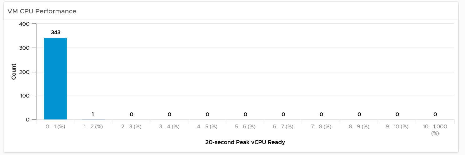
The above shows an example of an ideal environment. All the 343 VMs experienced very low CPU ready time. It is possible that either utilization is too low or no overcommit. This means the relative cost is high.
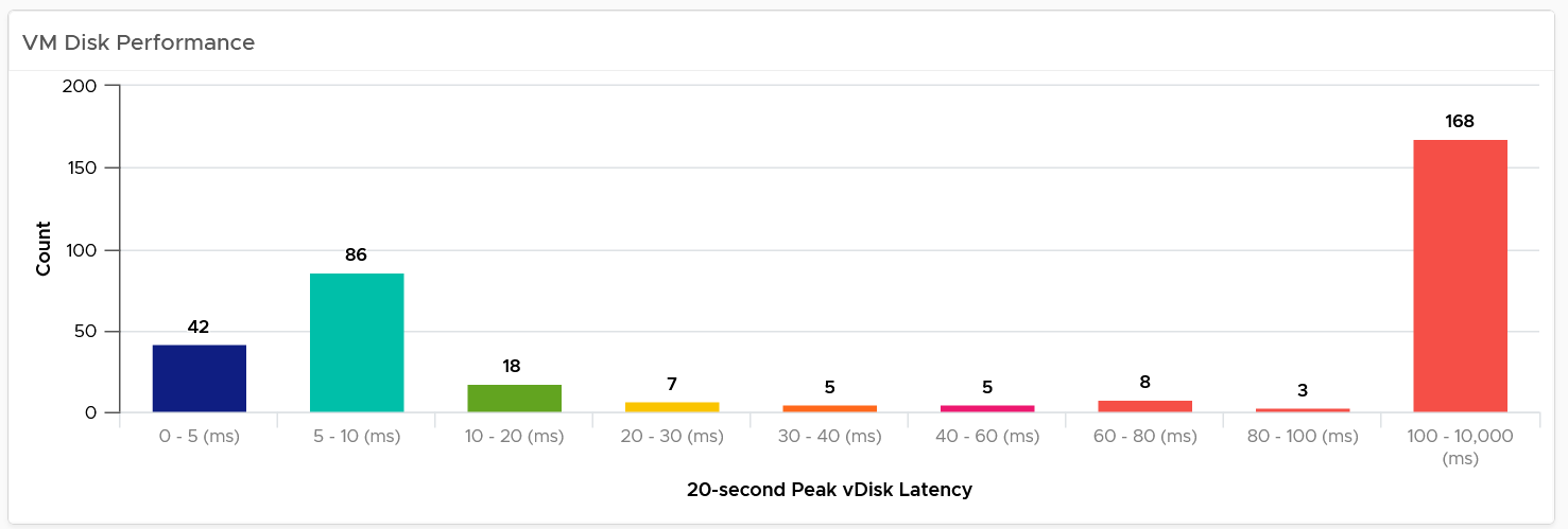
Let’s take a different example. Obviously, it’s from another environment.
What’s your conclusion from seeing the following chart?
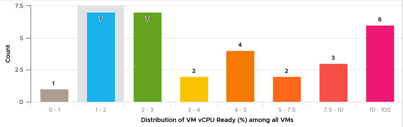
This environment has worse performance. The distribution is evenly spread, meaning many VMs experienced CPU Ready above 5%.
As a general guidance, investigate all those values that are really high, as they are not normal.
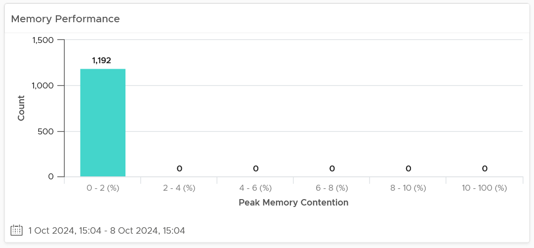
For memory, most customers do not overcommit memory. IMHO, this is too conservative for non-production environments. The following is what you can expect is you do not overcommit.
Storage Profiling
The threshold that you set can provide interesting insight. For example, the following looks normal at a glance. There are some bad latency numbers, as shown by the tall red bar at the end.
Since the pattern is a bit odd, I decided to make the “shift the buckets” by applying higher threshold. I did it by applying a higher latency bucket. T
The following is what I got!
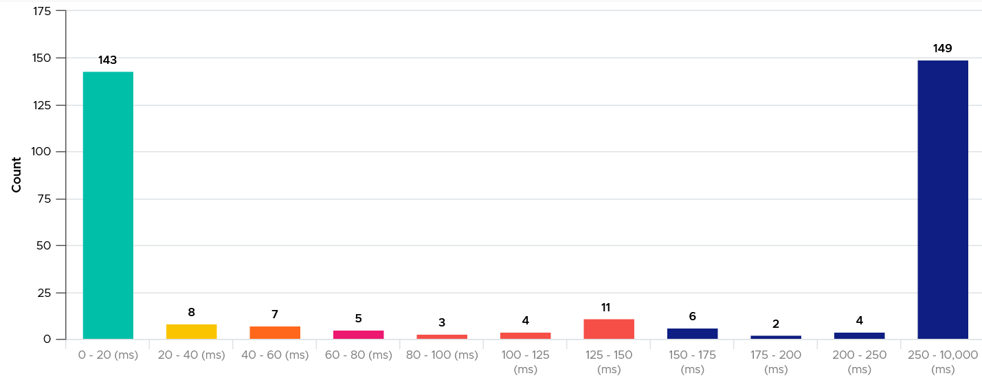
What do you think of the result?
It’s interesting to see the polarizing result! In this case, the lab has 2 different classes of storage. One is SSD the other is magnetic.
Extra Analyzis
If you want to confirm that the worst value is indeed an outlier, compare the value (which is 99th percentile) against the worst value. If the gap is sizable, that means it’s a one-off occurrence.
Export the table into a spreadsheet, and create a scatter chat. The following proves in my environment that CPU Ready tend to be short-lived.
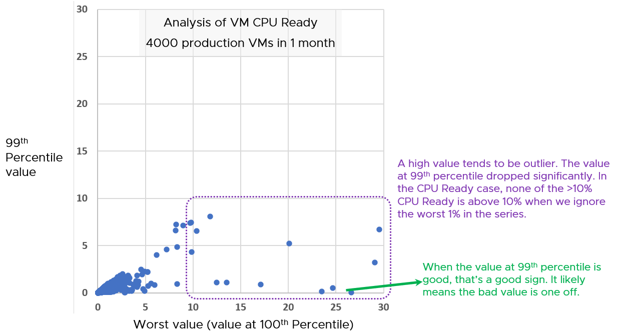
Notice the high values of 99th percentile value are around 5 – 8%, while the high of the worst values are around 15 – 30%.
Infrastructure Perspective
Now that you know the overall picture affecting all the VMs, the next step is to see the performance over time. You also want to quickly compare across clusters or datastores.
In a large environment with many clusters and datastores, you may have a few clusters or datastore that fail to deliver the expected performance.
For each cluster, you want to measure both the depth and the breadth. That means tracking 4 metrics
-
the worst CPU Ready experienced by any VM
-
percentage of VMs experiencing CPU Ready
-
the worst Memory Contention experienced by any VM
-
percentage of VMs experiencing Memory Contention
For datastore, you take VM disk latency, not outstanding IO.
Having the depth and breadth give you better insight.
Just like the case in VM, take 3 months data.
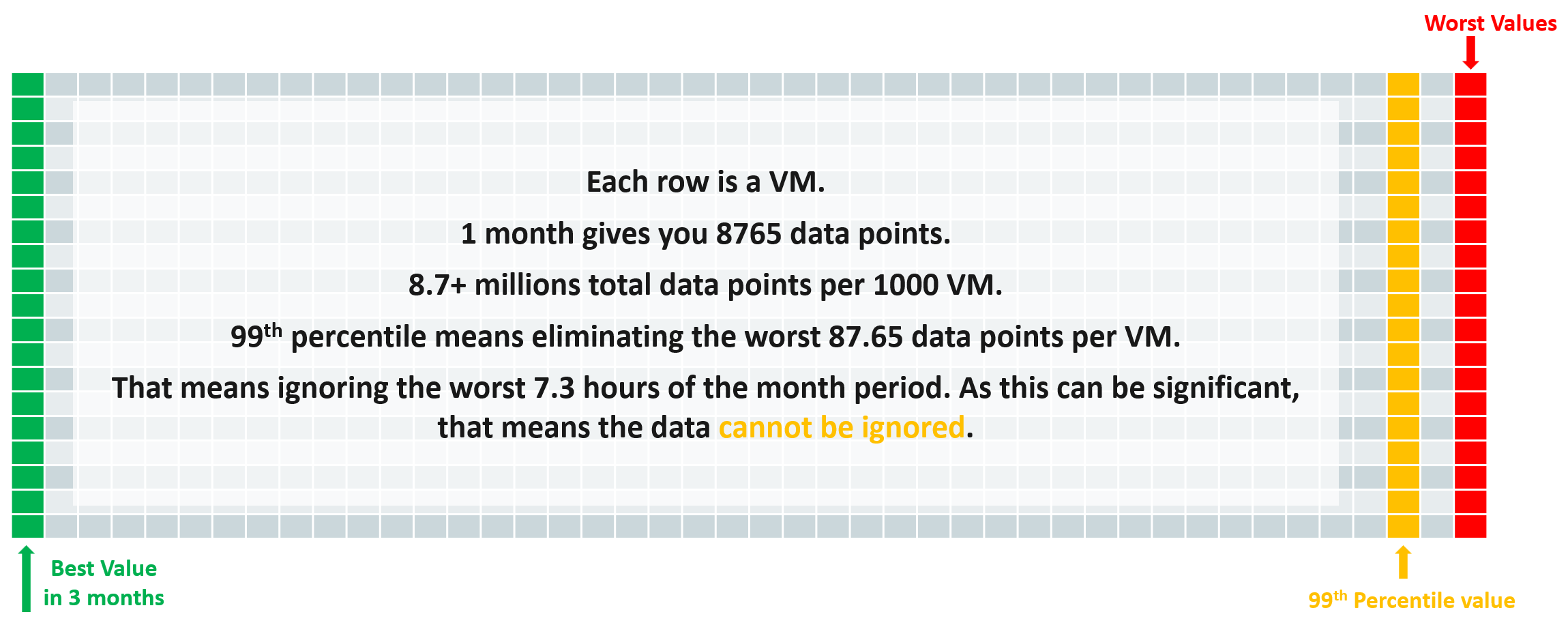
A cluster with 1000 VM will have a metric that represent 1000 VM in any given 5-minute interval. Since there are 8765 instances of 5 minutes in a month, that means you analyze 8,765,000 data points in that one cluster. Taking the worst among millions will likely return you with an outlier.
This is why we use the average of worsts. So it’s the average of all data points, where each datapoint is the Worst VM CPU performance data point.
To implement the above comparison for compute, create 1 view that lists the metrics. Color code the table so you can focus on the red ones.
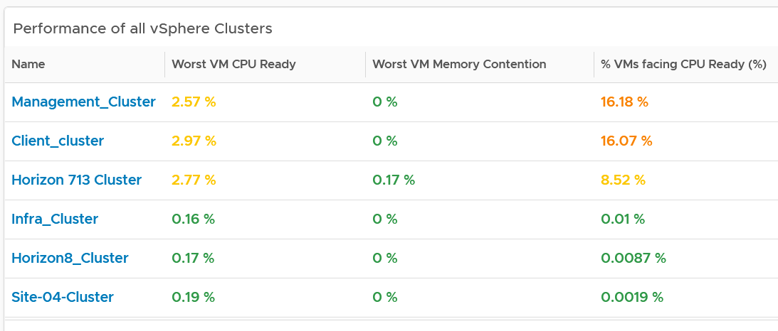
Create a similar table for datastores. I added the percentage of VM facing disk latency just to get some insight into how widespread the problem is.
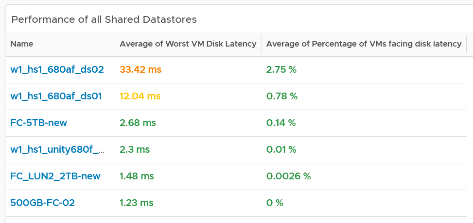
As in the case with VM, compare this with the default threshold used in VCF Operations, as shown previously.
The above covers “how bad the problem is”. We need to cover “how widespread the problem is”. How many percent of the VM population is experiencing the problem? The range used is
-
Green: 0 – 2.5% of the population
-
Yellow: 2.5 – 5%
-
Orange: 5 – 10%
-
Red: more than 10%
Analyzis
Use both the breadth and depth as input to your decision.
| Depth | Breadth | Analyzis Conclusion |
|---|---|---|
| Good | Good | Safe to add more load, assuming the utilization is low and overcommit is below your plan |
| Good | Bad | Performance is good but do not add more load as many VMs are experiencing contention already. |
| Bad | Good | Since it’s not widespread, check for common configurations among the impacted VM |
| Bad | Bad | If there has been no complaint for months and business are not impacted, it is possible that you do not have to do anything. If you have good relationship with the application team, this is the time to set their expectation lower. Otherwise, quietly and proactively plan for improvement as future workload may be more sensitive to latency. As a principle, IT should be ahead of business. |
Using the above as example, you can see that all the clusters can serve their VMs well, as the highest values are 3.6%. If this is what you want to maintain, then use 3.5% as the threshold. The first cluster is already full. It can’t handle anymore VM as it’s already exceeding 3.5%. The second cluster is near full.
For memory, all the clusters are doing well. If this is what you want to maintain, then set 0.1% as the threshold.
If you want to be more aggressive, then you set 5% for CPU Ready and 1% for Memory Contention.
For better analyzis, create a health chart or line chart showing the breadth and depth metric for a selected cluster. This lets you see trend over time. Perhaps the time of performance problem happens during Sunday night where there is hardly any users and you’re doing full back up. In that case, you can adjust your decision.
The following is an example where both CPU and memory are well within the green range.
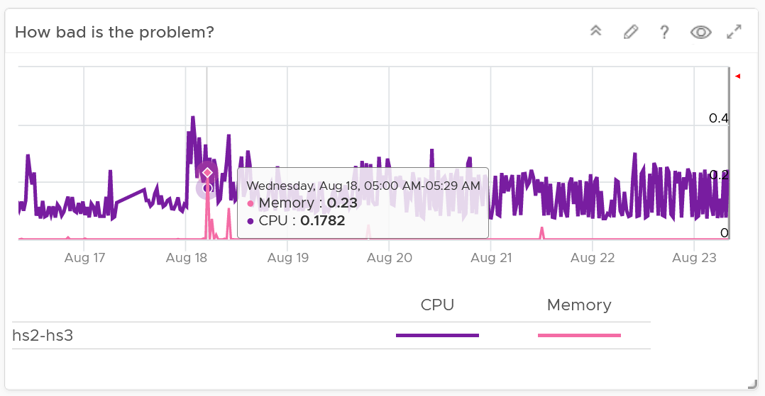
Next, look at the breadth dimension.
In the following example, what problem do you see?
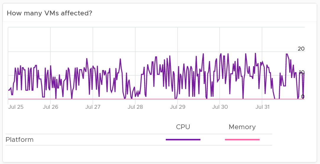
A high percentage of the VM population is experiencing CPU contention. On the other hand, memory is perfect. If it turns out that there is no issue with both the cluster and VM settings, you should consider buying more CPU as your workload turns out to be CPU heavy.
Network Profiling
Network is different due to its nature as an interconnect. We cover this in-depth in vSphere Metrics book. As a result, we need to investigate separately. Instead of investigating per VM, we investigate per network. This means per distributed port group.
We should investigate both the VMkernel network and VM network, as both can impact VM performance.
What metric should we choose?
There is no network latency counter. The proxy for it (network dropped packet) tends to have false positive, which makes profiling inaccurate. Luckily the false positive rarely happens. The false positive can be overcome by using 99th percentile metric, as it removes the outlier. The false positive happens more frequently on received side than transmit side. When profiling, we focus on the transmit side.
As there is fewer network than VM, it’s more effective that we use table instead of distribution chart. List all the networks, and show the received dropped packets at 99.9th percentile. 99th percentile is less suitable as your tolerance for drop packet is higher, and they rarely happen.
Sort the list in descending order so the problematic network appears at the top.
Guest OS Performance Profiling
I’m covering this dashboard next as they reveal performance issue that application team should consider.
There are metrics that directly impact the performance of Windows or Linux, the Operating Systems running inside a VM. These KPIs are outside the control of the hypervisor, meaning ESXi VMkernel is not able to control the increase or decrease of their values. Visibility into these KPIs also requires an agent, such as VMware Tools. As a result, they are typically excluded in performance monitoring.
Because these KPIs are closer to the applications, it is critical to know their values and establish an acceptable range, which will vary in your environment. By profiling the actual performance over time and from of all VMs, you can establish a threshold that is supported by facts. Since there are 8766 instances of 5 minutes in a month, profiling 1000 VM over a month means you are analyzing 8.8 million datapoints, more than enough to draw a conclusion.
Use this dashboard together with application team to determine the acceptable level of these metrics. Once you determine that, add thresholds to the table so you can easily see the VMs that exceed a threshold.
Take note that these guest OS metrics do not appear unless vSphere prerequisites have been met.
How to Use
Select a data center from the data centers list.
-
The three tables listing CPU, memory and Disk will automatically show the VMs in the selected data center or vSphere World.
-
Each table shows the highest value in the last 1 week (2016 datapoints based on 5-minute collection cycles), hence their columns are prefixed with Max.
About the CPU table widget
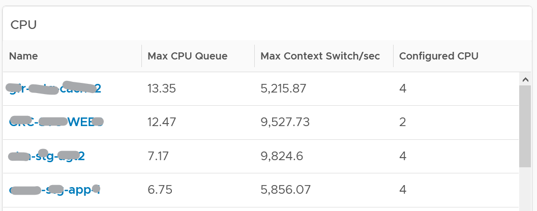
The CPU queue is the sum of all vCPU. A larger VM can tolerate higher queue as it simply has more processors. If you want to compare VMs of different size, create a super metric that calculates the queue per vCPU.
The Max CPU Queue column shows the highest number of processes in the queue during the given period. Best practices indicate you should stay below 3 for each queue. For a VM with 8 CPUs (8 queues), you want to be below 24.
Show the corresponding CPU Run at the peak of CPU Queue. High queue not supported with high run indicates application creating excessive threads.
CPU Context Switch. There is cost associated with context switch. The problem is there is no guidance for this number, and it varies widely. This is the very purpose of this dashboard!
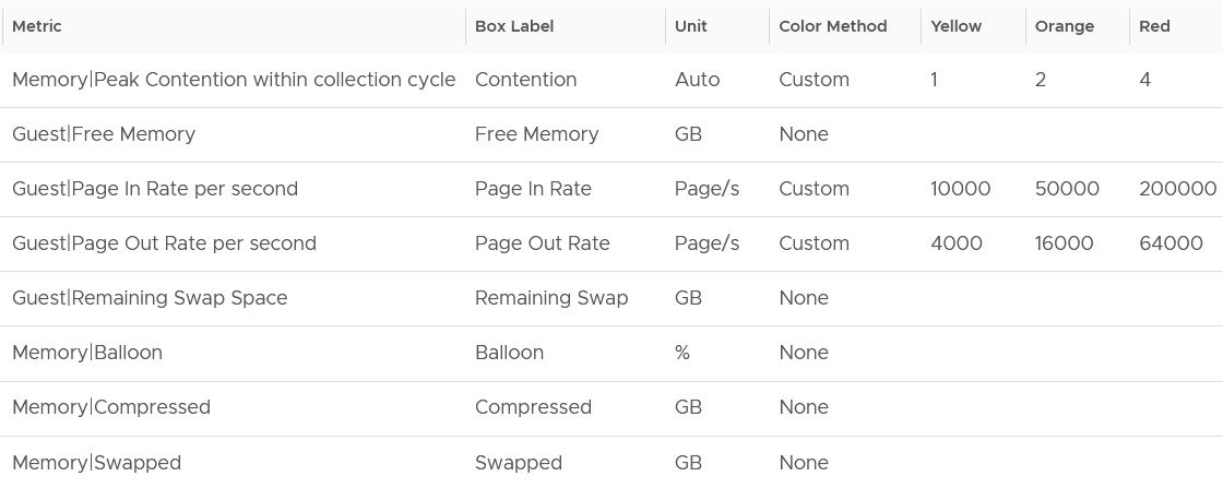
Review the Memory list widget below. Why are the Guest OS Paging metrics chosen, as opposed to In Use, Cache or Free memory?

Because they are measuring rate of change (performance), while the other measures a static disk space consumption (capacity).
Compare the page-in vs page-out. Is that what the application team expect?
Review the Disk list widget below. Why are these 3 metrics chosen?
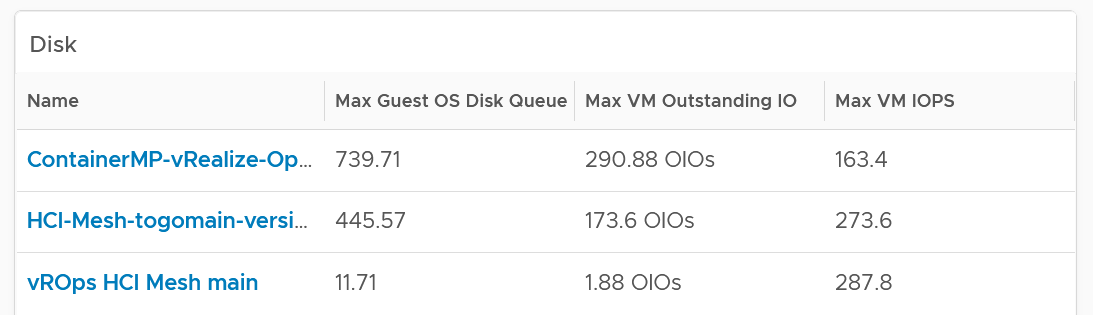
The Guest OS Disk Queue shows potential issue inside Windows or Linux.
The 2 metrics at VM level provides additional contexts. If queue is high inside the Guest, and OIO and IOPS are low at VM level, the problem is at Guest OS layer.
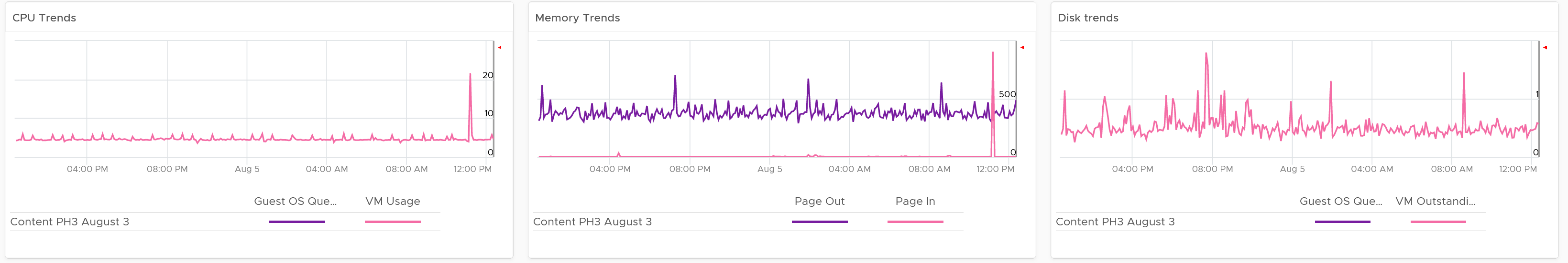
Select any VM from any tables above. The 3 line charts will appear automatically and will show data from the same VM to facilitate correlation.
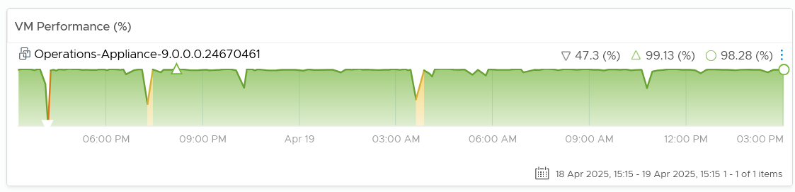
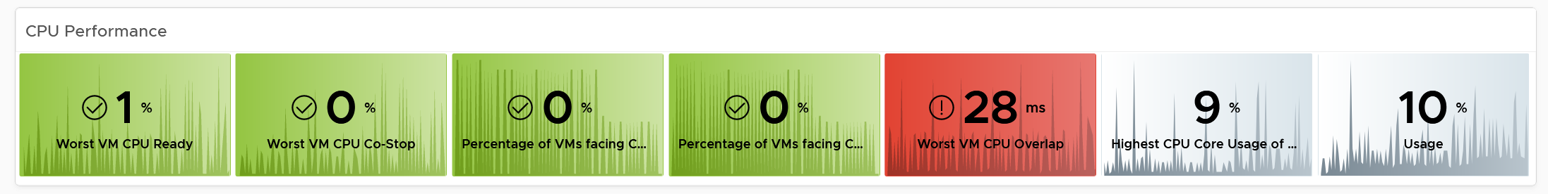
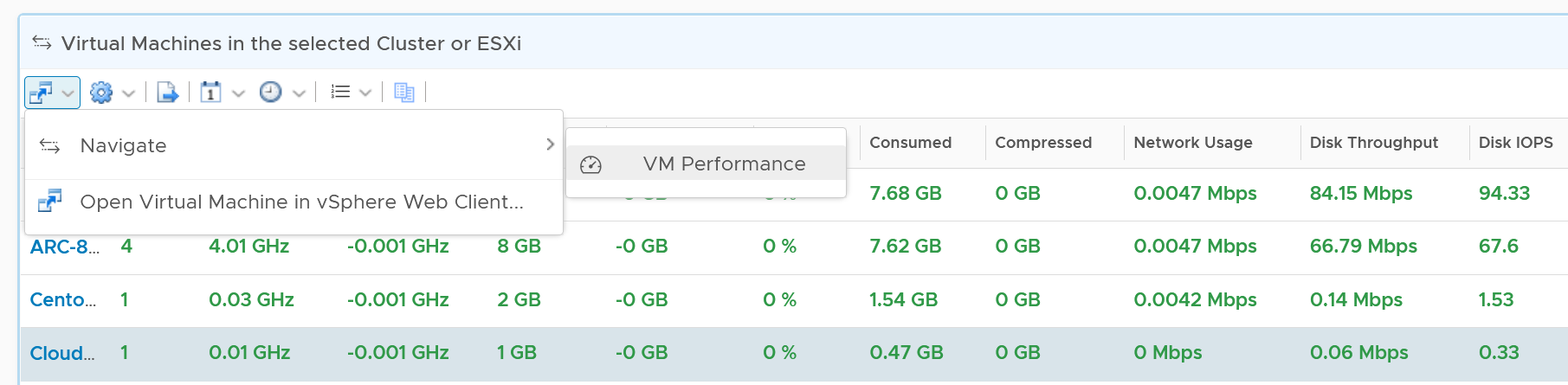
VM Performance
Now that you’ve profiled your environment, you’re ready to monitor specific VM performance.
There are 2 team who have an interest. As a result, we need to cover both Guest OS and VM metrics. In addition, we also need to cover both contention and consumption are they are intertwined. As a result, there are 2 x 2 sets of metrics. The following table shows the matrix.
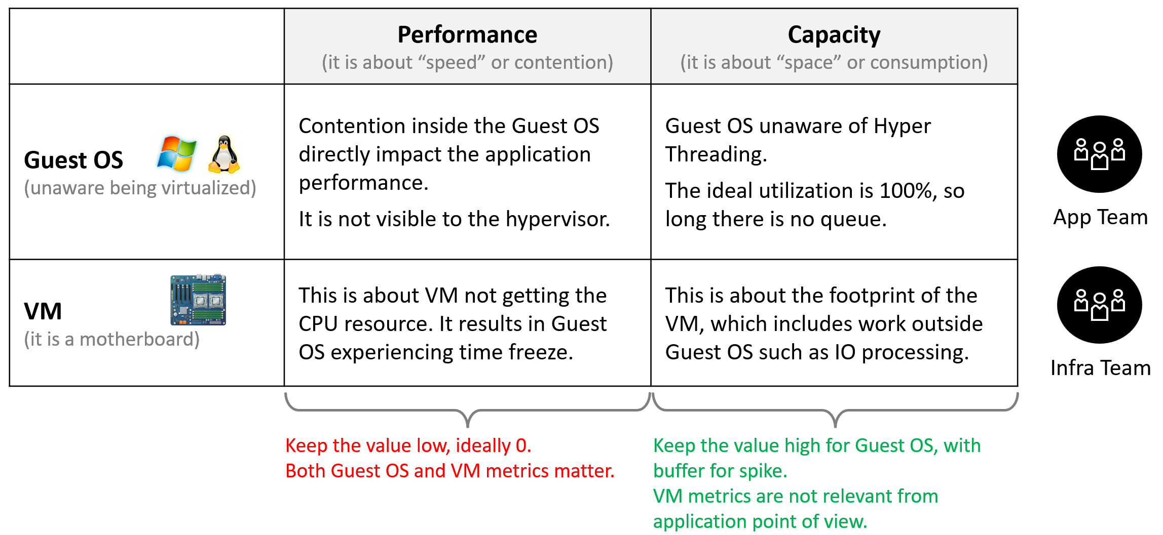
The following diagram is only showing CPU contention. A VM can have CPU, memory, disk, network or system problem.
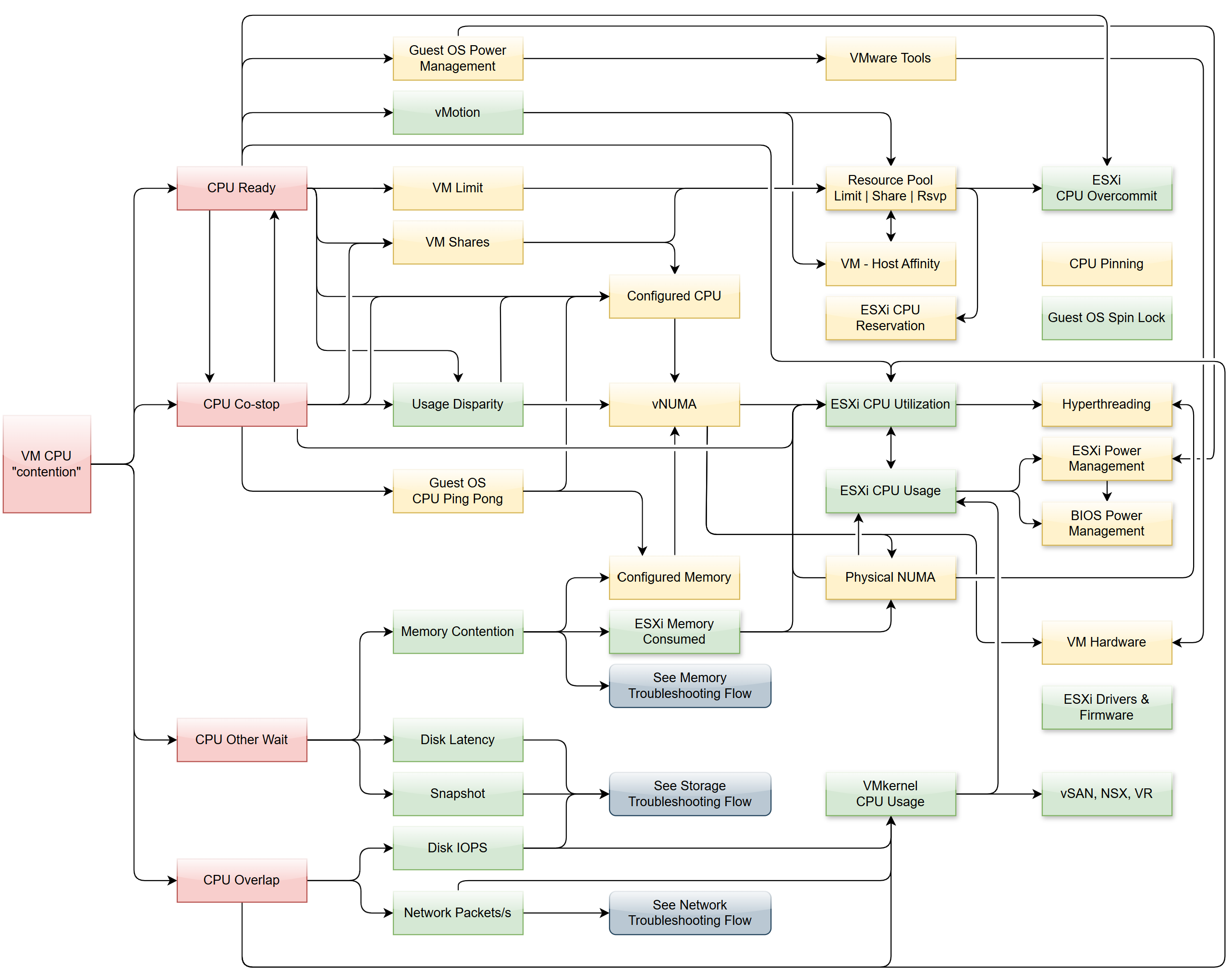
Why doesn’t the preceeding diagram include CPU Latency?
It includes a reduction of CPU efficiency due to hyperthreading. That’s not a performance problem.
There are 4 primary metrics proving that a VM does not get the CPU it demands. If these are low, the VM does not have a CPU performance problem, regardless of what other metrics show.
Primary metrics are explained by secondary metrics. For a single VM troubleshooting, check the VM itself, its parent ESXi, and Cluster-setting such as Resource Pools and VM-Host Affinity. Factors outside the VM is shown with shadow.
This diagram only covers VM. Guest OS has its own troubleshooting flow. Ensure BIOS is optimized for virtualization. Logically, cluster level setting such as DRS plays a part. See the Cluster diagram.
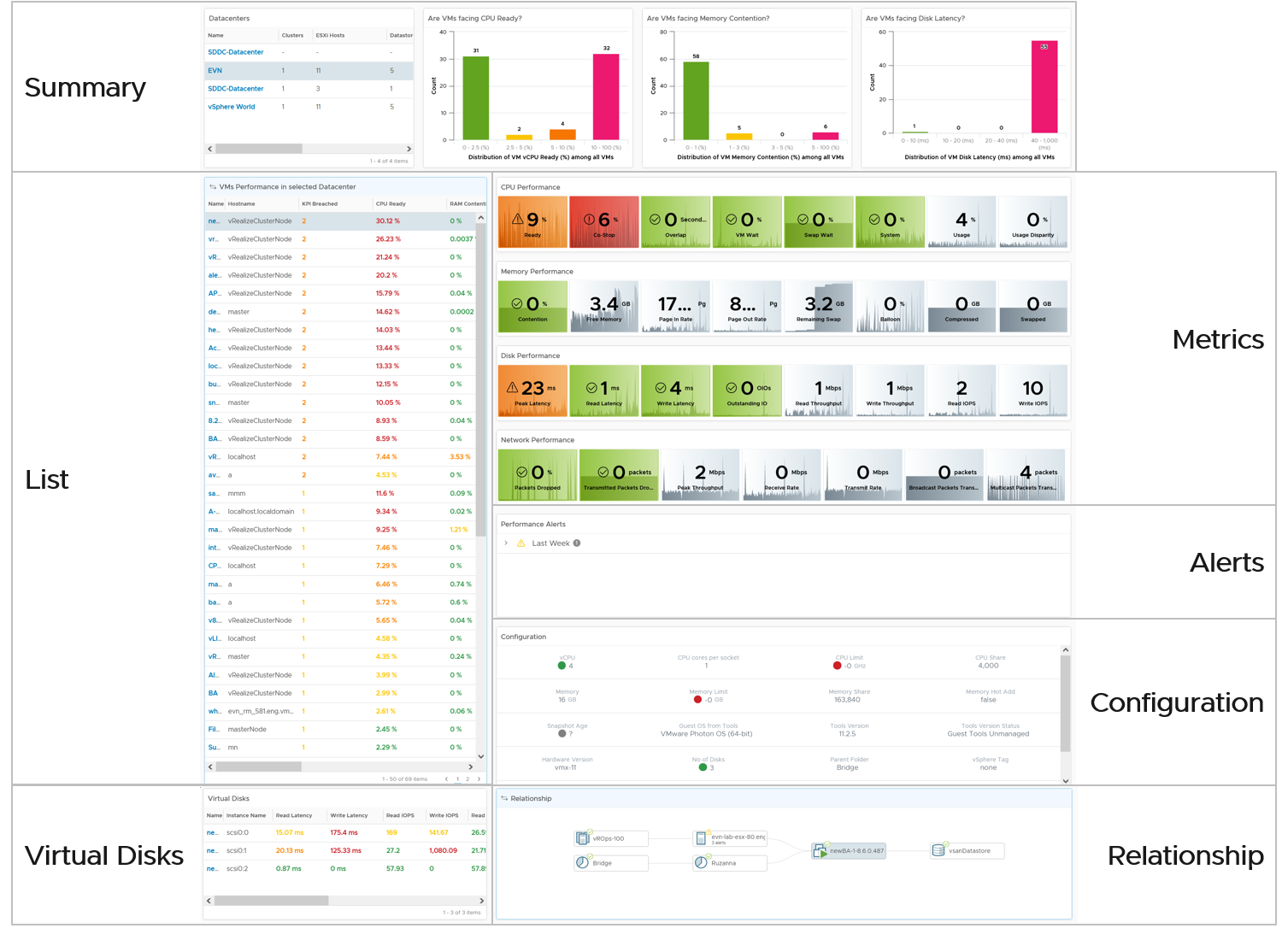
Dashboard
The troubleshooting flow is complex, hence the dashboard is complex.
The dashboard is laid out logically into 3 sections to provide a top-down flow of performance analysis.
| Summary | Quickly see the big picture. The first thing to check when a VM has a performance problem is if other VMs have the same problem. If the problem is widespread the root cause is not with the VM. Hence it’s important to see the big picture, before diving into a specific VM |
|---|---|
| List | A table listing all the VMs. It’s convenient to analyze many VMs. The table supports sorting, filtering and export for further analyzis. |
| Detail | This section is made of multiple widgets |
| Metrics. Only metrics impacting performance are shown. They are grouped logically by category of problems. | |
| Alerts. Only alerts impacting performance are shown. | |
| Configuration. Only settings impacting performance are shown. | |
| Relationship. Navigate into objects related to the selected VM. | |
| Virtual Disk. Drill down into the individual virtual disks. | |
Virtual Network. Drill down into the individual virtual NIC. This is not yet added out of the box. |
Summary
The dashboard uses a list of Data Center as a selector/filter. Why don’t we use vSphere Cluster as the selector?
Because this is about VM performance, not cluster performance. Multiple clusters can share the same datastore, and they often share the same network. These shared infrastructure can impact the performance of VMs on it.
Select one of the data centers from the table. The following bar charts will be automatically shown.
What does the following 3 bar charts tell you about the environment? They work in tandem to reveal if there is any performance problem, and if yes, what problems and how bad.
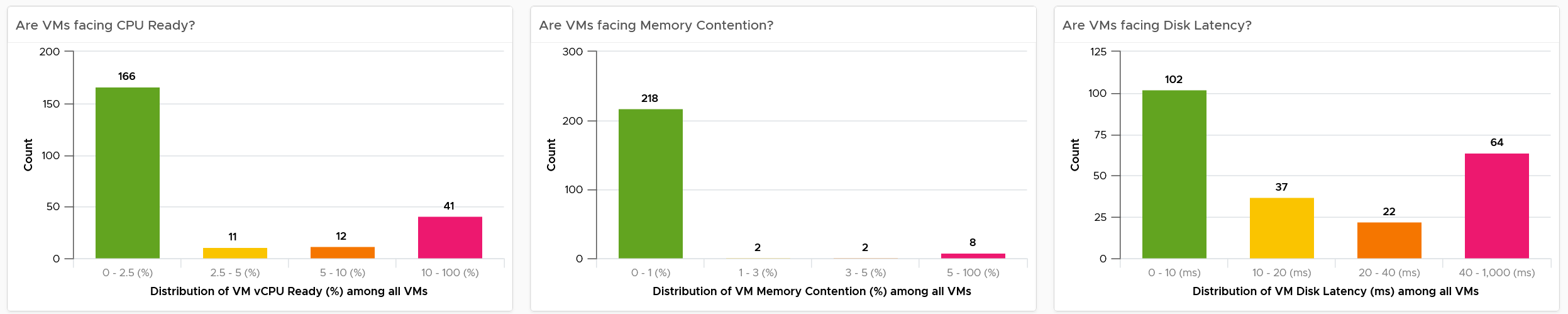
Each chart analyzes how the VMs are served by the cluster. For each VM, it picks the worst metric in the last 24 hours. By default, VCF Operations collects every 5 minutes, so this is the highest value among 288 datapoints. Once it has the value from each VM, the bar charts put each VM in the respective performance buckets. The threshold in the buckets consider best practice, hence they are color coded.
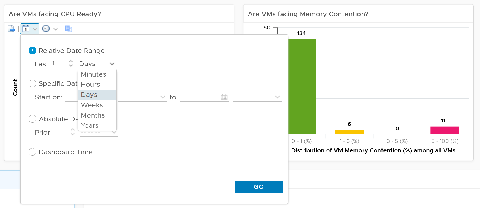
You can change the time period to the period of your interest. The maximum number will be reflected accordingly.
The value is actually the worst 20-second within the 5-minute. Yes, it’s using the peak metrics, covered here in the Troubleshooting Metrics section. Why do I choose the 20-second average instead of the 5-minute average, considering your SLA should be based on 5-minute average?
It’s to give you a heads up. Leading indicators. Otherwise, you get something like this:
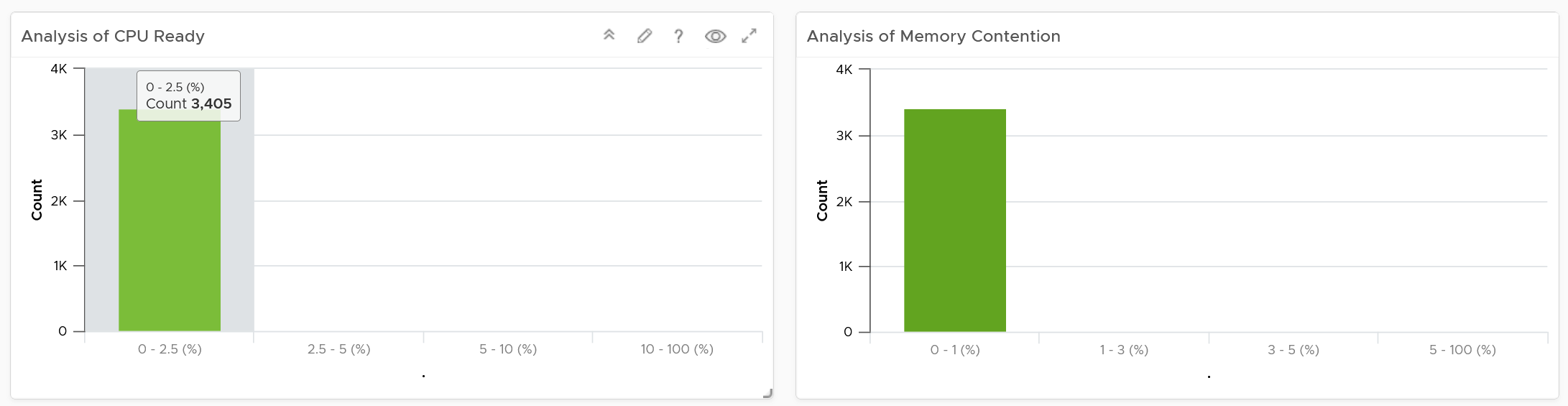
Yes, the above shows 3405 VM. And not a single one of them has CPU Ready > 2.5% and memory contention > 1% in the last 24 hours. It’s not so useful in giving you early warning.
For your mission-critical environment, you should expect that all the VMs are being served well by the IaaS. So expect to see green on both distribution chart. If they are, there is no need to analyze further.
For development, you may tolerate a small amount of contention in both CPU and Memory as you need to balance cost.
If it makes more sense for you, change the filter from data center to cluster. Once you are listing cluster, you can then add the cluster performance (%) metric and sort them in an ascending order. This way the cluster that needs immediate attention is on top.
You can click on any of the bar to see the list of VMs under that performance bucket. From there, you can select a VM and have its KPI automatically shown on the lower section of the dashboard.
Multi-VM Analyzis
When you select a data center from the table, the table listing all the VMs in the data center is automatically shown. A portion of the table is shown below.
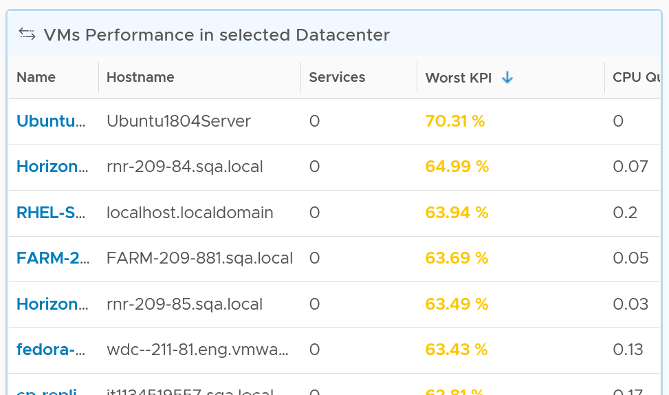
The table shows the hostname as known by Windows or Linux. This is the name that application team or VM owner know, as they may not be familiar with the VM name.
The table is sorted by KPI column, directing your attention to the VMs that are not performing. The column is based on the super metric VM KPI (%), which we covered in Part 2.
BTW, if the KPI is blank, that means at least one of the metrics is blank. Use the dashboard to check which metrics are blank. If not all the Guest OS metric appear, then the VMware Tools is likely outdated.
The rest of the columns show contention metrics. Notice there is no utilization metrics at all. You should know why by now 😊
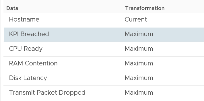
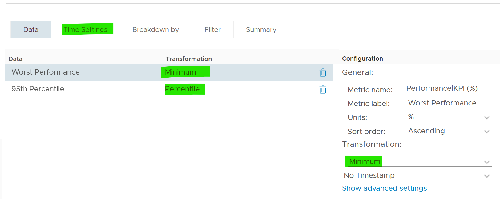
Because the goal is proactive monitoring, as opposed to reactive troubleshooting, the metrics show the worst value instead of the average of the monitoring period. You can see from the following screenshot that the Transformation is set to Maximum, instead of Current.
For example, the CPU Ready counter shows the highest CPU ready within the period you specify. The default period is 24 hours, as the dashboard is designed to be part of the daily SOP. The reason 1 week is not chosen is the performance > 24 hours are likely to be less relevant.
Unlike the bar chart, this shows average of 5 minutes. The reason is we’re showing VM, and the VM SLA should be based on 5-minute average.
If you have screen real estate, group the VMs by cluster. In this way, you can quickly see if the problem is in particular cluster. Avoid grouping by ESXi as VMs may relocate.
Per-VM Analyzis
Once you’re down on a specific VM, you need to check both at the Guest OS layer and the VM layer. The following are Windows or Linux metrics to check.
| Metric | Optimize or Fix |
|---|---|
| Runaway process | The process goes into an infinite loop. Remedy is to kill it. In a large VM with many vCPU, this can be impossible to detect if the process is only consuming 1 CPU. |
| CPU Run Queue | Ideally, measure both the queue per CPU and the total queue. A 64 vCPU having 1 queue on each CPU means 64 processes were waiting. Performance could be affected. If utilization is high, then add vCPU. If utilization is not high, check if there is imbalance among the vCPU. Some applications may need to be configured to use all vCPU. |
| CPU Context Switch | IO causes context switch. If utilization is not high, reduce vCPU to minimize ping pong. More on CPU Context Switch is covered here. |
| Network latency | Change driver. More CPU to process network packets |
| Disk Queue Length | Problem could be inside the Guest or outside. Check if VM outstanding IO and VM disk latency is high. If not, then the issue is with Guest OS, not underlying infrastructure. Check if Guest OS latency is high. If yes, change SCSI driver to PVSCSI is one good remediation. If not, leave for now. |
| Driver Queue | Storage driver such as LSI Logic and PVSCSI has their own queue. If you know how to get the value, let me know. |
| Network Buffer | The ring buffer in the virtual NIC card. This can get filled up. |
| Memory Page Fault | Look inside the Guest OS and Process to see if it’s memory settings aligns with configured RAM. It’s common for JVM or DB to have memory settings that don’t match Guest OS configuration. Need Telegraf agent as it is not tracked by Tools. |
At the vSphere VM level, these are the metrics to check:
| Metric | Optimize or Fix |
|---|---|
| CPU Ready | Check config: Limit, Shares (also relative to other VM, not just its absolute amount) Check if it’s caused by resource pool Check ESXi utilization. A sign of ESXi struggling is other VMs are affected too. Check vMotion stun time (requires Log Insight) |
| CPU Co-Stop | As per CPU Ready, but note that VM with many CPU has higher chance of experiencing co-stop. If VM utilization is not high, reduce vCPU. |
| CPU Overlap | VM has high IO (disk or network), causing its own CPU to be interrupted for IO by VMkernel. Check if ESXi cores utilization is balanced. |
| RAM Contention | High ESXi memory utilization. Check ESXi Balloon, ESXi reservation. Check vMotion stun time (this requires Log Insight) |
| CPU IO Wait | High disk latency causes high CPU. Check for snapshot as snapshot requires double IO processing. |
| Network Dropped Packet | After verifying this is not a false positive, check for packet retransmit and underlying infrastructure. If packets are broadcast packets it might be dropped by the network. |
| Network retransmit | When a packet is loss, it needs to be retransmit (unless it’s UDP protocol). |
| Network latency | Latency caused by hops. Optimize the traffic. Note this needs Aria Network Insight |
| Disk Latency | Check VM outstanding disk IO Check if IOPS Limit has been placed. |
| Outstanding Disk IO | Check underlying ESXi or datastore |
| vMotion | Check DRS automation setting If the actual vMotion is too long, check if the active memory. You can use Log Insight to see the throughput. For stunned time, you need Log Insight as it’s not shown in the UI. |
VM KPI (%)
Choose a VM of your interest from the table.
All the CPU, Memory, Disk and Network performance charts are automatically shown, each widget showing the KPIs of that VM.
CPU Metrics
The CPU panel sports the following 8 metrics. Review them. Do you know why we pick these 8, and show them in this specific order?
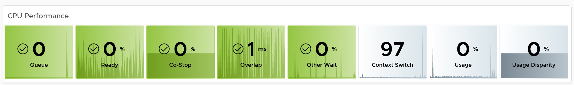
The metrics are shown in the order of importance or urgency. The most important one for Guest OS is CPU Run Queue, while the most important for VM is CPU Ready.
Peak CPU Run Queue. Ideally we divide by the number of vCPU. Create a super metric for that. Good practice 😉
Peak vCPU Ready (%) tracks if any of the virtual CPU is experiencing high CPU Ready. It takes the highest among the vCPU. This can be useful in large VMs with many vCPU.
Why are the last 3 metrics are not color coded?
-
CPU Context Switch actually impacts performance. I’m just unsure what to put as it varies among customers. For your environment, set it as appropriate after profiling.
-
The CPU Usage (%) is shown grey as it actually has negative corelation with performance. Grey is chosen as it also conveys wastage. Resources that are hardly utilized may not mean performance is at peak. In fact, it could be the opposite. If a VM just need 1+ vCPU, configuring it with 2 CPU will result in better performance than configuring it with 20 CPU.
-
The CPU Usage Disparity (%) metric. Color code it based on your expectation
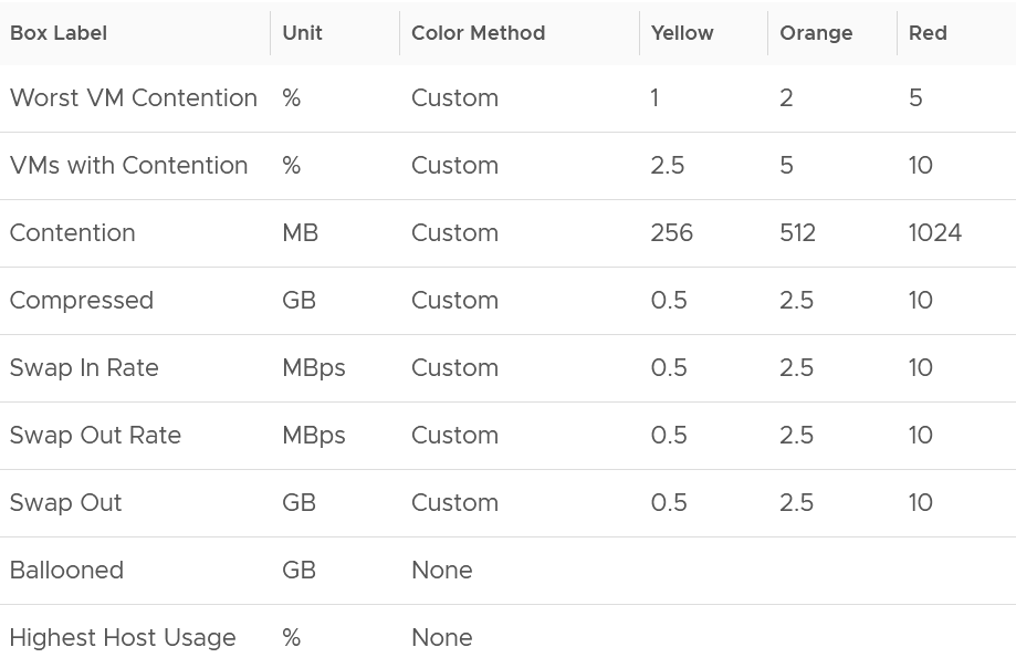
The following screenshot shows the threshold used:
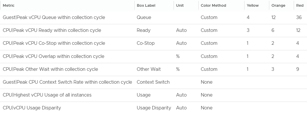
The Guest OS CPU Queue has a high threshold due to false positive. For details, see the metric documentation in this book.
The Other Wait metric has a high threshold due to false positive. For details, see the metric documentation in this book.
Yes, they are based on the 20-second peak. Read more behind the 20-second metrics here.
The chart also displays the present value, so you know if the problem is still happening or not.
Why none of the metrics have decimal point?
I round all the counter because the decimal is not significant and clutters the dashboard with no real value. There is really no difference between 0.1% and 0.9% in all these metrics.
Why CPU Latency or CPU Contention and CPU System metrics are not shown? Refer to the metric chapter for the reason.
Why is CPU Swap Wait not shown? Its value is a subset of Memory Contention.
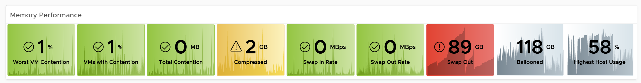
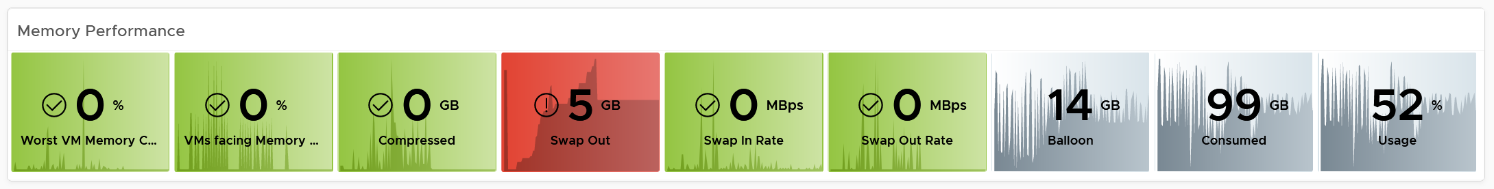
Memory Metrics
Now that you know how the widget is designed, let’s move content from CPU to Memory. Review the following screenshot.
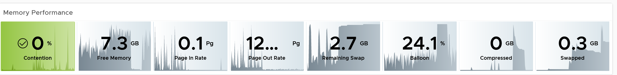
Why is contention the only color coded metric? Balloon, page in rate, page out rate, etc are not. See this example of where severe ballooning did not result in much contention at all.
Because memory is a form of storage. Most metrics measure usage of the disk space, not latency of access. Consider the disk space occupied. A utilization at 90% of the space is not slower than 10% utilization. It’s a capacity issue, not performance.
Why are the memory paging shown in color?
Because they are leading indicator and possible cause of memory performance within Windows or Linux.
Why is Balloon placed towards the end?
Because that’s a VM level counter. For memory, you want to measure at Windows or Linux level. The following shows the metrics we use. Guest means it’s coming from the Guest OS, not VM.
Why is ballooned, compressed and swapped not shown in color?
Because there presence do not mean the VM has performance problem. They are not metrics for VM performance. That’s a counter for the underlying ESXi and Cluster. As usual, refer to the metric chapter for details 😊
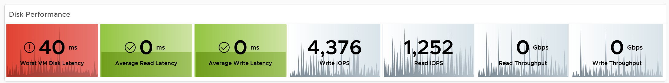
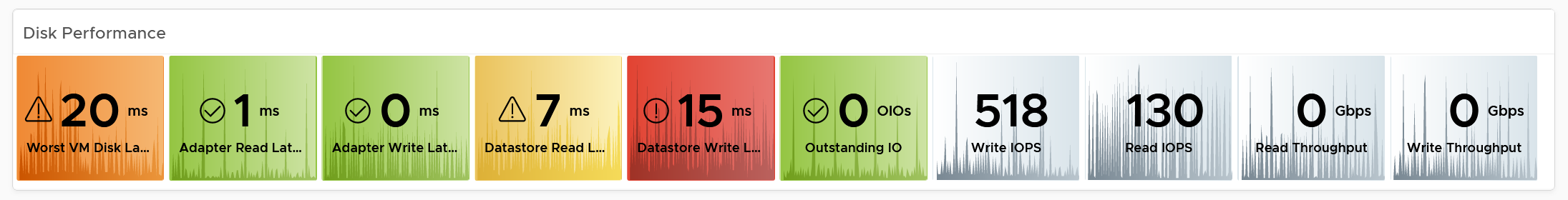
Storage Metrics
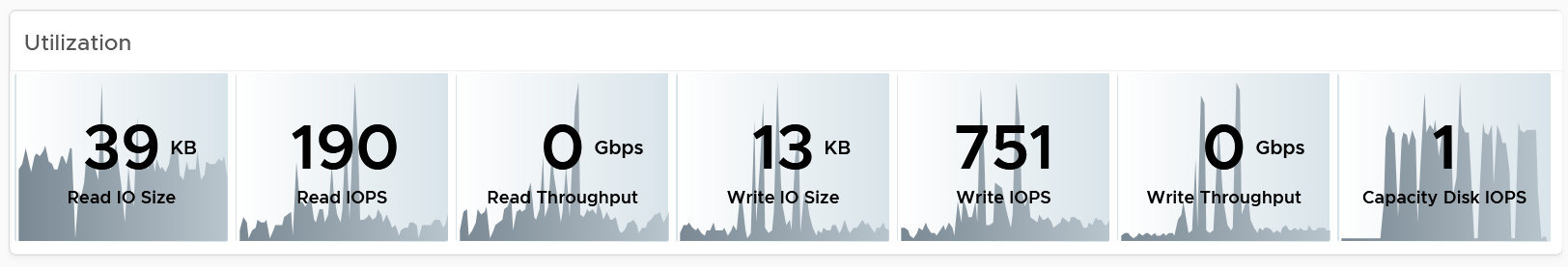
What do you expect to see for disk? What are the contention metrics, and what are the utilization metrics?
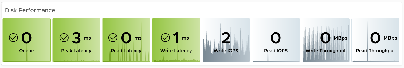
The most important one for Guest OS is Disk Queue, while the most important for VM is the Latency. The latency is based on the 20-second metric. It’s also the highest of read or write.
Peak Virtual Disk Read Latency (ms) and Peak Virtual Disk Write Latency (ms) track whether any of the virtual disks (either VMDK or RDM) is experiencing latency. This can be useful in large VMs with many virtual disks.
I put IOPS before throughput metrics as it’s more popular. Use Disk IOPS and Throughput together, especially for applications that use large block size. An IO with 250x block size (e.g. 1 MB instead of 4 KB) will generate equal throughput at 250x less IOPS, all else being equal.
For throughput, I use byte or bit as it’s the amount of disk space written, not the amount of data travelling in network line.
I use the following threshold. They are based on the profiling result documented in Part 2.
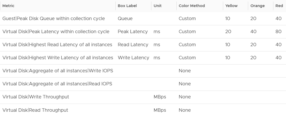
I round all the metrics to the nearest whole number. By now you know why 😊
Why is Outstanding IO metric excluded?
Read the description of the metric in Part 2 😉
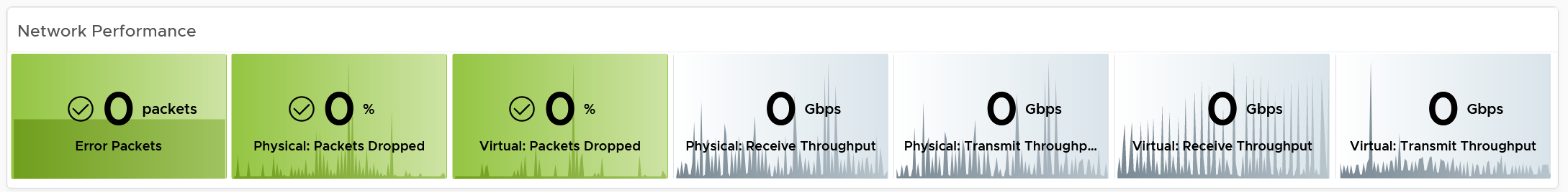
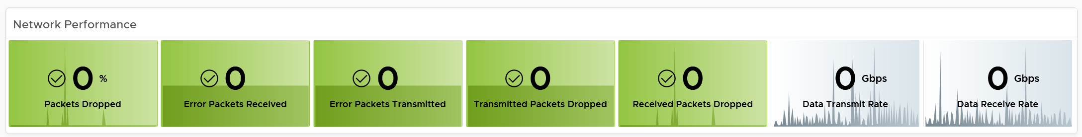
Network Metrics
The last component is Network. What metrics do you expect?
These are the metrics I use:
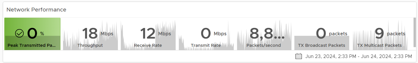
The Packet Dropped (%) formula is (dropped / (dropped + transferred Packets)) * 100%. In a rare case where there is no packet at all, the result shows undefined (blank). This is because the maths of 0 / 0 = undefined.
The following is the threshold I used:
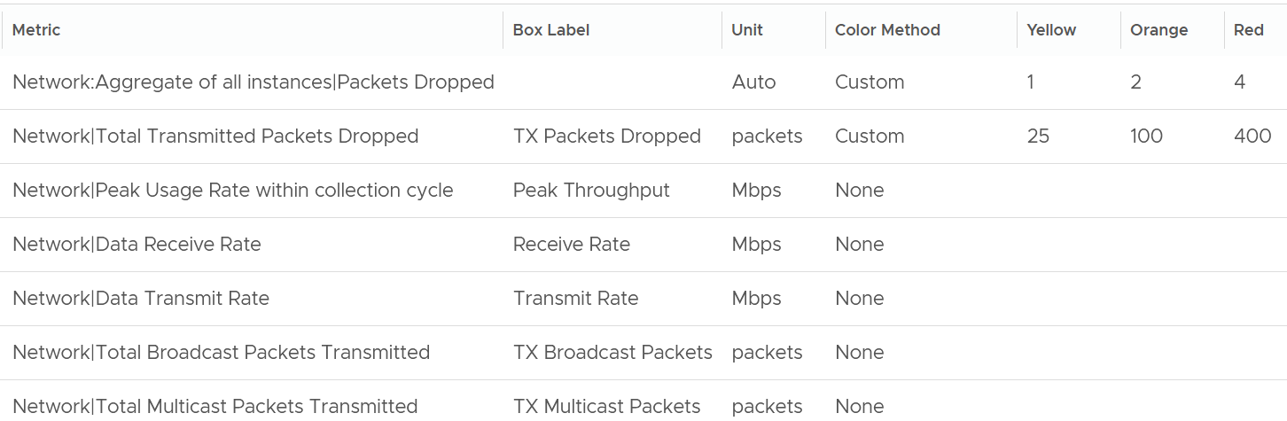
Why did I set the packet drop higher than I set in the super metric? It is in fact 2x higher.
The reason is this includes RX and TX. The RX tends to be several times higher, so setting it at 2x is actually conservative, relatively speaking.
Notice the missing counter?
There is no received packets dropped. The reason is false positive.
If it’s relevant to you, add the packets per second counter.
Broadcast packets and multicast packets metrics are added as most VMs should be unicast. If the number if high, investigate with the application team why the applications are behaving that way.
Alerts
The relevant alerts are also automatically shown. You can see the settings by editing the widget, and adjust them accordingly to fit your operational needs.
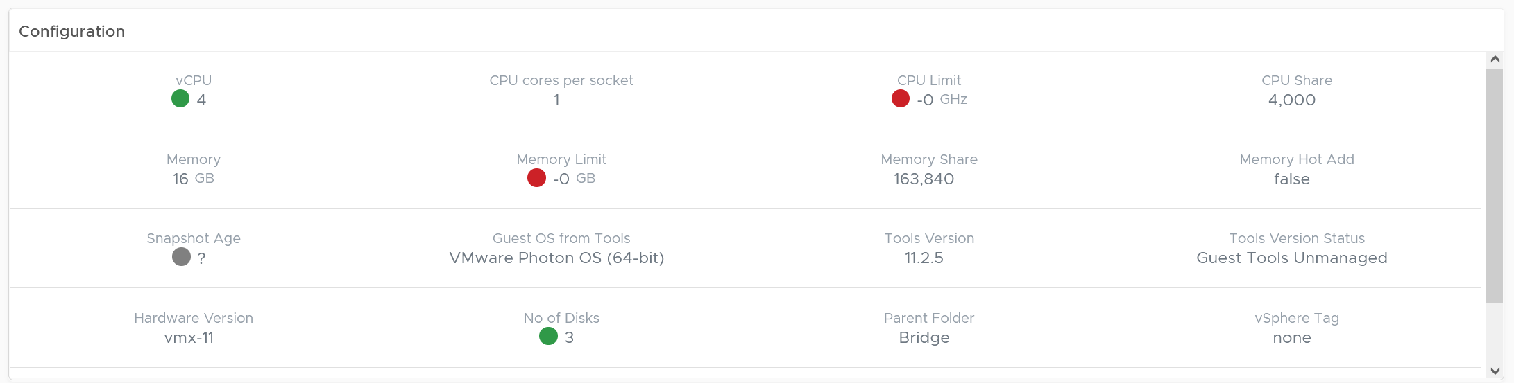
Configuration
This shows the relevant settings of selected VM. Customize as you deem appropriate.
Virtual Disks
A VM can have many disks, and it’s possible that these disks have different performance. The following table lists the individual virtual disks and their contention and utilization metrics. Both read and write are shown.
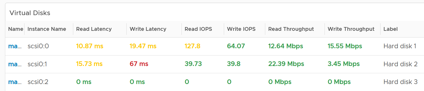
To see a trend over time, click on the VM object, and choose All Metrics.
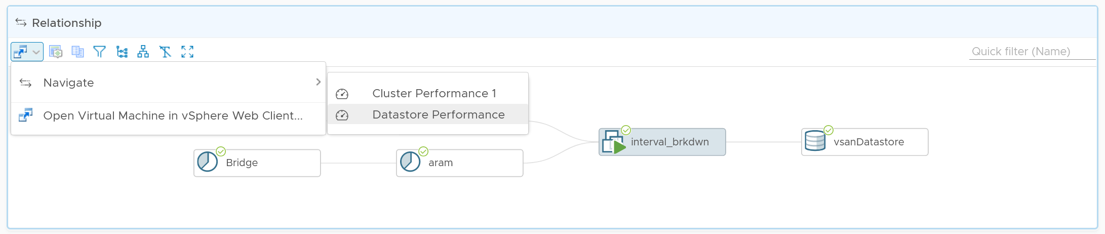
Relationship
From the VM, you want to navigate to the parent cluster or datastore. Use the relationship widget to navigate and auto select the associated cluster or datastore.
Heavy Hitters VM
IaaS provides four services, CPU, Memory, Disk, and Network.
-
CPU, Memory, and Disk are bound. A VM with 4 vCPU and 16 GB memory cannot consume more than this amount, the same applies to disk space. A VM configured with 100 GB disk space cannot consume more than that.
-
Network and Disk utilization are not bound. An active VM can consume all your network bandwidth, packet per second capacity and storage IOPS capacity.
The Storage Heavy Hitters dashboard forms a pair with the Network Top Talkers dashboard. To understand the IO demands in your environment, use them concurrently. If you are using ethernet based storage, storage traffic will run over the same physical network your network traffic is travelling.
Why not combine into 1 dashboard?
-
The users are different. Network dashboard may be required by Network Team, while storage dashboard by Storage team.
-
The remediation actions are different.
-
The customization is different. You extend each dashboard, going into physical array or NSX.
The dashboards are designed to help you analyze the impact of these VMs on your IaaS. It classifies the workload into two categories: short bursts and sustained hits.
Short burst last for a few minutes, while sustained hits can last much longer. A sustained hit that lasts for an hour can cause serious problems.
A heat map would enable us to visualize the data easier. However, it can’t show the past data, hence it’s not used. If you want see in heat map form, see the Live! Heavy Hitters dashboard.
Points to Note
-
add a line chart to automatically show the selected VM usage. Add the CPU usage also to see correlation between disk and CPU.
-
Group the VM by clusters of the same class of service (e.g. Gold), so you can see the profile for each environment.
-
For smaller environment, change the table from listing data centers to listing clusters.
-
For larger environment, add a distribution chart so you can see the spread of the metrics.
Compute Performance
This dashboard covers vSphere Cluster, ESXi host and resource pools, hence the generic name compute is adopted.
Design wise, while we can further add analyzis, I feel it’s not worth the cost of complexity. I understand the very large customers may want to add more analyzis. If you are one of those, drop me a note.
Overall Analyzis
2 color-coded trend charts are provided.
The first one gives the overall performance. Expect this to be steady, especially in a large environment.
The second one complements it by showing the count of clusters that are no longer in the green zone. If your problem is isolated, the first counter may miss.
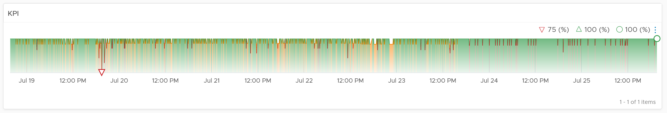
Average Performance
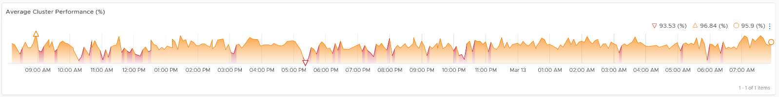
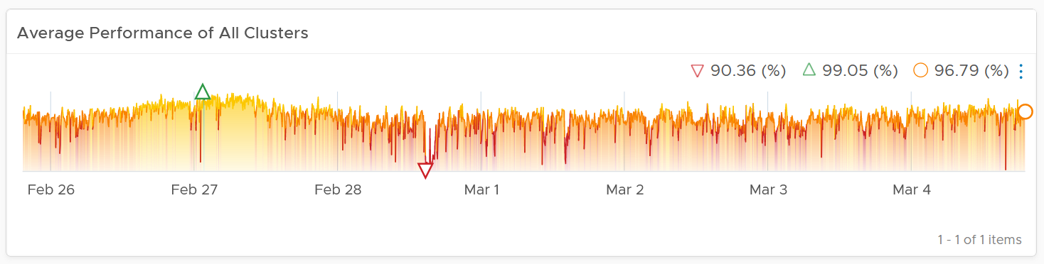
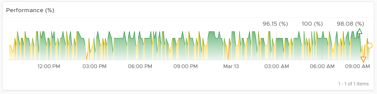
Look at the “Average Cluster Performance (%)” health chart at the top of the dashboard. In a high performing environment, where all the clusters are doing well, you will see something like this.
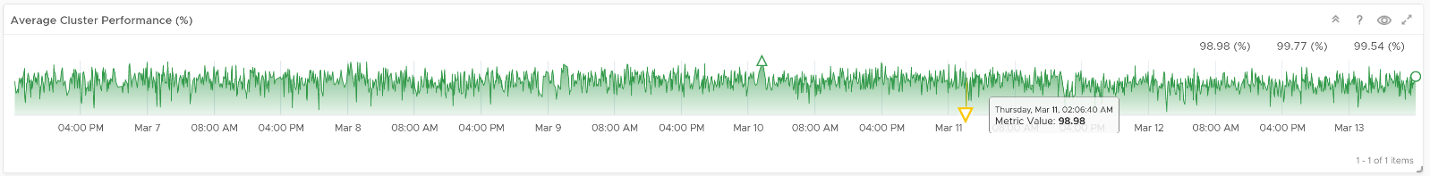
There was only one occurrence where the color is not green. At that time, the actual value is also relatively good.
In this case, all is good, and you may not need to look further.
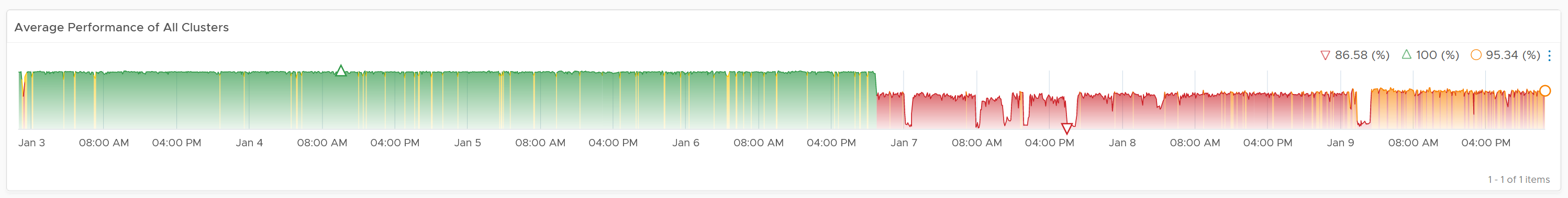
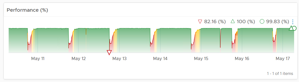
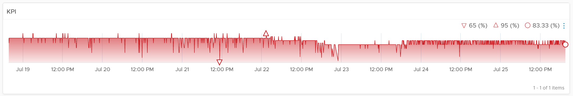
On the other hand, if the clusters are unable to serve the VMs well, you will see something like this.
The average among all the clusters is no longer green, with a few occurrences of reds. The good part is the value does not trend downwards. Check if this is normal in your environment.
As this KPI takes into account every single running VMs in your environment, the number should be steady, especially in a large environment. The analogy in real life is the stock market index. While individual stocks can be volatile on a 5-minute by 5-minute basis, the overall index should be relatively steady. A big drop is called a market crash and that’s not something you want in your environment. So a drop like the following warrants an immediate investigation.
The relative movement of the metric is as important as the absolute value of the metric. Your absolute number may not be as high you wish it to be, but if there have been no complaints for a long time, then perhaps there is no urgent business justification to improve it.
As the chart shows all the clusters, it uses the vSphere World object. This object is the parent of vCenter object, so it will show all clusters from all vCenter, making it suitable when you want to show everything.
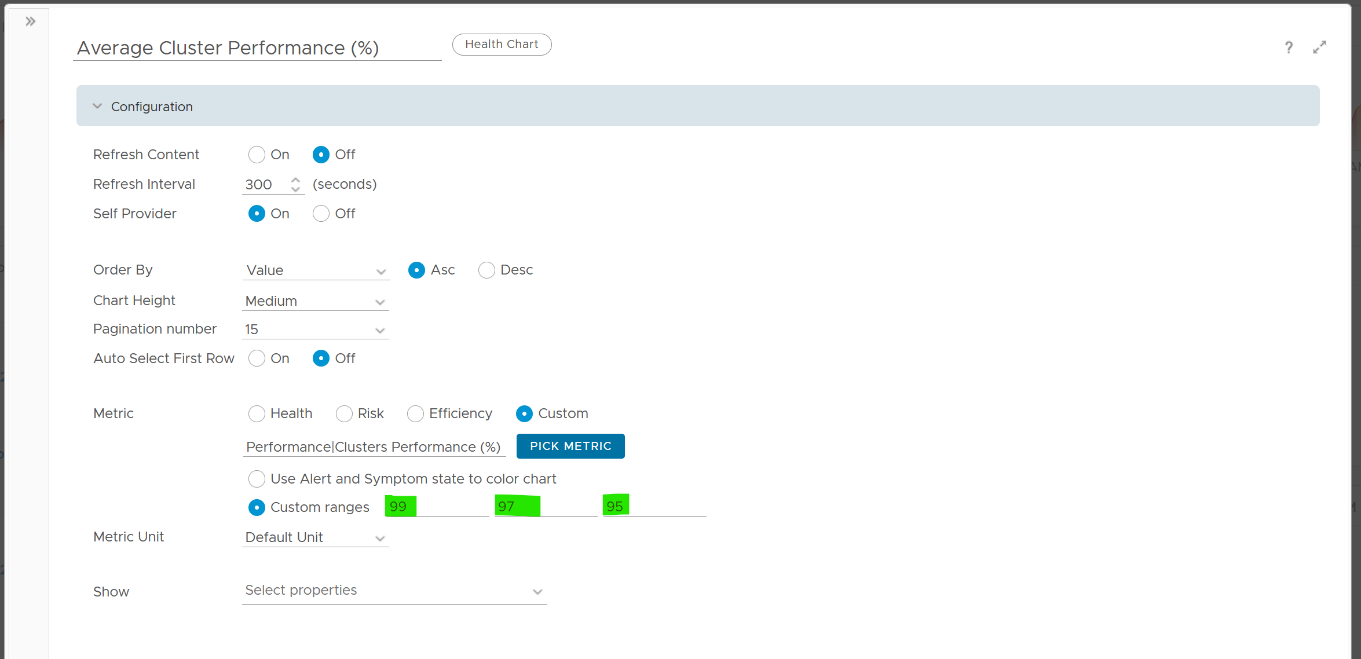
The actual metric used is Performance \ Clusters Performance (%), as shown in the following dialog box. This is the primary KPI for your entire IaaS. It plots how your IaaS is performing every 5 minutes, giving you the trend view of overall performance.
What is this metric based on?
It is simply the average of Cluster KPI \ Performance (%) metric. This performance metric in turn averages the VM Performance \ Number of KPIs Breached metric from all running VMs in the cluster. Hence a value of 100% indicates that every single running VM in the cluster is served well.
More details on the formula were covered earlier here as it’s an important foundation of IaaS performance KPI.
Non Green Clusters
This trend charts shows the number of clusters that are no longer in the green zone. Another word, the value of the Cluster KPI \ Performance (%) metric has gone down below 75%.
Review the following chart. What trend do you spot in the last 1 week?
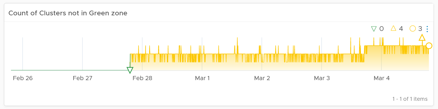
That’s correct, the number of clusters falling below green zone has gone up from 0 to 4.
Earlier, I wrote that this counter complements the first counter. The following chart is what you get from the 1st counter. Notice it’s hard to deduce that 3-4 clusters have fallen below the green zone. In this case, some clusters actually went up as we powered off their VMs, so the overall numbers remain similar.
Multi-Cluster Analyzis
If the chart is showing green, then all is good. If not, you want to know which clusters are not performing. This is where the Clusters Performance table comes in.
The table lists all the clusters, starting with the lowest performance. By default, it’s showing data from the last 24 hours as this dashboard is designed to be part of your daily SOP.
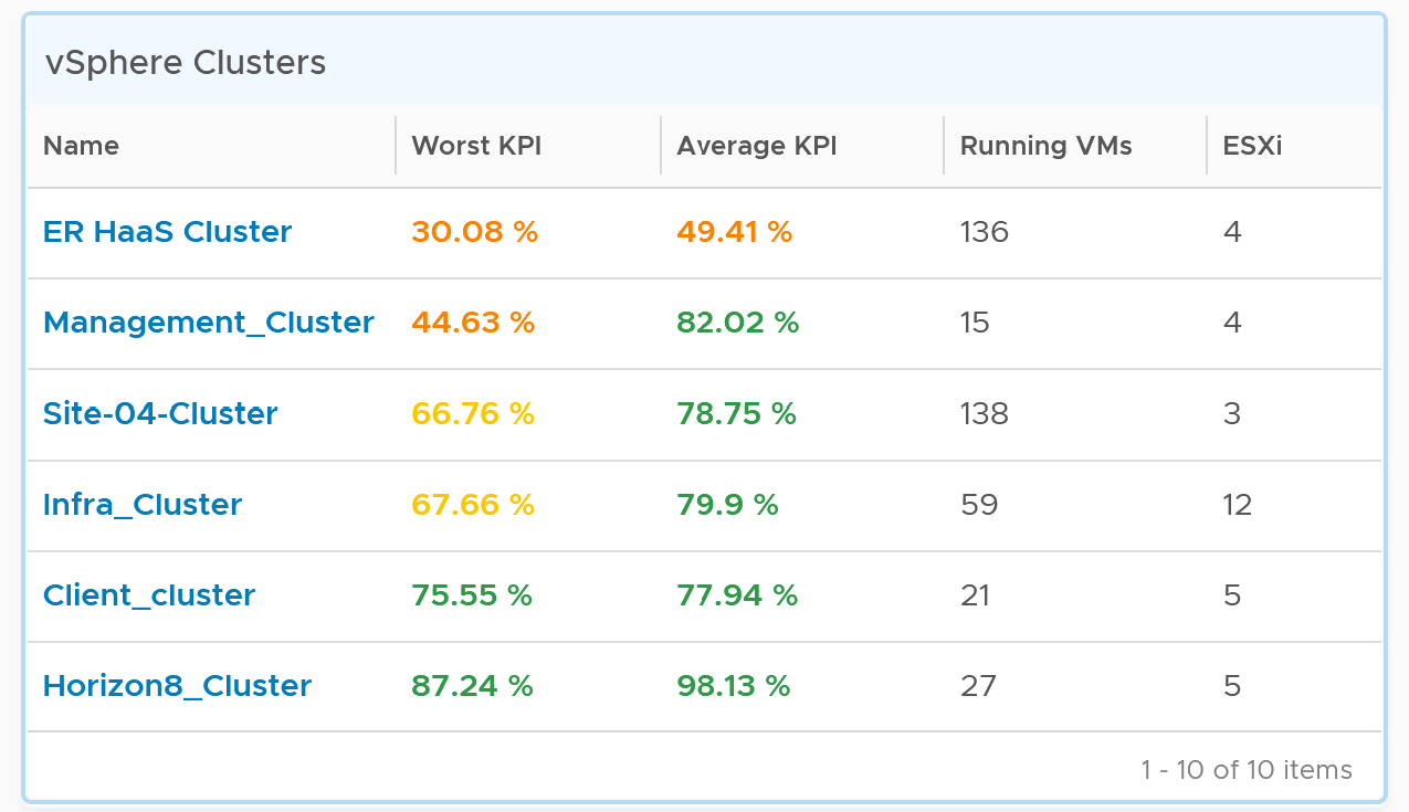
The Worst Performance shows the lowest number in the time period. As VCF Operations collects every 5 minutes, there are 12 x 24 = 288 data points in a day. This column shows the worst point among 288 datapoints.
For a very large environment with many clusters, add a grouping to make the list more manageable. Group it by class of service, so you can focus on the more critical clusters. You can then adjust the threshold accordingly. For example, add the column worst 1st percentile to complement the worst and the worst 5th percentile. This is useful if you have clusters with more than 1000 VMs, as 5th can be too late.
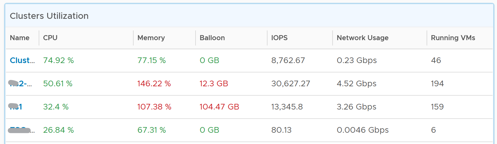
You may not be comfortable not seeing utilization metrics. Old habits die hard 😊. Modify the table to add key utilization metrics. The following table shows an example of metrics to add. Notice that I do not color code the disk IOPS and Network Usage.
Per-Cluster Analyzis
The table is accompanied by the health chart. It allows for quick toggling among clusters.
Select a cluster to see the trend over time, and see the Performance (%) health chart.
If the cluster has a daily or weekly pattern, increase the dashboard time duration to at least 1 week. Here is an example where the performance problem is clearly shown. You can see the cluster performance has regular drop in the last 7 days.
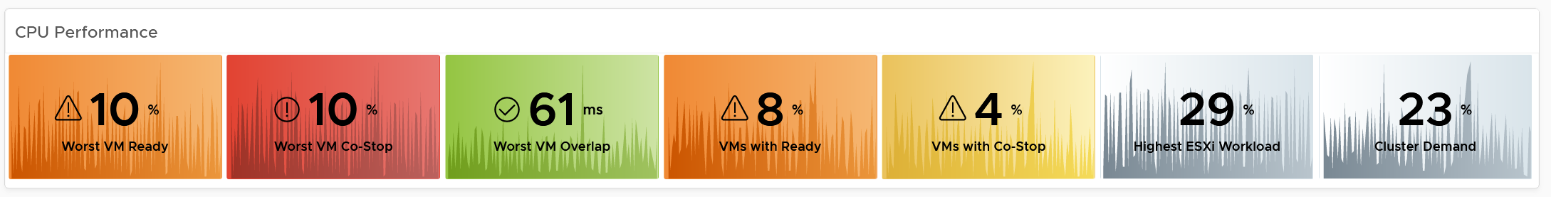
Once you determine the cluster to investigate, review the scoreboards. There are 5 of them:
-
CPU
-
Memory
-
Disk
-
Network
-
Others
They are shown separately, because you can have one problem and not the other. You may also drill down into a different path (e.g. into vSAN dashboard), and talk to different team (e.g. Network team).
CPU problems tend to be more common than Memory problems, due to lower overcommit ratio in memory in practice among customers. It is common to see customers do 4:1 CPU overcommit and only 2:1 memory overcommit. This conservative practice was due to the inherent higher value of memory counter. vSphere cluster shows high memory value as memory, giving the impression the actual utilization is high. And the reason for high value is modern Operating Systems like ESXi VMkernel uses memory as disk cache.
For performance, it’s important to show both the depth and breadth of the performance problem, as explained here. A problem that impacts 1-2 VMs requires a different troubleshooting process than a problem that impacts all VMs in the cluster.
The depth is shown by reporting the worst among any VM counter. So the highest value of VM CPU Ready, VM Memory contention, VM Disk Latency among all the running VMs are shown. If the worst number is good, then you do not need to look at the rest of the VM.
A large cluster with thousands of VM can have a single VM experiencing poor performance while >99.9% of the VM population is fine. The depth counter will not be able to report that most VMs are fine. It only reports the worst. This is there the breadth metrics comes in.
The breadth metrics report the percentage of the VM population that is experiencing performance problems. The threshold is set to be stringent, as the goal is to provide early warning and enable proactive operations.
CPU Metrics
This is the first of a series of performance scoreboards.
There are 3 metrics measuring the depth of the problem:
-
Worst CPU Ready among all the VMs in the cluster.
-
Worst CPU Co-stop among all the VMs in the cluster.
-
Worst CPU Ready among all the VMs in the cluster.
CPU Ready is the primary counter. Do you why CPU Contention is not used? See CPU Contention metric in Part 2 of the book.
CPU Co-stop is included, but placed at lower priority than Ready because high Co-stop does not mean the ESXi is struggling to serve the VMs. Co-stop can be reduced by right-sizing an oversized VM, so the remediation action is not always on the ESXi Host. CPU Overlap is included as it can happen when there are many active VMs in the cluster.
CPU Overlap is included as it indicates interrupts. A running VM was interrupted because VMkernel needs the physical core to run something else. A high and frequent number of interruptions is not healthy. This can also impact the VM performance. It’s placed third as the value tends to be small.
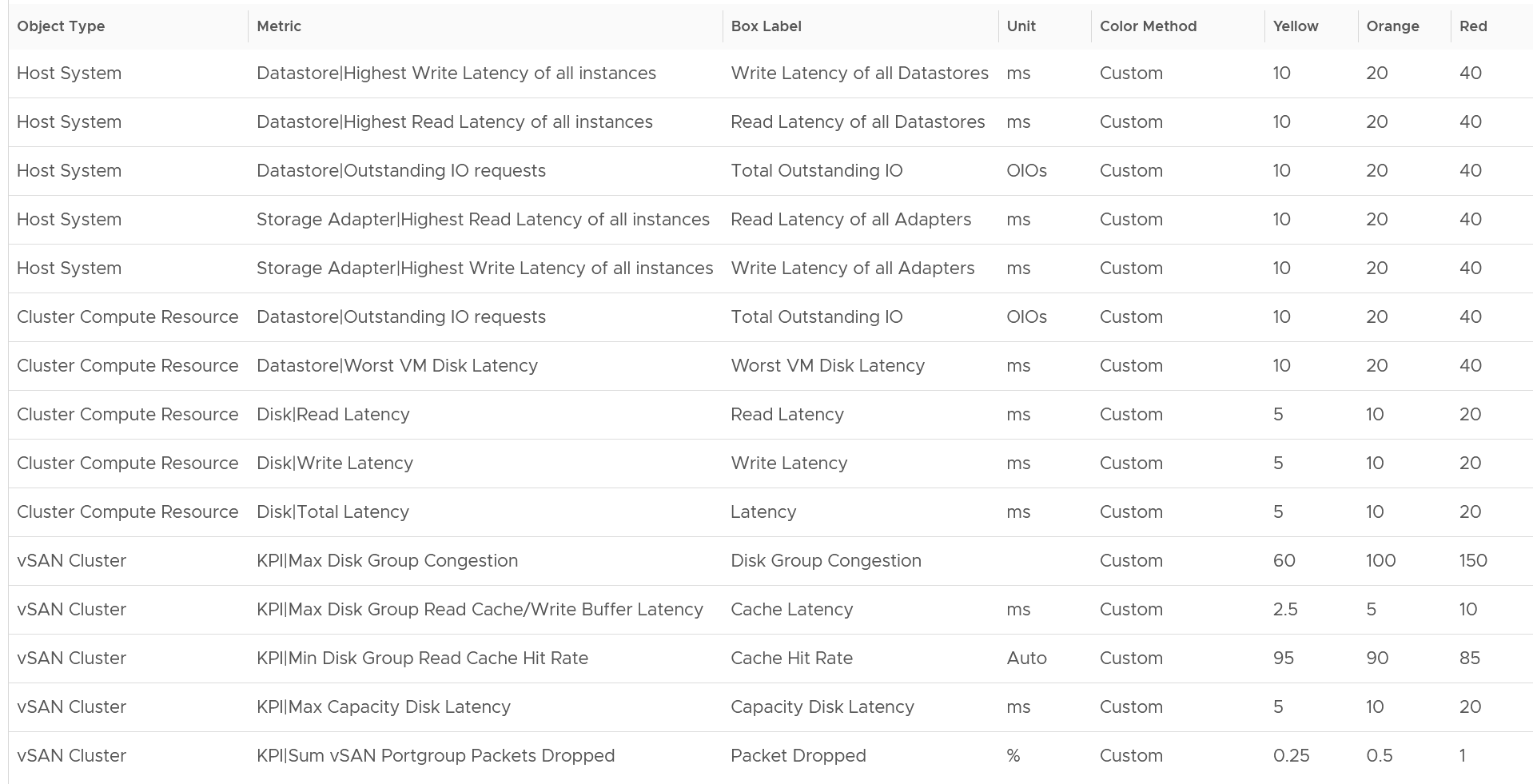
Here are thresholds used.
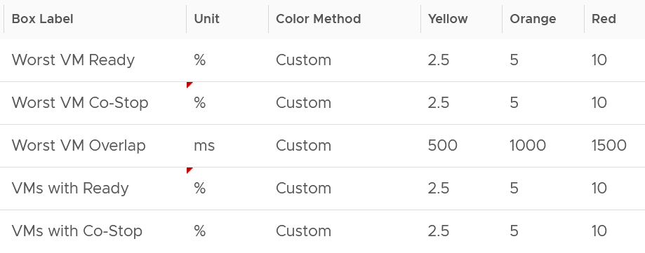
If you find that the CPU Co-Stop values in your environment is much better, adjust it accordingly.
Take note that the Workload metric can exceed 100% because it’s demand / usable capacity * 100. So this could happen if you have 4 hosts in a cluster with each host running at 100% demand and admission control is set to 50%.
If your cluster has many resource pools and Host to VM Affinity, create a super metrics to track the gap between highest and lowest CPU usage among ESXi hosts in the cluster. The reason is imbalance is pretty common, especially in large clusters with many hosts or VMs. There are many settings that can contribute to it (e.g. DRS settings, VM Reservation, VM – Host Affinity, Resource Pool, Stretched Cluster, Large VM).
Memory Metrics
Expect memory utilization to be higher than CPU, as it’s a form of cache. The Memory Consumed counter is used, as it’s more appropriate than the Memory Active counter. If active is low, no need to upgrade RAM as Consumed contains disk cache. For me, it’s fine for Consumed to be 99% so long RAM Contention is 0.
The high utilization metrics are explicitly shown. Balloon, Compressed, Swapped. Notice they can exist even though utilization is not even 90%, indicating there was high pressure in the past. If you look at only utilization, you’d think you are safe!
I use the following settings for the threshold. What do you notice?
The threshold for contention is much lower than the threshold for other metrics. This is because contention is the only performance metric. The rest is secondary, playing supporting role. You can have 10 GB compressed, so long they are not used, the VM does not experience delay.
Storage Metrics
The disk IOPS is split into read & write to gain insight into the behaviour. Look at the values for that cluster. Do they match your expectation?
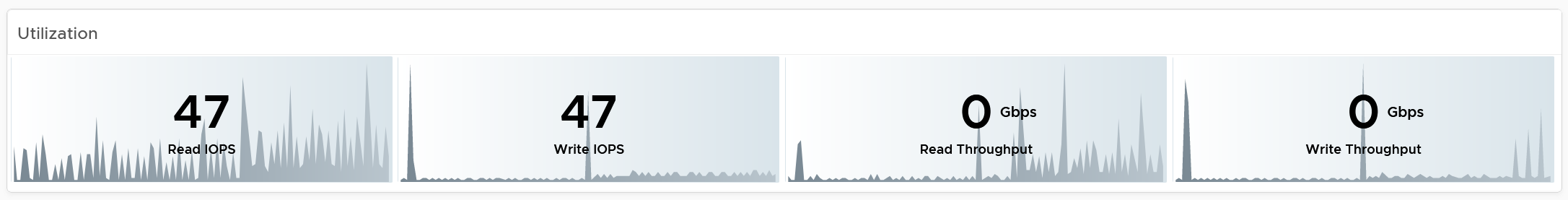
For throughput, why are the unit set at Gbps? Why not GBps or Mbps?
Because we’re referring to IO commands sent down the cable (your DC is not wireless, yet!). Your ethernet cable or FC cable use bit, such as 16 Gbps or 32 Gbps.
Mbps is too small for a cluster. A cluster doing useful work should easily exceed 1 Gbps as it’s just 128 MB/s. If you have distributed storage like vSAN, you can very well exceed 10 Gbps.
If you use VMFS datastores, add the disk contention metrics such as Bus Reset and Aborted Commands. You should expect they return 0 at all times.
Network Metrics
For network dropped packets, there are 2 types: physical (ESXi) and virtual (VM). The physical counter is used as that better represents infrastructure problems. The VM counter may suffer from a false positive. I recommend you customize this dashboard and add it anyway, for completeness.
Expect the network error 1% and dropped packet to be 0 most of the times, if not always. If it’s not, analyze to see if there is any patterns across all ESXi Hosts, and bring it up to your network team.
The network throughput is split into sent (transmit) and received to gain insight into the behaviour. Plus, the total usage can be misleading because it sums send and received traffic. In reality the network pipe is 1x for each direction (due to the full duplex nature of ethernet), not 2x shared by both.
Other KPI Metrics
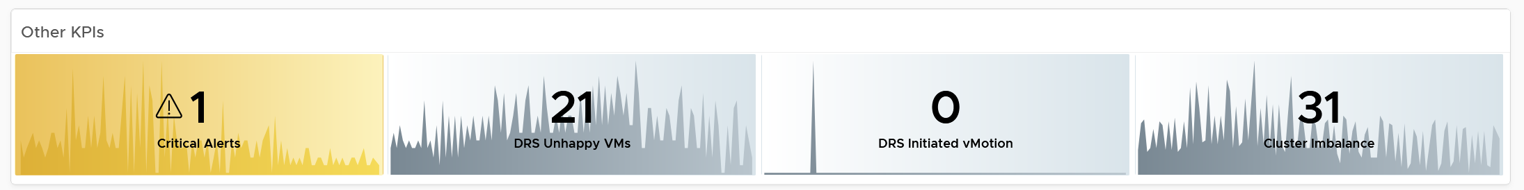
The vMotion line chart is added as a high number of vMotion can indicate the cluster load is volatile, assuming the DRS Automation level is not set to the most sensitive setting.
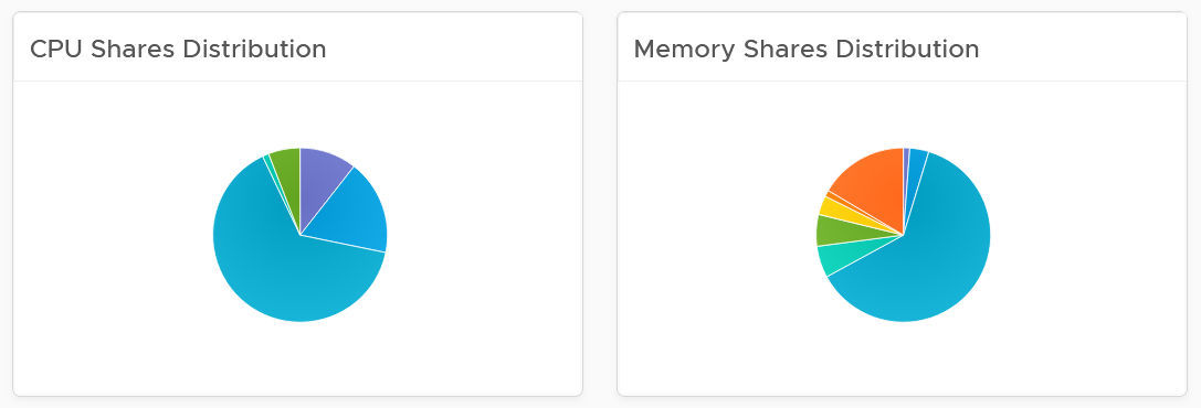
VM Shares
One common root cause for uneven performance problem is uneven shares. This is easy to make a mistake, as shares are relative. So when you see many slices of the pie, ask yourself why you need that many. Each slice should correspond to a Class of Service. So the entire cluster is serving 1 class, then you should see a simple circle with no pizza slice.
Resource Pool Analyzis
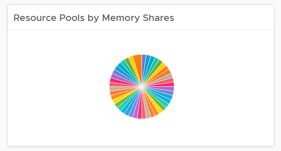
Resource Pool is another common reason behind uneven VM performance. They can also get complicated as you can cascade resource pool. The following example shows a cluster with way too many resource pools. This alone will make performance management difficult.
The second cluster has 4 resource pools. They are sized by their respective share. A pool with 2x share will have 2x the size. With that in mind, can you spot a problem?
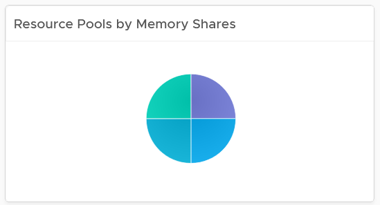
Yes, they are of equal share. What’s the point of having resource pool when they are the same share? It looks like a common mistake of using resource pool as folder.
The dashboard also provides a table listing all the resource pool.
You can navigate to the VM performance dashboard. It will show the VMs in the selected resource pool.
ESXi Analyzis
At the end of the day, a cluster is just a collection of ESXi. The performance can be caused by uneven performance among the member hosts. You can drill down from cluster to ESXi. The following table lists all the ESXi hosts in the cluster, sorted by the worst performance in the last 24 hours.
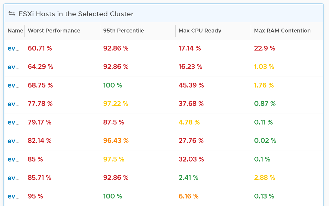
If the table is all showing green, then there is no need to analyze further. The reason 24 hours is chosen instead of 1 week is the performance > 24 hours ago are likely to be irrelevant.
You can change the time period to the period of your interest. The maximum number will be reflected accordingly.
The table helps you quickly compare the performance of each ESXi. You can also see the performance over time, to see a trend. For example, here is the performance of one of the hosts.
Another ESXi on the same cluster is showing a different experience. What does it tell you?
Yes, there is imbalance. A cluster is meant to be balanced, if you enable DRS. The above proves that something has constrained DRS ability.
Just like the cluster KPI, you can also see the KPI of a host. They are similar to the cluster, so to avoid duplication, I’m only covering the difference.
CPU Metrics
An ESXi typically has a few dozen physical cores, which take turn to run a few dozen VMs. This could create imbalance among the cores. The metric Highest CPU Core Usage tracks the highest utilization among the cores. If this number is consistently near 100%, that indicates at least 1 core is always busy. If this number if much higher than the Usage (%), that indicates imbalance.
Memory Metrics
For metrics where the cluster is the sum of its ESXi, the threshold used for ESXi is lower. For example, the red threshold used for cluster for compressed is 10 GB, while the threshold for individual ESXi is 2 GB.
Storage Metrics
It’s likely that the ESXi hosts in a cluster will have different disk IOPS pattern. They could be running VMs with different purpose. Even if all the VMs are the same (e.g. they are all from the same VDI pool), the way the users use the applications are different.
For ESXi, we show both the datastore level and adapter level. Why is that so?
Review the Storage Metrics chapter for the detail. In short, an ESXi can mount datastore and non datastore (e.g. RDM) via its storage adapter.
Network Metrics
Configuration
Certain settings such as power management and hyper threading can impact performance. The configuration widget shows the relevant property of a selected ESXi Host.
VM Analyzis
Selecting a cluster or ESXi will automatically list the running VMs. Use this table to check if the cluster or host performance problem were caused by VM configuration and usage. Note that it is possible that the VM was not on the same host at the time of problem, due to vMotion.
To drill down into a particular VM, select it and click the double arrow before the widget title. Choose the VM Performance dashboard.
The table is color coded for ease of analyzis, as you can have >1K VM in a cluster. Tailor the threshold to your environment.
Each of the column is showing the maximum value of the time period, so you can spot even if there is a short burst.
Datastore Analyzis
The list of shared datastores accessible by hosts in the cluster is shown. Take note that if your design has M:N relationship between clusters and datastore, then the numbers at datastore level is a number from all clusters.
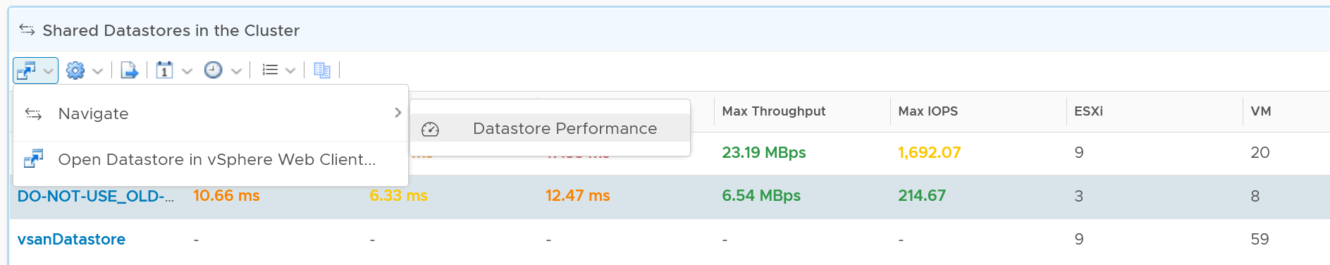
You can also drill down into the selected datastore.
Storage Performance
Use the Datastore Performance dashboard to view performance problems related to storage such as high latency, high outstanding IO, and low utilization. This dashboard is designed for both VMware administrator and Storage administrator, with the goal of fostering closer collaboration between the 2 team.
Local datastores are treated separately, as they have their own use case.
Overall Analyzis
The three bar charts provide the overall analyzis of the datastore performance in a given vCenter DC or World. They work together to give a better insight. Just like other performance charts, the value shown in the worst value during the time period.
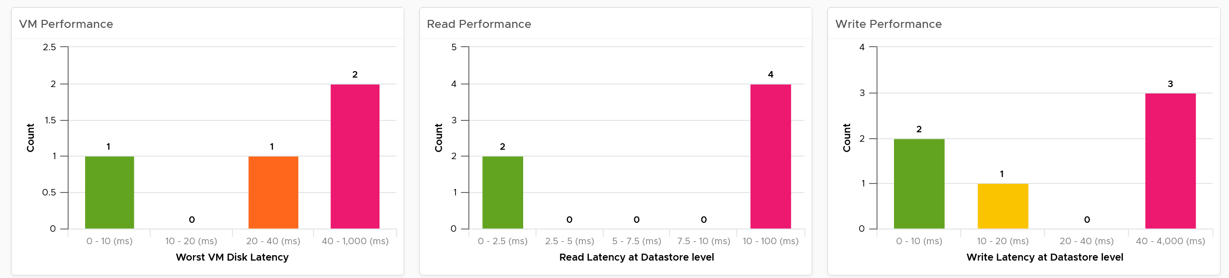
The first one shows how many VMs experience what kind of latency. This is your primary chart as it’s measuring at VM level. The next two charts are measuring at datastore level, which means they are the normalized average of all VMs in that datastore. Expect the first chart to be higher than the last two.
Read and Write latency are shown separately for a better insight. The nature of read and write problem may not be the same so it’s useful to see the difference.
The dashboard does not have datastore clusters. If your environment use it, add a View List right after the list of data center, and have it also drives the Datastore Performance view list.
Datastore Analyzis
A table listing all the shared datastores in the data center or vSphere World will also be automatically shown.
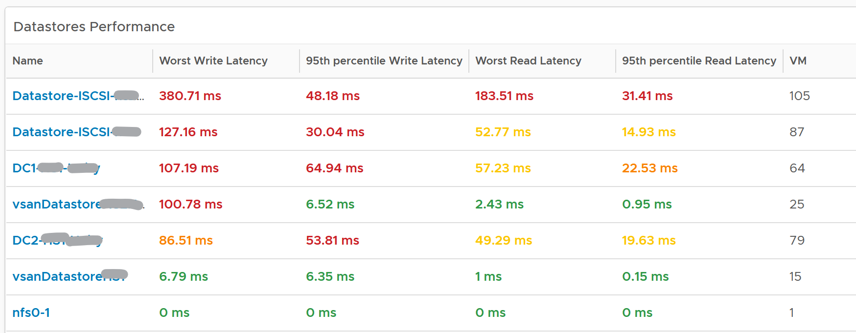
Since it’s a table, we can afford to show multiple numbers. Both the worst (peak) performance and 95thpercentile are shown. If the latter is close to the peak and it’s also high, then it’s a sustained problem. If the latter is low, then it’s a short duration.
The table is color coded. If you require a different threshold, adjust accordingly.
Select a datastore you want to troubleshoot. The relevant metrics and configuration will be shown automatically.
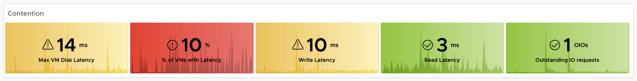
Its latency and outstanding IO is automatically shown.
Note the latency is the normalized average of all VMs in the datastore.
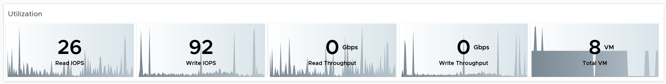
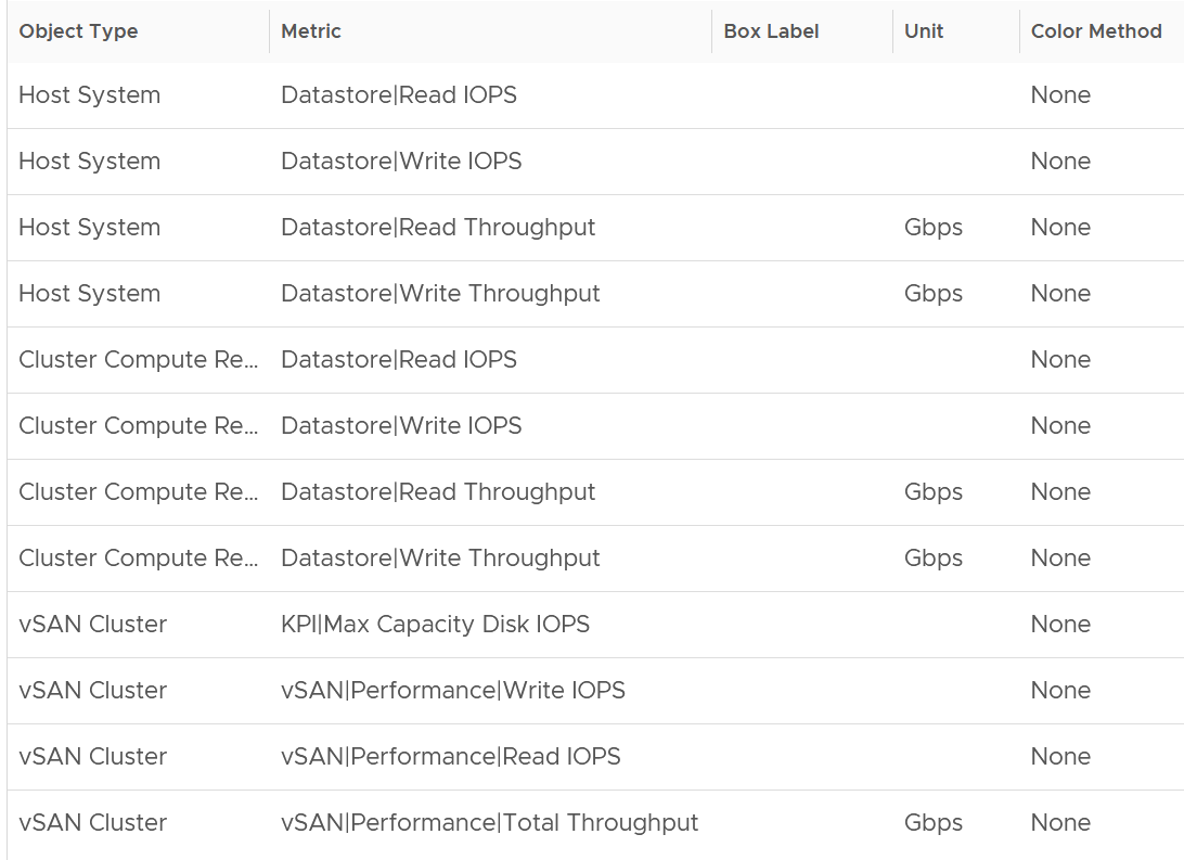
Its IOPS and throughput are also shown. These line charts are not color coded as it varies per customer. Edit the widget and add your expected threshold. It will make it easier for the operations team.
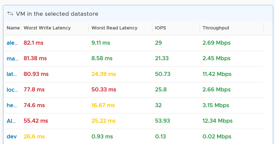
The list of running VMs in the datastore is automatically shown, with the relevant contention and utilization metrics.
VM Analyzis
Select a VM you want to troubleshoot. Its contention and utilization are automatically shown.
Note that this number is at the VM level. If you suspect one of the virtual disk has high latency, use the counter Peak Virtual Disk Read Latency (ms) and Peak Virtual Disk Write Latency (ms).
For utilization, here are the key metrics.
If you have many VMs with virtual disks on multiple datastores, add a View List widget to list the individual virtual disks. Use this list to plot the latency & utilization of individual virtual disk.
Relationship
From the datastore, what if you want to check which clusters or hosts are causing the problems? If it’s a vSAN datastore, what other relevant KPIs should you check?
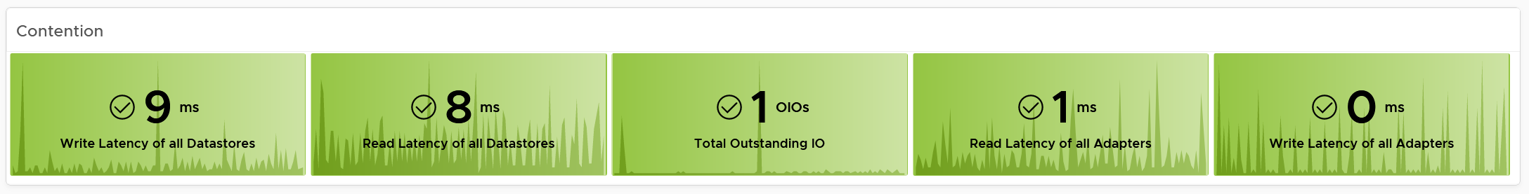
From the relationship widget, select either an ESXi, a vSphere cluster or a vSAN cluster. It’s relevant contention and utilization metrics will be automatically shown.
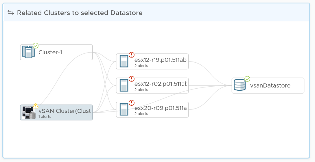
The following table shows the contention metrics for the 3 object types:
Just like all the contention metrics, they are color coded for ease of analyzis.
The following table shows the utilization metrics.
Just like all the utilization metrics, they are not color coded so not to give the wrong conclusion.
vSAN Performance
This dashboard is designed to complement the vSphere Cluster Capacity dashboard. It focuses on the storage and vSAN specific metrics, and does not repeat what’s already covered. It also does not list non vSAN cluster. That’s a long winded way to say you gotta use both dashboards to manage vSAN performance 😊
Cluster Analyzis
The table lists all the vSAN clusters, starting with cluster with the highest VM disk latency. By default, it’s showing data from the last 24 hours as this dashboard is designed to be part of your daily SOP.
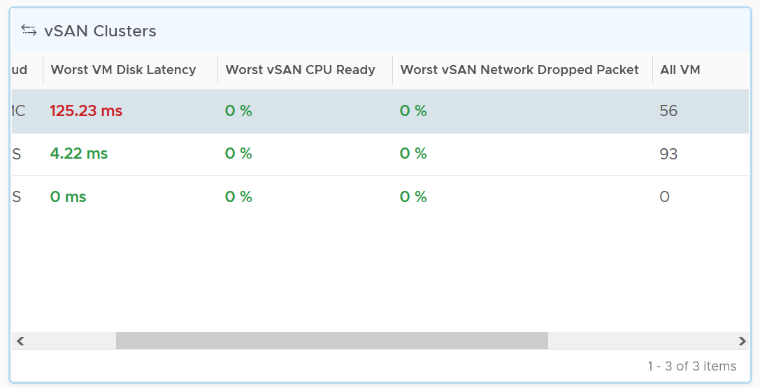
All Flash and Hybrid have different performance. Since there is only 1 benchmark, the all flash will perform better than hybrid, and that’s what you expect to see.
The first column shows if the distribution of disk latency experienced by all the VMs in the cluster. You should expect majority of the VMs to experience latency that matches your expectation. For example, in an all flash systems, the VMs should not be having >10 ms disk latency. If your vSAN environment is all flash, you may need to adjust the distribution bucket to a more stringent set.
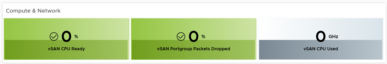
The second column shows if any of the vSAN kernel module has to wait for CPU. Expect this number to be near 0% and below 1%, as vSAN should not be waiting for CPU time. vSAN gets higher priority than VM World as it lives in the kernel space.
The third column shows if any of the vSAN cluster is dropping packet in the vSAN network (not the VM network). vSAN relies on network to keep the cluster in-sync. This number should be near 0% and less than 1%.
Select a cluster to investigate further. Its VM latency distribution will be automatically shown.
What can you conclude from the following 2 bar charts?
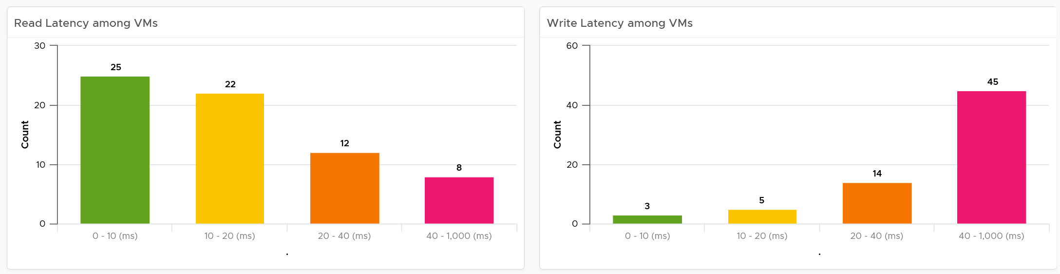
You can tell that most VMs in the selected cluster experience write latency, but not read latency. This helps you choose the right path of investigation.
The latency counter above is not at VM level. It’s at virtual disk level, meaning if a VM has 10 virtual disks, it takes the highest among any of them.
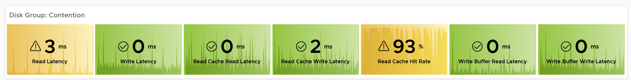
Contention
You can see various disk-related contention metrics of the cluster, as shown below.
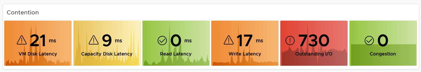
All these metrics are at vSAN cluster level, so there are some roll up involved. Why are the Read Latency and Write Latency not shown as the first metrics?
They are average. By the time the group average is bad, you could have half the population in worse situation. One way to overcome is to use a tighter threshold, as shown in the following table.
Read and Write are split as they tend to have different patterns.
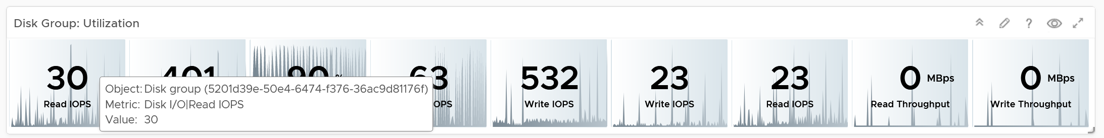
Utilization
As expected, we complement the contention metrics with utilization metrics.
Large block size can result in high throughput in relatively low IOPS. If you are seeing large block size when You are not expecting it, investigate which applications are the using it.
Max IOPS among capacity disk is shown as a disk has a limit, especially magnetic disk. A typical magnetic disk delivers ~200 IOPS, and this can be easily saturated.
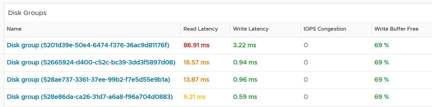
Disk Groups
You can drill down to the disk group level. All these metrics are the worst value among the disk groups.
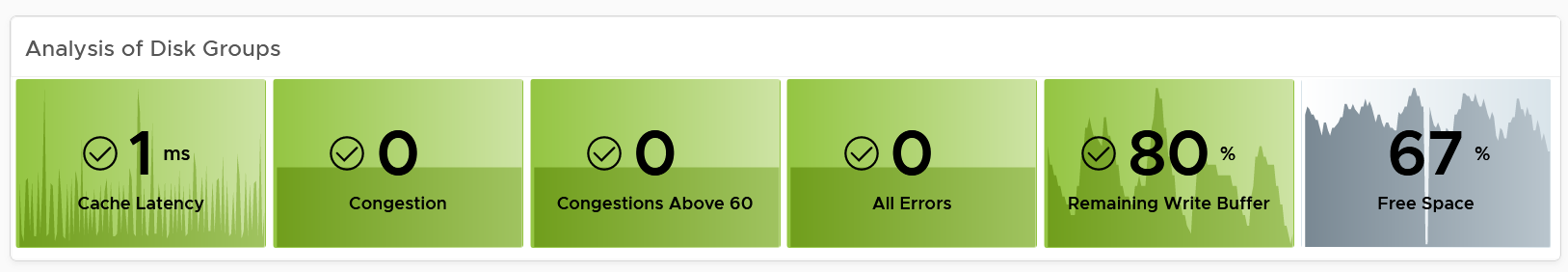
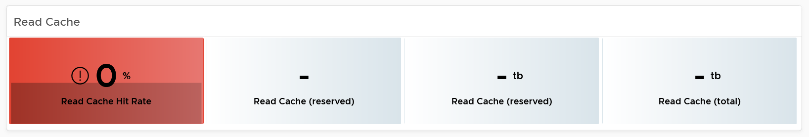
Same thing with the read cache. All the values shown below are the worst value among the disk groups’s read cache.
Other KPIs
The performance problem could be caused by non-storage.
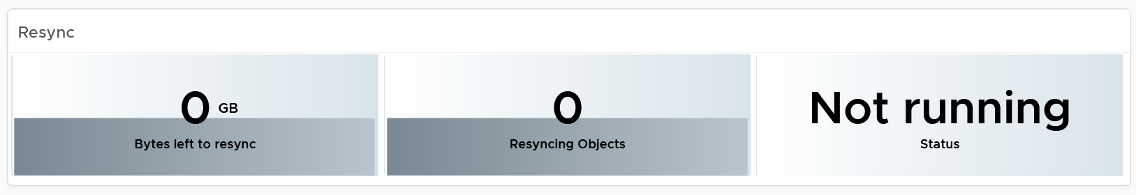
vSAN Resync is a type of utilization metric, but its presence can impact performance. vSAN has two scenarios that trigger rebalance (the reason for resync).
-
Proactive: A large variance among devices disk space utilization.
-
Reactive: When devices reach a critical capacity threshold (typically ~80%). This adjustment can be in the form of object components moving to other disks, disk groups, or hosts, or even splitting of existing large components into smaller components to achieve the desired result.
Disk Group Analyzis
You can drill down into individual disk groups.
Make sure they are fairly balanced. If not, you have a hot spot.
Select a disk group you want to analyze. Both the contention and utilization metrics are automatically shown.
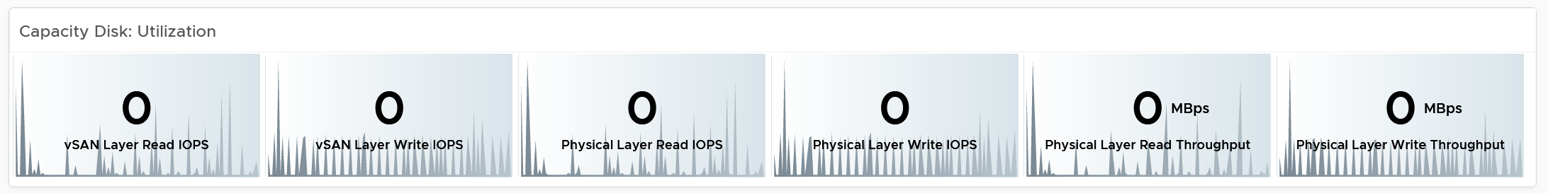
There are more metrics for the utilization. To avoid the name being truncated, I keep them short. To see the full name, simply mouse-hover over the counter name, as shown below.
For the throughput metrics, why do I choose bytes instead of bit? I use MBps, not Gbps.
Revisit the vSphere Metrics book for the answer.
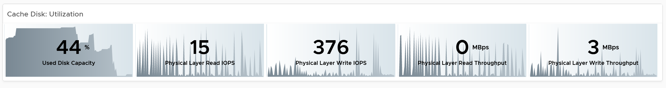
Cache Disks
You can drill down into individual disk groups. As this is SSD, you should expect their values to be below 5 ms.
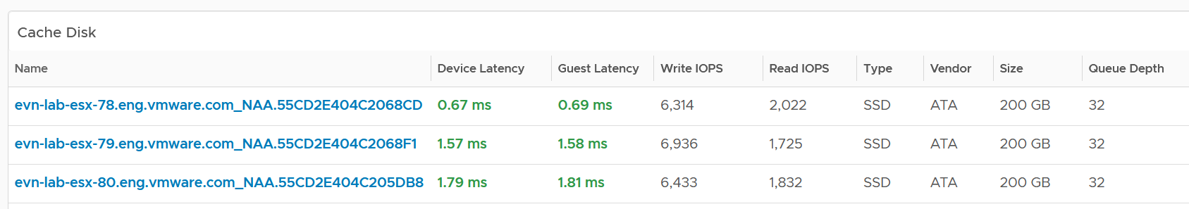
The configuration is also shown. Make sure they are consistent.
Select a cache disk you want to analyze. Both the contention and utilization metrics are automatically shown.
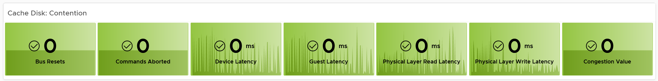
vSAN has various layers, which is covered in Part 2 Chapter 4 Storage Metric.
Congestion is a special derived metric in vSAN.
Why is the cache disk space utilization not considered contention?
Because 90% used does not mean it’s faster or slower than 80%. We can’t color code it.
Capacity Disks
You can drill down into individual disk groups. The latency value will vary between magnetic and SSD.
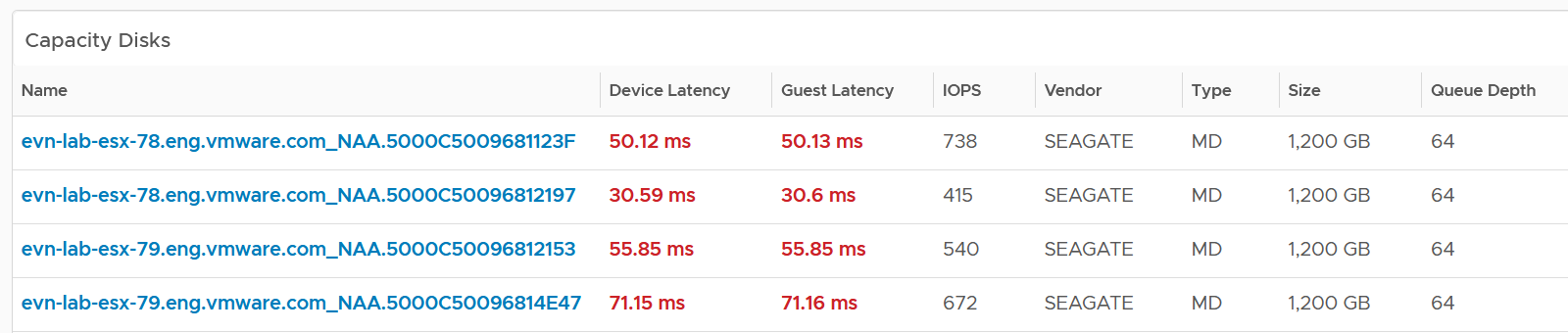
The configuration is also shown. Make sure they are consistent.
Select a capacity disk you want to analyze. Both the contention and utilization metrics are automatically shown.
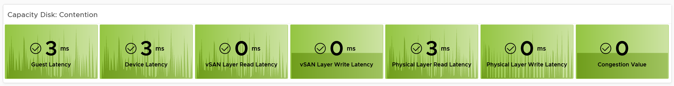
At this level, what you can do is basically observing if there is a hot spot.
Network Performance
Use the Network Performance dashboard to view performance problems related to network such as high latency, unusual traffic, and many dropped packets. This dashboard is designed for both VMware administrator and Network administrator, with the goal of fostering closer collaboration between the 2 team.
The dashboard enables drill down from distributed switch to the ESXi host and port groups in the switch, and then to the VM.
To prove that Network is performing well:
-
No Errors.
-
Not a single ESXi host is experiencing packet drops in any of its NICs (vmnics). If there are, show the ESXi names.
-
Not a single VM is experiencing packet drops.
-
-
Latency
- Good round trip latency. No network trombone across physical data centers if NSX is used.
-
Utilisation
-
Not a single VM is hitting its limit, be it 1 GE or 10 GE or higher.
-
Not a single ESXi vmnic is hitting its limit.
-
Total bandwidth hitting the physical switches is below capacity.
-
-
Special network
- The broadcast network is minimal. For both ESXi and VM.
How to Use
Review the Distributed Switches table
-
It lists all the switches, sorted by the highest packet dropped. The table splits the incoming traffic and outgoing traffic for better analyzis.
-
As the focus is performance and not capacity, the throughput metrics are not shown.
Select a switch from the table
- The health chart will automatically show the dropped packet trend over time.
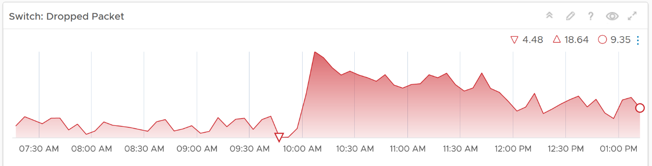
-
However, it will not narrow down the list of port groups automatically, as the list of port groups are always showing all the port groups in your environment.
-
If necessary, expand the 2 collapsed widgets. They are showing the network throughput and broadcast packets. Utilization is also shown so you can correlate if the dropped packets are due to higher utilization
Review the port groups and ESXi hosts in the selected switch
-
They are automatically listed when you selected a switch from the table above.
-
Just like the distributed switch, you can also see their relevant counters. The following shows the same chart, except for a single port group.
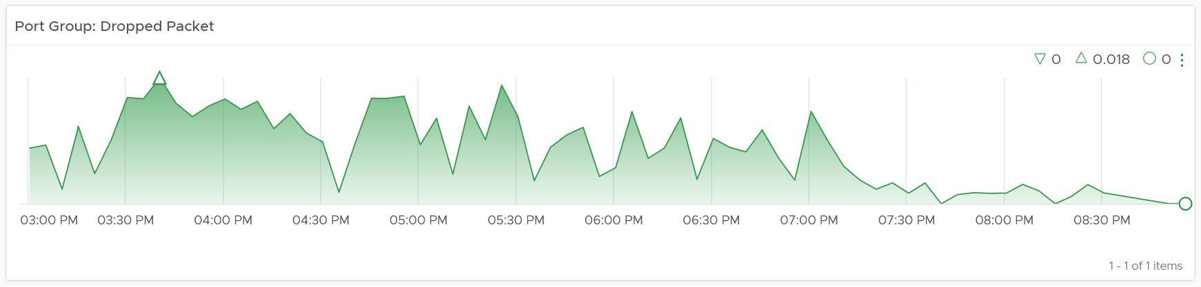
If your environment has unused network switches, you can filter them out from this list, as this dashboard focuses on performance.
Points to Note
Network latency within a data center should be below one millisecond. Use Aria Network Insight to study the latency or the retransmitting problems, caused by moving into the lateral traffic.
Add a physical network using the appropriate management pack, such as True Visibility Suite.
Most packets are unicast, between a pair of sender and receiver. If your environment has many VMs sending broadcast packets to everyone and multicast packets to many targets, add a Top-N widget to find out which VMs are sending these packets.
Enhance to include analysis of distributed port group. Does any of them hit their limit?