Performance
Operationally, you manage at cluster level, not at Resource Pool, ESXi host, or data center level. It’s the sweet spot for starting your monitoring and troubleshooting. As usual, we start with the contention metric, followed by the utilization metric.
By definition, the metrics are average numbers. So be careful as there can be VM that has issue but obscured in the cluster wide average. Even the so-called total or summation is mathematically an average. For example, the Total CPU Wait counter is the sum of all ESXi CPU Wait metrics, which in turn is the sum of all the VMs. At the end you get a large number, which you need to normalize and convert into average. Since you divide it against the cluster total, you get average.
Utilization vs Contention
There is a common misconception that you cannot have performance issue when cluster has low utilization. We introduced that problem as a story earlier here.
Is there corelation between cluster utilization and cluster contention?
I’ll show 2 opposite examples.
Example showing Correlation
If every VM is given the same treatment by the cluster, then yes.
Here is a cluster experiencing regular high utilization in the last 7 days. You can clearly see the peak. The cluster has 14 ESXi Hosts.
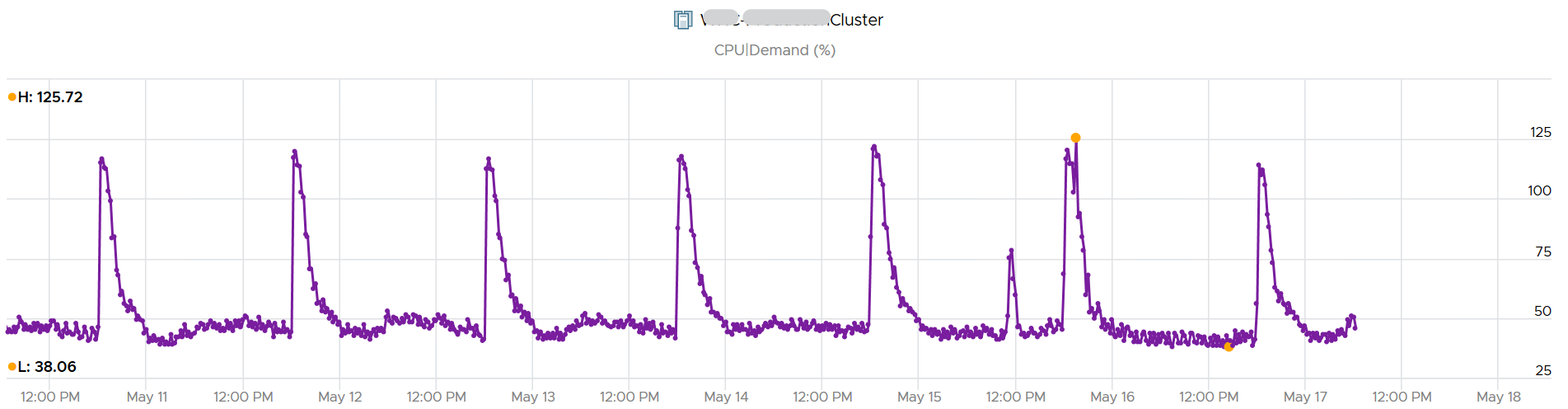
A logical question here would be what’s the impact on VM performance? Are they getting the CPU they asked? The cluster has 550 running VM.
This is where the contention metrics come in. One tracks the depth of the problem, the other the breadth of the problem.
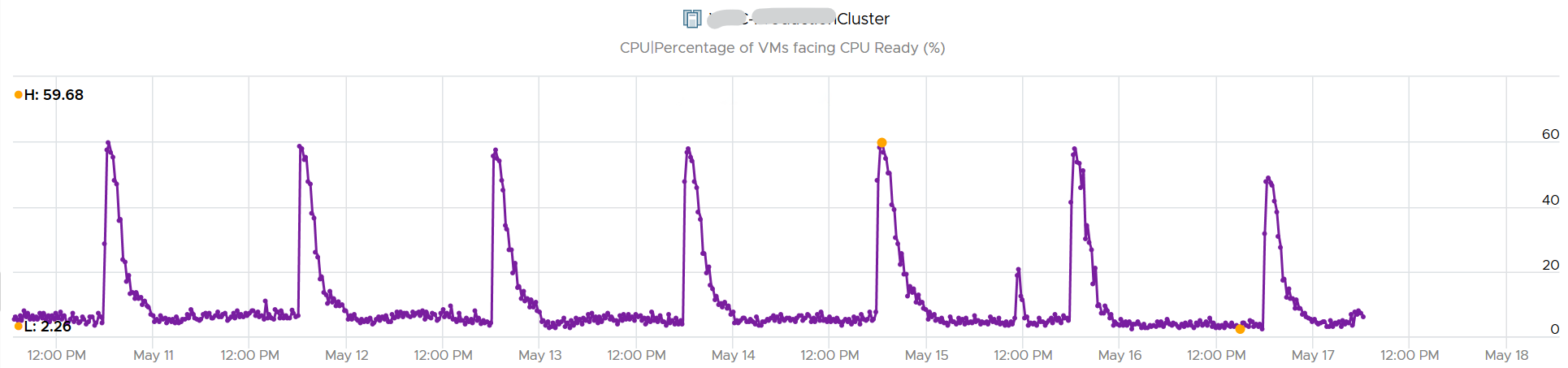
The counter Percentage of VMs facing CPU Ready > 1% shows a nearly identical pattern. We can see that a big percentage of the VM population is affected.
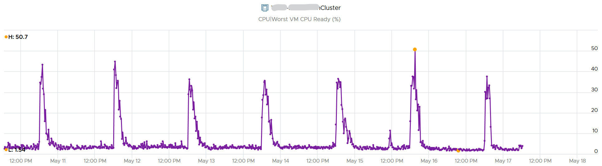
The second counter tracks the depth, giving the absolute worst CPU Ready value experienced by any VM in the cluster.
Example showing no Correlation
Performance is unmet demand. VM 007 can face very high contention when all other VMs on the same cluster face no contention.
It is possible for VMs in the cluster to suffer from poor performance, while the cluster utilization is low. One main reason is cluster utilization looks at the provider layer (ESXi), while performance looks at individual consumer (VM).
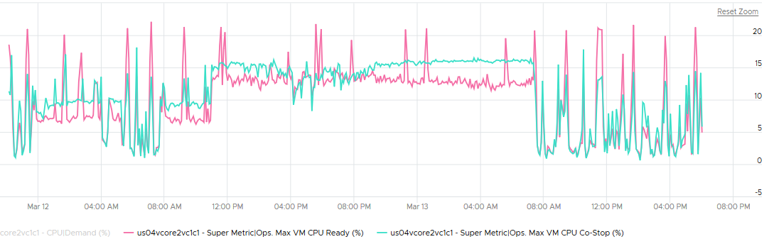
The following cluster has 32 ESXi supporting 2357 VM. The average demand across the cluster is <40%. Since it has 32 ESXi and 2357 VM, we can retire 8 ESXi or add 1K VM.
And yet the VMs in the clusters are facing contention. Both VM CPU Ready and CPU Co-stop are high.
Let me take another example, where you can see the corelation between cluster utilization and VM contention in the cluster. My apology that the picture is not sharp. You can see the cluster has 774 running VM at the start. One month later it has dropped to 629, a drop of 145 VM or 19%. The second line chart reveals the number of running vCPU dropped from 3019 to 1980, a whopping 1039 vCPU or 34%. That indicates the big VMs were moved out.
This cluster was running mission critical VMs. What’s going on?! What caused the mass evacuation.
Notice the mass evacuation happened multiple times, so it’s not accidental.
Looking at the last chart. It has 2 line. Maroon showing utilization, blue showing contention. Can you figure out what happened?
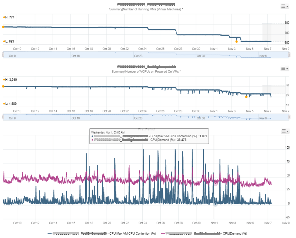
The cluster utilization was hovering around 50%. In that entire month, it barely moved. This cluster was probably 16 nodes, so 50% utilization means you can easily take out a few ESXi hosts actually.
The Max VM CPU Contention told a different story. Notice it spiked well above 75%. That impacted at least 1 VM. There were multiple spikes, leading to multiple complaints, and eventually infrastructure was forced to evacuate the cluster to fix the performance problem. Notice the counter dropped gradually in November, despite utilization remains fairly stable.
Example for Memory
We covered 2 examples for CPU. What about memory, since it’s a form storage. It’s just a disk space basically, so can VM experience contention when Cluster consume metric is not high?
I’d zoom into ESXi, so it’s easier to see. What do you deduce from this ESXi? This chart shows 1 month worth of data.
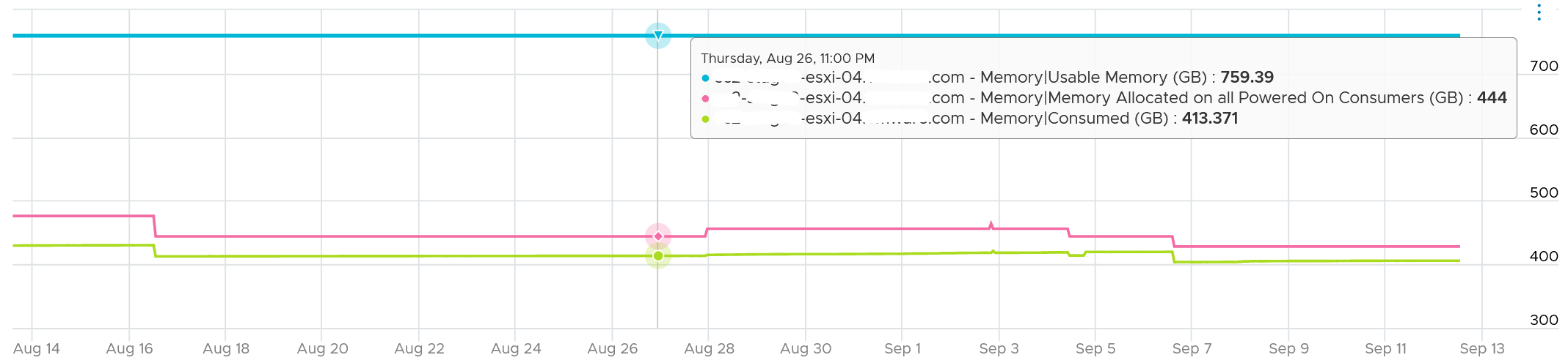
It has 759 GB of usable memory. All the powered on VM has 444 GB configured, out of which only 413 GB is mapped to physical DIMM. So there is plenty of memory left.
To confirm that it has plenty of memory, let’s plot Balloon. What do you expect?
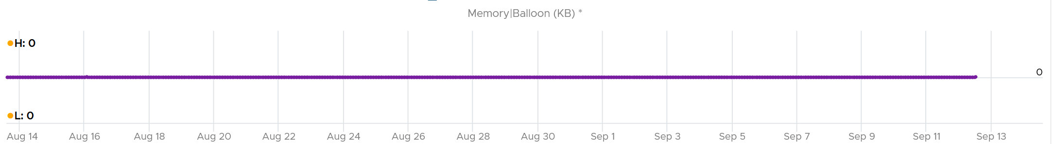
There is no ballooning. ESXi was under no memory pressure whatsoever.
So that’s the situation at provider level. How about consumer level?
VCF Operations has a metric that tracks the highest memory contention experienced by any VM in the host. This is a good leading indicator as all it takes is 1 VM, it matters not which VM.
As we can see here, there is a problem.
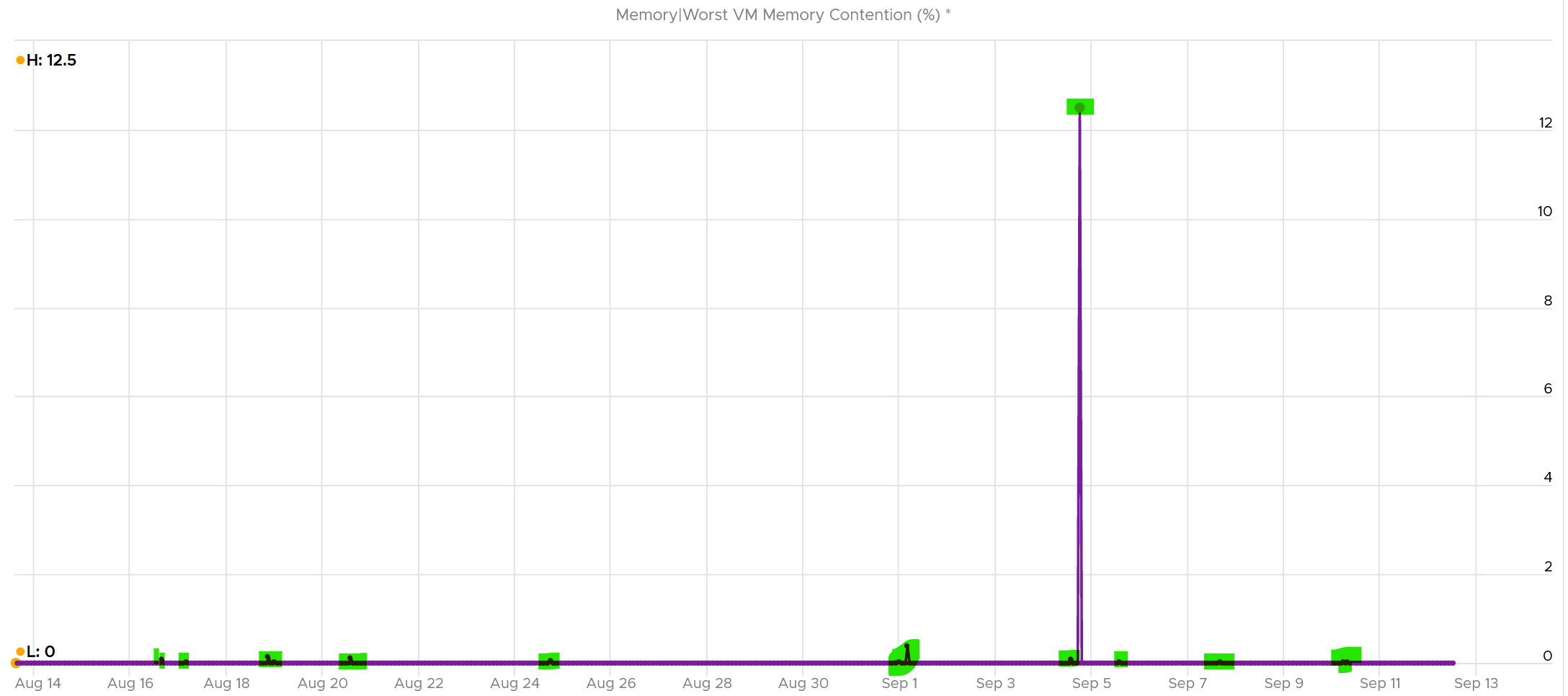
Can you explain why?
A VM experiences contention when the page is not in the DIMM. It was compressed or swapped out. Checking the compressed metric, it reveals that pages had to be brought it. Notice the swap metric lagged a bit, which makes sense.
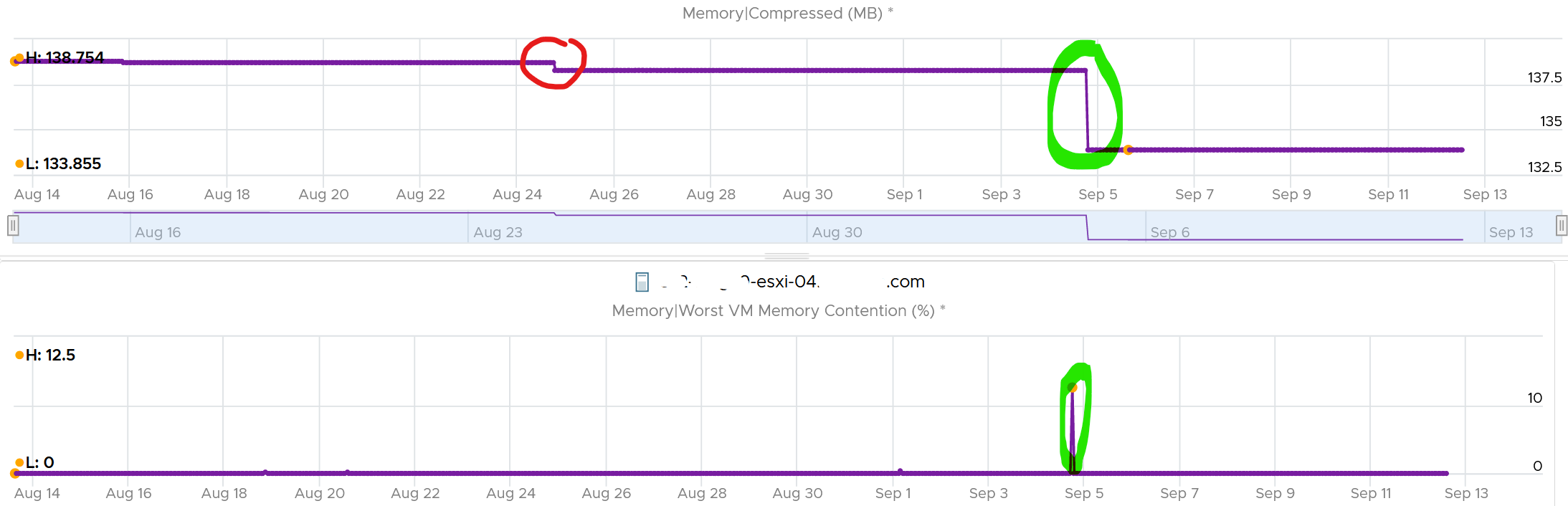
I am not able to explain the earlier dropped, the one in red circle. If you can drop me a note.
Let’s complete by plotting Swapped. I’m plotting all the way to the beginning of tracking.
It’s all 0. What happened?
That means all the pages could be compressed, so ESXi decided to compress instead of putting them into swapped file.
Now that we know it’s due to compression, we know the contention on 5 September was caused by compression. When was that page compressed, no one knows. Plotting back, the compression started around 2 August.
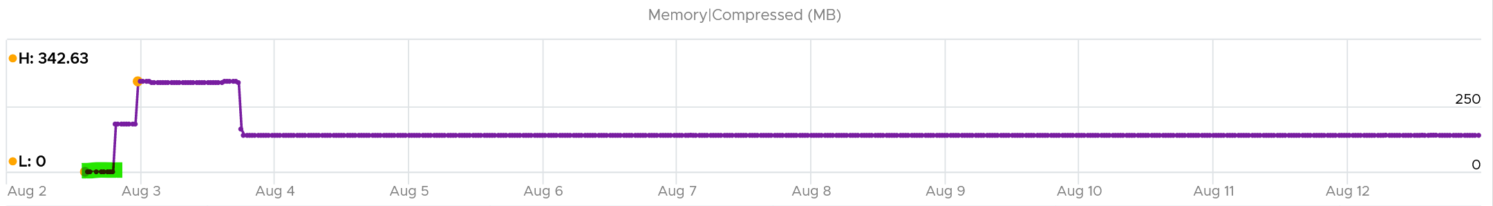
The compression was only 342 MB. Not even 0.1% of consumed memory. But if you are unlucky, it was the active VM that got hit, as in the case here.
The past is harder to debug, as we lack the ability to travel back in time and see the environment as it was. My guess here is the VM had limit, be it indirectly via resource pool or directly.
Cluster Performance (%)
We’ve covered in the VM chapter how we quantify the KPI of a single VM. How would you represent all the VMs in the cluster? Do you simply average the VM KPI (%)?
The answer is no. A cluster has a different purpose to a VM, so we need to see it from cluster point of view. For examples:
-
Contention inside a VM (this means Windows or Linux) is not that relevant to the cluster performance.
-
ESXi physical network is relevant to the cluster performance, but not to the VM performance.
A cluster is more of a group of ESXi hosts serving a VM.
The metrics are grouped into 2:
-
Breadth
-
Depth.
We cover why we need both dimensions in Private Cloud Operations book.
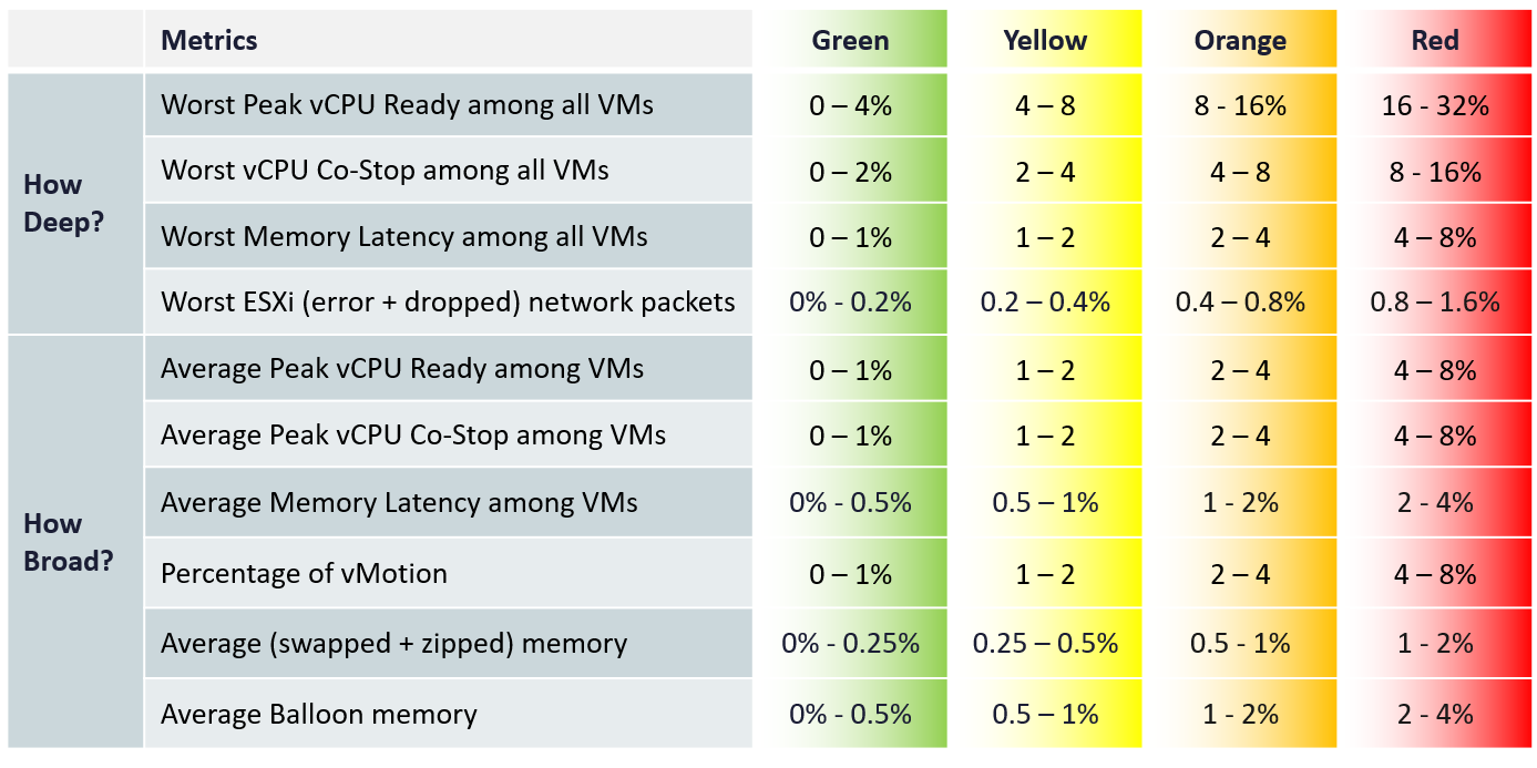
The metrics are using the 20-second peak so it does not miss short bursts. The limitation of this metric is outlier. A large cluster with thousands of VMs can easily have 1 VM having contention due to limit. One way to minimize the false positive is to set a higher threshold.
For the breadth, we use average. Ideally, we use 75th percentile instead of average. Average tends to be too late. On the other than, 95th percentile suffers from cluster imbalance. I’ve adjusted the threshold downward since I’m using average.
In a cluster with many hosts, there can be imbalance. It is not possible to aggregate at the host level first. This 2-level aggregation can result in suboptimal number. The drilling down to specific host can be facilitated with the host level metric.
Metrics
vMotion is included as it does impact the VM performance (although the end users may not notice in most cases) and it’s a leading indicator that the cluster is struggling to serve the load hence it has to shuffle the VMs around.
Take a look at this cluster. It has 488 running VMs on 16 ESXi host. Notice the percentage of VM being vMotion jumped to 5.3%, as 26 VMs were vMotion.
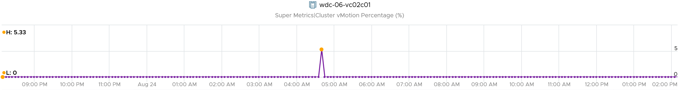
What do you think will happen to the VM CPU Ready and CPU Co-stop? 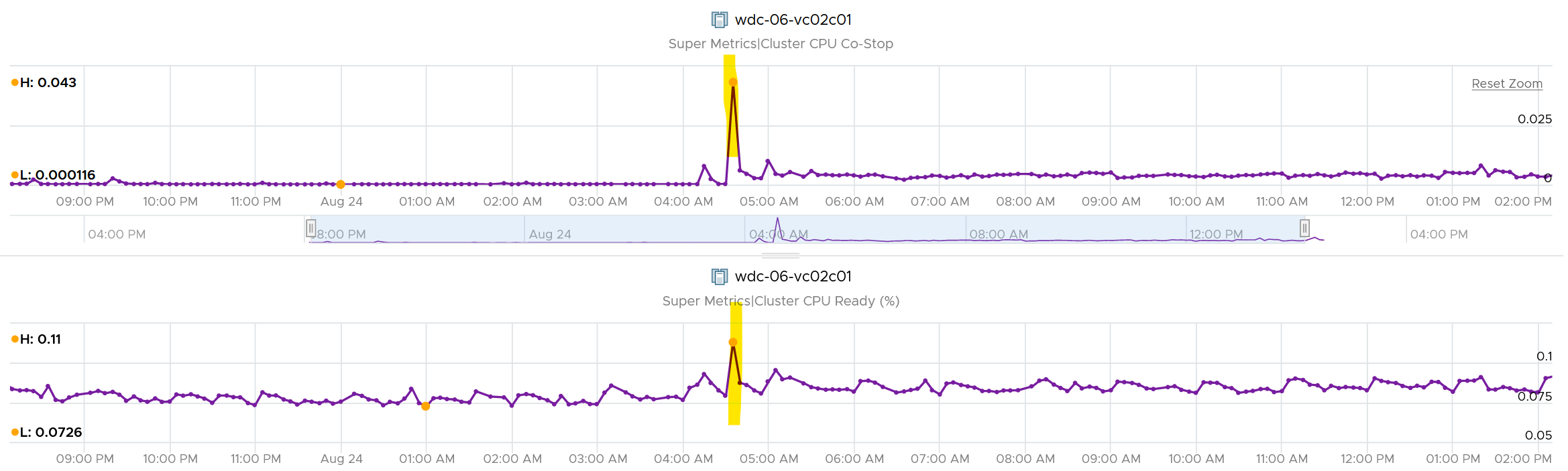
They rose. Since only 5% was impacted, the rise will be minimal.
The threshold should reflect reality. For examples:
-
While the impact on VMs is the same with Ready, using the same range for CPU Co-stop, CPU Overlap and CPU Other Wait will elevate the KPI score, as practically these 3 have lower score.
-
Dropped packet and error packets are very rare. Instead of summing them up, which will result in an average, I took the worst among ESXi host. Since many ESXi sports 25 Gb NIC, I set the threshold to be very low. On the other hand, I did not set green = 0, so the KPI does tolerate some issue.
-
Ballooning does not actually impact performance. That’s why it’s given 4x the threshold of zipped + swapped. I may change to 6x, but will have to consider large cluster. A cluster with 20 TB of RAM means 4% ballooned translates into 800 GB.
-
Ballooned, swapped, and zipped are given higher threshold as they could have happened in the past. These metrics are “sticky”. They also may not impact performance. But since many clusters sport >4 TB of RAM, I need to balance the absolute size.
Metrics Not Used
The following metrics are not included:
-
“Percentage of VM population experience CPU Ready > 1%” and “Percentage of VM population experience Memory Contention > 0%” as they measure the same purpose with the average.
-
VM utilization.\
They are irrelevant. Use the metrics at ESXi level instead.
-
ESXi Consumed.\
The higher the consumed, the better the performance. We use balloon, swapped and compressed metrics instead. Since they do not directly impact performance, we put as secondary KPI.
-
ESXi CPU Utilization.\
They do not actually impact performance. If you include them, take the highest among ESXi instead of cluster wide average, as average is too late.
-
VM DRS Score.\
The focus is on VM demand, which is not identical to performance (read: contention).\
For example: 23 VMs are running on a host. 15 VMs with low memory demand (8643MB to 66312MB) have score as 68. 8 VMs with high memory demand (132052MB to 264859MB) have the low score (< 25). The memory over-provision rate is 117%.\
Cluster DRS score = It is a weighted average of the VM DRS Scores of all the powered on VMs in the cluster.
-
Disk latency.\
Storage troubleshooting differs to compute troubleshooting. The exception here is Hyperconverged Infrastructure, as the compute and storage are integrated.
-
Percentage of VMs facing Disk Latency.\
It should be part of datastore KPI, not the cluster. The reason is if there is a population problem, you troubleshoot the datastore not the cluster(s) mounting it.
-
CPU Other Wait.\
There is a false positive. I’ve seen it hence decided to exclude.
-
CPU Overlap.\
I find their values to be very low that they might mask out other problems.
Future enhancements:
-
There are metrics that are only available in esxtop. They are not available in vCenter REST API, so they are not retrievable. Example is Local:Remote memory ratio for VM.
-
2 level roll up. This means that the cluster metrics take from its hosts instead VMs. In this way, every host is represented. Need to model the difference scenarios before we decide this solution meets the requirement better.
Implementation
The above is implemented using super metrics.
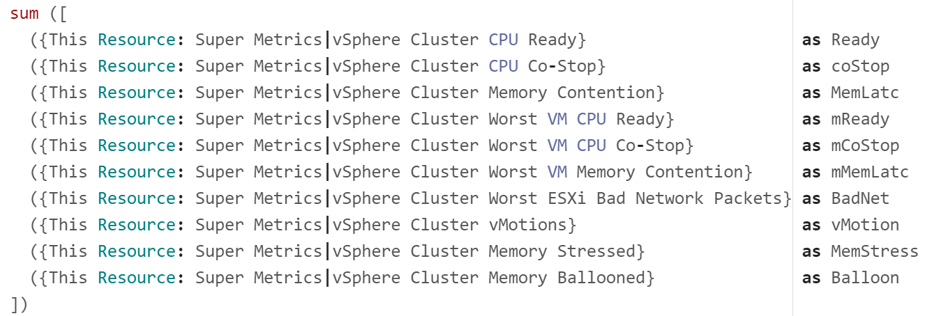
All the super metrics are fairly simple. They are simply taking the average or the maximum of either ESXi or VM in the cluster.
Something a little trickier is Ballooned (%). The formula is below.
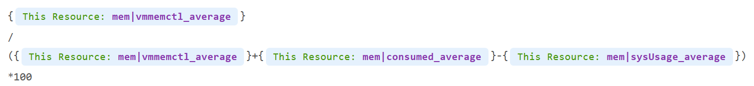
Why did I exclude kernel usage, but include ballooned?
Answer is in the Memory chapter.
Troubleshooting
At any given moment, a running VM always resides on an ESXi Host. Due to DRS and HA, it’s easier to monitor at cluster level. Since a cluster can have hundreds of VMs, you need consolidated metrics that can represent the experience of all the running VMs in the cluster. VCF Operations 8.2 provides the following metrics:
| Problem | Optimize or Remediate |
|---|---|
Worst VM CPU Ready. Worst VM RAM Contention | These are the highest value among all the running VMs. It shows you the depth of the problem. Check how many VMs are affected to see pattern. |
% VMs experienced CPU Ready % VMs experienced RAM Contention | Since it’s impacting many VMs, the problem is likely not at VM setting, but at ESXi or cluster level. Some possibilities:
Imbalance could be due to
|
| vSAN CPU Ready | It’s not something you can change, unless via ESXi advanced settings to modify the kernel scheduler behaviour? |
| ESXi Error Packets | Check the vmnic driver and firmware |
Service Level Metrics
These metrics require the understanding of how SLA, SLI and KPI differ. They are covered in-depth in Part 1 of VMware Operations Transformation book. Their implementation require VCF Operations super metrics and custom dashboard.
Cluster SLA
How to roll up the VM SLA into total SLA for the whole environment? Your CIO likely wants to see this number over time.
Calculating SLA per vSphere cluster also makes management easier. You know which cluster to attend to. The problem is SLA is a lagging indicator. It is based on the last 30 days or the last month.
Cluster SLA is derived from the VM SLA. It is simply the percentage of VMs that fail the SLA. How bad each VM fails the SLA, or how comfortable it exceeds the SLA, is irrelevant at this stage. At the cluster level, you care about pass/fail first.
That means the Cluster SLA is not the average of its VM SLA. Doing an average can be too late unless your SLA is 100%.
Once you know how many VM fails, you want to know who the VMs are and troubleshoot if there is a common reason.
Cluster SLI
SLA is a 30-day counter. You can’t wait that long before you do something. This is where SLI comes in. It’s an indicator, and not mentioned in the SLA contract.
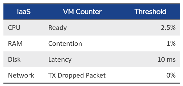
Let’s take an example of a cluster with 500 VM. Each VM consumes 4 IaaS resource (CPU, Memory, Disk, Network). It must pass all else it’s counted as 1 SLI fails.
The Cluster SLI (%) is simply the percentage of VM that fails the SLI. As a recap, this is the single threshold we use for all classes of service:
It’s a normalized average of the VM SLI, taking into account the actual SLI failures. That means it will give a lower number if the VMs are experiencing worse SLI individually. 1 VM experiencing 4 SLI failure will result in the same value as 4 VM experiencing 1 SLI value each.
The formula is
100 –
(
( Sum([VM]Performance|Number of KPIs Breached) + Sum([Pod]Performance|Number of KPIs Breached ) )
/
( Summary|Number of Running VMs + Summary|Number of Pods ) * 100 / 4
)