Capacity
Now that you’ve reviewed the raw metrics, let’s apply them into capacity management.
vSphere Cluster capacity is often misunderstood, as there are multiple considerations.
-
On the supply side, you have total capacity and usable capacity. Both have nuances.
-
On the demand side, you have utilization, reservation, allocation, and unmet demand.
-
The kernel impacts both the supply side and demand side. Be careful of double counting!
-
Lastly, CPU, memory, storage, and network have different natures.
Key Metrics
The essential metrics of capacity are
-
Total Capacity
-
Usable Capacity
From the first principle, the total capacity and usable capacity should not be a variable as it makes capacity management impractical. Your 100% should always be a constant so you have a stable anchor. This makes cost accounting less debatable too.
Total Capacity
To define total capacity, first determine whether its value is fixed or not.
If it’s not fixed, the next question is whether the change is Scale Up or Scale Out.
-
Scale Up happens on a single object. Example is the just in time capacity such as storage LUN, where the size can be increased on the fly or upon request.
-
Scale Out happens on a cluster of objects. The cluster members or nodes are typically identical in size. Examples are K8 cluster, K8 Workload, Horizon VDI Pool, and VMC vSphere Cluster. Scale Out is more popular than scale out as it’s cheaper. It does not work when the data can’t be partitioned.
Total capacity becomes dynamic only if you intentionally change the numbers. Some examples:
-
Horizontal auto-scaling solution such as VMware on AWS
-
vSphere Distributed Power Management.
Usable Capacity
Usable Capacity is an imaginary number that you get after deducting total capacity with the portions that capacity team decide to exclude. The number is non-real as actual utilization can exceed it.
Usable Capacity has to be a stable number. Having a volatile value over time makes capacity management hard. The cost of complexity is not worth the accuracy.
Let’s use vSphere Cluster as example.
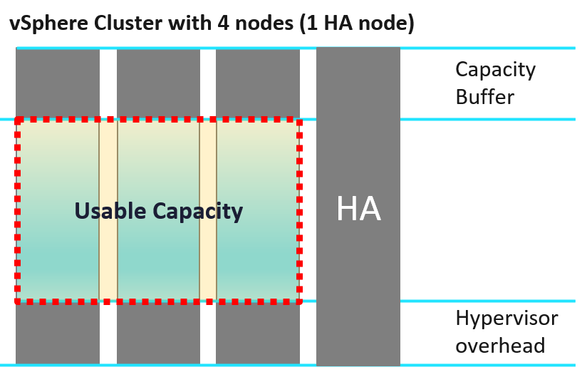
In general, there are 3 components that need to be excluded to form usable capacity.
Usable Capacity = Total capacity – Availability protection - Overhead – Buffer
Let’s look at each:
| Availability protection | This covers both local availability (HA) and disaster recovery. For hardware, this means the part that is added to cater for unavailability period. Common examples are RAID in disk, hot spare in storage array, vSphere HA in vSphere Cluster. Many hardware deployments come in a pair (e.g. network switches) because one of the nodes is for availability, not capacity. In vSphere Cluster, you typically design with at least 1 host as spare, so you can perform maintenance, upgrade without service degradation. While this host is actively participating in reality, you exclude this in your usable capacity. In Kubernetes, there is no such thing as HA as the node itself is transient. |
| Overhead | Overhead is part of the system architecture and can’t be avoided. In the case of ESXi, this is the hypervisor. This portion is not available for “consumer” or business workload. Examples:
|
Let’s apply the above concept into vSphere:
| ESXi Usable Capacity | Usable Capacity = Total Capacity – Hypervisor. |
| Hypervisor = VMkernel + vSAN + NSX + vSphere Replication | |
So what amount should we put for the hypervisor? It turns out that it’s not an easy answer. We will dive in later on. | |
| Extracting the hypervisor portion as a separate value has a bonus as it can be used use cases involving 2 different ESXi hosts, such as migration from non VCF cluster to a cluster running both vSAN and NSX | |
| Cluster Usable Capacity | Cluster is not a matter of adding the ESXi. There are 2 cluster-level settings:
|
| Be careful in aggregating as overhead and availability overlaps. Reason is your HA node contains overhead too |
Applicability
The formula for Usable Capacity depends on the model.
| Model | HA Host | Hypervisor | Buffer |
| Allocation | Included | Included | Included |
| Utilization | Included | Cannot be included as values are too volatile for capacity management | Included |
| Reservation | Included | Included |
Buffer
Buffer is a business decision and it’s optional.
It’s calculated based on capacity after HA, and not on the total capacity.
Peak utilization is often used as the reason to have buffer. The actual reason behind is performance avoidance. Since it’s about avoiding the contention from happening, the contention counters cannot be used. Take for example, a large cluster (could be vSphere, Kubernetes, or Horizon) where imbalance can happen among the cluster nodes. You have witnessed that it happens at say 95% utilization. In order to avoid that, you set buffer at 10%, effectively setting the usable capacity at 90%. This in theory gives you 5% buffer, as the last 5% can be measured using contention counter.
Disaster Recovery is a valid use case for buffer. Some examples are:
-
A pair of vSphere Clusters protecting each other in a DR pair.
-
A production cluster and DR cluster. The DR cluster typically run test and development workload, which will be powered off in the event of DR drill or actual DR.
-
A stretched cluster.
Let’s elaborate the first example
-
Say you design a pair of 10 node cluster to protect each other. Each has 9+1 set up for HA to give you room to do the usual cluster maintenance and upgrade.
-
You want to limit the utilization of each site at 50% of the 9 hosts. This translates into 45% utilization on each of the 10 hosts, if there is no imbalance.
-
To monitor the above, you set 50% buffer on the capacity after HA. That means the actual formula is (Total – HA) x Buffer.
-
Now, since the VMs typically run well below their configured size, you use allocation model and cap it at say 3:1.
-
To complicate matters, say 60% of the workload can be turned off during DR. In this case, you allow utilization to reach 160%.
Allocation
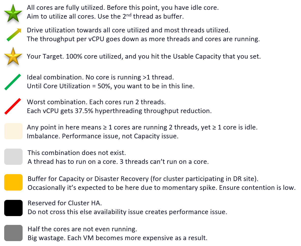
Overcommit Ratio does not include buffer. The following diagram makes it clear.
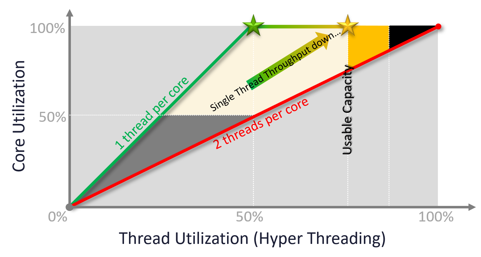
Overcommit ratio looks simple on the surface. As we dive deeper, it’s not as straight forward. For examples:
-
CPU hyperthreading.
This can be turned on and off. Should the ratio change accordingly? Do we consider it since there are only 2 threads per core? Latest CPU has >100 cores but each has only single threads. -
Datastore. Do you consider the space used by snapshot since overcommit is based on allocation? How about the availability protection created by vSAN?
To answer the question, remember that allocation model does not consider utilization. Since allocation is about allocating to consumer, the provider part should be excluded too.
| CPU | Include hyper threading. The reason is a VM vCPU maps to a thread, not core. |
| Yes, hyperthreading impacts performance, but overcommit is about capacity. Also, you can simply change the number. Instead of saying 8:1 to a core, you say 4:1 to a thread, with HT enabled. | |
To mitigate the performance impact, simply get a CPU that is 60% faster. Example:
| |
| Take note a lot of education is needed. When your tenants buy 4 GHz CPU from you, they expect 4 GHz, not 2.5 GHz (62.5% throughput). Since you enable HT, one way to simplify the message is to say the CPU speed is 2.5 GHz. | |
| Disk | For datastore, only consider the VM virtual disks. Exclude other VM disk space such as snapshot and memory swap. If you have a lot of snapshots and high memory overcommit, this can result in higher actual disk space consumption. |
| If the datastore is vSAN, exclude the vSAN availability protection (Failure To Tolerate). The downside of this is the overcommit ratio may fail to serve its purpose, which is to give early warning before actual utilization happens. So set a lower number, matching to the FTT setting. For example, if your FTT doubles the disk space consumption, then your overcommit ratio has to be halved. | |
| Network | For physical switch, exclude the inter-switch link. For ESXi, only include the physical ports used by the VM. |
Projected Metrics
At the heart of capacity is projecting the historical consumption into the future.
Projection
If there is clear trend, a projection is superior to a simple percentile calculation.
The accuracy of the prediction depends on the amount of data and the length of the cycle. If the data is limited and the pattern that matches your business cycles has not developed, the projection would not meet your expectations.
A workload with quarter end peak will naturally need at least 6 months for it to be accurate. If there is enough data, VCF Operations will consider 6+ months’ worth of data. While it gives extra weight to recent data, if there is a sudden but short-lasting change, it may not be enough to impact the projection.
Momentary peaks that are short lived and one-off should not impact capacity planning so the impact may not be noticeable in the projection.
Sustained peaks last for a longer time and do impact projections. If the peak is not periodic, the impact on the projection lessens over time due to exponential decay. Data is exponentially weighted based on how far back in time they are, giving recent data points more important than older ones.
Periodic peaks exhibit cyclical patterns or waves, such as hourly, daily, weekly, and last day of the month. There can be multiple overlapping cyclical patterns, which will also be detected. While you should not make capacity decision based on just a few days of data, you do need the 5-minute granularity as input. A 5-minute peak that gets repeated every hour should be considered.
Exponential decay is important as newer data is more relevant, but it might make the projection visually odd. The following projection looks “make sense”, because your eyes see the whole period and give equal weightage to all data points.
If you give higher weightage to newer data, it can potentially look like this.
Workaround
If you do not have 3 months and just need an overall sizing, consider using the 97th percentile value. Why 97th percentile? It's based on standard deviation principle. Two Standard Deviation away from the midpoint equals to 95%, and 3 Standard Deviation = 99.7%. 97th percentile hence provides a good balance between 2 SD and 3 SD. By and large, it captures just the right amount of peak and outlier.
Capacity Remaining
Capacity Remaining (%) metric is a complex metric as it depends on the time. Let me use an analogy as it’s easier when the demand has end date
You operate a restaurant business. It has 100 seats.
It’s 4 pm in the afternoon, and you have plenty of seats as it’s not a busy hour. But you’re fully booked for dinner.
What is your Capacity Remaining (%)?
The answer is it depends on what time.
What is your Time Remaining (Days)?
The answer depends on your projection.
If you only reject a small percentage of customers and the additional potential revenue is not worth the capital expansion, your Time Remaining is forever.
If you reject enough customers and foresee demand will grow, you take the risk of adding more capacity. In this case, your time remaining is 0 days.
The Capacity Remaining (%) metric is a projected value, 3 days into the future, hence it might differ with currently used capacity. The 3-days is hardcoded, not something you can change. No, it does not and should not care about the future demand, even though they are already committed.
As it is a future value, there is confidence band. You can choose between aggressive (based on the upper limit of the band) and conservative (based on the actual trajectory).
Note that the value of will be set to 0 if during the given collection cycle the demand breaches the usable capacity. This is because at that moment there is really no capacity. This can cause fluctuating value of Capacity Remaining metric if the load regularly touches the usable capacity threshold.
Take note that CPU Capacity Remaining (%) and Memory Capacity Remaining (%) appear in the policy as enabled but cannot be used. That’s an internal metric which should have been hidden.
Time Remaining
Capacity Remaining (%) and Time Remaining (days) metrics need to be reviewed together, because the ideal situation is the object (VM, cluster, etc.) is low capacity remaining yet high time remaining.
It measures the number of days before capacity runs out. For conservative projection, this measures the time required from now to when the upper confidence interval of Long Term Forecast intersects/crosses Usable Capacity. The projection is up to 1 year, with time remaining above 1 year is simply shown as 1 year.
Formula wise, it’s based on the utilization metric. It’s not a projection of the Capacity Remaining metric. But should it be? Let me know your thought!
Hypervisor
| Why Hypervisor? | Why not use the word kernel or VMkernel? |
| The hypervisor is more than kernel. There are user-level or application that is runs on top of the kernel. | |
| The word kernel is often mistaken with VMkernel. VMkernel does not include vSAN & NSX as they are not traditionally considered part of kernel. vSAN for example has processes parked under /opt resource group | |
| Capacity or Performance? | Why do I put hypervisor under capacity, and not performance? |
| Because operationally, the metrics impact capacity management. Since the hypervisor gets the highest priority, you do not monitor the metrics from performance viewpoint. If you need to see the ready time for each of the kernel process, see esxtop. |
Kernel does not have allocation as it’s an OS process.
The hypervisor has 3 types of metrics:
-
Reservation
-
Limit
-
Utilization.
Which one do you use?
-
Utilization is not feasible as it changes by the seconds. Just like total capacity cannot be volatile, the same goes with usable capacity.
-
Limit does not even make sense as certain features of hypervisor impacts all VM, hence should take higher priority.
-
Reservation tends to be too low if you run vSAN and NSX, and too high if you only run ESXi. It also fluctuates over time, giving you unstable usable capacity.
The last option is to manually include a static value when calculating the usable capacity. This means we need to know the amount.
Metric Type
ESXi scheduler uses share, limit and reservation to manage its worlds. Broadly speaking, there are 2 types of worlds:
-
VM
-
Non VM
You will see 3 types of metrics in the vCenter UI:
| Type | Analysis |
| Utilization | This is the actual, visible, consumption. It can be lower than reservation, but not higher than allocation. |
Since you’ve already paid for the hardware, you want to drive ESXi utilization as high as possible so long there is no contention. Since the hypervisor has higher priority than VM, we can safely assume we can use VM contention as the proxy for overall contention (assuming manual VM Limit is not set). The ESXi utilization metric considers both the hypervisor and VM. There is no need to separate the hypervisor in this case. The only time we need to separate is when we’re migrating the VMs into another architecture. | |
| Reservation | For the hypervisor processes, the maximum amount is taken care of by allocation, while the minimum amount is by reservation. This is a safety mechanism to ensure the hypervisor can still run when all the VMs want 100% resource. Processes that run at hypervisor level does not get its reserved memory up front. It’s granted on demand. CPU, being an instruction in nature, does not use the reserved amount unless it needs to run. If you plot in vSphere Client UI, you will see the value of utilization can be lower than reservation. |
| Allocation | For VM, allocation is useful as there is overcommit between virtual and physical. For the non VM, it is not useful since there is no overcommit because there is no virtual part. You notice that some hypervisor processes have no limit. If you plot them in vSphere Client UI, you will find their limits are either blank or 0. |
The above 3 values vary over time. Why is it hard to determine the size of the above 3 values up front?
Taking from page 258 of Frank Denneman and Niels Hagoort’s book, with some changes:
-
Some services have static values (allocation and reservation) regardless of the host configuration. Ok, this is the easy part.
-
Some services have relative values. It scales with the memory configuration of the host. Ok, that means you need to know the percentage for each.
-
Some services have relative values that are tied to the number of active VMs. Ok, that means you need to know how many VMs are active.
-
Some services consume more when they do more work. Example is storage and networking stack.
-
Some services consume more depending on the configuration. For example, vSAN consumes more when you turn on dedupe and compression.
Since an ESXi host has many services, it is impossible to predict the overall values of the above 3 metrics.
Grouping
All the processes that run in the hypervisor belong to one these 5 top-level resource groups1:
| System | host/system resource pool for low-level hypervisor services and drivers. You will find world such as minfree, kernel, helper, fault tolerant, vmotion, storage vmotion, vmk API mod, idle, and drivers. Doing multiple vMotion simulaneously will increase the consumption of vmotion resource. The data plane portion of vSAN is reported here, although there is no separate counter for it. |
| VIM | VIM = virtual infrastructure manager. vmvisor = hypervisor. This include NSX, and vSAN management plane. host/vim resource pool for host management process such as HA (aam), vCenter agent vpxa, hostd, VIM user (the group for DCUI, shell, SSH, Tools), authd, tmp, envoy, GPU Manager, ESX tokend, healthd |
| User | host/user resource pool All the running VMs are children of the User resource pool. This includes the VM overhead as it’s part of the VM. There is no breakdown for this pool. The only metric is host/user. vSphere Client UI does not display the CPU or memory reservation metrics. |
| Opt | Mostly vSAN. You will see it as opt/vsan. An example of process will be vsan/vsanperfsvc for the performance monitoring. Added in vSphere 8.0.1 |
| IO Filter | host/iofilter resource pool The IO Filter processes are grouped here. The generic framework allows 3rd party partner software to intercept and process network and storage IO. More about it at vSphere manual. Just search for “About I/O Filters”. If you are unsure, read this by Ken Werneburg. Note: vSphere Client UI does not display the CPU or memory reservation metrics. |
In the older version of vCenter, you could see the structure. The dialog box is no longer available in the present vCenter UI. I’ve made the screenshot smaller as the details has changed, so this is just to show the idea.
Relative Comparison
You will notice major differences in the way the resource groups consume resources.
| CPU | Memory | |
| System | Surprisingly low. It can be well below 1 GHz. | Relatively high. It’s ~20 – 30 GB depending on the ESXi |
| VIM | Relatively high. It’s around 4 – 12 GHz depending on the ESXi. | Surprisingly low. It could be even 0 GB. |
Metrics
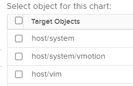
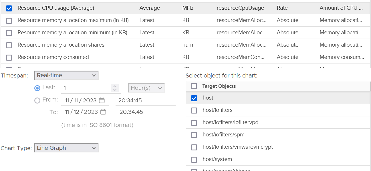
In the vSphere Client UI, you will see the list of resource grouping in the Target Objects section in the performance chart.
I’ve highlighted them in the following screenshot:
To see the kernel consumption, select only these 3 from the list above:
-
host/iofilters
-
host/system
-
host/vim.
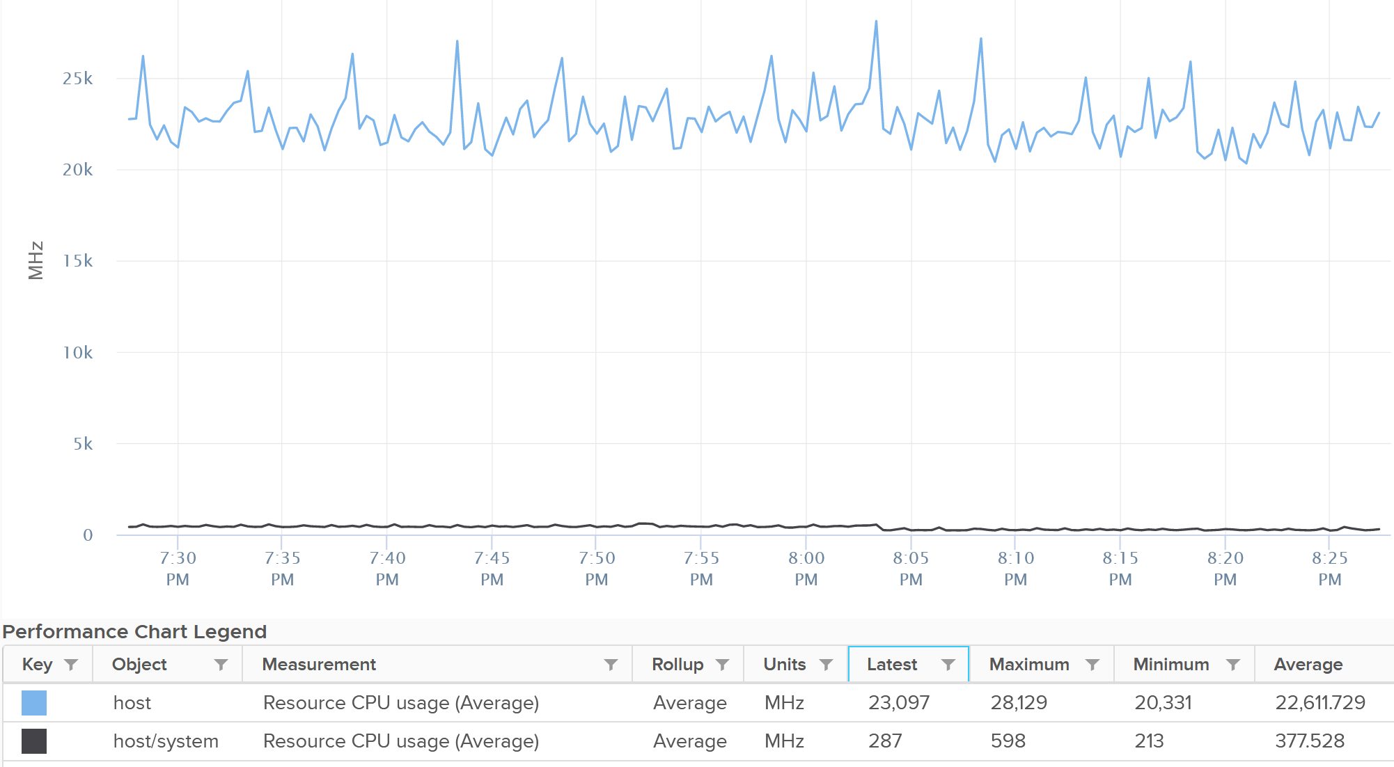
The rest of the items are part of them, so no need to plot them. More importantly, they are fairly small, well below 0.5 GHz. The following screenshot shows their highest 20-second average in the last 1 hour.
To see their total, plot their values in vCenter by stacking up their values, as shown below.
CPU
When you buy a CPU, what exactly is the capacity that you actually get?
To recap, this is what vSphere uses for ESXi.
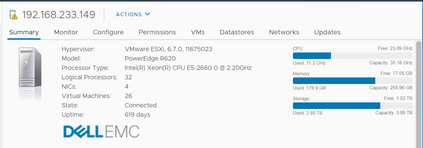
vSphere simply takes the base frequency x number of cores.
-
It does not include turbo boost
-
It does not include hyper threading.
The above is great for mission critical, where you need to be conservative and performance takes priority. For the rest of the workload, you can actually squeeze more. However, you need to set expectation as as the CPU speed depends on the model you buy.
I recommend you optimize the above answer. You can get more while keeping the trade off low. How?
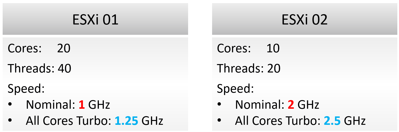
Let’s answer with a simple example. You have 2 ESXi servers:
Using the model provided by vCenter, what’s the total capacity of each server?
Answer:
-
ESXi 1 capacity = 20 cores x 1 GHz = 20 GHz.
-
ESXi 2 capacity = 10 cores x 2 GHz = 20 GHz.
The above is a good answer, but can we improve it?
On ESXi 2, VM will run 2x faster, but you can only run half as many VMs. If you run the same number of vCPU as you do on ESXi 1, the VMs on ESXi 2 will compete and incur ~50% CPU Ready time. Workload performance likely becomes unpredictable. CPU context switch will be very high.
That means ESXi 2 has 2x the performance, but 0.5x the capacity. The 200% performance only happens when you run at 50% capacity of ESXi 1. When you load ESXi 2 with 1x the capacity of ESXi 1, its performance could drop below 1x of ESXi 1.
The above shows the imperfect correlation between performance and capacity. This is why you cannot use a single number to measure both. Capacity should not include “the speed of the run”.
| ESXi 01 | ESXi 02 | |
| Capacity (The Space) | 40 threads | 20 threads |
Not what you expect?
Okay, let’s dive in.
The CPU capacity is in thread, not in Hertz.
Capacity does not consider performance or speed. It simply looks at the part of the CPU where a VM can run. Since a thread can run in parallel with partner thread in a core, it is as simple as counting the physical threads.
ESXi 01 can run 40 vCPU worth of VMs concurrently. By that definition, that means you do not overcommit when you run 40 vCPU, if we set aside hypervisor overhead for now. This is true as the VMs do not experience CPU Ready. Sure, they will run slower but that’s a performance, and not capacity question. The effect would be the same as having a slower hardware. Capacity is not performance. Think of capacity as space, while performance as speed.
Using highway analogy, the number of lanes is fixed, but the allowed speed typically vary depends on the segment of the highway.
BTW, this is consistent with AWS. It counts the threads, not physical core. AWS market it as no overcommit. Yes, they use allocation model and not utilization model.
| Metric | Allocation Model | Demand Model |
| Total Capacity | Total physical threads in the box | Core utilization and thread utilization. Do not use CPU Cycles (GHz). |
| Hypervisor Overhead | No of physical threads you manually assigned | Not applicable, as it’s included in total ESXi counters |
| Consumption | Sum of all running VM vCPU | Core utilization and thread utilization. Usage (GHz) tends to over report. |
| Performance is not applicable. | Ready + CoStop. Swap Wait and Other Wait are not CPU related. |
Utilization
Hyper Threading
What should we do with HT?
I recommend enabling it, but set your customers expectation on the CPU speed.
Note that HT technology may change in the future. New Intel Xeon no longer has HT, but uses small core and big core instead. Future Intel may bring it back. AMD still use it.
CPU Cycles
Do not express an ESXi capacity in MHz, as the total “capacity” becomes volatile.
-
If you enable hyper threading, the total capacity only goes up by 1.25x. However, the speed reduction experienced by VM is significant. It’s 37.5% slower.
-
All Cores Turbo brings up the total capacity. This number varies per CPU model.
The usage of GHz as the unit complicates calculation as it’s mixing performance and capacity.
Consumption
For allocation-based model, the consumption is simply the configured vCPU for all the running VM.
For demand-based model, the consumption is the maximum of CPU Usage and CPU Reservation for all the running VMs.
Do not include VM CPU contention, but make sure performance is tracked explicitly.
Reservation
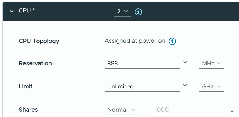
Take note that allocation is done in vCPU, but reservation is done in Hertz. When you vMotion a VM to faster ESXi, let me know if the reservation also increases accordingly. If not, you need to adjust manually.
Hypervisor
In the planning stage, we need a single number for usable capacity.
In the monitoring stage, we should be mindful that our estimate may be too aggressive or conservative. This is why tracking contention is paramount.
Recommended Value
What number do I recommend?
Based on the profiling documented in the kernel section later on, I’d use the following at 2.5 GHz clock speed:
-
12 threads if you use NSX and vSAN.
-
4 threads if you use ESXi only.
NSX EDP adds 2-4 cores as it regularly polls the network card.
vSphere Replication and HCX need to be sized separately.
vSAN File Services needs 2 vCPU as it's a VM. Set reservation.
CPU Metrics
I’ve given recommendations on the number to provide as part of the planning process. Now let’s dive into how the numbers are derived.
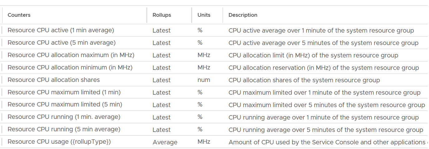
The following screenshot shows the CPU counter names used by vSphere Client UI. What do you notice?
Yes, the roll up of the counter.
In general, when you take the latest value of something, you tend to get a much higher value than averaging the entire period.
Utilization
There are 3 counters provided to track the actual utilization.
-
Usage
-
Running
-
Active
Usage is what you should use as it has the 4 resource groups and their sub pools.
Running and Active counters only has these 3 objects, hence they are less useful. You lose host/user, host/opt so you won’t get complete picture.
Plus, Active uses “latest” as its rollup.
If you still need to know about Active and Running, reach out to me and happy to share more details.
####### Usage
Now that we know which counters to use, what do you expect the values of the 4 groups?
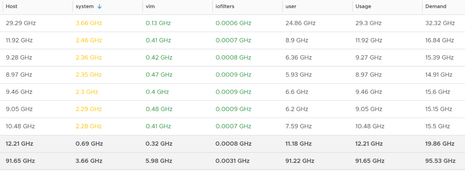
Here is a sample from ~400 ESXi hosts, where I sort the top 7 from highest System usage.
The bottom two rows show the summary. The first summary is the average among all the hosts, while the last row is the highest value.
Usage maps to the ESXi CPU Usage metrics under CPU group.
The value at host matches the value of CPU Usage. This means the metric CPU \ Usage (MHz) is the same with System \ Resource CPU Usage (Average) (MHz).
As the value contains VM metrics, the value is much higher than the kernel. You can see the host/system is far lower.
####### Real World Samples
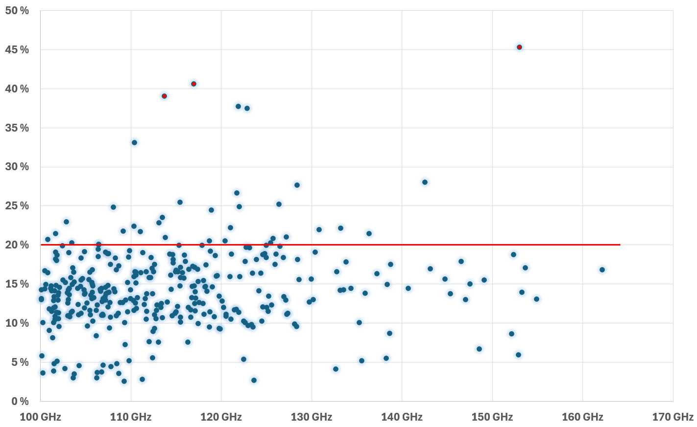
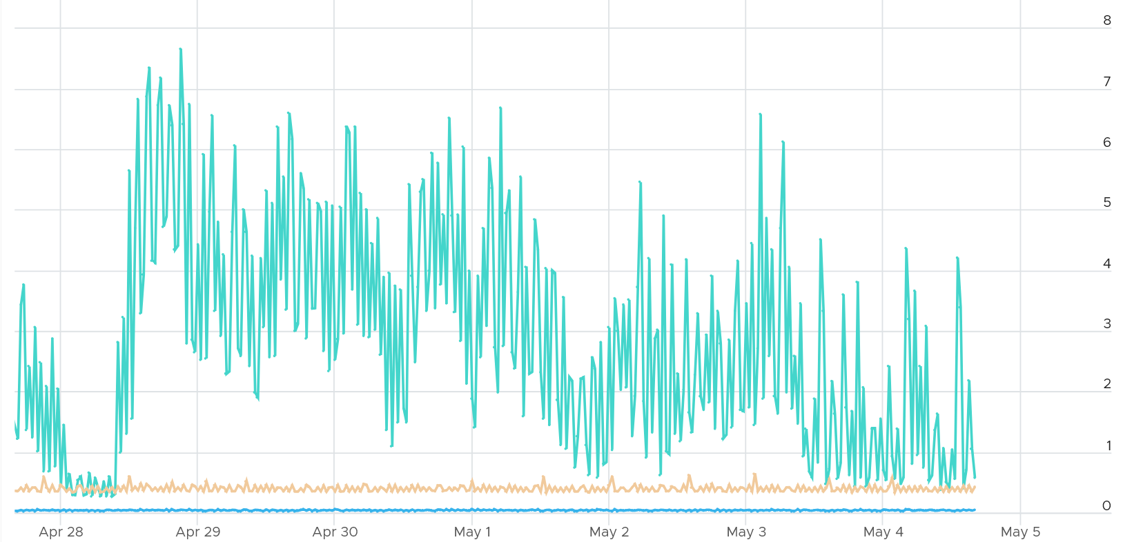
I plotted 364 ESXi hosts running production workload. All of them are doing at least 100 GHz and are running vSAN and NSX. For vSAN, they are a mixed of OSA and ESA architecture.
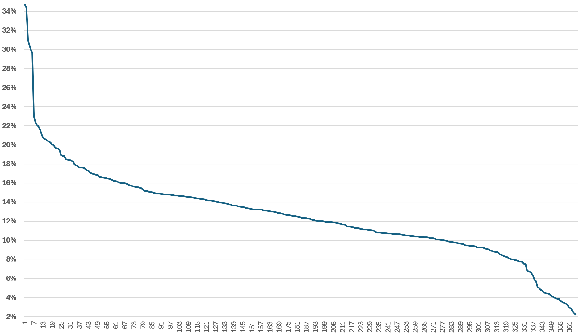
The line below shows the kernel relative to the total CPU Usage.
In terms of absolute utilization, the actual utilization has a wide range. This is despite all these ESXi were running at least 100 GHz.
Take note there is no perfect correlation between kernel utilization and VM utilization. This is especially true when the kernel has NSX and vSAN. All these 364 ESXi were running vSAN (mixed of OSA and ESA) and NSX.
The following chart shows that a great majority were below 10%. There is no strong correlation between the relative overhead and the absolute overhead.
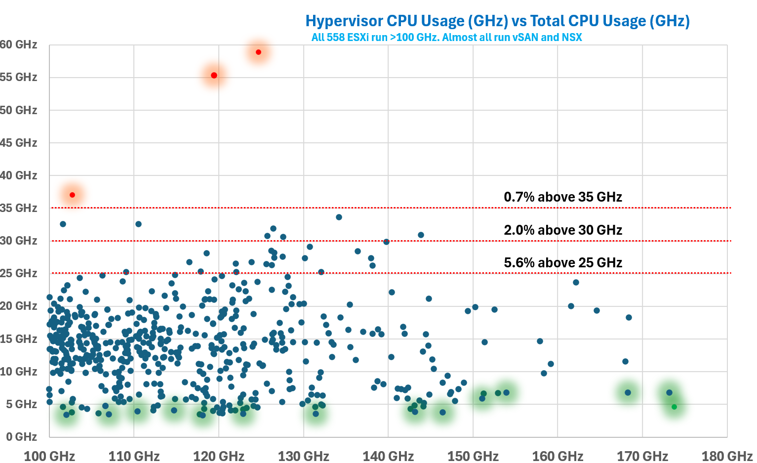
Another measurement, taken at a different time. This time there were 557 ESXi with CPU Usage > 100 GHz, with 2 of them clocking > 170 GHz.
There were 2 outliers at > 40 GHz, highlighted in orange. The hypervisor overhead remains steady at 100 GHz vs > 150 GHz. I drew a red line at 25 GHz to show that majority of the numbers are below this.
Plot the values across all your ESXi hosts. If you take enough hosts, you will notice the values vary. The following chart shows 558 ESXi hosts. Almost all are running both vSAN and NSX. They are all running at least 100 GHz. What do you notice?
Yes, there is hardly any correlation between total CPU Usage and hypervisor CPU Usage.
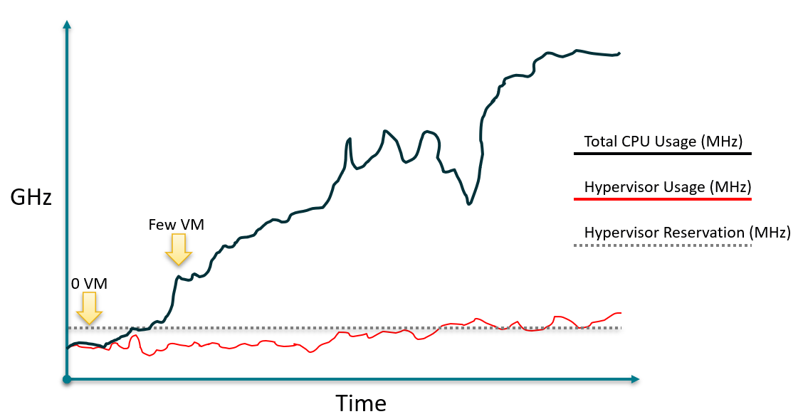
I drew the following illustration to show the lack of predictable relationship between hypervisor CPU reservation, hypervisor CPU usage and total CPU usage.
####### Network Impact
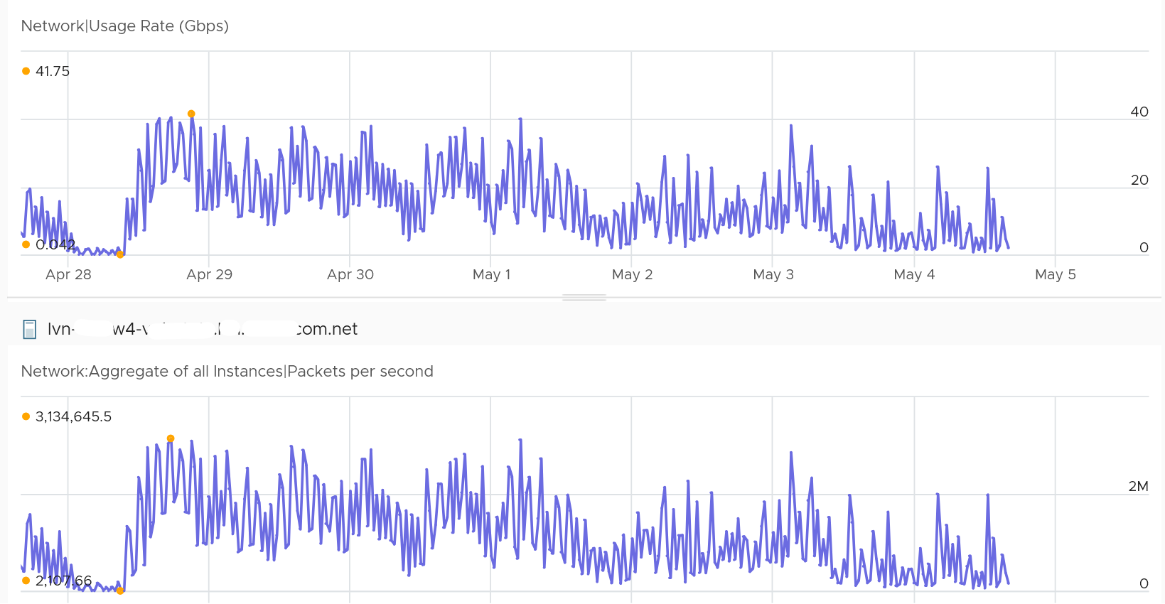
What’s the kernel overhead to do network packet processing?
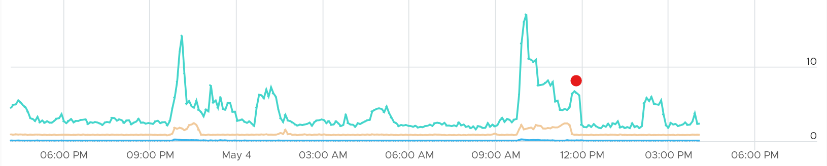
The following ESXi was doing > 40 Gigabit per second multiple times. It was processing > 3 million packets.
Hardly any impact on the kernel. The kernel was less than 8 GHz.
####### Storage Impact
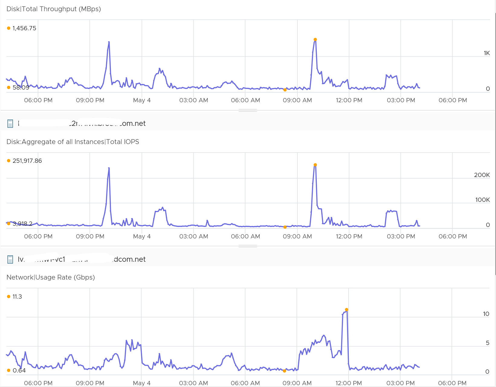
Storage IO processing can require more kernel if the IOPS and throughput are high. The following ESXi hit > 200K IOPS two times.
You can see a corresponding spike in the kernel. It went above 10 GHz.
The red dot is because of network.
Reservation
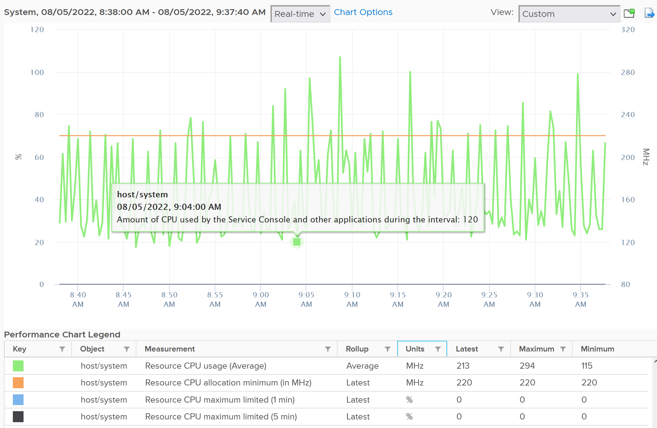
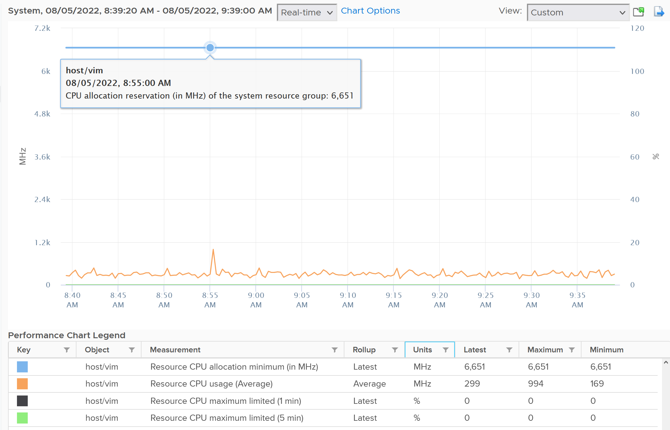
Utilization is relatively more volatile or dynamic, while reservation is logically more stable. The following screenshot shows CPU Usage fluctuates every 20 seconds, while reservation remains perfectly constant. Expect Usage to be higher reservation at high utilization.
Notice the maximum limited value is perfectly flat. That’s what you want as kernel processes should not have a limit.
The above is for host/system. The reservation is surprisingly low.
Now let’s look at host/vim. What do you notice from the following screenshot?
Surprisingly the reservation is not low. It’s around 6.6 GHz.
####### Real World Samples
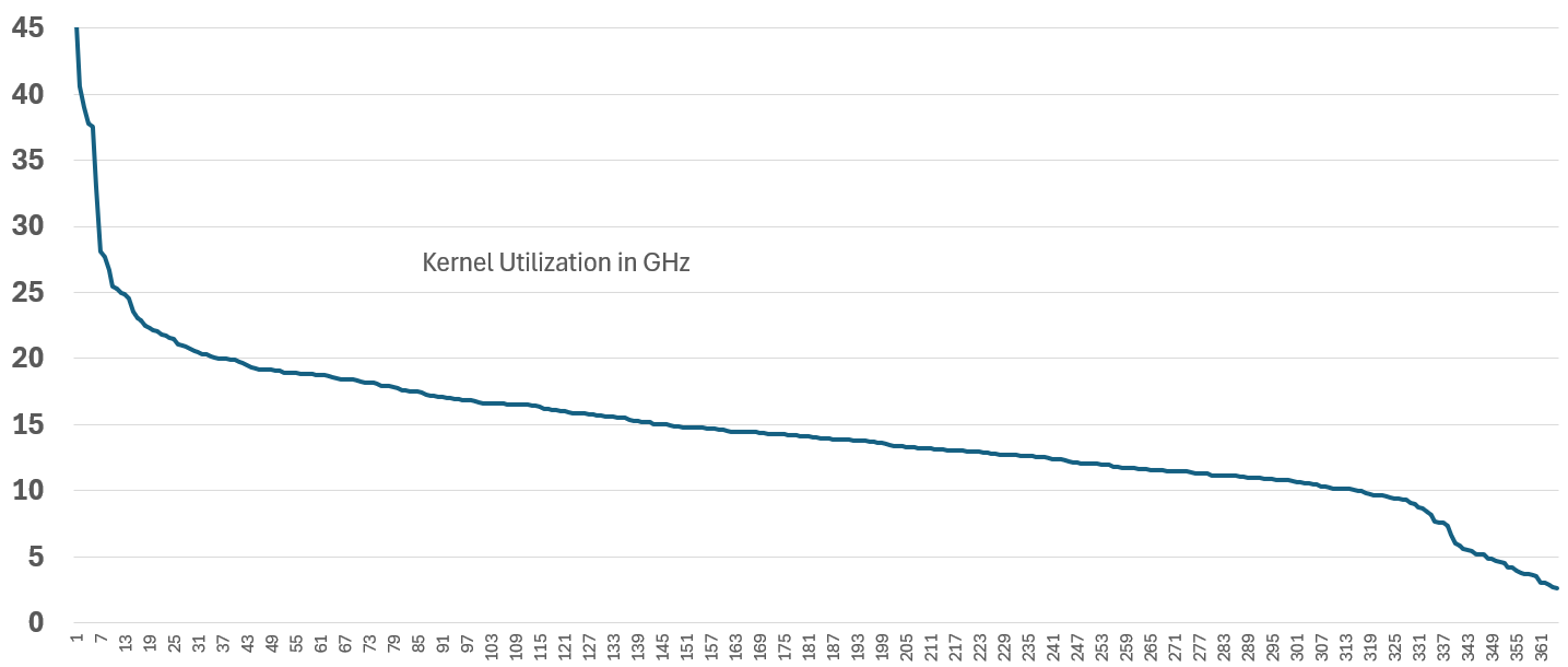
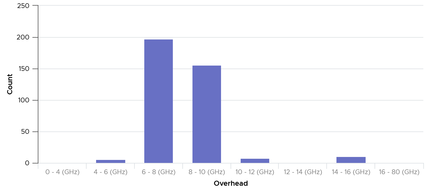
The above is from 1 ESXi. We need to plot for many to get a better understanding. The following diagram shows the distribution of the kernel overhead based on a sample of almost 400 ESXi in production environment.
By far the majority of the values lie in 6 – 10 GHz.
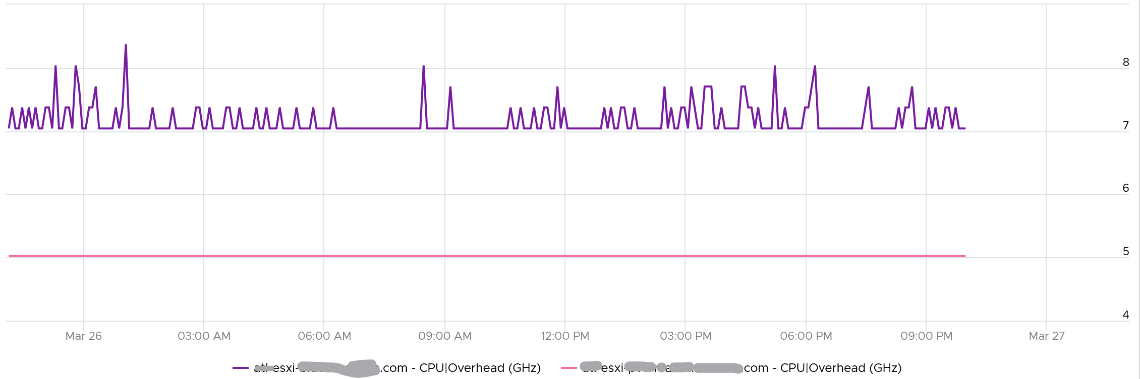
Their values tend to be stable over days, although from time to time I see fluctuating metrics, which is reasonable as there are multiple factors impacting the reservation.
The following chart shows both the fluctuating pattern and steady pattern (most common). They are from 2 ESXi hosts.
Memory
Memory is simpler than CPU as there is only “space” dimension. There is no “speed”.
Memory is more complex than CPU as Guest OS and VM are 2 different realms. None is perfect as an input.
Capacity Metrics
There are
| Metric | Allocation Model | Demand Model |
| Total Capacity | Total physical memory in the box. This is the same for either model | |
| Hypervisor Overhead | No of GB you manually assigned | Not applicable, as it’s included in total ESXi counters |
| Consumption | Sum of all running VM configured RAM. | ESXi Consumed |
| Performance is not applicable. | ESXi Swapped + Zipped + Guest OS Ballooned. | |
Hypervisor Overhead
In the planning stage, we need a single number for usable capacity.
In the monitoring stage, we should be mindful that our estimate may be too aggressive or conservative. This is why tracking contention is paramount.
What number do I recommend?
Based on the profiling documented in the kernel section later on, I’d say:
-
64 GB if you use NSX and vSAN
-
~20 GB if you use ESXi only. I don’t have real world numbers to back this up as the environment I have is NSX and vSAN.
Demand Metric
Unlike allocation, demand is tricky as different layers in virtualization has their own perspective. ESXi applies multiple memory management techniques, which makes it harder to determine the total demand:
-
TPS results in less actual usage.
-
Balloon means ESXi is under memory pressure, or the VM hit a limit.
-
Compress means the pages are still in DIMM, albeit occupying less space. How much less depends on the zipped result and if the remaining page is fully used or not.
-
Swapped and compressed share the same input. When a page cannot be compressed, it got swapped.
-
Host cache.
-
Memory tiering such as Intel Optane.
-
We exclude VM overhead as it’s negligible.
Because of the above, it is better not to mix metrics from Guest OS and VM.
ESXi Demand = Kernel Consumed + Sum of (Running VM Demand)
where VM Demand = Min (Limit, Consumed + Ballooned + Zipped + Swapped)
Limitation of VM counters:
-
Consumed metric is mostly inactive pages. So adding ballooned, zipped, swapped will make it even more conservative.
-
The Guest OS counter is more accurate as it’s closer to application. It tends to be smaller. However, Guest OS is unaware of ESXi memory management techniques.
Hypervisor Metrics
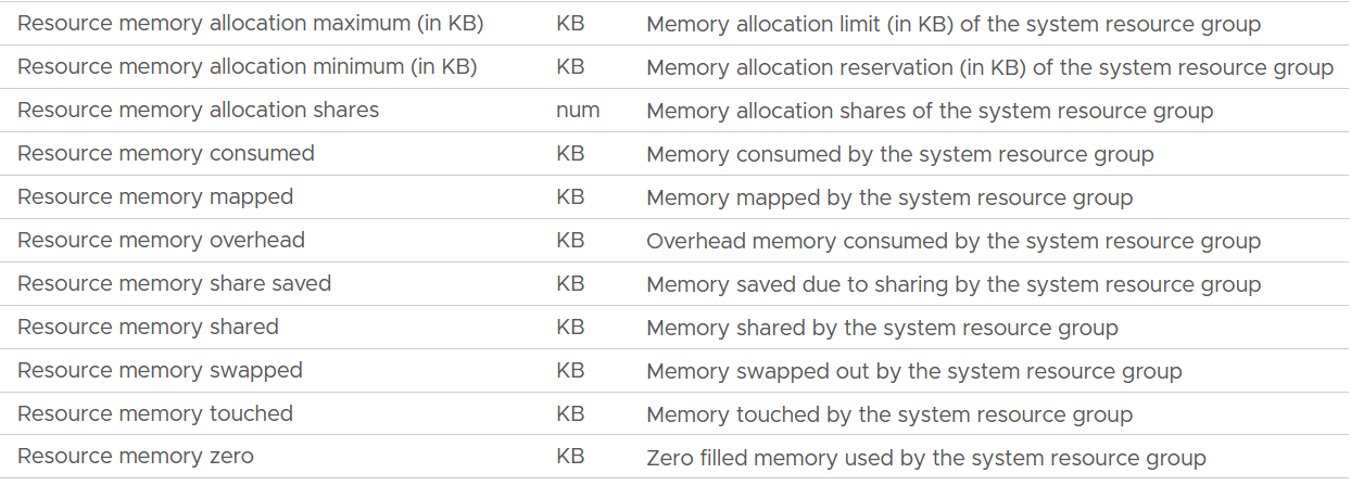
The following screenshot shows the counter names used by vSphere Client UI
Unlike CPU, the Rollups column values are all Latest. This makes sense as memory is measure storage space. You want to know the last value, not the average over collection period.
The Stat Types column values are all Absolute.
| Allocation maximum | As per CPU, this is the limit. |
| Allocation minimum | As per CPU, this is reservation. |
| Shares | Relative shares of each the kernel world. This is the kernel internal metric, not something vSphere Administrator should change |
| Consumed | The actual consumption. Just like CPU, this can be lower than the reservation. The host/vim world has no reservation. |
| Mapped | I’m unsure what mapped means. Regardless, there seems to be no use case for customer operations. The rest of the metrics are fairly similar with the associated metric at VM and ESXi level. |
| Overhead | |
| Share Saved | |
| Shared | |
| Swapped | |
| Touched | |
| Zero | The entire block contains just a series of 0. |
Utilization
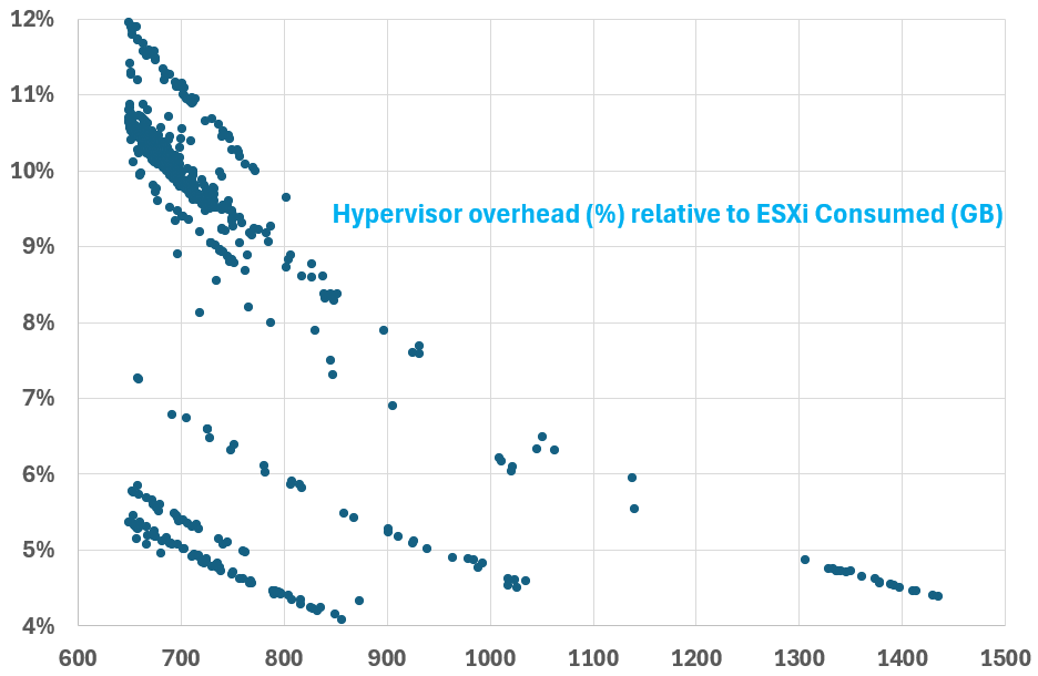
I plotted 607 production ESXi running vSAN and NSX. The hosts have Consumed memory between 650 GB and 1450 GB. As expected, the kernel overhead decreases relatively as total memory grow.
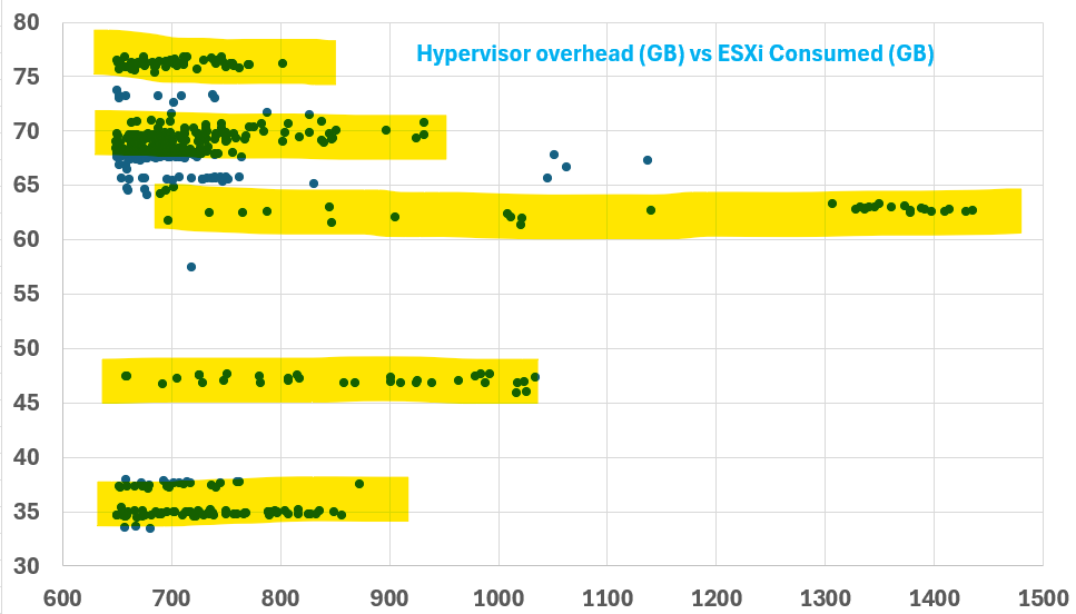
The number dropped to well below 10% once Consumed passed 800 GB. This means that the absolute amount plateau at a certain level. We can validate that by plotting the absolute utilization.
Interestingly, there are levels. From the preceding chart, you can see there are 5 groups of similar number range. I think it’s because of vSAN configuration.
Reservation
The metric name is Memory \ ESX System Usage (KB).
It is a raw counter from vCenter. Just in case you’re wondering, the name ESX System Usage is a legacy name.

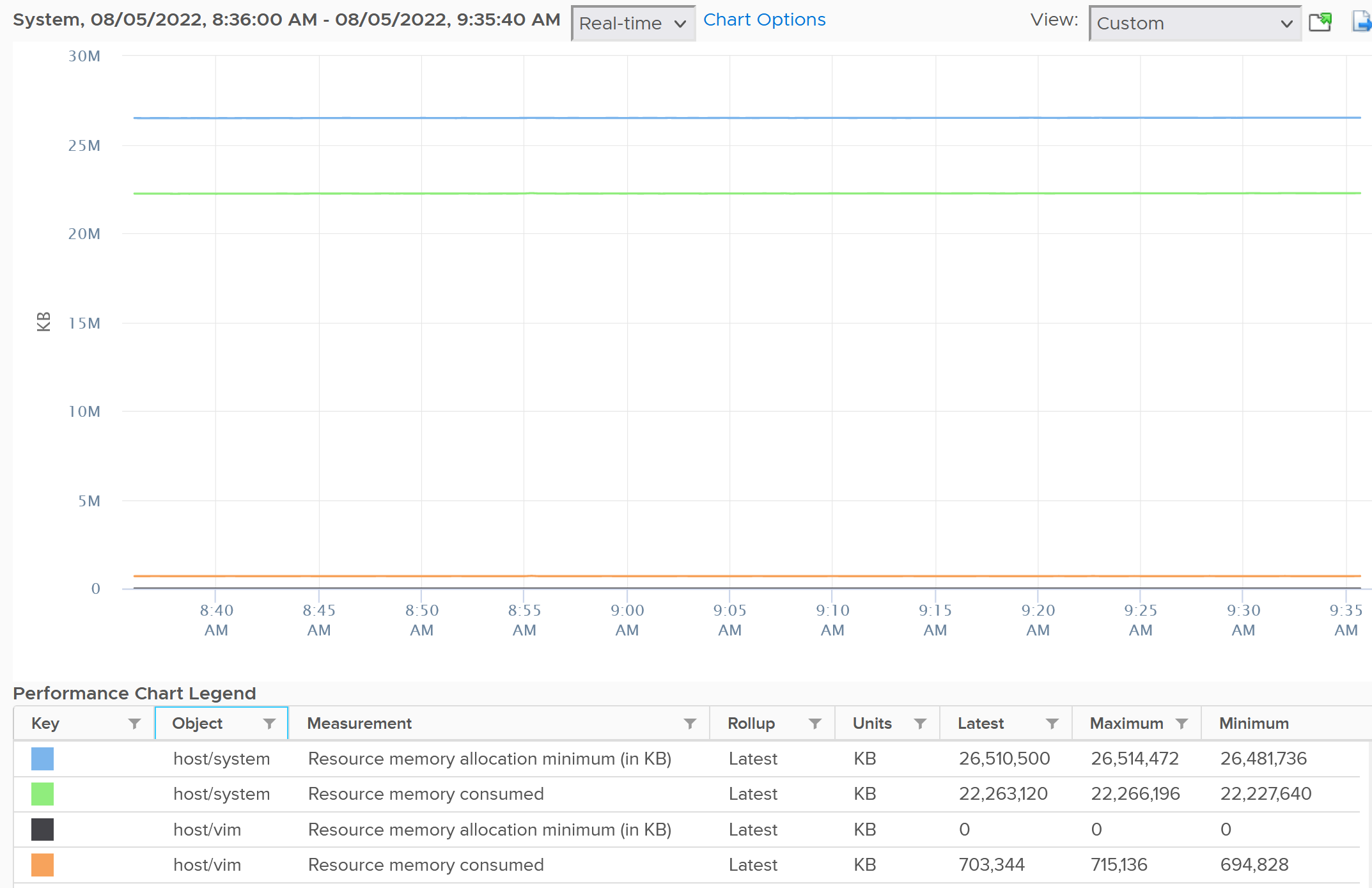
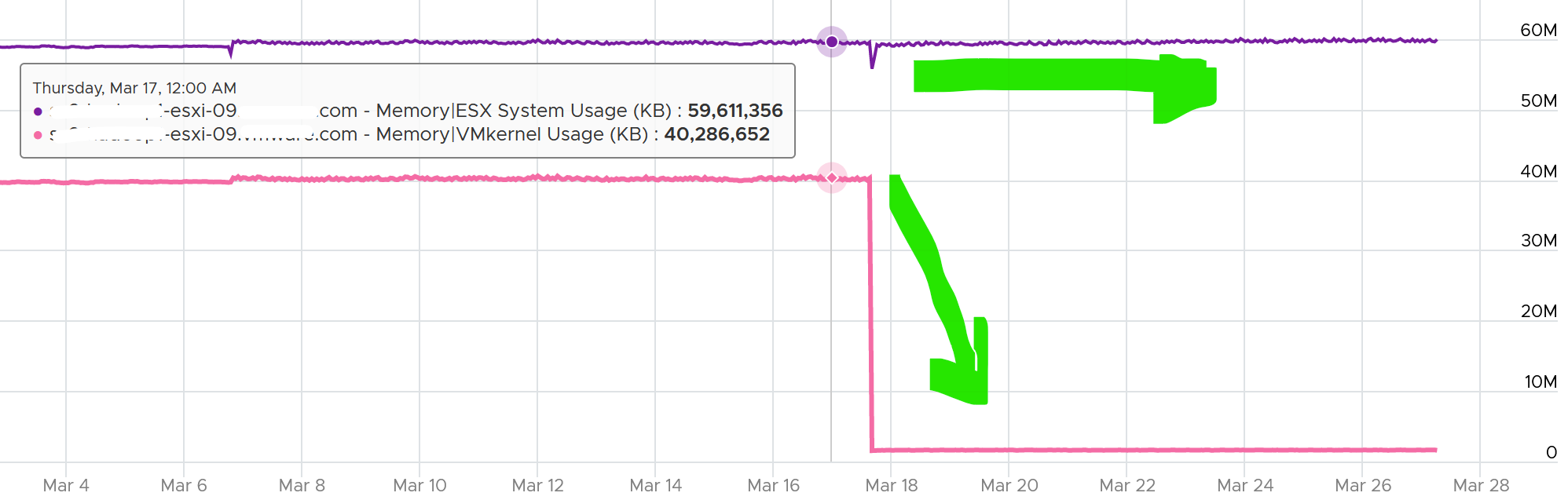
The following is an ESXi 6.7 U3 host with 1.5 TB of memory. Notice the kernel values remains constant over a long period. The number of running VM eventually dropped to 0. While the Granted counter drops to 1.5 GB (not sure what it is since there is no running VM), the kernel did not drop. This makes sense as they are reservation and not the actual usage.
Based on a sample of 500+ ESXi hosts, the range varies from 6 GB to 88 GB. In an ultra large ESXi with 12 TB RAM running vSAN and NSX, the reservation went up to 300 GB.
Utilization vs Reservation
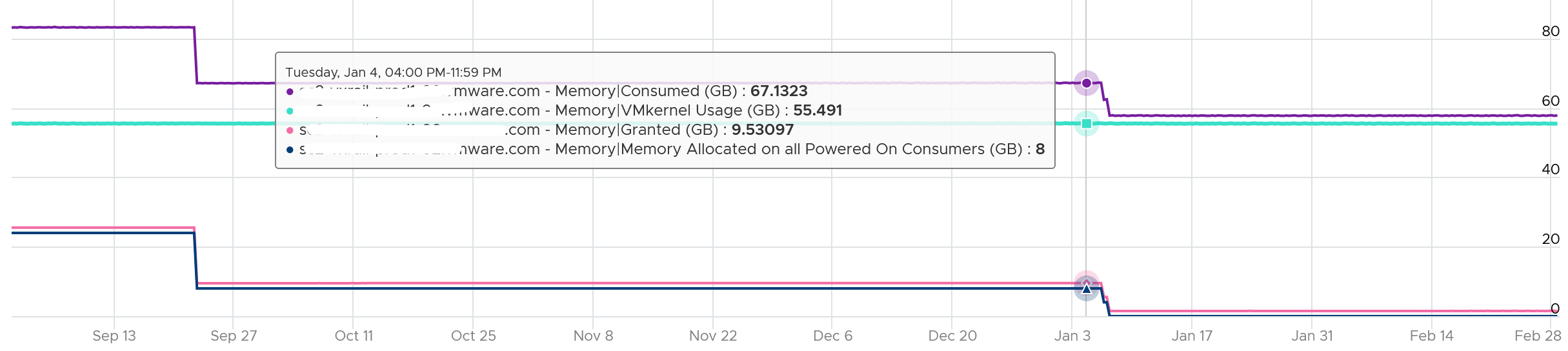
Logically, utilization does not always correspond to the reserved amount. The following chart shows the reservation remains steady when the utilization drops by 90%, from 40 GB to single digit.

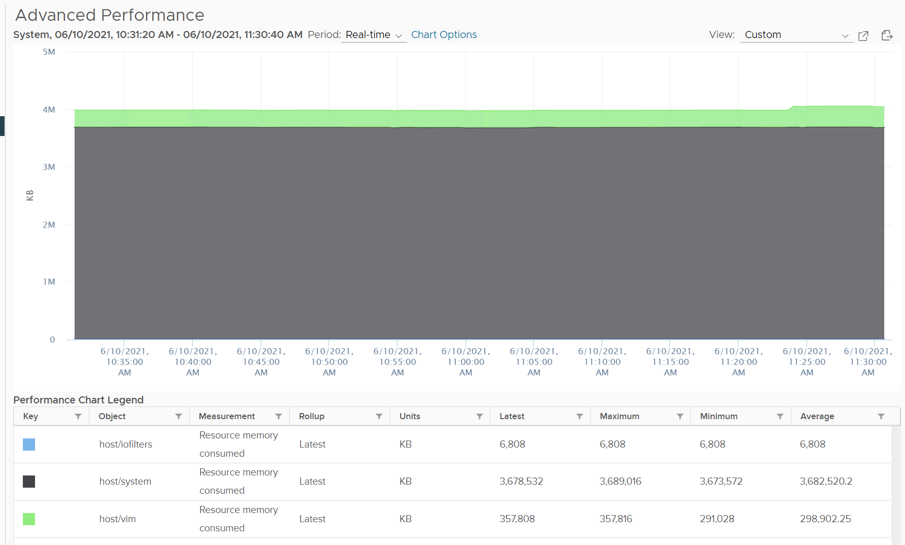
To see the actual usage, choose the metric Resource Memory Consumed metric from vSphere Client. Stack them, and you see something like this. The system part typically dwarfs the other 2 resources.
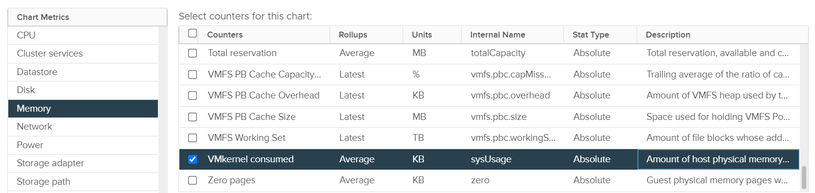
Do not take the value from Memory \ VMkernel consumed counter. That’s only the system resource. You can verify by plotting this and compare against host/system resource. You will get identical charts.
This value is for vSphere kernel modules. It does not include vSAN.
Storage
Used > Allocated
Can you use more than what you’re allocated?
That sounds illogical, doesn’t it?
Well, it can happen when “other consumption” comes into play.
For example, software-defined storage such as vSAN delivers the protection at software layer, not hardware layer.
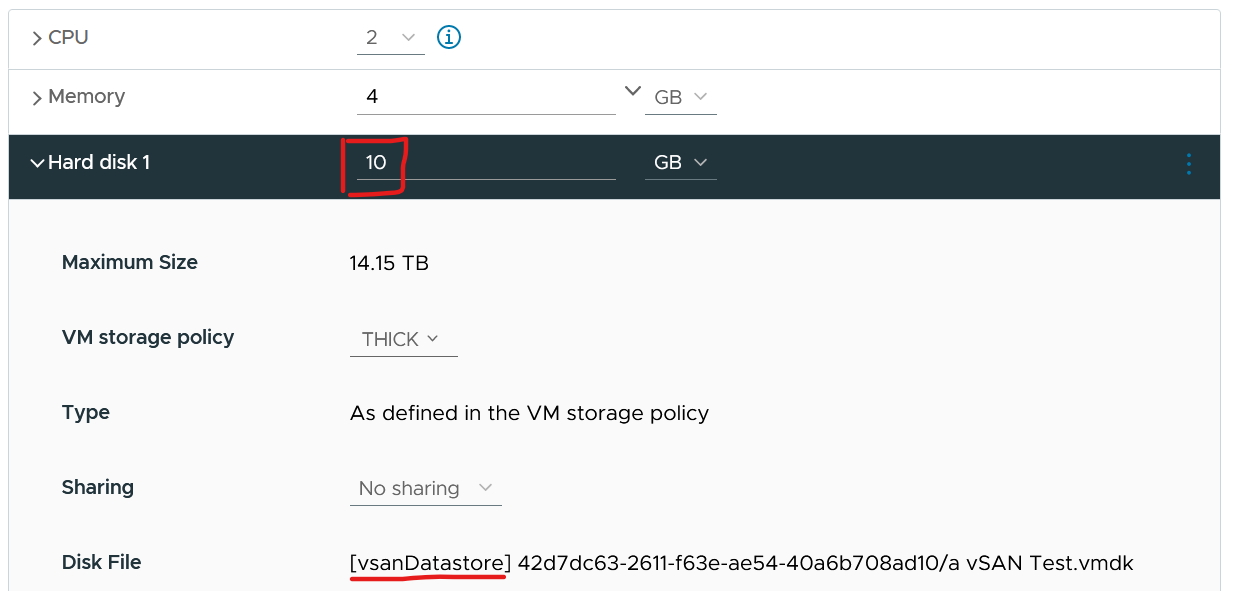
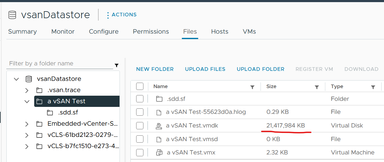
The following screenshot shows a VM configured with 10 GB hard disk. That means the guest OS is allocated with 10 GB.
It’s thick provisioned as specified by vSAN policy.
Guess how much disk space it actually consumes at the VMFS layer?

You’re right. It is 20 GB.
Implementation
Aria Operations metrics
| Memory \ Total Capacity (KB) | The capacity as seen by the kernel, which is essentially the physical size. |
| Memory \ Utilization (KB) | Sum of demand from all running VM (see below) + ESXi kernel reservation. Demand is the maximum of VM reservation and Guest OS needed memory + total page-in in the collection cycle (default is 5 minutes). Page in = page in rate x memory block size. If Guest OS is missing, it falls back to consumed. The amount also includes the VM memory overhead. |
| Memory \ Workload (%) | Utilization / Total Capacity. Likely this is usable. |
| Memory \ Memory Allocated on all Powered On Consumers | Sum of all running VM configured memory. This is used in allocation model. |
At the vSphere Cluster level, here are the metrics:
| Cluster Configuration \vSphere HA \ HA Memory Failover (%) | Cluster HA failover for memory. |
| Memory|Demand|Usable Capacity after HA and Buffer (GB) | Total Capacity minus HA above and buffer (not shown as property) |
| Memory|ESX System Usage (GB) | Kernel reservation |
| Memory \ Utilization (KB) | Sum of all ESXi |
| Memory|Demand|Workload (%) | Utilization / Usable |
| Memory \ Memory Allocated on all Powered On Consumers | Sum of all ESXi |
| Memory|Workload (%) | Normalized average of all ESXi? |
Cluster Capacity
Cluster capacity is more complex than ESXi capacity due to the following cluster-level property
| Total Capacity | Unlike ESXi, this could be dynamic due to reasons such as maintenance mode and DPM. Hybrid cloud such as VM sports on-demand host that is added dynamically. Dynamic cluster size increases complexity significantly. As a best practice, avoid removing hosts from the cluster if the cluster has < 5 ESXi hosts as your availability overhead becomes higher. |
| Buffer | For most cases, this is 10% for CPU and 0% memory. For stretched cluster, this is 50% for CPU and memory. For DR, this depends on the DR workload. |
| HA | This impacts usable capacity. For example, if it’s 9+1, then cluster average utilization at 100% means each host is averaging 90%. |
| Stretched Cluster | The 2 sites have their own capacity calculation, yet they impact each other. |
| Host-VM Affinity | The group of hosts have their own capacity, operating like a subcluster. |
| Resource Pool | Each pool has their own capacity. |
| DR | A cluster may participate in disaster recovery by providing destination during DR dry run and actual. This is why you need to specify buffer, so that usable capacity reflect this rarely happens workload. BTW, the buffer default value is 0% in VCF Operations. |
Total vs Usable
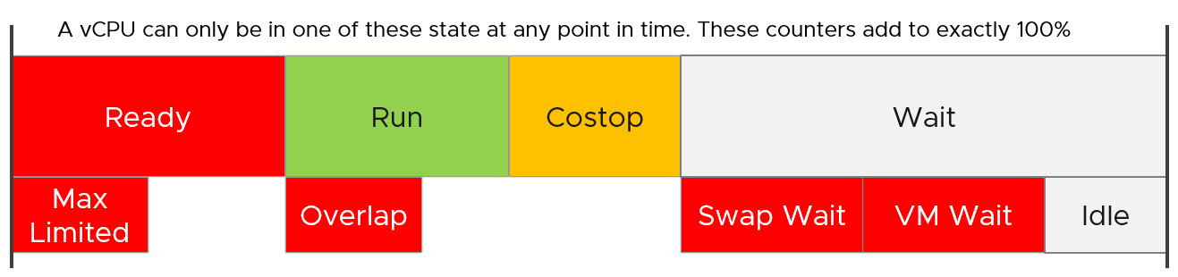
Let’s take an example.
Assuming 10 hosts in a cluster, with N+1 HA setting, and Buffer is set to 0%.
Usable Capacity is 9 hosts, so 9 is the 100% operationally.
From here, if a host is out, the calculation depends on what actually caused it. There are 3 different scenarios:
| Intentional? | Desired? | Impact | |
| vSphere DPM | Yes | Yes | Total Capacity |
| Maintenance Mode | Yes | No | Usable Capacity |
| HA happen | No | No! | Usable Capacity |
Intentional means it’s something you knowingly execute. In the case of vSphere DPM, it’s also something you want to happen. In the case of Maintenance Mode, you intentionally do it but it’s not something you want. So the 2 have different impact. vSphere DPM does not impact your HA as you still want HA even though you take out host(s). The length of DPM can be as long as there is no request for extra host. The length of maintenance mode should be as short as possible, hence the name maintenance.
HA events is an outage. It is obviously not something desired.
Undesired event impacts usable capacity and not total capacity.
| DPM Event | Maintenance Mode | HA Event | |
| Total Capacity | 9 | 10 | 10 |
| Usable Capacity | 8 | 9 | |
| Actual Availability | 9/9 = 100% | 9 / 10 = 90% | |
| Operational Availability | 9 / 8 = 100% (capped) | 9 / 9 = 100% | |
The actual availability drops to reflect reality. The operational availability remains at 100% due to N+1 HA design.
For completeness, let’s follow with a 2nd host out:
| DPM Event | Maintenance Mode | HA Event | |
| Total Capacity | 8 | 10 | 10 |
| Usable Capacity | 7 | 8 | |
| Actual Availability | 8 / 8 = 100% | 8 / 10 = 80% | |
| Operational Availability | 8 / 7 = 100% | 8 / 9 = 89% | |
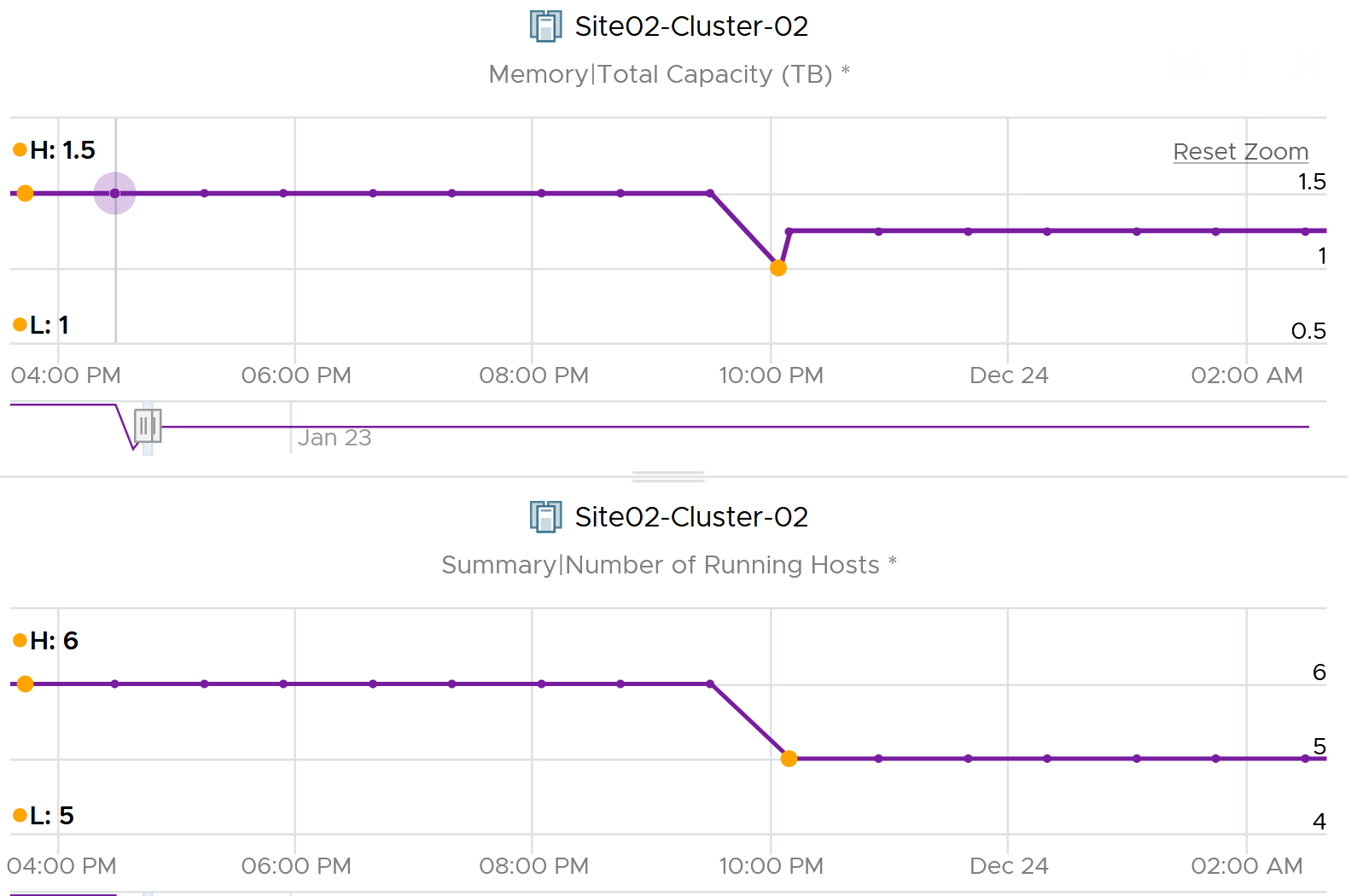
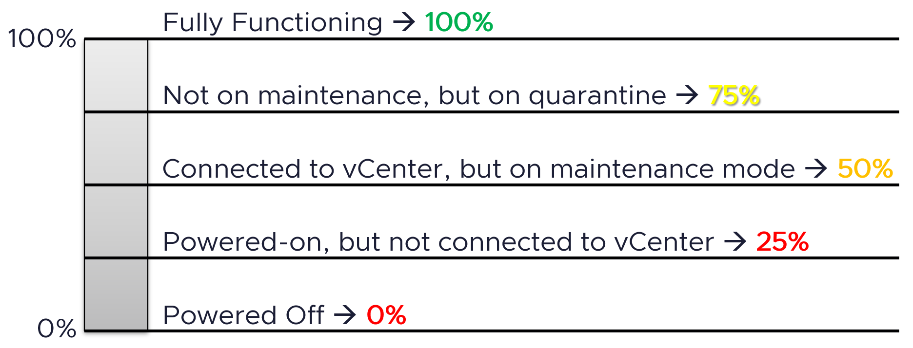
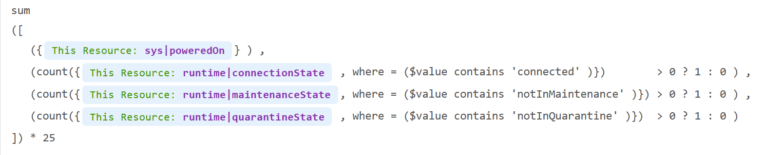
BTW, the metric Total Capacity only counts those ESXi hosts that are connected to vCenter. If a host is connection state = disconnected, its value becomes blank, so the Total Capacity is affected.

Footnotes
-
The structure is deep. To know more about how ESXi resource pool group structure, I recommend these talks by Valentin Bondzio. Specifically, minute 18:10 on his VMware Explore Barcelona 2023 session. ↩