Introduction
The World of Metrics

Metric is essentially an accounting of system in operations. To understand the counter properly hence requires a knowledge of how the entire system works. Without internalizing the mechanics, you will have to rely on memorizing. In my case, memorizing is only good for getting a certificate.
Take time to truly understand the reasons behind the metrics. You will appreciate the threshold better when you know how it is calculated.
Nuances in Metrics
It is useful to know the subtle differences in the behaviour of metrics. By knowing their differences, we can pick the correct metrics for the tasks at hand.
Naming Complexity
| Same object, same metric, different name | OpenTelemetry uses “Utilization” instead of “usage (%)”. So a Pod Memory is called Memory Usage (GB) and Memory Utilization (%). |
|---|---|
| Same name, same object, different formula | The metrics have the same name, belong to the same object, yet they have a different formula depending on where in the object you measure it. Example: VM CPU Used in vCPU level does not include System time but at the VM level it does. The reason is that System time does not exist at vCPU level since the accounting is charged at the VM level. |
| Same name, same purpose, different formula | Metrics with the same name do not always have the same formula in different vSphere objects. |
Memory Usage: in VM this is mapped to Active, while in ESXi Host this is mapped to Consumed. In Cluster, this is Consumed + Overhead. Technically speaking, mapping usage to active for VM and consumed for ESXi makes sense, due to the 2-level memory hierarchy in virtualization. At the VM level, we use active as it shows what the VM is physically consuming (related to performance). At the host and cluster levels, we use consumed because it is related to what the VM claimed (related to capacity management). This confusion has resulted in customers buying more RAM than what they need. VCF Operations uses Guest OS data for Usage, and falls back to Active if it’s not available. | |
| Memory Consumed: in ESXi this includes memory consumed by ESXi, while in Cluster it only includes memory consumed by VM. In VM this does not include overhead, while in Cluster it does. | |
| VM Used includes Hyper Threading but penalty is 37.5%. ESXi Used is also aware of HT but the penalty is 50%. | |
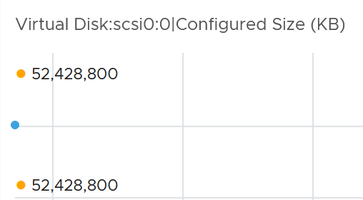
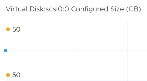
| Virtual Disk: in VM includes RDM, but in Datastore it does not. Technically, this makes sense as they have different vantage points. | |
| Steal Time in Linux only includes CPU Ready, while stolen time in VM (CPU Latency) include many other factors including CPU frequency. | |
| Same name, different meaning | Metrics with identical name, yet different meaning. Be careful of misinterpretation. |
| VM CPU Usage (%) shows 62.5% when ESXi CPU Usage (%) shows 100%. This happens due to different perspectives. When both threads are running, ESXi CPU Usage does not. | |
| Disk Latency and Memory Latency indicate a performance problem. They are in fact the primary counter for how well the VM is being served by the underlying IaaS. But CPU Latency does not always indicate a performance problem. Its value is affected by CPU Frequency, which can go up or down. Sure, the VM is running at a higher or lower CPU speed, but it is not waiting to be served. It’s the equivalent on running on older CPU. | |
| Same name, different behaviour | VM CPU Usage (MHz) is not capped at 100%, while ESXi CPU Usage (MHz) is. The later won’t exceed the total capacity. |
| Memory Reservation and CPU Reservation have different behaviors from monitoring viewpoint. | |
| In Microsoft Windows, the CPU queue includes only counts the queue size, while the disk queue excludes the IO commands being processed. | |
| Same purpose, different name | You would expect if the purposes are identical then the labels or names will be identical. |
| Kubernetes uses the term “Request”, while vSphere uses the term “Reservation”. The excuse from Google Borg is the persona is different. The developer is requesting a reservation. | |
Swapped Memory in VM is called Swapped, while in ESXi is called Swap Used. Static frequency CPU utilization in VM is called Run, while ESXi calls it Utilization. Different names make sense as they reflect different vantage points. | |
| What vCenter calls Logical Processor (in the client UI) is what ESXi calls Physical CPU (in esxtop panel). I think the word logical is confusing. Easier to use virtual vs physical. | |
| vCenter uses Consumed (%) and Usage (%) for the same ESXi CPU utilization. | |
Microsoft Windows has 3 counters to measure CPU consumption.
| |
| Confusing name | The name of the counter may not be clear. |
OpenTelemetry uses the following definition: “usage - an instrument that measures an amount used out of a known total (limit) amount should be called entity.usage.“ “utilization - an instrument that measures the fraction of usage out of its limit should be called entity.utilization.“ | |
| VM CPU Wait counter includes idle time. Since many VMs do not run at 100%, you will see CPU Wait counter to be high. You may think it’s waiting for something (e.g. Disk or Memory) but it’s just idle. If we see from the viewpoint of kernel schedule, that vCPU is waiting to be used. So the name is technically correct | |
| The term virtual disk includes RDM. It’s not just VMDK. The reason is RDM appears as virtual disk when you browse the directory in the datastore, even though the RDM file is just a pointer to an external LUN. | |
| Incorrect name | Task Manager in Windows is not correct as the kernel does not have such concept. The terminology that Windows has is called Job. A job is a group of processes that can be managed as one. Do you want it to be called Job Manager? 😊 I think Process Manager is better as that’s what running on top of the kernel. |
| Mixing terminology | Allocation and reservation are 2 different concepts. When you allocate something to someone, it does not mean it’s guaranteed. If you want a guarantee, then do reservation. Allocation is a maximum (you can’t go beyond it), while Reservation is a minimum. The actual utilization can be below reservation but can’t exceed allocation. You cannot overcommit reservation as it’s a guarantee. You can overcommit allocation as it is not a guarantee. Avoid using metric names like these:
|
The word device, disk and LUN are used interchangebly. They are actually not identical. Device is actually generic. It does not have to be storage device. It can be network device or security device. Disk tends to be phsyical, something you can hold in your hands. It is typically part of a disk group called RAID. Advanced storage array takes the concept further. It can create a logical volume spanning multiple RAID groups. The lazy name LUN was chosen. I prefer to call it Logical Volume, but will stick to LUN in this book. LUN is what ESXi host mounts and then format it with VMFS filesystem. |
Architecture Complexity
The 4 basic elements of infrastructure have been around since Adam built the first data center for Eve. Humankind has not invented the 5th Element yet. However, each of these 4 has their own unique nature. They have “speed vs space” dimensions. This in turn creates complexity in observability.
The following table shows how the 4 elements of infrastructure relate to these 2 dimensions.
| Speed | Space | Analysis | |
|---|---|---|---|
| CPU | Yes | N/A | Speed is measured in Hertz. Space is measured in vCPU or physical thread. |
| Memory | Limited | Yes | Speed is practically not applicable as the latency is in nanoseconds. It only matters in application that needs low latency such as GenAI. Memory read/write is speed, but since the latency negligible, it is generally not used in performance management. |
| Storage | Yes | Yes | 2 metrics for speed. Bytes per second and IO per second. Space is measured in bytes. |
| Network | Depends on the nature | Unlike server and storage, network takes >1 shape. It’s both a line and a dot. The network cables are the lines, the switch is the dot. | |
Let’s elaborate.
| CPU | The speed of CPU is far higher than the speed of the observability code. This results in values that is not 100% correct. For example, if you count the number of threads per thread state in Windows or Linux, you may get 5% variation. Your code operates in miliseconds while CPU runs in nanoseconds. |
|---|---|
| The primary speed metric (GHz) is not comparable across different hardware generation or architecture. 1 GHz in today’s CPU is more efficient than 1 GHz in older CPU. You get more work done. | |
| Different variants of CPU models in the same generation from the same vendor. | |
| Memory | Its function is caching, so its counters tend to be near 100%, and that is what you expect as cache is typically much smaller than the actual source. Anything less than 100% is not maximizing your money. CPU and memory metrics have different nature. 95% utilization for memory could be low, while 85% for CPU could be high already. |
| It’s a form storage, so its metrics are mostly about space and not speed. There is VM CPU Demand, but not VM Memory Demand. Demand does not apply to memory as it’s a form of storage, just as there is no such thing as a Demand metric for your laptop disk space. | |
| Storage | It has 2 sides (speed and space), but both have consumption metrics. The speed has 2 components for consumption: IOPS and Throughput. The throughput depends on the block size. It is also measured in bytes/second, not bit/second. The reason is you’re measurign the amount of disk space being read or written from the storage. Unlike network throughput, which focuses on the cable or wire, the disk throughput focuses on the node. |
| There is limit for disk IOPS, but not for disk throughput. The latter is not practical to implement due to varying block size. | |
| Network | While server and storage are nodes, network is interconnect. This makes it more challenging. We will cover this in-depth in the System Architecture section |
Their complexity results in difference in type of metrics applicable:
| Utilization | Reservation | Allocation | |
|---|---|---|---|
| CPU | Yes, but 3 different units for ESXi (thread, Hertz, vCPU) | ||
| Memory | Yes | Yes | Yes |
| Disk | Yes | Not Applicable | Yes |
| Network | Yes | Yes | Yes |
And lastly, beyond metrics there are also further complications such as:
| VM vs ESXi | The CPU metrics from a VM viewpoint differs to the CPU metrics from ESXi viewpoint. A VM is a consumer. Multiple VMs can share the same physical core, albeit at the price of performance. So metrics such as Ready does not apply to ESXi. The core and the thread are always ready. |
|---|---|
| ESXi vs vCenter | While ESXi is the source of metrics, vCenter may add its own metrics and the formula don’t always match 100% in all scenarios, such as Used vs Usage. |
| ESXi provides Run (ms), Used (ms), Demand (MHz) for VM CPU. vCenter adds Usage (MHz) and Usage (%). | |
| ESXi shows Used (%), while vCenter shows Used (ms). The first one affected by CPU frequency and can go beyond 100%. | |
| ESXi ≠ VMs + Kernel | The metrics at ESXi is more complex than the sum of its VM + the kernel. |
| M:N relationship | A VM with multiple virtual disks can span across multiple datastores, and even RDMs. On the other hand, a datastore typically hosts many VMs. An ESXi may mount multiple LUNs and a LUN is typically presented into multiple ESXi or even multiple clusters. These many to many relationships make the metrics across VM, datastore, ESXi, Cluster, Data Center inconsistent when viewed overall. Each of them is correct as each has to look from their own vantage point. |
Other Nuances
| Time | Some metrics reflect what happened in the past. That’s why the name is in past tense. |
|---|---|
| Memory ballooned does not mean there is an active ballooning happening. The process could have happened days ago, and the page was simply idling, never been asked by Guest OS. | |
| Roll up | vCenter measures every 20000 ms, but the maximum value for a completely idle thread is 10000. The reason is 20000 is the value set at the core level. Since a core has 2 threads when HT enabled, each was allocated 10000. |
| Unit | VM CPU Ready can be above 100%. If you look at esxtop, many VM level metrics are >100%. This is due to summation as opposed to average maths. |
| Why are CPU metrics expressed in milliseconds instead of percentage or GHz? How can a time counter (milliseconds in this case) account for CPU Frequency? | |
For CPU, 1 GHz = 1000 MHz. For memory and disk space, 1 GiB = 1024 KiB and 1 GB = 1000 KB. | |
| Esxtop and vSphere Client use different units for the same metric. For example, esxtop use megabit while vCenter UI use kilobyte for networking counter. | |
| Formula | ESXi CPU Core Utilization reports 100% when 1 thread is running. But it also reports 100% when both threads are running. To know which one is the case, you need to check ESXi CPU Thread Utilization. |
| ESXi CPU Idle (ms) includes low activities. It also considers CPU frequency, and not simply whether CPU is running or now. | |
| Sampling | Counters are sampled, so you should expect small rounding/timing drift, not a perfect mathematical 100.000% on every sample. |
Sampling can also drift in a busy system. For example, you want to sample every 20 second. If the sample takes a few seconds because you’re sampling massive amount of data and your system is busy, your final numbers will drift over time against wall clock. To overcome this, your collection logic must consider the time taken to collect and process. |
In addition to all the above nuances, there are complexity created by choices and scale.
| Choices | When you have 2 watches showing different times, you become unsure which watch is the correct one. |
|---|---|
| There are 5 metrics for VM CPU “consumption”: Run, Used, Usage, Usage in MHz, and Demand. | |
| There are 7 metrics for ESXi CPU “consumption”: Core Utilization, Utilization, Used, Usage, Usage in MHz, Consumed, and Demand. | |
| Volumes of Metric | The sheer number of metrics make analysis difficult. |
| Take for example, vCenter has 17 CPU metrics available at the VM level, and 12 of them are available at a vCPU level too. In addition, each VM comes with 28 memory metrics. That means a VM with 4 vCPUs will have 93 metrics (17 + 4 x 12 + 28). A vSphere environment with 1,000 VMs with 4 vCPUs as the average VM size will have process 93K metrics each time it collects. If you do that every minute, you will collect almost 134 million metrics per day. Since many customers like to keep for at least 6 months, that’s 24+ billion metrics. | |
| With so many metrics, the amount of business value received becomes a valid concern. At the end of the day, you are not in the business of collecting metrics. |
Interpretation Challenge
At the end of the day, you care about the interpretation of the value. What is considered good? As you can guess, the answer is “it depends”. Different applications have different tolerances. Even the same software has variable tolerance, depending on the use case. Even on identical user case, the end users have different tolerances.
The above makes it challenging to set up out of the box thresholds, which are universal for all cases. Set too low, and you see red too often when there is no actual complaint, and set too high, and you miss the actual problem.
As an example, let’s take disk latency. I take Microsoft SQL Server as that’s a popular application and it’s used in many production environments. The following is a guidance from Microsoft:
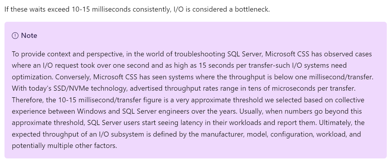
It says 10 – 15 milliseconds. But that’s at MS SQL layer. That means at MS Windows layer it needs to be lower, to account for processing latency and queue in the stack. This also means at vSphere VM layer, it needs to be even lower. So what should we set the value at VM level? How about read versus write? It is indeed a challenge to set.
It says “consistently”. Since IO measure per second, does it mean 300 seconds is far too long? That means 300x, which is definitely consistent. From what I’ve seen, if you set at 5 minutes, you are likely to get a lot of alerts but little complaint.
You can read more at Troubleshoot slow SQL Server performance caused by I/O issues.
Documentation Challenge
To master metrics, you need to be able to see them from 3 different perspectives:
| Technology | Computer architecture has not fundamentally changed since the first day of the mainframe. You have CPU, memory, disk and network. Documenting via this route is useful for infrastructure. |
|---|---|
| There are variants such as GPU and APU, and components become distributed and virtual. You need to be able to see how the metrics behaviour change. | |
| Pillars of Operations | Each pillar brings their own set of metrics. For examples:
|
| Product | Product such as vSphere, NSX, and Kubernetes bring their own set of objects. Each type of object (e.g. VM, K8 Pod, AWS S3, Oracle DB) has their own set of metrics. Since objects typically have relationship with other objects and are grouped under a parent (e.g. a K8 Cluster has multiple nodes, which in turn can have multiple pods), you end up with multiple parallel hierarchies or overlapping hierarchies. |
As a book has a simple and fixed structure, it’s impossible to document in 3 different ways. That’s why this book blends the approach.
-
It starts with the raw metrics, followed by derived metrics. Raw metrics tend to be simple and narrow in scope. Derived metrics combine multiple raw metrics. It tends to cover multiple areas.
-
For raw metrics, it follows the technology route. For each of the 4 infrastructure elements, it covers contention first, then consumption.
-
For derived metrics, it follows the product or object approach. Within each object, it follows the pillar of operations.
Ideally, we use an interactive website where you can browse from different perspectives. Or maybe we simply use Generative AI, assuming we can augment it with logic instead of 100% relying on English and Maths.
Virtualization Impact
vSphere counters are more complex than physical machine counters because there are many components as well as inconsistencies that are caused by virtualization. When virtualized, the 4 elements of infrastructure (CPU, RAM, Disk, Network) behave differently.
Virtualization splits the IT stack into Provider and Consumer. The providers have 2 types of counters:
-
Provider metric. This metric does not exist at consumer. For example, the physical network in ESXi.
-
Sum of Consumer metric. This metric aggregates the metric of consumers. For example, the sum of VM network in the ESXi.
The confusion comes because the metric name does not tell what type of metric it is. For example, is ESXi CPU Demand a consumer or provider metric?
Not all VMware-specific characteristics are well understood by management tools that are not purpose-built for it. Partial understanding can lead to misunderstanding as wrong interpretation of metrics can result in wrong action taken.
The complexity is created by a new layer because it impacts the adjacent layers below and above it. So the net effect is you need to learn all 3 layers (Guest OS layer, virtualization layer and physical layer). That’s why from a monitoring and troubleshooting viewpoint, Kubernetes and container technology require an even deeper knowledge as the boundary is even less strict. Think of all the problems you have with vSphere Resource Pool performance troubleshooting, and now make it granular at process level. You’re having a good time mastering K8 right? 😉
Since VMkernel is technically an operating system, it has kernel space and user space. Some counters include both, while others don’t.
What, exactly, is a VM?
From observability viewpoint, a VM is not what most of us think it is. It changes the fundamental of operations management. It introduces a whole set of metrics and properties, and relegates many known concepts as irrelevant.
For example, you generally talk about these types of system-level metrics in Windows or Linux
-
Processes
-
Threads
-
System Calls/sec
But when it comes to VM, you don’t. The reason these OS-level metrics are not relevant is because a VM is not an OS.
To master vSphere metrics, you need to know ESXi kernel. The kernel is a different type of OS as its purpose is to run multiple virtualized motherboard (I personally prefer to call VM as virtual motherboard). As a result, its metrics are different to typical OS such as Windows and Linux.
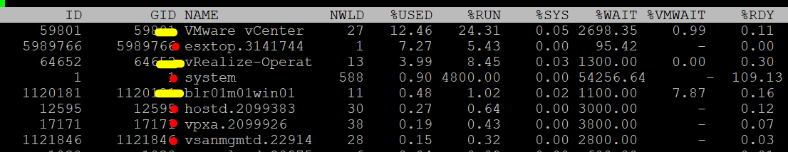
From the kernel’s vantage point, a VM is just a collection of process that needs to be run together. Each process is called World. So there is a world for each vCPU of a VM, as each can be scheduled independently. The following screenshot shows both VM and non VM worlds running side by side. I’ve marked the kernel modules with red dot. You can spot familiar process like vpxa and hostd running alongside VM (marked with the yellow line).
Visibility
Guest OS and VM are 2 closely related due to their 1:1 relationship. They are adjacent layers in SDDC stacks. However, the two layers are distinct, each provide unique visibility that the other layer may not be able to give. Resource consumed by Guest OS is not the same as resource consumed by the underlying VM. Other factors such as power management and CPU SMT also contribute to the differences.
The different vantage points result in different metrics. This creates complexity as you size based on what happens inside the VM, but reclaim based on what happens outside the VM (specifically, the footprint on the ESXi). In other words, you size the Guest OS and you reclaim the VM.
The following diagram uses the English words demand and usage to explain the concept, where demand consists of usage and unmet demand. It does not mean the demand and usage metrics in vSphere and VCF Operations, meaning don’t assume these metrics actually mean this. They were created for a different purpose.
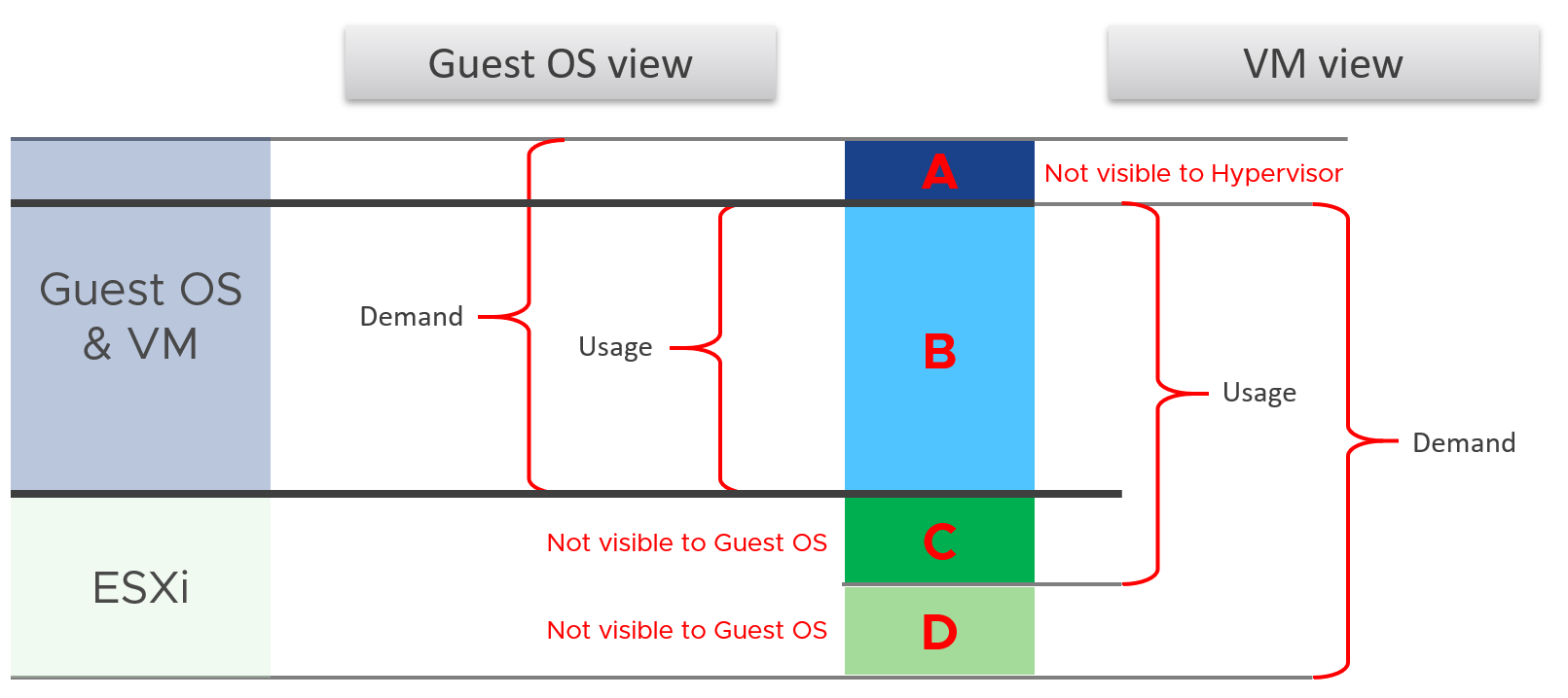
I tried adding application into the above diagram, but that complicated the whole picture that I removed it. So just take note that some applications such as Java VM and database manage their own resources. Another virtualization layer such as Container certainly takes the complexity to another level.
We can see from the above that area A is not visible to the hypervisor.
| Layer A | Queue inside the Guest OS (CPU Run Queue, RAM Page File, Disk Queue Length, Driver Queue, network card ring buffer). These queues are not visible to the underlying hypervisor as they have not been sent down to the kernel. For example, if Oracle sends IO requests to Windows, and Windows storage subsystem is full, it won’t send this IO to the hypervisor. As a result, the disk IOPS counter at VM level will under report as it has not received this IO request yet. |
|---|---|
| Layer B | What the Guest uses. This is visible to the hypervisor as a VM is basically a multi-process application. The Guest OS CPU utilization somehow translates into VM CPU Run. I added the word “somehow” as the two metrics are calculated independently of each other, and likely taken at different sampling time and use different roll up technique. |
| Layer C | Hypervisor overhead (CPU System, CPU MKS, CPU VMX, RAM Overhead, Disk Snapshot). This overhead is obviously not visible to the Guest OS. You can get some visibility by installing Tools, as it will add new metrics into Windows/Linux. Tools do not modify existing Windows/Linux metrics, meaning they are still unaware of virtualization. From the kernel viewpoint, a VM is group of processes or user worlds that run in the kernel. There are 3 main types of groups:
If you want to see example of errors in the above process, review this KB article. |
| Layer D | Unmet Demand (CPU Ready, CPU Co-Stop, CPU Overlap, CPU VM Wait, RAM Contention, VM Outstanding IO). The Guest OS experiences a frozen time or slowness. It’s unaware what it is, meaning it can’t account for it. |
I’ve covered the difference in simple terms, and do not do justice to the full difference. If you want to read a scientific paper, I recommend this paper by Benjamin Serebrin and Daniel Hecht.
Resource Management
vSphere uses the following to manage the shared resources:
-
Reservation
-
Limit
-
Share
-
Entitlement
Reservation and Limit are absolute. Share is relative to the value of other VMs on the same cluster.
Unlike a physical server, you can configure a Limit and a Reservation on a VM. This is done outside the Guest OS, so Windows or Linux does not know. You should minimize the use of Limit and Reservation as it makes SDDC operations more complex.
Reservation represents a guarantee. It impacts the Provider (e.g. ESXi) as that’s where the reservation takes place. However, it works differently on CPU vs RAM.
| CPU | CPU Reservation is on demand. If the VM does not use the resource, then it does not come into play as far as the VM is concerned. The reservation is basically not applied. Accounting wise, it does not impact CPU utilization metrics. Run, Used, Demand, Usage do not include it. Their value will be 0 or near 0 if the Guest OS is not running. |
|---|---|
| RAM | Memory Reservation is permanent, hence impacts memory utilization metric. The Memory Consumed counter includes it even though the page is not actually consumed yet. If you power on a 16 GB RAM VM into a BIOS state, and it has 10 GB Memory Reservation, the VM Consumed memory counter will jump to 10 GB. It has not actually consumed the 10 GB, but since ESXi has reserved the space, it is not available to other VMs. If it’s not yet used, then it does not take effect. Meaning ESXi Host does not allocate any physical RAM to the VM. However, once a VM asks for memory and it is served, the physical RAM is reserved. From then on, ESXi continues reserving the physical RAM even though the VM is no longer using it. In a sense, the page is locked despite the VM become idle for days. |
Limit should not be used as it’s not visible to the Guest OS. The result is unpredictable and could create a worse performance problem than reducing the VM configuration. For CPU, it impacts the CPU Ready counter. For RAM, in the VMX file, this is sched.mem.max.
Entitlement
Entitlement means what the VM is entitled to. It's a dynamic value determined by the hypervisor. It varies every second, determined by Limit, Shares and Reservation of the VM itself and any shared allocation with other VMs running on the same host. For Shares, it certainly must consider shares of other VMs running on the same host. A VM can’t use more than what ESXi entitles it.
Obviously, a VM can only use what it is entitled to at any given point of time, so the Usage counter cannot go higher than the Entitlement counter.
In a healthy environment, the ESXi host has enough resources to meet the demands of all the VMs on it with sufficient overhead. In this case, you will see that the Entitlement and Usage metrics will be similar to one another when the VM is highly utilized.
The numerical value may not be identical because of reporting technique. vCenter reports Usage in percentage, and it is an average value of the sample period. vCenter reports Entitlement in MHz and it takes the latest value in the sample period. This also explains why you may see Usage a bit higher than Entitlement in highly-utilized vCPU. If the VM has low utilization, you will see the Entitlement counter is much higher than Usage.
Overhead vs Not Overhead
Be careful not to lump every additional load as overhead.
-
Overhead means it’s mandatory (cannot be avoided) and has negative impact (such as slower performance or more resource required).
-
Not Overhead means it’s optional. You do not have to use the feature. Typically, it brings new capabilities that is often not possible to achieve without virtualization.
Let’s list some examples:
| Overhead | ESXi kernel. While it delivers value, it’s not optional and it’s not negligible. It impacts your usable capacity too. |
|---|---|
| IO processing by hypervisor. There is an additional processing done by the kernel, which could result in IO blender effect. However, this does not reduce the resource allocated to Guest OS. | |
| VM CPU and Memory overhead for the VM Monitor layer. This is a small amount and operationally negligible. | |
| ESXi memory consumed and CPU used by vSAN processes. | |
| VM log files. VM is a layer on its own and the log provides necessary observability. | |
| Not Overhead | VM snapshot. Snapshot is optional and it delivers new functionalities not available in Guest OS. |
| VM memory snapshot. This does not have the same purpose with hibernation file inside Windows or Linux. This feature enables memory overcommit at ESXi level. | |
| vSphere HA. The extra ESXi hosts provides availability protection. | |
| vSAN Failures-to-Tolerate policy. They provide availability protection since vSAN does not use hardware-level redundancy. For workloads where the VM is transient and you have the master template, you can set this to 0 (no protection). |
In addition, there is buffer. There are at least 3 types of buffers:
-
Capacity buffer. This reduces the Usable Capacity.
-
Cost buffer. This reduces the Sellable Capacity. This is typically on top of the Usable Capacity.
-
Disaster Recovery buffer
-
Security Attack buffer. This is sometimes call the clean room.
vMotion
Is it an overhead? It is not an overhead to the VM, but there can be impact to the VM metrics.
For example, unshared swap page in the source ESXi may become a regular memory page on the destination. This will increase the Consumed metric of the VM on the destination.
Similarly, sometimes the version of ESXi running on source and destination is different and may use different compression algorithms for memory compression. In that case, a compressed page may become a regular page in the destination increasing consumption.
Metric Mastery
There are thousands of metrics across a diverse architecture. How do you master them?
One way is to see the commonality. I studied The USE Method by Brendan Gregg, The RED Method by Weave Works, and the Golden Signal by Google. Based on their strengths and weaknesses, I came up with The Triple See Method, which is designed specifically for Broadcom VCF.
Triple See Method
There are 3 types of metrics you need to see and verify as 1 integrated set, before you make your final conclusion. These Triple See metric-type are peers, and they have their own purpose. They map well with the Pillar of Operations.
| Type of Metrics | Primary Application |
|---|---|
| Contention | Performance Management |
| Consumption | Capacity Management Cost Management Sustainability |
| Context | Configuration Management Compliance Management Inventory Management |
Let’s explain further:
| Contention | They measure something bad. They can be further divided by their impact
| ||||||
|---|---|---|---|---|---|---|---|
| Consumption | They measure something good. A high number is good for the business, if the load is useful (e.g. not a DDOS attack). Hence, make sure both the patterns and values match your expectation. There are 3 types of consumption. Deploy all 3 techniques above accordingly.
| ||||||
| Context | They provide answer to the “it depends” type of answer, by accounting for something (e.g. inventory, configuration) and provide context. The context is obviously only useful to someone who can derive insight from that context, else there is no meaning to it. For example, a high number of vMotion depends on your expectation. If you’re doing cluster live migration after office hours, you expect the number to match the theoretical limit. |
While contention is what you care, consumption gets the limelight as it’s easier to monitor and simpler to explain. Also, many systems do not scale well. Their “performance” drops when reaching certain level of utilization. Take a parallel database. As you add more nodes, the overall throughput drops as the nodes spend more time maintaining overall integrity among them. The CPU utilization of each node gets higher, only to be spent on overhead activities. In this case, what you should do is measures the overhead and the metric you refer to as “performance”. Do not use the CPU utilization to represent all these metrics.
There is a tendency to monitor utilization as if it is a pillar of operations. Just like contention, utilization is not something you manage. Yes, you monitor utilization, but you monitor it for a reason. By itself, utilization has no meaning. The meaning depends on the purpose.
Primary | Secondary Metrics
Metrics can be grouped into 2.
| Primary | Secondary |
|---|---|
The “What” It defines the situation. | The “Why” It explains. It covers the possible causes behind the value of the primary metric. |
| Typically only 1 metric per use-case | Typically many metrics to explain that single primary metric. |
| Typically can be color coded | Some can be color coded, some cannot as it’s contextual |
| The unit is normally percentage, where 0% is bad and 100% is good | Unit varies. Examples are GB, MHz, packets/seconds, and milliseconds. |
| Used in Monitoring | Used in Troubleshooting |
| Example: Capacity Remaining (%) | Supporting secondary metrics:
|
| Example: VM Performance (%) | Supporting secondary metrics:
|
Collection
Before we cover the metrics, you need to know how they get collected within a collection period (e.g. 20 second), and what units are used.
Interval
When you collect a metric, you have a choice on what to collect:
-
Collect the data at that point in time.\
Example: collect the value at 00:00:00.
-
Collect the average of all the data within the collection cycle.\
Example: collect the average of all values from 00:00:00 to 00:05:00.
-
Collect the maximum (or minimum) of all the data within the collection cycle.
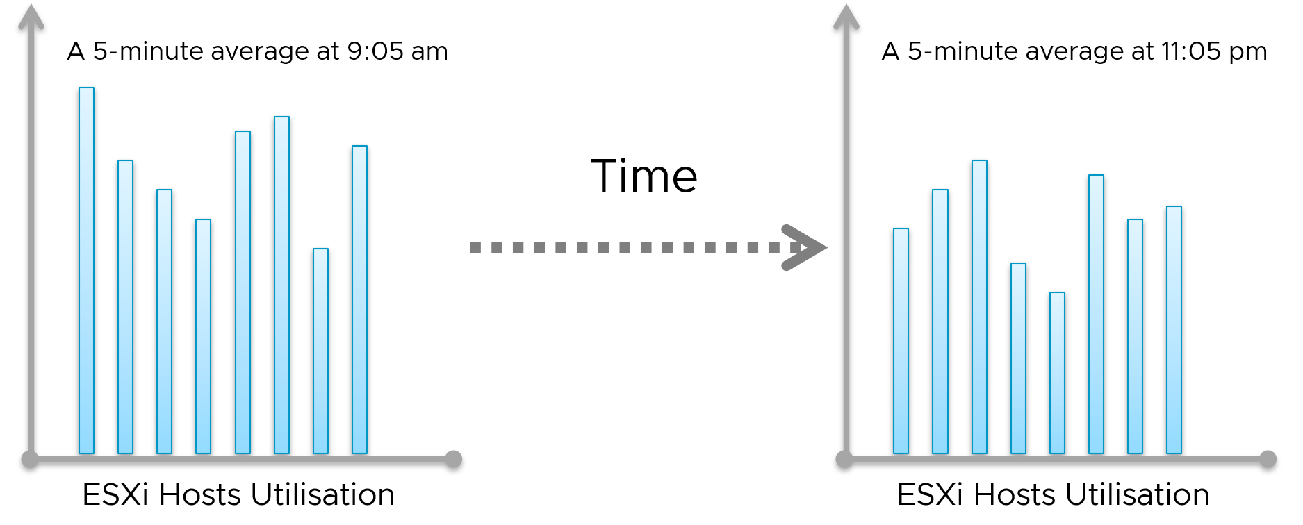
The 1st choice is the least ideal, as you will miss majority of the metric. For example, if you collect every 5 minutes, that means you collect the data of the 300th second, and miss 299 seconds worth of data points. On the other hand, it’s good when the latest data is more valuable, such as disk space and free memory.
The 2nd choice gives you the complete picture, as no data is missing. The limitation is your collection interval can’t be too long for the use case you’re interested in.
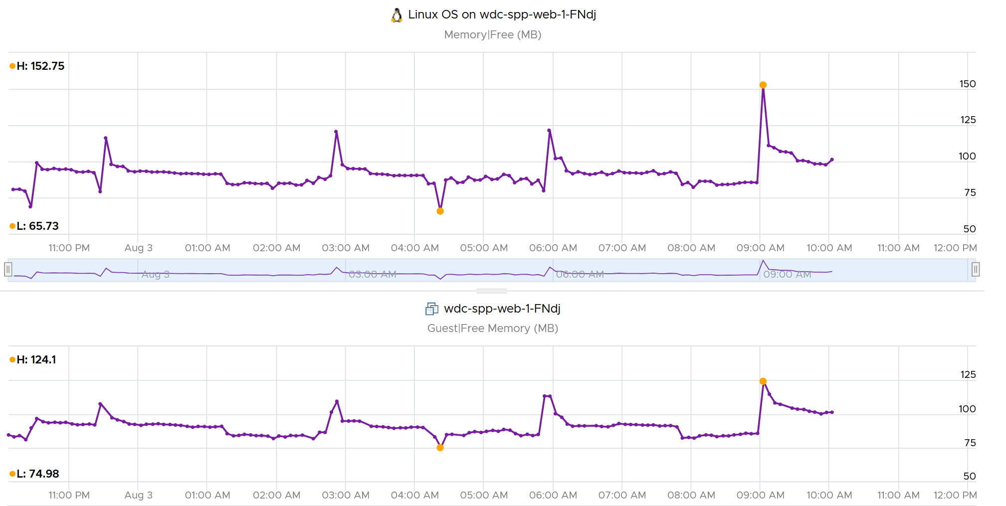
Comparing the 2 choices, the 1st choice will result in wider fluctuations. You will have a higher maximum and lower minimum over time. Telegraf chooses the 2nd choice, while Tools choose the 1st choice. You can see below the result. Overall, their pattern will be similar, especially for something relatively stable such as memory consumption and disk space consumption.
The 3rd choice complements the 2nd choice by picking the worst. That means you need 2 number per metrics for certain use case.
As you collect regularly, you also need to decide if you reset to 0, or you continue from previous cycle. Most metrics reset to 0 as accumulation is less useful in operations.
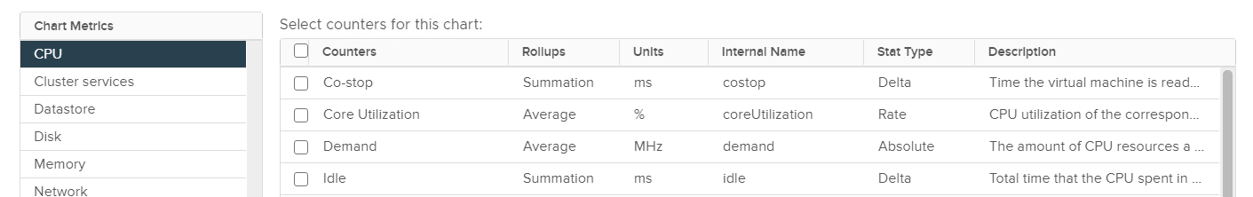
Let’s take a look at what you see at vCenter UI, when you open the performance dialog box. What do the columns Rollups and Stat Type mean?
Stat Type explains the nature of the metrics. There are 3 types:
| Delta | The value is derived from a running counter that perpetually accumulates over time. What you see is difference between 2 points in time. As a result, all the units in milliseconds are of delta type. |
|---|---|
| Rate | The value measures the rate of change, such as throughput per second. Rate is always the average across the 20 second period. Note: there are metrics with percentage as unit and rate as stat type. I’m puzzled why. |
| Absolute | The value is a standalone number, not relative to other numbers. Absolute can be latest value at 20th second or the average value across the 20 second period. |
Some common units are milliseconds, MHz, percent, KBps, and KB.
Metrics in MHz is more complex as you need to compare with the ESXi physical CPU static frequency. In large environments, this can be operationally difficult as you have different ESXi hosts from different generations or sport a different GHz. This is one of the reasons why I see vSphere cluster as the smallest logical building block. If your cluster has ESXi hosts with different frequencies, these MHz-based metrics can be difficult to use, as the VMs get vMotion-ed by DRS.
Why Milliseconds as Unit?
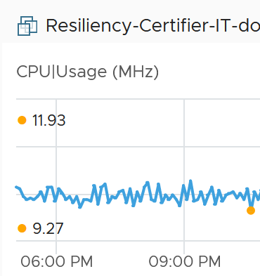
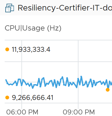
vSphere uses 3 types of units for CPU: millisecond, MHz and %.
Of the 3, the millisecond is the source. Time is the raw unit, meaning both the percentage unit and the MHz unit are derived from it, because they are expressed as the average/minimum/maximum over time. When we see the CPU demand is 2 GHz at 9:00:00 am what vSphere likely means is it the average from previous collection. It is not a point in time.
Time as a unit to measure CPU utilization does not seem logical. Where does it come from and why?
Hint: the stat type is Delta.
To answer that, we need to see from the ESXi kernel scheduler point of view. Think in terms of the passage of time and the amount of CPU cycles that get completed during that time. A CPU core running at 2 GHz will get 2x CPU cycles completed compared with a core running at 1 GHz. The same goes with Hyper Threading. You get less cycles completed when there is a peer thread competing at the same time.
What you think as utilization or usage or demand or used, it will be easier if you see them as cycles, once you make that small paradigm shift.
Let’s take VM CPU Ready. The following is taken from ESXi vsish[^1] command. It shows that the original, raw counter is actually a running number. To calculate the CPU ready of a given time period, we need to subtract the last number from the first number. To convert to percentage, we divide over the collection, which is 20000 ms in the screenshot.
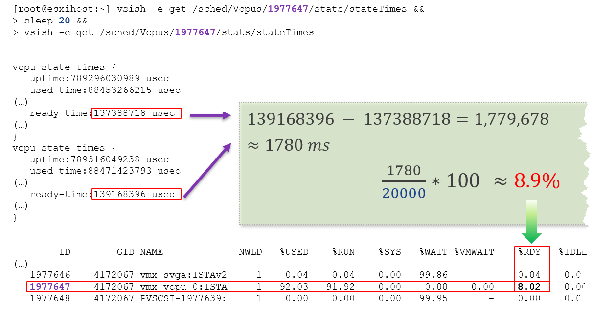
In the above, the slightly different values are due to different time in sample interval start and end.
I’ll take another example, to show that the original unit is time (microsecond, not millisecond).
/sched/groups/169890525/stats/cpuStatsDir/> cat /sched/groups/169890525/stats/cpuStatsDir/cpuStats\
group CpuStats {\
number of vsmps:7\
size:19\
used-time:905379300543 usec\
latency-stats:latency-stats {\
cpu-latency:798578245914 usec\
memory-latency:memory-latency {\
swap-fault-time:0 usec\
swap-fault-count:0\
compress-fault-time:0 usec\
compress-fault-count:0\
mem-fault-time:17939139 usec\
mem-fault-count:3834600\
}\
network-latency:0 usec\
storage-latency:0 usec
In vSphere UI and API, the counter for CPU Latency is percentage. But in the above, you can see that it’s true unit is microseconds.
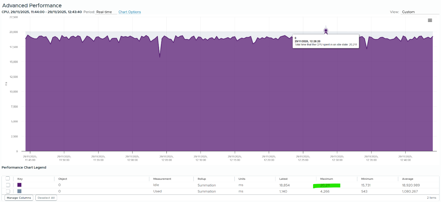
Because of the above, when collection is running late or the source is busy, the sum may exceed 20000 ms by a bit. In that case, you may see something like this.
Rollup Type
The Rollups column tells you how the data is rolled up to longer time period. The types of roll up are:
| Average | This means taking the average of the collected values. vCenter may average 20 values and report it every 20 seconds as a single value. |
|----|----|
| Maximum | This means taking the highest value. Useful when you want to catch the outlier. |
| Minimum | The opposite of above. Useful in situations such as free memory. |
| Summation | It is actually average for those metrics where accumulation makes more sense. For example, CPU Ready Time gets accumulated over the sampling period. vCenter reports metrics every 20 seconds, which is 20000 milliseconds. This is why the number keeps going up as you roll up to bigger object. |
| Latest | This is the most recent value. This is useful in cases such as disk space, where you care more about the present value. |
VCF Operations adds percentile, which is useful when you want to ignore outlier.
The following table shows a VM has different CPU Ready Time on each second. It has 900 ms CPU Ready on the 5th and 6th second, but has lower number on the remaining 18 seconds.
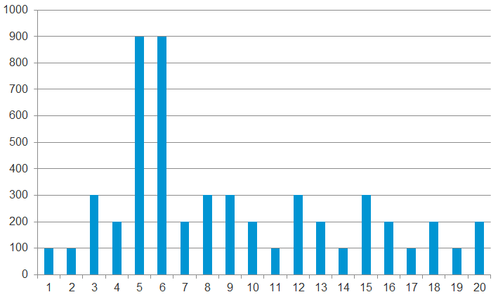
Over a period of 20 seconds, a VM may accumulate different CPU Ready Time for each second. vCenter sums all these numbers, then divides it by 20,000. This is actually an average, as you lose the peak within the period.
Latest, on the other hand, is different. It takes the last value of the sampling period. For example, in the 20-second sampling, it takes the value between 19th and 20th seconds. This value can be lower or higher than the average of the entire 20 seconds period. Latest is less popular compared with average as you miss 95% of the data.
Rolling up from 20 seconds to 5 minutes or higher results in further averaging, regardless of the rollup techniques (summation or average). This is the reason why it is better to use VCF Operations than vCenter for data older than 1 day, as vCenter averages the data further, into a 0.5 hour average.
Because the source data is based on 20-second, and VCF Operations by default averages these data, the “100%” of any millisecond data is 20,000 ms, not 300,000 ms. When you see CPU Ready of 3000 ms, that’s actually 15% and not 1%.
By default, VCF Operations takes data every 5 minutes. This means it is not suitable to troubleshoot performance that does not last for 5 minutes. In fact, if the performance issue only lasts for 5 minutes, you may not get any alert, because the collection could happen exactly in the middle of those 5 minutes. For example, let's assume the CPU is idle from 08:00:00 to 08:02:30, spikes from 08:02:30 to 08:07:30, and then again is idle from 08:07:30 to 08:10:00. If VCF Operations is collecting at exactly 08:00, 08:05, and 08:10, you will not see the spike as it is spread over two data points. This means, for VCF Operations to pick up the spike in its entirety without any idle data, the spike may have to last for 10 minutes.
VCF Operations is capable of storing the individual 20-seconds data. But that would result in 15x more data. In most cases, what you want is the peak among the 15 data points.
The Collection Level in vCenter, shown in the following table, does not apply to VCF Operations. Changing the collection level does not impact what metrics get collected by VCF Operations. It collects majority of metrics from vCenter using its own filter, which you can customize via policy.
| Statistics Levels | Metrics |
|---|---|
| Level 1 | Cluster Services (VMware Distributed Resource Scheduler) – all metrics CPU –entitlement, total MHz, usage (average), usage MHz Disk – capacity, max Total Latency, provisioned, unshared, usage (average), used Memory – consumed, mem entitlement, overhead, swap in Rate, swap out Rate, swap used, total MB, usage (average), balloon, total bandwidth (DRAM or PMem) Network – usage (average), IPv6 System – heartbeat, uptime VM Operations – num Change datastore, num Change Host, num Change Host datastore |
| Level 2 | Level 1 metrics, plus the following: CPU – idle, reserved Capacity Disk – All metrics, excluding number Read and number Write. Memory – All metrics, excluding Used, maximum and minimum rollup values, read or write latency (DRAM or PMem). VM Operations – All metrics |
| Level 3 | Level 2 metrics, plus the following: Metrics for all metrics, excluding minimum and maximum rollup values. Device metrics |
| Level 4 | All metrics, including minimum and maximum rollup values. |
Take note: vSAN API gives you the last data, not the average or peak of the entire period. Since VCF Operations collect every 5 minutes, you get the data for the 300th second.
Real Time Collection
Do we really need real-time collection and analysis for every single metrics, on every single objects, 24 x 7?
We collect the metrics for a reason, such as performance and capacity. The reasons dictate the frequency for each type of metrics.
Take note that how frequent you collect is not the same with how granular the data points. For example, VCF Operations collect every 5 minutes by default from vCenter, but it grabs 15 data points in 1 collection cycle. For majority of the data, it averages these 15 data points and store as 1 number.
| Use Case | Collection Point | Collection Frequency |
|---|---|---|
| Performance: Profiling | 1 – 20 seconds for all counters | 1 – 20 seconds |
| Performance: Troubleshooting | 1 - 20 seconds for raw contention, 5 minutes for everything else. More explanation after this table. | 5 minutes for both |
| Performance: SLA | 5 minutes. Why SLA differs to troubleshooting and why 5-minute is the sweet spot is covered in the book VMware Operations Transformation, 4th edition. | 5 minutes |
| Capacity | 15 minutes for all. Value is the average over 15 minutes, not the peak. Functionally, you do not need 15-minute granularity. Operationally, it’s safer to do 15 minutes. If there is collection failure, either due to collector or target system, you only lose 15 minutes’ worth of data. | |
| Cost | ||
| Compliance | ||
| Sustainability | ||
| Inventory | ||
Performance Troubleshooting
For troubleshooting, you want per-second data. Who does not want sharper visibility? However, there are potential problems:
-
It may not be possible. The system you’re monitoring may not be able to produce the data, or it comes with capacity or performance penalty.
-
It’s expensive. Your monitoring system might grow to be as large as the systems being monitored. You could be better off spending the money on buying more hardware, preventing the problem to begin with.
-
You get diminishing return. The first data point is the most valuable. Subsequent data points are less valuable if they are not providing new information.
-
The remediation action is likely the same as there are only a handful of things you can do to fix the problem. The number of problems outweigh the actual solution.
So what can you do instead?
Begin with the end in mind. Look at the solution (e.g. add hardware, change some settings) and ask what metrics are required. For each required metrics, ask what granularity is required.
I find that 1 – 20 second is only required for the contention-type of metrics. For utilization-type and contextual-type, I think 5 minute is enough. You need higher resolution when the contention-type metrics do not exist. For example, there is no metric for network latency and packet retransmit at VM level. All you have is packet dropped. To address the missing metrics, use utilization metric such as packet per second and network throughput.
Units
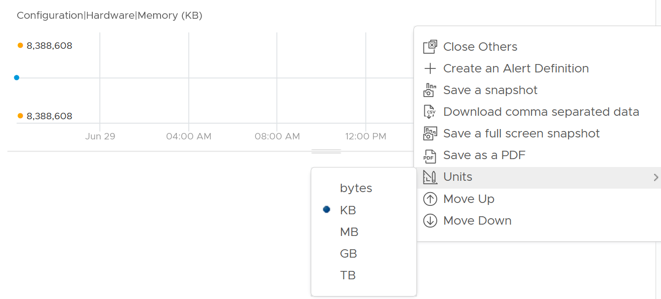
No thanks to lack of consistent implementation among vendors, there is a common confusion on units.
1000 vs 1024
There is confusion between 1024 and 1000.
-
Is 1 gigabyte = 1024 megabyte or 1000 megabyte?
-
Is 1 Gigabit = 1000 Mb or 1024 Mbit?
The answer from Google is 1000 for both.
Google does not distinguish network throughput and storage throughput.
As expected, Google uses 1 byte = 8 bits
Storage Vendors
However, many products from many vendors use the binary conversion instead of decimal. This is one of those issues, where what’s popular in practice is different to what it should be in theory.
To add further confusion, there is consistency among storage and network vendors. For example, you get shortchanged when you buy storage hardware.
Guess how many GB do you actually get from this 128 GB? This screenshot is from the vendor official website. I think many hardware vendors do the same.

The answer is 116 GB.
The following is the above actual disk in Windows 11.
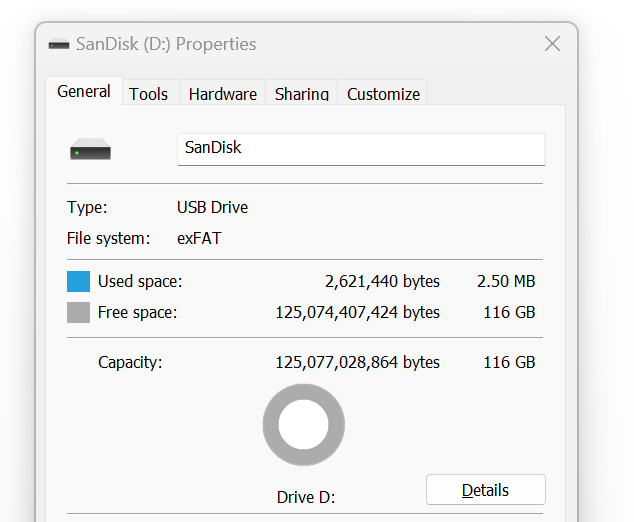
You lost 9%!
Microsoft Windows use 1024 for storage.
VCF Operations
VCF Operations use 1024 for storage, 1024 for network, 1024 for memory, but 1000 for CPU.
Here is the proof for storage. Yes, I validated network and memory too.
VCF Operations use 1000 for CPU
|  |
|  |
|
|----|----|
Kilo vs Kibi
To address the confusion, the committee at International System of Quantities came up with a new set of names for the binary units. Instead of kilo, mega, giga, they use kibi, mebi, gibi, tebi, and pebi.
It is confusing to drop familiar terms like kilo, mega and giga. I prefer kilobi instead of kibi as it shows the relationship to the commonly known units. Or if you want to emphasize the binary nature, perhaps kilo2byte, mega2byte, giga2byte as the name.
Let’s take an example
-
1 Kibibyte = 1024 bytes. That means 1 Kibibyte = 1.024 KB.
-
1 Gibibyte = 1024 Mebibytes = 1,073,741,824 bytes
The abbreviation is also changed from K, M, G to Ki, Mi, Gi, where the letter i is small case. This confuses the population further as Ki can mean Kilo or Kibi. I’d have chosen another letter instead of i.
VCF Operations still uses the traditional (KB, MB, GB) as shown in the following screenshot.
Note the conversion from byte to bit remains. 1 byte = 8 bit.
Bit vs Byte
Do you use Byte/second or bit/second?
To me, it depends on the context. If you talk about disk space, you should use byte. You measure the amount of disk space read or written per second. If you talk about network line, you should use bit. You measure the amount of SCSI blocks travelling inside ethernet or FC cable. Pearson uses 1024 for disk space, and 1000 for transmission speed, in their certification. There are other references, such as gbmb.org, NIST, and Lyberty. In short, there is really no standard.
The following is network transmit. It’s showing 30.81 MBps. So this is a rate, showing bandwidth consumption or network speed.
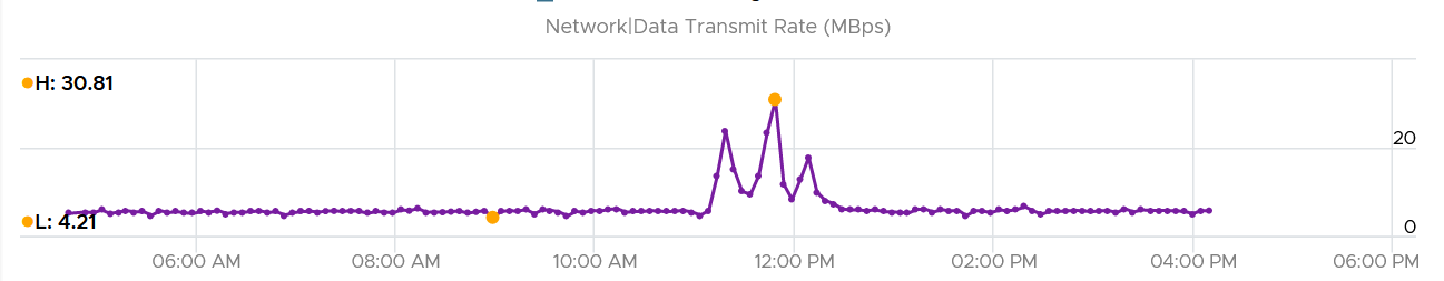
What would it show if you convert into KBps?
30810, if it uses 1000.
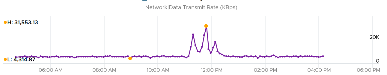
Since vRealize treats 1 Mega = 1024 Kilo, the above is what you get.
Since it’s network, let’s convert into bit.
What do you expect you get in Mbps?
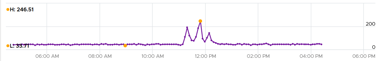
You get 31 x 553.13 x 8 bits / 1024 = 246 / 51.
Aggregation
We discussed in earlier part of the book about data collection. After collecting lots of data across objects and across time, how do you summarize so you get meaningful insight?
Aggregating to a higher-level object is complex as there is no lossless solution. You are representing a wide range of values by picking up 1 value among them, so you lose some details. The choices of techniques are mean, median, maximum, minimum, percentile, sum and count of.
The Problem with Average
The default technique used by many observability tools is the average() function as that represents every value to be aggregated. Average is great across time, but not across members of a group.
The problem is it will mask out the outlier unless they are widespread. By the time the average performance of 1000 VMs is bad, you likely have a hundred VMs in bad shape.
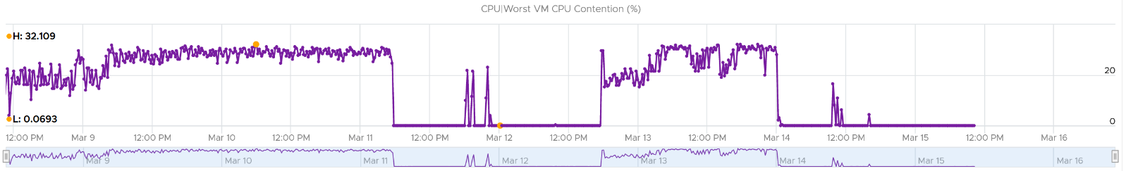
Let’s take an example. The following table shows ESXi hosts. The first host has CPU Ready of 149,116.33 ms. Is that a bad number?
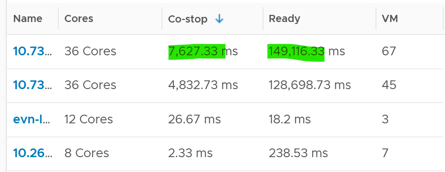
It is hard to conclude. It depends on the number of running vCPU, not the number of physical cores.
That host has 67 running VMs, and each of those VMs can have multiple vCPU. In total there are 195 vCPU. Each vCPU could potentially experience CPU Ready of 20,000 ms (which is the worst possible scenario).
If you sum the CPU Ready of the 67 VM, what number would you get?
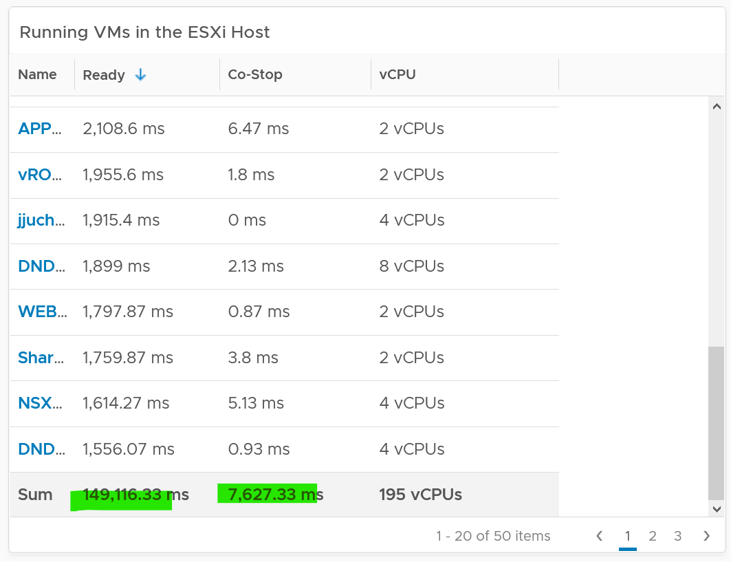
You’re right, you get the same number reported by the ESXi host.
This means the ESXi CPU Ready = Sum (VM CPU Ready), and the VM CPU Ready = Sum (VM vCPU Ready).
Because it’s a summation of the VMs, to convert into % requires you to divide with the number of running VM vCPU.
ESXi CPU Ready (%) = ESXi CPU Ready (ms) / Sum (vCPU of running VMs)
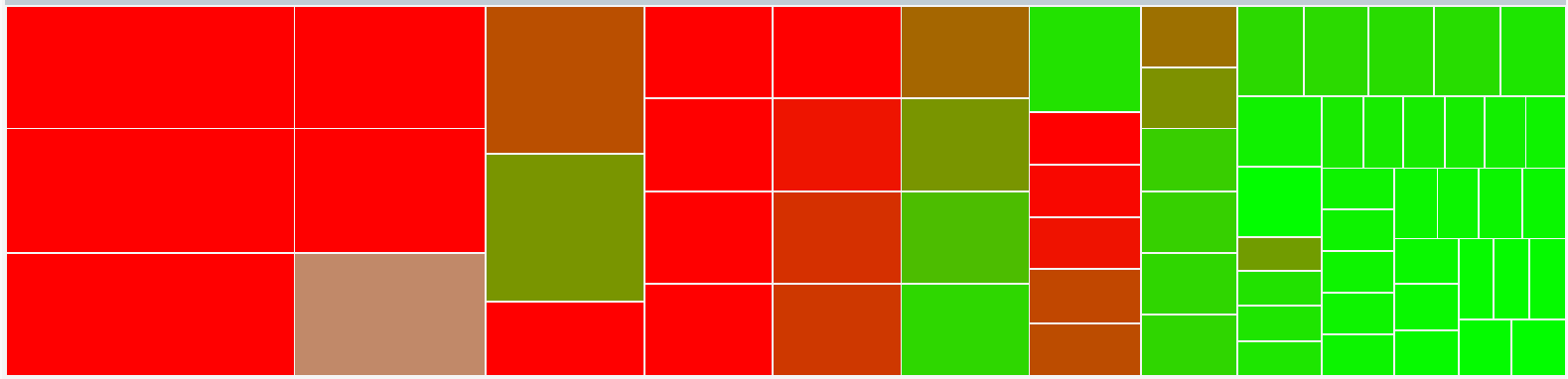
Are the CPU Ready values equally distributed among the VMs? What do you think?
It depends on many settings, so there is a good chance you get something like the following. This heat map shows the 67 VMs on the above host, colored by CPU Ready and sized by VM CPU configuration. You can see that the larger VMs tend to have higher CPU ready, as they have more vCPU.
Lagging vs Leading Indicators
When it comes to performance management, you need to see the problem while it’s still early, when only a small percentage of users or applications are affected. For that, you need a leading indicator, not a lagging indicator (after the fact). Leading indicators complement the lagging indicator by giving the early warning, so you have more time to react.
Performance use the contention metric as its primary input. The problem with contention metrics is it drops (or spike, depending on how you see it) suddenly, typically at the point of overcommit. It differs to consumption metrics which goes up towards 100%.
As a result, average is not suitable for rolling up performance metrics to higher level parents. For example, a VDI system that was designed for 1000 users should serve the first 1000 well, and it should struggle after the capacity is exceeded.
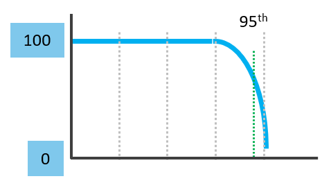
Average is a lagging indicator. The average of a large group tends to be low, so you need to complement it with the peak. On the other hand, the absolute peak can be too extreme, containing outliers.
The following chart shows where Maximum() picks up the extreme (outlier) while average fails to detect the problem. This is where the worst 5th percentile or the worst 1st percentile makes more sense.
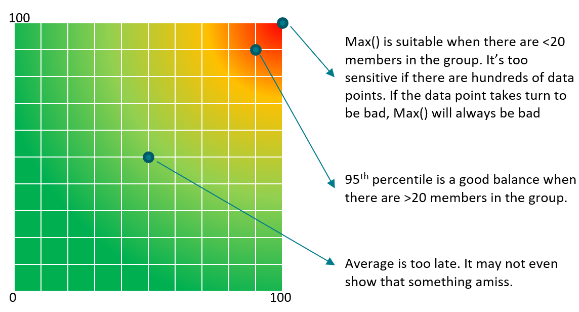
These are the techniques to complement average(). Depending on the situation, you apply the appropriate technique.
| Worst() | This returns the worst value of a group. It’s suitable when the number of members is low, such as ESXi hosts in a cluster or containers in a Kubernetes pod. It’s also suitable for hourly value, as there are only 12 data points. If you want to ignore outlier, then use Percentile function. | ||||||||||||||||||||||||
|---|---|---|---|---|---|---|---|---|---|---|---|---|---|---|---|---|---|---|---|---|---|---|---|---|---|
| Percentile() | It is similar to the Worst() function, but it returns the number after eliminating a percentage of the worst. See this handy calculator to learn the percentile function. I’ve summarized the most common scenarios, showing the worst 5th percentile works well the number of members is less than 100. If the number of members is >250, I’d take 97th percentile (3 standard deviations).
The problem with percentile is it picks a single member. It cannot tell if there is a population problem. | ||||||||||||||||||||||||
| Average of Worsts | This solves the percentile by averaging all the numbers above the percentile. If you take the average from 95th percentile to 100th percentile, you represent all these numbers. This results in a number that is more conservative than 95th percentile. This is superior to percentile as the band between 95 – 100 may vary. By not hardcoding at a single point, you pick a better representation. | ||||||||||||||||||||||||
| The limitation of this technique is when you have outlier. It can skew the number. If you suspect that, choose a lower percentile, such as 90th or 92.5th percentile. | |||||||||||||||||||||||||
| Count() | This is different to the Worst() or Percentile(), as you need to define the threshold first. For example, if you do Count of VM that suffers from bad performance, you need to define what bad is. That’s why Count() requires you to define the band for red, orange, yellow and green. You can then track the number of objects in the red band, as you expect this number to be 0 at all times. Waiting until an object reaches the red band can be too late in some cases, so consider complimenting it with a count of the members in orange band. | ||||||||||||||||||||||||
| Count() works better than average() when the number of members is very large. For example, in a VDI environment with 100K users, 5 users affected is 0.005%. It’s easier to monitor using count as you can see how it translates into real life. | |||||||||||||||||||||||||
| Sum() | Sum works well when the threshold for green is 0. Even better, the threshold for yellow is 0. With this, you just need to watch when the total is above 0. The main limitation of Sum() is setting the threshold. You need to adjust the threshold based on the number of members. If there are many members, it’s possible that they are all in the green, but the parent is in the red. | ||||||||||||||||||||||||
| Disparity() | When members are uniformed and meant to share the load equally, you can also track the disparity among them. This reveals when part of the group is suffering when the average is still good. |
In some situations, you may need multiple metrics for more complete visibility. For example, you may need Worst for the depth and Percentile for the breadth. In this case, pick one of them as the primary and the rest as secondary metrics. You can also use worst and worst 5th percentile numbers together for better insight. If the numbers are far apart, that indicates the Worst number is likely an outlier. If the numbers are similar, you have a problem
“Peak” Utilization
One common requirement is the need to monitor for peak. Be careful in defining peak, as by default, averages get in the way.
How do you define peak utilization or contention without being overly conservative or aggressive?
There are two dimensions of peaks.
-
Peak across time of the same metric.
-
Peak among members of the group at the same time
Let's take a cluster with 8 ESXi hosts as an example. The following chart shows the 8 ESXi utilizations.
What’s the cluster peak utilization on that day?
The problem with this question is there are 1440 minutes in a day, so each ESXi Host has at least 288 metrics (based on the 5-minute reporting period). So this cluster has 288 x 8 = 2304 metrics on that day. A true peak has to be the highest metric among these 2304 metrics.
To get this true peak, you need to measure across members of the group. For each sample data, take the utilization from the host with the highest utilization. In our cluster example, at 9:05 am, host number 1 has the highest utilization among all hosts. Let’s say it hit 99%. We then take it that the cluster peak utilization at 9:05 am is also 99%.
You repeat this process for each sample period (e.g. 9:10 am, 9:15 am). You may get different hosts at different times. You will not know which host provides the peak value as that varies from time to time.
What’s the problem of this true peak?
Yup, it might be too sensitive. All it takes is 1 number out of 2304 metrics. If you want to ignore the outlier, you need to use percentile. For example, if you do 99th percentile, it will remove the highest ~23 datapoints.
Take note that the most common approach is to take the average utilization among all the 8 ESXi hosts in the cluster. So you lose the true peak, as each data point becomes an average. For the cluster to hit 80% average utilization, at least 1 ESXi host must have hit over 80%. That means you can't rule out the possibility that one host might hit near 100%.
The same logic applies to a VM. If a VM with 64 vCPUs hits 90% utilization, some cores probably hit 100%. This method results in under-reporting as it takes an average of the “members” at any given moment, then take the peak across time (e.g. last 24 hours).
This “averaging issue” exists basically everywhere in monitoring, as it’s the default technique when rolling up. For a more in-depth reading, look at this analysis by Tyler Treat.
There is another nuance of peak.
Depth vs Breadth
There are 2 dimensions of problem:
-
How deep or acute is the problem?
-
How widespread is the problem?
Both measure the severity of the problem.
A deep problem is suitable for a single entity. For example, if a VM has a very high CPU ready, it’s worth looking into.
A broad problem is suitable for the population. For example, if many VMs experience a moderate CPU ready, it’s worth looking into. You do not want to wait until the CPU ready becomes higher. As a result, use a lower threshold.
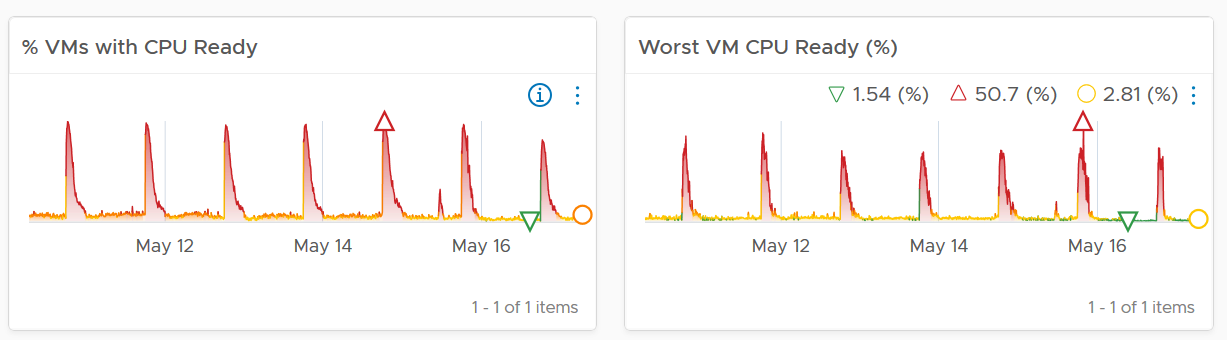
What do you notice from the following screenshot? There are 2 metrics, the maroon line shows the worst among all the VMs in the cluster, the pale blue shows the cluster wise average.
Notice the Maximum is >10x higher than the average. The average is also very stable relative to the maximum. It did not move even though the maximum became worse. Once the Cluster is unable to cope, you’d see a pattern like this. Almost all VMs can be served, but 1-2 were not served well. The maximum is high because there is always one VM that wasn’t served.
Be careful when you look at metrics at parent object such as cluster and datastore, as average is the default counter used in aggregation. Here is another example. This shows a cluster wise average. What do you think of the value?
That’s right. No performance issue at all in the last 7 days. The cluster is doing well. This cluster run hundreds of VMs. What you see above is the average experience of all these VMs, aggregated at cluster level. If there is only a few VMs having a problem, but the majority are not, the above fails to show it.
Now look at the pattern. You can see there are changes in that 1 week period.
What do you expect when you take the worst of any VM? Would you get the same pattern?
Answer is possible (not always!), if every VM is given the same treatment. They will take turn to be hit.
Notice the scale. It’s 60x worse.
The following diagram explains how such thing can happen.
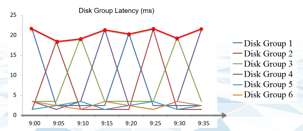
The above charts show 6 objects that have varying disk latency. The thick red line shows that the worst latency among the 6 objects varies over time.
Plotting the maximum among all the 6 objects, and taking the average, give us two different results as shown below:
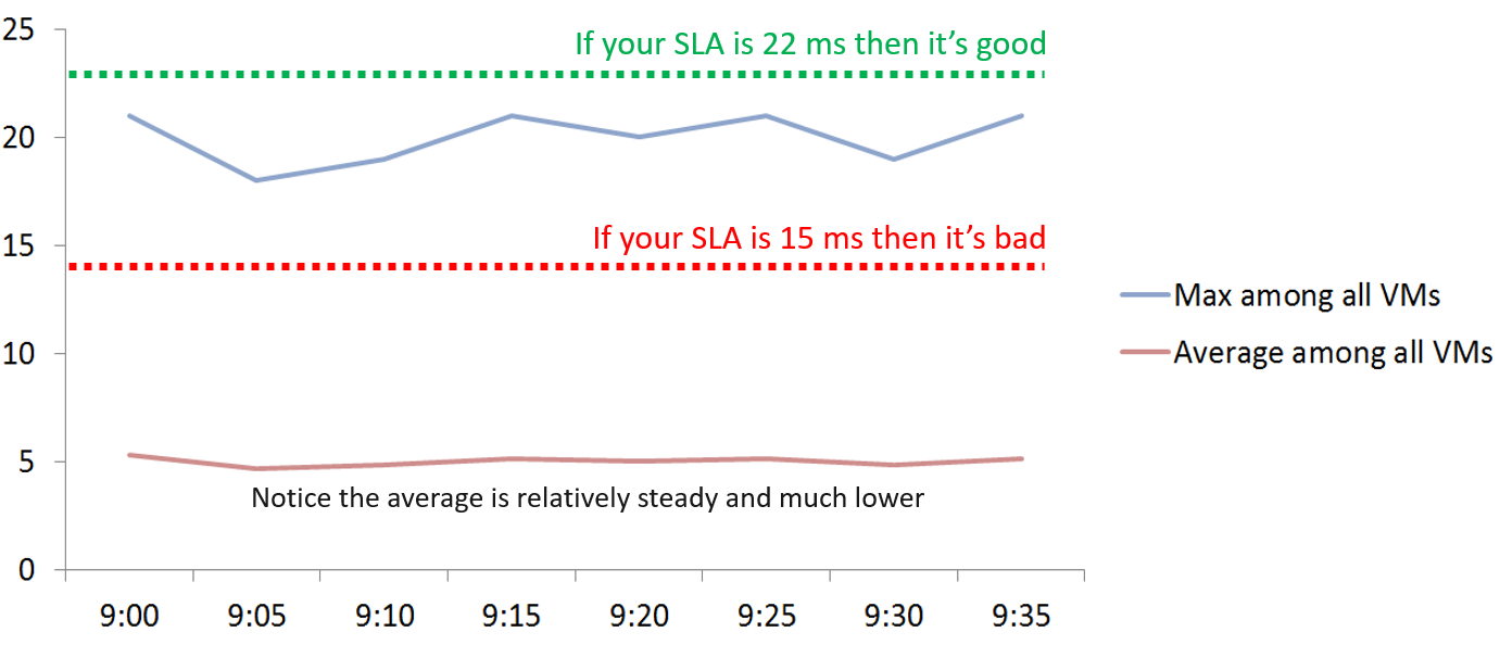
If you don’t have the SLA Line, how do you know how much buffer you have?
Proactive monitoring requires insights from more than one angle. When you hear that a VM is hit by a performance problem, your next questions are naturally:
-
How bad is it? You want to gauge the depth of the problem. The severity also may provide a clue to the root cause.
-
How long did the problem last? Is there any pattern?
-
How many VMs are affected? Who else are affected? You want to gauge the breadth of the problem.
Notice you did not ask “What’s the average performance?”. Obviously, average is too late in this case.
The answer to the 3rd question impacts the course of troubleshooting. Is the incident isolated or widespread? If it’s isolated, then you will look at the affected object more closely. If it’s a widespread problem then you’ll look at common areas (e.g. cluster, datastore, resource pool, host) that are shared among the affected VMs.
How do you calculate the breadth of a problem?
There are 2 methods:
-
Threshold based. You determine the percentage of the population above a certain threshold. The limitation is defining the threshold is hard as it depend on the metric.
-
Percentile based. You determine the number at certain percentile. I recommend 90th percentile as average is too late and you want a leading indicator. The limitation is you don’t know the percentage of the population.
I recommend the percentile-based as it can be consistently applied to any metric.
The following table uses the threshold-based.
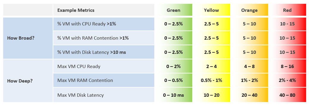
The following shows an example where both breadth and dept confirm you have a CPU Ready problem.
Usage Disparity
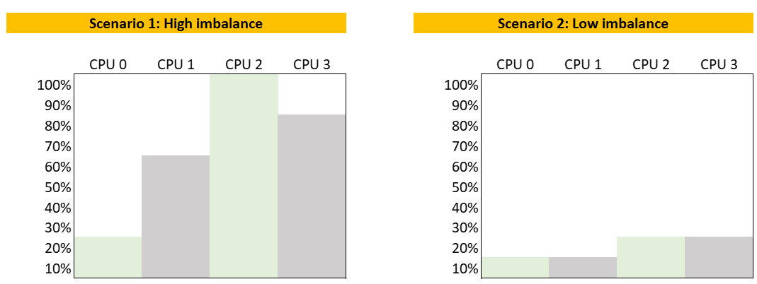
Imbalance among utilization can reveal a problem, as there are many examples where you expect balance utilization:
-
Usage among VM vCPU. If a VM has 32 vCPU, you don’t want the first 8 are heavily used while the last 16 are not used.
-
Usage among ESXi in a cluster
-
Usage among RDS Hosts in a farm
-
Usage among Horizon Connection Server in a pod
-
Usage among disk in a vSAN disk group
-
Usage among web server in a farm
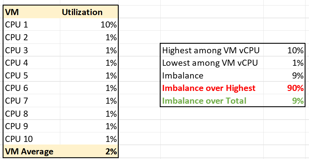
We define imbalance as highest – lowest.
It is expressed in percentage, meaning we need to divide over something. There are 2 options:
-
Divide over total. This is a fixed number, as the total is a constant number.
-
Divide over max (highest). This is a dynamic number, as the max is fluctuating. The imbalance is relative, as it depends on the value of the Max metric.
Both use cases have their purpose. We are taking the first use for these reasons:
-
That’s the most common one. The second use case is used in low level application profiling or tuning, not general IaaS operations.
-
It’s also easier to understand.
-
It does not result in high number when imbalance is low in absolute terms. See the charts below
The following calculation shows that using the relatively imbalance results in a high number, which can be misleading as the actual imbalance is only 10%
Performance Modelling
There are 3 main reasons why we need to model performance of a system or object into a simple, higher-level set of metrics.
| Persona | Monitoring is first performed by Level 1 operators. As first line of defence, they need to cover wide not deep. It’s not practical to track many metrics for thousands of objects. In addition, some of the raw metrics require specialist knowledge. |
|----|----|
| Scale | A single metric enables monitoring at scale. For example, if you have a single metric representing a VM, you can do aggregation on these VMs. |
| Reporting | Senior IT management prefer to see a higher-level metric as it’s easier to relate to the business. They understand VM Performance (%) but may not appreciate CPU CoStop (ms). |
Quantifying something complex with many components is difficult. It’s like trying to figure out the inflation rate of a country. It’s impossible to have the Consumer Price Index that properly represents the economy as different individuals have different baskets of goods. Even if we could develop the basket for each individual, that basket changes each year, rendering comparison with previous year invalid.
On the other hand, a country needs the number in order to manage its economy. The approximation is certainly much better than nothing.
Let’s take another example. This time, we go down to a much smaller scope. A person, you or me. We take annual health check, performing all sort of tests, and the results will be a series of metrics (e.g. your bad cholesterol level). Are they 100% accurate for you from young until you are old? Are the guidelines 100% accurate for everyone in your country?
Beside the absolute value, the relative movement of the value over time also provides insight. The patterns and trends over time are useful for management.
Now that we’ve seen real life examples, can we apply them to IT systems? For example, how do we define the performance of a large system such as vSphere, NSX, Horizon or Kubernetes?
The challenge is there are many components that makes up this metric. There is a need to consolidate all the performance metrics into a single KPI so you can manage at scale.
Say you have 1000 AWS EC2 instances to be monitored. You have a bunch of metrics, and you then consolidate them into 2 KPIs instead of 1. How would you know which EC2 has issues? You need to show 2 sets of heat map or table. That means you need to manually corelate the first table with the second. It’s not scalable operationally.
Having >1 metric also presents challenge as you roll up to higher level object. How do you show a trend chart of performance over time at vSphere data center levels when you have >1 metric?
After years of trials and improvements on the model, I’m happy to share that we can define system performance as a metric. This means you can have the performance metric for any object, such as vSphere Cluster Performance (%) and Kubernetes Node Performance (%).
Calculation
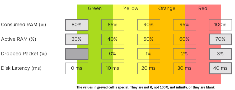
Performance is defined as 0 – 100%. 100% means best possible performance. This means a perfect score of 100.00% is not possible as certain contention such as disk latency cannot be 0.
0% means it’s at your worst expectation, not the absolute slowest possible. For example, if you expect 40 ms as the least you can tolerate, then the value will turn to 0% when disk latency hits 40 ms.
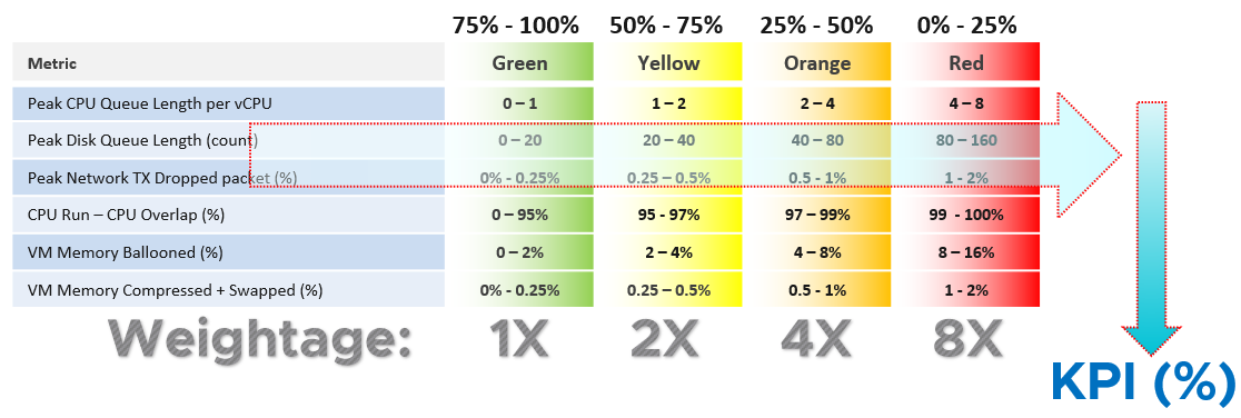
We use 4 colors, so we can divide 100% into 4 equal parts. So Green is simply 75% - 100% and Red is simply 0% - 25%. This is more natural than dividing into 3, where you end up with odd numbers such as 33.33% and 66.67%.
The other advantage is it gives you leading indicator (shown as yellow).
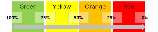
Why don’t we make green 95% - 100%? 75% for green sounds rather bad or low.
My answer is if you create an unequal distribution, some bands will have to be narrower than others. With uneven bands, you also need to be extra careful when defining the threshold for each metric that make up the KPI. I made the 4 bands equal, so the thresholds are easier to set.
Making the threshold easy to set is critical. As you design your KPI, you will vrealize that the threshold is the hardest part. In fact, I exclude metric when I do not feel comfortable with its threshold.
The following KPI uses 4 metrics as its input. Each metric has a set of thresholds for green, yellow, orange and red.
Now that we have the threshold for each metric, we can convert each metric into green – red. The model is also able to handle when the entire range is defined by a single number. This is useful when you want to define green = 0. That means a single packet loss will put the metric into the yellow range already.
What if anything above 0 is red?
You simply set 0 for green, yellow and orange. Within the red zone, you can set 0 – 1, or 0 to something.
Translation
Since the metrics have different units, we need translate to a common unit so we can aggregate.
How do we translate a row?
Let’s use an example. Take the Disk Latency (%) metric. It has range from 0 to 40 ms, which maps into the 0 – 100% using the following mapping table.
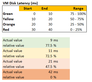
With the above mapping, we can be precise in assigning the value. For examples:
-
9 millisecond disk latency translates into KPI value of 77.5%, which is green. The reason is green ranges from 75% to 100%, where 0 ms equals to 100% and 10 ms equals to 75%. So each millisecond is around 2.5%.
-
42 millisecond disk latency translates into 0%. It is above the upper threshold of 40 millisecond. Since we do not show negatives, anything above the limit is shown as 0%
Threshold
The threshold is designed to support proactive, not alert-based operations. Hence, the red range does not mean emergency and you must drop everything. It means you need to take a look within the next 24 hours. This also gives you time to evaluate how many times it falls into the red zone and the overall trend.
The threshold could be argued from 2 ways:
-
Scientifically
-
“Practically”
Scientifically, a VM does not care what’s stopping it. Whether it’s Ready or Co-Stop or Overlap, the Guest OS does not know. Using this logic, you should set all the threshold the same way. On the other hand, you can follow what happens in production, in healthy environment. These metrics do not follow the same scale.
I take the lowest of the two, as the requirement is proactive monitoring.
If you have many metrics that make up the KPI, and one of them is red but the remaining is all green, the overall KPI value may not reveal that there is problem. That single red does not have enough weight to bring down the rest.
Progressive Weightage
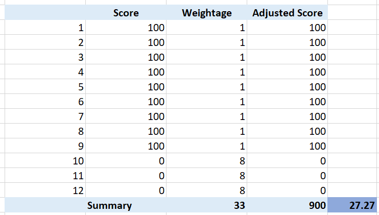
We assign weightage so that yellow is 2x green, orange is 2x yellow and red is 2x orange. Mathematically, a single red has equal weightage with 8 green. The following table shows that 1 perfect red and 8 perfect green will result in the score of 50.
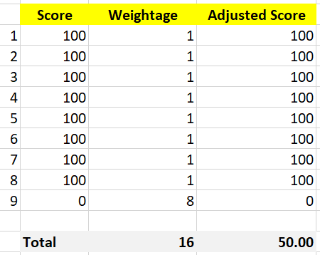
That also means that if you have 1 perfect red, and your green are not perfect, you can expect your value to be in the orange category.
This relative weightage plays a key role in determining the threshold. Try to match the actual value so they also correspond to 1x 2x 4x 8x. For example, set the VM disk latency so it goes up from 20 ms 🡪 40 ms 🡪 80 ms 🡪 160 ms. Notice they always double.
Note that this method does not replace assigning different weightage to each metric. You can still do that.
Optional Features
The above model is capable of handling many cases. To handle more complex requirements, apply any of these optional techniques. They can also be used together or individually.
Important Metrics
What if some metrics are relatively more important than others?
Give it a higher weightage. If metric A is 2x more important than metric B, then ensure metric A weightage is 2x of metric B.
If both are equally important, but the chance of metric B hitting bad is 2x higher, then give it 2x the weightage if you want an earlier warning.
The sum of all weightages is 100%. In the following example, the CPU is given highest weightage. Notice they sum to exactly 100%
| Metric | Weightage |
|---------------|-----------|
| CPU Usage | 40% |
| Memory Usage | 20% |
| Disk Usage | 20% |
| Network Usage | 20% |
Multi-table KPI
What if you have a long list of metrics and they are equally important? For example, if you have 21 metrics, and one of them is red while others are green, that single red will not be able to pull the overall KPI down low. If you want the KPI to be low because the issue is severe, you need to split the large table into smaller table. Ensure the grouping is logical.
For example, a Kubernetes cluster can be affected by either infrastructure problem or application (workload) problem. If we combine all the metrics, each metric has a relatively low weightage, as their sum is 100%. We solve this by combining them into 2. We then take the lowest of the 2 sub-KPI metrics.
Creating a 2nd table is also useful for override.
How do you deal with a serious problem that rarely happens? What weightage do you give it? Take for example, error packet in Kubernetes. Say you give it 40%, because it is a serious hit on performance. But since it rarely happens, then this 40% is basically a given. If you want to avoid taking 40% from the total weightage, you take this metric from the row, and place it on a separate table. This 2nd table overrides the first table with its value if it produces a lower value.
For example, if there is any error packet, you want to set the KPI value to red to reflect that there is a severe problem happening.
Validation
Once you design the KPI for a specific object, always do a validation. This helps you validates if the thresholds, weightage, metrics actually deliver the score that matches your expectation. Write down the common scenarios along with the expected value.
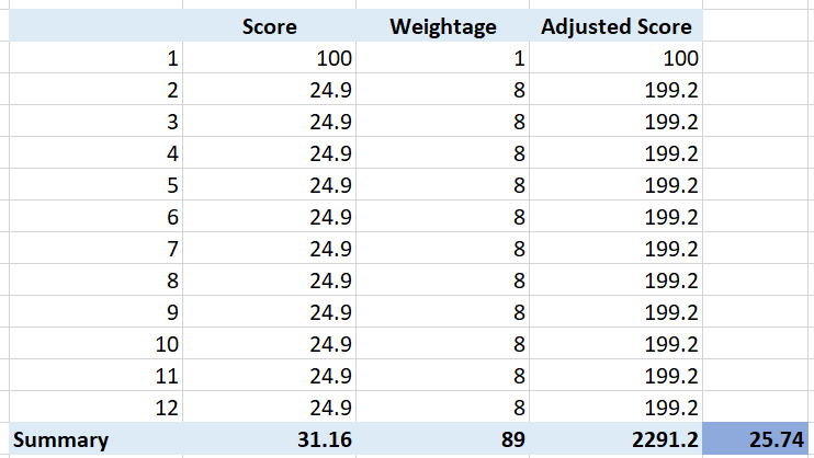
I got a surprise on the result, that I thought there was a bug in the formula. Remember that 1 red has the weight of 8 green? So when I see 3 reds and 9 greens, I expect the value to be in the red, which is below 25. But I got a low orange.
So let’s do some validation. I find testing the corner case useful. So let’s see what value we get when we have 9 perfect green and 3 worst red. What value do you expect?
A simple, non-weighted average will give a value of 75. This is right in the border of green or yellow.
What color does the weightage score give us?
It gives us a low orange. It is not red, but close enough to be red. This is why the score is important too, not just the color.
What if your red is not the worst, but barely red? How many borderline red (near 25%) required before a perfect green (100%) is showing red?
The following table shows 1 perfect green score and 11 barely-red scores. What color do you get at the end?
Yup, you get orange, not red. It takes many red scores, which makes it practically impossible to get a red if each red is barely there. That’s why your red threshold needs to be 2x your orange threshold. If you make it too big, you will get barely-red in most cases.
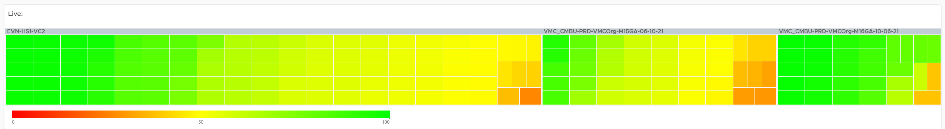
In actual environment, you certainly do not want to see red, even in development environment. Each VM will have their own score, but overall you want to see majority green. Use heatmap to show, as it will automatically order them by the value.
Chapter 2