
**\
June 2026**
Back of cover page. Delete if you do not plan to print.\
Thank you Mai Mai for the design. Daddy proud of you!

*The book is in your hands because of the couple above.\
It is dedicated to the loving memory of Mama and Papa…\
for your love and sacrifice in raising me in the old town of Suroboyo.*
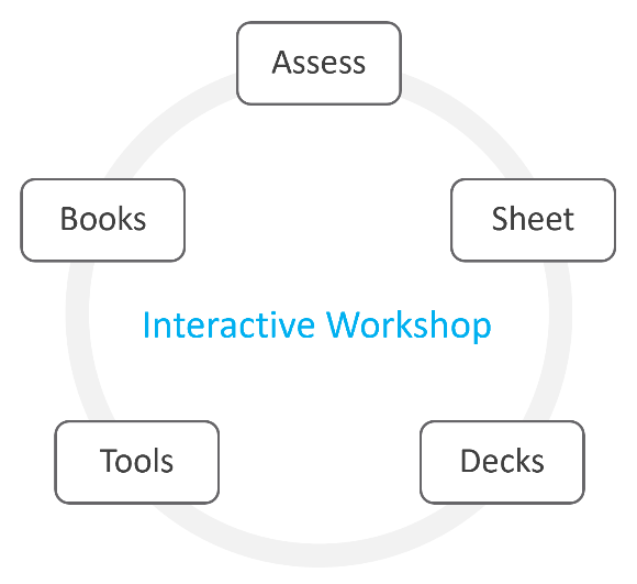 | This book is part of an interactive workshop. The workshop material consists of 3 books, 2 assessments, worksheet, a set of PowerPoint decks, and a few VCF Operations adapters. They can be found at Broadcom VMware {code} site and downloaded here. The program is delivered as a small and focused workshop among practitioners who are responsible for operating private cloud based on VMware Cloud Foundation. It dates back to 2016, when Kenon Owens created Operationalize Your World and delivered dozens of sessions across in Asia Pacific. |
|---|
| What this book is | An informal book. Think of it as I’m talking to you. We’re just 2 IT Professionals having a discussion. |
|---|---|
An advanced book. IT Operations are like fingerprints. Two companies can have identical architecture, yet their operations will not be the same. Their policies and processes will differ, and so are the people and politics, hence this book supports the idea that you tailor the product to your unique operations. A great tool to tailor is vCommunity adapter by Onur Yezseven. | |
| An editable book. Keep the good parts, throw away the bad ones, add your unique contents, and voila you have documented your operations! Post a screenshot of a cool customization you’ve done and you’ll make my day! | |
| What this book is not | It is a solution book, not a product book. It does not cover VCF Operations feature by feature. It is not a place where you learn the product. There are many materials on the Internet on how to use the product. There is also the official manual. You do read them, don’t you? 😉 |
| It focuses on the management, not the architecture, aspect of private cloud. So, no coverage on VCF design, deployment and product troubleshooting | |
| It also does not cover all aspects of operations, such as process innovation, organizational structure, and financial governance. VCF Cloud Operating Model covers that. |
How To Use This Book
The book is designed to be consumed as offline Microsoft Word document on Windows. It is not designed to be printed. Its table of content is the side menu of Microsoft Word. Follow the steps shown on following screenshot:
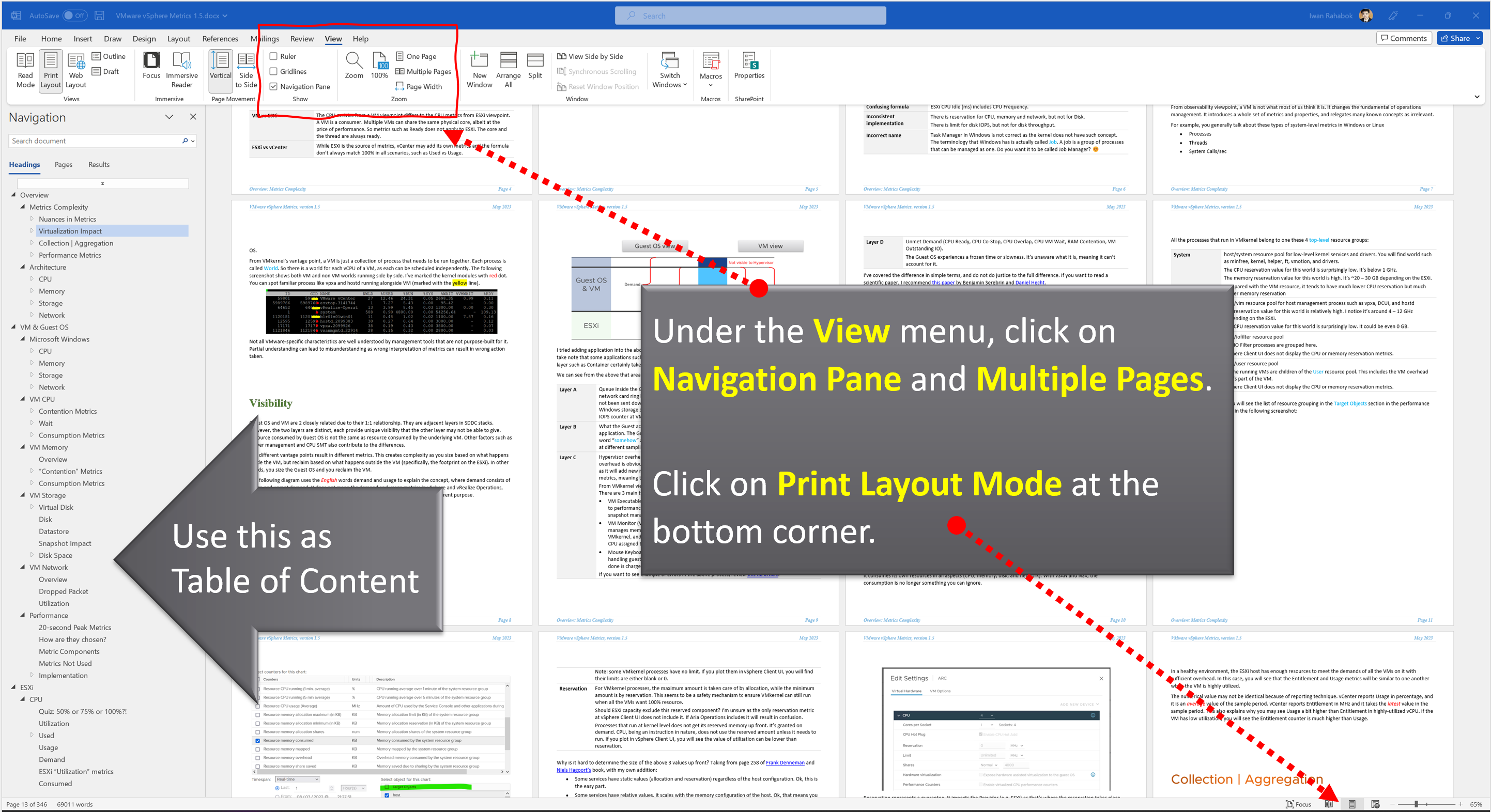
Use the navigation pane as a dynamic table of content, else it’s easy to get lost even when using 43” monitor. If you simply read it top down, without having the navigation on the left, you will feel that the chapters end abruptly. The reason is each chapter does not end with a summary, which is required in printed books but redundant in online books.
Table of Contents
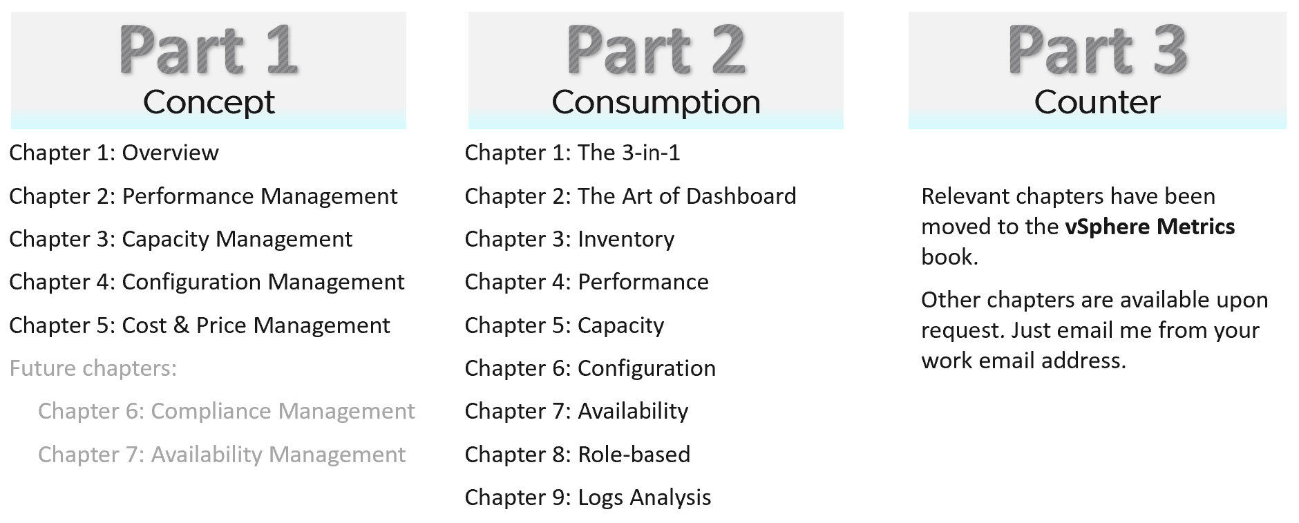
| Concept | It covers all the pillars of IT Operations, and the best practices to manage them. It provides an overview and is suitable for management role. It explains the root cause of why IT struggles with multi-cloud operations, and then shares a new paradigm that has resonated well with customers. It aims to correct decade-old misconceptions on “best practices”. |
|---|---|
| Consumption | It covers dashboards, alerts, reports that implement the concept, so it can be consumed by the right persona. This part gets hands-on and assumes knowledge of the products. |
| Counters | The reference section. It goes deep into metrics used to implement the dashboards in Part 2. I’ve extracted majority of the vSphere metrics and created a separate book. This also addresses the needs of those who just want to learn vSphere. Download here. You’re welcome |
You do not have to read the chapters in sequence from part 1 to part 3, although it will be easier to understand if you read in order. Because each part stands alone, the chapter numbers within each part restart at 1. The other reason is I’m tired of manually renumbering the darn chapters!****
Assumptions
| Version | You have the latest release of VMware VCF Operations. |
|---|---|
| Having said the above, this is not a product book. Some contents of the book can be implemented using earlier releases. To assure you that you can do that, I have kept screenshots from older versions whenever possible. It is also my excuse for not updating the old screenshots! | |
| Customization | The ability to customize VCF Operations to your operations has been the hallmark of the product since it was released more than a decade ago. I was a pre-sales engineer when I first saw 1.0 a long time ago, in a galaxy far away. The ability to slice and dice an environment was a godsend, as I spent a lot of time working with customers troubleshooting and optimizing their environment. This 4th edition continues the tradition of the book by showcasing the full potential of the product |
Part 4
I added Part 4 for miscellaneous stuff that I’m unsure where to put. Some chapters should eventually become its own book as they share a common theme.
Chapter 1: Business Applications. Authored by Peter Tymbel.
Chapter 2: Super Metrics. Authored by Varghese Philipose.
Chapter 3: Automation. Authored by [Thomas Kopton](https://www.linkedin.com/in/brock-peterson-5756534/).
Chapter 4: SDDC vs IaaS
Chapter 5: Terminology
Chapter 6: Infrastructure Architect
Since Part 4 is the last one, it’s also where I put a personal note to wrap up the book.
Removed Chapters
Over the last decade, the book grew to well over 1000 page. The size made it harder to digest.
To address the above, I’ve removed the following chapters. If you need them, just reach out to me on LinkedIn.
| Chapter | Reason |
|----|----|
| Availability Management | The content is not complete and deep enough to exist as a separate chapter. |
| Compliance Management | As above |
| Kubernetes | As above. If you need the formula of the metrics, reach out to me via LinkedIn. |
| True Visibility Suite Dashboards | Authored by Brock Peterson |
| Green Dashboards | Authored by Varghese Philipose |
| Log Insight | Authored by Marine Harutyunyan and Samvel Israelian |
| VMware IT Story | Authored by George Stephen from VMware IT |
This page is intentionally left blank.
Why? I don’t know. Some people do it, so I just follow as IT behaves more like fashion nowadays…
PART 1
Concept
The first part of the book explains the best practice of IT Operations Management for a private cloud based on Broadcom VCF software.
Your IaaS
Part 1 Chapter 1
This first chapter provides a tour of IaaS operations management, starting with why reactive and hectic operations is common, and the paradigm shift required to proactive & predictive operations.
Overview
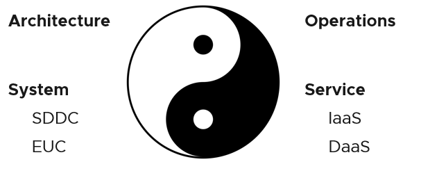
What you architect is SDDC. But what you handover as a business result to your CIO is IaaS. What you bought from your vendor is SDDC, but what you sell to your customers is IaaS.
The transformation from SDDC to IaaS requires Operations Transformation. We transform from complaint-based to SLA-based, which requires fundamental process changes from alert-driven to insight-driven.
SDDC is a system, IaaS is a service. A system cares about its architecture, while a service cares about its service level.
Whether the Application Team or VM Owner pays for the service with a chargeback model or not, it is a service. VM Owners no longer own, hence care, about the underlying architecture.
They are 2 sides of the same coin. We can assess if the architecture is good or not, based on the actual result in production. Does it result in firefighting and blamestorming? Or do you have peaceful operations where alerts are meaningful and actionable?
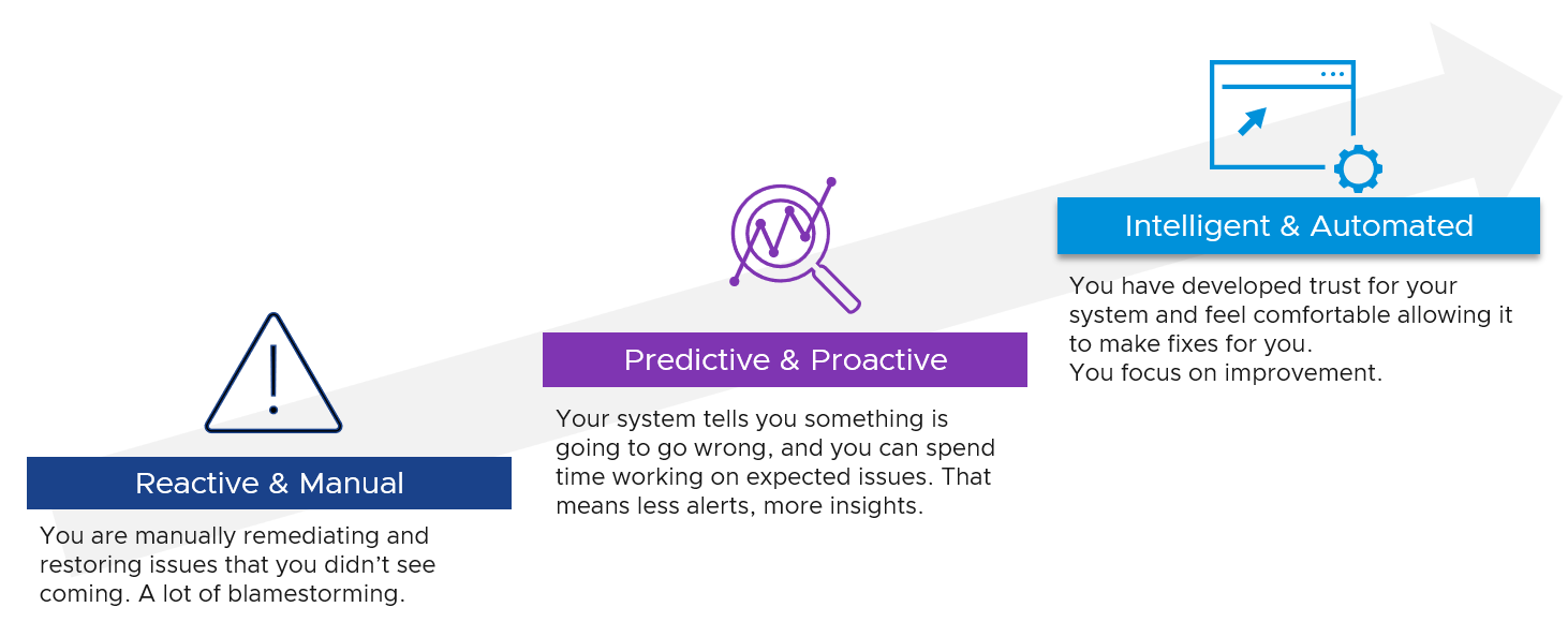
Many operations rely on alerts as the starting point. Actions are taken based on alerts, resulting in reactive day-to-day operations.
IT Operations covers a wide area of systems. It’s common to see more than 1K alert definitions across all systems under monitoring. As the team wants to be alerted early, a conservative threshold is set up. This results in alert storms.
Since automation is perceived as the holy grail of solutions, alerts are typically set to auto close if the symptom disappears. The creates a bigger problem, common in large enterprises with a large IT team. That problem is “lazy operations”, where no alert is associated with no problem.
Complaint-based Operations
How do you know that the Infrastructure as a Service (IaaS) Platform (be it on-prem private cloud or externally in the cloud) is serving its workload well? If you depend on complaints, then you run “complaint-based” operations.
Changing from reactive to proactive is unfortunately a complex undertaking, especially in large organizations where there are many roles and personas. It requires operations transformation and a paradigm shift. It is not easy to get customers to agree on a Service Level Agreement (SLA) when you’ve promised them “good” for years already. This book aims to provide practical guidance, something you can implement with the current version of Aria products.
The Litmus Test
The following questions below helps you assess the maturity of your IaaS business.
Is your IaaS cheaper than public cloud?
The commoditization of infrastructure means your IaaS is being compared with similar platforms such as VMware Cloud on AWS and Amazon Web Services.
If not, your CIO may question your business value. The primary reason for having an in-house architect is so you can bring better price/performance, after taking into account your salary.
Do your customers blame your IaaS?
If the answer is yes, take a moment to ponder why. There is a high chance you are relying on complaints in your operations, so you actually encourage them. No complaint, no problem. That’s why it’s aptly named Complaint-based Operations.
The reason why you rely on complaints is the operations team have no other means by which to measure success. You have not defined the performance of your IaaS. That’s one of the goals of this book.
A sign of matured operations is that you have complete, correct, and accurate SLAs (Service-level agreements). Complete means you have Performance SLAs and Compliance SLAs, not just Availability SLAs. Correct means the SLA is measured on each paying VM, and not at the infrastructure level. It also means you use the right metrics. Accurate means the measurement has to be measured every 5 minutes, as any longer intervals than this can miss the problem.
Does troubleshooting mean all hands-on deck?
Do you have a process that is followed by all teams (network, storage, server, OS, application)? Does that process end with Root Cause Analyzis (RCA)?
As part of RCA, do you set up alerts so the same issue can be detected faster if it happens again? Without an alert configured, the RCA should not be closed. The alert is necessary as it will trigger the next RCA process.
Does Help Desk provide a good first level defence?
If Help Desk simply passes issues through to the next level, you need to look at why.
Help Desk is your first line of defence. They are not as technical as you are. Equip them with Standard Operating Procedures and simple dashboards so that they can handle VM Owner complaints by discovering:
-
Is the problem caused by IaaS not serving the VM well?
-
If yes, which part of the infrastructure: CPU, RAM, Disk, Network?
-
If not, how to prove it convincingly?
Do you struggle with many over-provisioned VMs?
This is an indicator that you are operating as a System Builder as opposed to a Service Provider. As a System Builder, you are meddling with each System (read: Application). You size them and argue with the application teams, who are actually your customers. You are busy as there are many applications, and you are outnumbered.
If you are operating as an internal Cloud Service Provider, you should not be “in the way” of the business. You use an effective pricing model to drive the right behaviour. Does a public cloud provider block application teams when they buy 40 CPU AWS EC2 VMs when they only need 2 CPU? They don’t, hence neither should you.
Can you justify new infrastructure when utilization is not high?
This is not referring to additional money that comes with new projects. This is referring to existing workloads on existing clusters/storage.
Capacity is measured on utilization and performance. A cluster is at full capacity if it can’t serve its VMs well. Since it takes time to buy hardware, you must have an early warning system to detect this performance degradation.
Common Mistakes
“If you don’t have a problem, I don’t have a solution” summarizes how I engage customers. After >1.5 decades of engagements with hundreds of VMware customers and outsourced partners, here are typical mistakes I’ve observed:
-
Using automation as the primary solution for transformation.
-
Private Cloud is seen as automation project as opposed to operation. Private Cloud is not virtualization with automation and self-service. It is the required technical foundation to transform the business of enterprise IT from system builder to service provider. The automation, workflow and self-service portal are merely supporting features. The primary components of Private Cloud are SLAs and Class of Service, hence it’s operations-centric, not automation-centric.
-
VMware Cloud Foundation is architected with server-consolidation mindset. That means the system has no awareness of IaaS and SLAs. Different classes of service are mixed in the same cluster or datastore.
-
There is class of service, but the system does not clearly state it. The naming standard does not include class of service.
-
Performance is never defined properly. The infrastructure is designed for performance, but the benchmark does not align with what actually being sold. There is no Performance SLA, and often there are no Key Performance Indicators (KPI)1.
-
The infrastructure has no awareness of business units, applications, or application-tiers. The business is not reflected in the infrastructure.
Maturity Model
It’s a good practice to assess the level of operational maturity, as it allows you to summarize where you are. There are different variants of this models, so don’t be hesitant to tailor to your goals. I’ve included a short assessment within Part 4 Chapter 1 to get you going.
When scoring yourself, assign score on the following area:
-
Policy: Is your policy outdated? Best Practice typically means proven or common practice.
-
People: How skilful is the team vs the need? This includes the way the team is organised.
-
Process: How effective are the key processes (e.g. planning process, troubleshooting process)?
-
Pillar: How mature is each pillar of operations? For example, if your capacity management is mature, you are balancing cost and capacity very well. If your performance management is mature, you’re not reactive to endless complaints because you have SLA formally agreed.
-
Platform: This covers both the technology supporting the business workload, and the IT tools used by the operations team to support the former. For example, if you do not have clear visibility, you’re flying blind.
Multi-Cloud Management
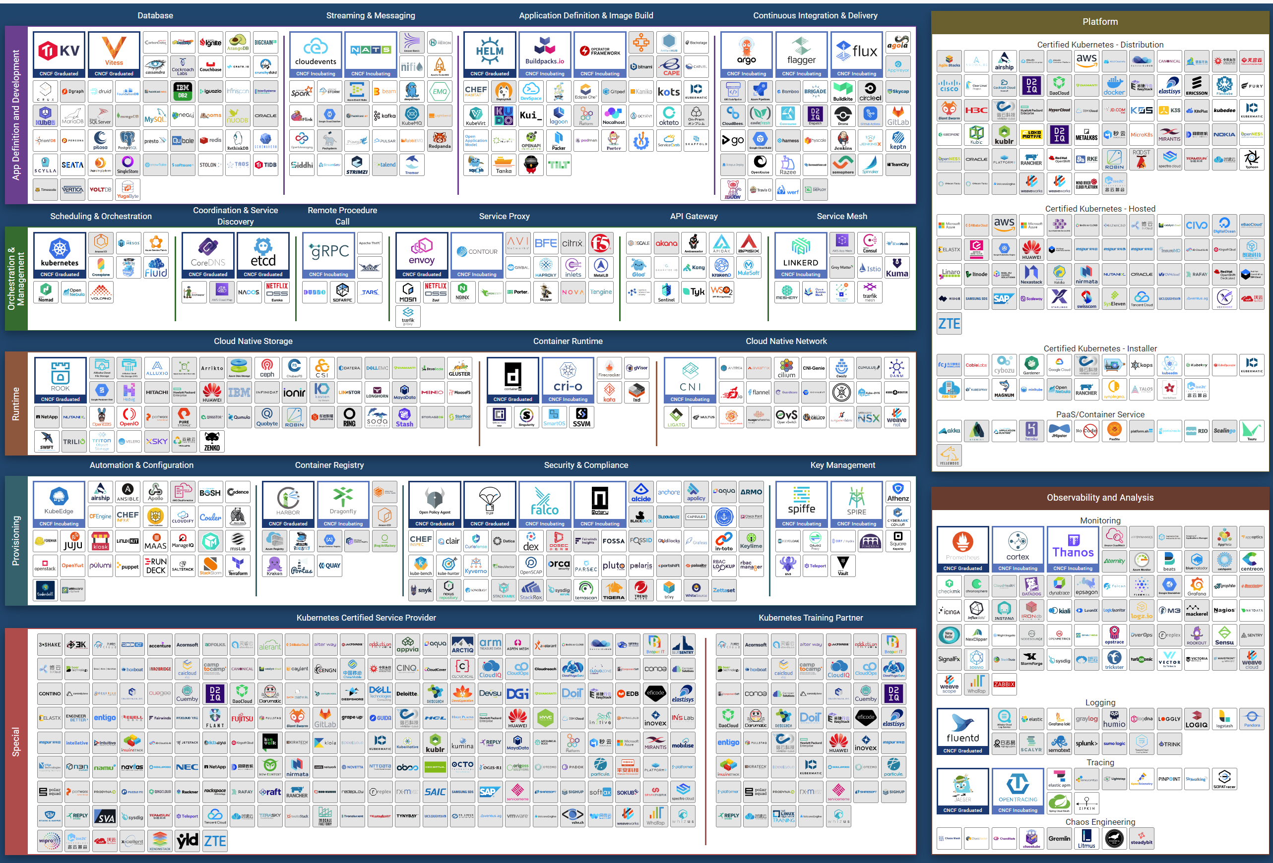
A single private cloud - something you have complete control of - is hard enough to operate, let alone operating multiple incompatible infrastructures. Multi-cloud operations, where you are responsible for something that you do not have complete controls take the operations challenge to the next level. Don’t be disheartened if your organisation is struggling with running multi-cloud operations.
The complexity is due to the immaturity of the architecture. There are simply too many components involved, as shown in the landscape diagram by Cloud Native Computing Foundation. The individual products that make up the architecture is not important, hence I intentionally make the diagram small.
Eventually though…, the architecture will slowly mature and turn into a commodity. CIOs will begin to focus on the operations, as the business will demand proper governance with SLAs.
Regardless of the underlying system architecture, CIOs are still required to manage cost, capacity, compliance, performance, and availability. The Pillars of Operations do not change just because you change the plumbing.
The Business of IaaS
There are 3 variants of an IaaS business. They differ in terms of what you actually sell, how you do pricing, and what SLA you put on the table.
| Item | Pricing | Availability SLA | Performance SLA |
|---|---|---|---|
| VM | Price depends on VM size. A larger VM has a higher price. Price depends on quality. A better tier has a higher price. Example of an item purchased: 1 VM, 4 vCPU, 16 RAM, 200 GB disk, in Gold Tier. | Per VM. Depends on the tier. | Per VM. Depends on the tier. |
| Resource Pool | Sold per GHz, GB RAM, TB Disk. Example of item purchased: 100 GHz CPU, 1 TB RAM, 80 TB Disk. It can come with a 100% reservation; hence it’s guaranteed. Alternatively, it may have partial reservation. It typically comes with best effort burst, in the form of expandable resource pool. On the other hand, it may come with a limit but it’s always higher than what you paid for. For example, you pay for 1 TB of RAM. You can have 0.5 TB guaranteed and a 2 TB limit. | Per VM. Limited tiering capabilities. | N/A. While Resource is reserved, customer is allowed to overcommit within their own limit. It’s not something the IaaS service definition imposes. |
| Hardware | Price per ESXi host. Customers decide how many VMs they want to place. HA is provided by vendor. Example of items purchased: 8 ESXi Hosts. Example provider: Azure VMware Solution (AVS). | On the Host or Cluster, not VM. | N/A Customer can squeeze as many VMs. |
Class of service is harder to implement in resource pools as there are more moving parts. You can have cascading resource pools.
VM as a Service
The most popular variant of IaaS is VM as a Service. It is typical example of “buy wholesale sell retail” business. You buy in bulk (hardware, software) and commit DC space for years, then sell in small chunks (VM, K8 Pod). You make profit as your buy price is several magnitudes lower than your sell price, on a per unit basis. You probably pay 5x less per GHz than you sell.
| Purpose | Serve the workload. They take the shape of VMs. The VMs in turn can be K8 nodes or classic applications. The workload must be grouped by tenant and business applications. |
|---|---|
| KPI | The key metrics used to measure the performance of the infrastructure. Is it serving the VMs according to its SLA? |
| Cost | The total cost should be cheaper than public cloud. Typically, customer aims at >2x cheaper, not just marginally cheaper. |
| Pillars | The key pillars that transform the SDDC into IaaS. IaaS has multiple class of services. Each has their own Availability SLA, Performance SLA, Security SLA, and Service SLA. |
| Proof | The metrics demonstrating that the architecture works as intended. Operations become proactive. It’s based on insight, not alert. |
The business goal is to ensure the application and VMs are running well yet cost effective. In this way, you keep the customers happy.
The cost part is easy to quantify. You know what you actually spend on hardware, software, services and salary. The “well” in running well is the hard part as there is a big unknown. This is also the source of argument between application teams and infrastructure teams.
Say you are architecting for 10K VMs in 2 data centers. You envisage 2K VMs in the first month, 5K VMs in the first half year, and eventually to 10K within the first year. Do you know the basic info about each of these 10K VMs, so that you can architect an infrastructure to serve them well?
-
How big are they? What are their vCPU, RAM, and Disk configuration?
-
How intense are they? CPU utilization, RAM utilization, disk IOPS, network throughput?
-
What are their workload patterns? Daily, weekly, monthly, no pattern, etc?
The answer is obviously no. Even application teams do not know as some of the applications may not be developed yet. Their vendors may not know either as the actual usage is not yet known.
Promising that the SDDC will serve all 10K VMs well is akin to promising the highway you architect will serve all the cars, buses and motorcycles well, when we can’t predict how many they are and how often they will use it. We will cover this more in the Performance chapter.
So how can we promise that your IaaS will serve your customers well?
We can by using price/performance. The principle you share with your customers is the common sense principle used in all service industries:
-
You want it cheap; it won't be fast.
-
You want it fast; it won't be cheap.
This is where the Class of Service and the associated SLAs come in. The highest class of service provides the best uptime and performance but comes at a price. All these attributes are well defined in the SLA, leaving no room for ambiguity. The contract is not subject to interpretation. You define all the key metrics up front, assuring your customers that you are confident of delivering as promised.
You then architect your IaaS to deliver the above class of services. The class of service becomes your business offering. With that, you are ready to begin with the end in mind.
Capabilities
The platform should provide a complete self-service portal for all types of users. The features should cover all stages in the life cycle, starting from provisioning. Provisioning should have an SLA and be supported with workflows and electronic approval.
Key Metrics
You measure across the pillars of operations management. Each pillar is measured, hence managed, by a purpose-built metrics. This enables you to manage at scale.
| Pillars | Metrics | |
|---|---|---|
| Availability | Operational Availability (%) | Relative Availability, against your availability architecture and green zone. |
| Actual Availability (%) | Absolute availability, reporting the fact as it is. This metric typically has lower value than Operational Availability (%). | |
| Performance | KPI (%) | Absolute performance, reporting the fact as it is. |
| SLI (%) and SLA (%) | Relative performance, against your promised SLA. SLI = SLA Leading Indicator | |
| Capacity | Capacity Remaining (%) | Relative to usable capacity, not total capacity. |
| Time Remaining (days) | The number of days until Capacity Remaining (%) hits 0. | |
| Compliance | Benchmark X (%) Compliant | Compliance against specific industry or internal benchmark, such as PCI-DSS. 1 metric per benchmark. |
The Restaurant Analogy
Sunny Dua2 and I use the restaurant analogy when explaining the need of SLA. The analogy has resonated well with many customers. Humans can always relate to food!
Essentially, a restaurant has 2 areas, often with a clear demarcation line:
-
The Dining Area.
-
The Kitchen.
Think of your IaaS business like a restaurant business. It has a dining area, where your customers live, and a kitchen, where you prepare the food. Guess which one is more important to the owner?
You are right. The dining area.
If everything runs smoothly in the dining area, customers are being served on time and on quality, and they are paying you well; it is a good day for the business. Whether you are running around in the hot kitchen is a separate, internal matter. The customers do not need to know about it.
We use the analogy to drive the message that you need to focus on the customers first, and your SDDC second. If you take care of your customers well, and they are happy with your service, the problem you have in your IaaS is a secondary and internal matter.
-
The “dining area” is the Consumer layer. Look at the diagram below. It is where your customers’ VMs live. In the public cloud such as AWS, that’s all you can see.
-
The “kitchen” is the Provider Layer. This is your infrastructure layer, where VMware and the hardware reside.
Public cloud is part of the kitchen. Just because you no longer own the infrastructure does not mean you don’t take management responsibility. The structure of enterprise IT means the infrastructure team ends up being held accountable.
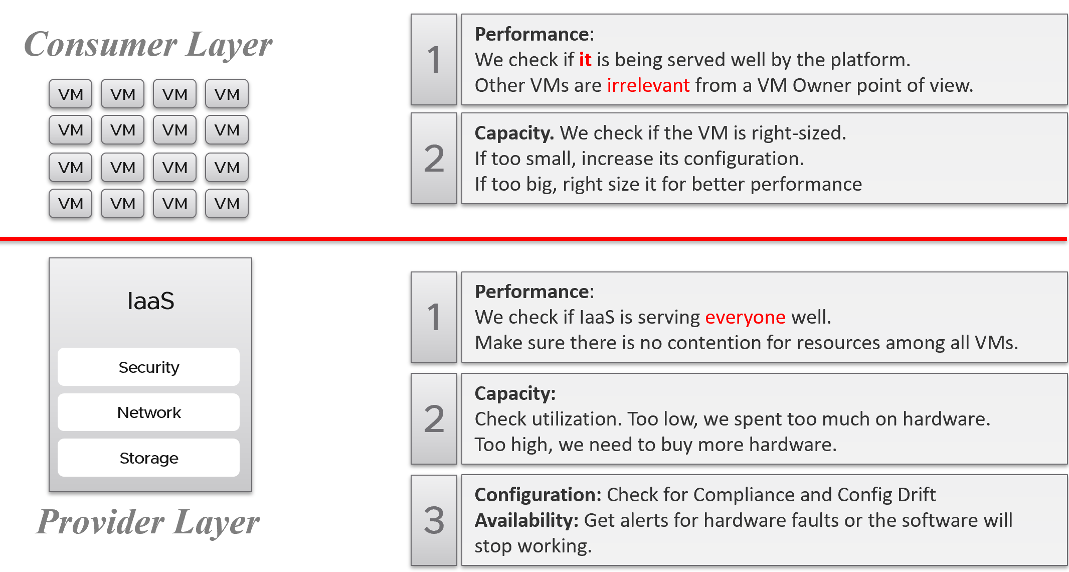
There is clearly a line of demarcation between the two layers. Your customers should not care about the details of your SDDC or EUC. The VM Owner does not care if you are firefighting in the data center. Because they do not care, whether you are using an older VMware Cloud Foundation or the latest, this is not something you want them to dictate to you. The same goes with your choice of hardware brand and specification.
Conduct regular sessions with the application teams on the following topics:
-
How to run best on VMware, with optimal performance, highest availability, most secured while keeping cost minimal.
-
How to monitor the performance, availability, and security when you’re running on VMware. How to know you’re being served well by the IaaS platform according to the promised.
-
Windows and Linux performance best practices.
-
Why rightsized is better than oversized for VM.
Understand their expectation of the infrastructure. In large environments, different VM Owners can have different expectations and levels of knowledge.
The application teams become consumers of a shared service—the cloud platform. Depending on the SLA, the application teams can be served as if they have dedicated access to the infrastructure, or they can take a performance hit in exchange for a lower price. For SLAs where performance is guaranteed, a VM running in the cluster should not be impacted by any other VMs. The performance must be as good as if it is the only VM running on the ESXi host.
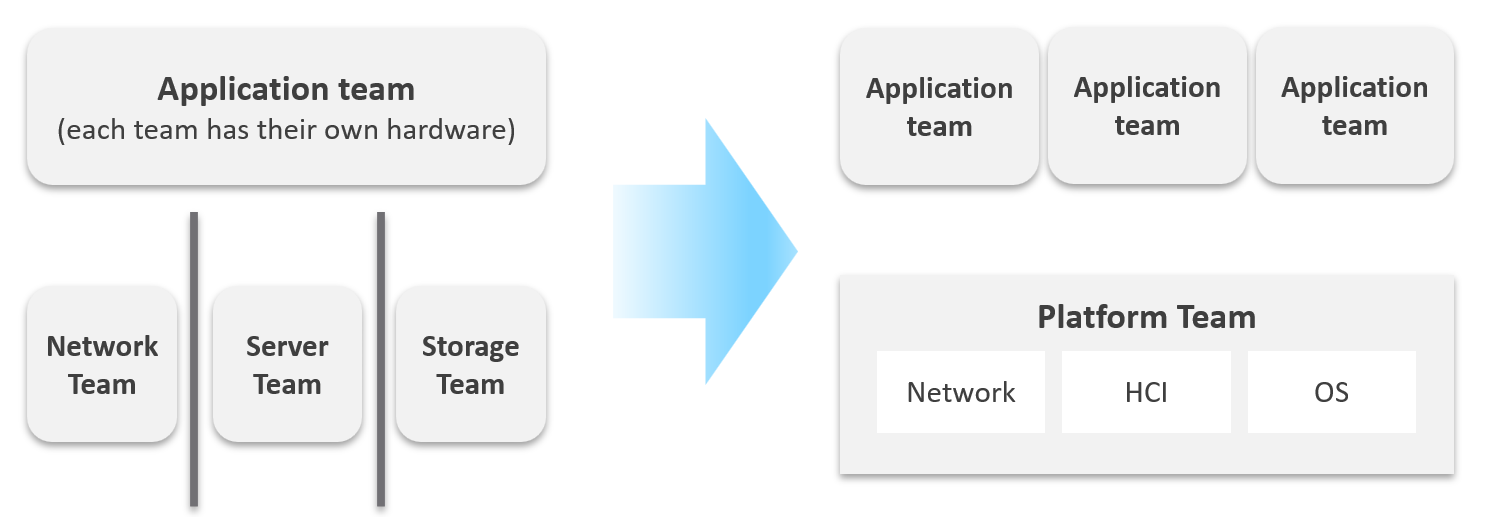
Let’s zoom into the kitchen area, as that’s also undergoing a transformation. The Server team or Windows team or Linux team typically took the ownership of the shared platform and evolved to become the platform team. With the evolution of Hyper Converged Infrastructure, storage is being absorbed into the platform. The boundary with the Network team is also becoming blurry with network virtualization. Many network services such as Firewalls and Load Balancers are virtualized. Recently, with the arrival of the Kubernetes, the platform team began owning containers and K8s, plus there are new teams (DevOps and/or SRE) that sit in between Platform team and Application team.
Purpose-Driven Architecture
When you architect IaaS or Desktop as a Service (DaaS), what goals do you have in mind? I don’t mean the design considerations, such as availability and performance best practices. I mean the business results that your architecture has to deliver, viewed from the people who paid for the system, and by the people who will pay for the service. Set aside your opinion on the goal, as you neither pay for it nor use it.
Logically, the answer depends on what is being sold. You can either sell application or infrastructure, broadly speaking. Some popular examples are:
| Service | What you sell | Examples |
|---|---|---|
| SaaS | The software is provided as a service. Customers need not install it on-site. Common among ISVs who want to avoid on-prem installation, avoid outdated installations, or mine their customers’ data. | Salesforce, VMware Skyline, Microsoft Office 365. |
| DBaaS | Database as a Service. There are 2 variants: Instance: A customer shares the binary with others. Patching the software means all instances using the instance get patched. They all need to have common maintenance window. Dedicated binary: Customers can have different versions, patch levels, and downtime schedules. | Examples such as Mongo DB as a Service or MS SQL as a Service are common among enterprise. The DBA provides this as service to the application team, who are not as deep on databases knowledge. |
| PaaS | Platform as a Service. A set of services used by business applications. AWS provides many such PaaS services and is the main reason why customers choose them. | Central IT provides a set of common services (e.g., login, payment) to all business units websites. |
| DaaS | Desktop as a Service. Typically, Windows 10 + End-User applications. Application teams must be involved, as a simple 10% CPU increase of your browser can impact performance SLAs as the ESXi host becomes heavily over committed. The goal is to ensure End Users are getting a quality desktop experience while keeping the price per user low. | Many enterprises’ IT provides this for better security and PC-manageability. They may deploy this with thin client. VMware Horizon Cloud, Microsoft Windows Cloud are cloud examples. |
| K8aaS | Kubernetes as a Service. There are 2 variants: Dedicated cluster. Shared cluster. | Amazon EKS |
| IaaS | There are 3 variants here. As this is the topic of the book, let’s explore in depth. | |
Begin with The End in Mind
It’s important to reflect the business in both the IaaS platform and your operations. It makes the infrastructure team aware of the context and impact to the business. In their day-to-day operations, they need to be Business Application centric. This calls for a paradigm shift.
Your CIO wants live information projected for his peers to see on how IT is serving the business. This requires you to have awareness of the business units and their critical applications.
In your service offering, you include the ability for customers to check their own VM health, and how their VMs are served by the underlying platform. This means your architecture needs to know how to associate tenants with their VMs. At the very least, create a structure so they can browse or find their applications and VMs.
Business Application
Is the problem with your business application caused by your infrastructure? The problem is typically performance, although it could be availability or security.
You can create a universal model for all business applications since the infrastructure metrics are the same.
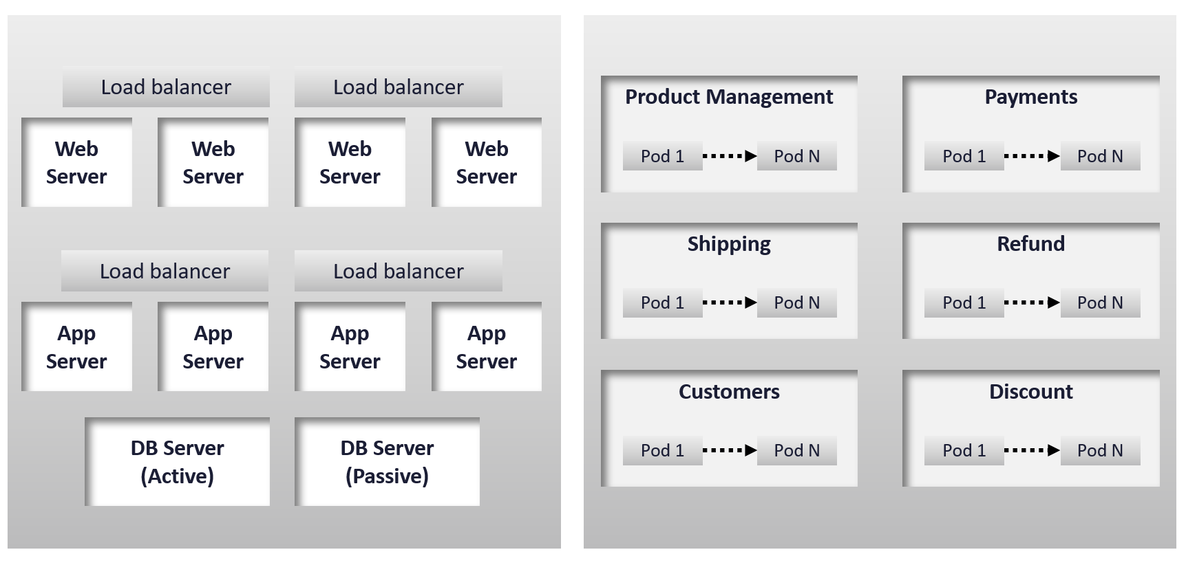
The health of a tier is the average health of its members. This is because a tier scales out across distributed instances. We are not taking the minimum value because processing within a tier does not happen in sequence. This is not a convoy. A good Load Balancer will balance both performance and availability.
“Hold on!”, you might say. Since it is scale-out architecture, the Application Team has catered for this. If they only need 3 web servers, they will deploy 4 or even 5. So, both performance and availability are not affected if one web server goes down. The measurement of a tier has to take into account this extra capacity, and not simply do an average of all members.
This logic sounds reasonable. But is it correct?
It is correct for availability. It is not correct for performance. Performance needs to include all nodes as it reflects reality.
Day 1 | Day 2
Architecture is Day 1, and Operations is Day 2. Day 1 happens before Day 2.
By Architecture, I mean the detailed technical work, including building and commissioning the system. While the business plan and high level marketecture3 is defined during Day 0 (Planning), the real architecture work is done on Day 1.
However, if we think deeper, Day 2 impacts Day 0, which is Planning. The reason is the End State drives your Plan. Your Plan drives your Architecture. So, it’s 2 🡪 0 🡪 1, not 0 🡪 1 🡪 2.
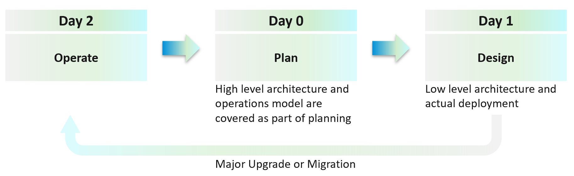
Day 2 is not simply the first few days after you go live. It’s the day you set sail4.
Let’s use an example to illustrate how Day 2 impacts Day 0, which in turn impacts Day 1.
Say you are an internal cloud provider, and you plan to charge per VM. You plan to have 2 classes of offerings:
-
Gold: suitable for production workloads. Performance optimized.
-
Silver: suitable for non-production workloads. Cost optimized.
For Gold, you plan to not overcommit CPU and RAM. If 1 CPU typically uses 4 GB RAM, then a 64-core ESXi host will only need 256 GB. If you buy a host with 1 TB RAM, then you may end up in a position where you are not able to sell the remaining 768 GB as you have no more vCPUs to sell. This means your hardware specification is impacted. That’s an example of how Day 2 impacts Day 0.
For Silver, you plan to overcommit 4:1 for CPU and 2:1 for memory.
-
You assume that 1 vCPU typically uses 4 GB RAM. Your customers are allowed to buy more or less memory, so this 4:1 ratio between CPU and RAM is just a guideline for overall planning.
-
You plan to run vSAN with dedupe + NSX + vSphere Replication. You also expect heavy IO VMs, which requires kernel processing. For all these supporting, non-business workloads, you allocate 8 cores and 64 GB RAM.
-
If you buy a 64-core ESXi, you have 56 cores left and you will be able to sell 224 vCPU.
-
These 224 vCPU will need 896 GB RAM. Since you overcommit 2:1, you need 448 GB for VM. Total RAM you need is 448 + 64 = 512 GB.
-
That means the hardware spec you need is 64 core and 512 GB RAM. If you buy more RAM than this, you may not be able to sell this extra RAM as you may not have vCPU to accompany them.
The above 2 examples show how your hardware spec can’t be decided without considering the average VM profile and the overcommit ratio you plan. Yes, Day 2 does dictate requirements and constraints to Day 0.
You also promise the concept of Availability Zones for Gold class, as they host mission critical business services. Your company policy for Business Continuity dictates that in the event of an entire cluster failure, you plan to cap the number of VMs affected. If you limit to say 300 production VMs, then your cluster size should not be too big as you won’t be able to fully utilize the resource. I’ve seen multiple customers having 32-node production clusters running 1K – 2K VMs.
Promise vs Reality
In a large environment, you may have the luxury of designing different infrastructure for different workload types. Common examples are GPU Intensive workload, Disk Intensive, etc. If the infrastructure is superior to your standard offering, you need to be careful in setting the right expectation.
Let’s take an example: you promise you can handle CPU Intensive workload as you’ve chosen the best CPU.
Notice the issues here?
There are at least 2 of them.
-
You probably heard of Winston Churchill quotation “Sometimes doing your best is not good enough.” What you think is the best CPU may not be good enough for the workload, either in terms of GHz, number of threads, or power efficiency. For example, if your ESXi sports a 3.8 GHz speed but the application wants 5 GHz, giving it extra vCPU does not exactly meet the requirement.
-
Assuming you pass the first issue above, how do you prove that this so-called “best CPU” is actually able to handle the workload? What metrics do you use? Remember it’s just a CPU. All you have as metrics are just GHz and vCPU. If you rely on the application team metric, you need to be prepared to spend time doing testing with them. You should also apply 100% reservation to eliminate infrastructure-level contention. The problem with reservations is that you cannot overcommit. It means you defeat the purpose of virtualization to begin with.
So, what can you do?
-
Set the right expectation. For example, you state that your infrastructure uses dynamic power management. In most cases, this is good for the application as they get Turbo Boost when they are running hard. In situation of light use, the application may run at lower speed.
-
Do not promise something you can’t measure. In this case, the main metric you want to measure is “Is the CPU available when the VM asks for it”. Metrics such as Ready, Co-stop, Overlap, and Other Wait track these moments of contention. You provide great observability by showing these metrics.
-
Measure what is relevant to your business. If what you offer (read: the SLA) does not guarantee that the whole core is available to the VM, then do not measure the time the VM vCPU runs on a shared core.
VCDX | VCMX
Why do we draw a distinction between promise and reality?
My take is because IT Architects typically do not include Day 2 in the architecture. This is specific to VMware; hence I’m proposing VCDX should be accompanied by VCMX (Management). Designing the architecture and transforming the operations are 2 different skills5.
As a service provider, while your technical knowledge is important, your customer measures you on your service level. While they care about your systems architecture and its technological marvel, they measure you on service quality.
Architecture and Operations are two equally large realms. While we certainly consider Operations when designing a system, it is not a part of Architecture. This book is an example of Operations. Notice it goes deep into metrics as troubleshooting is at the heart of operations.
Architecture and Operations also differ in other industries. The person who designs the space shuttle is not the person operating it. You need to be an astronaut to be qualified to operate a space shuttle. The person who designs an F1 race car is not the person driving it. Different expertise is required. They complete each other and are inter-dependent, like Yin and Yang.
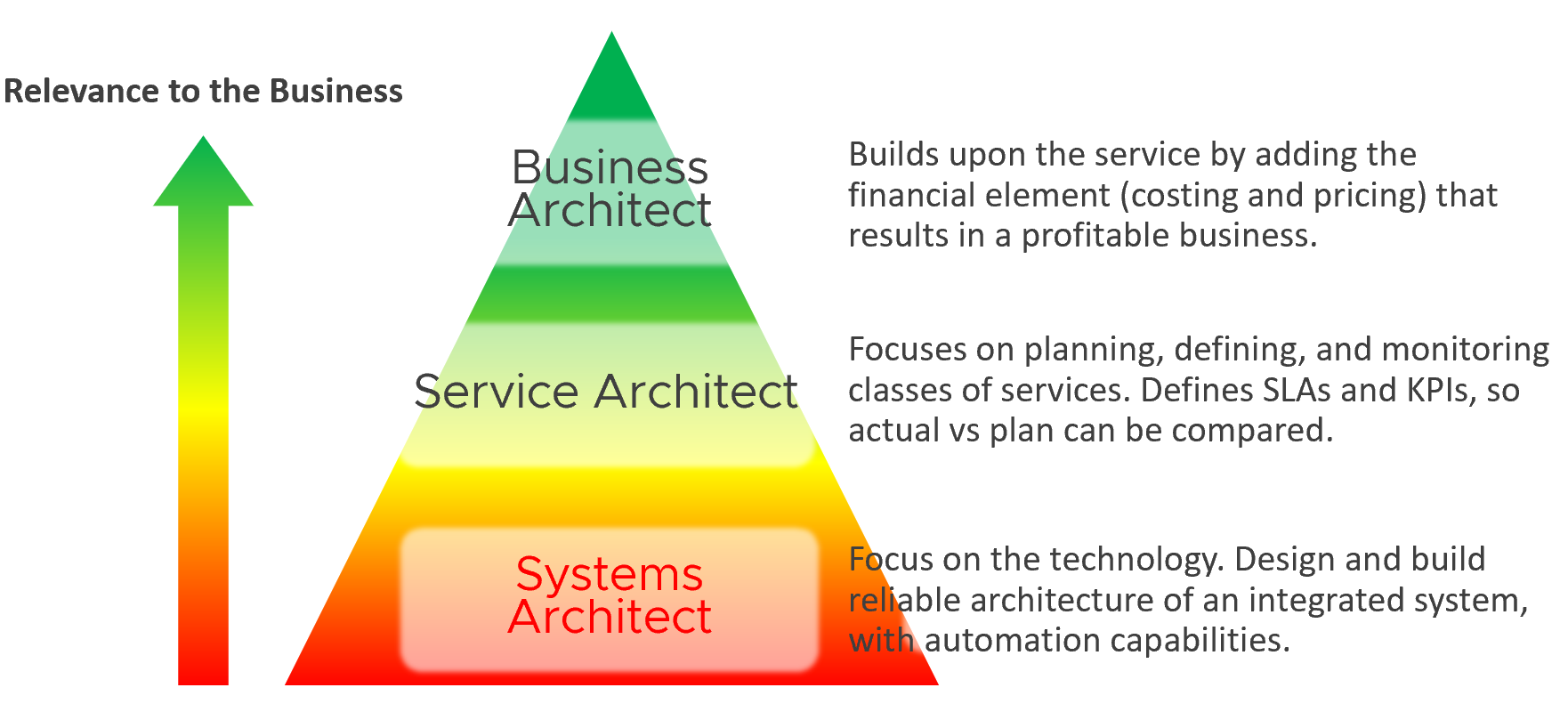
Since Infrastructure is becoming a service, you need to know how to architect a service (e.g., IaaS, Database as a Service, Desktop as a Service).
-
What are the services the IaaS is providing? How do you define a service?
-
What metrics do you use to quantify its quality?
-
How many services? How do you distinguish between a higher-class service and normal one?
You also need to know what type of services are on demand. Service Architects go out, meet customers and understand their requirements. What classes of services are on demand now and in the future? From there, you can architect the corresponding services to anticipate the demand.
As a Business Architect, you not only know the cost of running the service, but you also know how & when to break even. You are not responsible for profit and loss, as you are not the CIO or Cloud Service Provider CEO, but you do play a strategic advisor role to them. You know what to price, how to price, and most importantly you know your price is competitive (or, at least you can provide a business justification for reasons other than price).
From my interactions with customers, I notice that Infrastructure Architects are not leading the Day 0 phase. They provide input to the Planning stage but are not the lead architects driving it. The Infrastructure Architect tends to focus on technical bits, something that CFOs and CIOs value less (hence they spend less time on it). They also do not architect the operations. I see many seasoned VMware Architects not extending their influence beyond architecture. I think that’s a lost opportunity because Day 1 and Day 2 is actually part of the same side. Think of it as a Mobius strip.
Service Architect and Business Architect are the next steps for Infrastructure Architect. I shared story “The Chef and his cooking” back in 2014 during one of the VMUG session.
By the way, how do you know who is the real architect of a system? Let’s say you have mega VDI system, with integrated components such as VMware, Omnissa, thin clients, office networks and many other things. Who is the true architect of this?
My answer:
The owner of the hands on the keyboard figuring out the root cause when there is a massive problem that no one knows why. That’s your real architect. The team who drew the architecture diagrams are not.
Automate | Operate
You need to account for situations where things go wrong, intentional or unintentional. Real problems happen in Day 2 as that’s when you have business workloads doing revenue generating transactions. Do not architect something you are not willing to troubleshoot. Think of the roles and skills required to operate your architecture. Provide the necessary visibility into each component and define what constitutes health.
I hope the above examples show that Day 2 is where you want to start. As said in a famous quote: “Begin with the end in mind”.
Did you notice something missing in the discussion above?
Yes, I did not cover Automation.
Why is that?
For me, that’s part of architecture. You should not automate what you cannot even operate. So, automation is not part of operations. Automation is a feature of your Architecture, meaning you design the system with automation in mind. Using an analogy, it’s like a plane with many automation features. Fly-by-wire. That’s a feature of the plane. How you use the plane to ensure passengers arrive at the destination safely, comfortably, timely and fresh: that’s operations.
In terms of transformation journey, automation should be placed last. Do not automate what you cannot operate. You’re speeding up the problem if your operations is not well governed.
Observability
Observability is not a superset of monitoring. They are two different things.
| Observability | Monitoring |
|----|----|
| It is a property of the system to be managed | It is an action done by an actor |
| Observability and Debuggability are peers. Just because a system emits metrics and logs regularly, does not mean it has ways to be stepped through and debugged. | Monitoring & Troubleshooting are peers. Just because an admin has the skills to monitor a system, does not mean he can fix it. |
For details, see the terminology chapter at the end of the book.
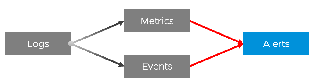
Input | Output
There are 66 types of inputs which work together to give you your alerts, dashboards, and reports. Each of those input types has their own purpose and format. They also tend to overlap. So typically, different observability tools excel on each.
Output is documented in PART 2 of the book.
An alert may feel like an input, as you start from it. It is not an input as it’s a trigger you create based on the values of the data types. For example, you create an alert when certain log events occur, certain property changes and certain metrics threshold being crossed.
Review this diagram. What do you notice?
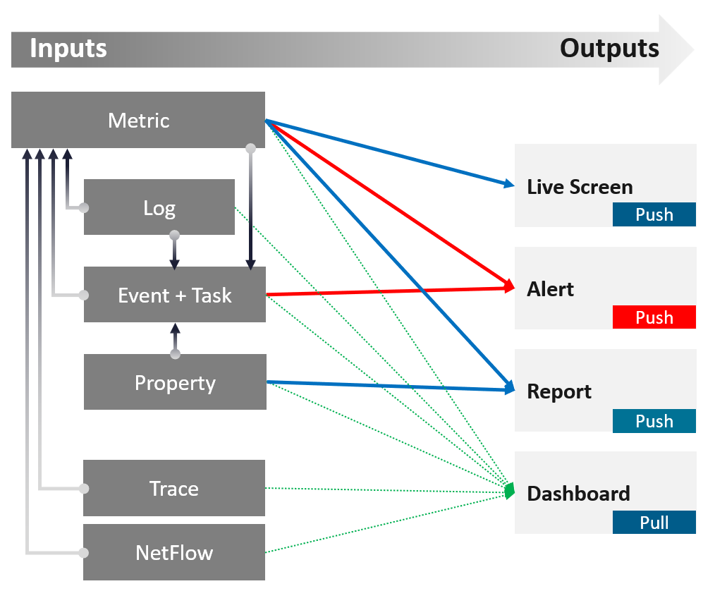
| Metric | The definition is it is produced at regular intervals, even if the value is constant. That’s why state is a metric, not a property. Unlike property, a metric is not editable by user. Its valued is not entered by users. It’s generated by system. A metric always originates as a number. It may be translated into a string for ease of understanding. The number could be a code, whose description is a string. For example, “-1” means no limit. By the way, I prefer infinity to indicate no limit as that seems more natural. It can be a raw metric or computed metric. A computed metric is derived from existing metrics and properties. An example of a computed metric is a super metric in VCF Operations. There are 3 types of metrics (contention, consumption and context). They are explained further in the vSphere Metric book. If it crosses a certain threshold, it can trigger an event or generate a log message. From events, we can create a metric, such as a count of vMotion in the cluster. If the number does not match expectation, we can trigger an alert. A daily proactive dashboard showing the trend across hundreds of clusters may give a clue if a problem will happen today. In this case, the proactive work avoids the alert to begin with. | ||||||
|---|---|---|---|---|---|---|---|
| Property | This is the opposite of metric, as it does not happen in predictable interval. There are 3 types of properties:
Property change is a type of event, which can trigger an alert. Since not all properties are important, the significant of the event is also impacted. For examples:
Number of ESXi hosts in a cluster is a property as the cluster is configured with that. Number of running ESXi hosts is however a metric. | ||||||
| Log | A log is a raw message, typically produced by developers directly.
Numbers can be extracted to form metrics, while text can describe an event. Metrics and Events can then trigger alerts. >99.9% of the logs are not useful. How do you minimize the cost while maximizing the benefit? | ||||||
| Event | An event is a record of something that happened. It could be bad, neutral, or good. It could be planned or unplanned. The bad ones may warrant an alert. Unlike a metric, it does not happen on regular interval. An event has a start time. It might also have an end time. For example, threshold bridged is an event. If the value drops below the threshold, the event ended. | ||||||
It can be a setting change, a state change, or a label change. A label is “external”, meaning it is not an inherent property of the object. Events also trap the activities performed on those objects. For example:
|
In addition to the 4 basic inputs above, you need the following in certain situation:
| Traces | A trace is a record of code in-motion. Some can produce numbers, which are metrics. This is needed is low level, function-level troubleshooting. By the way, function tracing can be traced back (pun intended) to Solaris 10 Dtrace, back to 2005! |
|---|---|
| NetFlow | A NetFlow captures path taken, typically flows of network packets. It shows networked relationship and can produce metrics. |
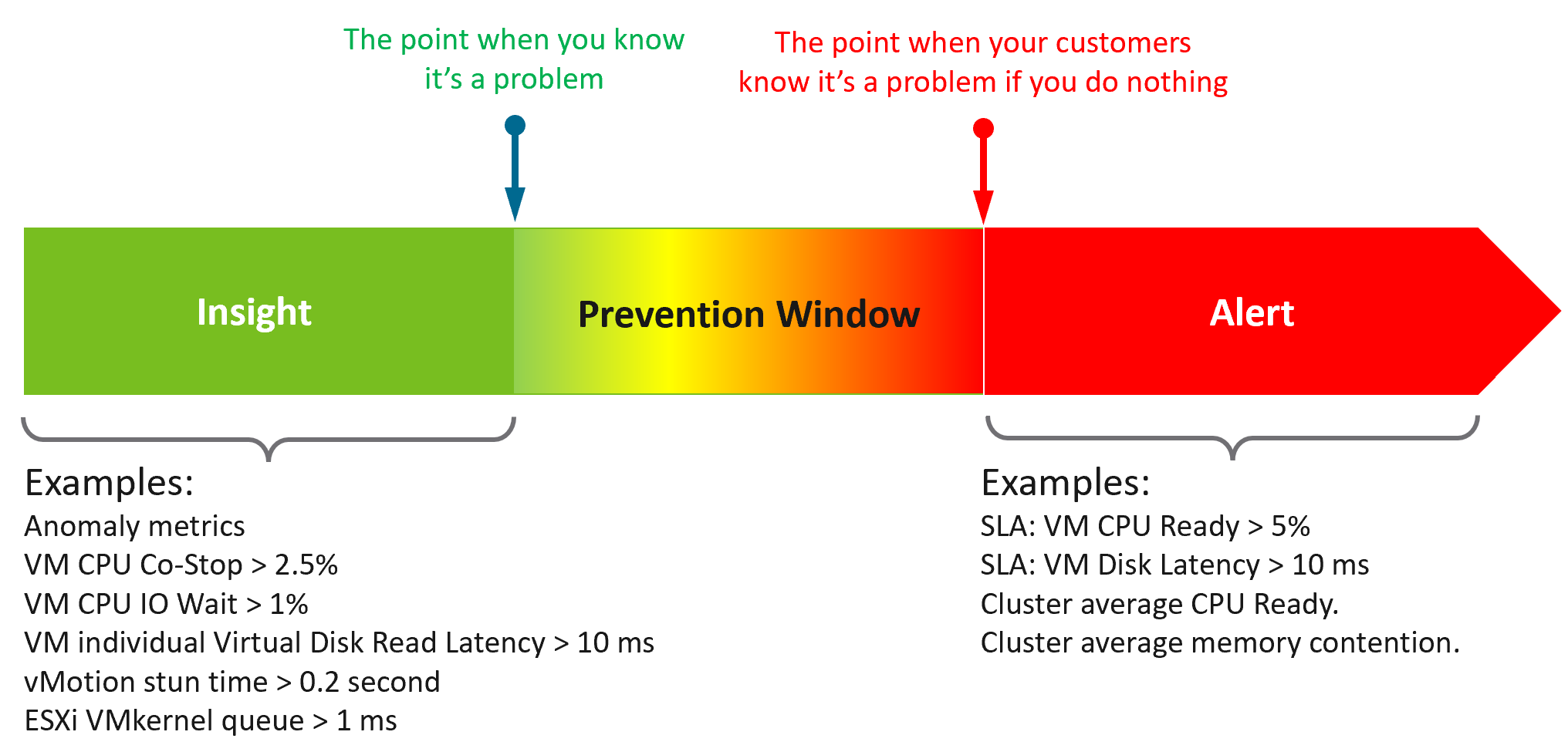
Symptom | Alert | Insight
The reason you have alert storm is you treat alert as To-Do List. You want to be reminded of everything so you do not miss anything.
Analogy: Think of Alerts as your Accident/Emergency Department. You can have dozens of departments dealing with all sorts of illness, but only 1 central location for urgent matters. So where are your “dozens of departments” in your private cloud? Some focus on security, some on storage, some on capacity, some of performance. If you monitor your blood pressure, weight, regularly, why not have daily health check for VCF?
Alert hopefully starts with symptom, a minor and non-urgent issue. This gives you a window to catch during your proactive daily health check.
Mild symptoms that do not go away over time becomes an alert, as it has become urgent.
While symptom and alerts are closely related, insight is something else altogether.
-
The former is bottom up, the latter is top down. You typically gain an insight from a collection of alerts and symptoms, plus additional context. Insight uses many more metrics, especially the supporting metrics.
-
Insight is much harder to realize as it requires both technology expertise and environment experience. It deals with “hint” instead of issue. You need to know the overall architecture and what’s happening operationally, so you can derive an insight from the alerts and symptoms.
-
Insights complement alerts, not replace them. Insights do not have the concept of “auto close” as they do not involve help desk tickets
Proactive Alert is an oxymoron.
Proactive means you’re acting before something happened which forces you to react. The moment you react, you’re reactive. Just because the business is not impacted does not make it proactive.
For example:
-
vSAN shows high disk latency on Sunday midnight. You’re called to investigate, before business become impacted on Monday morning. You fixed it on the weekend and save the business.
-
Does that “weekend warrior” make it a proactive alert?
-
What if the same alert happens during business hours and business impacted? Does that make it reactive?
Alerts rely on threshold, be it dynamic or static. A Threshold has an inherent limitation. It misses the big picture, as it can only see what has crossed the threshold.
 For one object that reached this threshold, there could be many just beneath the level. Think of an iceberg. The small portion above sea level, the tip of the iceberg, is an alert. It does not provide the total picture. In fact, the chunk beneath the surface is far larger.
Insights answer much harder questions, which are typically fuzzy hence they can’t be defined as alerts. Examples of questions are:
-
Are we being attacked? Are they events and activities that happens in parts of our environment where they are not supposed to happen?
-
Is performance degrading? Is there any common pattern and cause?
-
Is the environment behaving differently to what we expect?
Insights focus on the underlying problem. They also help buy you time so you can address the problem before the users complain. In the following example, the alerts use the SLA metrics and threshold. Insights require more granular metrics and supporting metrics
 What do you think of the preceding example? Would it result in less alerts and less reactive troubleshooting?
The main limitation of proactivity is false positives. It also requires daily operational discipline.
An Insight is useless to those who are not familiar with the environment. The numbers shown by an Insight should match reality, and only a person intimately involved with the actual operations can sense if the numbers are not correct.
Let’s take an example: the insight shows your total IOPS throughput is low. If you don’t know what to expect on that day, that number is meaningless. But if on that day you expect high throughput because your company is in the retail industry and it’s the day before Christmas, then you know the sales are not happening as per expectation. Proactively check before your CEO complains why business is not doing well.
| Alert | Insight | |
|---|---|---|
| Goal | To fix. You’re ill. | To prevent. You’re not sick. |
| What it is | A formal event with ticket recorded in the system. May have an incident associated. | Not a formal event. No incident. |
| Situation | Business or operations may be impacted. | No impact. |
| Known problem. You may not know the root cause though. | No known problem. | |
| Urgent. You must look at it today. | Not urgent. Can do on the next business day, or even next week. | |
| Hopefully not important issue | Important issue | |
| Nature | Reactive and unpredictable. | Proactive and regular. Daily, weekly, monthly. |
| The system tells you. Response is mandatory. | Response is not applicable as you initiate. | |
| Person | Low expertise. Follow steps or SOP. | Deep expertise. No steps to follow. |
| Does not need to know the overall environment and workload well. | Must know both the environment and recent operations. | |
| Metric | Focus on primary metrics (the What). | Focus on both primary metrics and secondary metrics (which explains why primary metrics are bad) |
| User Interface | Start with Email or notification on your mobile phone. | Start with a big dashboard on desktop. |
| A specific alert. You work bottom up. | The big picture of the overall environment. You work top down. |
Lagging Indicator | Leading Indicator
| Lagging Indicator | Leading Indicator | |
|---|---|---|
| Used in | Alerts. Reason is alert is your fallback, if you forget to proactively address. | Insights. |
| Focus | “Dining-area” metrics. Metrics that impact customers. | “Kitchen” metrics. Underlying metrics that impact the primary metrics. |
| Technicality | Simple to understand the meaning (not necessarily the underlying formula). | Tend to be low level metrics that require deep technical knowledge. |
| Persona | Level 1 and Help Desk. | Subject Matter Expert. Familiarity with the environment is required. |
The 2 Sides of VCF
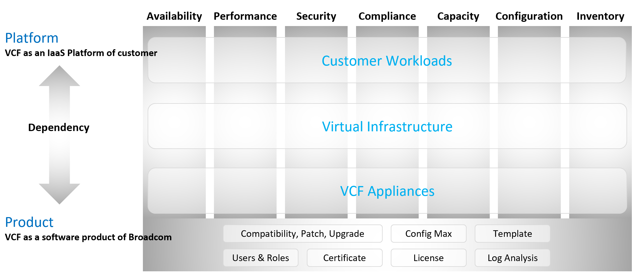
Think of it as “no workload” vs “with workload”. Workload means the customers VM, not your infrastructure software.
Infrastructure software are virtual appliance or K8 pods that you need to have as part of your private cloud platform.
VCF belongs to a category of software called SDDC. You use the software on commodity hardware and create a private cloud on your premises. This is not so obvious as it’s the only product in this category.
Because of its nature as a data center defined as a software, there are 2 sides of VCF:
-
As an IaaS platform of customer.\
This is what the application team care.
-
As a software product of Broadcom.\
This is what the infrastructure team care.\
The software takes the shape of one of these 2 forms:
-
Virtual appliance. Examples are vCenter Server and NSX Edge
-
OS kernel software. Examples are ESXi VMkernel, vSAN and NSX kernel modules.
-
The 2 sides can impact one another, requiring you to see them as one. You need to manage all aspects of operations such as availability, security, and inventory.
-
There are 2 layers: consumer and provider.
-
The consumer layer is where VM and containers run.\
This layer consists of 3 sublayers (application, Guest OS, and virtual machine).\
VCF scope ends at VM (BIOS & motherboard) and Tools, as the Guest OS is largely outside the influence of VCF the product.
-
The provider layer is the virtualized platform (compute, storage, network).
Service Level Agreement
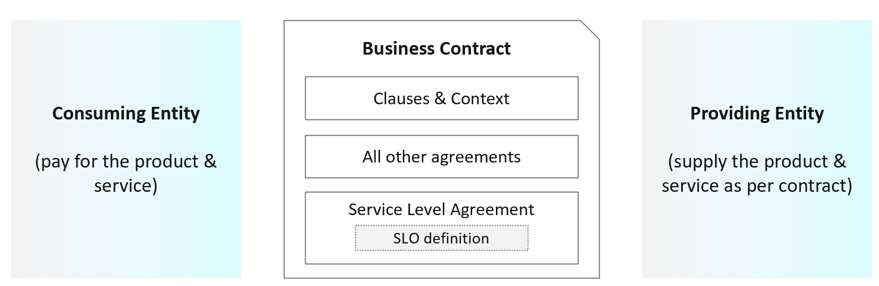
The difference between an enterprise grade Cloud and non-enterprise grade Cloud is the SLA. A cloud provider can state that they have the best technology, the most experienced professionals, the most innovative process, industry certifications, blah blah blah to prove that they are the best. All that will not carry weight if they are afraid to back it up with the SLA in their contract. The SLA enables customers to hold the cloud provider accountable as it carries a financial penalty.
Once the SLA is defined, then customers want to know how it will be delivered. This is where the process, architecture, certification etc. come in. The what always comes before the how.
With that, let’s define “SLA”.
First, it is just a component of a business contract. The business contract is a legally binding document which has many other clauses outside the SLA section. The contract first needs to set the context and definition. After that, it has a set of agreements, with SLA being one of them. Examples of other agreements include confidentiality agreements, terms of payment, non-competitive agreements, and marketing agreements.
The SLA section has actual metrics that define the SLA. Google calls this SLO. It works for them as they do not have SLA (to you as their customers). As enterprise IT, you have SLA to your tenants. SLO creates confusion as it sounds like a peer to SLA, when it’s just a goal. I’m not using SLO, as SLA and SLI are sufficient in practice. For SLI, a better explanation is SLA Leading Indicator, not Service Level Indicator. It’s a leading indicator as it tells you in advance the chance of you meeting SLA or not at the end of the month. SLI is not a peer to SLA.
Guess how many SLAs do you need?
It depends on the type of services. Most service providers will only commit to the simplest and most obvious one, which is availability. It’s the simplest as it’s binary. The darn thing is either up or down. Google only covers availability in their SLA post here, which is based on Google Cloud’s SLA. AWS only cover their infrastructure, and not your EC2 VM. I have read this and many other articles. While it makes sense for Google business, it’s not suitable for IaaS. Happy to discuss my documented analyzis.
Just because something is up, does not mean it is fast. In fact, a service that is slow to the point it’s unusable is as good as down.
Just because something is fast, does not mean it’s secured. This is why a Security SLA is necessary.
The 4 SLAs of IaaS
The business of IaaS should provide four SLAs, as customers want complete coverage. These four are focused on Availability, Performance, Compliance, and Service. Below is a diagram showing the first three: what they do, and what they measure.
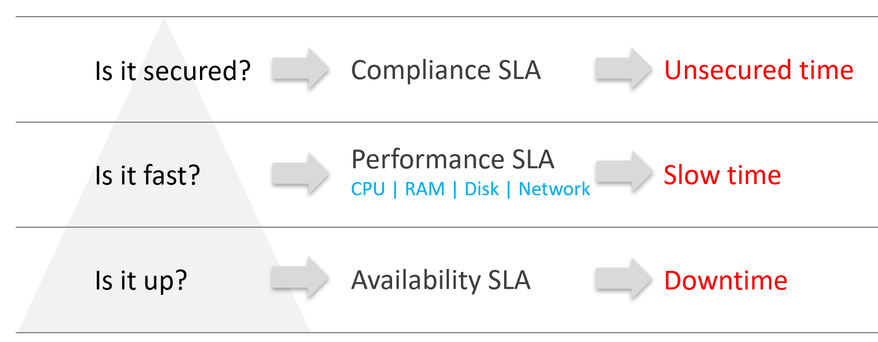
Wait, why am I not showing the 4th one?
Because it plays a secondary role. The first 3 covers the actual workload, while the 4th one covers the human (typically tenant or application team).
| Availability | This is the most basic SLA. It is the oldest and most well-known. In reality, it is largely a given. It does not matter what the agreed number is. If the darn thing is down, you better hurry to bring it up before there is a complaint or things get worse! |
|---|---|
| Performance | The Performance SLA is far more valuable than Availability SLA. It is the solution to complaint-based operations by defining what exactly is “fast”. In IaaS, it covers CPU, Memory, Disk and Network, hence there are four metrics used. |
| Compliance | Also called Security SLA as the goal is secured environment. This is hardly talked about, as customers and providers expect this to be 100%. This is why you need to provide an SLA, as promising 100% will lead to disappointment. It measures the security compliance to industry regulation or certification. |
| Service | Service provided by both human and system (typically in the form of self-service portal) |
In the Availability SLA, you measure downtime. In the Performance SLA, you measure ”slow time”. In the Compliance SLA, you measure unsecured time. Regardless, you measure something and express it in 0 – 100%, with 100% being perfect relative to the contract.
VM vs Guest OS
VM and Guest OS are 2 separate objects but they are 1 logical entity due to 1:1 permanent relationship. It is common for IaaS provider to cover both.
If your responsibility includes the Guest OS, then your SLA needs to include Windows or Linux.
| Type of SLA | Virtual Machine | Guest OS |
|---|---|---|
| Availability | VM is powered on. BIOS is up and running. A VM is basically a virtual motherboard. Windows and Linux are not part of SLA. | Windows or Linux is up and running. This may include basic services such as security agents. Application is not part of SLA |
| Performance | VM is getting the CPU, memory, disk, and network resources it demands | Windows or Linux performance counters are within expectation. |
| Security | VM is protected as per vSphere hardening guide or industry regulation. | Windows or Linux is protected as per respective vendor or industry regulation. |
In this book, I assume your IaaS offering includes Guest OS. However, the metrics for Windows and Linux are not yet complete due to the lack of maturity of their performance modelling.
Availability SLA
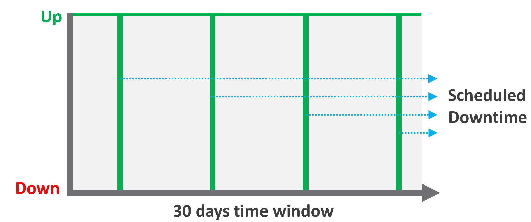
Many vendors claim a very high availability SLA. This is misleading as they do not include scheduled downtime. This unique saving grace lets you state you’re 99.999% available even though the actual reality, experienced by end customer, is lower. This is why you need 2 metrics:
-
One for availability as defined in the SLA.
-
One for actual availability. It reflects reality.
The 2 metrics names are:
-
Actual Availability (%).\
This is much easier to measure as it does not consider context. Down is down, regardless of when, who and why.
-
Operational Availability (%)\
This is harder to measure.
Example:
-
All VMs has weekly scheduled downtime to apply urgent security patch. It’s every Sunday 0000 – 0200 hours.
-
Last month, the database server was brought down for patching 3 times. But all happened within the scheduled downtime. While Windows was only shutdown for 15 minutes, the large database took 45 minutes to fully restore.
-
In this case, the Operational Availability (%) for the month of June is 100%. It meets SLA.
-
The Actual Availability (%) accounts for the 3 hours of total downtime.\
It’s 3x of (15 minutes + 45 minutes).\
In the month of June, there are 24 hours x 30 days = 720 hours.\
Actual Availability (%) = 717 / 720 = 99.58%
Formula
| Definition | Defined as Guest OS is pingable, because running but isolated fails the availability test. The Ping Source is predefined and set by the IaaS provider, not the customer. It pings the VM, not a specific process (e.g. web server. This is IaaS, not web server as a service.). |
|---|---|
| The uptime only covers the Guest OS. If it takes the application 15 minutes to become fully operational as it has to load files and other services, that’s not counted. | |
| Inclusion | If the crash is caused by VMware Tools or IT Infrastructure owned drivers/agents, then it’s counted. |
| Exclusion | Unscheduled downtime caused by customers. If the crash is caused by bad applications behaviors, the SLA is not affected as that’s not within the control of IaaS provider. As it takes time to figure out what caused the downtime, you need to be able to recalculate the metric. |
| VM owner-initiated reboots as they might reboot their OS to solve problems or after installing software. How to track as developer may not inform the IaaS team, as Windows does not fully trap this event? | |
| Scheduled downtime. Guest OS upgrades, patches that requires reboot, Tools upgrade, VM Hardware version are not counted if you execute within the agreed scheduled downtime. | |
| Complication | A challenge that impacts availability but not performance is recovery time. Windows or Linux maybe up in 1 minute, but it needs to perform fsck (filesystem consistency check) before application can launch. This is considered as part of downtime. |
Supporting Techniques
You need to back up your promises with solutions that are convincing for customers. Here are some solutions that you may offer to justify and support the higher availability SLA.
| Backup | Gold Tier provides application-level back up. It also provides more frequent full back up, and customers are provided with self-service individual file restore. | |
|---|---|---|
| High Availability | Gold Tier provides application-level monitoring. Customers can also ask for specific boot-up sequence of their VMs, and ask for VM-Host affinity rules to minimize risk. | |
| Disaster Recovery | Gold Tier provides lower RPO and RTO. Customers are also entitled to annual real-world tests, where the production workload is run from the DR site. | |
| Snapshot | Gold Tier provides longer snapshots and larger snapshots. | |
| OS Management | Gold Tier provides flexibility in patching. Customers can specify delay in patching and request custom patch packages, where not all patches from Microsoft or Red Hat is applied. | |
| VM Management | Gold Tier provides flexibility in updating Tools and VM Hardware. Customers are allowed to defer the updates. | |
Performance SLA
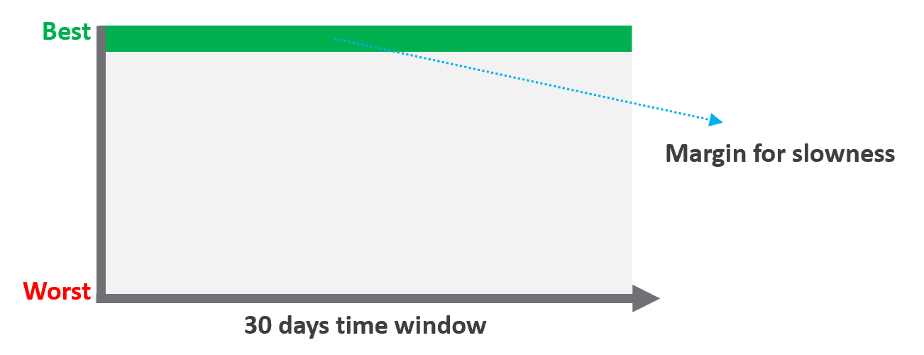
Unlike availability, which has the luxury of scheduled downtime, there is no such thing as scheduled “slow time” with performance. You can’t say that you’re doing infrastructure upgrades and use that as excuse for why VM performance will be slow. As a result, you need to put your margin or buffer somewhere else.
Slow is not binary. It’s a spectrum from 0 contention to absolute worst (as good as dead). Some metrics such as disk latency can never be 0. It will be a small number, but it’s not 0. The same goes with the value of the CPU Ready metric. So, we need to define a threshold above 0.
| Definition | All are measured at VM level, not individual vCPU or vDisk. For disk, it’s also the average of Read & Write. All are averaged over 300 seconds, which is an appropriate balance for SLA monitoring. An SLA that is based on a 1-minute average will be too tight and result in either a cost increase or a reduction in threshold. |
|---|---|
| Inclusion | 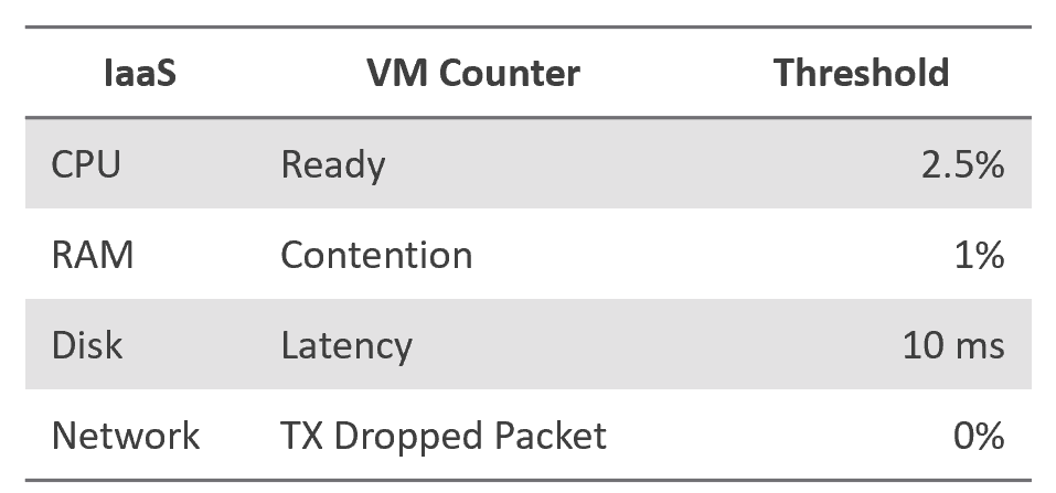 |
| Exclusion | Received Packet Dropped. It’s not reliable enough to be used in the SLA contract due to false positives. A packet could be dropped as it’s not for the VM. More details in the Network metric chapter. |
| Other forms of contention, such as CPU Overlap, CPU Other Wait, and vMotion. They are too granular for the purpose of a contract. You track them via KPIs instead. |
Why should you only use CPU Ready and exclude CPU Co-Stop and CPU Contention from the Performance SLA?
It took me years to vrealize the mistake.
You should exclude CPU Contention because its value can go as high as 37.5% without the application noticing any degradation. You can login to Windows or Linux and feel that it’s responsive.
Use the above threshold as they are. There are two main reasons:
-
Major changes in the value, such as changing CPU Ready from 2.5% to 5%, will require you to adjust your “nines” to a higher number. This requires you to profile your environment first.
-
A common value in the industry will also enable you to compare with your peers and get an industry-acceptable numbers. You can then compare how well you serve your mission critical VMs, your Test/Development VMs, etc.
Just like in Availability, there are extra things you can do to give confidence to your customers. For example:
- Gold Tier provides priority on the network. Customers can opt for a periodic ping service to ensure network latency between their applications remain within the agreed threshold.
Compliance SLA
| Definition | Percentage of compliance against an agreed security policy or benchmark. A compliance SLA differs from an Availability or Performance SLA in one key area: the compliance SLA should promise perfect compliance. Compliance is binary: you are either compliant or you aren’t. You shouldn’t be telling your customers that you will have less than perfect compliance with your own security requirements. It has a window, typically ad-hoc, to enable investigation or maintenance which may result in temporarily becoming non-compliant against your compliance benchmark. Compliance calculation is purely from Infrastructure Team point of view. |
|---|---|
| Inclusion | Internal security standards, typically an adaptation of VMware best practices or the VMware Security Hardening Guides. Regulatory benchmarks, e.g. CIS, ISO, DISA, FISMA, PCI DSS, HIPAA. For the vSphere infrastructure, compliance with these benchmarks (and custom ones) can be directly managed through the compliance features of VCF Operations. |
| A VM compliance must consider its immediate surrounding. If the parent ESXi, the vSAN storage, and the distributed network and storage is not secured, the score need to reflect it. | |
| Exclusion | This depends on the definition of your IaaS Service. You are only providing SLAs for what you control. |
If you provide the guest VM OS as part of your IaaS service, then you will need to maintain compliance by managing configuration (using something like Group Policy and/or a configuration management tool) and you will also most likely have some security tools and agents that run inside each VM. When the guest OS is part of the service, you should be measuring availability by whether the guest OS is running (e.g. via ICMP ping). If you do not provide the guest OS as part of the IaaS service, then you do not need to worry about maintaining compliance in the guest OS, and you are also measuring availability by whether the VM is powered on. |
Service SLA
IaaS is built on commodity hardware and provided as a utility. Having said that, there are many ways to differentiate your service vs your competitors. Use class of service to distinguish premium service classes. The following table lists some examples.
| Provisioning Time | In environment where the churn is high, the time taken to provision become important. You need to clearly define what “provisioned” means, as it can range from bare Windows or Linux to completely set up and configured with applications & database loaded. |
|---|---|
| Provisioning Success | Provisioning a complex set of multi-tier business applications with many VMs and many external integrations or endpoints may fail from time to time. If this is relevant to your environment, then add it as part of the SLA so you can focus on the higher class of service. |
| Support | Gold Tier customers will be alerted over email and messaging network within 10 minutes. |
The two popular examples are response time and path to escalation. Do not promise resolution time unless it’s completely within your control. Gold Tier provides faster response time and longer coverage hours (e.g. 24 x 7 x 365). Your ticket is also directly answered by Level 3, bypassing the front liners. | |
| Gold Tier comes with regular business reviews, attended by your management. | |
| TAM | Gold Tier comes with a Technical Account Manager, acting as single point of contact for customers. The TAM is also the internal champion, representing customer interests within the vendor internal world. |
| Monitoring | Gold Tier VMs will be proactively monitored, not just relying on alerts. |
| Gold Tier provides deeper visibility into the underlying physical infrastructure where customers VM are running. Customers are entitled to see lower-level internal metrics such as vMotion stun time and VMkernel latency. | |
| Gold tier provides self-service monitoring. Customers are given their own login to a portal where they can monitor their own VMs. They can initiate scheduled downtime |
There are other metrics you can add to differentiate one class from another. However, be careful of adding metrics that do not actually serve your business. For example, it can be tempting to put the accessible time of your self-service portal, to protect you from scheduled downtime. You need to work on the basis that your “office” is open 24 x 7 x 365 days.
The Metrics of SLAs
Do you set it per week, per month or per year? Let’s find out!
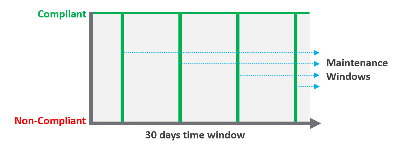
The Time Window
SLA is a monthly metric, not daily or yearly. You use an entire month of data to calculate it, averaging 8640 datapoints of 5-minute averages.
In the following table, notice 99.999% in a year is more time than 99.95% in a week. Your customers would not accept a yearly metric as they can be exposed to a long downtime. You would not accept a daily metric as there is no room for error. The monthly metric provides a balance between service quality and cost to deliver the service. It also makes reporting easier as you simply follow the calendar month.
Each additional “9” shrinks your SLA window by 10x. That’s why each decimal can cost a lot more money, as a different architecture may be required.
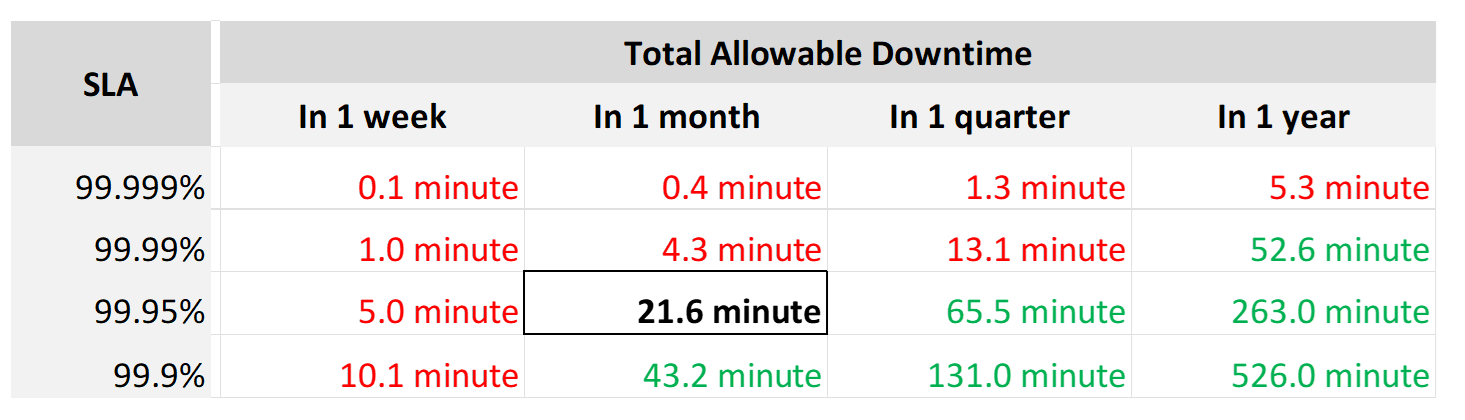
Even if you measure the SLA once a month, it can still be very difficult to meet. Take a look at the following table:
If you promise 99.99%, you only have 4 – 4.5 minutes of downtime per calendar month. That means your architecture must be able to detect the issue and then complete remediation in just a few minutes. That’s a tight space to manoeuvre.
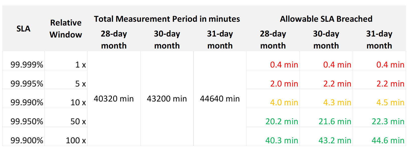
Let’s analyze the size of the failure window we have per month. The table below gives you a better gauge into what SLA you want to set for each class of service.
| 30-day SLA | Failure Window | Failure Chance per SLA |
|-----------:|---------------:|-----------------------:|
| 99.99% | 4.3 minutes | < 1 time |
| 99.98% | 8.6 minutes | < 2 times |
| 99.97% | 13.0 minutes | < 3 times |
| 99.96% | 17.3 minutes | < 4 times |
| 99.95% | 21.6 minutes | < 5 times |
| 99.90% | 43.2 minutes | < 9 times |
| 99.80% | 86.4 minutes | < 18 times |
The 2 Sides of an SLA
This is one of those things in life where it’s so obvious that we overlook it.
There are 2 sides of an SLA.
| Promise | What you promise to your customers. Obviously, the higher the price, the better the service, the higher the SLA. So, there can be multiple numbers, matching the number of class of services. |
|---|---|
| Reality | What is actually delivered. Calculated at the end of the month. There is only one number, regardless of the class of service. A Gold VM can fail its SLA even though it’s getting a higher number than a Bronze VM. |
SLA Calculation
Since an SLA is a monthly counter, it needs to be derived from thousands of 5-minute counters.

The four elements of IaaS (CPU, Memory, Disk, Network) are evaluated every 5 minutes. As this results in a metric, we need to give it a name. I call this SLA Leading Indicator, as it’s telling you in advance if you’re going to fail the SLA or not.
We need one metric for each service. In IaaS, the formula is:
If VM CPU Ready > 2.5% then 100% else 0%
If VM Memory Contention > 1.0% then 100% else 0%
If VM Disk Latency > 10 ms then 100% else 0%
If VM Network TX Dropped > 0 % then 100% else 0%
VM SLA Leading Indicator (%) = Average of Above 4 metrics.
So, every 5 minutes, a VM gets a score of 100% or 75% or 50% or 25% or 0%.
The VM Performance SLA (%) value is simply the average of the 5-minute datapoints over the last calendar month.
Whether that’s good or bad, it depends on what is being promised. The higher the class of service, the higher the price, and hence the higher the SLA.
Performance Quantification
| CPU | CPU Ready time of 2.5% in a 5-minute collection period translates into 7.5 seconds of ready state. This 7.5 second freeze does not have to be a contiguous block. Likely it is sub-seconds, spread well over 300,000 milliseconds. |
|---|---|
The number is not measured against CPU Utilization. 2 VMs can have identical Ready time while having very different utilization. VM 01: CPU Ready 10%. CPU Run 90% VM 02: CPU Ready 10%. CPU Run 10% To VM 1, the situation is not that bad as it still got to run most of the time. To VM 2, the performance is bad as it cannot run half the time. | |
| Memory | Memory Contention is relative to the amount of memory being used. Unlike CPU, it is not measured across time. Reason is memory does not “run”. |
| Disk Latency | This is the average latency across 300 seconds. As disk IO is measured per second, a VM doing 1000 IOPS is doing a total of 300,000 IO commands over the entire 300 seconds. |
| It’s also an average of reads and writes. As each virtual disk can have its own latency, this number is normalized at VM level. |
Class of Service
Now that you have the 4 SLAs, you compare them with the associated Classes of Service. The reason to offer multiple Classes of Service is that if you only have one Class of Service offering and you promise good service, everyone will expect the same first-class experience.
Kim Ramirez advises that from a pricing psychology standpoint it might make sense to offer Gold, with the expectation that nobody will buy it, and it only serves to make Silver look like a good deal. In life, one way we know something is good or bad is via comparison. Relative value can complement absolute value in educating customers.
Having a comparison also addresses potential confusion where customers wonder where Gold is, if they only see Silver and Bronze offers.
If you do not wish to make a certain class available, provide the reason to your customers and/or management.
Price/Performance
The price-performance ratio is widely accepted as it is simple to understand and it’s built on fairness. You’ve probably heard of this: “I offer 3 variants of service: Cheap, good, and fast. Pick any two. You want it cheap and good; it won’t be fast. You want it cheap and fast; it won’t be good. You want it good and fast; it won’t be cheap!”.
In IaaS, how do you apply the above principle?
-
For Availability, this is measurable. If you reduce the downtime window by 2x, logically you should pay 2x.
-
For Performance, how do you quantify this since it depends on utilization? Since utilization does not exist yet, you use overcommit ratios. If there are 2x vCPUs in the cluster, then each of them pays half price. This is fair as the cost must be distributed to all.
-
For Compliance, this is a little different. Unlike with availability and performance, it is in your interest as a service provider to provide a perfect and consistent level of compliance across all classes of service.
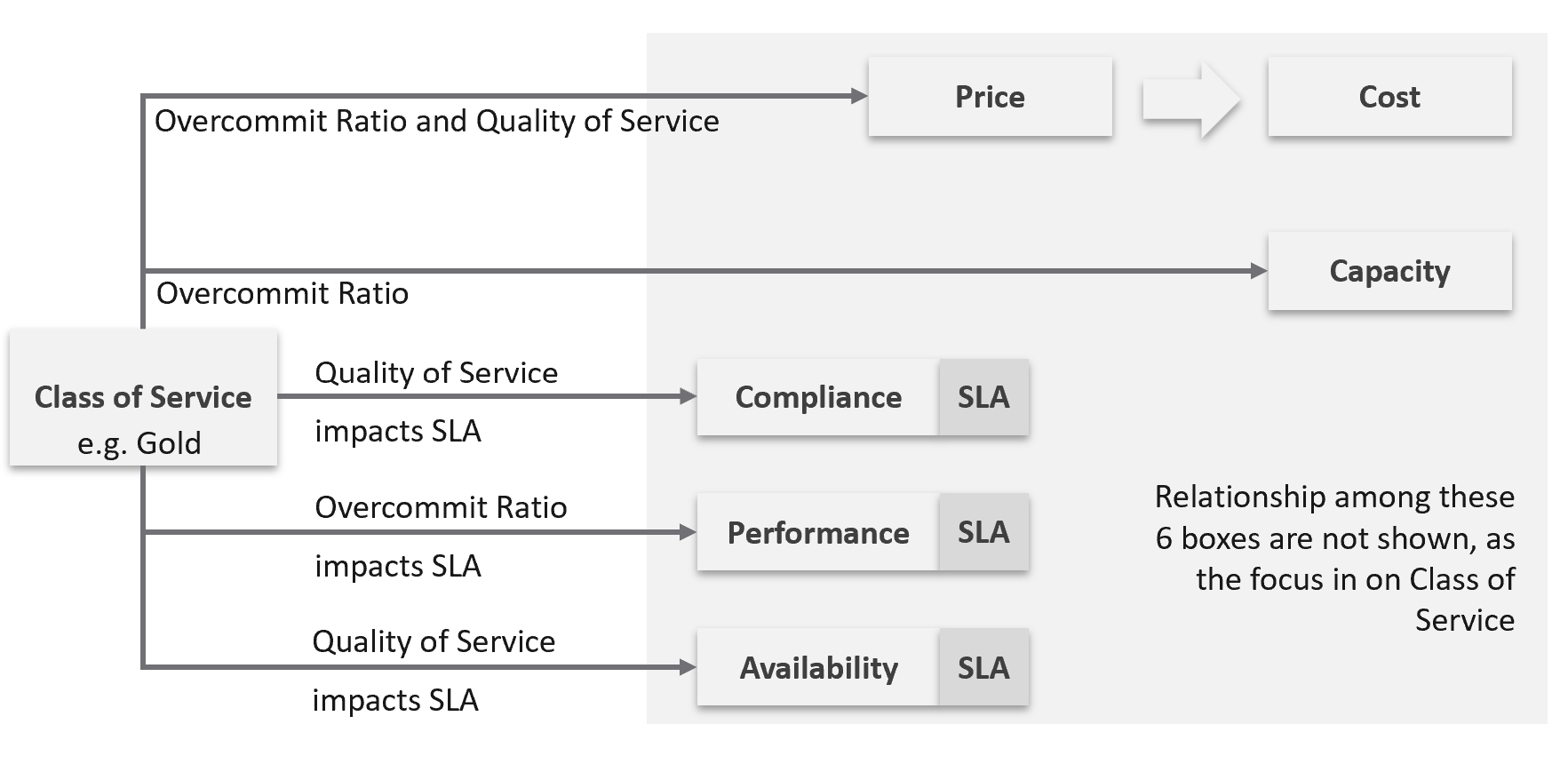
The class of service impacts many parts of operations, so it needs to be central to your plan. The following diagram shows how the quality of the service and overcommit ratio serve as input to operations management.
The following table shows a basic and generic guideline to a class of service. The actual model that you will implement will differ, taking into account actual hardware model and business demand.
| Tier | Price | Overcommit | “Performance” | Positioning |
|---|---|---|---|---|
| 1 (Gold) | 1.00 X | 1:1 | Perfect | Performance “Guarantee”. Suitable for latency-sensitive mission critical applications. |
| 2 (Silver) | 0.50 X | 1:2 | Great | 50% discount for a mere 5% penalty. Great value compared with Gold Tier. Suitable for most Production workload. |
| 3 (Bronze) | 0.25 X | 1:4 | Good | 75% discount for a mere 10% penalty. Notice the price is half and the performance drop is doubled. This makes it fair and consistent. Suitable for Test & Dev workload. |
| 4 (Free) | 0.00 X | Max | Average | Suitable for temporary projects. No Availability SLA, no Performance SLA |
I put “guarantee” in quote because for CPU this is not possible as the VM CPU Ready counter does not register 0.00% when there is no contention.
Performance
The word is shown in quote as it’s a broad definition. It includes all the types of SLA.
The performance column in the table above is backed by clearly defined SLA, because you need to quantify what the penalty exactly translates into.
-
Let’s take Bronze as example. I put 10% penalty to position the business value. In reality, the performance metric is not simply ≥ 90% for Bronze.
-
Using CPU as example, it is not that the CPU Ready will be ≤ 10% at all times.
-
10% is too high a number. A VM experiencing 9.9% CPU Ready constantly for entire month will pass the SLA. This is obviously unacceptable. A fairer number is 2.5% since it is an average of 5-minute.
-
“At all times” translates into 100% SLA. It’s cost prohibitive. On the other hand, average is far too loose. SLA is expressed in “nines”, such as 99.93 or 3 nines. It is never expressed in lower number such as 95% as that translates into 1 in 20 failure rates.
-
2.5% will serve all classes. You just need to adjust the “nines”.
Free Tier
The Free Tier is useful to convey the value of the SLA. Human nature tends to appreciate something when after it’s taken away from us.
Business wise, the free tier must be funded by paid tiers. Since it is free, you are excused from providing SLA. It’s acceptable for them to have unpredictable downtime and slow time. Commercial cloud providers provide free tier that are intentionally designed to be slower and less reliable, because they want you to upgrade and pay.
The Benchmark to Rule Them All
Gold class has higher SLA than Silver class. For that to happen, that means they are measured against the same threshold or benchmark.
-
For availability, you measure all classes against the ideal, which is no downtime.
-
For performance, you measure them against the same threshold, which is the “slow time”.
-
For compliance, you measure them against the ideal, which is perfect compliance.
-
For service, you measure them against the ideal, which is the best possible service.
A VM in silver environment will expect that it does not get what it demands as often as a VM in Gold. If the VM Owner wants to have more consistent service in performance, then simply pay more and upgrade to the gold cluster.
This approach is easier than setting up a different performance threshold for each tier. Say you set the following:
-
Gold: VM Memory Contention: 0.5%
-
Silver: VM Memory Contention: 1.5%
You notice the problem already?
It is hard to explain the delta or gaps between the class of services. Why is Silver 3x the value if it is only half the price? Shouldn’t it be proportionate?
There is a 2nd problem. If you set different standards, it is possible that Silver will perform better than Gold, because it has lower standard. This can create confusion.
This means the performance in production is expected to have a higher score than the development environment. Development environments will obviously perform worse than Production environments.
How much worse, exactly?
Let’s find out by applying all the above into actual numbers. You have 9 numbers, 3 SLA x 3 Class of Service.
Recommended SLA
Let’s put all the above SLA in an example. The following is what I’d recommend:
| Tier | Availability SLA | Performance SLA | Compliance SLA |
|---|---|---|---|
| 1 (Gold) | 99.975% | 99.9% | 99.95% |
| 2 (Silver) | 99.950% | 99.8% | |
| 3 (Bronze) | 99.900% | 99.6% |
Why they are all different numbers? Isn’t easier to have 1 number for each class?
Well, they measure different things:
| Availability | It can afford to have the highest SLA because scheduled downtime and downtime caused by customer is not included. I put 99.975% as Windows or Linux may need to run filesystem integrity check. If you have many IT services or Security services that must be started before application services are started, adjust the SLA accordingly. Notice the downtime windows is 1x, 2x, and 4x. It helps in justifying the price when the gaps are clear and consistent. |
|---|---|
| Performance | Lower SLA due to stringent standard. It’s stringent so it can cover the mission critical environment. As a result, the Bronze environment will have a harder time meeting it. If you think that’s too strict, reduce the SLA not the threshold. To see how bad the reality, use KPI. Notice the number for performance is 1x, 2x and 4x. Silver failure window is 2x bigger because its price is 2x cheaper. Remember the Price/Performance principle? The basic concept is you pay double you get something 2x better. Why not 100% for Gold since there is no overcommit? Because that’s just the compute portion. You do not control the network and storage portion. |
| Compliance | It has identical SLA for all classes as it’s in your interest to secure everyone. You don’t want to have a security loophole, which can be used as jump box to attack the rest. I did not put 99.99% as that’s not even 1 chance of mistake. As the value for compliance is the last value of collection, that could be as short as 1 second. Consider how fast it takes for you to effect a change. If you rely on manual change, then adjust the number accordingly. |
Penalty Quantification
Let’s drill down to see what the SLA numbers
In the following sample of 1 hour window, there are 12 measurements of the CPU Performance SLA for VM 007.
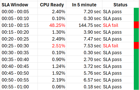
The VM 007 suffers 2 SLA failures.
-
The 1st failure is bad. The number is very high. Since SLA is binary, this is simply counted as failure. There is no severe failure in the book of SLA.
-
The 2nd failure is barely a failure. Again, since SLA is binary, this is also counted as a complete failure. There is no partial failure.
So why did I recommend 99.9% and not 99.95% for Gold?
-
The 0.05% matters operationally.
-
99.9% means the VM may not get the promised SLA for up to 0.1% of a given month. Using a 28-day month as it’s the shortest, this translates into 40.3 minutes.
-
Since SLA is computed every 5 minutes, the provider only has up to 8+ chances of SLA failure in the month of February.
-
This means CPU Ready > 2.5% for 8 times in the February months.
Sample Offering
Putting the above together, what does a sample class of service actually look like?
Price & SLA
SLA is the hard product, the main thing that you get when you pay for the service. Using the airline business as an analogy, the hard product is the seat. Other things such as in-flight entertainment and meals are soft products.
In IaaS, since you do not typically care about the hardware specification (e.g. the type of SSD for storage, the memory brand and technology), you focus on the SLA.
| Gold | Silver | Description | |
|---|---|---|---|
| Price | 2x | 1x | Gold is priced 2x Silver. |
| Over-commit | CPU 2:1 RAM 1:1 | CPU 4:1 RAM 2:1 | The reason why Silver is half price is because there are twice as many consumers. |
| Availability SLA | 99.975% | 99.950% | Gold has 2x less downtime |
| Performance SLA | 99.9% | 99.80% | Gold has 2x less “slow time” |
| Compliance SLA | 100% | 100% | You should maintain perfect compliance with your compliance requirements for all classes of service. |
| Service SLA | Gold | Silver | See the Service section for details. |
If you mix environments, it becomes operationally challenging. Your only tool is to apply reservations and shares. For example, give Gold 2x the value over Silver to justify the 2x price.
The preceding table is a generic guideline. As part of your planning with IT Management, you help them define and decide on each Class of Service. This planning session requires vendors input as you want to optimize cost. Use vendors discounting and licensing model to complement the plan, not dictate the plan.
Yes, it’s a balancing between ideal solution and what actually gives the best bang for the buck.
At the end of the planning session, you may end up with something like this.
| Tier | Price | Compute | Storage |
|---|---|---|---|
| Gold | Highest | CPU 1:1 RAM 1:1 | All Flash |
| Silver | Good (67% of Gold) | CPU 1:2 RAM 1:1.5 | All Flash |
| Bronze | Low (33% of Gold) | CPU 1:6 RAM 1:2 | All Flash |
| Free | Free | N/A | Magnetic |
For Silver and Bronze, to maximize consumption of hardware, you base on average ratio of 1 vCPU to 4 GB RAM. This is a common ratio. If you want to tailor this to your own environment, use VCF Operations to give you the actual ratio.
For Silver, you decide on 3:1 CPU overcommit and no RAM overcommit. Based on 1 vCPU 4 GB RAM, you need to buy 12 GB RAM for each physical core. Buying 64 cores maximizes your vSphere license. That means you need 64 x 12 = 768 GB of RAM. If you run vSAN and NSX, you need to account for the overhead accordingly.
The 3:1 overcommit enables you to lower the price by 3x for CPU portion. If you do 50/50 split between CPU and RAM, the overall price is 67% of Gold, yielding a 33% discount.
For 33% discount, what’s a reasonable performance penalty? What’s acceptable to both your CIO and application team?
CIO also decided that free tier is not offered as that’s not the business you want to be in.
As you can see, the hardware spec is driven by the business model. Decide on the overcommit & price first.
If you want your customers to right size in advance, then a 64 vCPU VM needs to be more than 64x the price of 1 vCPU VM. If the pricing model is a simple straight line, there is no incentive to go small and no penalty to over provisioning. You will end up forcing rightsizing in production, which is a costly and time-consuming process.
Size Limit
Because you overcommit, you run the risk of contention. One way to minimise this risk is to control the maximum size of VMs. You want to avoid monster VMs dominating your overcommitted ESXi hosts. The following table provides an example of the size limit you associate with each class of service.
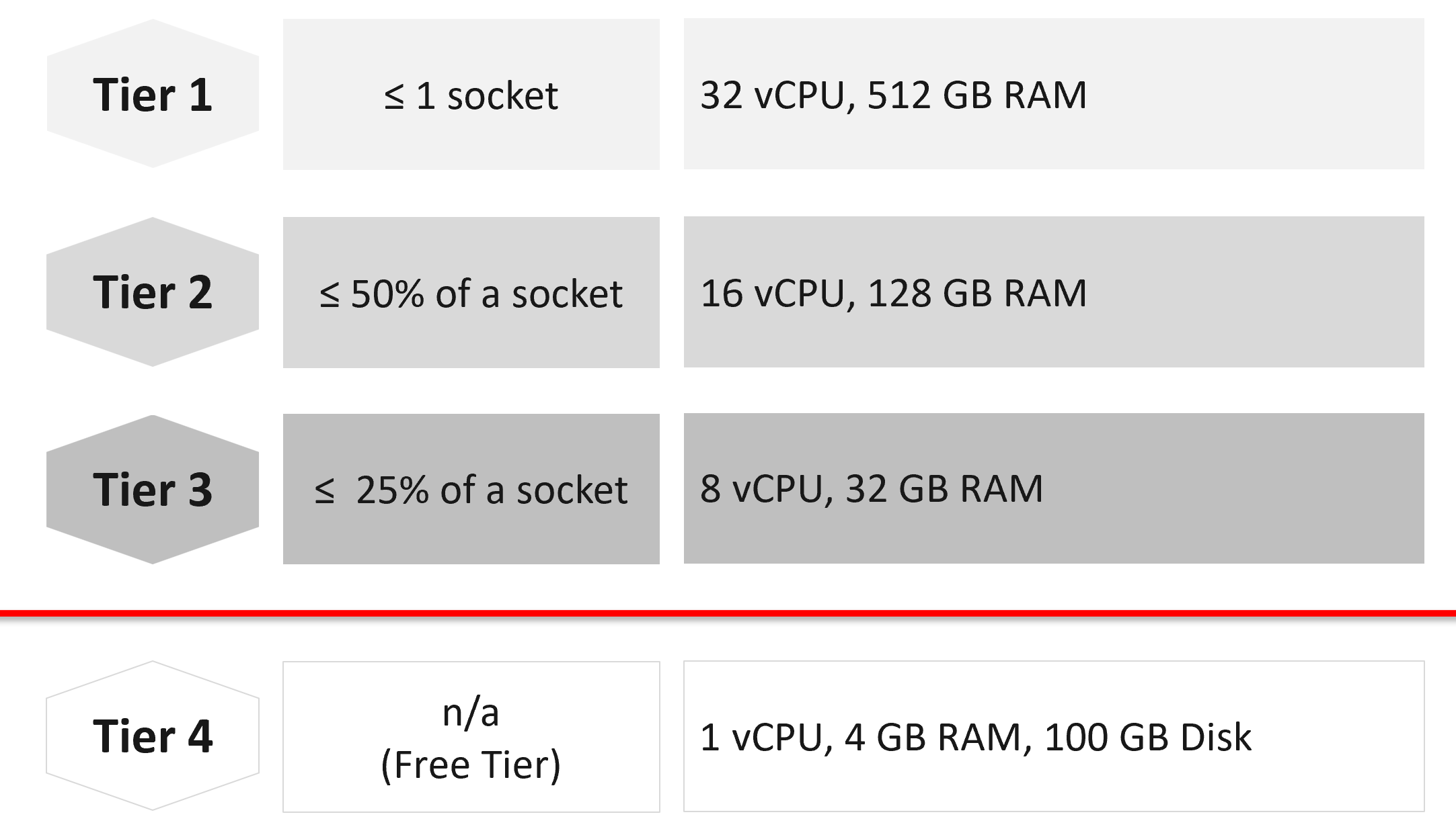
Capping the size at each tier is a good way to prevent monster VMs from causing performance problems in environment with higher overcommit ratio.
If you allow a single VM to be the same size as the ESXi host, you practically can’t do overcommit if you want good performance.
The Free Tier may also be limited further by capping the number of free VMs per customer, else you’d go bankrupt.
For comparison, AWS’s free tier for EC2 is only 1-2 vCPU & 1 GB RAM as it’s based on t2.micro and t3.micro.
Service
Beside the hard product, soft products play an important role in further differentiating Gold from Silver. Support, both reactive and proactive, is one major area where different classes of service can show the value of higher tiers.
| | Gold | Silver | Description |
|----|:--:|:--:|----|
| Response Time | 2 hours | 4 hours | Gold has 2x faster response time |
| Support Hours | 24 x 7 | 12 x 7 | Gold has 2x support hours |
| Support Process | Level 2 | Level 1 | Gold bypasses the first level help desk. |
| Root Cause Analyzis | Provided | Additional Charge | The RCA includes setting alerts to ensure the same incident is identified immediately. |
| Proactive Support | Daily | None | Gold VMs gets daily health check (KPI and alerts). |
| NOC Screen | Yes | No | Silver VMs are not displayed in a live screen of Network Operations Center room. Reason is the business need to focus on the Gold VMs. |
| Report | Weekly | Monthly | Gold has more frequent report. |
| Business Review | Monthly | None | Face to Face discussion where we review the SLA and support issues. |
| Critical Patch | Higher priority | Lower priority | We patch all Gold VMs first before protecting the lower tier VM. |
| Optimization | Yes | No | Performance and capacity optimization (via proactive right-sizing, for example). |
Availability
This is another soft product in IaaS. Ensure that Gold has much better offering here so the 2x price is clearly justified.
| Gold | Silver | Description | |
|---|---|---|---|
| Snapshot | 1 week | 1 day | For Gold, we will also remind you just in case you forget. For Silver, it’s auto-delete. |
| Size of snapshot | No limit | 100 GB | |
| No of snapshots | 2 | 1 | Gold can have 2x as many snapshots at any given time. |
| Back up | Higher priority | Lower priority | We back up all Gold VMs before backing up Silver VMs. |
| Full back up | Weekly | Fortnightly | Gold has 2x full back up frequency. |
| Back up level | Application | OS | We will install & manage back up agent. |
| Back up report | Yes | No | We provide report for back up status. |
| Disaster Recovery | Separate add-on service | Both services do not have DR as default. | |
Compute & Storage
A VM runs in a cluster but is stored in a datastore. How do you architect both the compute and storage subsystems to support the class of service?
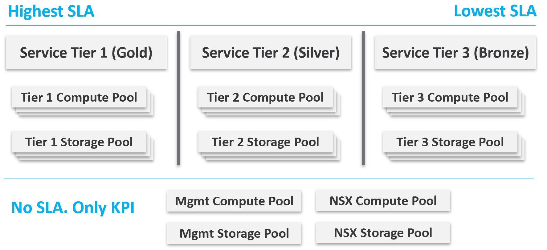
From a performance management point of view, vSphere clusters with vSAN form the smallest logical building block of the resources. While resource pools and VM-Host affinity rules can provide smaller subdivisions, they are operationally complex, and they cannot deliver the promised quality of IaaS service. Resource pools cannot provide a differentiated class of service. For example: your SLA states that Gold is two times faster than silver because it is charged at 200% more. A resource pool can give Gold two times more shares, but whether those extra shares translate into half the CPU readiness cannot be determined upfront.
Same with storage. A VMFS datastore is not able to provide differentiated service levels. Even if they can, it’s not based on latency, which is what your customers care about. The same limitation applies in vSAN. Let’s take an example.
-
You promise Gold VMs will get 10 ms latency at worst. For Silver VMs, you promise up to 20 ms latency. The justification for 2x the latency is they pay half as much. So far so good.
-
You set your storage policy and IO Control, favouring Gold while trying to ensure Silver gets something.
-
Since storage IO control configuration is not based on latency, you may end up with 9 ms for Gold and 21 ms for Silver, where you could have gotten 10 ms and 20 ms.
Mix and Match
Should we provide flexibility, where customers can choose Gold Compute but Bronze Storage?
In the following example IaaS, mixing is partially allowed. Tier 1 cannot mix with Tier 3, as seen by the missing lines.
The result is 7 combinations instead of 9, as shown by the 3 green lines and 4 red lines.
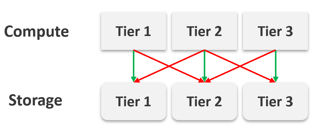
It looks operationally visible.
Now let’s see if the above idea scales….
We will just add one extra cluster for each tier. Only 6 clusters in total.
| 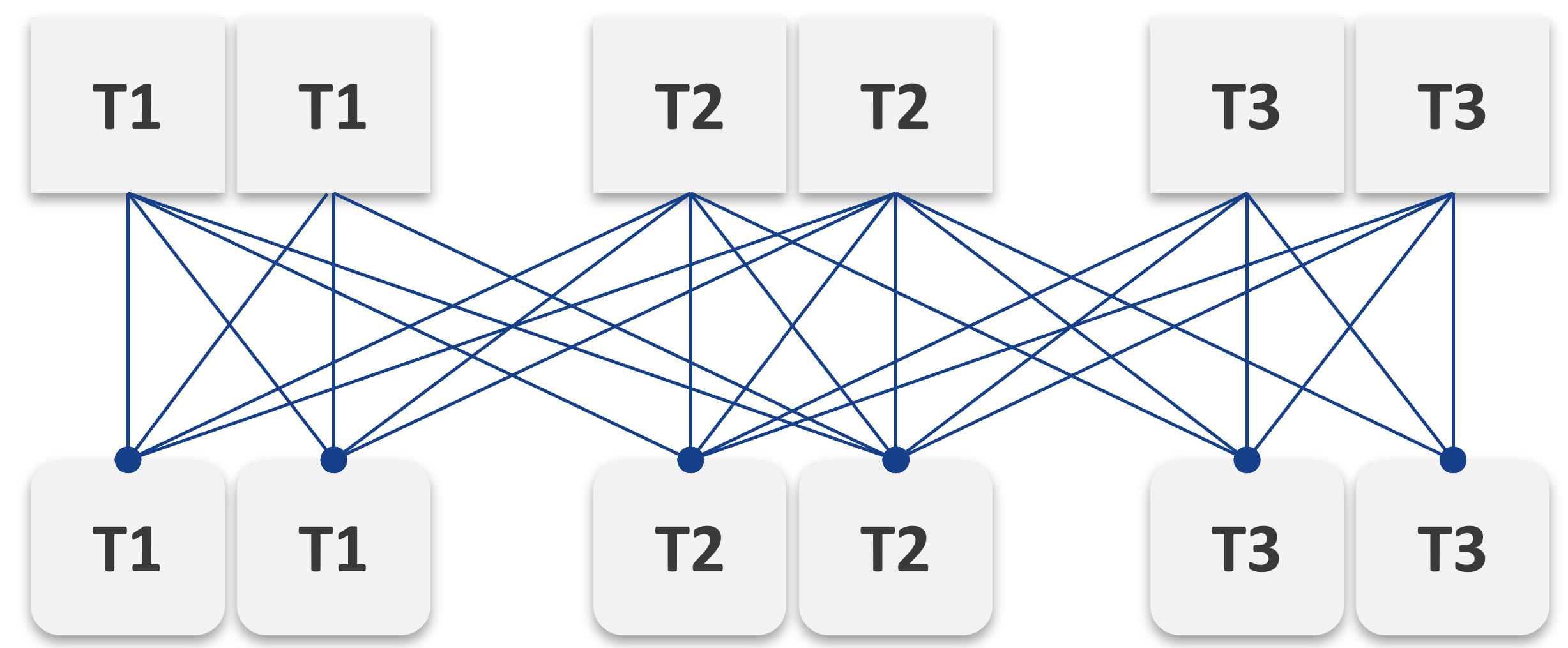 |
|
|----|
Simply adding 1 cluster for each tier dramatically increases the permutation. What if you have 10 clusters each?
This is a classic case of flexibility becoming complexity. Flexibility has its price, so you need to make the business call. In smaller environment, you can afford to be more flexible.
There are further complications. As examples:
-
You need to have two tags: one for compute and one for storage. What do you call a VM with Gold compute and Silver storage?
-
Separating storage from compute also means 2x the tagging. You now need to tag both the clusters and datastores.
-
We can create a logic where the virtual disks inherit the class of service from the datastore. But what if we have RDMs? Yes, that’s still a rather popular choice.
-
If you further allow different storage classes for different VMDKs, then you need to tag each virtual disk. This makes reporting difficult as now you need to list each disk attached to each VM.
-
Performance troubleshooting also becomes difficult. Say you allow a VM to buy Bronze Compute but Gold Storage, because the load is storage sensitive, but the application team does not care about CPU. What if the VM disk latency is caused by CPU contention?
SP5 Framework
VCF as the core of your private cloud require a new IT operations management framework. I call it The SP5 Framework. It’s the IT Business Strategy supported by its 5 components (Policy, Pillars, Process, People, Platform).
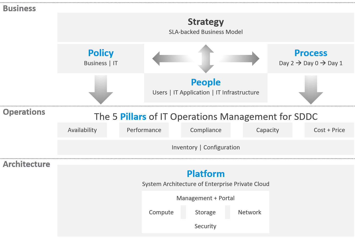
There are 5 pillars of operations management. They are the management disciplines a CIO directly cares about, which is why you need to ensure they are “good”. To achieve that, the people (IT professionals) is organised accordingly. Processes and policies are then put in place to balance between governance and agility. A complete set of policies and SOPs answers “who does what when where and how”. Finally, you implement all these using technology product, such as VMware Cloud Foundation.
What are the capabilities of a private-cloud-ware? How would you explain to your CIO and CTO?
Using a vendor-neutral diagram, we can say that virtualization is the foundation technology that enables the creation of flexible pool of resources.
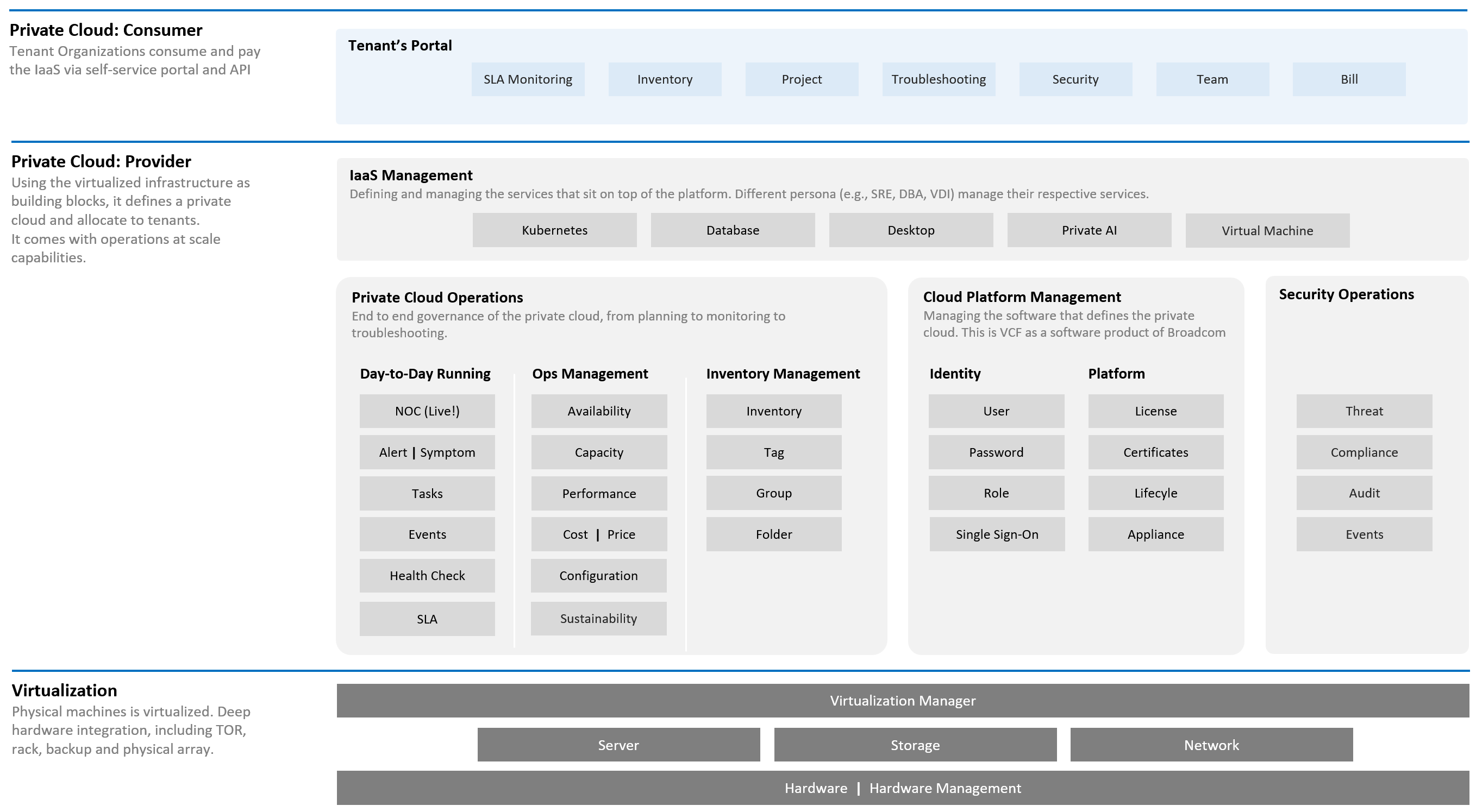
What do you manage, actually? What do your customers want you to manage? How do you manage what you need to manage?
The most basic thing is you need to have visibility into the environment. There are thousands of objects (e.g. VMs, applications, firewalls) with complex relationships and interdependence. Inventory gives you this. That’s why it’s the first box in the diagram below.
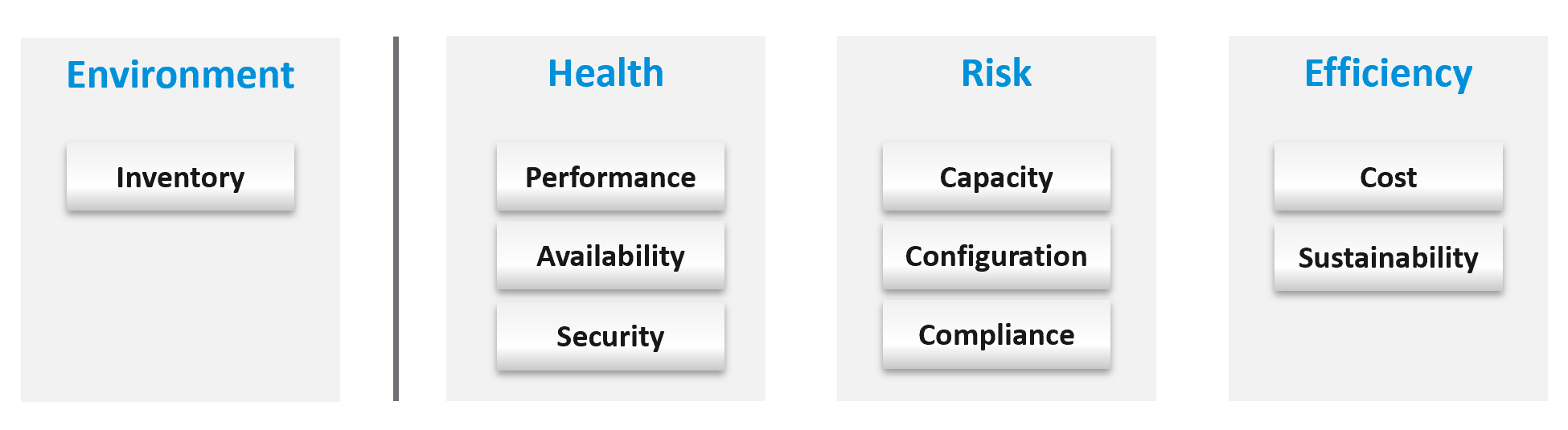
Once you know what you manage, you can then move on towards making sure those things are healthy. If there is no real problem, then you move to address potential problems. If there is no risk, then you look for optimization.
How do you know you’ve mastered operations management? What’s the acid test?
When you can go on long vacation in peace, without the worry of urgent escalation calls asking for information or decisions that only you can make or provide.
See Part 4 of the book on details of Health.
Why a New Framework?
Before I came up with the pillars of operations, I studied other IT frameworks as it’s easier to use existing as adoption will be faster. There are many frameworks in running the business of IT. ITSM, IT4IT, ITIL, COBIT, Microsoft Operations Framework, and many others where you can learn about overall IT Management7. In this book, I’m focusing on areas that are related to VMware Cloud Foundation, and only on Day 2.
The philosophy of ticket and incident-based operations are reflected in these frameworks. I’m not against the principle of using tickets as a unit of work, but most implementations have been disappointing to users. That’s odd as the very purpose of the help desk is to help the users. When you call your telco, bank, airline, etc. for support and you get a ticket, how has the experience been to you?
It’s terrible.
So why impose that bad experience to your customers?
The SP5 Framework differs fundamentally as it aims to do away, not just minimize tickets and incidents. The proactive, insight-based operations require a small number of seasoned IT professionals with deep technical expertise and knowledge of the business. It does not work on a very large number of teams spanning many departments, each following rigid and siloed policies.
I found many frameworks to be heavy. This means they are complex and costly to operationalize. ITIL 4 has 34 management practices for the entire IT Business. I find 34 are simply too many to manage. You end up managing the management. This defeats the purpose to begin with.
| Service Management (17) | Technical Management (3) |
|---|---|
Business Analysis Service Catalogue Management Service Design Service Level Management Availability Management Capacity & Performance Management Service Continuity Management Information Security Management Service Request Management Service Desk Incident Management Problem Management Change Enablement Service Validation & Testing Service Configuration Management Release Management IT Asset Management | Deployment Management Infrastructure & Platform Management Software Development & Management |
In addition to managing 20 types of services and technologies, you also need to manage 14 general management:
-
Strategy Management
-
Portfolio Management
-
Architecture Management
-
Service Financial Management
-
Workforce & Talent Management
-
Continual Improvement
-
Measurement & Reporting
-
Risk Management
-
Information Management
-
Knowledge Management
-
Organizational Change Management
-
Project Management
-
Relationship Management
-
Supplier Management
Even with 34 management practices, ITIL 5 merges Capacity and Performance as 1. I see them as distinct disciplines, done by a different persona and are having different processes. This book covers both disciplines in-depth, while ITIL 5 does not.
Duplication
Frameworks have lots of big words that are subject to interpretation in the real world as you try to implement them. Some of them also overlap, or even mix up concepts altogether. For examples:
| Monitoring and Alerting | They are not peers. When you monitor a system, you will arrive at one of these 3 conclusions:
Alerting is one of the 3 ways for your monitoring system to communicate to you. You interface to the tools via alerts, dashboards, and reports. |
|---|---|
| Changing vs Optimizing | They are not peers. Optimizing is part of changing. You can’t optimize without making any change at all. You change something because it is broken or it needs improvement. |
| Operating vs Supporting | Support is part of day-to-day operations. It mostly revolves around inquiries and incidents. If you’re doing operations right, it also involves insights and proactive changes. |
| Automation and Orchestration | Automation is the “big item”. Orchestration is just one of the techniques for automation. It typically strings together a number of different scripts, which could be in different programing languages. |
| Measurement and Reporting | I’d rather call this Monitoring, as Measurement is a noun. Reporting, as covered in Part 2 Chapter 1, is just one way for computer systems to talk to humans. The other two are alerts and dashboards. |
| Monitoring and Event Management | Monitoring is a process, an activity. It is not something you manage. The diagram in the next section shows how Process and Pillar are related. Unlike alerts, events could be neutral or even positive. An event is an accounting of something happened, and related to tasks or activities. Just like a metric is an accounting of utilization or contention. A log is a record of something that happened. You don’t manage metrics, event, logs as you don’t have full control over them. So events are just inputs to your operations. It’s one of the 5 data types to monitoring. The other 4 are metrics, properties, logs, and netflows. These 5 measure the observability of an architecture, and they feed into your monitoring tool. Their values or meaning are defined by the context of the pillar. |
| Operations and Governance | They are the same. You manage operations by having governance. Operations management covers risk (availability risk, capacity risk, security risk) and applies control (compliance to approved configuration, clear accountability for each role, manage cost so they don’t overrun) . |
Complexity
There are many IT management areas that are not pillars of operations. They are either unnecessary or just providing support to Operations Management. For examples:
| Service Level Management | An SLA is not something you manage; it is a by-product. You manage availability, performance, compliance, and if you do that well you will pass your promised SLA. |
|---|---|
| Service Continuity Management | This is part of your architecture, not something you manage. A good architecture is a living system, as it’s designed to handle updates and upgrades without compromising the SLA. |
| Demand Management | This is part of Capacity, as the art of capacity management is about making sure there is just enough supply to meet demand. Both insufficient and too much capacity are problems. |
| Continuity Management | This is part of Availability, which cover snapshots, HA, DR, replication, active/active, back up, etc. |
| Incident management | To me, incident (e.g. your website goes down) and problem (e.g. your core router hit a rare bug) are not something you manage. You manage the impact, such as availability and performance. As part of availability, performance and compliance management, you are bound to have incidents, which were caused by problems (e.g. incompatible configuration, bug). You should focus on why you have so many availability, performance, compliance, configuration, or capacity problems. By reducing them, you will reduce your incidents. Aim to minimize incidents and problems, instead of accepting their prevalent existence as acceptable and invest on their management. |
| Service request management | |
| Problem management | |
| Service Desk | This is a technique, a solution you design as part of your monitoring strategy. While the team needs to be managed, it can span thousands of people; it is not a pillar of operations. |
| Continual Improvement | To me, this is more culture, realized as a set of processes, policies and structures. See Kaizen as an example. While it’s important, it’s not a pillar of operations |
The Pillars
What do your CIO actually care? Because that is what you will manage.
Well, the first thing your big boss care is availability. You have neither performance nor security issue if the system is down. Hacker cannot even login to an vCenter that is not even available.
Next, just because something is up, does not mean it’s fast. Your boss can argue that your system is so slow it is basically not available to users. So you need to manage performance**.**
Next, just because the system is up does not mean it’s secured. Security and compliance matter.
There are 5 pillars of operations. Each pillar is an individual unit of management. They represent individual disciplines and are compatible with one another.
-
Availability management
-
Performance management
-
Security and Compliance management
-
Capacity management
-
Cost and Price management
How do manage them? What are the key processes required to run multi-cloud operations?
The following diagram maps the process and the pillars.
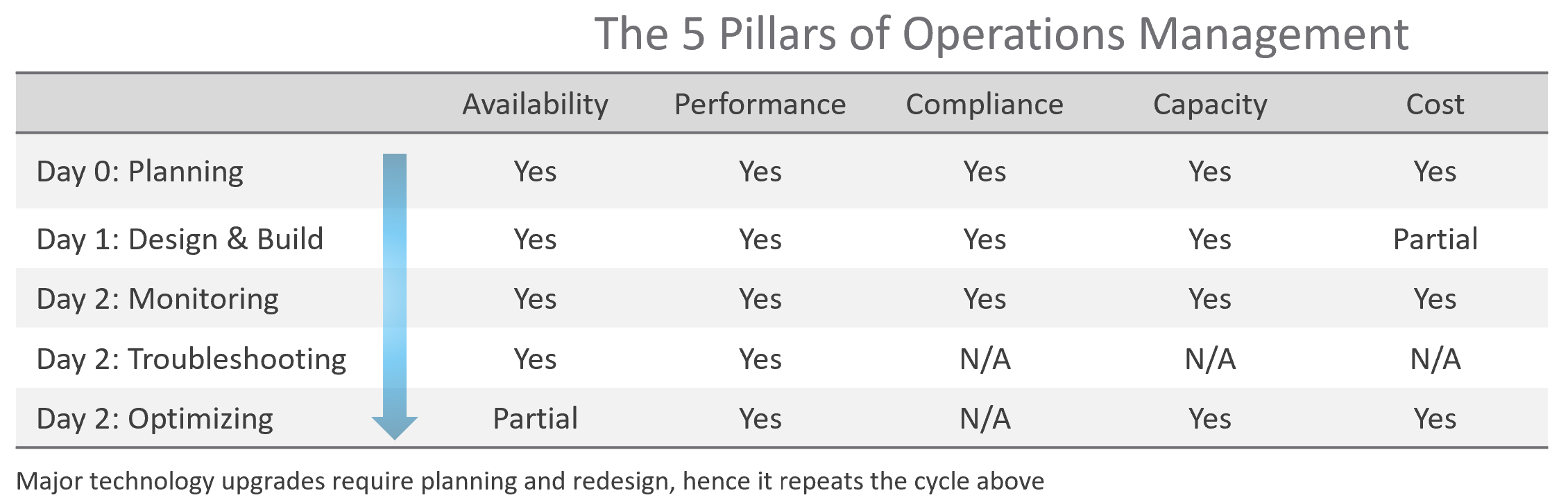
The complexity of each pillar depends on the technology: for example, vSAN capacity is more dynamic than a traditional SAN. In vSAN, changing the storage policy could create a sudden spike in consumption.
The 5 pillars of Operations Management are interdependent. Knowing the relationship is as important as knowing the individual component. Relationship matters as the symptom and the root cause are often two different things. A performance problem could be caused by a configuration problem, such as an outdated configuration or incompatible versions.
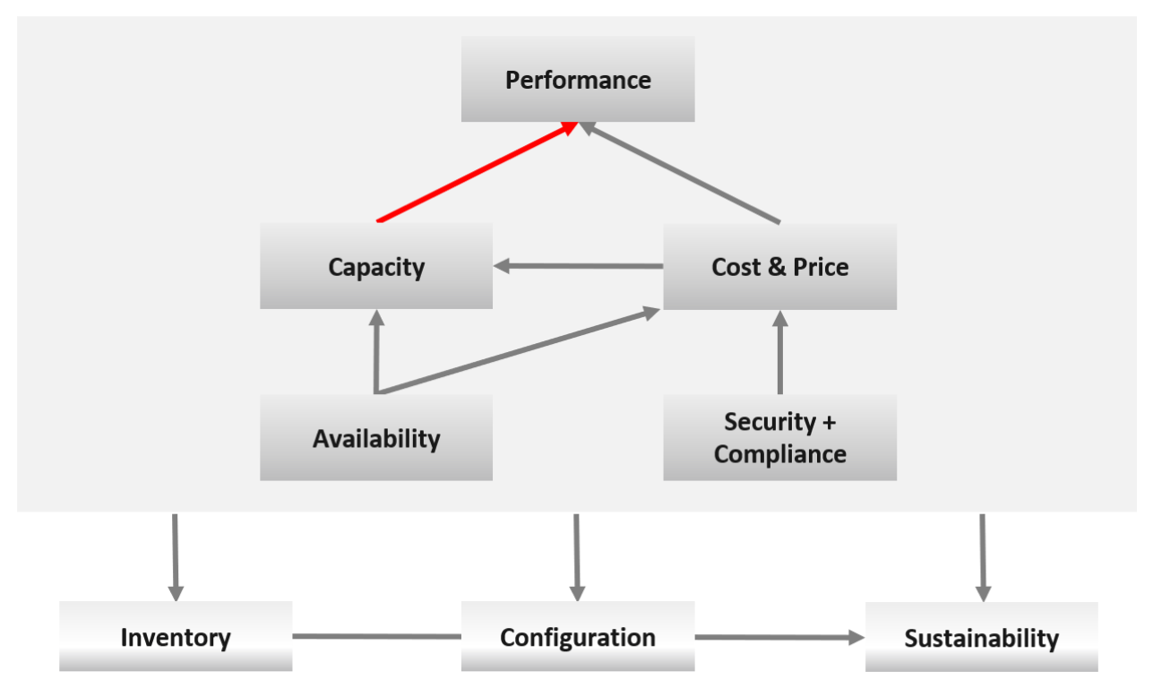
I chose a red line as it’s a complex relationship. As Capacity goes down, Performance remains steady. As Capacity drops below 0%, performance suddenly takes a hit.
I put Security and Compliance together outside as it’s typically managed by a different department. Their scope extends beyond the Data Center to areas like physical building security and employee work-from-home solutions.
Lines with arrowheads means there is impact:
-
Availability increases your cost, as you’re adding extra resources for no capacity benefit.
-
Compliance typically increases your cost. The more compliance requirements you must maintain, the larger the operational overhead involved in managing and measuring it.
Lines without arrowheads means there is relationship but not impact:
-
Availability and Capacity should not overlap. You calculate capacity after taking out availability.
-
Inventory and Configuration do not impact each other.
The following diagram provides more details.
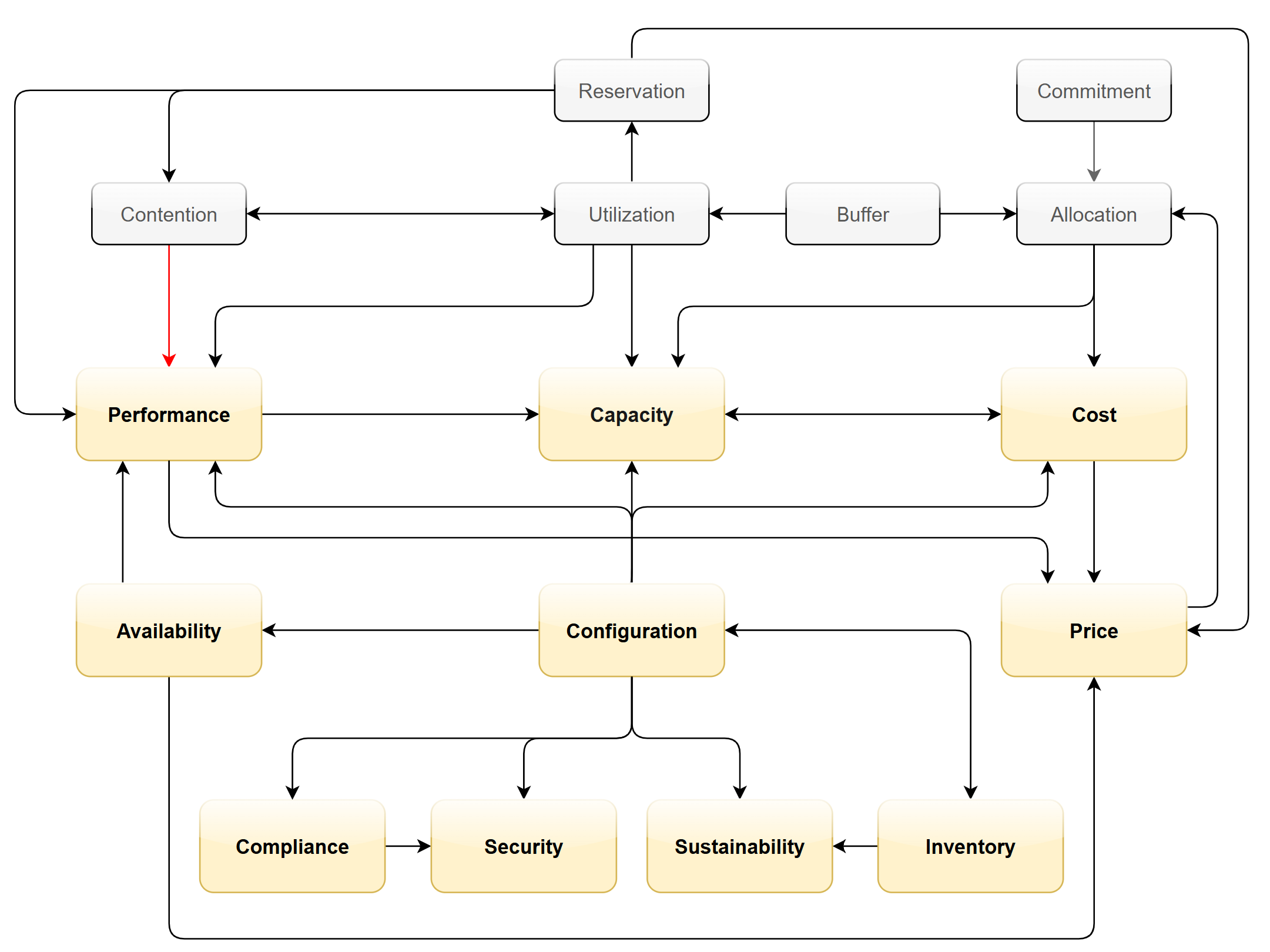
Let’s elaborate on each pillar.
Availability
There is a spectrum of availability solutions, including snapshots, back up, redundancy, fault tolerant, clustering, and SRM. Each can have impact on cost. Most of them require additional resources so they must be part of capacity planning, so they do not impact performance. For example, load balancers and replication needs to be accounted for.
You also need to include the potential workload caused by DR events in your capacity planning.
There are two metrics for availability:
-
Actual Availability (%)
-
Operational Availability (%)
The first one simply measures the fact as it is. It does not consider the HA (high availability) configuration and scheduled down time.
Operational Availability complements it by considering the above. So its value will be higher, as it reflects the operational impact. This is also the number used in the SLA.
The higher the Availability SLA, the higher the cost of the service. There is a big increase for each additional 9 of availability. Five 9s of availability costs 10x more than four 9s as the margin of error is reduced by 10x.
Why isn’t there a line to Performance?
Availability events like a host outage, when accounted for in the design, should not impact performance, as it does not lead to a drop of usable capacity.
Performance
Ever heard of “the system is so slow it is as good as down”? Just because something is up, does not mean it’s fast. On the other hand, if you have catered for HA, you can have part of the system down with no impact on performance and capacity.
From day-to-day operations, performance is the most important pillar of operations. This is why the next chapter is Performance Management.
Performance is often confused with capacity as “more work done means good performance”. This “more work” requires higher utilization. This simple thinking has drawback as it associates idle with low performance.
The primary metric for performance is contention. You don’t have performance issues if there is no contention. One common cause for contention is utilization over capacity or limit.
Capacity
There are 2 types of capacity:
| Short Term | Long Term | |
|---|---|---|
| Performed by | Day to day Operations | Capacity Planner |
| Availability Management | Highly relevant | Not so much |
| Performance Management | Highly relevant | Not so much |
| Cost Management | Not so much | Highly relevant |
| Timeline | Present. This means now or today. It cares less about tomorrow. | Future. Depending on the lead time to add capacity. If procurement is required, this can be months. |
| Projection is not applicable. | Projection is mandatory | |
| Scope | Resources that can be provisioned within an hour or so | Resources that are not yet purchased |
| Focus | Hardware | Software (as they are more expensive) |
Short term capacity is related to performance. They are interdependent; hence one is often mistaken for the other.
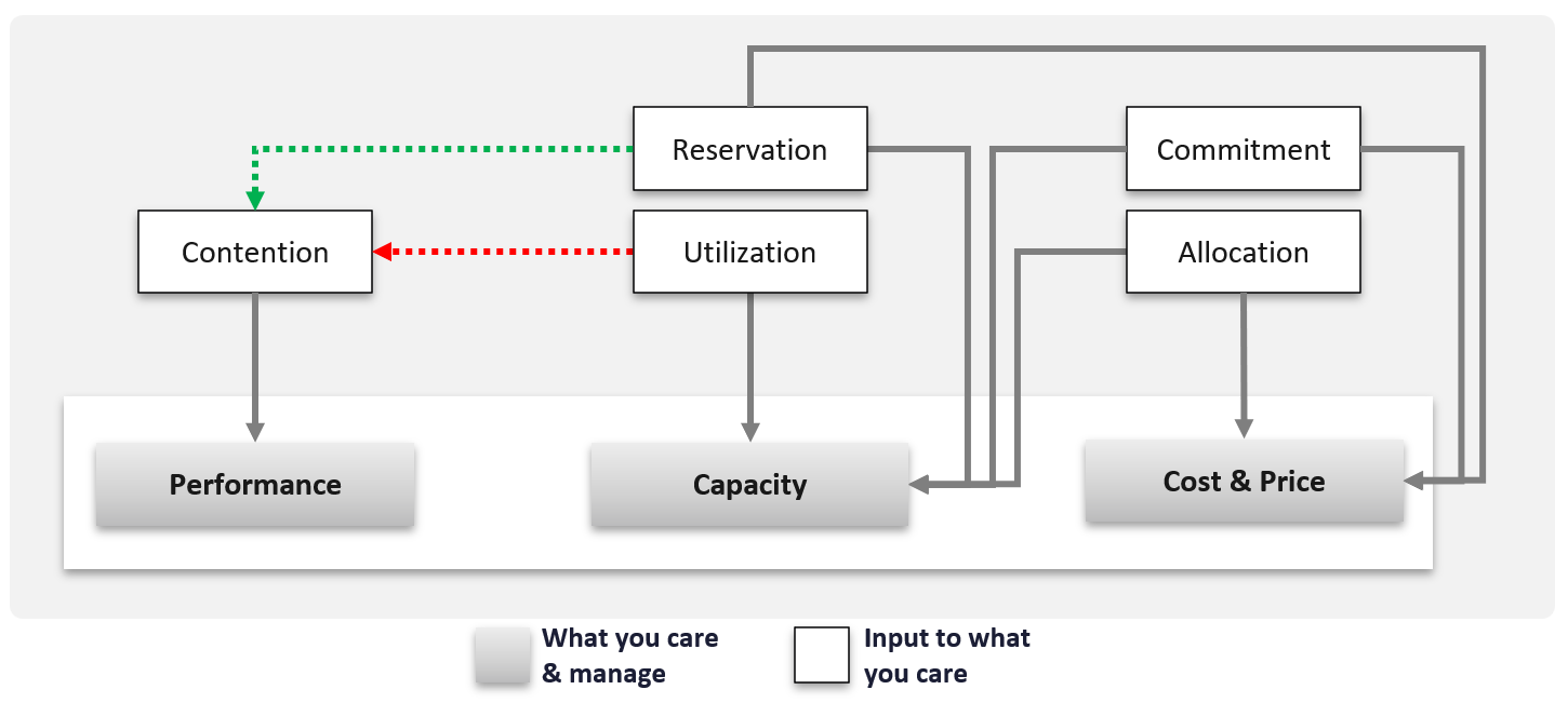
Capacity is affected by Performance as it needs to consider contention metrics not just utilization. If you can’t satisfy existing demands, then you won’t provision new workload, hence capacity is practically full. The utilization metrics may not be high yet, but that’s a secondary consideration as you stop adding new workloads until you figure out why.
Capacity also considers demands that do not manifest yet. This is why you need to consider reservations and allocation. They also minimize the consumption to go too high and cause contention.
Price can help address capacity. The best way to address oversized VMs is having a pricing plan that encourages smaller sized VMs. If the price is free then use a business justification to right-size instead.
Using highway transportation as example: You do not add lanes because of congestion that lasts a short time or rarely happens.
But what if the workload is revenue generating? For example, during annual sales you expect a much higher demand that happens only 1 day in 365 days. Do you build permanent capacity for the rest of the 364 days? Are you able to provide a burstable capacity, either in the cloud or on-premises?
Applying the above into vSphere on-premises, perhaps on that special day you need to limit other workloads, power them off, take hardware from other clusters, or move workloads to other clusters.
It focuses on the consumer, while the long-term capacity view focuses on the provider. The short-term view answers questions that care about today. Examples:
-
“Can you deploy additional workloads?”\
The now part of the question is important, as the deployment is typically done by automation. You want to prevent the deployment if it will cause problem. This means you need to check both the present situation and the future situation.
-
“Can we take out resource providers temporarily?”\
Examples are putting ESXi hosts into maintenance mode, or doing a cluster upgrade.
Reclamation
Infrastructure team should not force their internal customers to reduce their own consumption. This is a hard political battle, as there are more developers than administrators in a typical large enterprise. A better way is to show the CFO the total cost of wastage, money that can otherwise be saved. CFO will simply hold the budget for new hardware, and force the respective line of business to optimize their current consumption8.
Compliance and Security
Just because a system is up and fast, does not mean it’s secure.
Security is related to but not the same as Compliance. Security covers issues such as attacks (be it by internal employee or by external threat). Compliance deals with configuration settings or values that may expose security loopholes or are required to conform to specific sets of standards. Compliance is closely related to configuration as you comply by controlling the values of specified configuration items.
Compliance is measured against both internal and/or industry standards. It’s also measured continuously.
In Security you worry about being attacked. This means you track malicious activities, such as inappropriate usage of administrator accounts, or denial of service attacks.
Compliance is binary: you are either compliant with your defined compliance requirements, baselines, or benchmarks, or you aren’t. Compliance is also unaffected by complex and qualitative affairs like resource contention and performance. For this reason, as a service provider, you should guarantee to your customers that you will be perfectly (100%) compliant with your own compliance benchmarks for all classes of service.
However, you only provide a compliance guarantee on what you manage. If you don’t provide the VM’s guest OS as part of the service, then you don’t manage compliance for it, and you don’t provide an SLA against it. If you do provide the guest OS, then you must also manage its configuration via something like Microsoft AD Group Policy.
Cost and Price
Last but not least: money.
Cost and Price are necessary in the transformation towards becoming a real service provider.
| Price | With hardware becoming commodity and infrastructure becoming invisible, price has naturally become a common denominator among all IaaS providers. The general expectation is the price per VM is similar across cloud providers. One way to provide differentiated pricing is SLAs. While Price should be higher than Cost, it can be set independently of cost. Use discounts and progressive pricing to set the correct price for the right terms and conditions. Progressive pricing will also discourage oversized VMs from being provisioned in the first place. It’s easier to handle then, rather than once VMs are already in production. At an individual VM level, the better the Performance SLA, the higher the price customer is willing to pay, hence the term Price/Performance. |
|---|---|
| Cost | At the platform level, cost also goes hand in hand with capacity. The higher the utilization of the IaaS, the lower the cost per VM. Cost is separate from capacity as it can be optimized without reducing capacity. Cost and capacity can also go independently of each other. You can increase capacity without increasing cost via technology refresh. You can reduce cost without reducing capacity by lowering non-capacity costs such as the rate you pay for services. |
Non-Pillars
What’s missing in the 5 pillars?
-
Inventory.\
Inventory is simply what you have. Your responsibility is a lot more than accounting of what you have where and how they change over time.\
Inventory is just a by-product. You plan for capacity, with certain configurations. As you manage your cost & capacity, the inventory will adjust accordingly.
-
Configuration.\
Configuration is just a means to an end. You care about configuration only because it impacts security, capacity, performance, and availability. So it is often both the problem and solution to all the above pillars.
-
Sustainability.\
It’s covered by both capacity and cost. The only thing unique is the source of power. It’s simply looking at the same things, albeit from a different angle. It does not replace any of the existing pillars of operations management.
-
Reliability.\
This is just a characteristic of the system. Obviously, you want performance & available to be consistent, hence reliable and as you gain confidence, it becomes predictable. For example, if your website performance is not reliable or its uptime is not stable, you will troubleshoot from a performance or availability angle. There is no need to elevate the nature of something into an entity by itself. It complicates operations as you end up with overlap.
-
Recoverability.\
This is just a property of availability. Just like debuggability is a function of performance & availability.
-
*Manageability.*
This is just a property of configuration.
Inventory is related, but not identical to configuration. They tend to be confused easily. For example, “configuration maximum” actually means inventory maximum.
| Inventory | Configuration |
|---|---|
| An account of what you have where. So, the location, the movement, and the count matter. | Properties of your inventory. The location is just another property of the object |
| Inventory uses a small subset of configuration as the focus is on counting the number of objects. The majority of properties managed by configuration are not relevant to inventory. | The full set of settings, that you either intentionally set or have to accept. |
| Configuration drift is not relevant. | Configuration drift is important. |
| Inventory movement is important. | Inventory movement is not relevant. |
| Inventory has stock stake concept. This can involve physical or virtual items. | Configuration does not. |
Deals with distribution. You want to keep them “balanced”. e.g. number of VMs across all your vSphere clusters. | Deals with variance. You want to keep them minimal. e.g. version of VM hardware versions. |
Examples:
-
Number of VMs in a cluster is a part of inventory, not configuration.
-
Number of ESXi hosts in a cluster is a part of inventory. But it’s also part of configuration as that’s the design of that cluster. The cluster is configured with 8 ESXi hosts for a reason, and deviation may need to be explained in design documentation.
Inventory also deals with the change of inventory. A high number of churns is an inventory problem, not configuration problem. For example, as part of inventory management, you may want to check how many VMs were added, were deleted, were changed in your environment in the last 1 month.
There is a subtle difference between volume of change and the rate of change. Volume typically covers a longer period (e.g. 5 minutes, 1 hour, 1 day), while rate covers shorter period (e.g. per second, per minute).
To make inventory management easier, you typically group items by function. For example, in IaaS, you may have:
| Consumer Layers | Business Application (typically it spans multiple pods or VMs). Software (e.g. Microsoft SQL Server). Container or pod. VM (which could be in cloud). |
|---|---|
| Provider Layers | Cloud services (AWS something). Kubernetes. vSphere + vSAN + NSX. Physical (network, arrays, servers, UPS, racks). |
Proactive Operations
The following diagram shows how Level 1 Team (the frontliner) and supporting team (Level 2, Application Teams, etc.) work together to avoid alert in the first place.
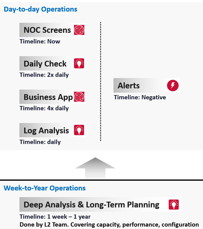
The roles conducting the tasks are:
| Level 1 Team | Watch the Live Screens on the NOC wall |
|---|---|
| Manage alerts and perform the SOP associated with the alerts | |
| Level 2 Team | Conduct the daily health check with the goal of preventing alerts of the day |
| Analyse the logs to catch issue early | |
| App Team | Watch their own critical applications. Frequency depends on the business cycles of the application. |
Since humans operate on a timeline (we are a 3D being living in a 4D world), let’s plot the above from a daily life perspective.
The following shows the timeline of actions taken during a 24-hour period.
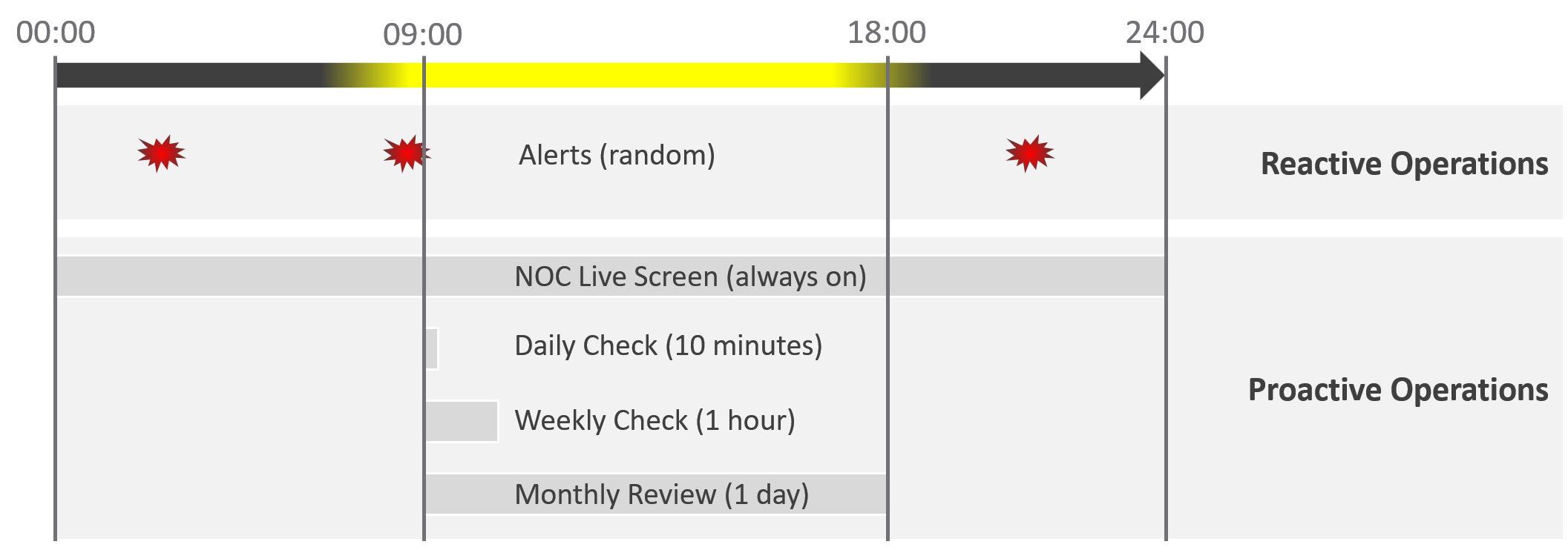
Live NOC screen and dashboard work together to realize proactive operations. You need both.
| Live Screen | They provide live, real-time, information. They are conveniently projected on the big screens for NOC Team to glance quicky. It is always available, and auto-refresh. |
|---|---|
| The NOC Room screens enable the L1 Team understands the situation better. Coupled with clear SOPs, it should result in less quantity and higher quality escalation | |
| They complement daily check well. Since you only check the dashboard in the morning, what happens to the rest of the day? | |
| Daily Check | They focus on insight, not alert. We covered both in-depth in Part 1 of the book. |
| Insight and alerts are complimentary. Open both pages side by side. |
They complement alert well. The main limitation of alert is bottom-up. It can’t show the complete picture. Alert is the tip of the iceberg.
Why do we add critical business applications in the methodology?
As covered in chapter 1, we need to begin with the end in mind. Since the purpose of IaaS is to run the applications, we need both the application team and the infrastructure team to track the critical applications. I put 2x daily as the minimum.
Proactive operations should result in less alerts, both in frequency and intensity. Volume wise, the bulk of alerts are the yellow alerts, due to their lower threshold. They can be replaced with insight, which is discovered as part of a daily proactive health check dashboard.
| Alerts | A better name for alert is guard rail. This way, the purpose is clear. It is to catch when human forgets, or system fails without warning. It is not the starting point of operations, where operators passively waiting for alerts to happen then do something. |
|---|---|
| A well-run operations have a low number of alerts. | |
The nature of alert means its use case is narrow. You do not want to run your operations based on alerts. Too many and you’re overwhelmed. Too few and you lack the early warning. This is why insight is the main driver, with alert playing secondary role. |
What’s the limitation of the above?
They focus on day-to-day operations. Both have short timeline. Maximum 1 day. If you have quarterly workload, you will not see them.
You also need a deeper and longer analysis, to implement major improvement. You do this via a set of interactive and powerful dashboards, such as the performance baseline profiling dashboard. Because you do it monthly or longer, you can afford a longer time to execute it. Use it to solve larger, more complex, and political problems.
Is there another benefit of this “out of band” operations management?
Yes. Use it to improve your daily operations itself. Both the Daily Check and the NOC Screens should help in preventing the alerts in the first place. However, you may have alerts that fall through the crack. On a weekly basis, review these alerts and improve the dashboards accordingly. Once this is repeated over a long period of time, you’re bound to catch many of the alerts and get better in preventing them.
Roles and Timelines
Human and AI agents are 3D being. We operate on a timeline. Human operators also complies to the nature of days and nights.
Different roles have different time pace. The following diagram shows only some of the roles.
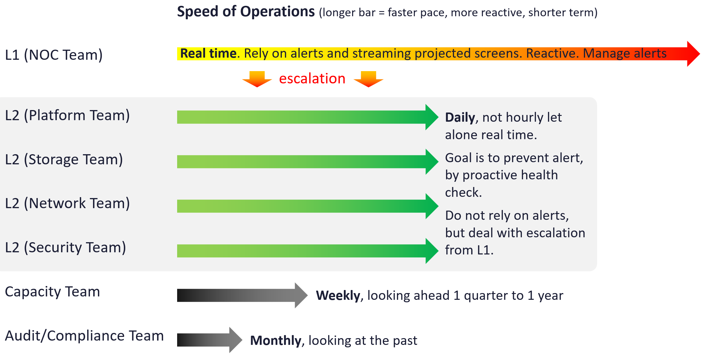
The NOC room team runs at the most pressing speed as they deal with real time situations. They are the only role watching the operations live as it unfolds. As a result, they are typically equipped with multiple large screens on the wall.
Their focus is to keep the environment healthy. Typically, they do not have the skills nor time to improve the environment. This is where the Level 2 team comes in. Unlike the generalists in Level 1, the various groups that make up Level 2 team are specialist on their own area.
These Level 2 team perform proactive check, at the start of each day. The goal is to prevent alerts firing during the day, as that would make their life easier that day.
I added Capacity team and Audit team to show examples of team that do not get involved in day-to-day operations.
Let’s now see the diagram differently. This time, we focus on the timeline as human operates along a timeline. We adhere to the natural cycles of nights and days.
As part of proactive operations, there are at least 2 cadences:
-
Daily
-
Weekly
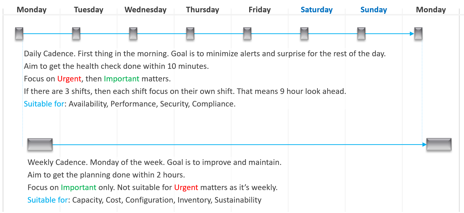
Let’s highlight the differences:
| Daily | Weekly | |
|---|---|---|
| When | First thing in the morning. Do it before you jump into the first problem. You are planning your day here. | On Mondays. After you settle with your daily cadence. Does not have to be first thing. However, you need to block longer time |
| Duration | Minutes. Aim for 5 minutes. This will allow you to do it a few times a day. | ~ 1 hour. 1 hour is probably what most administrators can practically afford. |
| Other Tools | Use the dashboard together with the Alerts home page and NOC screens. So yes, ideally you have multiple large monitors. |
SP5 Framework: People
There are many personas required to keep operations running well. Some are directly involved in the day-to-day operations, while others focus on the big picture, hence requiring a longer time frame. In small branches of a large organisation, the roles are played by the same few people, backing each other up. You can have 3 people doing everything with no structure, or 300 people with clear demarcation and formal hierarchy. Regardless, the jobs still need to be done, so document all the roles and responsibilities. Now you know why I make this document editable.
There is a many-to-many relationship between “jobs to be done” and persona. It reflects the dynamic nature of live operations. You have team members taking leave or away, hence you need someone else to step in on an ad-hoc basis.
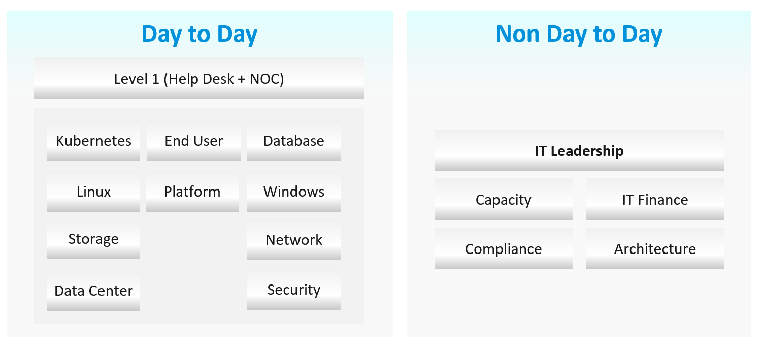
Day to Day Roles
| Level 1 Operators | Deal with the production environment. Perform a regular check on the overall environment. Use both insight and alerts. Responsible for closing alerts. Alerts should be closed only when root cause is known, not when symptoms disappear. Closing alerts without knowing why they happened prevents lesson learned and can potentially backfire. Perform simple troubleshooting, following SOP. Typically, these SOPs do not require reading logs. SOP is ideally automated, taking input parameters, so the chance of human error is minimized if the number of manual steps or frequency is high. Focus on Availability, Performance and Security. Typically stationed at Network Operations Center room and called the Help Desk. |
|---|---|
| Platform | Activated when Level 1 is unable to solve the problem. For each problem solved, this role should update the troubleshooting guide so Level 1 can be empowered. Focus on insight, not alerts. Look at the big picture and try to prevent alerts from happening. They focus on risk (e.g. configuration risk, compliance risk). More senior than Level 1. May specialize is some areas (e.g. vSAN, networking). They document the knowledge base and develop SOP. They automate the SOP as much as possible. Perform advanced troubleshooting, which often requires logs analyzis. Work with the Architecture Team. Lead or involved in the evaluation of operations management tools. Design and maintain VCF Operations dashboards and alerts. In larger organization, there can be more levels. |
| Operations Manager | Manage the level 1, level 2, level 3 operators. Deal with tenants on SLA. |
Other Roles
There are other roles that Ops Teams need to deal with. Here are some of them. In larger organisation, each could be a team on their own.
| Security | In large organizations, this could be a separate department by itself. It could also report outside IT if the scope covers beyond computer system. They work closely with the Compliance persona. |
|---|---|
| Compliance | Set the compliance settings to agreed internal and industry standard. Verify that non-compliance alert was addressed timely and correctly by the operations team. Report & discuss the compliance status with upper management. Focus on Risk (Configuration, Compliance). |
| Capacity | Plan the supply side of capacity, working with the architect role. Plan the demand side of capacity, working with line of business or sales team. Does not get involved in the day-to-day capacity. ESXi hosts going into maintenance mode is an operational problem, not capacity management matter. |
| IT Finance | Typically work with Capacity Team on purchasing. |
| IT Management | There can be multiple levels here, all the way to the CIO and CTO. Look at the big picture, trends over time, and future. Not so much what’s going on hour-by-hour. Weekly report, focusing on the overall health and not individual users or pools. Monthly presentation and review, supported for live dashboard for an interactive discussion. Generally, does not get involved in troubleshooting and architecture. Primary focus is Compliance and Cost. Performance is not the focus, as that was likely promised to be “good” by the Architect as part of the design. |
| Architecture | Design the system architecture. Needs to get input from Day 2 team, and design with the end in mind. Look into the future. Evaluate new technology and assess if technology refresh or migration to a new architecture makes business sense. May lend support on complex troubleshooting. In larger organizations:
|
| Network | The network team is typically separate. This is due to the nature of networks. |
Guess what role is missing?
Yes, Site Reliability Engineer (SRE).
The role focuses on automation. I see them as a variant of platform team, because in operations you should only automate what you can operate. Doing automation without mastery of operations have resulted in many DevOps turned into Dev Oops!
Exit Criteria | Entry Criteria
Among the roles and departments, there are handovers and boundaries. This is especially important for escalation. What’s the Exit Criteria and Entry Criteria?
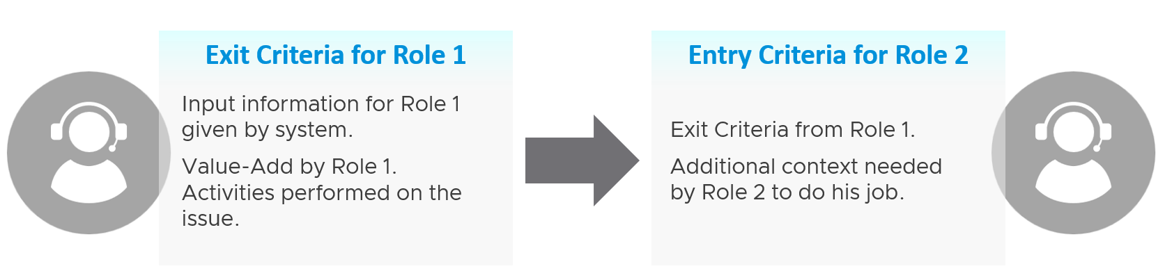
Take for example the escalation process from Level 1 to Level 2 support.
L1 Exit Criteria defines the set of analyzis they have performed on the issue. If it’s not in their capability, they have the right to escalate to L2.
| L1 Staff | Perform check following their SOP to ensure the Exit Criteria is satisfied. The guide to analyze is provided by the respective L2 as part of the alert definition. |
|---|---|
Add additional information that L2 needs, giving all the context an L2 personnel needs to perform their job. The context is part of the handoff process, meaning Level 2 will not accept the escalation if the necessary details are not provided The list of information can be basic information, such as VM owner. It can also be a set of additional low-level counters or test results that the L1 Team ran but does not have the skills to analyze. It’s analogous to seeing a specialist doctor who asks you to bring your test results. | |
| Since L1 is generalist, while L2 is specialist, the L1 staff must escalate to the right Level 2 group. | |
| L2 Staff | The 2 pieces of information above becomes the Entry Criteria for L2. |
| L2 Team automatically accept the issue and now the ball is in |
“It’s on my court”
Each team need provide the standard list of metrics, events, error that shows that the problem is on their court. These items are monitored by their respective team, and alerts are in-place.
The following list examples metrics and events for different team.
| Application Team | Naturally, the actual metric and event are application-specific, and even version-specific. |
|---|---|
There is general abnormal behaviour regardless of application. Examples:
| |
| Database Team | |
| Windows Team | CPU: Context Switch, Run Queue |
| Linux Team | CPU: Context Switch, Run Queue |
| K8 Team | K8 Pod: CPU Throttle, Out of Memory event. |
| Virtualisation Team | For VMware vSphere VM:
|
For Infrastructure :
|
SP5 Framework: Process
Day 0 & Day 1 are typically done by the Architecture team, and Day 2 is typically done by the day-to-day operations team. In large organisation, Day 1 could be different as there is enough workload for them to continuously upgrade. For example, if you have 6000 ESXi hosts, and you have a 5-year depreciation policy, you’re basically replacing 100 boxes per month. That means 25 hosts per week on average.
Troubleshooting is often wrongly elevated in importance or status, as if it’s a singular or major area of operations. It is not. What you can troubleshoot, and how you troubleshoot it, should be planned during system architecture phase. Another word, think of what can go wrong, how they can be detected, and the remediation action. If you do not plan the troubleshooting element of your architecture, each actual troubleshooting event will be more painful that it needs be.
Day 0
| Plan | This is where you set the goals. The goal should follow the SMART criteria. Make sure they are aligned with the business deliverable. For example, if you plan to build a private cloud, how do you measure success? What are the metrics, so you know how successful you are? |
|---|---|
| Size | A big chunk of planning is sizing the environment. Some companies perform stress tests and load tests, so they know what to expect when the real load occurs. Without planning and testing, you don’t know if the reality should be, as you do not have a measured goal. When you architect vSAN, how many milliseconds of disk latency did you have in mind? For example, you set the goal of 10 ms measured at VM level (not at the vSAN level and not at the individual virtual disk level) based on 5-minute average? |
Day 1
| Design | This is where you design, build the system, and launch the service. This includes configuring the various operations inputs such as cost drivers (e.g. application license costs, electricity rates). This is not part of the book as there are plenty of materials on it. Day 1 is generally closer to Day 0, as it’s the realization of your plan. |
|---|---|
| Build | Ideally this is automated to ensure what is designed is 100% identical to what is built. This includes deployment of the infrastructure, physical and virtual. |
| Test | Ensure what is built works as intended. For example, if you build a vSphere cluster, test that each ESXi host can recover from an HA event. |
| Upgrade | I do not consider them as part of Day 2. Upgrade varies from a simple patch to complete rearchitecting, where you are running the old and new system side by side. This type of upgrade is basically a migration, as you have the luxury of a new build. It also involves substantial planning, so you might have to circle back to Day 0. |
| Migrate |
Day 2
Day 2 is when the real challenge happens, as this is the stage you need to ensure critical workload is served well.
As a result, it includes proactive tests of the system resiliency and security. Monitoring is more than just checking. It’s about ensuring that the system is able to handle emergencies and remain secured.
Define your Standard Operating Procedures (SOP) to ensure knowledge is captured and lessons are learned. It’s also important to know “who does what when” to ensure gaps are covered. If your operations are partly or fully outsourced, ensure the vendor provides the documentation.
Having SOPs does not mean that you do not have ad-hoc tasks at all. You do, however, want to keep them minimum and so they are manageable.
| Deploy | This refers to the deployment of workloads, not infrastructure. Workload lifecyle management happens throughout the years, hence it’s considered Day 2. |
|---|---|
| Prove | You have redundancy (HA) and DR, right? How do you know they work if you never test them? A pair of core switches that have been left untouched for years may give you a surprise when there is an unplanned HA event. Once a year, test your HA to make sure they work. Annual reboots could be a good idea to clear cache and logs. As part of firmware, driver, OS, and VM Tools updates you may need to reboot anyway. Take advantage of this downtime by testing the resiliency of your infrastructure. Another area you need to test is security. Conduct independent penetration tests. |
| Monitor | These 2 will be elaborated as they form the bulk of Day 2 activities |
| Troubleshoot | |
| Optimize | As part of your monitoring, you may not discover a problem, but you spot an opportunity to make performance even better, reduce costs even further, and free up wastage in capacity. It’s common for new versions to deliver performance improvement. Again, you do this proactively, not waiting for complaints to happen. |
Monitor | Troubleshoot
Monitoring is What, while Troubleshooting is Why.
Monitor is where you compare Plan vs Actual. That’s why the goal must be clearly defined. Does the reality match what your architecture was supposed to deliver? If not, then you need to adjust your plan. That’s why Plan and Monitor form a circle.
For example, you plan to deploy VDI for 10K users. At 1K, you find out that the users are consuming more resources than plan. You either need to scale down your deployment or add more resources.
You do this when reality is worse than planned, or something is amiss, not when there is a complaint. You want to take time in troubleshooting, so it’s best done proactively. And quietly with no one rushing you for results.
| Monitoring | Troubleshooting | |
|---|---|---|
| Question answered | What is the problem? | Why does it happen? What is the actual cause of the problem? |
| Nature | Proactive. | Reactive. |
| Expertise | Low. A junior IT person is better suited, as it’s repetitive tasks with the aid of predefined dashboards and alerts. | High. Needs experienced IT Pro as there are wide variances on the steps taken. Also needs someone who understands the environment. |
| Metric | Generally, 1 metric. And this metric is also the SLA. This is the 1st metric you or your customer check. Primary metric. You check it proactively as part of your SOP. | Always many metrics. There are layers of metrics, one impacting another. Secondary metric. You only check if the primary is reaching threshold. |
| Duration | Should take just 5 minutes. | Can take days, with back-and-forth discussion amongst various teams. |
| Frequency | Performed daily. Gold Class will have higher frequency of regular monitoring than Bronze, as part of the SLA. | On demand. |
| Timeline | Now and Future. You consider future load and anticipate. | Now. Future is irrelevant. Your focus is to put out the fire or potential fire. |
| Logs | Not required. Metrics, properties, and Event suffice. | Almost always required. For network troubleshooting, you also need netflow data. |
| SLA | SLA is applicable in monitoring. | Yes. It becomes urgent if SLA is breached. |
| KPI | Use KPIs in monitoring instead of individual metrics. | Yes, but as a starting point. You then drill down into supporting metrics, which are often raw metrics. |
In most cases, monitoring is best done using a 5-minute interval, as 1 minute of bad metrics may not have business impact. Troubleshooting on the other hand may require per-second granularity. However, that does not always mean you need to see each and every counter if your remediation action is the same.
Health Check
When you monitor, what you check is the health of the system. Health Check is just another buzzword as it’s relatable to human health.
This is part of monitoring. There is no need to complicate with another jargon.
When you monitor the health, cover all 3 aspects of health:
| Present Health | Future Health | Better Health | |
|---|---|---|---|
| Focus | Illness | Illness (risk) | Fitness |
| Nature | Mostly Reactive. With KPI, you can do some proactive action for performance management. | Proactive. Alert is not a suitable UI or flow as there is intra-day urgency. | |
| Scope | Availability (Reactive) | Capacity | Cost |
| Performance (Proactive) | Configuration | ||
| Security (reactive part) | Security (proactive part) | ||
Frequency
How often should you monitor?
The answer depends on the types of information available:
-
For issue where there is no early warning, then no point wasting time doing proactive check as you won’t find any signs of degradation. You can only rely on alerts and be reactive. Availability is an area where the software or hardware typically go down without warning.
-
For issue where there is early warning, the frequency depends on the suddenness.
-
For situatiosn where the degradation is rapid, you may even need live streaming screen that is conveniently displayed 24/7.
-
For situations where the degradation is slow, such as capacity, once a week is enough.
-
Since daily fits well with business cycle, the overall performance is best checked daily, complemented with NOC screens and alerts.
-
For details of the health metrics, see the vSphere Metrics book.
Troubleshoot
There are many things that can go wrong, especially in production and on the eve before you take a vacation.
Troubleshooting requires expert team. The expert team is also the team setting up the thresholds used by the Level 1 team. Troubleshooting involves logs analyzis, as many systems do not generate complete metrics, and there can be many different causes behind a common problem. At the end, the actual root cause may not even be closely related to the problem. Troubleshooting is much more than simply “finding out” and goes beyond just gathering facts. It focuses on why, and then formulates a solution to prevent future incidents. Incidents mean something is dead, slow, or breached. You troubleshoot availability, performance, and security. Capacity and cost are not something you troubleshoot.
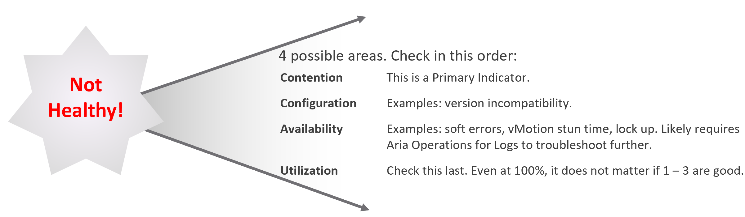
Due to its complex nature, the first time an incident happens is forgivable.
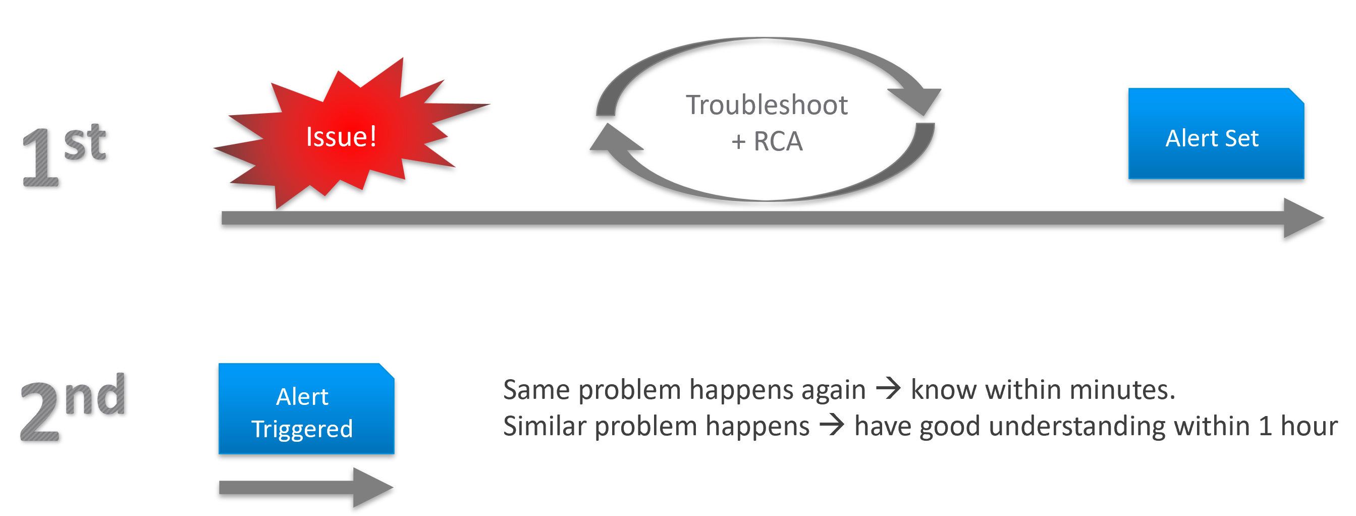
To codify troubleshooting, consider a layered approach. This makes it easier for the less technical teams. Classify your troubleshooting metrics, events and properties into two categories:
| Primary Metric | This defines performance. It is the What. This is always expressible as 0 – 100%, so it’s easier for the Level 1 team. It’s almost always a hybrid metric. Example: Kubernetes Cluster Performance (%) |
| Secondary Metrics | This provides some explanation to the primary metric. It is the Why. Aim for this to be expressible as 0 – 100%, so it’s easier for Level 1 team. Example: Highest ESXi Memory Consumed (%) in a Cluster. Metrics that can’t be color coded are harder for Level 1 teams, as the meaning depends on the context. Example: VM Disk IOPS |
Root Cause Analyzis
Root Cause Analyzis (RCA) is an important component of an optimized process for operations management.
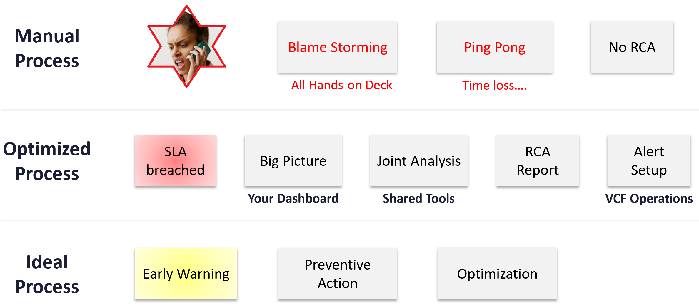
The structure of an RCA report varies among customers, even if the issue they are troubleshooting is essentially the same. Regardless of structure, what do you think is the most important content in the report from an operations management perspective?
The most important content in the report should be the corrective actions to prevent recurrence, such as alerts that are configured to proactively highlight indicators of recurrence. Without these alerts, you cannot reliably detect the issue before it reoccurs and take corrective actions if required.
There is a good chance that the root cause is different than the symptoms. It may happen on a different object altogether and the error message could be seemingly unrelated. A root cause typically starts as a log message, meaning it has not bubbled up into the screen (UI) as formal alarm. When the vendor support team recommends you a specific log message to trap, how do you validate it is correct?
You need to ensure that the alert is valid. That means it should not result in false positive.
Let’s take an example. Take a VDI mass disconnect issue, where >100 users had their sessions disconnected at the same time. The analyzis concludes that the problem started with a log message (“resuming traffic on DV port”), so we need to trap this message when it appears again.
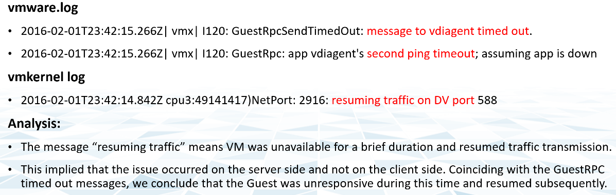
The first thing you need to do is validate the above alert. Using tools like VCF Operations for Logs, you cross check the message against your entire environment, especially the healthy (in this case, unaffected users). Ideally, you cross check for entire week, not just during the time the incident happened.
The following was the result when I cross checked against all the users in the last 5 working days. The log message has happened more than 1000 times, meaning that “resuming traffic on DV port” is not the message that I should base my alert on. There are too many of them and there is a clear pattern following office hours.
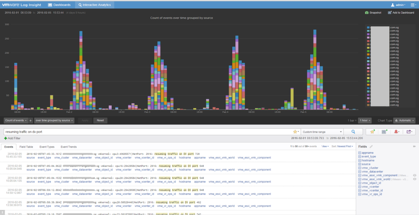
Optimize
The outcome of monitoring is not always troubleshooting. You may discover nothing to fix. However, that does not mean you discover nothing as you may discover the opportunity to improve.
Optimization delivers many practical benefits and real business results. Here are some of them:
| Lower Cost | Reclamation: Orphaned VMs, powered off VMs, Idle VMs, Oversized VMs, snapshots. Reduce DC footprint: Saves Software (MS, RedHat, VMW, etc.) and Hardware (server, storage, network) + Data Center (rack, space, cooling, UPS) Move burst capacity from Own to On-Demand. |
|---|---|
| Better Performance | Performance Profiling. Enable proactive monitoring via actual baselines. Establish Performance SLAs, complementing Availability SLAs. NOC Dashboards. Insight, then Alerts. Faster business service via self-service + approval workflows. |
| Lower Complexity | Standardize architecture. Simplify business policy or security policy. Standard Operating Procedures (SOP). Reduce human error via automation. Replace ageing hardware and upgrade outdated software. |
| Higher Customer Satisfaction | Internal IT department. Reputation among Applications Team. External SP. Repeat business. Ability to justify or defend pricing. Price/Performance. |
| Higher Compliance | Internal compliance with evolving, mandatory and/or optional security benchmarks, such as VMware security hardening guides, CIS, ISO, or FISMA baselines, or industry regulation such as DISA, PCI DSS, or HIPAA. |
I’m sure there are more of them. Drop me a note with your real-world stories!
Day to Day Operations
The daily discipline of who does what everyday matters.
-
The most important and the most basic is availability. If your system is down, you cannot have performance problem.
-
The next thing you ensure is performance. A system that is so slow is as good as down, perhaps to the point the hackers get tired of waiting 😊
-
Yes, security is number 3, not number 1 in the grand scheme of operations.
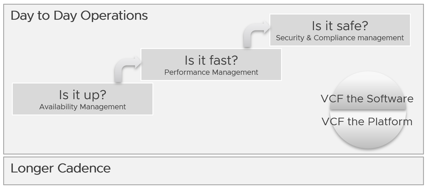
You assess the above on both “sides” of VCF, as they are intertwined. We covered this in earlier part of this book.
Day to day operations become more systematic when you distinguish between monitoring and troubleshooting.
Real Time
This is assisted with a set of live dashboards on the big screen in the NOC, showing real-time metrics and events. As the time duration is basically minutes, capacity is typically not relevant. You focus on availability, performance, and security.
The focus is to gain early warning, hence buying time if operations turn into an emergency. That means there is no alert triggered yet.
You want to put out fire fast.
| Availability | Focus on undesirable events. Make sure they match your expectations of what is actually happening in your environment at that time. For example, if you’re not deleting VMs and the live screen shows many VMs being deleted, something’s amiss. |
|----|----|
| Performance | Focus on overall performance and make sure the fluctuation is within your expectation. |
| Security | Focus on suspicious activity such as loosening of firewall rules or usage of administrator accounts. |
Daily
The daily SOP should look ahead, using the historical data and business context as a guide.
| Availability | Check for soft errors. This likely requires you to look at the logs from each hardware and software vendor. For example, vSphere has proactive HA. |
|---|---|
| Ensure backups are performed. For example, if you take a snapshot of 1549 VMs and only removed 1518, the backup likely failed to consolidate the snapshot. | |
| Performance | Insight analyzis. Look at the overall environment. Mission Critical VM Performance. Focus on looking forward to the next 1 day, by considering the pattern over the last 1 week. Know the expected workload, by working closely with the business owner. |
| Compliance | Ensure non-compliance is remediated. |
| Security | Check for potential security attacks, such as loosening of firewall rules and usage of administrator accounts. |
| Configuration | Check for misconfiguration that can cause issues. |
| Implement urgent patches, after appropriate validation | |
| Capacity | VM provisioning. Ideally this is automated, so it happens throughout the day. In this way, your developers need not wait for the end of the day. What you need to ensure is the aggregate load does not overwhelm the shared environment. |
Snapshot deletion. Set up a policy to delete snapshot older than say 3 days. You do not want to wait until 1 week. Ensure the exclusion is properly implemented, so you do not delete from VM whose snapshot you’ve agreed to keep. | |
| Powered-off VM deletion. Once a VM passes the powered-off definition, there is no need to wait for another week before you delete them. You do have backups, don’t you? | |
| Powering off Idle VMs. Once a VM passes the idle definition, there is no need to wait for another week before you gracefully shut the OS down. |
Longer Cadence
Let’s review some examples of SOPs that you should have.
Weekly
Weekly or longer is suitable for different types of tasks. As you have more time and are working on longer time horizon, you should look at both the big picture and look ahead.
The end of the week is a good time to document the changes and lesson learned from the week, and plan ahead for the next week.
| Capacity | Capacity monitoring and planning. Check actual growth vs projection (plan). |
|---|---|
| Reclamation Process. VM rightsizing, Idle VM, etc. This can be done weekly as you need to deal with the VM owners. | |
| Compliance | Root cause for non-compliance is documented, and preventive measurement is put in place so it does not happen again. |
| Configuration | Minor updates. For example, from vSphere 7.0 U1 to U2. This is typically part of standard IT tech stack hygiene, where you keep up with the update from all your vendors while making sure they are compatible. This protects you from security non-compliant and emergency patching during business hours. Review does not mean immediate implementation. For example, there is a newer version of VMware Tools. You may decide to start implementation in 2 months, as you have 15K VM and you need to prioritize and batch them. |
| Major upgrade. For example, from vSphere 6.5 to 8.0. This is typically a one-off project, as opposed to regular maintenance. The implementation is typically executed within a green zone, so other regular maintenance may be deferred to make space. | |
| Overall | Weekly Management Report. Focus on reviewing the operations of the week, and plan for next week. |
| Review of ad-hoc events. What are the lessons learned, and can they be turned into an SOP and alerts set up? |
Monthly
The month serve as logical time period as human and business relate well with calendar months. There are different activities at the end of the month or the start of the month.
| Availability | Restore test of backup. Make sure it can be restored and the data is readable. |
|----|----|
| Configuration | Less urgent update. Review new versions and ensure you do not fall too far behind. |
Longer Cadence
You complement the above frequent SOPs with a regular cadence with a longer time horizon. Naturally, the focus is on the big picture, major projects, and strategy.
| Quarterly | Overall | Quarterly Management Report. Focus on longer term items such budgeting. |
|---|---|---|
| Cost | Budgeting. Review actual versus plan. | |
| Availability | DR Test (Production is still running). Isolate the network. To ensure users are comfortable with the procedure when actual DR strikes. | |
| Half-yearly | Availability | HA Test. Actual test that your HA works as intended. Covers vSphere, physical switches, storage array, etc. |
| Yearly | Availability | Actual DR Failover (Production not running) and Failback to primary DC |
| Capacity | Inventory Stock Take. To discover unused VMs and physical items in data center | |
| Ad-hoc | Capacity | Unexpected demand. This is why it’s important for capacity teams to stay close with the business, especially the ones working on major initiatives. |
VM Life Cycle
This should be supported with an approval system, so all Change Requests and associated actions are properly recorded. This eliminates finger-pointing in the future. It will also support audit: who is keen on “who did what change to which object on when”?
| Stage | Notes |
|---|---|
| Request | If a VM is free (price is basically $0), then rely on business justification and IT policy. Policy states the criteria for the different class of services. VM size is requested by the application team, approved by their management. For size or quantity above certain thresholds, IT should review. |
| Creation | The actual deployment of the VM in vCenter. This is ideally automated. This stage generates the actual VM name, create folders if necessary, and places the VM into the correct folder. Once the VM object is registered in VCF Operations, create the custom group is necessary, and set the custom property. |
| Changes | Changes in VM size need to be approved as it impacts capacity and performance. If you have to use shares and reservation, ensure they are updated accordingly. |
| Retire | Delete the VM and remove it from inventory. |
Performance vs Capacity
Think of it as Quantity vs Quality. Or Space vs Speed.
They are heavily intertwined.
-
Rightsizing belongs under capacity, but it uses performance as the primary consideration. For mission critical, the metric is highly granural (1 – 20 second), not 5 minutes average.
-
Infrastructure capacity is about maximizing utilization, but it gets overridden by performance.
Performance is more time sensitive and important than capacity. Manage performance first, capacity second. Using the restaurant analogy, you focus on the dining area first, then the kitchen.
In larger organizations, they are typically managed by two different teams. The capacity team does not get involved in the day-to-day operations as they focus on longer-term resource availability. They also consider latent workload and future demand, which performance does not consider.
The capacity team may not have the technical skills to troubleshoot performance. On the other hand, the day-to-day operations deals with “what’s on the floor” of the data center. Their primary focus is meeting the demand from applications on that day.
Capacity involves factors like HA, Buffer, Overhead and Reservation. None of these are relevant to performance monitoring. In Performance, you don’t care about them as performance is about reality (what actually happens). Those factors may cause performance problems, but they are not considered in the performance metric.
Capacity uses a smaller subset of the resource than performance. One main concept is Usable Capacity, which is unique to capacity. There is no usable performance, usable compliance and usable availability.
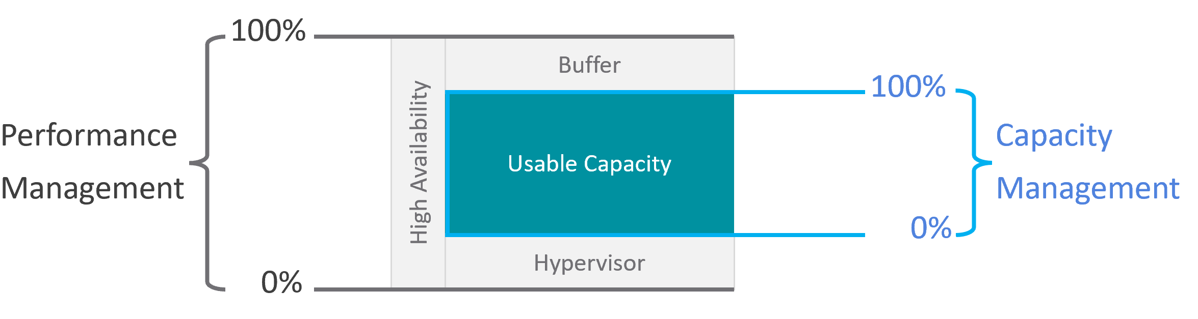
The relationship between capacity and performance varies depending on the object. Consumer objects (e.g. VM, K8S Pod) have different natures than provider objects (e.g. vSphere Cluster, vSAN Cluster). For provider objects, performance is always bottom up. You start with the VM running inside in the provider object, and then aggregate the metrics. Capacity is always top down. You look at the big picture first, then drill down. For example, you start with the vSphere cluster, then drill down to ESXi.
For an IaaS provider, the following tables explains how performance and capacity differ.
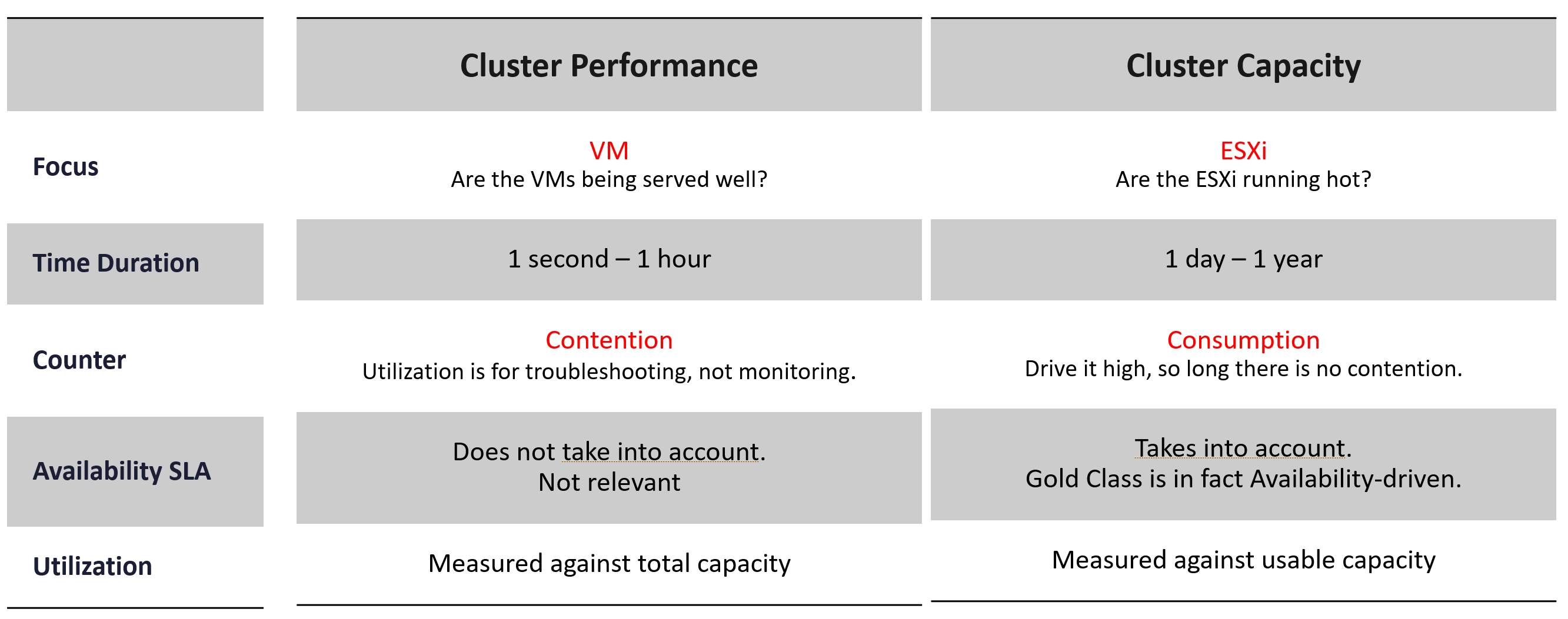
Utilization vs Demand
Utilization is not something you manage. It is just an input to what you actually care, which is capacity and performance. The nuance is both use utilization differently. In addition, capacity uses demand metrics, which takes the highest of utilization & reservation.
Performance will be absolute (real value), Capacity will be relative (it depends on settings). Unlike performance, Capacity is measured against usable capacity, not absolute capacity. There is no such thing as usable performance.
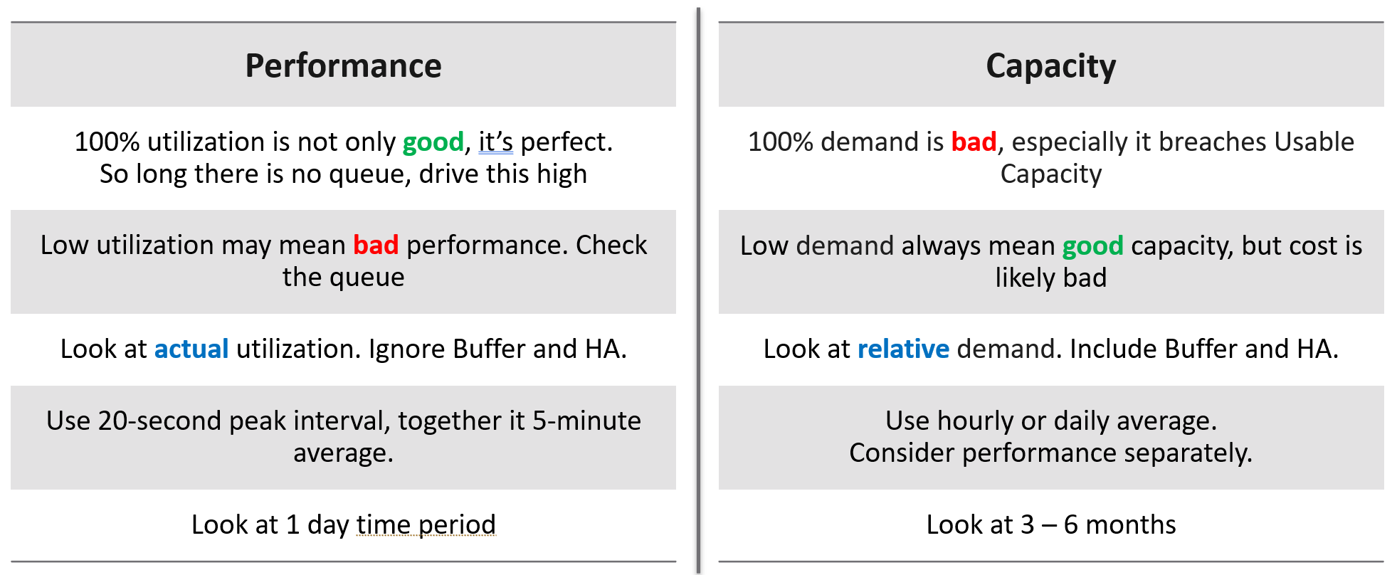
Now that we’ve looked at purpose, now let’s look at object.
Take a 16-node vSphere cluster, for example:
-
For performance, taking the average utilization of 16 hosts is too late. It’s also not practical, as you don’t typically wait until all 16 have a problem. In this case, you want to take the highest among the host as your primary counter for cluster utilization. If the counters show no issue, then there is no need to look at the remaining hosts.
-
From capacity, taking the average makes sense, as you do capacity at cluster level. You will continue adding until either you run out of capacity or you hit performance problems.
Contention vs Consumption
The following diagram shows 3 different scenarios on how contention and consumption can play out:
-
What you think will happen: you theorize that contention will only happen when utilization is high, and the unused capacity acts as cushion to prevent unmet demand from happening. This is unlikely as there could be imbalance.
-
What actually happens in most environments: demand is unmet even though utilization is not high, due to suboptimal configuration or constraints. Imbalances and incorrect cluster configurations are two typical causes of contention at low utilization.
-
What would happen if your environment is optimized: you have very high utilization yet you keep unmet demand within the promised SLA.
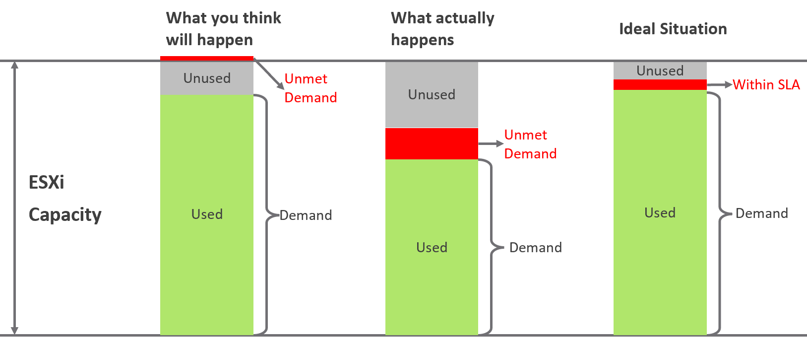
Don’t confuse “ultra-high” utilization indicators as a performance problem. High utilization does not compromise performance, so long as there is no queue or contention. Just because an ESXi Host is experiencing ballooning, compression, and swapping does not mean your VM has memory performance problems.
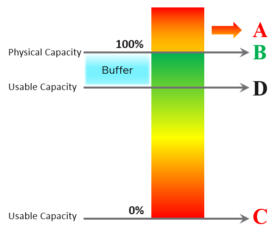
| A | It’s a common misperception that performance problems happen mostly here. It actually rarely happens here as utilization rarely exceeds 100% in real world due to buffer created by high availability. |
|----|----|
| B | Maximum utilization is achieved at 100% utilization. Consequently, the overall Performance is best here as the system completes the most amount of work. |
| C | Worst performance actually happens when utilization = 0% as nothing gets done. The demand is not being met at all (for whatever reason). |
| D | This is the threshold of Usable Capacity. It has nothing to do with Performance. Performance is in fact better above this threshold. |
Pattern Difference
You can’t forecast performance using capacity. Their metrics have different patterns.
Let’s take an example to see how contention and utilization differ. The following is using a cluster object as the example. There are two metrics, each expressed in percentage.
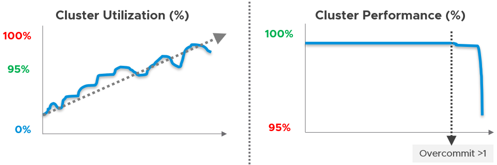
You want your utilization to be as high as possible, as you’ve paid for the hardware already. So, you start from 0% but want to move up as far as possible.
Performance is different as it depends on the class of service. Your Gold Class should deliver higher performance than your free tier else you may breach your SLA. Metrics wise, there are 2 metrics: SLA and KPI.
Performance Management
Part 1 Chapter 2
The goal of performance management is to address problem before customers complain. If you can’t detect the problem before customers do, then you don’t have performance management in place. The word manage implies proactive. Passively waiting for an alert or complaint to trigger the troubleshooting process is not performance management. Proactivity requires regular cadence to prevent the problem. This cadence requires an internal threshold that is more stringent than the external, formally agreed SLA.
A Day in the Life of a Cloud Admin
Here is a common story often told in the virtualization community, which will resonate with you as an IaaS provider.
A VM Owner complains to you that her VM is slow. It was not slow yesterday. Her application architect and lead developer have verified that:
-
The VM CPU and RAM utilization did not increase and are within a healthy range.
-
The application team has verified that CPU Run Queue is also in the healthy range.
-
The disk latency is good. It is below 5 milliseconds.
-
There are no network packets loss.
-
No change in the application settings. In fact, the application has not had any changes in the past month.
-
No recent patches were installed into Windows.
-
There was no reboot. It has been running fine for weeks prior to this issue.
She said your VMware environment is a shared environment, and perhaps an increase in the number of VMs and an increase in the workload of other VMs are straining your IaaS.
She also said that her other VM, which was P2V recently, was performing much faster in physical.
If you think she is saying it’s your fault, you are right!
What do you do?
It is certainly a difficult situation to be in. You oversee more than 10,000 VMs. You have successfully consolidated them into 500 ESXi Hosts, saving the company 9500 servers, not to mention a lot of money. You built your reputation during the process, so this is not just a matter of her VM not performing. Your reputation is at stake here.
You also recall that your team has been adding new VMs regularly over the past several months so she could be right about the increasing number of VMs straining the IaaS platform. In addition, there have been several soft errors in your network and storage, and your team has been investigating for weeks. But why did she say it only happened today, but not yesterday or a few days ago?
It’s a hard question. To answer it, we need to take a step back and elaborate. Let’s dive in!
The 3 Realms
In the big picture, there are 3 realms of IT in business. Each realm has its own set of teams. Each team has a set of unique responsibility and hence skills required. The following diagram outlines the 3 realms, alongside with typical layers within each realm and questions being asked.
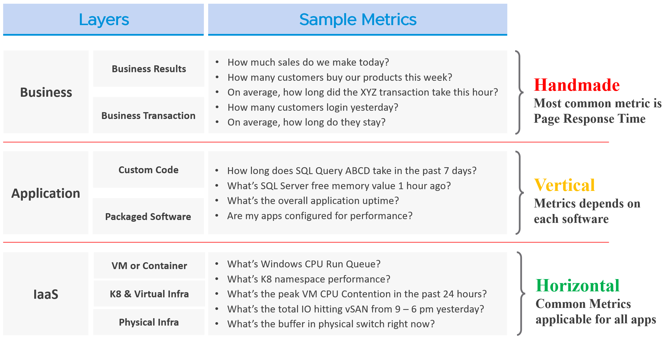
The fight typically happens between application team and infrastructure team, as both are IT. The business folks are real consumers or end users and not technical enough to provide solutions.
By the way, for those who use enterprise architecture framework, the 3 realms above actually map to TOGAF9 by The Open Group.
-
Business maps to Business Architecture
-
Application maps to Information Systems Architecture
-
IaaS maps to Technology Architecture
Each team need to have their own KPIs, and there must be SLAs between them.
| Layer | Owner | Observability |
| Business | Non-IT (specific departments owning the business functions, such as Internet Banking) | Service Response Time. This is business-function specific. For example, if it’s an eCommerce website, a good example of function is the payment for a shopping cart. |
| Application | IT (Application Team) | It depends on the application software and codes. Typically requires agents with specific knowledge of that application, as it has unique metrics. As a result, it is not possible to develop a generic KPI. |
| Infrastructure | IT (Infrastructure Team) | It’s possible to develop a universal KPI that works on all applications as it’s basically about CPU, memory, disk, and network. This is the focus of our work. |
While businesses run on IT, not all business KPIs depend on IT. Some depends on marketing, pricing strategy, and what your competitors are doing. Take an ecommerce portal: its top business KPIs probably involve revenue and gross profit. As you can imagine, if your competitors are doing a massive discount, you may not be able to achieve your sales and profit target.
That means there are 2 types of business KPIs:
-
Metrics based on IT software.
-
Metrics not based on IT software.
Examples for the ones relying on IT are business transactions (e.g. buy a product, update personal information, transfer fund) that are provided by the IT system. They can be online (real time, a user is waiting) or batch (runs in the background) in nature. They can be user to system, or system to system. Online transactions are often measured in time taken to process a single transaction (typically less than a few seconds) and is called Online Transaction Processing (OLTP). Batch transactions are often measured in time taken to process many transactions (which can be hours).
As you can imagine, different transactions require different amount of time. Even the same kind of transaction (e.g. generating a report), can vary as it depends on the amount of data or records. As an application architect, it’s important to define the expected time taken to complete commonly used business transactions. Obscured business transactions that are rarely used can be given low priority. However, this effort is not scalable if you have hundreds of business applications.
If you want universal metrics for all business applications, then page response time and error returns are the only metrics. I like the principle behind apdex, but not its implementation. Happy to share an improved formula if you are interested.
Performance troubleshooting is largely an exercise in elimination. The methodology slices each layer and determines if that layer is causing the performance problem. Hence it is imperative to have a single metric to indicate if a particular layer is performing or not. This primary metric is aptly named Key Performance Indicator.
Higher layers depend on the layers below, and hence the infrastructure layer is typically the source of contention. As a result, focus on the bottom layer first, as it serves as the foundation for the layer above. The good part is this layer is typically a horizontal layer, providing a set of generic infrastructure services, regardless of what business applications are running on it.
Now, we don’t know the impact to the application when there is latency in the infrastructure. That depends on the application. Even on the same identical software, e.g. SQL Server 2019, the impact may differ as it depends on how you use that software. Different natures of business workload (e.g. batch vs OLTP) get impacted differently even on the identical version of the software.
The Layers in IT Systems
To continue the discussion of layers in IT systems, the following example of an IT system shows 5 layers. The challenge in performance troubleshooting is the layers may not share context. Depending on the application and infrastructure architecture, there could be more layers.
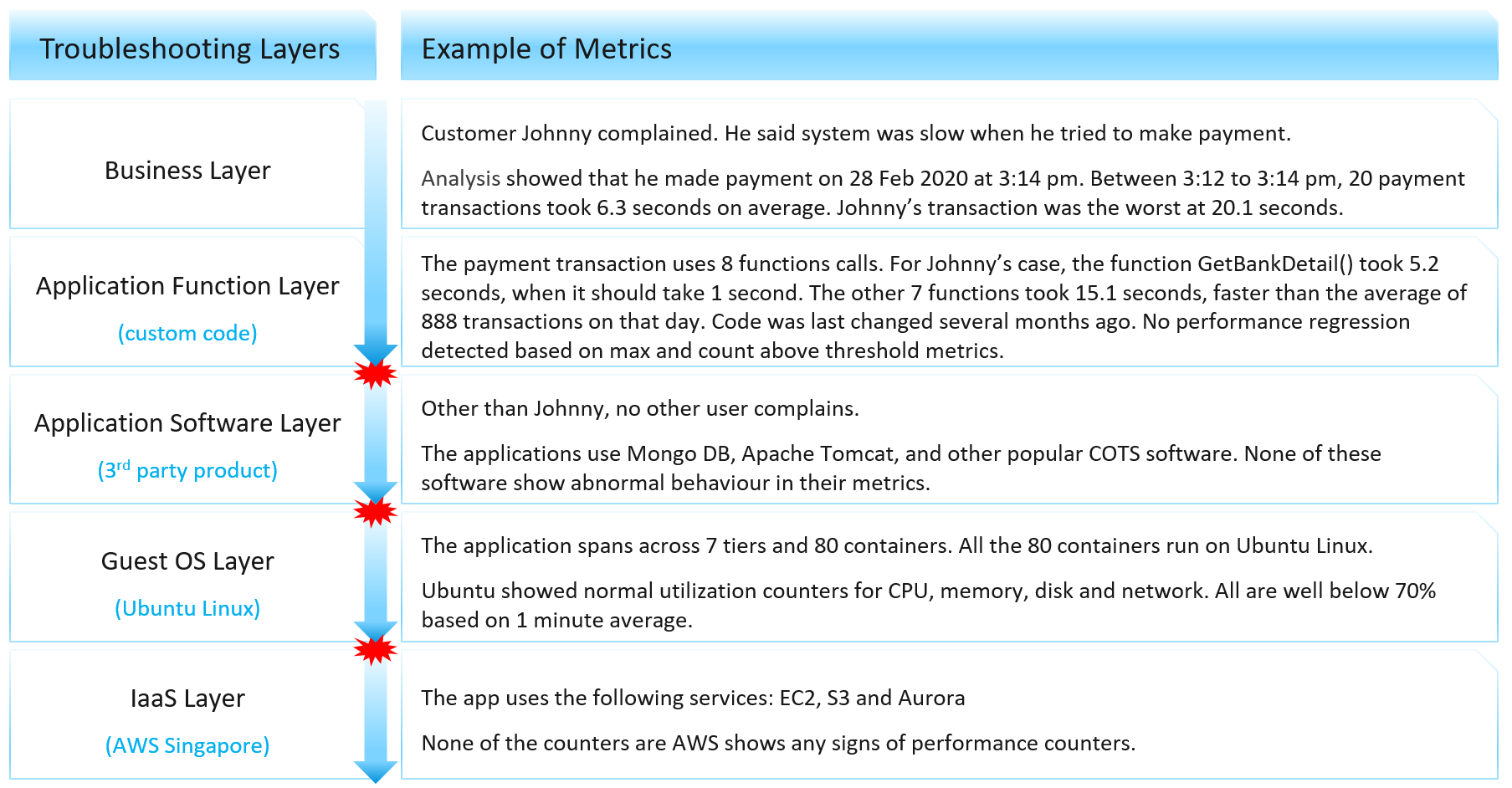
Using the example above, we can demonstrate how the lack of visibility is making troubleshooting virtually impossible. Let’s run through the hypothetical example depicted above. The story starts with a complaint as that resonates better.
At the Business Layer, you can see the performance of each business transaction. You not only know which user was affected, you also know what transaction was affected as the metric has transaction ID. You can trace it in the code as you know how long each function calls take place, assuming you log for every single transaction.
The problem starts when you move beyond your code and into Commercial of the Shelf (COTS) software. The software may show that its queue is 10000, which is 5000 more than what the manual say it can handle. But you have no idea if the user’s transaction was in that queue or not. The COTS software metrics do not relate to users anymore, let alone individual transactions. The red explosive icon marks where context is lost.
Moving from application to infrastructure resulted in another loss of context. Windows or Linux has no idea what applications you’re running. As far as the OS is concerned, every application is just a process. It will report basic CPU, Memory, Disk and Network utilization per process. More advanced metrics are reported at OS-level, system wide. For example, you do not know if your process was the one experiencing network packet loss. The packet loss metric is a system-wide metric.
Moving from individual EC2 or VM to the shared infrastructure results in another loss of context. In the case of public cloud, you may not get visibility into the physical layers at all.
The Layers in IaaS
Let’s apply the layers to IaaS.
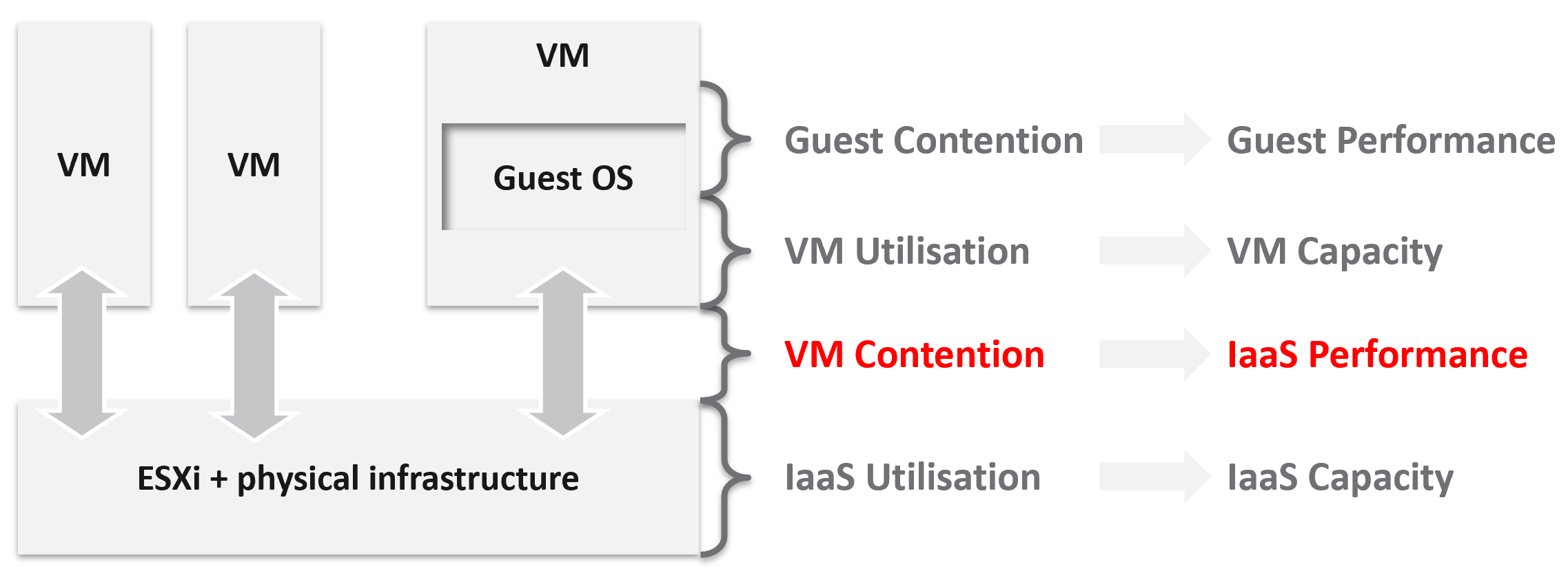
The 1st level is Guest OS contention. This is beyond the control of the IaaS platform. It’s completely up to each Guest OS to manage their given resources.
The 2nd level is useful for tracking VM capacity. Say a VM is given 8 vCPU. If you want to know if it’s using it, this is the area where you measure it. Whether you measure it In-guest or at the VM level, it depends on the specific use case because each layer lacks visibility into the other.
The 3rd level is where the VM meets the provider. This is where you track whether the IaaS platform is serving the VM well.
The 4th level is the underlying IaaS platform. This level is irrelevant to the VM Owner. This is normally the domain of the capacity planners and the troubleshooting specialists.
Let’s drill down further, breaking the layers more.
IaaS Metric Types
Broadly speaking, there are two categories of metrics we are interested in: consumer metrics, and provider metrics.
Consumer metrics consist of:
-
Business Applications: this could span multiple VMs, containers, and serverless functions. The metrics here are business metrics, not IT metrics. They are the best at measuring the application performance, but they can’t explain why it’s not performing,
-
Service: this is a process running inside Windows or Linux. We normally call this the application. An example is a database server.
-
Guest OS: there are two kinds of performance metrics; One at the Windows/Linux layer, and one at the driver layer (e.g. PVSCSI, vmxnet).
-
Container: this typically runs inside a VM. If there is more than 1 container in a VM, it makes operations management harder.
-
The Virtual Machines themselves.
Provider metrics consist of:
-
Compute virtualization, also known as the hypervisor. This is where the VM or container is running.
-
Storage and Network virtualization: they act as subsystem, supporting layer to the hypervisor. Ideally, they should have VM-level metrics, so you can trace how a single VM is performing deep into the storage and networking stack.
-
Physical resources: with hyperconverged, the only physical resources which are not already included in the categories above are basically network equipment due to their function as interconnects.
The following diagram captures the interrelationships between these metrics.
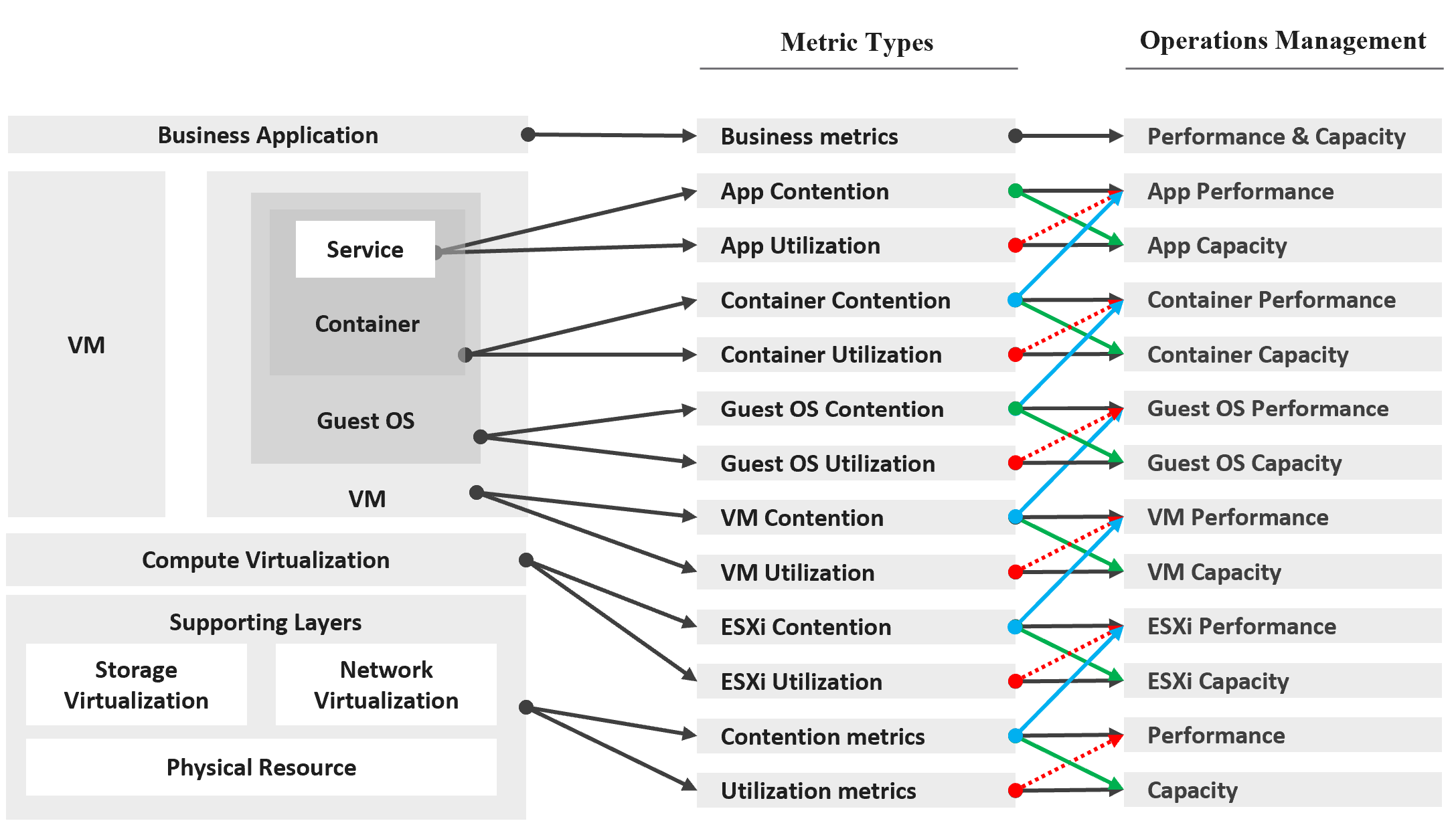
Notice how consumer and provider metrics are intertwined. A consumer contention metric becomes the performance metric for the provider.
Contention metrics are placed above utilization metrics as that’s what you should drive your operations. As Mark Achtemichuk said in this article, “drive by contention”. For each layer, you have a set of metrics. The black line indicates that contention is the primary counter for performance, and utilization is the primary metric for capacity.
| Green lines | show that contention metrics give valuable input to capacity metrics by showing how much additional capacity is required. For example, the number of queues in the CPU should be used to determine the amount of CPU to add. |
|----|----|
| Blue lines | show that contention in underlying layers directly impact performance in the layer above. For example, if a Guest OS experiences disk latency, the application will feel the impact. That can result in a ripple effect to the top layer. |
| Red lines | are not solid, as they’re highlighting a misconception. If contention = 0, then utilization at 100% is in fact maximum performance. If contention is not measurable, then add buffer to utilization as queue tends to develop at high utilization. |
On the other hand, you can have poor performance at low utilization. Many things can cause this as there are many possible configuration errors.
Optimized Performance
Optimized performance is difficult because the best performance is achieved when utilization/throughput is at 100%. This is when the most work is being done by the system overall. Running at that level requires a perfect level of mastery due to many dimensions of inter-dependencies. In addition, majority of loads have peaks so on average you could be well below 100% during idle periods.
| Type of Dependency | Description |
|----|----|
| Vertical | There are layers in the stack, and a problem in a lower layer can impact an upper layer. |
| Horizontal | The four elements of IaaS are not standalone. When CPU is paused, RAM & Disk will experience latency as time shifts as far as the Guest OS is concerned. |
| Flow | A problem in your NSX Edge VM on the NSX Edge Cluster can impact a business VM sitting on another cluster, because of the traffic flow. If you don’t understand the flow, you can waste time troubleshooting at the wrong place. |
| Version | There are valid reasons behind “What Works With What”. It’s a known problem that not all versions of all components work well together. Drivers, Firmware, etc. can cause interoperability problem, which can manifest itself as performance. |
Key Performance Indicator
In this book, my definition for KPI is strictly on performance, because the word performance has a specific meaning in enterprise IT. To me, KPI as a term does not apply to availability management and compliance management. We should call the key indicators that determine availability as KAI, and the key indicators that determine compliance as KCI10. This prevents confusion as implementation-level solution requires us to be non-ambiguous with terminology. For a general overview of KPIs, Norman Dee has written a series of blog post starting here.
We’ve covered SLAs in-depth. They are complex to operationalize, especially the performance SLA.
Google VMware “performance SLA”, and you will find only a few relevant articles. The string performance SLA must be within a quote, as it is not “performance” and “SLA”, but “Performance SLA”. Yes, I’m after web pages with the words Performance SLA together. You will get many irrelevant results if you simply google VMware Performance SLA without the quotes.

I checked the first few dozen results. Other than my own articles, Google returned only a handful of relevant articles. The rest were not in fact relevant once you read them carefully. The relevant articles did mention Performance SLA, but did not define and quantify what a Performance SLA is. If something is not quantified, it is subjective. It’s hard to reach formal agreement with customers quickly and consistently when the line is not clearly drawn. If you have a disagreement with your customers, especially paying customers, guess who wins 😊
KPIs as a Stepping Stone
As an SLA is hard to vrealize, what can you do today?
You walk from where you stand. Adopt KPIs first as you don’t have to worry about classes of service. If you have different expectations set for Production and Non-Production VMs, then create a group for each. Create a super metric that averages the performance of each group. You should expect production VMs to have a better KPIs overall.
KPIs complement SLAs by providing the stepping-stone in your operations transformation. It is a necessary step towards operations with formal business SLAs.
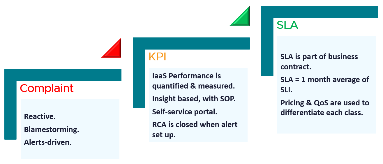
| Complaint | Metrics based on user complaints. Blamestorming among teams. Politics come into play. Alerts-driven, not insight driven. Reactive and firefighting. |
|---|---|
| KPI | Using both 20-second average and 5-minute average. Performance for both Consumer and Provider objects are quantified & measured. KPI includes Guest OS, if IT owns VM sizing. 1 common policy for all. No formal class of service defined. Performance is based on production environment. Insight based, with SOP. RCA is closed with alerts set up. Customers can track the SLA via self-service portal. |
| SLA | SLA is measured on 5-minute average. SLA = 1 month average of SLI of that specific month. SLA is part of business contract. 1 policy for each Class of Service. Pricing & QoS are used to differentiate each class. |
KPI | SLA
KPIs and SLAs work hand in hand.
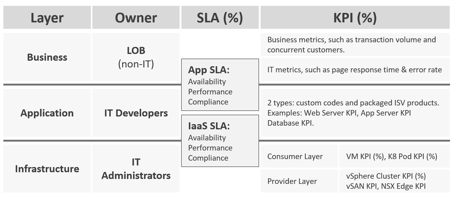
KPIs are also better suited for when the infrastructure team takes ownership (and responsibility) for sizing the VM. Since sizing the VM basically means sizing the Guest OS resource, you’re now responsible for metrics at Windows and Linux level.
Regardless of SLAs, the main reasons for creating a KPI metric is ease of monitoring. A KPI is color coded. Metrics can be color coded like traffic lights (e.g. green, yellow, orange, red), so you can understand their indications and react faster. The goal is in fact to enable proactive remediation, before the situation degrades too far.
Differences
| KPI | SLA |
|---|---|
A single metric that quantifies the true performance of a logical entity. VM and Guest OS are 2 separate objects, but they are 1 logical entity due to 1:1 permanent relationship, hence they are combined in 1 KPI number. | A set of metrics written in the business contract between the service provider and service consumer. Typically, this is between the IaaS provider (the infrastructure team) and the IaaS consumer (the application team or business unit). What happens inside the Guest OS is not even relevant to the VM SLA. |
| Simple to operationalize. | Complex to operationalize. It needs Operations Transformation, much more than technical changes. You need to look at contract, price (not just cost), process, people, class of service, etc. |
| It tends to be absolute, as it’s reporting raw metrics | It is always relative, compared to an agreed threshold. |
Leading Indicator. 5-minute window. They are used as the starting point to troubleshoot, before user complaint | Lagging Indicator. 30 days backward looking, to be precise. You complement it with SLI, a 5-minute tracking indicator. If you breach, you’re talking penalty already. Typically it’s a credit for the next billing cycle as opposed to actual refund. |
20-second accuracy. It tracks at higher intensity, and it covers more metrics and events. | 5-minute accuracy. |
| Based on day (e.g. last 1 hour), which is moving as time passes. | Based on date (e.g. June 1972), which is a fixed period. |
Comprehensive coverage. Covers the SLA metrics, plus relevant additional metrics that provide early warning before the SLA metrics are breached. There are many KPI for a given SLA because not all metrics should be in the contract, while almost all performance metrics need to be monitored. | Limited. Only important metrics are included. Having too many metrics in SLA makes it harder to comply. Guest OS metrics should not be included as that’s part of “application KPI” or VM KPI, not IaaS SLA. They impact the VM performance, but nothing the IaaS can do, meaning the remediation is at the Guest OS layer. |
KPIs in IaaS
Within the context of VM as a Service, here are the KPIs and SLA.

Why are there more KPIs than SLAs?
There is only 1 SLA per service.
| VM KPI | It excludes the application or service running inside Guest OS as infrastructure team stops at Windows or Linux. |
|---|---|
| Business Application KPI | There are actually 3 levels of KPI. The highest and most important tracks the business transaction (e.g. user login). If the number is below expectation, you check for application software KPI (e.g. Apache web server) and infrastructure KPI (which is basically the VM KPI) |
| vSphere Cluster KPI | It includes only the contention metrics of the running VMs. The utilization metrics are excluded as that has no direct correlation to the cluster performance. If the cluster is running vSAN, then the KPI should include metrics measuring vSAN performance. |
| vSAN KPI | I do not add in the diagram to keep the diagram simple. vSAN KPI includes VM disk latency of all VM accessing the vSAN datastore (from the same vSphere cluster or from other cluster). |
| NSX KPI | I do not add in the diagram as it has a many to many relationship to vSphere cluster. |
Baseline Profiling
How do you determine what’s an acceptable performance by your customers? Is their expectation unrealistic (read: not impossible but costly to implement)? What’s the value of profiling your environment if the application team is unhappy with your service level?
Let’s look at 3 scenarios. The first 2 are corner cases, and the 3rd one is the most common, especially in large environment with many application teams.
| Happy | Unhappy | Mixed |
|----|----|----|
| If your application team is happy, then the profiling is a proactive exercise to ensure performance is maintained as your environment grow or change. | If your application team is not happy, then the profiling quantifies the complaints so they can be measured. It reveals the full picture as it analyzes the entire VMware environment, not just the complaints. | Likely, some are happy and while others are not. |
| This prevents infrastructure from being blamed for application-level changes. For example, if your database size grow, it can slow down the application. | It might prove the blame on infrastructure is not right, if the metrics are good. | In a large environment with many VM Owners, it’s common to see different owners have different threshold. A 10% CPU Ready may be fine for Owner A yet a 2.5% CPU Ready causes Owner B to be upset, even though both VMs are in the same class of service |
| It helps you establish the SLA while everyone is still happy. | It shows how bad the situation is, and how much improvement is needed. This can help in justifying additional capacity | Profiling brings up these facts to facilitate discussion to get everyone agree on the same SLA, because it’s a shared platform |
This is why education is important. As you have promised to serve everyone well, you need to have a threshold that works with 99% of your customers, and not 98%. While 99.9% is a better target, it’s also far more expensive.
Methodology
Now that we know the value and purpose, let’s discuss how to implement it. The following flowchart shows the overall process
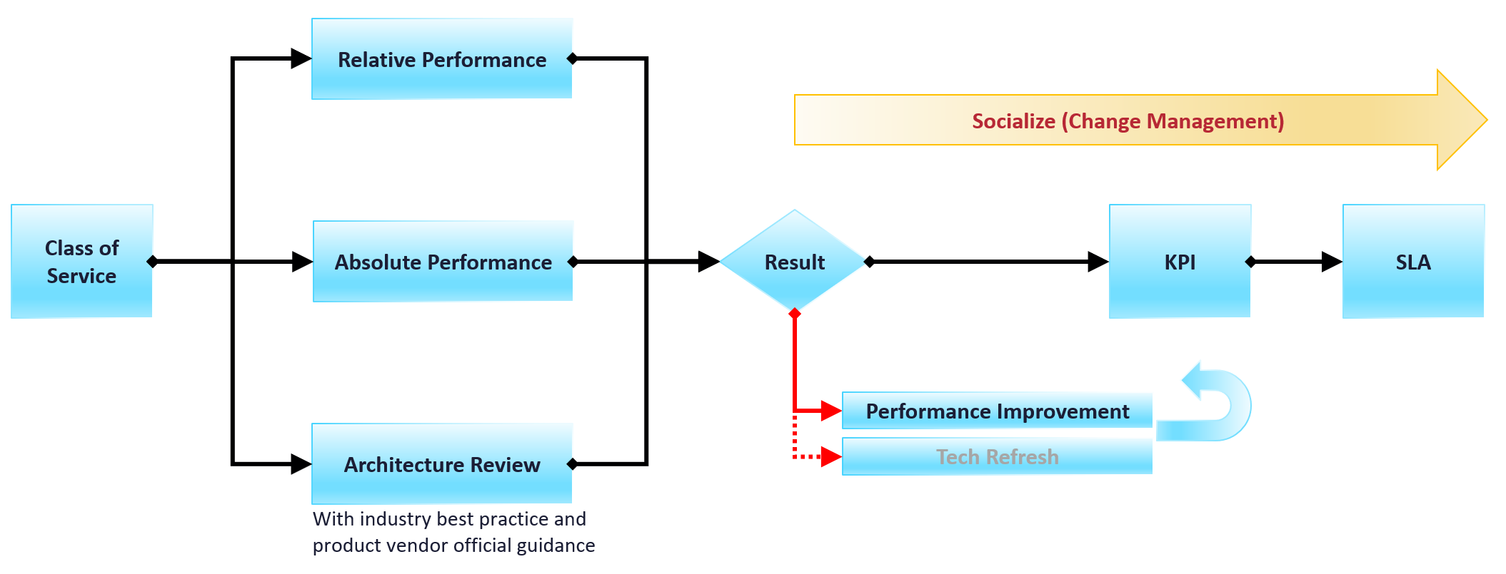
Do you have a performance SLA implemented?
If yes, that’s great!
-
Do you get complain from your customers? If yes, go back and follow the no performance SLA flow.
-
If there is no complaint, how is your actual SLA compared with your contractual SLA? The first one is what was actually delivered in your DC, while the contract is just a promise written on a piece of paper.
-
How is your promised SLA compared with industry best practices? If there is a room for improvement that both your customers want and your management supports, then it’s worth looking at the system and process to improve it. This may result in a technology refresh, reducing your cost while increasing both capability (availability, performance, capacity, and compliance).
If no, then how do you set? There are 3 factors to consider:
| Complaint | This gives the relative number, as complaint is subject to the person giving the complaint. Different people have different tolerance levels when it comes to how slow a system is. This is the most time-consuming, as most of the time there is neither data nor analyzis. You might have to interview the actual users one by one. In some political cases, you will need to get the business users, the application developers and the infrastructure team in a room or zoom. Compile the list of actual complaints. Analyze each complaint to ensure the problem is indeed with the infrastructure (and not application-level issue). If it is due to infrastructure, write down the actual metric or event that prove the problem. |
|---|---|
| Actual | This gives the absolute number, as it’s based on actual number. This number should be based on the 20-second peak, as the 5-minute average is not sufficient. |
| Best Practice | This comes from the makers of the product. For example, Microsoft has a guideline for disk latency for its SQL Server database |
2-level Profiling
Profile both “inside the VM” and “outside the VM”. The following diagram show the metrics of interest for each level.
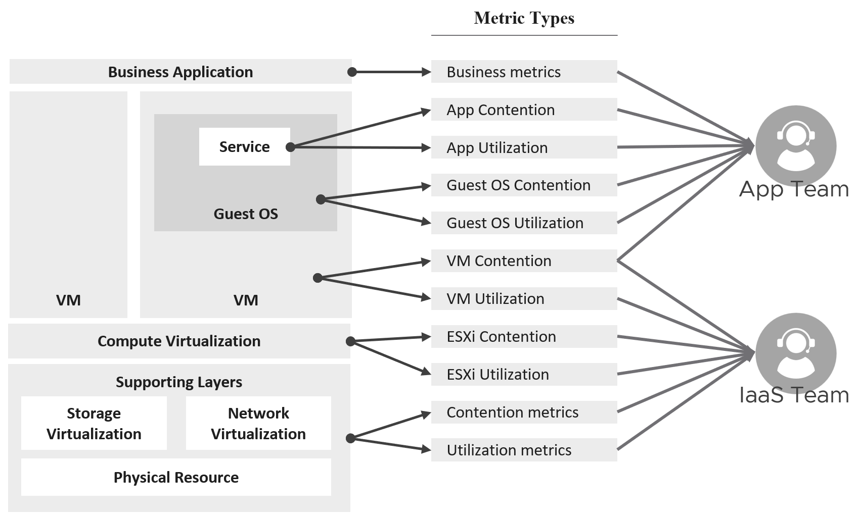
Time Factor
You definitely need enough data points per VM. I recommend 1 – 3 months so you get at least the month end business cycle.
| Period | Data Points | 99th percentile |
|---|---|---|
| 1 hour | 12 | These are too short a timeline as there isn’t enough data points, or it will not capture monthly peak. |
| 1 day | 288 | |
| 1 week | 2016 | |
| 1 month | 8765 | What I recommend so habit it formed. |
| 3 months | 26298 | Too infrequent. You may forget. |
Taking the worst value of 8765 data points can result in outlier.
I recommend taking the 99th percentile. This eliminates the worst 87.65 data points per VM if you take 1 month’ worth of data. That means ignoring the worst 7.3 hours of the month. As this can be significant, that means the data cannot be ignored.
How about maintenance, upgrade, and other exceptional activities?
They should not take up 7+ hours per month.
Outcome
What are the possible outcomes of the analyzis? There are 1 – 4 action items you can do. The action “align with best practice” include configuration changes, design changes and version upgrade.
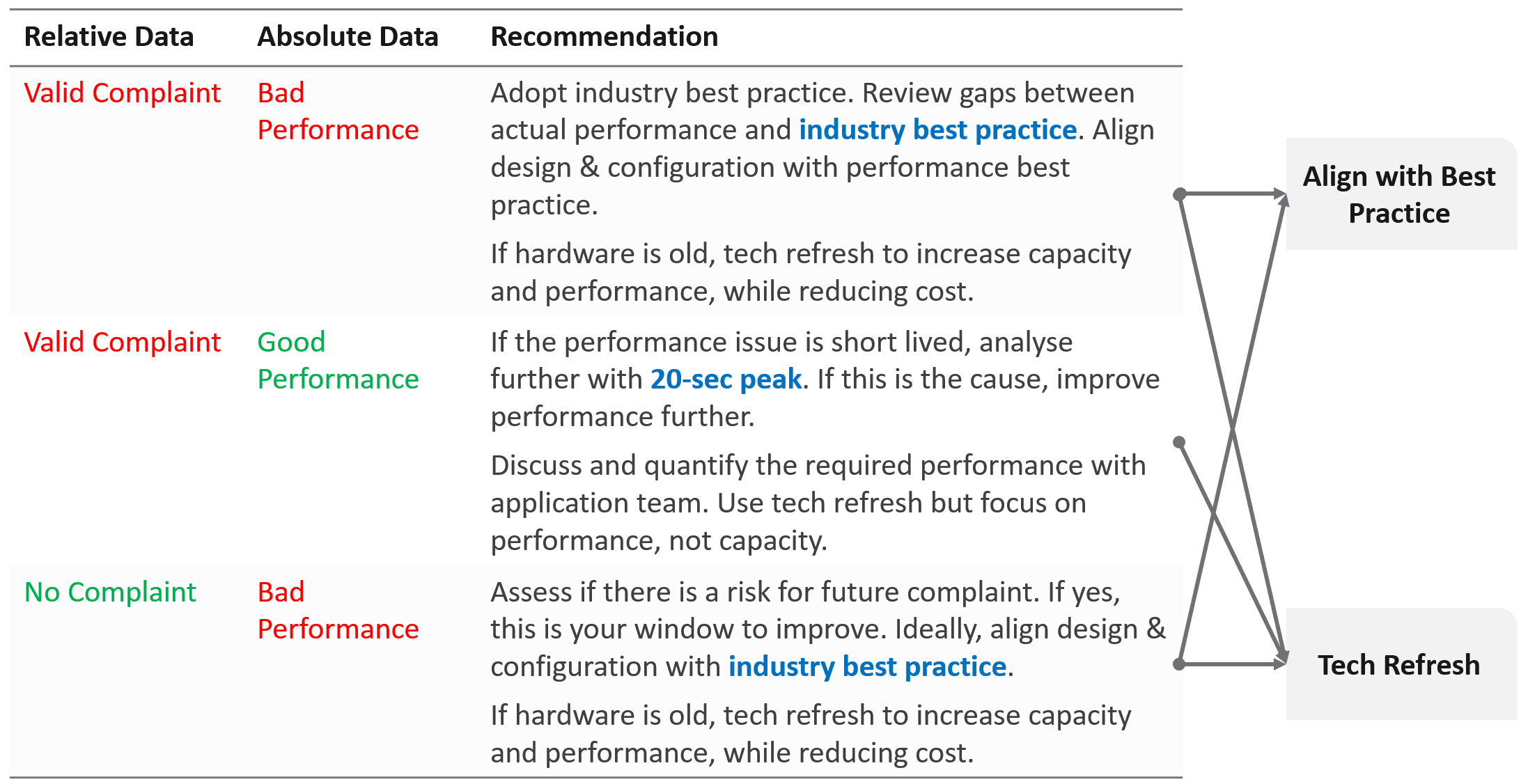
What if you have no complaint and the profiling proves the performance is good?
-
That’s certainly a good news. It is the ideal situation and you may not have to do anything. However, make sure you set expectation at the right level (balancing price/performance).
-
Proactively, check if present both performance & capacity are enough for future demand.
Complaint Analysis
Why do we start with complaint?
Because this is what the business experience.
End users normally complaint on 2 types of problems:
-
The system is down. This is easier to confirm as the proof is clear. You typically have log files too.
-
The system is slow. This is much harder as it’s subjective.
They don’t normally complain about the system is not secured.
The problems above can be major or minor. Major problems are easier to analyze, and they tend to be reproducible. You have many users, or many applications, or many VMs affected over long period of time. In this case, the problem is likely something common, and you can see the metrics.
Minor problem is hard to analyze. You likely need to interview the actual user. When you do, gather the following
| Time | This is not the time the complaint was lodged, but the time the problem actually happened. For example, the developer may complain at 12:34 pm that her application was slowed at 09:51 am, and it lasted 14 minutes. |
|---|---|
| VM | The VM affected. Ideally, this was analyzed by developer as the VM causing the problem, not the VM receiving the problem. |
| Analyzis | What is the root cause? If the actual cause is not directly related to the symptom, it needs to be explained as it becomes less convincing. |
| Proof | What’s the metric or event that prove that the root cause was indeed correct? The acid test is alert. The expectation from senior management is if the same problem happens again, you know right away. How can you know it right away? The alert. You set up an alert to trap the root cause. If your root-cause alert does not detect the problem, you have not found the root cause. |
Consideration
What things must you consider when doing the profiling?
| Resolution | Profile based on 5-minute average, not the 20-second metrics. This matches your SLA. |
|---|---|
| Scope | Profile Compute and Storage. Why is network not included? Network needs to be analyzed separately due to its nature as interconnect and not nodes. |
| Focus | Profile all the VMs, not just the VMs you care. This gives you the complete picture. The only time you exclude VMs is when you’re 100% sure they cannot impact the performance of the VMs that matter to you. Typically, this means the environment is physically isolated, including separate physical network and storage. For example, if there is a physical data center where you don’t care at all, you can exclude them. In large environment, split by Class of Service. The higher one should be performing better than the cheaper tier. You profile the VM, not the cluster or datastore, as that’s where the SLA is. |
Noisy Neighbour
I use the word Noisy Neighbour instead of “resource management” as it’s clearer in meaning. When you have enough overall capacity, but some consumers (VM, K8 Pod) aren’t getting what they are asking, you have imbalance in the shared environment. One major root cause of imbalance is noisy neighbour.
In a shared environment where there is practically no limit or control placed on consumer (e.g. VM, Container), you can get into Victim Villain problem. This is where a small percentage of consumer cause performance problem to others. It could be as simple as 1 constant consumer causing the problem to the same few victims, so you know who the villain and who the victims. It could be as complex as transient problems, where you can not even see a pattern. Both the villains and victims are random, and they may even trade position over time. Sometimes the victim is the villain, causing self-harm.
The real villain may not be the VM, meaning the real request of the load is coming from outside the VM. Windows or Linux was simply executing what a central command center asked.
The cause of the problem may not even be related to the symptom.
A story I remember well is the Head of IT Operations asked me to “find the b@$t@rd that did this to me”. He believed there is a villain VM in this environment that randomly attacked other VMs. The symptom is the victims became unresponsive, sometimes to a simple ping, but the problem always disappeared within 15 minutes. The victims were spread across multiple clusters, multiple datastores and multiple data centers. There is no pattern on the victim. They varied in size, and both Windows and Linux were affected. There is no pattern on the time, so he did not know when the next attack would be.
We did a lot of analyzis, working with both storage team (they were on EMC high end array) and network team (they have synchronous replication for mission critical datastores over Cisco switches and routers).
At the end, we found out it was the anti virus signature update. It was not randomized over long period. When hundreds of VMs were updated, the combined IOPS saturated the WAN link, reducing the synchronous replication. That basically paused IO commands, so the VMs were frozen.
What are the 3 knobs you have to control noisy neighbour?
-
Share
-
Reservation
-
Limit
We cover them in Configuration Management chapter. Go to the Resource Management section.
What knob is missing from the above?
Do you think Priority is missing? I think priority is too strong a knob. It gives 0% to the lower priority ask, which is not what you want. You still want each consumer to get something, which is basically what share does.
Let’s now apply the above knobs into the four main resource types. In future I hope to address GPUs as they have different functionalities.
Just like there are many nuances on metrics, there are also nuances in addressing noisy neighbours.
You will see that the settings are complex. Adding Resource Pools complicates further as you have another management layer.
CPU
Let’s begin with CPU as this is typically where the problem is.
| Control | Analyzis |
|---|---|
| Limit | There is a default limit, which is the configured CPU size of the VM or container. The problem with this limit is most of the time it’s too high, driven by cheap pricing. A VM that only needs 8 vCPU has a 32 vCPU configuration. Why? Because the buyer can afford it. |
Let’s take an example:
In the above example, all you need is a few 32 vCPU VM to create the problem. If you have 10 of them, there is a chance each fills up 1 ESXi host. This is why both overcommit ratio and maximum VM size are both in your pricing policy. While you can set a limit on the VM, it can result in unpredictable performance as Windows or Linux does not know that it can only really use a portion of the resources allocated. The limit is also applied in GHz, not vCPU. So the impact can vary each second as the frequency fluctuates. | |
| Reservation | Can you solve the above problem by reserving CPU to all the VMs? The answer is no. You can only reserve 25% of the configured capacity of each VM, because the overcommitment ratio is 4:1. That means a 2 vCPU VM is only given 1.25 GHz. This loosely translates into 0.5 vCPU only, not enough to run anything useful. One adjustment you might think of is to guarantee the first vCPU. So each VM gets 2.5 GHz, regardless of size. Since there are 400 VM, you reserve 1000 GHz. Your total capacity is only 1000 GHz, so the cluster is filled up. This actually exceeds your usable capacity, as you need to account for HA. On the other hand, you have 25% boost due to HT. Reservations become less effective as you increase the overcommit ratio. At 8:1 overcommit, you cannot guarantee more than 0.5 CPU worth of resource across the environment, on average. |
| Share | Share is per vCPU, not per VM. While a larger VM has more overall CPU shares, the share is not shareable among its vCPU. In the following example, the vCPU 1 of VM 2 does not get 2x the share as it does not benefit from idleness of vCPU 2 of VM 2.
|
IO cost the associated VM. A VM doing excessive network packet and disk commands may experience CPU ready if it runs out of share. The reason is the share is measured against CPU Used, and not CPU Run. CPU Used includes CPU System, which account for the work performed by hypervisor on the vCPU behalf. %USED = (%RUN + %SYS - %OVRLP) * Frequency Factor * HT Scaling Factor. Hence a high CPU System will eat the share of the vCPU. |
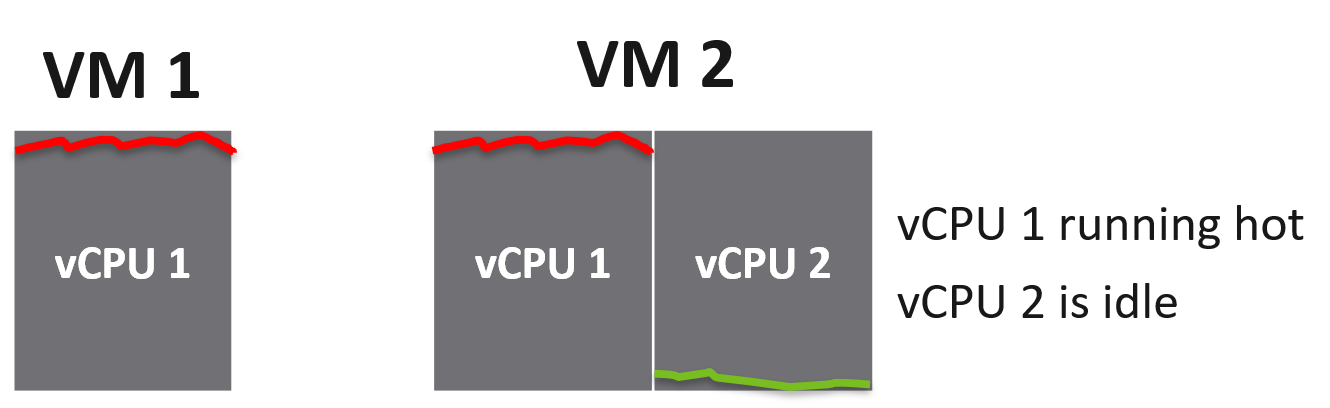
Memory
Memory is basically an extremely fast disk, such that you care about space more than speed. As a result, the memory utilization metric tends to be flat over time, both at the VM level and ESXi level. The exception here is transient VMs or containers. ESXi clears its consumed metrics when the associated VM is powered off. So in environments running Horizon Instant Clones, you get higher fluctuation.
Because of this flat utilization, the overcommit ratio is lower. This results in relatively less contention, and therefore problems. The problem with this solution is cost. You are basically paying for a lot of cache.
| Control | Analyzis |
|---|---|
| Limit | The memory utilization at both Guest OS level and VM level consist of mostly cache, pages that are not used. Since there is no limit within Guest OS, should you apply at VM level then? This carries the risk of memory contention, as the 2 layers are independent of each other. You need to track the memory contention closely if you are doing this. Considering the lack of real-time remediation solution, I’d recommend you stay away from this, and focus on right-sizing at the Guest OS level instead. |
| Reservation | Unlike CPU, memory reservation is “sticky”. Once the VM touches that page, it’s permanently reserved regardless of subsequent usage. The problem is the VMkernel does not know if that page is useful or not. As a result, I’m not recommending you use this. Unlike CPU, where you frequently go beyond 2 : 1 overcommit, you typically do not overcommit beyond 2 : 1. If you overcommit, tracks the VM memory ballooning counter for an early warning of memory contention. For your highest class of service, where you guarantee memory performance, there is no overcommit. Per-VM reservation becomes irrelevant when the entire cluster does not overcommit. |
| Share | See CPU, as the behaviour is the same (although the default share values themselves are slightly different). |
Disk
There are actually two types of metrics, as disk has both space (GB) and speed (IO and throughput). The speed dimension is more problematic as the limit is much higher and the spike is unpredictable. You can have either IOPS or throughput giving you problems.
Unlike compute, there is no defined upper limit by default. A VM can generate unlimited IOPS or throughput. This creates risk, as it can take just a single developer running IO Meter to saturate your shared storage.
Compared with compute, storage typically has more layers, as the actual storage provider is often outside the hypervisor. Even with hyperconverged storage like vSAN, the vSAN kernel module is a separate stack and you need to deal with the vSAN network. In the case of central storage array, you likely need to deal with a storage fabric.
Because of the separate layers, there are multiple points of control:
-
Non vSAN: VM, datastore, storage array. If the fabric has control, you can set it there also to throttle IO going into the central array.
-
vSAN: VM and vSAN.
The control for VMs can be seen below, which shows that I’ve set a 4000 IOPS limit and give Hard disk 1 a higher share value.
The problem is: should you set it? If yes, what numbers?
| Control | Analyzis |
|---|---|
| Limit | There is a limit for IOPS, which is per virtual disk. Can you see the challenge in setting this number? There are different variations (block size, read/write ratio, random or sequential). That means the resulting performance of 1000 IOPS can vary. The problem is your application team typically do not know this level of details. Guess who loses when you argue with your customer? If you set too low, the VM latency may go up. If you set too high, it defeats the purpose. Your central physical array may be saturated. For example, if your storage is supporting 2000 VM, if the limit of VM 1% of what your array can deliver, then it only takes 5% of the VM population (40 VM in this case) to saturate your storage. And this is assuming their IOPS are perfectly distributed across your disks. In reality, you have hot spots. For VMs, you can consider limit for the OS disk, if applications do not use it. This at least prevents rogue agents or system-level service for running amok. |
What about the control at datastore level (non vSAN)? SIOC provides 2 choices for congestion threshold. As you expect, both have their own pros and cons, else you just need the best and no need a choice. What about the control at a vSAN level? We certainly need to dive a lot deeper in this area, before applying limits to each virtual disk. What about disk space? How do you prevent your datastore running out of space when you overcommit? For thin provisioned, you can’t control when the disk space will be used. The only thing you can monitor is snapshot age. Remove them within a few days to minimize the risk of huge snapshot. | |
| Reservation | There is no reservation for VM Disk. See earlier screenshot listing 5 VMs in a table. None of the column show reservation. |
| Share | Shares come into play only when latency hits some threshold. Unlike CPU, the share does not care about the disk space size. Ideally, the control you want is IOPS per GB. So when you buy more capacity, get faster disk. The reason is when you sell disk space, it should come with a certain amount of IOPS and throughput at certain latency threshold. This is how you justify gold storage higher price per GB. |
Storage I/O Control
The control at the datastore level is for a different purpose. Storage I/O Control (SIOC) is a datastore-wide throttling. There is share and limit, but not reservation.
You can enable SIOC on each datastore, including local datastore.
Take note because vSAN has its own mechanism, SIOC does not apply to it.
Network
Network is the hardest to solve, due to its unique nature as interconnect. I cover it in-depth in vSphere Metric book. Read at least the section “Why Network Monitoring is Unique".”
Done?
Great, now let’s discuss how the noisy neighbour problem is harder in the network.
We start with a single ESXi, not distributed switch, as that’s where the villain VM is running. Let’s say the ESXi has 2x 25 Gb/s physical NIC. Total is 50 Gb although you typically count this as 40 Gb, giving you 20% headroom. In these 2 cards, you run both the VMK traffic (vSAN, vMotion, vSphere Replication, etc.) and VM. Let’s say you have 25 running VM on average. Assuming you allocate around 20 Gb for VMK, that leaves 20 Gb for 25 VM.
Now, a single villain VM can hit 10 Gb. For example, Hadoop worker node receives large amount of data over the network, sustaining 5 Gb over 300 seconds period. That leaves 10 Gb to be shared among the remaining 24 VM. Each only gets 400 Mb/s on average. If they are not network intensive, they may not feel the impact.
But the above calculation is done on 2 x 25 Gb network. If you only have 2 x 10 Gb, you increase your risk significantly. In a sense, it goes back to fundamental of capacity management, which is your overcommit ratio.
Review the following diagram, which shows a vSphere Cluster. Why is network missing on Resource Allocation?
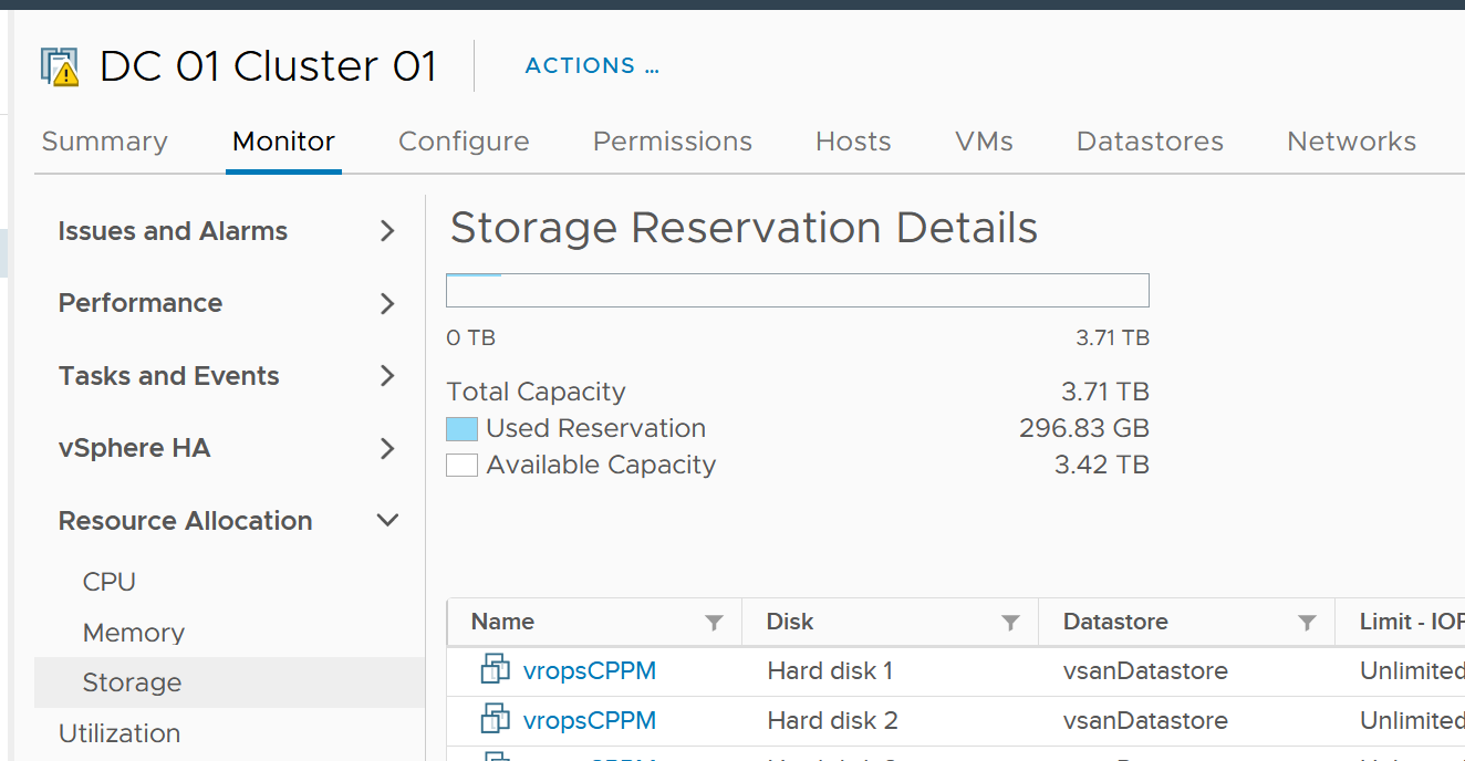
The reason is you configure it on the distributed switch.
Just like compute, you can set on each VM network adapter the shares, reservation and limit.
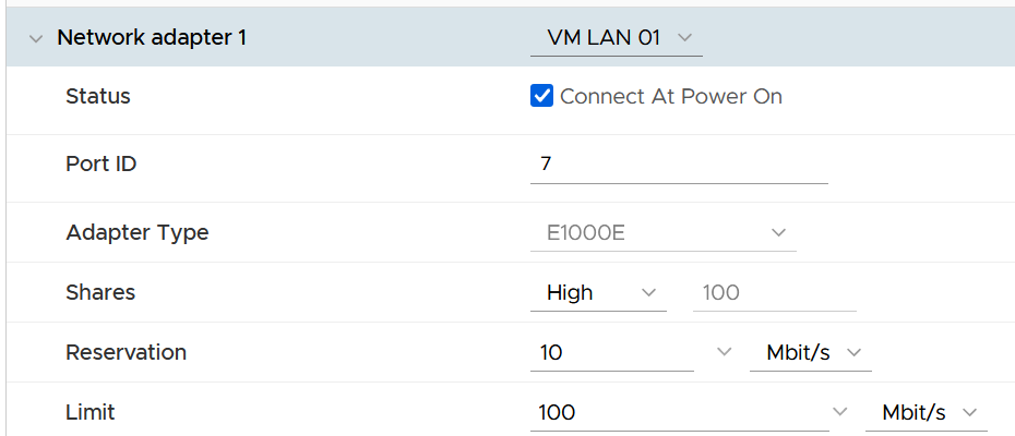
| Control | Analyzis |
|---|---|
| Limit | Just like compute and storage, if you set limit you need to ensure it’s high enough for the VM, yet low enough for the ESXi physical NIC card. So what number do you set? I think it should be 8 Gb/s. That’s good for the VM, while giving some buffer at ESXi assuming it sports 2 x 25 Gb/s physical NICs. There is also management challenge, as the settings are buried deep and set in multiple places. So at the end of the day, it might not be practical. |
| Reservation | If you have plenty of bandwidth, consider setting 100 Mb/s per VM. Use the metric profiling technique to arrive at number specific to your environment. |
| Share | The main thing you need to check is actually between VM and non VM. The share should be larger for production VM network and development VM network. Regarding VMkernel, it’s tricky. Is vMotion more important than vSphere Replication? What if you’re replicating a mission critical VM but migrating a development VM? |
Solution
So what can you do to avoid it altogether, instead of just minimizing it?
Well, if you overcommit, the answer is it is not possible. It’s like the highway. You overcommit the lanes, so during peak hour there will be some congestion. You can minimize the impact by having the right capacity planning.
Start with the right pricing policy.
-
It should be a function of your overcommit ratio. In a nutshell, your message to your customer is “if you all want to pay half price, there will be 2x as many of you as I need to break even”.
-
Have progressive pricing tier, so a 64 vCPU VM is not simply 64x the price of 1 vCPU VM.
If you do not charge, then use Class of Service as the policy. The size of the VM or Container is less in the lower class of service, as the class has higher overcommit ratios.
Educate your customers, and communicate clearly the different quality of service. For example, the following shows the SLA for memory.
| Class of Service | Overcommit | Performance Threshold |
|:--:|:--:|----|
| Gold | 1 : 1 | VM contention is 0% for 100% of the time in the entire month |
| Silver | 1.5 : 1 | VM contention is <1% for 99.99% of the time in the entire month |
| Bronze | 2 : 1 | |
Maximum VM Size
The following table provide guidance on the maximum VM size.
| Overcommit | Maximum VM Size |
|---|---|
| 1 : 1 | Maximum size = ESXi logical CPU. Logical means HT enabled. An ESXi with 48 cores 96 threads means 96 logical CPUs. However, take note of CPU throughput degradation and CPU NUMA effect. |
| 2 : 1 | Maximum 0.5 of ESXi logical CPU As there can be 2 large VMs running, they will feel the 37.5% penalty as each of them actually want the entire physical core. To avoid that, reduce from 0.5x to say 0.4x, giving 20% headroom. |
| 4 : 1 | 0.25x Same as above. You can have 4 medium size VM, each of them taking up 1 entire socket in a 2 sockets ESXi host. So a pair of VMs compete for 1 physical socket. |
| 8 : 1 | 0.125x. This level of overcommit is generally only suitable for lab, dev or simple VDI (where the desktop is 2 vCPU each). It’s not suitable where a lot of VMs are 25% of entire cores. For example, if your ESXi has 48 cores total, then avoid doing 12 vCPU VM. Keep them at 4 – 6 vCPU instead, so they can be slotted more easily in the cluster |
Other Reference
By the way, the noisy neighbour problem happens in non-VMware environment too, as it’s a function of overcommitment on shared resources. Here is an article about noisy neighbours in Microsoft Azure.
Capacity Management
Part 1 Chapter 3
Overview
“Good” Advice
Let’s begin with this as I keep seeing it in VMware-based environment. The scope of the advice is about a VMware vSphere Cluster, but the principle applies to others such as Kubernetes, VDI or AI.
Can you figure out why the following statements are wrong? They are all well-meaning advice on the topic of Capacity Management. We’re sure you have heard them, or even given them.
Regarding vSphere Cluster RAM:
-
We recommend 1:2 overcommit ratio between physical RAM and virtual RAM. Going above this is risky.
-
Memory Usage on most of your clusters is high, around 90%. You should aim for 80% as you need to consider HA.
-
Memory Active should not exceed 50-60%. You need a buffer between Active Memory and Consumed Memory.
-
Memory should be running at high state on each host.
Regarding vSphere Cluster CPU:
-
CPU Ratio on cluster “XYZ” is high at 1:5, because it is an important cluster.
-
The rest of all your clusters’ overcommit ratio looks good as they are around 1:3. This gives you some buffer for spikes and HA.
-
Keep the overcommit ratio to 1:4 for Tier 3 workload as they are not mission critical.
-
CPU usage is around 70% on cluster “ABC”. Since they are UAT servers, don’t worry. You should get worried only when they reach 85%.
-
The rest of your cluster’s CPU utilization is around 25%. This is good! You have plenty of capacity left.
Can you figure out where the mistakes are?
The mistake is they are simplified. Capacity may appear simple:
-
Can you architect a cluster where the performance matches physical?\
Easy, just don’t overcommit, or put 100% reservation for that VM.
-
Can you architect a cluster that can handle monster VMs?\
Easy, just get lots of cores per socket.\
Easy, just get lots of core in the box.
-
Can you architect with very high availability?\
Easy, just have more HA hosts, more vSAN FTT with failure domains spread across different racks, more NSX Edges.
-
Can you architect a cluster that can run lots of VMs?\
Easy, just get lots of big hosts.
-
Can you optimize the performance?\
Sure, follow performance best practices and configure for performance. Just be prepared to pay.
-
Can you squeeze the cost?\
Sure, minimize the hardware and software cost, and choose the best bang for the buck. You know all the vendors and their technology. You know the pro and cons of each.
But how to put all the above together that optimize cost, performance, security and availabiity?
Concept
Balancing demand and supply require you to look at these 6 components below. Steps 1 and 2 are done together, and the remaining 4 steps can be done in parallel.
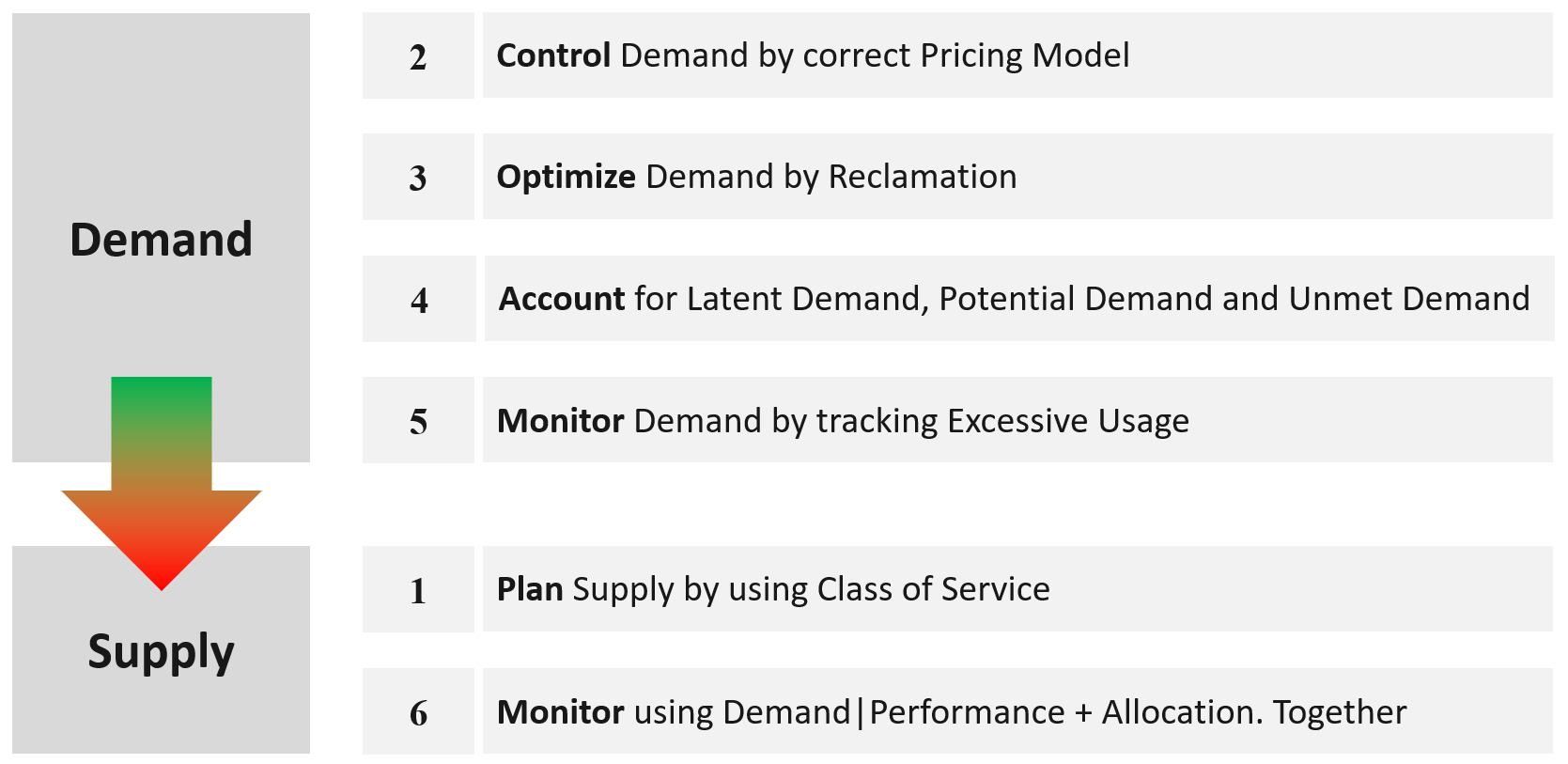
The above is less harder to do if you do it right from the start, which is why we need to begin at the planning phase.
If you start from Step 6 and ignore Step 1 and 2, you will play the lead role in a Mission Impossible movie, because you can end up with many over-provisioned VM issue. These VMs are typically the larger ones, and more important to the business. It is hard to solve this in production environment as it will involve downtime and the burden is on you to prove it will not have performance impact. Politically, it may make the team who sized the VM and justified the cost look bad.
Your best bet is to prevent the problem from happening in the first place.
VM impacts capacity in 2 ways:
-
Rightsizing
-
Reclamation.
Private Cloud Capacity
Your IaaS consists of 3 large components
-
Compute
-
Storage
-
Network
| Compute | It covers ESXi, cluster, resource pool, and physical server. It gets the most attention as the consumer (VM or Pod) runs in a cluster of ESXi host. It’s a good starting point, especially if you have 1:1 relationship between compute and storage. |
|---|---|
| Storage | It covers datastore, datastore cluster, vSAN, RDM, physical array, back up infrastructure, etc. It needs to be managed equally well, if you have many to many relationships between cluster and datastore. If you use vSAN HCI Mesh, then you also need to manage the storage portion carefully. |
| Storage Capacity differs to Compute Capacity and presents a challenge on its own. Unlike compute capacity, which is basically vSphere cluster, storage varies in shape. The two major ones are datastore and vSAN, as local datastore and RDM are rarely used. In addition, storage has thin provisioning at both virtualization layer and physical layer. We will discuss vSAN capacity separately as it has its own unique factors such as FTT, plus it needs to consider compute too. | |
| Network | It covers virtual and physical. It also includes switch, router, firewall, load balancer, etc. It is typically less of an issue for VMware Architect, as it’s typically done by the Network Architect. In addition, it’s common for ESXi to sport 50 Gb of bandwidth. So unless you run high bandwidth applications, such as networking VMs and web servers, running on the same ESXi hosts, you may not hit the limit. |
Stages
Capacity Management requires an end-to-end plan, typically spanning multiple years, not months. Why?
There are 2 reasons:
-
At the provider, the physical layers form a constraint. A rack, top of rack switch, cabling, cooling all have limits.
-
At the consumer level, production workload tends to live for several years, and they change along the way.
Such a long plan requires adjustment along the way, because at the end of the day it is about comparing the reality you face with the plan you set. Good or bad is relative to your plan. If you plan for no overcommit because performance is absolute and budget is not an issue, then you’ll never run out of capacity. In other cases, that could be considered bad as you could end up with a lot of wastage.
There are 4 phases of capacity management:
| Plan | Within this phase, you perform sizing and estimate how long the infrastructure will last. Depending on the project, you may even size a multi-year capacity up front. The longer the plan, the bigger the margin you need to allocate. Higher margin or buffer certainly increases the risk of excess capacity. As not all plans are confirmed, you may run multiple What If scenarios. This is the phase where you buy hardware. |
|---|---|
| Monitor | This phase starts after deployment. You begin tracking and compare the reality against plan. For example, you expect the capacity for your new DaaS project to last for 1 year. 3 months into deployment, you have 25% of your users consuming the DaaS. However, your overall utilization is already at 70%. This is a red warning, indicating your plan is off by significant margin. |
| Optimize | You optimize both the supply and the demand. To optimize supply, you typically perform a tech refresh. Newer hardware can bring 2x the capacity at the same cost. To optimize demand, you perform reclamation and rightsizing. |
| Upgrade | As the hardware reaches end of life, you either upgrade or migrate. The workload likely need vMotion somewhere else. This typically involves technology version refresh and design changes. |
Capacity Management becomes easier if you begin at the planning stage. This is where you define your offering, setting the price and performance expectation. Without expectation being quantified as metrics, your customers will demand high performance as you’ve promised them “good” performance.
e first place, by using progressive pricing. This is covered in the Cost and Price Management chapter.
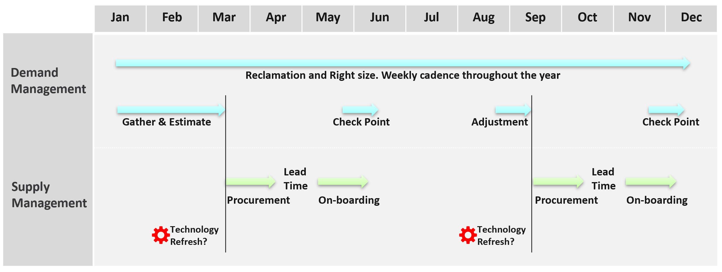
Discipline in capacity optimization is necessary due to excess wastage. Establish a weekly cadence that is executed regularly (depending on the size of the environment).
In large environment, set up upgrade cadence. Let’s take an example:
-
You have 1200 ESXi hosts. Hardware depreciation and warranty is 5 years, so you replace after 5 years. That means you replace 240 hosts per year. If you do a monthly cadence, you replace ~20 servers per month.
-
To balance between keeping variations low and harnessing new technology, you set the standard per year. Technology Refresh is an integral part, as new technology delivers both lower cost and higher capacity, not to mention faster performance and tighter security.
The Planning Stage
Capacity management begins long before hardware is deployed. It begins with a business plan, which decides on what class of service will be provided to serve which locations. Class of Service was covered earlier in SLA. You should also read the Performance SLA portion here, as it’s required when you overcommit the capacity.
| Input | Consideration |
|---|---|
| Location | The physical location, which could be data sovereignty or network latency requirements. |
| Cost | It impacts the architecture and location. |
| Class of Service | It’s related to the type of service. In addition to IaaS, you may have VDI, Database as a Service, K8 as a service, etc. |
| Security | It might require traditional physical or air gap separation. |
| Availability | This includes HA and DR. |
Depending on the business policy, you may have to comply with Business Continuity Policy or security policy. Examples:
Contain the security risk. Internet-facing VM and internal-facing VM do not share the same network. | |
| Environment | Other than production, you may need to provide test, development, staging environments. |
| What if an application needs to do a scalability test? A revenue-generating application going live may need to simulate their full load to ensure it can meet the sales demand. This scalability test can’t be performed in production environment. One solution is to triple purpose the DR cluster. It’s DR + Dev + Test, where test includes scalability test. This means the cluster size needs to be larger. If this is not possible, then burst to cloud, as it’s temporary workload. |
Group your operations by clusters or group of clusters. Take note that the vCenter Data Center object for example. It can contain clusters of different purposes. It will not make sense to combine the metrics into a single data center capacity remaining (%) metric, if the member clusters are not interchangeable.
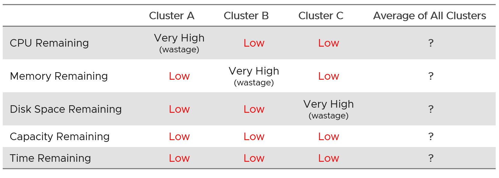
Architecture Plan
As you can see, it’s complex to balance all the above. To make it worse, what worked last year for you may not work next year as many factors change. Regardless, make an overall plan that lists all the input you need. In a large environment, list all the input considerations for vSphere Clusters.
From a capacity monitoring point of view, vSphere cluster is the smallest logical building block, due to HA + DRS + DPM. So it is correct to assume that we do capacity planning at Cluster level, and not at Host level or Data Center level.
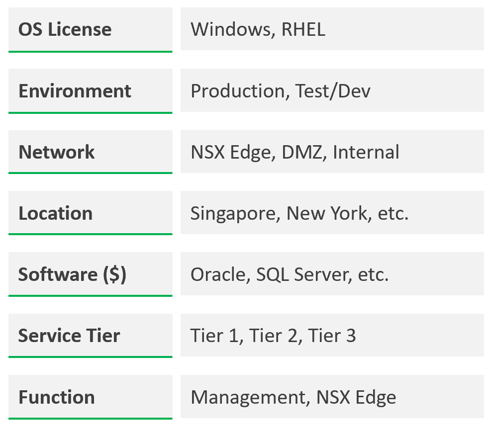
DR solution such as Site Recovery Manager impacts capacity as you need to consider both the DR test and actual DR.
Example
The following shows a VCF environment with just 2 physical locations but 18 unique clusters. It has 7 clusters for business workloads and 2 clusters for non-business loads (overhead).
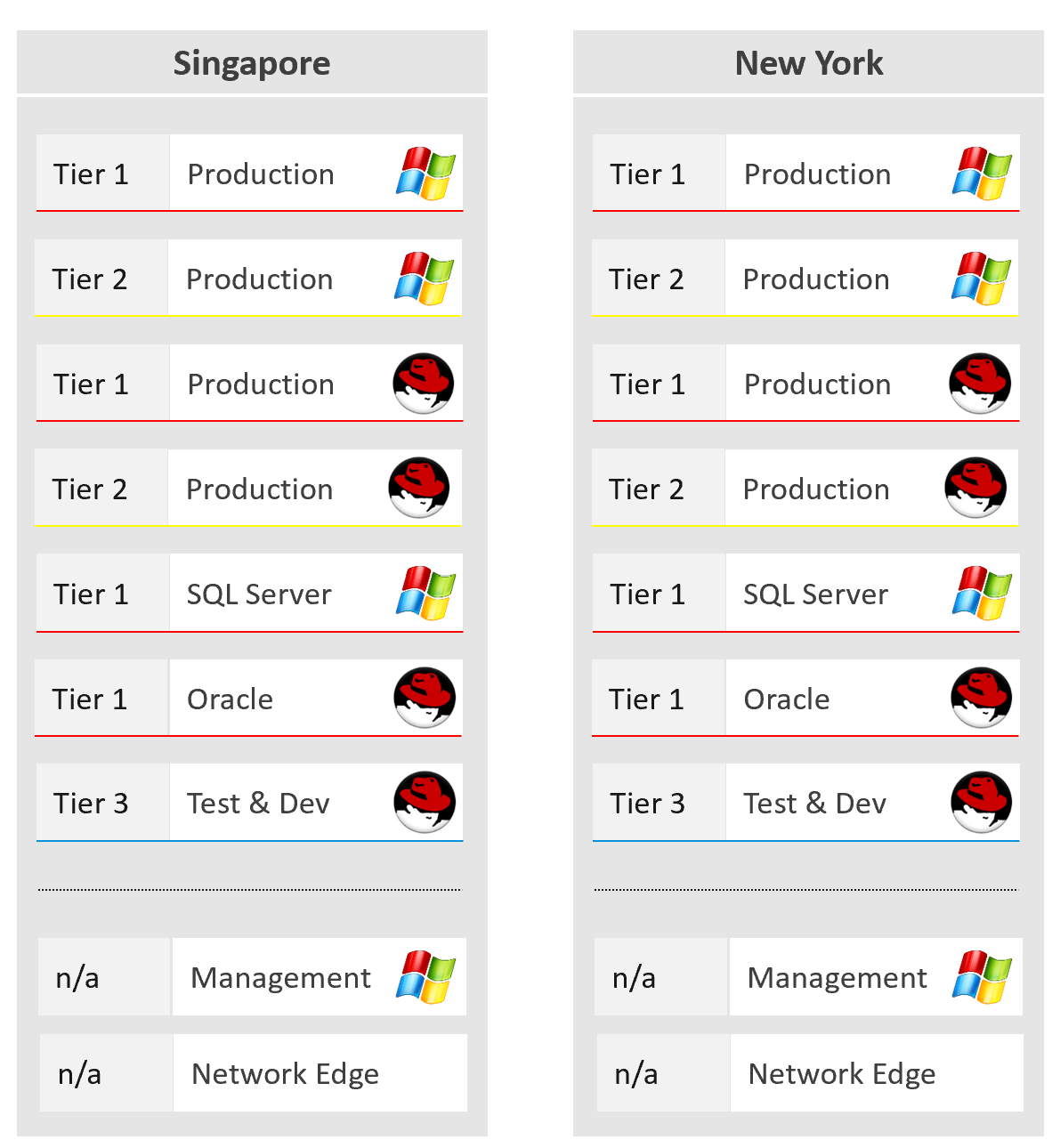
Optimized Capacity
Optimized Capacity means you fully consume what you bought, without wastage or compromising performance.
There are two areas where you can optimize:
-
Consumer
-
Provider
Consumer
In the consumer layer (process, guest OS, container, VM), optimize the following:
| CPU | Use CPU Run Queue as primary counter, as utilization should be 100% to minimize ping pong and NUMA. Make sure all the CPU is used well by check the CPU Usage Disparity metric, as some applications tend to gravitate towards the first 8 vCPU. |
|---|---|
| Memory | Utilization should be near 100% as it contains cache (majority of pages not active). Check page fault to see if there are excessive page fault. |
| Disk | Rightsize the filesystem. Note this requires Windows or Linux partition modification. Reduce the usage of RDM. If you do, and you use thin provisioning at array level, check for wastage using unmap. |
| VM | Imbalance cluster with low ESXi utilization can be caused by monster VM. Can the applications scale horizontally instead? |
| Container | Do you use 1 container per VM or multiple containers per VM? If it’s >1, how do you ensure one does not dominate the others, since their size is not capped. If you use 1:1, how do you prevent container sprawl? |
Provider
In the provider layer (ESXi, cluster, datastore & datastore cluster, distributed switch and port group, hardware), you can optimize the following:
| Compute | Reduce pockets of resources by using larger cluster, removing Host/VM Affinity and setting DRS to be fully automated. Avoid usage of Resource Pool. Increase supply while keeping cost the same by doing a technology refresh. Avoid usage of CPU pinning. Reduce reservation. VMs in the same cluster should have same priority |
|---|---|
| Storage | Use larger datastore to minimize island of buffers. Use local datastores for agent VM or applications that do not need HA. Reduce islands of datastores by consolidating datastores that are lowly utilized. |
| Network | Use larger physical pipe. For example 2x 100 Gb instead of 4x 10 Gb. Use load-based teaming. Remove unused network. While network is good for segregation, VXLAN or VLAN sprawl make both management and security harder. |
Capacity Model
Capacity is only possible if we can model it. That means defining the different types of capacity dimension. For each dimension, we need to define the formula for total capacity, usable capacity and consumption metrics.
4 Inputs to Capacity
Manage capacity by considering the 4 types of input below.
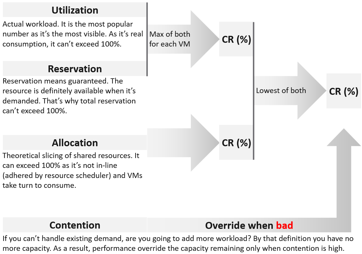
Use Reservation and Allocation to prevent utilization from going too high, and hence causing performance problem. Reservation is a stronger tool, as the kernel, DRS and HA honor it. So use it more carefully than Allocation.
Utilization and Reservation are in-line. Allocation is not.
-
Because they are in-line, they cannot exceed 100%. Unlike utiilzation, reservation only kicks in when it is needed.
-
Not in-line means ESXi and vCenter do not use allocation for actual resource scheduling. As a result, you can overcommit in allocation.
There are 2 levels of load:
| Overcommit | To prevent utilization from going to high, you are driven by contention. If it’s high, you stop adding new load regardless of utilization |
|---|---|
| In mixed class, use reservation to prevent overcommit from going too high. This in turn will prevent utilization from hitting 100% | |
| Not Overcommit | This happens in mission critical where the business value of the workload far exceeds the cost of infrastructure. |
The ratio between consumer and producer is 1:1. Both utilization and contention become irrelevant as each VM can get what it wants. Allocation is the only useful input. | |
| Reservation does not consider hyperthreading as it’s technically hard to determine the actual CPU cycles. For CPU, each thread in a hyperthreading only gets 62.5%. So the maximum reservation is 62.5%. |
Allocation is the metric you use when selling the capacity to your consumers. If you charge half price relative to full price, then your overcommit should not exceed 2:1.
Use Allocation when you want to protect the shared infrastructure from sudden spike.
The ideal scenario is the cluster is running at 100% utilization but 0% contention, because it’s working as productively as possible. You get your investment well used. This is why performance is an override, but only used when it’s bad.
Why is reclamation not included?
Because it only changes the capacity remaining (%) value when you reclaim the actual wastage.
However, wastage should be part of your SOP. It can impact your decision as wastage is prevalent. Capacity can be low, but if you can reclaim a sizeable chunk of wastage, you can defer hardware purchase.
Projection
At the heart of capacity is projecting the historical consumption into the future.
The following diagram shows why projection is superior to a simple percentile calculation.
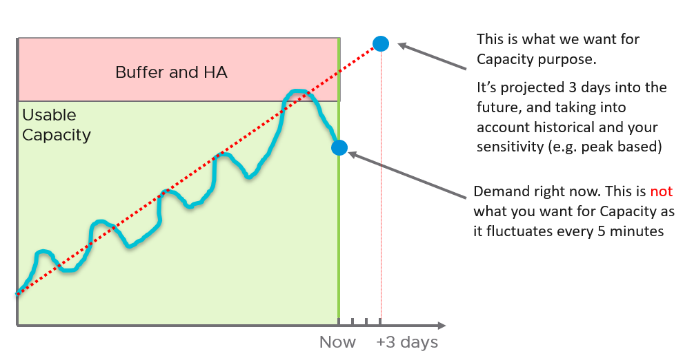
The accuracy of the prediction depends on the amount of data and the length of the cycle. If the data is limited and the pattern that matches your business cycles has not developed, the projection would not meet your expectations.
A workload with quarter end peak will naturally need at least 6 months for it to be accurate. If there is enough data, VCF Operations will consider 6+ months’ worth of data. While it gives extra weight to recent data, if there is a sudden but short-lasting change, it may not be enough to impact the projection.
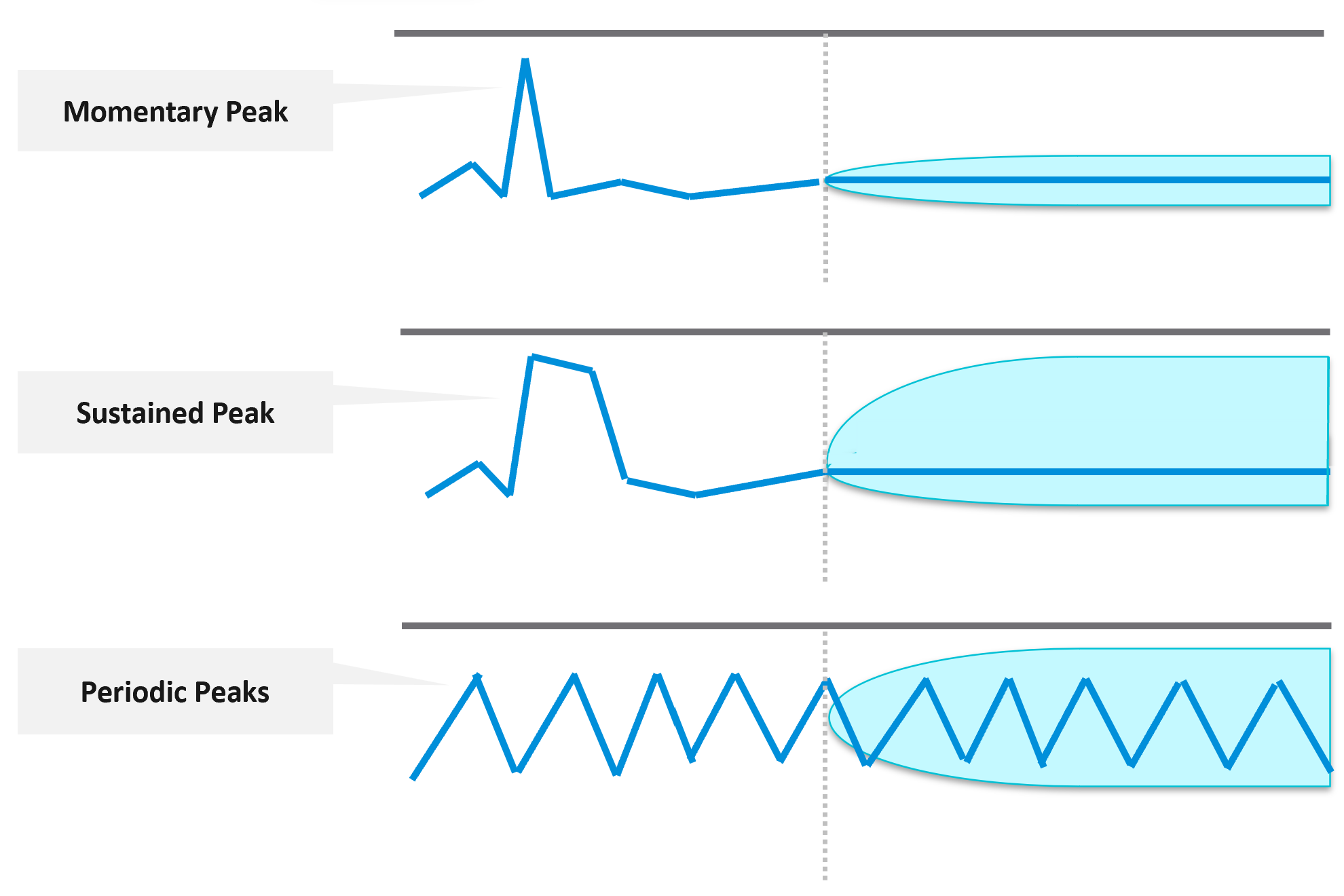
Momentary peaks that are short lived and one-off should not impact capacity planning so the impact may not be noticeable in the projection.
Sustained peaks last for a longer time and do impact projections. If the peak is not periodic, the impact on the projection lessens over time due to exponential decay. Data is exponentially weighted based on how far back in time they are, giving recent data points more important than older ones.
Periodic peaks exhibit cyclical patterns or waves, such as hourly, daily, weekly, and last day of the month. There can be multiple overlapping cyclical patterns, which will also be detected. While you should not make capacity decision based on just a few days of data, you do need the 5-minute granularity as input. A 5-minute peak that gets repeated every hour should be considered.
Exponential decay is important as newer data is more relevant, but it might make the projection visually odd. The following projection looks “make sense”, because your eyes see the whole period and give equal weightage to all data points.
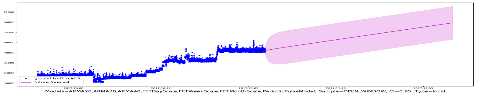
If you give higher weightage to newer data, it can potentially look like this.
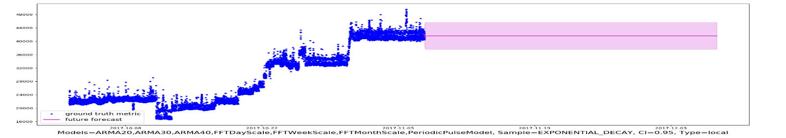
The projection algorithm is based on ARIMA, DFT, Spike and Plateau models. A year's worth daily aggregated (currently average) data is used, with more weight given to more recent data (this feature is called exponential decay). A limitation is it won’t handle workload with annual cycle.
Workaround
If you do not have 3 months and just need an overall sizing, consider using the 97th percentile value. Why 97th percentile? It's based on standard deviation principle. Two Standard Deviation away from the midpoint equals to 95%, and 3 Standard Deviation = 99.7%. 97th percentile hence provides a good balance between 2 SD and 3 SD. By and large, it captures just the right amount of peak and outlier.
Utilization
It reflects the actual, live usage of the resources. If utilization is high, it does not matter if the overcommit ratio is far below your target, the cluster is full.
If utilization is low and won’t go high for foreseeable future, that is not a good thing. Unless it’s a newly provisioned object that is yet to grow to its full usage, or disaster recovery protection, that indicates wastage resources.
How should we fit wastage in the utilization model?
The following is my recommendation. I divide the capacity into 10 equal chunks. That means the usable capacity is green when it’s around 40 – 80% used, with ideal target of 80%
What is the challenge of above implementation?
It’s only applicable for utilization-based capacity. It is not applicable in:
-
Reservation. Low reservation does not mean wastage.
-
Allocation. It is not something “real”.
-
Contention.
This means wastage cannot be used in the Capacity Remaining (%) metric as this generic metric may represent other dimensions.
Reservation
Just because you set a reservation does not mean it’s actually consumed. Reservation that is not yet consumed impacts capacity but not performance. Using a restaurant analogy, if all your tables are reserved but only 20% turns up, you have 0 capacity left but can easily serve all customers as the real demand is only 20%.
From the above you can tell that the demand metrics should not include reservation. On the other hand, you do need to calculate your restaurant capacity. That means you need 3 metrics
-
Utilization
-
Reservation
-
Sum of individual consumer Max (utilization, reservation). This is the metric you should use as the demand.
Let’s take an example of a restaurant with 2 floors.
-
The 1st floor is 100% filled up with diners.
-
The 2nd floor is 100% reserved.
What’s your capacity left?
The answer is 0%. You can’t take any more customers unless they are reservation holders.
Applying the above to vSphere, how do you know who are the reservation holders that are yet to consume what they are entitled to?
For compute, those are VMs already powered on but have not consumed CPU and memory at their reserved threshold. When you get to the actual metric, you will notice there is some complication we need to take care.
VM reservation has a positive impact on the VM performance, but a negative impact on the cluster capacity. It places a constraint on the DRS placement and HA calculation.
Reservation complicates operations because of 3 reasons:
-
It has 2 parts: allocated and used.
-
Resource Pool and its children VMs can have independent settings.
-
Reservation and Utilization need to be accounted together.
For storage, those are thin provisioned VMDK files that are yet to grow to their full size.
Use Cases
When do you use reservation?
I only see 2 use cases. Let me know if you have others:
-
To be more conservative with capacity.\
You want to manage the risk of performance problem from over provisioning. You can’t use the demand counter as the actual demand is not high enough.\
Total reservation from all running VMs cannot exceed cluster capacity. As a result, this this creates a suboptimal cluster as VMs do not use the entire assigned memory at the same time. The working set is typically much as smaller as the purpose of memory is cache VM Performance
-
To give different performance to higher class of service.\
You’re running mixed class of services in the same environment. To protect the higher-paying consumer, you give them higher reservation. Take note the correlation is not perfect. There is no deterministic correlation between VM reservation and VM performance. A VM CPU Ready does not improve 2x because you increase its CPU reservation by 2x.
Implementation
Now that we’ve covered the theory, where do you set the value? Do you set at VM level or at resource pool level?
Frank Denneman recommends in this blog article that you “create a resource pool and set a reservation at the RP level. If a reservation is set at the VM object-level it has an impact on admission control and HA restart operations (Are there enough unreserved host resources left after one or multiple host failures in the cluster?”
A limitation of the above is the reservation is not tied to the VM. If you operate a multi-cluster load balancing, ensure all member clusters have consistent settings.
Allocation
The total demand could be more than the visible demand, which is the active load that is consuming your capacity. There is demand that is not yet visible, because it has no utilization at present. Use the Allocation Model and buffer settings in VCF Operations to cater for this invisible demand.
The other use case for allocation is showback and reporting. There are typically restrictions such as contractual obligations or SLAs that mandate capacity shall not be overcommitted beyond an agreed upon ratio. Note these restrictions are usually non-technical.
Allocation model is less relevant when utilization or reservation is high enough that you worry about them more than allocation.
Allocation model also has usable capacity concept. Deduct the hypervisor overhead. This means VMkernel, vSAN, NSX, and vSphere Replication must be deducted from total capacity.
Invisible Demand
| Rare Demand | This can wreak havoc in a shared environment. A group of highly demanding VMs can collectively impact overall performance of the cluster or datastore. An example of this is annual sales. In this case, the capacity team should set an appropriate overcommit ratio and drive by allocation as the demand is low most of the time. A rare part of sudden demand is disaster, like stock market crash. It can’t be predicted. Whether your CIO wants to pay in advance for such rare thing is a business decision, not within the call of Capacity Planner. |
|---|---|
| Unexpected Demand | Many critical VMs are protected with Disaster Recovery. During a DR drill or actual disaster, this load will ‘wake up’ and consume. You should consider the Site Recovery Manager Recovery Plans into your capacity. Be careful with the complexity as 1 Recovery Plan can have many Protection Groups, yet 1 Protection Group can be included in many Recovery Plans. |
| Potential Demand | Many newly provisioned VMs take time to reach their full expected demand. It takes time for the database to reach the full size, the user base to reach the target, and the functionalities to be complete. Newly provisioned VM tends to be idle (which can be months) and may suddenly grow. If you have many of them, plan for their eventual size. |
| Unmet Demand | There are 2 parts to it: inside the VM and outside the VM. If the VM is undersized, the unmet demand will not be visible to the underlying infrastructure. Unless that is intentional, it is wise to include undersized VM in the cluster capacity monitoring. The visible part of unmet demand becomes part of IaaS KPI and SLA, covered in Performance Management chapter. |
Limitation
The allocation model has the following limitations:
| VM Size | VM size is not considered in the overcommit ratio. It assumes that scheduling two monster VMs is as easy as scheduling many small VMs. The ESXi scheduler can juggle higher number of small VMs than a few large ones, especially if they peak at different times. Utilization is completely ignored. The consumer part is simply based on the configured amount. In cases where there is additional workload, the allocation model can report lower capacity consumed than actual. |
|---|---|
| Overhead | Any form of utilization is not considered, including consumption because of virtualization. For example, software-defined storage such as vSAN actually puts the availability protection data in the same datastore with the actual data. So you end up with double the consumption inside the datastore. |
| IaaS Workload | Agent VM is included as part of demand as it takes the shape of a VM, although it tends to use local datastore. |
Overcommit
Overcommit is the main technique to reduce cost of shared infrastructure or shared service. So long the contention (real and risk) is acceptable, it reduces the cost to everyone. In daily life, queueing or waiting for service is common.
As a cloud provider, if you do not overcommit, you may not be able to compete on cost. Public cloud players (e.g. AWS) uses 1:1 overcommit for CPU but they count the thread (not just the core). They do not overcommit memory.
Some customers do procurement planning based on overcommit ratios. A comfortable overcommit ratio is determined, and that’s what is used to project utilization into the future. The overcommit ratio is intended to be a rough estimate of utilization, e.g. 5:1 CPU overcommit ratio means that on average each vCPU should only run 20% utilization else you will have contention.
Consider your SDDC overhead. Your overcommit ratio is smaller if you have kernel modules such as vSAN and NSX. For example, if VMkernel takes up 4 cores and 32 GB of RAM, deduct this from your capacity first, then you do your overcommit maths.
Cluster Capacity Planning
How do we put together the utilization, reservation, allocation and contention into a real-world example? Can this example include 3 class of services (gold, silver, bronze) for a more realistic implementation? Mixed Class is unfortunately common due to budget & environmental constraints.
To start, we need to quantify the relative value of gold vs silver vs bronze. Keep it simple, so it’s easy for tenants to understand the business values of each.
I recommend a 2x gap. It’s easier to explain to senior leadership and application team. Operationally, it’s easier to manage at scale than 1.5x gap or 3x gap.
2x gap means gold class is 2x better than silver class, and silver is 2x better than bronze. To achieve this promise, you put in place techniques such as reservation and allocation. You also guard the performance and keep the headroom accordingly.
Separate what you promise (or sell) and how you deliver that promise.
-
To the tenant, the gold class is 2x better than silver class. The chance of encountering contention is 0.5x silver. This is what you sell.
-
You prove to the tenant that you assign 2x reservation, have half the overcommit ratio, and has 2x the headroom. These 3 are the techniques as you can’t directly guarantee contention is half.
How do you implement the above technique?
The following table shows an example of. Notice the consistent 2x gap.
Why is Cluster overall utilization put at the bottom, with a blue line?
Because that is not an input, but an output. It is what likely happens when you set reservation and allocation.
Reservation
This is the only mechanism to protect higher class VM from lower class VM. For example, gold VM is priced 4x than bronze VM because it is entitled to 4x reservation.
Take note reservation is measured in Hertz, not vCPU.
Allocation
Allocation is only counted when the VM is powered on.
It is relative allocation, measured againsts usable capacity.
The CPU is based on thread, not core. So take note the performance degradation.
Take note the number for memory includes memory tiering, a new feature in vSphere 8. The overcommit is based on the physical RAM, meaning it does not count the NVMe device.
Contention
Contention means the cluster KPI, not the cluster SLA. The reason is the context is cluster capacity. You don’t declare the cluster full just because of a one-time performance issue.
Because if the cluster is unable to serve existing workload, capacity becomes 0, regardless of the other 3 numbers. Performance was covered in-depth in the previous chapter.
Why is the performance number lower than the performance SLA?
Because it is not the same number. This number is measured on a daily basis, not monthly basis. This means there is a 30x less margin for error. For example, Silver has a target of at least 99% per day, leaving only 14.4 minutes to fall below expected performance.
Utilization
It is relative utilization, measured againsts usable capacity. However, there is a limitation as the hypervisor overhead cannot be excluded due to dynamic nature.
For Gold, since you do not overcommit, there is a high chance that the utilization is well below 60%.
For Bronze, since you overcommit, the utilization becomes the upper limit. Do not go beyond this threshold as you run a risk of contention.
Stop Provisioning Threshold
As SLA is calculated at the end of the month, it’s a lagging indicator. It’s only useful for business reporting, not proactive operations. To complement it, you need to implement an early warning system that tracks in real time (or maximum every 5 minutes). You need to know when to stop provisioning, as you don’t want to make the matter worse and eventually breach SLA.
In fact, knowing when to stop provisioning is also too disruptive for your operations, if VMs are provisioned via self-service. What do you do for VMs already in the queue of being provisioned?
You need a predictive metric, a leading indicator showing that the risk is getting higher. This enables you to still provision those VMs in the queue, or better still give 1 week worth of heads up.
| Class of Service | Stop Provisioning | Early Warning |
|---|---|---|
| Gold | When overcommit reaches 1:1 | Not applicable, as there is no overcommit. Use the actual allocation to start procuring new capacity. |
| Silver | When any VM in the cluster experiences VM Contention >1% in any given 5 minute | Cluster Consumed > 95%, or Cluster Balloon > 1%, or Cluster Swap + Compress > 0% |
| Bronze | As above | Cluster Consumed > 95%, or Cluster Balloon > 2%, or Cluster Swap + Compress > 1% |
Template
I’ve created a Microsoft Excel spreadsheet to help you plan capacity based on the above model. Download here. | 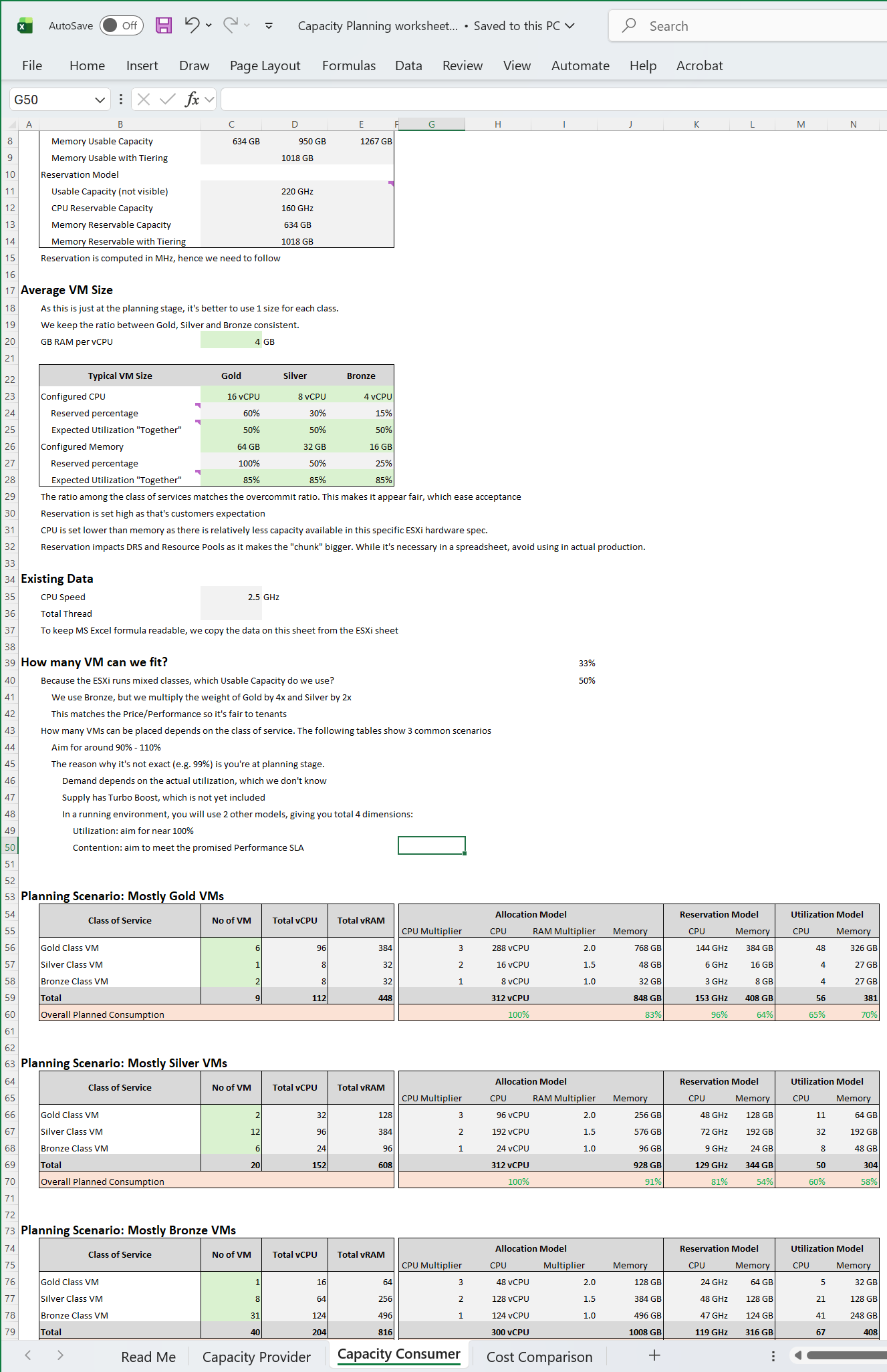 |
|---|
Once you open the spreadsheet, the first thing you need to confirm is the size of your ESXi host.
The spreadsheet comes with default values that I think provides a good balance between cost and size.
Reclamation
It is only applicable when VMs are free. When VM is the main source of budget for IT department, the responsibility to reduce VM cost will naturally shift to the application teams as infrastructure team will not want their budget reduced.
Reclamation delivers many benefits, and some of them are listed below
| Area | Benefit | |
|---|---|---|
| Unused VM | CPU Memory Storage | This delivers the highest benefit, but it’s also hardest to find as the VMs may not be idle nor undersized. They appear like an active VM. Improve on the underlying IaaS capacity and performance. Savings on storage only happen when you delete the VM. |
| Oversized VM | Memory Storage | VM Performance. Especially if Guest OS does a lot of CPU context switch and VM size exceeds whole box total core counts. The rest of benefit is the same with Idle VM as the portion you’re reducing is idle. |
| CPU | The oversized part is idle. So it only benefits allocation model. | |
| Idle VM | Memory Storage | Cluster Capacity, especially if you use allocation model. Cluster RAM as idle RAM pages tend to occupy ESXi memory. One quick way to free up is to reboot the VM. Negligible savings on CPU demand as idle loop hardly occupies real CPU cycles. Savings on storage only happen when you delete the VM. |
| CPU | Idle VM only saves you from allocation model. | |
| Powered off VM | Storage | Datastore Capacity |
| Orphaned VMDK | Storage | Datastore Capacity. Does not impact cluster capacity |
| Snapshot | Storage | Datastore Capacity. |
| Unmapped | Storage | Datastore Capacity |
There are 5 areas of reclamation, from the easiest to the hardest. Naturally, the logic differs for each.
Non VM files are the easiest, because they are not owned by someone else. They are yours! Non VM objects, such as templates and ISOs should be kept in 1 Datastore per physical location. Naturally, you can only reclaim Disk, and not CPU & RAM.
An orphaned file is a file in the datastore that is no longer associated with any VM. Orphaned VMs and orphaned VMDK’s are not even registered in vCenter. If they are, they may appear italicized, indicating something wrong. They may not have owners too.
For orphaned RDM, look from the storage array if there is any ESXi mounting it. You need an adapter for the specific storage you want to monitor.
Snapshots are not backups, and they do cause performance problems to the VM if kept for extended periods of time. Keep them only for the purpose of protection during change. Once the change is validated as successful, keeping the snapshot does a disservice to the VM. A Snapshot is easier to reclaim, hence VCF Operations lists them separately.
Reclamation Approach
Active VM is politically the hardest, as they serve business workload. Focus on large VMs first. Take on CPU and RAM separately as they are easier to tackle when you split them. Divide and conquer. If you reduce both, and application team claim performance impact, you need to restore both. Claiming CPU and RAM from small VMs can be futile, regardless of idleness. An idle VM with one vCPU cannot be further reduced. Focus on the large VMs, for the reason covered here.
Focus on Monster VMs
When reducing oversized VM or powering off idle VMs, focus on large VMs. Let’s take an example for comparison:
-
Reduce 20 large VM. Average reduction is 10 vCPU.
-
Reduce 100 small VM. Average reduction is 2 vCPU.
In both scenarios, you reclaim 200 vCPU. But the large VM option delivers more benefits and is easier to realize. Here is why:
-
Every downsize is a battle because you are changing paradigm with “Less is More”. Plus, it requires downtime, which requires approval and change request process.
-
Downsizing from 4 vCPU to 2 does not buy much nowadays with >20 core Xeon.
-
No one likes to give up what they are given, especially if they are given little. By focusing on the large ones, you spend 20% effort to get 80% result.
-
Large VMs are also bad for other VMs, not just for themselves. They can impact other VMs, large or small. ESXi VMkernel scheduler has to find available cores for all the vCPUs, even though they are idle. Other VMs may be migrated from core to core, or socket to socket, as a result. There is a counter in esxtop that tracks this migration.
-
Large VMs tend to have slower performance. ESXi may not have all the available vCPU for them. Large VMs are slower as all their vCPU have to be scheduled. The counter CPU Co-stop tracks this.
-
Large VMs reduce consolidation ratio. You can pack more vCPU with smaller VMs than with big VMs.
Powered Off VM
Compared with orphaned VMDK, Powered Off VMs are harder to remove, as there is now an owner of the VM. You need to deal with the VM Owner before you delete them. This is where tagging them with the owner email or Business unit would have been useful. We discussed proposed tagging in Chapter 1, specifically here.
There are different techniques to define power off:
-
Non Stop. In this technique, you want the VM to be continuously powered off. A quick power on to check something in the VM will remove the VM from powered off list.
-
Percentile. In this technique, you can turn on the VM for a short period of time.
Each technique has their own pro and cons. VCF Operations use the non-stop as it is safer.
Powered Off as Brake
Why do cars have brakes?
So they can go faster!
Take advantage of Powered Off as the brakes for your Idle VMs. If you treat Idle and Powered off as 1 continuum, you can power off the Idle VMs earlier. You get the benefit of CPU and RAM reclamation. It’s a safer procedure too, as you can simply power it back on if you find that the VM is actually being used.
One major caveat if you do this, is the average utilization of the remaining VMs in the cluster becomes higher. As a result, you may not be able to achieve the overcommit ratio needed to break even.
2 Sides of a Running VM
There are two reclamation formula for running VM (idle or not). The formula is complex as it has 2 different stages:
| Before | Determine if the VM falls under the category. For example, does the VM qualify as an Idle VM? This should look inside the VM, as that’s where the workload runs. Measuring at the ESXi level could yield incorrect results because:
|
|---|---|
| After | Determine what can be reclaimed. Since what is being reclaimed is ESXi resources, the usage inside the Guest OS is irrelevant. The queue inside the Guest does not impact the hypervisor, so there is nothing to reclaim at the ESXi layer. All metrics are from ESXi. Guest OS metrics are not applicable as we’re not reclaiming from inside the Guest. |
So you need to apply 2 different types of logic.
Idle VM
By definition, idle means it’s not doing useful business workload. A VM that is doing only non-business workload (e.g. AV scan, Windows regular update) should be considered as idle. This non-business workload is hard to detect via unless you have process-specific whitelisting. This is also not fool proof as some non-business software uses Windows or Linux system services as proxy.
Idle VM is a great target, as you can now claim CPU and RAM when you power them off. You cannot claim disk yet as you are not deleting them yet. Take note that you are not reclaiming real CPU cycle as it’s idle to begin with. Idle VM does not actually consume any ESXi CPU cycles. So reclaiming a 10 vCPU VM running only 1 vCPU does not give you 9 vCPU. You are reclaiming blank air. For memory, you will reclaim real ESXi memory as idle VMs tend to have its consumed memory remained on ESXi.
Idle VM has a default threshold of 100 Mhz. This means 5% utilization in a single vCPU VM running on a 2 GHz ESXi. This also means 0.25% on a 20 vCPU on the same ESXi. The reason for static is idle by definition is absolute, not relative to the VM size. Oversized VM is relative.
While a VM uses CPU, RAM, Disk and Network, we only use CPU as a definition for Idle. There is no need to consider all 4, and require all 4 to be idle, because they are inter-related. It takes CPU cycles to process network packets and perform disk activity. Data from the network card and disk must be copied to RAM before processing, and the copying effort requires CPU cycles.
Take note of a corner case limitation of VM with runaway CPU, where CPU is high but no meaningful memory access, network transmission (TX) and disk processing. Idle VM will fail to detect it. It’s a corner case, hence I think it’s not worth the complexity. Also, the CPU runaway typically happens on a process, which likely a single threaded. Use the CPU Usage Disparity (%) metrics to detect that.
Idle has to be defined so it’s measurable and not subjective. Declare it as a formal policy so you don’t end up arguing with your customers.
VM that is rarely used can appear idle, if you measure idleness over a long period of time. For example, if a VM is only productive (from business viewpoint) for 2 hours a week, that means the remaining 166 hours should be classified as idle. That’s 98.8% idle.
To counter the above, you want to evaluate idleness on a daily basis. A VM has to be idle every single day for ‘N’ number of days. This daily calculation is stored in the counter Idleness Indicator. It is a rolling counter. That means it is calculated every 5 minutes, but each value takes the last 24 hours of data. This is better than calculating only once a day so that VM does not have to wait before it gets declared as idle or not.
As you can see in the following example, its value is only stored if there is a change. This makes it easier to see when and if it changes.
Now that you have it daily, it’s a matter of rolling up to the whole period (default value is 7 days). We set the value to just 7 days so you can see the calculation result within a week. Note that we set to 100% and we ignore newly provisioned VM.
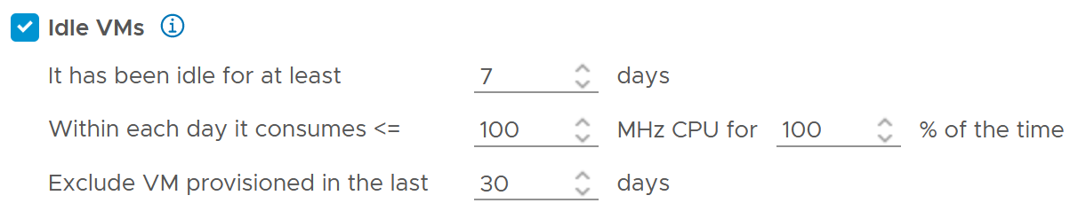
Think of the various situation before extending from 1 week. For example, a VM has been in production for a few years. A new version of the application has been developed, and this VM is being decommissioned. The VM goes idle. As the application team does not inform infrastructure team, the VM will take at least 7 days before it’s marked as idle. If you change that to 1 month, it will take longer.
On the other hand, a month-end VM that processes payroll can be idle for 29 days.
The counter that covers the whole period is called Reclaimable Idle.
It is a daily counter, that’s set to 1 (true) if the VM meet the idle criteria.
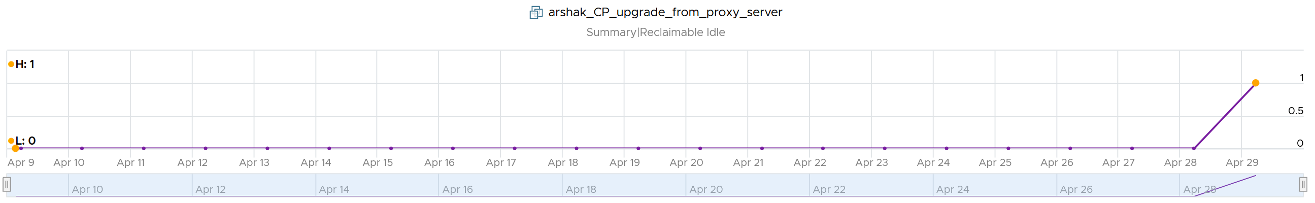
To list the idle VM, you need both metrics to be true.
Why can’t you just use Reclaimable Idle?
Because it’s a daily counter. You can mistakenly assume a VM is idle even though it’s recent activity shows it’s not idle anymore.
In some environment, it can take time before a newly provisioned VM is used. Check the creation date of the VM before powering it off.
Have we got all cases covered?
Nope. There is a corner case, where you tighten the definition (say from 100 MHz to 50 MHz). What was Idle may no longer qualified for idle. We can recalculate the daily metric, but this consumes performance. So to be safe, we will restart again from Day 1. So if the Idle Window is 2 weeks, customers have to wait 2 weeks.
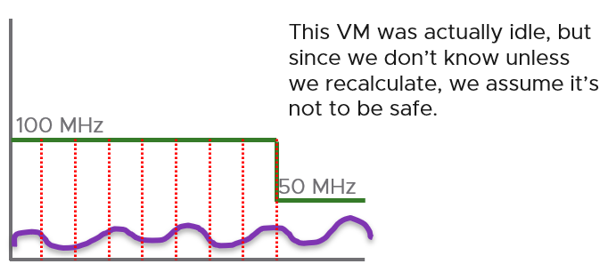
Oversized VM
Oversized VM has a different logic than idle VM since the Idle VM definition does not depend on the size of the VM. The Idle VM definition simply measures if the VM is generating enough workload or not. Idle is about GHz, while Oversized is about %.
Oversized VM depends on the size of the VM. A 64 vCPU VM running 7 vCPU is oversized, while an 8 vCPU running 7 vCPU is not.
| VM Is undersized | Calculated based on CPU & RAM total capacity and recommended size values. If for at least one of the containers (CPU or RAM) the recommended size > total The lowest value for increasing the CPU is 1 vCPU and for memory is 1 GB |
|---|---|
| VM is oversized | The VM is oversized if it is possible to reclaim a CPU or Memory. Calculated based on CPU & RAM total capacity and recommended size values. |
| VM Reclaimable CPU | Calculated based on socket counts and core counts of VM = Minimum (( reclaimable Sockets * cores Per Socket + reclaimable Cores In Remaining Sockets), CPU Core Count - 2) Will not suggest the reclamation if the CPU Reclaimable value < MHz Per Core value |
| VM Reclaimable Memory | = total Capacity – recommended Size Must be ≥ 1 GB and the remaining capacity after reclamation should be ≥ 2 GB |
Limitation: the implementation in VCF Operations is based on projection, not a mere 5-minute or 1 day data. So if you power off an oversized VM, it remains considered as oversized until it passed the definition.
Cost of Oversized
More CPU, memory and disk do not translate into faster performance. In fact, it carries additional overhead.
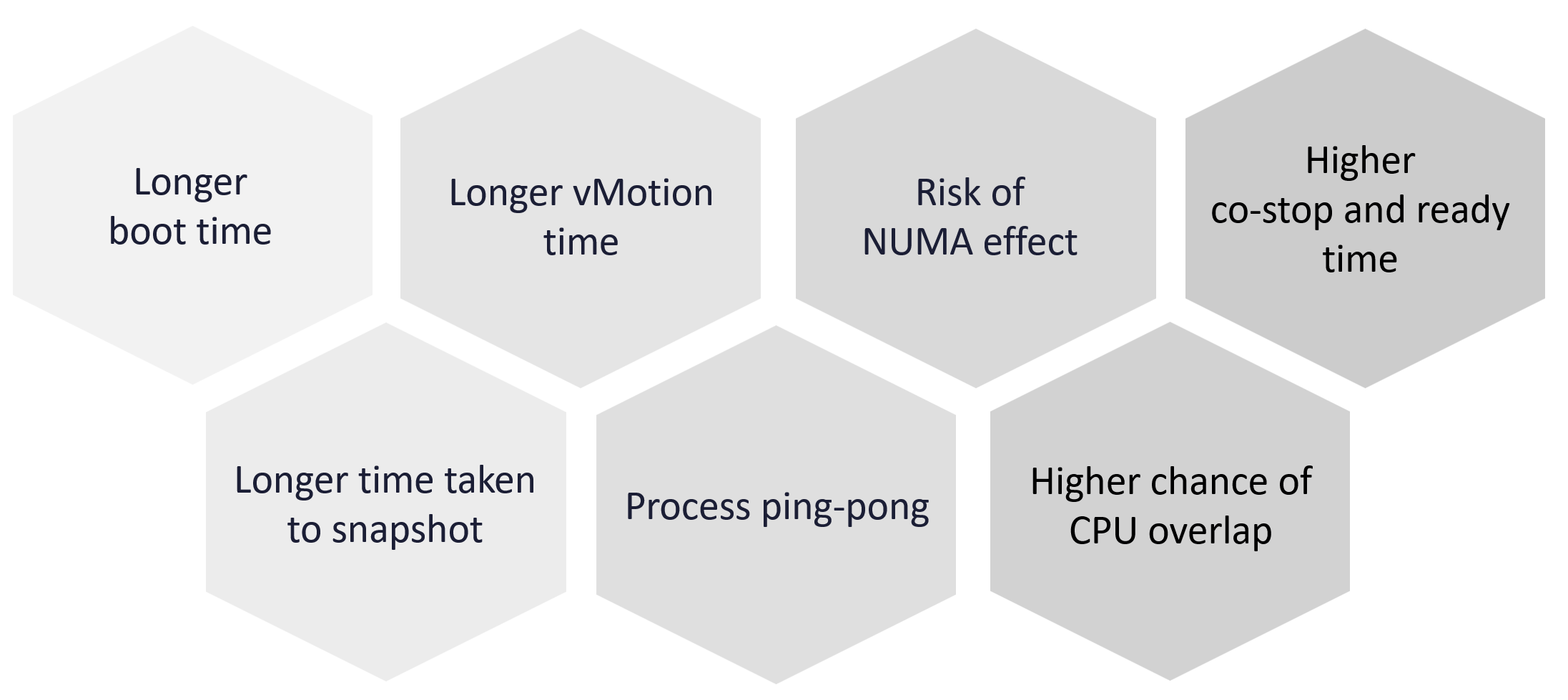
TRIM and Unmap
When Guest OS delete files or parts of it, it does not replace the value with 0 and just leave the block. This is more efficient and also enable recovery. But this cause the underlying VMDK to grow. The same thing happens at the array level. This is where Trim and Unmap come in.
VCF Operations tracks the unmap operations via 2 metrics at ESXi Host. The first one is Unmap IO, which tracks the number of unmap SCSI instructions. For example, if the value is 100, that means ESXi has sent 100 requests of unmap to its datastore. So think of it like IOPS, except the IO is not writing/reading actual block, but more of a request to delete (unmap) the block in the back end array. The value is the sum of 20 seconds since vSphere reports per 20 seconds, then averaged over 5 minutes. In the example below, you can see the host sends unmap commands frequently in the last 30 days.
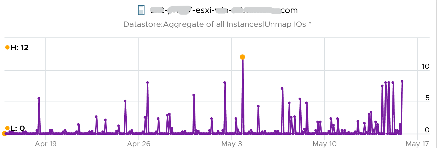
The second metric is Unmap Size, which tracks the total unmapped space from the operations above. The value is shown in MB.
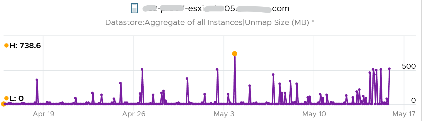
You can track both operations on each datastore, but you can’t aggregate them per datastore.
For further reading on TRIM and Unmap in vSAN, read this detail article by Patrick Kremer.
The problem only happens on thin provisioned disk. So if you want to check how much space you can reclaim, create a view that compare the value inside the Guest vs the value shown at VMDK level.
Unused VM
Unused VM is not idle, but they do not provide business value anymore. The application team may have stopped using it, but left the application running just in case they need in the future. The VM is not idle as it still generates CPU activity. The activity can be business workload, IT workload, or both.
This makes unused VM much harder to find, as what works for VM 00001 may not apply to VM 10000.
The IT workloads take many forms. Guest OS upgrade, Guest OS patches, and application patches can be 3 different workloads with different patterns. VMware Tools patches, anti-virus scan, intrusion detection scan and agent based back up are other common examples. In an environment with high security, there can be many security related agents running. Or worse, they can be agentless, executed via network.
Business workloads can be batch jobs, reports or monitoring. No one is using the application anymore, but the application continues running. It could be generating report and send email to someone who just ignore that emails. This is harder to identify than the one running pure IT workload as it’s more unique.
Unused VM is hard to detect as the infrastructure team lack the business context, and the patterns vary widely. The owner verification is required before you power off the VM. This is why it’s important to have ability to relate a VM to a department or owner. We discussed the necessity of business-centric infrastructure in Part 1 Chapter 1.
There are some checks you can do to find the unused VMs when their CPU usage is not low. Find VMs that exhibit multiple of these behaviours. Take note that each of these can be false positive, so you need multiple of them for more accurate conclusion.
Configuration
Configuration is easier to interpret than utilization, as they tend to have clear cut rules. The following list some configuration items you can consider.
| Isolated | It’s no longer connected to a virtual NIC, so it’s not communicating with other machines. |
| Guest OS | It’s running older version, especially those nearing End of Life. It indicates the application team may have written a replacement applications running somewhere else. Running old version of Windows, Linux and/or Kubernetes. Expired license. Temporary license. |
| Application | It’s running older version, especially those nearing End of Life. It’s running application that you no longer license. In this case, there is urgency to power it off. It’s running without license, or with evaluation license, or expired license. It has no business application installed. Just base OS + IT security applications. |
| Owner | It belongs to a folder in vCenter that is no longer owned. Unable to figure out the tagging for the VM. Request to contact the owner has gone unanswered. Owner has changed organization. |
| Report | The application is no longer listed in any of the reports to the department owning it. This could be performance report, capacity report, compliance report, chargeback report, etc. |
| Location | It runs on a cluster that is due for decommission. It is stored in a datastore, that sits on an array that is due for decommission. Its folder has names like “old”, “decommissioned”, and “archived”. |
| Relationship | The VM is talking to other VMs. You can check which services is talking at which port. Check what services it’s using over the network. This is useful for VMs in the cloud, which uses cloud services from AWS, Azure, etc. As these neighbors could also be unused, using this alone is not reliable. |
| Alert | Alerts associated with VM have disabled. |
Utilization
| CPU | While usage is not idle, or even high, it’s the same CPU. There is very little context switch, indicating the same processes are running. If the CPU Usage Disparity (%) metric is stable, that indicates constant run. |
|---|---|
| Memory | While the In Use metric is high, it’s passive. There is lack of paging, both in and out. |
| Disk | While IOPS and throughput are not low, its filesystem is stable, rarely changing in both size and activities. The IOPS and throughput also eventually form a pattern over the long run. |
| Network | The network it belongs to is no longer reachable, or has been isolated. That means access to it is non-existent or highly restricted. The VM sends very little packets out, indicating it is not talking much on the network. At the same time, it’s only talking to a fixed and small group of other servers. Take note that secure applications that store data typically are restricted. |
| It belongs to a VLAN that is due for decommissioning. | |
| Log | The amount of logs or Windows Event is much lower relative to its peers. The pattern is also predictable over time. |
Other Signs
| No login | No one has ever logged into the Guest OS, be it from UI or the console (e.g. SSH into Linux) for a long time. If user log in, it’s for a very brief period of time. |
|---|---|
| Process | It’s the same set of processes that are running. The number of processes also remains steady and predictable. The process that takes up the most CPU is not business software. It’s system process or IT application. |
| Availability | It never gets rebooted, or it gets rebooted often. Essentially, it seems like no one cares about its state. Reboot happened during business hours and no one complained. |
| Performance | Severe performance issue and you don’t get a complaint. If someone owns it, you will get a formal ticket if the performance is terrible for a long time during business hours. At night, a VM can experience slowness for 1 hour and no one may notice. |
Bottom line, what can you do if you are unsure?
You’ve announced to everyone that the VM would be deleted if no one claims it repeatedly, yet no one replied. Anything safer you can do than powering off the VM, as powering off disrupts the running process and close opened files? Powering off does not guarantee that it can be brought online successfully.
You have 2 choices:
-
Disconnect it from the network. This makes the VM isolated, without shutting down the application. If it’s used, the VM Owner will know it.
-
Apply CPU limit to it. This slows down the VM. The VM Owner will feel the impact and complain it’s slow.
When you do that, ensure you tag the VM or move them into a “Unused VM” folder. If these unused VMs spans multiple vCenter servers, use VCF Operations custom property. If there are many of them, create a dedicated dashboard so you can see them at a glance.
Annual Stocktake
Unused VM is hard to detect. If you don’t have the VM owner, perform a stocktake on those unidentified VMs.
Stocktake is applicable if your IT business is not profit oriented. This means it applies to internal IT department even though you have chargeback as you aim to be a good corporate citizen.
The stocktake actually starts from Day 0, where VM is being requested. Make expiry date mandatory, to catch those temporary VMs. For permanent VM, set it to 1 year. If you set beyond 1 year, you increase the risk of change of owners and you lose the contacts. Reorganisation can result in the department or team owning the VM no longer exist. What was meant to be permanent VM suddenly becomes unused VM.
You need to have a process to keep unused VM in check. Have a simple process so that you can get an agreement from all your customers. As business owners may not know the VM name, include the following information
-
Hostname. Take the one from inside the Guest OS, not from vCenter.
-
Application name
-
IP Address. They may login with IP address and it rings a bell to them.
-
Guest OS name and version.
-
vCenter Folder name. This should be the business unit it belongs to. See Part 1 Chapter 1.
-
95th percentile utilization in the last 3 months.
-
Any other information and context you think will help them remember it’s their VM.
Rightsizing
What do you rightsize? Not all objects are relevant for rightsizing. Take for example, an ESXi host. Once you buy it, you rarely change the size over the lifetime of the server. Same with datastore and vSAN.
Typically, what you rightsize is VM and Kubernetes.
Let’s dive into VM. Why so many oversized VMs?
Over Provisioning is a common malpractice in real life SDDC for these reasons:
| Legacy | Physical machine was P2V, bringing its configuration as it is. |
|---|---|
| Cost | The price is low for the business paying for the VM. The private cloud is either free or much cheaper than public cloud. |
| No progressive pricing. An 10 vCPU VM costs exactly 10x of 1 vCPU VM | |
| Education | The mindset that bigger capacity means better performance is hard to change. |
| Vendor | Some sizing is dictated by the vendor owning the commercial software. They will not support if you deviate from it. |
Challenges
Taking away resources from VM owner is notoriously difficult. The political science part is harder than the rocket science part.
| Fear | Will it be slow after the VM downsized? |
|---|---|
You need to prove, using metrics, that there is no performance degradation. What if the slowness is caused by other factors? It is possible that other factors other than CPU or memory were the actual culprit. How do you prove it? | |
Solution: Establish a formal and transparent process where VM owners can see their VM performance and usage pattern before and after. The comparison should span 1 month just in case there is month end peak. | |
| Paid For | If the VM was already paid for, how do you position it, so the original size did not look like a mistake by other people in their planning? You don’t want to come across correcting other departments. |
Solution: Project them as the real hero that saves the company, and the infrastructure team as just the facilitator. | |
| Micro Burst | This is the hard part. Some applications have sharp but short CPU bursts. They only last a few seconds, so a 20 second averaging fails to show them. |
| Highly volatile burst typically does not apply to memory. | |
Solution: Collaborate with VM owners since they have business transaction level monitoring. Use the 2 second metric in VCF 9.1. |
Micro Burst
In the following screenshot of Windows Performance Manager, the 2 CPU shot up to >80% for just 1 – 3 seconds.
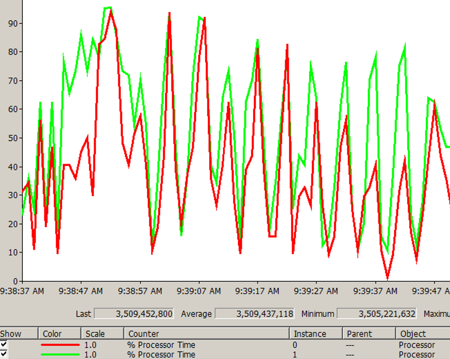
The data point above is per second. If you average the number over 20 seconds, it will show 50%. If you downsize to 75%, you will likely have higher CPU run queue.
There are 2 main approaches to identify the applications:
-
By default “No”.\
The onus is on the application team to inform the infrastructure team that their application has short and sharp CPU burst.
-
By default “Yes”.\
The infrastructure team conducts a company wide scan. Since agent cannot be used, your choice is esxtop, VCF Operations 9.1, or build your own adapter. Since 2 seconds results in high amount of data generated, limit the number to 1000 data points to avoid impacting the system being monitored.
Best Practices
| Hardware | Map to the underlying hardware (CPU, RAM) architecture. AMD EPYC and Intel Xeon use an 8-core block. |
| Performance | Rightsizing is not about capacity. The capacity is there to ensure performance, especially during peak times. |
Solution: Include contention metrics in the formula. For time-sensitive business transactions, measure at this level and Guest OS level. Track contention before and after downsize change to prove that there is no impact. Have a dashboard that any application owner can use. | |
| Collaborative | Agree upfront on the metrics and methods to quantify performance. Ideally do this before relationship turns defensive. |
| Agree on the date of the change. Make it a joint execution. | |
Solution: Make a dashboard where everyone can see Before vs After for each VM that was rightsized. | |
| Show big picture | While a few VMs may not attract the attention of the C-level leaders, the total may be financially significant. |
Solution: Show a company wide number showing the excess. Report regularly and send it to all stakeholders. | |
| Encourage small | Small VMs are immediately provisioned, available via self service. Larger VMs require more justification and management approval. They are also subjected to regular review of their consumption. |
Solution: Progressive pricing. Discount for small VMs is subsidized by premium pricing of large VMs. | |
| Application-aware | Certain applications such as Java VM and databases manage their own memory. |
| Kubernetes Node does not run applications directly. They run containers, which in turn run the processes and threads. | |
Solution: Exclude them from the standard formula. Work with the DBA or K8 SRE. |
The Big Picture
If you have thousands of large VMs, how do you communicate easily to your senior management that many of the large VMs do not use the CPU given to them in the last few months?
You need to present a convincing chart, that shows the utilization of hundreds of large VMs (which you defined as having > 16 vCPU) every 5 minutes, so a short peak is not excluded in your presentation.
The first thing you need is to create a dynamic group that captures all the large VMs. Create 1 group for CPU, and one for RAM. You then plot their utilization, every 5 minutes, in the last 3 months.
In a perfect world, if all the large VMs are right sized, which scenario will you see: scenario 1 or 2?
Both scenarios show the average CPU utilization of the large VMs.
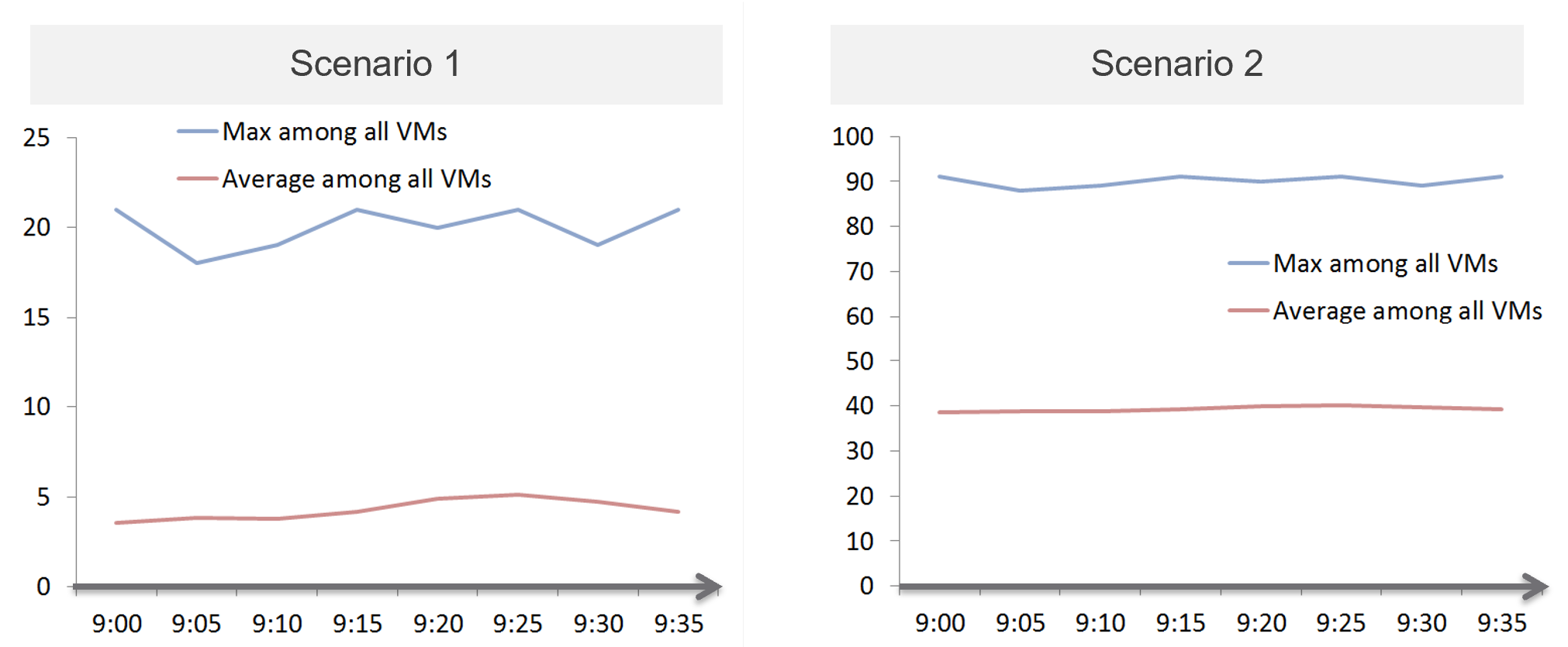
That’s right. Scenario 2.
Because the group has hundreds of members, there is a good chance that one of the large VMs is using the CPU given to it. On average, they should be hovering around 40 – 50%, as at any given 5-minute interval, some may be idle while others may be busy.
The technique we use for both CPU and RAM are the same. I’d use CPU as an example.
Once you create a group, the next step is to create two supermetrics:
| Maximum() | Maximum CPU Workload among these large VMs. You expect this number to be hovering around 80%, as it only takes 1 VM among all the large VMs for the line chart to spike. If you have many large VMs, one of them tends to have high utilization at any given time. |
|---|---|
| If your Maximum line is constantly ~100% flat, you may have a runaway process. To find out which VM, list the VMs and set the 95th percentile of the time period you’re interested. The runaway VM will be at the top showing 100%. | |
| If this number is low, that means a severe wastage. | |
| Average() | Average CPU Workload among these large VMs. You expect this number to hover around 40%, indicating sizing was done correctly. |
| If this chart is below <20% all the time for the entire month, then all the large VMs are oversized. |
Why is it not needed to create the Minimum?
There is bound to be a VM who is idle at any given time.
The 2 line charts show us the degree of over provisioning. Can you tell a limitation?
It lies in the counter itself.
We cannot distinguish if the CPU usage is due to real demand or not. Real demand comes from the application. Non-real demands come from the infrastructure, such as:
-
Guest OS reboot.
-
AV full scan.
-
Process runaway. This can potentially result in 100% CPU Demand if the application is multi-threaded. How to distinguish a runaway process from legitimate high workload is the challenge.
Progressive Pricing
How do you prevent oversized VM to begin with?
Hint: why doesn’t cloud providers like AWS have oversized VM issue?
They have no issue as it’s good for their business. In fact, their profit margin is higher on oversized VM.
One effective solution is progressive pricing. We cover this in Part 1 Chapter 5 Cost & Price Management.
If you do not charge for VM, then you’re left with official approval and corporate policy. For example, the bigger the VM, the higher the approval chain. You can also make the form more complex, needing more justification for monster VM.
Regardless of the pricing, make sure each VM has life span. While they can live forever, they are subjected to annual confirmation that they are still required by the business.
Start Small?
Considering the above problem, how do you prevent the problem to begin with?
One idea is to give every VM a minimal size regardless of their requirements. As this standard is small, majority of VMs will end up needing an upsize over time. So you need to be prepared for CPU Hot Add and memory Hot Add.
There are a few things to consider before taking this approach:
-
It goes against the service provider business model. This is classic System Builder, where IT acts as the infrastructure architect, getting involved on VM sizing discussion. Ideally, you use price as your primary lever for sizing, as you may not be familiar with the load of their applications.
-
Upsizing logic is more complex than downsizing. You need to consider NUMA impact on performance. The maximum size also depends on the ESXi hosting the VM.
-
It can be abused. A synthethic load can be added in the code. Counter this by having a continuous and long-term monitoring.
-
Upsizing needs to be more responsive. While application team can tolerate weeks before you downsize their VMs, they probably want their VM to be upsized within the same day. And if performance is affected, they may even ask for it to be done within an hour or so.
Before vs After
Since you’re reducing CPU and/or memory, it’s essential to show the key statistics before and after the changes.
CPU
The overall utilization should remain the same. If the CPU cycles drop (in GHz), increase the share instead of adding back the vCPU.
If the usage was spread across all CPU, the remaining CPU will likely show higher utilization.
If the usage was uneven, the remaining CPU will show similar utilization. In the following Windows machine, the CPU basically took turn to run.
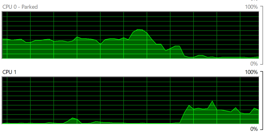
The CPU run queue should not go up. It should remain the same. If it does, check the thread states metric.
The CPU context switch should go up, if the application runs many threads. Ensure the increase is negligible.
Memory
When memory is reduced, you will likely see less free memory, and more active swapping.
If the VM is large and suffers from NUMA, the Local NUMA metric should go up. This should improve performance, especially on memory intensive applications.
Using Microsoft Windows as an example, you will likely the Available (MB) metric drops. This is fine as the memory is not used. It is not deleted as deleting it serves no purpose as there is no demand.
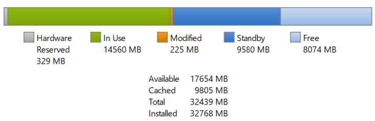
Other Changes
Changes in CPU and memory utilization can be caused by disk and network demand. Ensure you’re comparing apple to apple by plotting disk IOPS, disk throughput, network throughput and network packets/second.
Logic
| Rule | Description |
|---|---|
| It’s not just utilization | It needs to consider unmet demand. CPU wants to run, but it cannot. Memory has lots of page faults in Guest OS memory. |
| It’s not just demand | Size base on what the Guest OS needs to perform well, not just base on what it demands at present. Applicable for RAM, where Guest OS can’t operate optimally without buffer. In capacity, we size not just for demand, but also for performance. While we can satisfy the demand for memory with just the In Use, it might come at the expense of performance. The only thing faster than memory is CPU. So make sure CPU is not waiting for data. This is done by caching as much as possible, as it's hard to predict what pieces of data is required by the program. |
| Includes peak | Consider the busy or peak period, because that’s when the VM needs to work the most. |
| Consider big picture | A single 5-minute burst is too short a timeframe to determine the entire next 3 months. Consider long term pattern. This alone makes sizing an art, as you need to know the nature of the workload. |
| Excludes IT load | Exclude the time when the Guest OS is not doing business workload. There are a few IT workloads that cause high utilization. Common ones are Guest OS reboot, Guest OS updates, anti-virus full scanning, agent-based full back up. So long as these tasks don’t prevent the Guest OS from doing useful work, you can exclude them. The exception is when your VM needs to run at these non-business hours too. So it depends on the VM. This is the hard part, as it requires awareness of the footprint (read: process name) |
Sizing upwards and downwards should have identical consideration.
-
The only difference is they have different boundaries. The lower boundary applies to downsizing, and the upper boundary applies to upsizing.
-
For downsizing, Guest OS needs a minimum amount of RAM to operate.
-
For upsizing, consider the NUMA boundary. Also, a VM should not be larger than the total number of logical processors on the ESXi Host, else it won’t even boot. In fact, it should be smaller as you want to account for the VMkernel overhead.
As you can see from above, sizing is complicated. And the above is just Guest OS. We have not considered other things that need sizing such as Containers and Business Applications.
The art of sizing has 2 parts: time and metric.
-
First, we calculate the value for a given point in time. The correctness of the input value matters, else you have GIGO effect.
-
Second, we plot thousands of these values over time, and project it over time. The projection has to consider the peak cycle, meaning it has to be geared towards conservative sizing. It also has to consider the business cycle. If you have annual sales, then consider annual data.
Migration
The arrival of the cloud makes migration more common than before. While the destination differs, the sizing methodology does not. There are many examples of migration. Popular ones are:
-
From old DC to new DC.
-
From on-premises to cloud. This is typically VMware-based cloud as you can simply move without changing VM. Examples are Amazon VMC and Microsoft AVS
-
From Cloud to on-premises. This is typically due to high cost. It’s hard to beat owning with renting if you apply a 5-year TCO. Cloud used to give newer hardware, which is no longer the case.
In the above, you typically change all infrastructure. New server, new network, new storage, new SDDC. You may virtualize network & security by adding NSX. You may also virtualize storage by going vSAN.
Migration ranges from a simple 1:1 to complex M:N migration. It also ranges from a single cut over done over the weekend to multiple migrations lasting years. Destination can be on-prem (e.g. cluster upgrade) or cloud. I’ve seen both directions.
Challenges
Regardless of the migration type and scope, there are some common changes and basic requirements. These could create challenge in the migration project.
Faster Destination
You are using faster & bigger hardware. You have higher CPU speed, more CPU cores, faster RAM, faster storage, bigger network, less network hops, etc. It’s faster by at least 4x compared to the ageing environment it replaces.
And that’s exactly where the problem might start.
A VM that takes 8 hours to complete its batch job may now take 2 hours, all else being equal. So it completes the same amount of work, doing as many disk, network, CPU, memory operations in 4x shorter duration.
So what happens to the VM IOPS? Yes, it went up by 400%, all else being equal.
What happens to VM CPU Usage? It also went up by 400%, as it has to complete the same amount of logic. Suddenly, a VM that runs relatively idle at 20% becomes highly utilized 80%. What was an oversized VM has become an undersized VM.
I call the above as Performance Multiplier. Unfortunately, it’s hard to guess the impact. This is why you are better off testing with a few well known VM first, such as infrastructure VMs or applications that are owned by IT. Examples are email servers, file servers and your Active Directory services.
Because of the above, my recommendation is to keep the VM size. Do not rightsize and migrate at the same time. If you change the size, you will be in the defensive position if there is performance issue.
Different Architecture
The destination could be using software-defined storage and network. Both vSAN & NSX consume ESXi CPU and memory, not to mention storage and network. You must also be aware that certain vSphere disk space counters got affected by vSAN FTT policy.
If you’re migrating to the cloud, take note that the management load and SDDC load, such as vCenter and NSX Edge appliances are also residing on the same cluster. The unique nature of VMware-based cloud migration creates situations that you need to address. For example, you need to watch Elastic DRS if you do not want it to get triggered.
Cost Pressure
How do you typically justify the budget for the new infrastructure, since it’s both faster and bigger?
Yes, you promise higher consolidation. You have more CPU cores, more RAM, so logically you use higher over-commit ratio. As Mark Achtemichuk said in this article, use it carefully.
Since you have to increase overcommit ratio, how do you then prove that performance will not be affected as you drive utilization higher? That calls for a Before vs After performance comparison.
Enterprise IT (read: Infrastructure Team) is also using the opportunity to right-size VM, but VM Owners are against downsizing. How to down-size VM without impacting performance?
Long Migration Project
The problem with project that lasts months is things change. The application may change due to business or technology requirements. The people (application team, infrastructure team, management team) may change and politically this can complicate matter. In large scale project, the inter-DC pipe can be a choked point if large number of VMs on both sides are communicating at the same time. For example, if you only have 10 Gb/s bandwidth for inter-DC, it may not be enough when you have 500 VM on Site A + 500 VM on Site B using the pipe. You essentially only have 10 Megabit/sec per VM. You can try to group the applications, but you can’t control if they change.
This is why I’d rather choose intensity over time. Migration is not one of those projects that are best done slowly.
The following shows an example where the migration takes 6 months.
I drew 1 source cluster and 1 destination cluster. In reality, there can be many to many relationships.
The source cluster has both less capacity (hence smaller area) and slower performance (hence darker color). This is a typically scenario as the new hardware typically delivers faster speed and more space for the same cost.
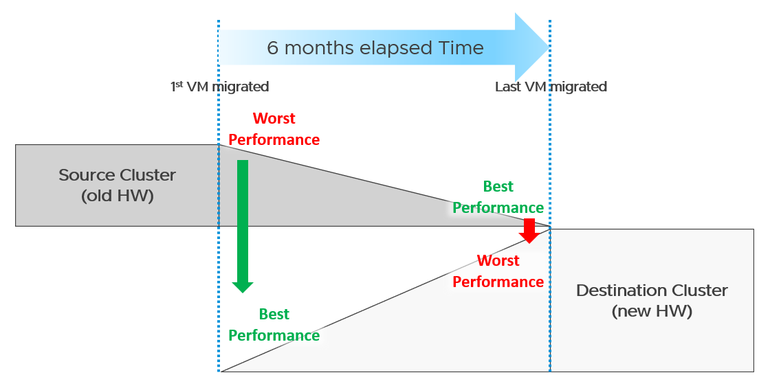
What potential problem did you spot?
This long migration period created an undesirable situation where the first few VMs enjoyed the whole cluster. They could run with 0 contention as there was enough resource for everyone.
Application team felt the responsiveness. Everyone was happy. They might start new features or load the systems even more. Overall utilization went up. So far so good as there was enough capacity.
As more and more VMs get added, the new infrastructure hit the point of overcommit. At this point, the VMs would begin experience contention.
On the other hand, the remaining VMs in the old clusters began to experience less contention. So their performance actually improved. The application team felt good, and started taking advantage of the newly found performance. They begin changing the application or increasing the data size. The users’ expectation also went up as they can do more work. Everyone is feeling more productive.
The last VM to be migrated might get a shock. The performance might actually drop from the end user’s viewpoint.
The above could result in mismatch expectation. This is why SLA matters. You also need to have the SLA agreed prior to the migration. Do not rely on users’ complaint or user-level metrics as that’s beyond your control.
Best Practices
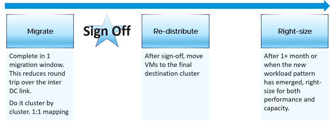
Migration is best done as soon as possible, ideally in one migration window. This minimize inter-DC traffic. For example, if VM 1 talks to VM 2 and VM 2 talks to VM 3, if you somehow forgot to migrate VM 2, you have a ping pong traffic. The latency and bandwidth could cause application performance. So pick the longest window you can get, such as major public holiday or company shutdown.
Migrate 1:1. This means 1 source cluster and 1 destination cluster. Obviously, you exclude the powered off VMs 😊 This makes migration management, and VM troubleshooting easier.
Within a week, get a sign off. Before sign-off, do not allow changes as that can make comparison invalid. Changes include application, business functions and infrastructure.
Do not right-size using the utilization data of the old Data Center. Wait until the new pattern establish itself. I recommend resetting the capacity engine starting date.
Infrastructure Sizing
You are planning a tech refresh for Cluster X. It has 24 ESXi and 1000 VM. You are hoping to reduce infrastructure to 12 ESXi, hence you buy newer CPU, increase the clock speed and add cores per socket. With such major changes, do you consider individual VM one by one, or you do see how they behave as a group?
The answer is the latter, as 1000 VM will not peak at the same time.
Do you consider what happens inside Windows or Linux, or do you see their footprint on your ESXi? The correct answer is the latter, as what happens inside is irrelevant.
Simple Migration
Aim to do a 1:1 migration. 1 cluster to 1 cluster. After you migrate successful and got the sign off, you then move the VMs into their final destination cluster.
If you do this 1:1, your sizing becomes much simpler. You simply add headroom for the next 3 years or so at the cluster level. If your new cluster sports vSAN and NSX, you need to consider their overhead. Speaking of overhead, you also need the VMkernel overhead, which varies.
The issue of you have with the single VM gets amplified here. Instead of dealing with just 1 faster VM, you now deal with many. Even if the workload is identical, since they complete the job in much less time, your workload pattern turns to spiky. What took 1 minute now take 20 seconds. If your monitoring is 5 minutes, your observability is 300 second average. You can have microbursts that you cannot see. This is why using the 20-second peak metrics is necessary.
Be aware of heavy hitters VM. Consider 2 VMs. Both have 16 vCPU. Both are running hot, but one of them is heavy on IO. It sends a lot of network packets and doing lots of disk IOPS. This 2nd VM has a different footprint on the ESXi. It’s much more demanding. All those IO processing need to be processed by other physical cores. That’s why your sizing should include disk IOPS, disk throughput and network throughput.
Generic Formula
New Sizing = (Sum of VMs Usage x Future Growth x Performance Multiplier) + Overhead
Where:
| Sum of VM Usage | It is the chosen number to represent all the data in the assessment period. Ideally, you capture 1+ year so you do not miss annual data. Now that’s ~105K datapoints as there are that many 5-minutes in a year. So what numbers do you pick? If the chart is trending, especially upwards, you need to account that the workload is increasing. So I’d use a projection, instead of simply take say the 95th percentile. The percentile also treats recent data as more relevant. For such large data sets, there can be outlier. Both projection and percentile handle this. |
|---|---|
| Future Growth | The headroom you need before you top up hardware. So if you buy every year, then you need at least 1 year of buffer |
| Performance Multiplier | An additional buffer you put to account that faster performance. |
| Overhead | Virtualization layer, which is vSAN + NSX + VMkernel load. This is the reason why you can’t take your existing cluster load. Your new cluster overhead is different. It’s likely higher as your hardware is bigger, and you may have vSAN and NSX. |
Notice something missing?
Yes, it’s reservation. I exclude it as you need to avoid using it. If you want to use it, take the maximum of Usage or Reservation.
Specific Formula
The generic formula we have needs to be applied to each of the 4 elements of infrastructure. CPU, memory, disk and network need to be treated differently.
We also need to apply to specific object. Let’s start with vSphere Cluster as that’s the most common.
| CPU | Your main number is in GHz. You support that with another number, in vCPU. For vCPU, the performance multiplier does not apply as you maintain constant. Usage is based on allocation. Overhead is expressed in physical core, so you apply it on the Usable Capacity instead. Allocation Sizing = (Sum of VMs vCPU configured x Future Growth) Make sure this number is within your comfort level. |
|---|---|
| Memory | You only have 1 number. It’s in GB. Performance Multiplier does not apply to memory as it’s just a storage space. New Sizing = (Sum of VMs Usage x Future Growth) + Overhead |
| Disk | Your main number is in GB. It only covers disk space, hence Performance Multiplier does not apply here. You typically do not migrate snapshot. You will also exclude non VM such as orphaned vmdk and template. New Sizing = (Sum of VMs Usage x Future Growth) + Overhead You support that with 2 numbers, one for IOPS and one for Throughput. Performance Multiplier applies here. vSAN migration needs to consider vSAN overhead. You’re moving the redundancy from hardware level to VMDK level. |
| Network | Your main number is in Gigabit/second. You support that with number of packets/second. Make sure both numbers are within what the new hardware can deliver. |
Sample Output
You do the above exercise per cluster. You get something like this:
| CPU | Memory | Disk | Network | |
|---|---|---|---|---|
| Old Cluster 01 | 145 GHz 3504 vCPU | 3.9 TB | 8.2 TB space 8374 IOPS 49 GB/s throughput | 38 Gbps 83K packets/s |
The above is only valid for a 1:1 migration. Anything more complex takes us to the realm of complex migration.
Complex Migration
From that simple migration above, you can see that a simple sizing exercise becomes complex when the destination is much faster. This turbocharges the VMs, changing the workload pattern.
This becomes a real issue in complex migration, defined as migration that you cannot complete in a single shot or migration where you mix the VMs across clusters.
Long Migration Project
If you need to migrate over multiple green zones, stretching the period into months, you need to treat sizing as an iterative process.
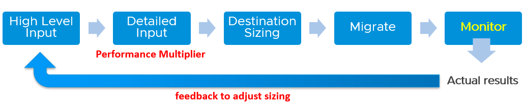
In complex migration, it does not begin with what you to migrate. It begins with the destination. You plan your end state first, add what you want to migrate, and then work back and forth between the 2 sides.
The reasons why you go back and forth are:
| Speed | See Performance Multiplier |
|:---|----|
| Time | In a large-scale migration, it can take months. During that time, the workload may change. The new features added by the application team may alter your sizing |
| New workload | Because the migration period stretches over time, you get new VMs that do not exist in the old clusters. |
| Selection | You typically do not migrate everything and you may use the migration as opportunity to regroup. For example, you may move from per department to per class of service, as your IT business changes from System Builder to Service Provider. |
Migration Group
What happens when your consolidation is not One to One, but Many to Many?
For example, you are consolidating from 47 clusters to 19, but the VMs in a single source cluster will end up in multiple destination clusters. The following examples shows 5 old clusters being consolidated into 3 new clusters. However, the VMs are being reclassified.
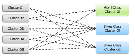
This is more challenging as each VM can potentially have its own usage pattern.
Take for example, you have 500 VM in a cluster, but you only need to migrate 100 of them.
Do you take the individual utilization one by one, estimate the size for that VM, repeat for each VM, and finally simply sum all the VMs up?
You can’t do that as they may peak at different time.
This makes the sizing process cumbersome as you must create group. 1 group for each destination cluster. If you have 30 destination clusters, you need 30 groups. This migration groups become a central piece of your migration monitoring and sizing. They form a pair of “Before” and “After”. The group should consist of just VMs because that’s what you’re migrating. As a bonus, these groups help you in tracking and adjusting later on in the project. As you migrate a VM, remove it from this group.
The main limitation of the migration group is it has no historical data. The data starts from the time the group is created. To see the past, use super metric preview as a workaround.
Rolling Up
As part your overall planning, you need a total number. How do you prevent this number from being inaccurate?
The answer is you cannot.
Take for example, 2 clusters. They have highly cyclical workload, which goes up to 90% and down to 10%. Their workload pattern happens to be complimentary. When Cluster 1 is highly utilized, Cluster 2 is lowly utilization. If you combine them, you get a flat line utilization.
Each cluster has 10 hosts. But because their workload do not overlap, when you combine, the total utilization is only 11 hosts, not 20 hosts.
So what is your sizing requirement at vCenter level?
11 hosts or 20 hosts?
The answer depends on whether you plan to combine them or not in the destination cluster. That’s why you need to begin with the end in mind. If you plan to combine, the answer is 11. If not, the answer is 20. Big difference.
What if you do not know yet?
That means you have 2 numbers, serving as rough estimate of the minimum and maximum.
Use these numbers as the guide. As you migrate, you adjust your sizing.
Reporting
When you are migrating your customers workload to another infrastructure, the onus is on you to prove that you are not causing problems to the VMs or Applications. This is especially true if it’s your idea to migrate, and you are not giving them a choice.
To you as infrastructure team, the migration is a capacity exercise. To your customer the application team, they care more about their VM availability, performance and security. This means you need to quantify the “Before” and “After” to avoid misunderstanding at the VM level. If you have 1000 VM, you need to do 1000 comparisons.
This comparison cannot be done immediately after a VM is migrated. It needs to consider a longer timeline, such as 1 week, for a more complete comparison.
On the other hand, you do not and cannot make the post-migration comparison too long. Compare 3 months of before against 1 week of after.
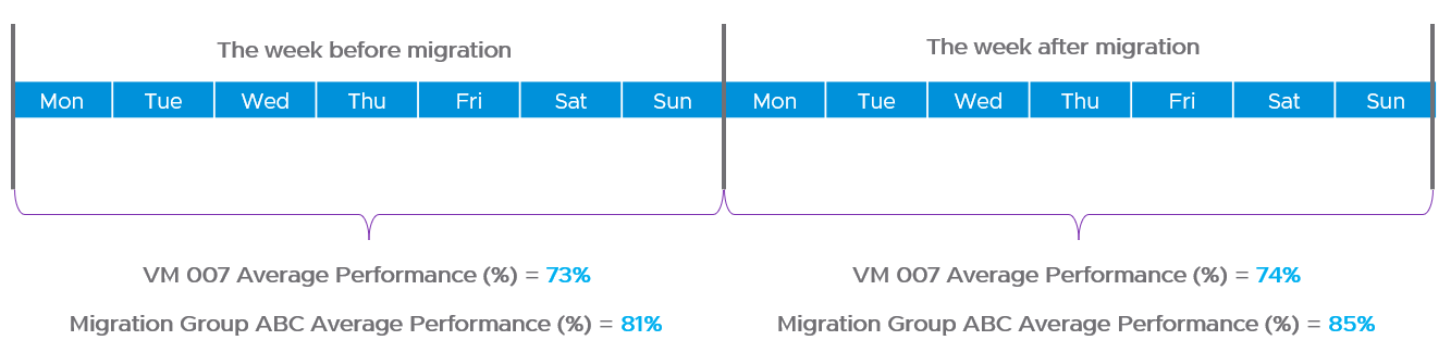
How do you report that the migration does not result in availability, performance and security degradation? If you promise improvement, how do you quantify that?
| Consumption | First, you prove that the VM is not doing less work. That means CPU utilization, Disk IOPS and Network Throughput. Expect the numbers not to drop. We cannot combine these counters as they can’t be standardized into 0 – 100%. Why is memory not included? Memory is basically disk space and it’s a form of cache. The memory counter at VM level is irrelevant, and the memory counter at Guest OS level is not within your control. |
| Contention | Second, you prove that your IaaS is serving the VM well. That means CPU Ready, Memory Contention, Disk Latency and Network Dropped Transmitted Packet. Plot the contention number using the 20-second peak counter. Expect the numbers to drop. If it increases, it remains below the promised SLA. If you are responsible for the Guest OS, then you need to show that queues are not higher post migration. This is why I recommend to keep the VM size. Let the oversized VM be migrated as it is, and right-size it after migration is signed off. |
Once you have the above numbers, it’s a matter of plotting them over time.
The above solves it for 1 VM. How to measure for many VMs?
As usual, you create a group to help manage at scale. For each migration batch, you create 1 group. So if you plan to migrate over 35 windows, you have to create 35 groups.
1 migration window should be kept within the day. This makes your Before vs After comparison easier. If you’re migrating 3x on Friday night, Saturday night and Sunday night, then it’s 3 migration windows.
Configuration Management
Part 1 Chapter 4
Configuration Management is about preventing issues caused by incorrect settings. ensuring the actual configuration settings matches the intended or desired value. The configuration of hardware and software products must be identical with the documented systems architecture.
We should be able to quantify configuration manage. This makes it easier to track over time. We can assign 100% where there is no configuration issue, and 0% where none of your desired configuration rules are being followed.
Approach
Configuration management starts with a plan, where you decide what settings are suitable for what objects. So have your plan documented as corporate standards.
The actual configurations you have in production should reflect your current architecture standard and security policy. Your architecture or standard may change over the years, but it should be documented. You then use the configuration dashboards to compare the reality versus intended standard. If they differ, one of them is wrong and needs to be addressed.
Standards make operations simpler and are often required for compliance. For example, you have a standard for VMware Tools versions, and you choose one version as your standard, but allow 2 other versions across your environment as it takes time to upgrade. You can create a pie chart showing the distribution of VMware Tools version. Each slice in the pie chart counts the occurrence of a particular value. You should expect to see only three slices. If you are seeing more than three, then the reality differs to your standard.
The plan should cover beyond VCF due to dependency. For example, ethernet jumbo frame needs to be configured end to end, including all the physical switches in between. Settings must also be checked across the entire stack, especially the lower layer as problem in a layer will impact the layer above it.
The challenge is balancing conflicting requirements, while meeting constraints such as cost and capacity. For example, you may have to mix different classes of service in a single cluster. Compromise like this makes configuration management essential.
It is a never-ending job as you need to keep up with the versions and product end of life.
Wrong configuration can be costly. There are 6 areas of operations that could be impacted, so choose your trade off carefully.
-
Availability
-
Performance
-
Capacity
-
Cost
-
Security
-
Compliance
In addition, there are VCF product specific settings that need review, such as:
-
License.\
Make sure you have the correct amount for each type of license.
-
Certificate.\
Many parts of VCF have different expiry dates.
-
Configuration Maximum.\
This is especially relevant in a very large deployment where you hit the limit of VCF scalability.
-
Users and roles.\
This includes the service account and locally-defined account.\
This includes password management.
-
Log.\
ESXi, vCenter, NSX, etc. are configured to send the correct type of logs.
-
Compatibility\
As you need to eventually patch and upgrade, this becomes a cycle.
Purpose-driven Architecture
How do you reflect the business in your private cloud architecture? How does the architecture enable an application-centric operations, where everyone can see the business divisions and their applications?
My answer is a top-down tagging.
Label or Tag
Label is type of property. It is always external. We attach is to an object. It’s added onto the object as part of its creation or during its lifecycle.
Let’s take an ESXi host as an example:
-
The serial number is not a label.
-
The location is a label. It’s added by someone, manually or via script.
Tag gives context to various persona running your operations. The context is important. Many customers struggle with tag management as it spans many parts, across software and hardware from all the vendors that you have in your environment.
Label needs to be designed top down so tags are complete and correct.
Categorize your tag, so it’s easier to manage them. There are customer-facing tags, and internal-tags.
Business Tags
These are the tags that application team or your customers care. Have an agreement with them. Note that different department will have different requirements, but you only have 1 set of tags, so have a company wide proposal before meeting each group.
Example tags:
-
Cost Center. This enables chargeback and reporting
-
Class of Service
-
Department. Map this to vCenter folder
-
Owner email.\
At the very least, you need the email so system can automatically notify them and ask for approval. In large organization, even a full name may not be unique
-
Owner phone.\
For mission critical VM where you need to contact urgently or after office hours.
Balance your tag. Too many tags and it becomes a challenge to update them. For example, if you have 10K VM and each VM is tagged with the direct, actual owner, you can end up with hundreds of names. These people may change department, role, or leave. It’s easier to establish a business agreement where you have 1 contact person per department
IT Tags
These are the internal tags for your infrastructure team.
Example tags:
-
Refresh Date.\
The date or month or quarter where the hardware is due for a tech refresh. Use the end of warranty as a consideration, and establish a policy on when to upgrade.
-
Class of Service.\
For VM, this is inherited from the cluster where the VM is running. It’s automatically updated for new VMs or relocated VMs
-
Location.\
For hardware, it helps to know the physical location within a DC floor.
-
Importance.\
I prefer this terminology over criticality as criticality mixes urgency and importance.\
Give a clear but short name such as high, medium, low.
-
Environment.\
Example values: Production, QA, Test, Development.
Implementation
Use the VCF Operations custom property as opposed to vSphere tags and annotation. These two features were designed much earlier and have limitations, all of which were addressed by VCF Operations. For example:
-
Limited to vSphere only. Can’t cover Horizon, AWS, Microsoft, business applications, etc.
-
Historical data not kept. You don’t know what the previous values are, when it changed and who changed it.
-
No dynamic membership. Can’t automatically assign to objects that meet selected criteria, and membership do not automatically update.
-
Values are all strings. You can’t do numerical computation on them even if the values are actually numbers.
-
The values in vSphere annotations are free-style string, meaning you can’t control the consistency of the content. On the other hand, vSphere tags have rigid value. You can’t type a value; it has to be chosen from predetermined list. It is not practical with information such as phone numbers, as they’re likely unique.
-
Tags are per-vCenter, so you need to maintain copies across all vCenter servers.
The following screenshot shows how to dynamically tag all VMs that are in Gold Clusters as Gold VMs. Gold Clusters are in turn a custom group whose members are clusters that provide the gold class of service.
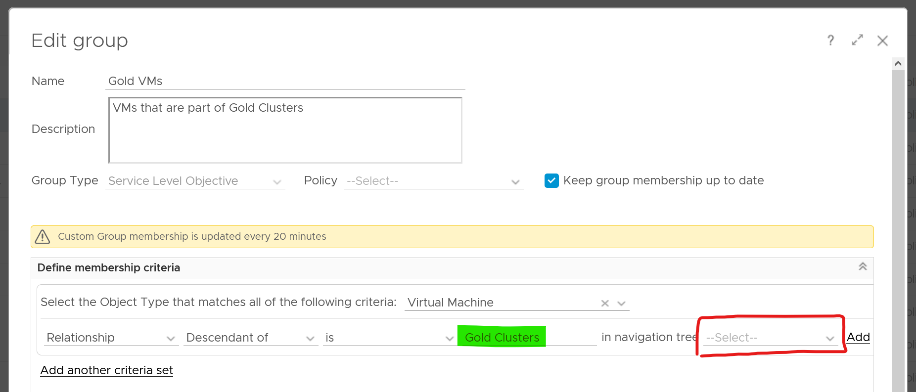
Naming Convention
Have you ever heard of stories of changes being made by accident to the wrong VM or ESXi host or LUN because their names are similar and hard to read?
Yup. We all have been there 😊
Is the VM naming convention easy to understand yet hard to make human error? How about the Guest OS naming convention?
Does the VM name and Guest OS name map? Is it easy to figure one from the other?
Guidelines for naming convention:
-
Make it easy to understand the business context (especially useful for new staff).
-
Reduce the chance of making human error (e.g. typo).
-
Reflect the criticality of the VM (class of service).
-
Provide some context (e.g. name of department owning it).
There is no need to provide the owner information in the name as it’s already covered via custom property and vSphere folders.
Design a naming convention for the following:
| Category | Object | |
|---|---|---|
| Consumer | Guest OS | Ideally there is a way to map it to the VM, so keep them fairly similar. For example, WIN for Windows family, and LNX for Linux family. Avoid LIN as that is too close to WIN, both in spelling and in pronunciation. |
| VM | Typically this would be the same as the OS hostname for manageability reasons. It should have the owner ID, such as the department code. | |
| RDM | Design them as one set. Make sure the name is unique across multiple physical arrays | |
| vVOL | ||
| Provider | Resource Pool | It should have the parent cluster it belongs to |
| ESXi | it should have reference to the physical location (rack, row, floor) of the box. | |
| Cluster | Class of service | |
| Datastore | ||
| Datastore Cluster | ||
| Distributed Port Group | Designed them as one set. The port name should tell which switch it belongs to. | |
| Distributed Switch | ||
| vSphere | Folder | Make sure the 4 types of folders have unique and easy naming convention. It has to be unique across vCenter servers. |
| Data Center | It should | |
| vCenter | ||
| vSAN | Fault Domain | |
| File Services | ||
| NSX | NSX Edge | Avoid including the size as it may change. |
| NSX Manager | ||
| Logical Switch | ||
| Group | ||
| Kubernetes | K8 Container | Designed them as one set. Make sure the names are unique across K8 clusters. It should have the business owner ID. |
| K8 Pod | ||
| K8 Workload |
Example
The name should reflect the object. This is less important in the UI as have you the context. But in code (programming), it helps to know what object you’re dealing with to reduce human error.
Here is naming convention I’d use for cluster and datastore name.
| Part | Value | Meaning | Reason |
|---|---|---|---|
| Class of Service | GLD | SLV | BRZ | Gold, Silver, or Bronze | I use this as the first part of the name as it’s the most important one. I avoid Tier 1, Tier 2, Tier 3 as it could be unclear if Tier 1 is higher than Tier 3. Also, they also differ by 1 character, which is prone to human error. |
| Location | SGP | SFO | The physical location of the | This does not change. Typically, it’s a city. For stretched clusters – clusters spanning two cities or availability zones within a region – suggestions for the location code include:
Different options are suitable for different scenarios depending on your business and where you operate IT infrastructure. |
| Environment | PRD | DEV | Production, Development | Different treatment or context. |
| Serial No | 1 | No meaning | Just in case you need to have more than 1. Note if you have 3 digit it increases the chance of making a mistake. Think of a way to group them. |
Using the above, you get names like VMW-CLS-GLD-SGP-DEV-1 for the first vSphere gold cluster in Singapore serving development workload, and VMW-CLS-SLV-SFO-PRD-9 for production silver cluster no 9 in San Francisco. I added VMW as you may have non-VMware platforms (such as AWS or mainframe) in your environment.
I’d add LOCL for local datastore, VSAN for vSAN, VMFS for networked VMFS and NFS for NFS type. Raw Device Mapping LUN should have RDM or VMW, whichever easier for your storage team
Don’t be hesitant to use dash or underline as they make names easier to read and provide a good delimiter to use in code when managing environments through automation.
Review Approach
There are literally thousands of settings that you need to manage. How do you know you cover them all?
Focus on the impact to day-to-day operations a product has, rather than the feature of the product itself. Take the view from Day 2, not Day 1. Products under monitoring, such as vSphere and vSAN, can have features that are related, but have different impact to operations.
VCF Operations takes the principle that there are different impacts to operations, and applies a methodology for looking at configuration. It does not group the settings by features or objects. Rather, it begins with the impact in mind, and prioritize what can be done.
There are 3 dimensions to consider, resulting in 3 ways to review. Use all 3 to ensure completeness.
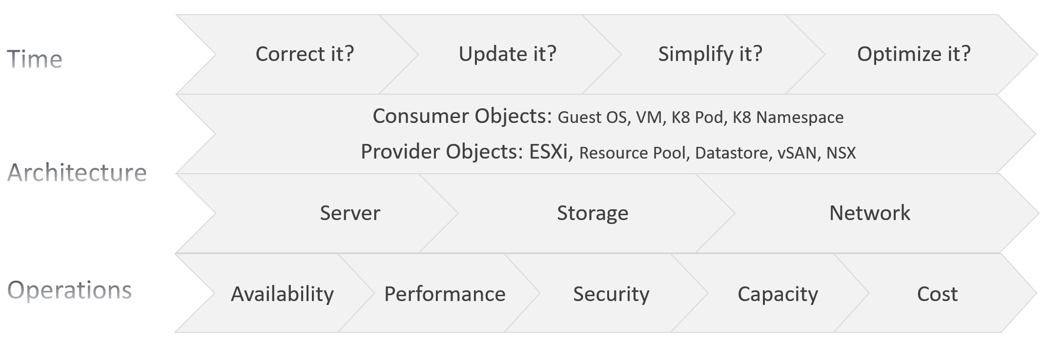
The first one is based on time. You assess the most pressing issues first. You also check them more frequently. Use a 4-step check, starting from the most urgent.
The second one is based on the SDDC architecture. There are 2 types of objects, consumer and provider.
-
Both are equally important.
-
Consumer is important as it’s what your customers care.
-
Provider is important as it can impact many consumers.
As VCF is a type of SDDC, you can review from the 3 types of infrastructure:
-
Server or Compute. This covers CPU, GPU, and memory.
-
Storage. The stacks start with Guest OS partition 🡪 VM virtual disk. From here it covers technology such as ESXi storage subsystem, datastore, RDM, vVOL, and vSAN.
-
Network.
The last one is based on the pillar of operations.
-
The first to check is availability, as it’s the most basic. If the system is down, other problems become irrelevant.\
For hardware, higher availability is achieved via redundant component.\
For software, higher availability is achieved via clustering technology, with 2 load balancers fronting the nodes of the cluster or farm.
-
Just because something is up, does not mean it is fast. This is why performance is second. You check for configuration that impacts performance.
-
Just because something is fast, does not mean it’s secured. This is why a Security and Audit come into play.
-
Other areas of pillar operations worth checking is capacity, cost and sustainability.
Time-based Approach
| Step 1 | Address settings that are incorrect, insecure, not following your corporate standards or against best practice. You should correct them as appropriate. This is typically the most urgent step. |
|---|---|
| Step 2 | The settings are correct, but on older version. It’s hard to keep up with all the vendors releases, so you should prioritize those oldest versions, especially those no longer supported. As part of operations best practices, keep the infrastructure up to date. Running outdated components that are too far behind the latest version, can cause support problems or upgrade problems. It is common that the fix for the problem is only available in the later versions. Outdated hardware can also result in higher operating costs. Outdated hardware might cost more data center footprint, such as rack space, cooling, and UPS. Refreshing your technology and consolidation are two common techniques to optimize cost. A typical SDDC or EUC architecture spans many components. While each can run the latest version, they may not be compatible or supported. |
| Step 3 | The settings are correct and up to date, but they complicate your IaaS operations. Since you are unlikely to eliminate them all, establish policy that minimize them as part of simplifying your operations. Complexity can come from many things, lack of standard being one of them. Think of the standards in your SDDC architecture or EUC architecture, and customize the configuration dashboard to shine light on the issue. I think having flexible VM vCPU and memory size do not create complexity, as the permutation is not something you manage. |
| Step 4 | The last step is about cost and capacity, as there is nothing wrong already. You want to maximize the usage of your resources while minimizing your cost. It’s a balancing act! |
The 4 Types of Check
Checks are performed to ensure you comply with best practices.
You can categorizes check into 4:
-
Value Check, where you compare a single item against a desired value. The desired value can be static or universal, or relative depending on the context.
-
“Multi Object" check, where you compare multiple items against one another. You can check them for consistency, for compatibility, and for contrast (read: variance)
Value Check
You compare its value against the desired value. The desired value depends on the type of check:
| Against Standard | Naming convention. Compare the name against your corporate naming standard. |
|---|---|
Logging standard. This applies to system such as Windows, Linux, ESXi, VCF Appliances, NSX Edge. For critical VMs, consider logging to capture errors that do not surface as metrics. These errors typically appear as events in the log files, or Event database it the case of Microsoft Windows. Use Log Insight to parse Windows events into log entries that can be analyzed. | |
| Against Version | It needs to be minimally supported by the vendor. Compare the product version against your corporate standard. Aim to have N and N-1 only. |
| Against Date | Expiry date, which should cover:
|
| Against Threshold | Absolute threshold. Example is the configuration maximum. Note this can vary depending on the combination. |
| Relative size, which depends on the parent “container”. For example, a relatively large Linux container in a Kubernetes Node can cause performance issue to other containers and itself. |
Consistency Check
| Against Peer | This is about consistency among members of a group. For example, all the ESXi hosts in a cluster should have identical configuration. |
|----|----|
| Against Partner | This is about consistency with adjacent connection. For example, ESXi MTU setting should match DVS MTU setting. |
Compatibility Check
While consistency is about identical value, compatibility is not. Most of the time, the values are not the same.
Think of “what works with what when and where”.
-
You’re running hardware and software from multiple vendors, and they don’t always work best in every possible permutation. Pay attention to the detail, minor version number too.
-
Upgrading one component often requires upgrading adjacent products.
-
What is right for development environment may not be appropriate for production. In the same production environment, what was suitable last year may not be suitable this year.
Variance Check
Too many variants happens when you want to achieve flexibility. There is a cost of complexity as the number of variants increases. The complexity can manifest in security, capacity, compliance, performance, or just day to day operations as your team have to be aware of myriads of things.
-
Guest OS
-
VM
-
ESXi
-
Server BIOS
-
vSphere Cluster
-
Storage
-
Network
Take note that some variants do not create operational complexity. VM sizing is one such example. Having a t-shirt sizing costs wastage with little benefit of operational overhead.
Review List
It’s difficult to logically list as a setting typically has multiple sides. Take for example, do you put NFS security setting under Storage, Datastore, or Security?
In this section, I group them based on the object. In the case of NFS, it will appear in both ESXi and datastore objects.
Before you review the settings, review the name first. Ensure they follow the naming conventions. There is a chance it’s not adhered to.
Consumer Objects
Guest OS and VM are separate as they have their own set of requirements. In large organisation, there could be 2 separate team responsible for each.
Guest OS
| Type | The actual Guest OS may not match the type specified during VM creation. This could be due to Guest OS upgrade, or reformat. Update the value in vCenter to avoid confusion. Do this by comparing these 2 properties:
|
|---|---|
| Version | Are there outdated Windows or Linux version? |
| Too many versions of Linux distros. Within the same versions, minimize the build numbers and patch level. | |
| Too many versions of Microsoft Windows. Within each edition, too many editions | |
| Driver | Is PVSCSI used appropriately? |
| VMXNET3 or PVRDMA or SR-IOV used appropriately? See this for networking driver best practices. | |
| Agents | Are they too many agents? Back up agent, security agent, monitoring agent? What’s their total footprint (since they are overhead)? If you use agents, such as Telegraf agent and Log Insight agent, ensure they are installed only in the correct VMs, are up to date and collecting properly. |
| Windows Drive | Consistent purpose of each letter. For example c:\ drive should always be for OS only. |
| Consistent usage of temp drive. | |
| Consistent usage of data drive. Since you do not know how many each OS will have, you can start with Z:\ and go backwards. | |
| Application | You want to avoid flying blind. After all you have some responsibility for everything that runs on your platform. Just because the VM name or hostname say webserver does not mean it’s running web server. Using tools such as Telegraf or Service Discovery, find out what application (key process) are running and who is it talking to. Since your workloads are sharing resources and are over committed, your operations are easier if you know what is running inside. This helps with monitoring and troubleshooting. It is also required by some ISV for software licensing. |
| Java Virtual Machine or Database with memory allocation too large relative to Guest OS. Unless you’re running other application, the extra memory is not accessible by the application. | |
| Settings | Too many configuration setting options in your corporate standard. |
| Disable screen saver as it’s irrelevant for server OS |
Tools
I single out Tools as it’s an essential piece, required when running workload on VCF.
Using VMware Tools has multiple benefits, such as driver and observability. For the list of benefits, refer to KB 340.
For more information about VMware Tools, see the VMware Tools documentation.
| Existance | Are Tools installed on all VMs? The lack of support from Independent Software Vendor (ISV) owning the application is the most common reason that VMware Tools is not installed in the Guest OS. The ISV vendor may claim that no additional software is installed in their appliance unless they have certified it. |
|---|---|
| Availability | If yes, are they running? If VMware Tools is installed, there might be reasons why the application team disables it. The infrastructure team should inform and educate their application team, and document the technical recommendations on why VMware Tools is needed to run at all times. |
| Version | If yes, are they up to date? Compatible with the VM hardware version? |
| If you are running older version of Tools, you may not have the following Guest OS performance metrics: CPU Run Queue, CPU Context Switch, and Disk Queue Length, Memory Used | |
| Too many versions of Tools. Newer versions tend to have better observability |
VM
| Version | Are there outdated VMX hardware versions? |
|---|---|
| Too many versions of VM hardware | |
| Advanced Setting | Minimize the usage of advanced parameter setting. Ensure modification complies with your standard. |
| Multi Network | Are there non-networking VM spanning >1 network? A VM that has multiple network interfaces can bridge the network, causing security risks or network issues. Take note that a VM that is part of multiple networks can do so with just a single NIC card. A single NIC can be configured to access multiple networks, with each interface having their own IP configuration. |
| Driver | Is it correct? Up to date? |
Compute-related
| Relative size | Ensure that the VM size does not exceed the size of the underlying ESXi host. If your ESXi host has CPU hyper-threading, do not count the logical processors. Instead, count the physical cores only. |
|---|---|
| NUMA | If the number of configured vCPUs on a VM is higher than number of cores per socket on the ESXi, the VM can experience NUMA effect. If the ESXi has more than one physical CPU (socket), cross-NUMA access negatively impacts performance. For best performance, keep it within the CPU socket. |
| Modern CPU die consists of multiple chiplets. For example, a 64 core CPU is made of 8 x 8-core chiplets. Each chiplet has its own cache. In this case, any VM greater than 8 vCPU will spread over multiple NUMA nodes. | |
| vSocket and vCore configuration. Does it match vNUMA best practices? | |
| Large VM | The larger the VM, the longer time is required to vMotion, Storage vMotion, and backup. |
Are there monster VM? Large VMs that are running hot can impact the performance of other VMs, especially since they are given higher shares by default. Only when the large VM is under-utilized, can the ESXi run other VMs. | |
| Hot Add | CPU Hot Add and Memory Hot Add. Are those applied at the correct VMs? CPU Hot Add results in NUMA optimization disabled. So memory is being interleaved between the nodes. Hence, only use Hot Add if the benefit outweighs the cost. |
Storage-related Configuration
| Virtual Disk | For disk space, if the disk is thin-provisioned and under-utilized, you can deploy other VMs in the same datastore. Ensure that the snapshot is tracked closely, as the risk of capacity running out is higher for a large virtual disk. | |
|---|---|---|
| What is the unmapped reclamation opportunity? | ||
Monitor at virtual disk, not VM. Each virtual disk must be monitored in terms of IOPS, throughput, and latency. Having multiple virtual disks increases the monitoring and troubleshooting need. If the reason for having many virtual disks is performance, identify which counter serves as proof that multiple virtual disks are required. It is possible that the performance required is met by a single virtual disk. | ||
| Snapshot | Ensure that the snapshot is removed within one day after the change request. If not, it might be forgotten, resulting in a large snapshot and impacting the performance of the VM. | |
| Disaster Recovery | Incorrect vSphere replication setting. One reason is the VM Owner never informs infrastructure team on the changes. | |
| Are all the VMs protected by SRM meant to be protected? Some VMs could be no longer use but are still protected. Review the Recovery Plan. How frequent was it run and when was the last run? | ||
| Fault Tolerant | Any feature, especially something as powerful as this one, comes with its own set of complexity. So make sure the VMs with FT are the correct VMs. | |
| vVOL | Is the usage following design best practice? | |
| Shared Disk | Are there VMs sharing VMDK or RDM disk? | |
| Guest : VM mapping | It is simpler to have a 1:1 mapping between Guest OS partitions and the underlying virtual disk (VMDK or RDM). While you can run logical volume at Windows or Linux level, it creates complexity. | |
| VM : Datastore mapping | Minimize VM that spans multiple datastores. This can make performance troubleshooting and capacity planning difficult as you create a M:N relationship between VM and datastore. | |
| RDM | Keep the usage minimal as they result in LUN sprawl and unused RDM object in the physical array | |
| Are they excessive usage, where RDM is used when there is no need to? | ||
| Are they unused or hardly used RDM? | ||
| Are they oversized RDM? | ||
Resource Management
I highlighted this separately as its flexibility need to be managed carefully. It’s hard to keep the settings fully consistent in a large environment over the years.
vSphere provides powerful control over infrastructure resources. You can apply shares, reservation and limit. As feature, they are closely related, appear in the same dialog box in vCenter client UI and should be mastered as one. However, they impact operations differently. The following table describes that in more details.
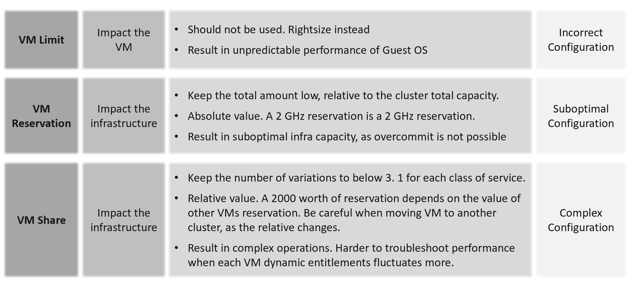
| Control | Analyzis |
|---|---|
| Limit | The most basic form of control. It sets the upper limit that the consumer can’t exceed. It is a hard limit. It is more relevant in container as by default it has no upper limit. With limit, if the underlying shared resource is available, it will go wasted instead of being used. On the other than, this guarantees that consumer will not exceed what they pay for. You can also contain the damage of denial-of-service attack. From the above, you can see it cuts both ways. You need to balance cost and performance. |
| Reservation | Complement limit by setting the floor. This is also another form of guarantee, so your total reservation cannot exceed your total capacity. Take note Disk has no reservation for IOPS and throughput. |
| Share | Share is only effective if there is enough resources left to share. If you have 80% reservation, then you only have 20% left to share. The 20% is only effective if the demand is larger. Share is relative to the configured size. A VM that is 10x bigger is given 10x shares by default. |
Imagine a host with a fixed capacity of 10 GHz. Two VMs are running on that host, one with a single vCPU, and one with two vCPUs. The single-vCPU VM will have 1000 shares. The two vCPU VM will have 2000 shares. Both VMs want to consume 10 GHz. Ignoring overhead, you could expect the VM with a single vCPU to get 3.33 GHz of a physical CPU, and the VM with 2 vCPUs to get 6.66 GHz of the physical CPU. On the other hand, imaging both VMs only need 5 GHz. In this case, VM 1 gets 5 GHz and VM 1 gets 5 GHz. |
Share
Shares values are relative, meaning the value depends on the value of sibling objects such as, resource pool or VM.
Here are the default values for VM:
| | vCPU | Memory |
|--------|------|-----------|
| Low | 500 | 5 per GB |
| Normal | 1000 | 10 per GB |
| High | 2000 | 20 per GB |
Here are the default values for Resource Pool:
| | CPU | Memory |
|--------|------|---------|
| Low | 2000 | 81,920 |
| Normal | 4000 | 163,840 |
| High | 8000 | 327,680 |
I’m unsure why a resource pool CPU is 4x VM but memory is 16x. This means a VM in a resource pool can potentially get 4x for CPU and 16x for memory, relative to VM outside the resource pool.
A VM 2x larger should have 2x share, all else being equal. If you right size VM manually via vSphere Client UI, it auto adjusts the share. If you do via API, it does not. Check those VMs whose share you manually change, to ensure the number is still valid.
Cluster with many VM Shares (normalized per vCPU and per GB RAM) makes performance troubleshooting harder. Each share should map to exactly one class of service, such as one for Gold and one for silver, as the shares defines the class of service.
If you move VM across clusters, ensure that the values of shares are consistent across clusters to avoid unintended consequences while moving the VM to another cluster.
Check for VMs whose size are not aligned with their share. On a regular basis, ensure the share value per VM vCPU = 1000 and per VM GB of RAM = 10240. I downloaded a list of VMs into a spreadsheet. For a sample size of just 1500 VMs, I see incorrect values such as below.
I plotted the values over a scatter chart and see there are both too big and too small.
Reservation
It limits your ability to overcommit, resulting in less optimal usage. High total reservation, especially both CPU and memory, also complicates the cluster operations as it impacts the HA slot calculation and limits the DRS choice of placement.
Any relatively high amount of VM reservation? If yes, this will impact the HA Slot Size. Large amount of CPU and memory reservation impact the cluster capacity, so use it only for important VMs.
Do you specify it at each VM, or at the parent resource pool?
There are pros and cons.
For VMs that belong to the same application, specifying the reservation at the resource pool is easier.
Limit
Are there VMs with limit? CPU limit and memory limit can result in unpredictable performance. You should downsize the VM instead.
CPU, Memory and Disk IOPS Limit. There is no network limit.
Avoid using limit as it can result in unpredictable performance. The Guest OS is not aware of this restriction as it is at the hypervisor level. It is recommended that you shrink the VM instead.
Limit has a valid use case in Resource Pool. If the tenants only buys 1 TB of RAM, and the contract does not include burstable capacity, set a limit. This will prevent consumption beyond the sold capacity.
Resource Pool
Use resource pool sparingly. It should only be used when selling Resource Pool as a Service.
Shares and reservation settings in resource pool and VM need to be looked together, especially in scalable setting.
| Children | Resource Pools shares do not match the number of VMs. The resource pool value is divided and shared among the VMs. The more the VMs, the lesser the resources allotted to each VM. This can be solved by turning on scalable share. |
|---|---|
| Ensure the RP setting is not causing the shares or limit issue to children VMs. This can be tricky in large cluster with many hosts as the RP metric is at cluster level, while a VM is running on 1 host at a time. | |
| Sibling | Resource Pool with VM as sibling is a common mistake. Once you create the first resource pool, you must create at least another resource pool. A single resource pool with no peers makes no operational sense as it’s not a folder. Since no VM should be peer to it, you need at least 2 resource pools. |
| Compare the relative values across sibling resource pools. If Gold resource pool should have 2x the share of Silver resource pool, then its value has to be 2x. | |
| Cascading | Any cascading resource pool? If yes, what’s the reason for it since resource pool is often mistaken as folders? Avoid further splitting into sub resource pools. Each layer increases the complexity of performance management. |
Compute
ESXi
| Hardware | Are there too many variations of server hardware vendors, models, and generation? Even within the same model and generation, minimize the specification difference. |
|---|---|
| Are they outdated hardware? Which model is entering end of support? | |
| Version | Are there outdated ESXi versions? |
Too many ESXi software versions? For each version, are the update and patch levels consistent? | |
| CPU | Older generations. Too many variants. |
| CPU architecture. Impact NUMA size and type of workload (Intel P-core and E-core) | |
| HT exists but not enabled | |
| Low frequency. This impacts performance of CPU intensive application. | |
| Memory | Are there too many size variants? |
| Is the CPU: Memory ratio supporting the workload? The general rule of thumb is 1 vCPU gets 4 GB of RAM. So a machine with 64 cores 128 threads get 512 GB of RAM. | |
| If performance is more important than cost, then do not disable large page. | |
| BIOS | Are there outdated BIOS versions? |
| Are the settings consistent, especially within a cluster? | |
| Power Management | Unless the workload requires it, BIOS level should be set to OS managed. Pass the control to ESXi, and then set ESXi to balance. |
| Availability | ESXi is in one of these situations:
|
| Standalone ESXi | |
| vMotion disabled | |
| Security | Direct Console UI is enabled |
| SSH is enabled | |
| Shell is enabled | |
| Encryption not enabled | |
| Capacity | A small host faces scalability limits in running a larger VM. While a 2-socket, 32-cores, 128 GB memory ESXi can run 30 vCPU, 100 GB memory VMs, the VM experiences a non-uniform memory access (NUMA) effect. |
| ESXi with Hyper-Threading Disabled. While it provides a more predictable performance to the VM, it comes at a high price. | |
Low CPU core counts. Aim for 48 to maximise software license. This limits the ability to run larger VM. | |
| Low total memory. Include vSAN ESA and NSX in the sizing. | |
| Insufficient network capacity. Include vSAN ESA and NSX in the sizing. | |
| Too many variants of the above | |
| Advanced Setting | Minimize the usage of advanced parameter setting. Ensure modification comply with your standard |
| Avoid CPU Affinity | |
| Unused device such as DVD-ROM, USB are disabled |
Management
| Configuration profiles | Is it used correctly? |
|---|---|
| Log | Use VCF Operations Logs as it has VCF specific log analyzis with extracted fields. The fields are used in out of the box dashboard and alert. |
| ILO | Is lights out management configured? If yes, are they secure? |
| Agent | Any 3rd party agent installed? |
| NTP and DNS | Ensure both Network Time Protocol and DNS are configured. Incorrect time can turn logs from useful to potentially misleading. Logs are a necessary component of operations, and are the main source of information in troubleshooting. While troubleshooting performance across objects, the sequence of logs determines which event is the likely root cause as the oldest event started the chain of events. |
Storage Related
| HA | Is the HBA configured for high availability? |
|---|---|
| Paths | Incorrect multi-pathing setting. |
| Too many storage paths. While redundancy is good, having too many may not bring the result you expect. Compare this with airplane with 2 engines versus 4 engines. | |
| Single path | |
| Zoning | FC or iSCSI LUN zones follow best practice, such as single initiator zoning. |
Network Related
| HA | Is the HBA configured for high availability? |
|---|---|
| Technology | Actual network speed is lower than configured. This happens due to auto-negotiation, which could happen due to high dropped packets. |
| Older generations, such as 10 Gb and 1 Gb ethernet | |
| Static IP | Any ESXi using dynamic IP address? |
| Consistent Address | Is the network address following easy to understand pattern? Since your ESXi hostname will have some sequential number, make sure this number matches the IP address. This will minimize human error. |
| Consistency across network, on the same ESXi | |
| Consistency across ESXi hosts, on the same network | |
| Capacity | Is the actual throughput the same with the configured speed? Auto-negotiate can result in reduction of speed in order to preserve connectivity. |
Any network on 1 Gbps or 10 Gbps? Other than management network, all other networks should be on 25 Gbps. | |
Is there enough capacity for the purpose? What’s your sizing for NSX Edge cluster? It should be greater than the sum of all NSX Edge VMs on the host + vMotion + vSAN. | |
| Kernel Network | Are the following kernel traffic separated: • Management • vMotion • IP storage • vSAN • vSphere Replication Ensure these networks are indeed private, and not used by other purpose. |
Cluster
A cluster is the smallest logical building block for compute. Consider it as a single computer with physically independent components for high availability. Ensure that it has enough CPU cores, CPU GHz, and Memory. For ESXi in 2024, it is typical to have 1 TB memory. This results in 12 TB of memory for a 12-node cluster, which is enough for DRS to place many VMs as it balances them.
| HA | HA disabled. Without high availability provided by the infrastructure, each application must protect itself from infrastructure failure. |
|---|---|
| Clusters with Admission Control disabled. Reservation is respected only when Admission Control is enabled | |
| Cluster HA Failover %. Make sure this number matches your design. | |
Is there any VM with exception? Overriding the cluster default complicates operations. | |
| DRS | DRS disabled. DRS focuses on performance and capacity, while HA focuses on availability. Without DRS, you must build a buffer on every ESXi host to cope with peak demand. |
DRS set to manual. This means that DRS initiated vMotion does not take place unless it is manually approved by administrator. Since DRS calculates every five minutes, your quick approval is required to prevent a change of condition. | |
| Cluster with EVC Mode means it’s not able to take advantage of the newer capabilities. | |
| Automation Level. Ensure this meets the requirements of that cluster | |
Is there any VM with exception? Overriding the cluster default complicates operations. | |
| DPM | Are the settings matching your expectation? |
ESXi Consistency
Consistency matters. Check at least the following settings are identical:
-
CPU model, generation and frequency.
-
Memory size and speed
-
BIOS version and ESXi versions.
-
BIOS Power Management and ESXi Power Management.
-
ESXi Storage Path. Ensure that the number of paths and the path policies are identical.
-
All the hardware drivers and firmware
Putting host devices in a consistent bus or slot for a particular type (vendor/model) facilitates automated installation and configuration, and makes administration and troubleshooting easier.
vSphere Cluster Variation
There are sizable differences in the variants.
| Sub-cluster | Sub-cluster technique, such as VM to Host affinity creates operational complexity. It can result in performance problem despite sufficient capacity. |
|---|---|
| Small Cluster | A small cluster has a higher HA overhead when compared to a large one. For example, a three-node cluster has 33% overhead while a 10-node cluster has 10%. For vSAN, a low number of hosts limits the availability option. Your choice of FTT is relatively more limited. |
| High number of small clusters result in silos of resources. | |
| Large Cluster | They can have higher redundancy. Instead of 3 clusters with 6+1 each, you can have 1 large cluster with 18+2. You have 1 ESXi host while providing higher redundancy. |
| Cluster with 32 nodes or more. Large clusters are harder to operate | |
| vSAN | It imposes addiitonal consideration, such as a VM will have both compute host and storage host. |
You can combile or integrate multiple clusters. There are 3 possible variants:
| Multi-Cluster | A group of clusters operating as one large cluster. Each member still has their own capacity remaining calculation, but they can balance between members. |
|----|----|
| Stretched Cluster | Stretched Cluster is more complex than traditional cluster. They provide Disaster Avoidance (DA), not Disaster Recovery (DR). Having a DA does not remove the requirements for DR. |
| SRM Cluster | Cluster integrated with Site Recovery Manager introduces complexity in capacity management as the protected VMs need to be accounted for. |
Storage
This covers all storage components of VCF, such as datastore, datastore cluster, RDM, vVOL, vSAN, physical storage array, and general storage settings you need to check.
They are put together here to facilitate discussion with storage team.
Too many variants of storage architecture: VMFS, NFS, FC VMFS, iSCSI VMFS, vSAN, vVOL, physical RDM, virtual RDM.
While each architecture has their unique fit for purpose, take note that each requires expertise on performance, security, availability, upgrade. There is a cost as you need to keep up with the technology, and risk that you overlook
Datastore
| Version | Are there outdated VMFS or NFS version? |
|---|---|
| Local datastore | Are they any VM running on local datastores? These should be limited to agent VM or VM that do not need vMotion and backup. Backing up from a slow storage can cause performance problem to the VM as the local disk may not be able to serve both. It’s not a place you put back up as you can forget. |
| Unused datastore | Datastore with no ESXi. Datastore with no path means there is no ESXi accessing it |
| Datastore with no VM. | |
| Hardly used datastore | Datastore with low VM count. If you have many of them, it results in datastore sprawls and pockets of unused space. |
| Datastore with low activities. That means the VMs are idle or unused. | |
| Datastore with low usage. | |
| Small datastore | Small datastores run a relatively higher risk of being full from snapshot or over-provisioning. |
| Variance | Too many variants in the datastore size |
| Availability | Datastores with too many paths creates complexity |
| Datastore with single path carries risk as there is no redundancy. | |
| Datastore : Cluster mapping | Datastores that are shared by >1 cluster are more complex from both capacity monitoring and performance troubleshooting |
| Datastore Cluster | Inconsistency among the member datastores can result in capacity or performance issue. |
Others
| LUN | Unused LUN. That means there is no VMFS or vVOL on top of it. Inconsistent priority. For example, it gets gold priority at the physical array level but silver at vSphere level. |
|---|---|
| NFS | Does the NFS share use up to date security for authentication? |
| vVOL | Are the inventory matching your expectation? |
| Physical Array | Array firmware version need to be compatible with ESXi. |
| Queue depth | Mismatch of queue depths along the various storage stack. Need to calibrate all the way to physical array |
| VAAI | Is it following best practices? |
| vSAN Max | Are you running VMs in the cluster? While technically this is possible, this is akin to running VM on your physical array. It complicates operations as it adds a server dimension. vSAN Max should be seen as a physical array, with benefits such as simplicity and >2 node service controllers. |
Network
This covers all component of VCF. They are put together here to facilitate discussion with network team.
This cover distributed switch, distributed port group, NSX, physical switch, and general network settings you need to check.
Distributed Switch & Port Group
| Version | Are there outdated versions? |
|---|---|
| NIOC | Is network IO control configured? |
| Port Group | Unused network (distributed port group) is a potential security risk as you may have the tendency of not monitoring it. Network is basically a path or road, so it can be used by unauthorized user. |
| Traffic Shaping | Is it used appropriately? |
| Shares | Are the shares of various network configured correctly? |
| Limit | Is limit configured? Can share be used instead of limit as it’s more flexible for contention control? |
| Performance | MTU mismatch |
| Jumbo Frame | Are they configured for the right networks? |
| Are they configured end to end? For the configuration outside your control, how do you know when they are changed? Use tools such as Cisco Discovery Protocol to probe. | |
| Security | Are any of the following networks not set to Reject?
|
Others
| TOR switch | As a top of rack switch has direct connection to ESXi, ensure the firmware version is compatible. Check the speed does not negotiate down. |
|---|---|
| Firewall | Any ports configured correctly? Certain services such as syslog, NTP and vSphere High Availability require ports to be opened. |
| NSX | Version is compatible with relevant components. |
| Ensure the redundancy for both NSX Controller and Manager match your plan. | |
| NSX Edge configuration not following best practice. | |
| Encryption | Are networks such as vMotion encrypted? |
| Are you using hardware assisted encryption such as Intel AES-NI? |
Security
There are 2 types of potential security issues:
-
Configuration
-
Activity
Configuration is easier as it’s a setting that can be compared with an expected value.
Activity is harder as it depends on the context. There are 3 subtypes:
-
Action by human. Example is someone issueing delete commands on ESXi console.
-
Action by system. Example is excessive broadcast packets. Most VMs should not be sending excessive broadcast or multicast packets, as traffic should be unicast. While the monitoring can be done at VM level, the troubleshooting needs to be done inside Windows or Linux as that’s the source.
-
Action by AI, acting as digital employee. The AI agent is identified by its employee ID, and reports to a human employee.
Examples
This covers all component of VCF. They are put together here to facilitate discussion with security team.
| Root | Is the usage minimized? What scenarios are allowed? This applies to both ESXi and VCF Appliances. |
|---|---|
| Are the commands typed logged and analyzed? Create a Log Insight dashboard that traps undesirable commands such as mv and rm. | |
| Time Out | Is the time out configured correctly? Apply it for ESXi Shell and user login. |
| vCenter | Are the access to vCenter properly limited? |
Cost & Price Management
Part 1 Chapter 5
How cost and price work together, and how to optimize cost so you run the private cloud at half the cost of public cloud.
Cost versus Price
With hardware becoming commodity and infrastructure becoming invisible, price has become a common denominator among all IaaS providers. Applications can run spanning multiple cloud, so whichever cheaper is likely to get the deal to serve the applications.
“Cluster with plenty of capacity is more expensive as the cost is only shared by few VMs”.
Do you agree with the above?
If you do, you’re mixing cost and price. The cost of the cluster is fixed, regardless of the number of running VM. In fact, you likely pay 5-year cost in advance as you get a discount far higher than bank interest rate. For example, borrowing money costs 10% per year. The vendor salesman offers a 50% discount if you fully paid a 5-year ELA (Enterprise Licence Agreement). Which one do you take, assuming you plan to run for at least 5 years?
Be consistent with the terminology. 1 English word shall give 1 meaning, regardless of the perspective. If you have different interpretation, you get confusion. Since what is price to you is cost to your customer, avoid using the word VM Cost as the definition changes. When you are talking about a specific VM, it has price, not cost.
Cost and Price are often confused as enterprise IT does not charge real money. The IaaS team typically will pass on the cost to the application team. This is where the confusion comes in, as there is no such thing as a VM Cost. Another word, nothing to pass on as VM price and VM cost are 2 independent numbers. The concept of unallocated cost is flawed.
Let’s use an example.
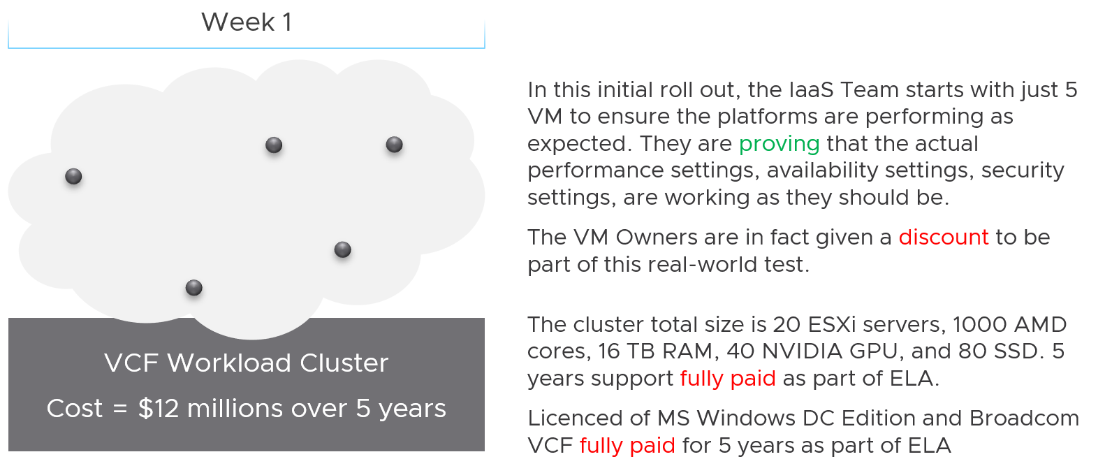
The total cost for 5 years, including data center facilities, is $12 million.
Financially, it’s approximately $200 K per month.
The VM are not large VMs. They are just 4 vCPU, 16 GB RAM. Together, they cannot even saturate 1 ESXi, let alone 20. Guest how much the total cost to run those 5 VMs for a month?
If your answer is $200 K, you’re right.
Now, will the owner of those VMs be willing to pay that much?
Obviously not. She will compare you with AWS or Google.
She will say public cloud charges $100 per month for such VM. So your price should be just $500 total per month.
Now, the VMs cost is $200 K per month, but you can only price $500 per month. You suffer a big loss, which is common during the early days.
Fast forward…
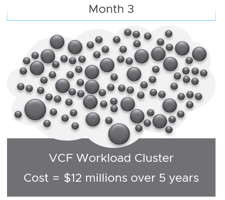
3 months have passed….
There is a lot of more VMs running, including much larger ones. You make higher profit on these monster VM as you apply a progressive pricing.
The cost of running all these VMs remain at $200 K per month. However, the total price you earn has now increased drastically, in line with the additional VMs.
As you keep adding VMs, you eventually reach your break-even point.
Break-Even
When planning your pricing, think of the time required to reach the breakeven point. That period should leave enough time for you recoup your expenses as you likely will make a loss in the early period. It should be way before the depreciation ends.
In the following simplified example, the plan fails to balance cost and price. It assumes a break even that is too close to the end of the deprecation. While it’s profitable in the end, the profit is insufficient to cover the loss in the early years.
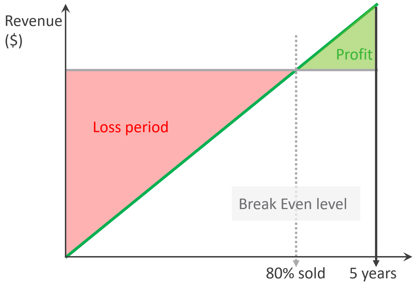
The break-even point depends on the break-even level. You may not be able to fully sell all the resources at the end. So if your plan is based on 80% sold, then the total VM price of this 80% has to be able to cover the cost of everything.
In the following example, the financial plan correctly balances cost and price. They reach break-even point early enough to recoup the loss.
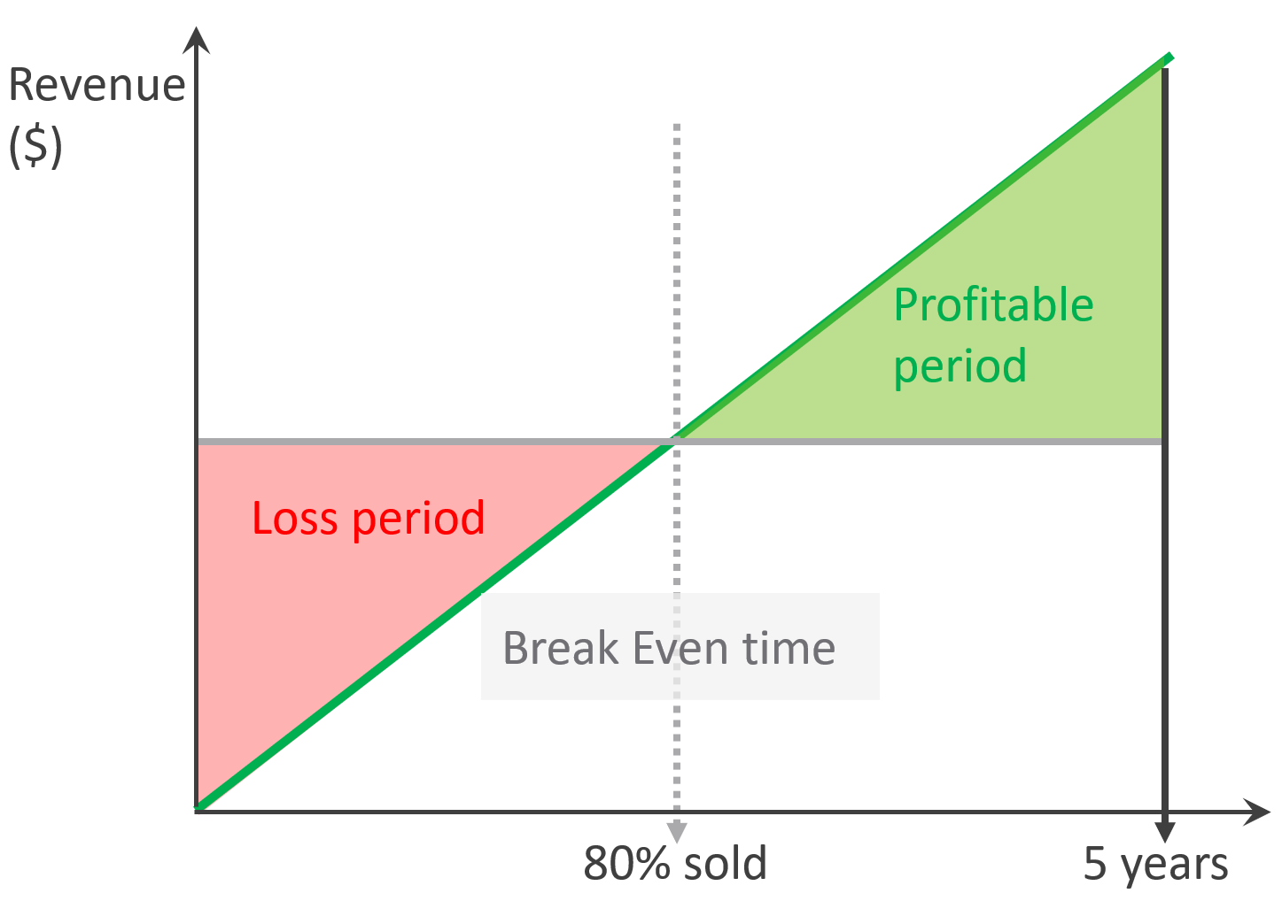
While there is unsold capacity, and hence less revenue, there is no such thing as unallocated cost.
The preceding examples are simple as they assume linear revenue. Your revenue may follow a slanted S curve, where first few months are low income, follow up rapid sales, but taper off after a few years. Regardless of how fast you make the sales, always ensure you’re not making a loss at the end of depreciation period.
VM Cost vs VM Price
There is no such thing as a VM Cost. So no point trying to figure out the cost per VM or the cost of VM 007.
To prove the point, assume you power off and delete every single VM today.
-
How much money do you save? The answer is $0. You already have multi-year ELA contracts with various IT vendors, you have to pay regardless of how many VMs are running.
-
How much money do you earn? Well, the payment from tenants will drop to $0. They will stop paying. Either real money to your company, or funny money to your cost center.
If that’s the case, how do you link between cost and price?
The answer is the Unit Cost is based on provider object while the Unit Price is based consumer object. In the case of CPU, the cost is per 1 GHz of ESXi physical core, while the price is per vCPU of VM. The price also depends on the overcommit ratio, so it varies despite the cost being constant.
Unit Cost and Unit Price are not mathematically related. The Unit Cost does not depend on how much you plan you plan to charge. It also does not depend on planned Overcommit Ratio. Let’s illustrate with an example:
-
You bought 2 identical clusters from the same vendor at the same time. The total cost of both is the same.
-
As a result, the unit cost is the same.
-
You plan to use Cluster 1 for mission critical, and Cluster 2 for development. Cluster 1 will have no overcommit, while Cluster 2 will have 2x overcommit. As a result, you need to charge 2x for cluster 1 else you will not be able to break even as your cost per core is the same.
Unit Cost is associated with ESXi, not VM. VM is about price, not cost.
Cost | Capacity
Cost can go down while capacity goes up.
Is old hardware more expensive? It depends on the maintenance cost and cost avoidance.
Cost covers expenses that is beyond capacity. It covers people, process, and architecture. You can reduce these costs by improving
-
process effectiveness, typically achieved by business process reengineering exercise.
-
process efficiency by automation. E.g. deletion of powered off VM with approval workflow.
Cost
| Cost Savings | This is an oxymoron. You can’t save on what you’ve already spent. This also includes expenses you’re yet to spend but your Finance department has committed the amount in the accounting book. |
|---|---|
| Cost Avoidance | You avoid or defer a purchase or spending. You do save cost in the present as you’re no longer spending the money. |
| Cost Optimization | You reduce future “on-going” cost. For example, instead of $1 billion a year on total IT infrastructure, you will reduce to $800 million starting next year. That’s an actual savings that accounting department will register in the book. |
| I use a fancy word instead of simply “Cost Reduction” as cost may increase fromIT department but reduce in other departments as you automate and replace human with AI. |
Total Cost
There are 3 main components that make up the entire 5 years cost.
-
Product
-
Service
-
People
Product and Service are always external, meaning you pay a vendor. People can be internal cost or external.
Products are infrastructure hardware and software that you pay vendors. You typically pay a vendor a bundle, as hardware typically comes with support service and management software. To get the cost, simply look at all the sales contract from them.
There are many types of Service for private cloud. The most common ones are:
-
Data Center facilities. The unit varies depending on the vendors. For example, you may pay per rack for a data center service, and it comes with certain amount of power and cooling capacity.
-
Managed services. Examples are VCF operations management. You typically pay that the vendor upkeeps the VCF environment timely, and make sure it’s in healthy condition.
People mean time provided by a human. You pay for his time, not business outcome. The scope of service provided is generally more flexible as you pay for effort and skills, not outcome. It does not matter if the employment contact is part time or full time. You pay monthly salary or daily mandays rate.
People cost is the full loaded cost of the infrastructure team. This includes everyone needed to design, build and manage the private cloud. Yes, this includes portion of CIO salary, reflecting the portion of time he spends on infrastructure.
Cost Categorization
When you add any cost to the total cost, think of how you will allocate back. Since vSphere VM runs on an ESXi, you want to associate the cost to ESXi. From here, you can always include the HA host and aggregate the cost to the cluster level.
Since you will always have cost component that is not sold per ESXi, how do you associate to all the ESXi? For example, how do you associate the cost of network?
This is tricky as you may pay a lump sum amount to Cisco or Arista as part of your 5-year ELA. Some of these gears may not be used by ESXi hosts only. Some of the network license may not be used in all your ESXi hosts. In this case, the only way is a rough allocation. You simply get the total cost and divide into the number of ESXi.
Let’s look at more examples:
| Area | Unit | Apportion | Reasoning |
|---|---|---|---|
| Salary | People | Yes | If the person has other responsibilities, then apportion by estimating the relevant time spent. Example: 10 senior IT managers with average Fully Loaded Cost of $ 1 million and 25% time spent on the private cloud. A rough guide for Fully Loaded Cost for management layer is 1.5x – 2x of annual salary, to account for stocks and perks (e.g. secretary, business trips). |
| DC Facilities | Rack | Yes | Only include the racks used by the private cloud. Within these racks, estimate the portion of the private cloud gears. Example: $100 million for a 10-year lease contract for 100 dedicated racks in a co-location. 70% house the private cloud. Within these 70 racks, the share of private cloud equipments is 80%. |
| Software X | Guest OS | Yes | Assuming the ELA covers both private and public clouds, only includes the Guest OS running in the private cloud. Whether you’re just in the planning stage (no VM is deployed) or in the operating stage (most VMs are running), $10 million for 10 thousand OS images in a 5-year ELA. You want to minimize True-Up as your Finance department does not like it, so your plan includes 10% buffer as experience tells you there is always a surprise project, and the new CEO has announced aggressive revenue growth internally. Since the Plan A is based on 9100 VM, do you allocate based on 9.1K VM or 10K VM? Regardless, the $10 million is the minimum commitment you’ve signed, so it needs to be accounted for. Planning stage: the cost You need to do a rough translation |
Unit Cost
To calculate unit cost, get all the components so the Total Cost is complete. This must match the depreciation period. Do 5 years instead of 3 years as public cloud has gone up to 6-7 years.
The total cost includes everything. Any expense needed to provide the complete private cloud environment with operations. The workload running on top is not included, so it’s basically the infrastructure layer.
Infrastructure software includes softwares such as security and back up.
People including full time, part time and outsourced contractors. the salary of full-time employee and IT leadership.
Dividing the total cost into CPU, memory and disk is not easy. For examples:
-
VMware Cloud Foundation contains storage components.
-
Network hardware is also used by storage if the storage array is Ethernet based.
Why is the total cost only split into 3 components? The share of others is 0%.
The reason is this is not cost, not price. The Unit Cost has to be based on provider layer. The Unit Cost can not be allocated to consumer (VM or K8 Pod) as we do not know how many they are.
Unit Cost
Unit Cost depends on hardware and software. New cluster should cost less due to bigger hardware.
For the CPU portion, it is expressed in physical core, not vCPU nor GHz. Notice how software vendors also charge their product by core. How much you price that core depends on the overcommit ratio and SLA.
Complication with CPU
The above works well with memory and disk space. Both have only 1 unit.
CPU has 2 units. One for speed, one for space.
As you’re dealing with capacity, choose the one for space, which is in physical threads.
An ESXi with 10 cores, 20 threads, always have 20 threads of capacity, regardless of the power management settings. Unit Cost is derived by dividing against 20 threads. There is no Class of Service in cost, as the overcommit ratio is always set to 1:1.
Cost Allocation
What if you need to pass the cost back to your internal consumers? Your IT department is not a profit center, so you just need to show other departments the cost you spend and then divide among the consumers.
The answer is “the request is invalid”.
-
The reason is your cost is actually price to them.
-
Likely, you don’t enough demand in the first year. Can you pass this total cost among few tenants? You can’t, as they will not pay higher than what AWS or Azure discloses publicly.
-
In the last year, where you have full demand, do you intend to pass on the savings? If yes, how will you recover the loss of the initial years?
Based on the above, it’s clear you should not allocate cost to each running VM.
Let’s use an example from service industry where the practice is matured.
An airline plane carries 300 passengers and fly 500 times a year on multiple routes. There are potentially 150 K seats passengers can buy. The airline has a price for every one of those seats, and they will manage and adjust the price dynamically. There are days they make a loss on a flight, there are days they make a profit.
Do they have 150 K costs for each seat? No. There is no need to calculate the profitability of every single seat.
All they need is the standard or general unit cost.
Same thing with VM as a Service. If you insist on allocating cost to every running VM, you likely end up with incorrect calculation. Show the price instead.
Cost Avoidance
Since the savings is always in the future, you should not use historical or past value as the value of money changes over time.
Let’s take a simple example:
-
You spent $3 million on a hyper-converged infrastructure (HCI) solution 5 years ago.
-
It has been used well, and capacity remaining is now 0%, so you need to buy a new HCI. This will cost you only $1 million as the cost of HCI solution has gone down by 2/3 in the last 5 years.
-
Via a diligent and arduous reclamation process, you manage to free up capacity. As a result, you do not need to spend the $1 million. You can defer this purchase to the next fiscal year.
-
What’s your cost savings from this reclamation: $3 millions or $1 million?
Accounting wise, it’s $1 million only as that’s the amount you defer to spend. While that HCI cost you $3 millions 5 years ago, a brand new set with equivalent capacity costs a lot less. In accounting fundamental, you should not mix numbers from different date, let alone from different fiscal years.
BTW, depreciation is not relevant here as you’re talking about new system, and not the old one. Depreciation applies to the old storage.
The $1 million cost avoidance is certainly an estimation. The actual cost to be avoided or to be spent depends on vendor quotation, and your negotiation skills. Take note that the actual cost typically is more than the HCI cost. Additional costs can exceed the hardware cost. You need to include the full loaded cost, such as data center facility, implementation service, back up storage, administration service, software licence, management, etc.
Reclamation alone does not save cost. How much do you save when you delete files in your notebook?
Right. Zero.
Only when it helps you defer buying a new drive that the reclamation becomes real. But it’s a cost avoidance, not cost saving.
How about service? We like to cite productivity improvement as a cost saving. While this delivers business value, it is not a hard cost savings. It is a soft benefit with no accounting value. The hard savings only happen when the need to buy additional resource/headcount is deferred, or reduction in Managed Services contract value.
Cost Avoidance
| Area | Action | Calculation |
|---|---|---|
| Storage | Delete orphaned files and powered-off VMs. Delete unused files from Guest OS | GB of disk deleted files * Cost per GB of new capacity. E.g. 10 TB files * $10 per TB = $100 future expense avoided. |
| Compute | Power off idle VMs Reduce oversized VM | Total GB of Consumed RAM saved. Total vCPU saved. Express the above in terms of No of ESXi, multiply by the average cost of new ESXi. |
| Network | Consolidate and power off hardware | Total physical network ports saved. |
| Facility | Power off equipment. Change DC Provider to cheaper one. | |
| Service | Move from cloud to on premises for long term workload. Cloud gets expensive with long term contract. Optimize cost so it does not grow as fast as business demand. | Get the actual monthly bill from your cloud provider. Use 1 year of cost and exclude the highest 20% bill as that is likely a momentary spike. |
IT needs to be ahead of business. When calculating the cost avoidance, includes committed projects and future growth. It’s common for projects to not have enough capital to buy from vendor. Reusing existing assets can go along way.
You should also take into account undersized VMs, as the application team may demand that they are upsized.
Calculate CPU, RAM and Disk. If possible, include network too. It is harder to calculate, as by nature it’s just interconnect. For each of these three IaaS resources, calculate both the demand and the reclamation. For the demand, don’t forget to include the full cost. When a VM needs 100 GB, it translates into a lot more as you factor is DR, cyber recovery, back up, snapshot, etc.
The following table provides an example.
You need to prepare the above table per physical location. Just because you have 10 TB RAM in Singapore does not mean the VMs in Armenia can use it.
Cost Optimization
For organizations with a large infrastructure footprint, tech refresh is a great way to reduce cost. Going down from 100 racks to 50 racks will reduce both capital and operating cost if you can reduce software licensing cost. Nowadays the software, especially business application software and not infrastructure software, costs more than the hardware.
| Area | Action |
|---|---|
| Vendor | Vendor consolidation. Some vendors prefer you commit long term and will give you lower unit cost. |
| Hardware | Technology refresh. Moving from FC SAN + Array to ethernet based HCI should deliver lower cost. |
| Virtualize. While server virtualization is widely practiced, there is much more work to be done for storage and network virtualization. Use vSAN as it’s already part of VCF. | |
| Software | Technology refresh that standardizes or reduces license count. |
| Removal of overlapping software | |
| People | Do away with less employees. In general, many organisations are both top heavy and laden with overlapping departments. A classic example is a centralized Project Management Office and the middle management layers. Be careful with accounting engineering where headcount is saved but the work is outsourced. |
| Facility | Power off equipment and reduce rack footprint Change DC Provider to a cheaper one. |
Optimized Cost
The above exercise will help in optimizing cost. There are certainly other avenues to optimize cost, as cost covers more than just capacity. It covers People, Process, Architecture.
| Level | What | |
|---|---|---|
| Consumer | Process Guest OS Container VM | Remove wastage, such as Orphaned VMDK, Snapshots, Powered off VM and Idle VM. Reclaim by shrinking oversized VM. Only useful for allocation based from cost viewpoint. Automate, with approval workflow & audit trail. |
| Provider | ESXi Cluster Datastore & DS Cluster Switch and Port Group Hardware | Hardware tech refresh. Newer hardware have more capacity and faster performance, at the same price. You can also save expensive software license (e.g. database, middleware). Virtualize storage and network, not just compute. Consolidate. Small clusters have higher HA overhead, smaller datastore have higher overhead. Optimize cost by consolidating them. Increase utilization of clusters and datastores, without compromising performance. Reduce overhead. Review if the applications truly justify active/passive, resulting in 50% overhead. Standardize the architecture. This reduces complexity, not cost. |
Complexity
Complexity has cost.
-
A public cloud outage, despite not being your fault as you’re just a consumer, can cost your company reputation, business and regulatory fine.
-
Some cost such as company reputation is priceless.
-
Complexity is hard to quantity. Human error can be costly but you need to resort into probability theory to quantify that.
-
Reduction of complexity typically increases cost. Simplifying operations, such as not mixing VMs with different class of services in the same cluster, will reduce complexity. But it also comes at a cost of larger infrastructure.
-
Standardization will reduce chance of human error. But this also means less flexible configuration, which tends to increase cost. One way to reduce is automation as that reduces the human cost.
Price
Price is what your customers care as that’s what they pay. Since you compete with public cloud, your VM price is largely set. Yes, it’s a commodity market after all.
VM Price is not a function of VM cost adjusted with margin, discount and penalty. Price is determined by the value perceived by the paying customer. The cost is actually irrelevant as customers do not and should not have to care about how you manage your profit and loss.
Unit Price should remain the same within the same class of service. Using the airline industry example, the ticket price does not depend on the plane generation. Singapore Airlines has multiple generations of business class seats across different size of planes, yet you never see them price based on that.
Overcommit Ratio is the way you justify a higher price, hence it’s imperative to disclose upfront to your customers.
You need to develop both the Pricing Model and the Cost Model together.
There are 2 types of pricing model
-
Allocation
-
Utilization
Allocation is best when the consumption has a limit. That’s why it fits VM well, as a VM always has fixed CPU and Memory configuration. A 64 vCPU VM is charged more than a 8 vCPU VM, regardless of utilization. Both can be idle for days, and the bigger VM will be charged more.
Utilization is the only choice when there is no limit. A container without limit means we don’t know what amount to allocate as it does not have predefined size.
Usage-based Pricing
What exactly is “usage”?
The answer actually varies, depending on the service.
Let’s say you provide desktop as a service. If you truly charge based on usage, then if a user does not log in, then there is no usage. The problem here is you need to provide the desktop available 24 x 7, as you do not when the user will login. If you have 1000 users, you need to make sure you can cater for the peak demand, else there will be complaint from users who do not get a desktop when they ask for it.
A good comparison is NetFlix or Internet Broadband. You pay a fix fee, regardless of your usage. Whether you are watching 24 x 7 or just occasionally, you are paying the same rate. The same with your home broadband.
In Kubernetes, pods are by default unlimited. It can grow the size of the node. As the pod has no fixed size, you can’t charge based on allocation.
In this case, here are the steps:
-
Work out the total cost.\
This means the sum of everything that you’re spending. Do it over 5 years, or whatever the depreciation time you use.
-
Normalize the above to hourly.\
This gives you the hourly total cost.
-
Figure out your capacity.\
Usable, not Total. This is your sellable capacity.
-
For K8 or vSphere, allocate into Compute and Storage.\
Since K8 uses core instead of MHz, you charge using core or milicore as the unit. Do not charge per MHz as that complicates the formula.
-
Project your expected utilization. If you only project 40%, then your price has to be at least 2.5x of the cost.
To translate into price, consider the peak hour. For example, you may mark up during office hours and provide discounts for after office hours. Some workloads need not be run immediately. By having "peak hour" pricing, you spread out the demand to weekend.
What about storage IOPS and throughput? One way to prevent abuse of the shared environment is using cost. This is tricky though, as the usage comes at 2 levels (Guest OS and VM). For example, do you charge for the IOPS caused by back up and snapshots? That’s why it’s important to keep the pricing model simple.
Progressive Pricing
As an internal cloud provider, what business problems do you want to solve with pricing? Use price to drive the right behaviour and encourage adoption.
Oversized VM is a problem that is best solved before the VM hits production. So design your pricing model to encourage the right size from the beginning. Right size, right from the start. Create a progressive pricing and apply discounts for smaller VM sizes. The following diagram shows an example of tiered pricing. Premium pricing is applied on VMs larger than 16 vCPU, while discounted pricing is applied on VMs smaller than 8 vCPU.
Class of Service
How do you apply the progressive pricing above into different Classes of Service? How much of a premium should you put on the big VM? How deep should you discount the small VM? The multiplier effect (the progressive tax) cannot be too high because public cloud does not have such tax. They follow a linear pricing. If you use a high multiplier, your price will be too high, or you will absorb a deep loss.
The following table provides an example of multiplier.
We apply the same principle for RAM.
Keep your pricing model simple. The more complex your bill, the more you have to explain. The following table provides a suggestion of what to charge and what to bundle. Bundling means you include it in your overall cost but not charge explicitly for it. You are certainly trading off accuracy with simplicity.
Overly simplified pricing could be unfair to customers, but that’s common in other industries. Take the airline industry, where my favourite airline is Singapore Airlines. I notice they have at least 4 generations of planes. The new plane is more efficient, costs less to operate and is more enjoyable to customers. On the other hand, if you take into account depreciation, the old plane is already fully depreciated. And yet, the price is the same across all generations.
Private Cloud | Public Cloud
In the cloud era, application teams are provided with more choices of infrastructure. All they need is a credit card and application development can start. No need to deal with internal red tape just to get a bunch of hardware, since infrastructure is all available as an on-demand service.
The public cloud providers are competitors to internal on-prem cloud. These vendors are happy to migrate all your workload to their cloud, and replace the infrastructure team with their own staff.
In reality, public cloud and private cloud are complimentary. They have their pros and cons. See this for comparison.
As an internal cloud provider, you need to turn the public cloud providers into allies. That requires a shift in your business model, from infrastructure provider to a multi-cloud service broker. You broker the request for infrastructure with the most appropriate provider. You evaluate, choose and deliver multiple clouds if the on-prem cloud does not meet the business needs. Even the on-prem cloud can be a service that you procure (meaning you do not own the hardware and software), if that fits your business requirements better.
It is indeed possible for a small and no-frill internal IT infrastructure team to complement a much larger cloud provider. Being small, especially since you are on-site and work in the same company, enables you to offer a better service. Nobody likes dealing with the bureaucrazy, pun intended, of a large corporation’s support organization. You can get lost in the mountain of policies.
You also need to do an apple-to-apple comparison. List the entire components of the service. The following table provides an example, where you add your private cloud alongside externally hosted cloud. You should complement this table with another table comparing the SLA and price. I’ve provided a sample of SLA table in the Capacity Management section.
| Component | AWS | VMware on AWS | On-Prem Cloud | Remarks |
|---|---|---|---|---|
| Server Hardware | Identical | Identical | Identical | Comparable hardware spec |
| Storage | Excluded | Included (vSAN) | Included (vSAN) | Cost under Storage |
| Backup & DR | Excluded | Excluded | Excluded | Cost under Storage |
| MS Windows | Included | Included | Included | |
| Hypervisor | AWS | vSphere | vSphere | |
| Management Tool | Excluded | VCF Operations | VCF Operations | |
| Support | Excluded | Included (remote) | Included (on-site) | IT provide full time on-site support |
| Sys Admin | Included | Included | Included | |
| Security | Excluded | Included | Included | AV, Firewall, IDP, IDS, etc. |
| Network: Bandwidth | Excluded | Excluded | Included | |
| Network: Core | Add it | Included | Included | NSX + physical + People LBaaS, FWaaS |
| DC Facility | Included | Included | Included |
The comparison can be done in 2 ways:
| Consumer | You compare a single unit of consumption, and over a short time. For example, you compare a VM with 4 vCPU 16 GB RAM 100 GB disk. You take the daily cost, not the 3-year cost. |
|---|---|
| Provider | You compare the whole infrastructure to support all the consumers, and over a long time. For example, you compare the entire private cloud over 5 years. The cloud may have 10K VM on it. |
Sample Comparison
In this example, we take the lowest cost from AWS. Start with EC2 as that’s the most popular services that matches what you provide. Take the lowest possible cost. In this case, it is 3 years commit with full upfront payment. Also, take Linux as opposed to Windows.
For CPU, we take AWS Graviton, as it’s cheaper than Intel Xeon and AMD EPYC.
For tenancy, we take Shared as it’s cheaper. This means your private cloud has an advantage as it’s not shared with other companies.
For VM size, we take 4 vCPU and 16 GB RAM as that’s the most popular size.
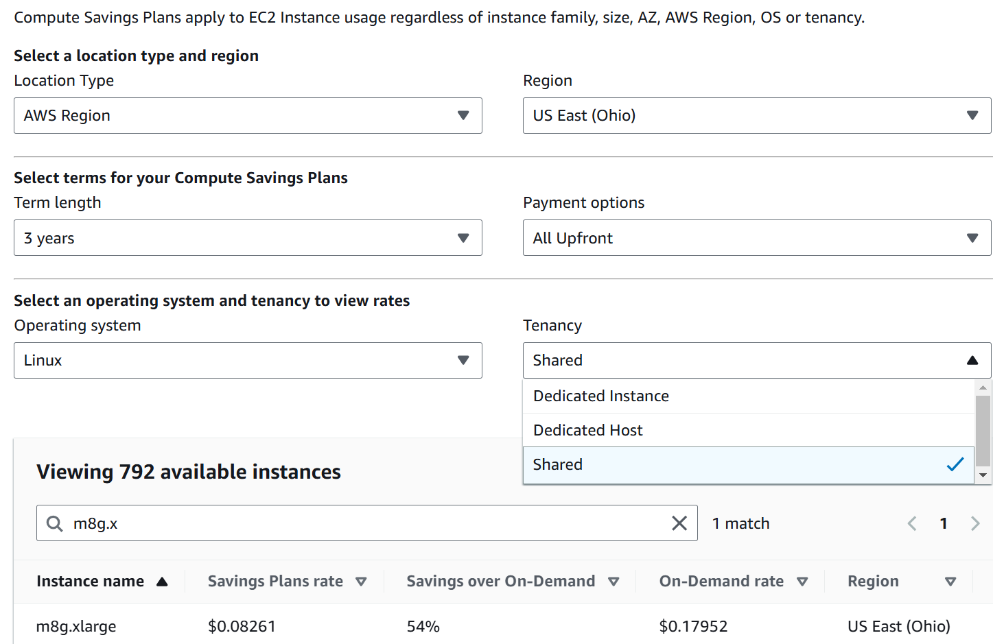
Since you commit this for 3 years regardless of usage, you pay US$ 2171 in advance for a 4 vCPU 16 GB VM on Linux.
END OF PART 1\
Okay… now that the concept makes sense to you, let’s move into how to apply and consume them.
PART 2
Consumption
How do you implement the concepts in Part 1 so they are consumable by various roles?\
That’s the goal of PART 2.
Proactive Operations
Part 2 Chapter 1
Proactive Operations is a complex concept. How does it work in real life?
System Engagement
As a product, how does VCF Operations “communicates” to its users?
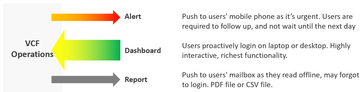
In terms of urgency, live screen is the most pressing, followed by alert. Report is suitable for long term review. Use dashboard as much as possible as it offers the richest functionality and interaction. That’s why the diagram above shows it with bigger arrow than the other 3 ways.
If you apply the above thinking, you will vrealize several benefits:
| Less reports | Encourage users to login as they get richer experience. Compliment with login-less dashboards, made available at user-friendly intranet website |
|----|----|
| Higher engagement | Higher engagement with IT Leadership Team. Take time to educate and demonstrate how dashboard meets their needs better. Use a login-less dashboard, displayed prominently near their office to encourage involvement. |
| Better telemetry | It’s not possible to track if users actually read your reports. With dashboard, you can even track how they interact with VCF Operations, using 3rd party website tracker software. |
| Flexible threshold | You can tailor the threshold (green – yellow – orange – red) accordingly, as each of the 4 way of communication have different level of urgency. |
Synergy
The following table details how the 3 ways of engaging are complementary. I’ve excluded screen as it has narrow usage.
| Alerts | Dashboard | Report | |
|---|---|---|---|
| Nature | Reactive | Proactive | Passive |
| Good For | Exception | Exception. Analysis | Exception. |
| Depth | Detail | Detail and Summary | Summary |
| Use Case | Troubleshooting | Troubleshooting. Monitoring. Optimizing | Export to spreadsheet or PowerPoint |
| Time | Minutes | Daily – Monthly. | Weekly onwards |
| Focus is “now” | Focus is days | Focus is weeks | |
| Roles | L1 | L1 onwards | IT Leadership |
| Architect Team | Finance Team | ||
| Capacity Team (Dashboard + Report work together) | |||
| Audit Team (Dashboard + Report work together) | |||
| Tenant (Dashboard + Report work together) | |||
Timeline
In VCF Operations, the following are implemented as dashboard:
-
NOC screen
-
Daily health check
-
Longer cadenced
However, they have diferent timeline. As a result, they have different purpose.
| Live NOC Screens | Daily Preventive Check | Longer Cadence | |
|---|---|---|---|
| Purpose | Real time visibility into the overall environment, so live fire is attended right away. | Prevent alerts of the day. Tomorrow is another day as it will be checked tomorrow morning. | Larger optimization and issue avoidance. Deep and broad analyzis of the whole environment. |
| Urgent (hopefully not important) | Important (hopefully not urgent) | Important (definitely not urgent) | |
| Timeframe | Focus: last 5 minutes | Focus: next 12 hours | Focus: Weekly – Quarterly |
| Data: 1 hour | Data: 1 week | Data: 1 year | |
| Usage and Interaction | Live. Always on and projected on the big screen. | 2x a day. Once at start of day, the other at end of day. | Less standard. Multiple usage throughout the week/month, depending on the persona and need. |
| Time spent to analyze: 10 seconds | Screentime: 10 minutes | ||
| User | L1 (first liner) | L2 (expert) | Auditor, Capacity Planner, Performance Specialist, Cost Specialist |
| Primary Content | Availability. Performance. Security. | Same area of concern, but the Daily Check is broader and deeper as it has much longer horizon. | Capacity (utilization, reclamation, optimization). Sustainability. |
How are their differences translating in the product UI?
| Live NOC Screens | Daily Preventive Check | Longer Cadence |
|---|---|---|
| Dashboard size matches the projector/TV. No scrolling. | Dashboard size is 1 -2 screen deep. | Dashboard size is >2 screen deep. |
Table not suitable. Hard to conclude by seeing many numbers. Easier to see trends + present number | Scoreboard is suitable, as L2 will click to do interactive filtering and analyzis | Table for export to spreadsheet for further analyzis |
| No interaction as there is no keyboard/mouse. See from a distance. It auto-refreshes and auto-rotate | Standard interaction process | Rich interaction. Flexible flow, depending on the need at that time |
Live Screen
The real-time nature of life inside the Network Operations Center room calls for a different type of visibility.
Collaborate with NOC Room team, as they are ultimately the consumer. What information do they need? What do you need from them? What’s the Exit Criteria and Entry Criteria?
The following diagram summarizes the key requirements and constraints. As a result, the dashboard needs to be designed accordingly.
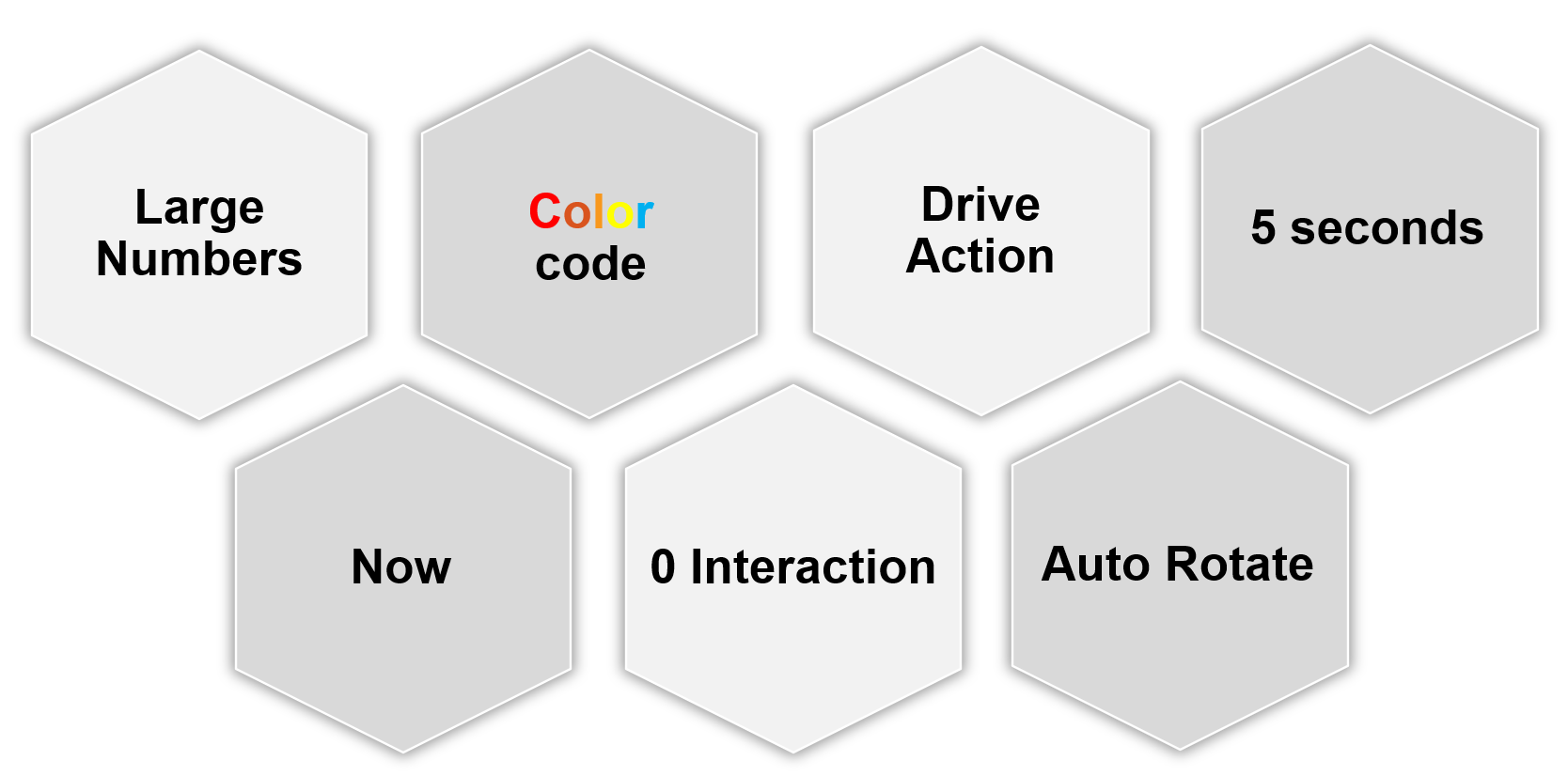
| 0 interaction | Think of TV, not monitor. NOC screen does not have keyboard and mouse for user to click and type. So the information is auto-refresh and auto-rotate. If your TV has a touch screen, that’s a bonus. This should not replace the basic need of being useful from afar. |
|---|---|
| Toolbars & buttons on screen should not be used. They add confusion, plus there is no way to use them from afar. | |
| Most widgets are not suitable as a result. | |
| Large Number | As the information is seen from a distance, the font used is much larger than the standard font used in laptop or desktop monitor. This also means the screen real estate is relatively less. When designing, use a 14” screen instead of 24” screen. |
| Now | It is placed strategically because it displays a time sensitive information. As such, many operational use cases are actually not suitable for these. For examples, Capacity, Cost, and Sustainability management are not highly time sensitive. They tend to stay static for hours, rendering them unsuitable for live screen. It’s showing the latest 5-minute data. The past is less relevant. Ideally, project the next 1 hour. The information auto-refresh frequently. Think 1 minute, not 10 minutes. If the display is static for 300 seconds, users will not be drawn into it. The information presented is more urgent in nature than alerts (otherwise you simply use alerts!) and is used to complement alerts. |
| Color | Heavy use of color. Color is easier to digest than text, as you don’t even need to read. Lots of text can confuse viewers. Text can be hard to read from afar. Use key colors (green, yellow, amber, and red) classify the severity of the issue. By default, all should be green. If you display something that is red most of the time, after a while the viewer will ignore it. This defeats the very purpose of displaying on the big screen. Use alerts for something less urgent. Ideally, all the numbers are in %, with 0 being bad and 100 being perfect. |
| 5 second | KISS (Keep It Simple Show). Remember the 5-second test. The screen should be easy to interpret, user friendly and do not require an explanation. |
The above principle applies to the part of the dashboard that is projected on the big screen. You can dual-purpose the same dashboard, to cater for the operators in the NOC room. These help desk administrators should have the same dashboard on their desktop or laptop. They can then use keyboard and mouse to interact with the dashboard, enabling them to drill down and find out more information.
I’m aware that other persona, especially IT leaders, may drop by to NOC room to check things out. This does not mean we design a NOC dashboard for them. For example, say CIO drops by every single day for 10 minutes. In this case, if it makes life easier, prepare a dashboard to facilitate the “check”. Only bring up during the visit. There is no need to have the dashboard on the wall for the remaining 23:50 hours.
Action
Action, not information. NOC show data for your action, not for your information.
Focuses on immediate remediation. Remediation action has to be immediate, as soon as possible if it’s red.
If something can’t be fixed within the same day, why show it live? Remediation that takes >1 day should not be shown, as the dashboard will be red for hours. Use alerts for longer remediation window.
Problems that don’t require immediate attention should be avoided, as they are distraction. Your NOC Screen is not your To Do List.
Examples of suitable actions: stop provisioning of new VM, take action on VMs that abuse the shared infrastructure.
Examples of not suitable actions: Increase supply of infrastructure, such as adding hardware.
Auto Rotate
It’s not enough to auto-refresh due to the sheer amount of information. Auto-rotate enables you to show more content without scrolling the dashboard, and prevent human’s boredom from seeing the same screen for hours.
Configure the dashboards to auto-rotate in a logical flow. Explain the flow to the users as it can get overwhelming.
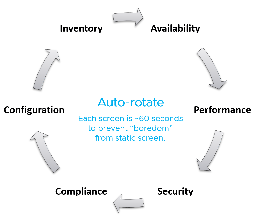
Implementation wise, you need to disable Guest OS screen saver, Aria Operations user time out and Guest OS going to sleep.
Full Screen
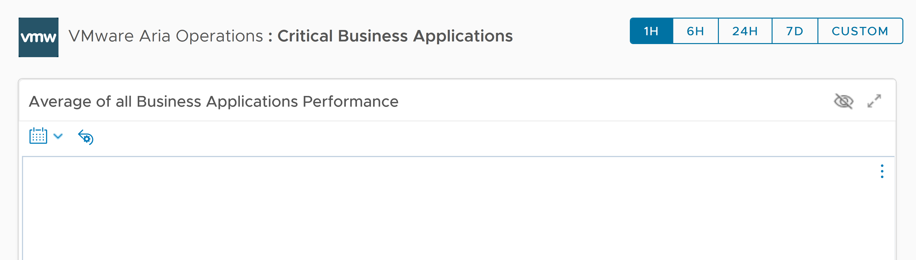
For improved focus, hide the menu and navigation by using a login-less dashboard. This will also maximise the screen real estate. Complement this by enabling the browser full screen, so viewers do not even see it’s a web page. The preceeding screenshot is the result.
Take note that viewers cannot leave the page and navigate out into other pages in vR Ops. The object link below does not work. Yes I agree the product should have removed the URL.
Daily Health Check
This daily, proactive health check forms the 2nd leg of your proactive operations.
Start each day with a proactive daily health check. Initially, this is done by both Level 2 and Level 1 team. As Level 1 gain confidence, they may even do it at the start of their shift. As there are 2-3 shifts in 24/7 operations, the dashboard gets used multiple times a day. The dashboard aims to minimize alerts by analysing underlying issues, hence it requires some expertise of how VCF performs. It also requires someone who knows the environment well, especially what is happening on that day.
Morning Routine
As the person responsible for the health of the overall environment, what do you check every morning, with your first cup of coffee?
If the answer is a list of alerts or complaints, how do you know the big picture?
By and large, your environment is good, otherwise you’re not reading this specific chapter 😊. If it is not good, you have some knowledge on the problems as you need to explain it to your management. On this assumption, this dashboard focuses on things that need attention.
It complements alerts by showing insights (situation that has not triggered an alert) and show the overall picture. The overall picture is also useful as before you troubleshoot something specific you should ensure the issue is not with the overall environment.
As insights complements alert, open the 2 screens side by side. Simply open 2 browser windows, as shown in the following screenshot.
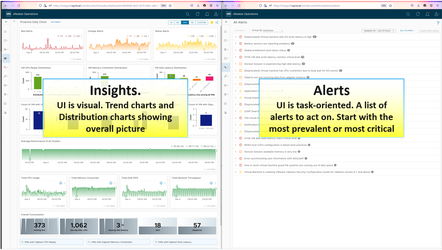
There are 2 dashboards, one from VCF Operations and one from Log Insight.
vSphere Daily Check
As part of our daily check, you’re after changes and unusual events. There are 4 types of changes:
-
Configuration changes.
-
Consumption changes. Both unexpected increase and drop are not desirable.
-
Supply changes. Focus is on unexpected drop, which could be due to a variety of reasons (e.g. maintenance taking longer than expected).
-
Dynamics: VM state change, VM location change, VM inventory change
The first thing to check is the trend of alerts. Since you’re checking this daily or even more, the number gives you a good indicator of what’s ahead of you.
Alarm can give insight when reviewed as a set and over the last 24 hours.
It cuts across objects, so we must be able to see ripple and correlation.
Check the patterns of alarms in the last 24 hours. Is that within expectation?
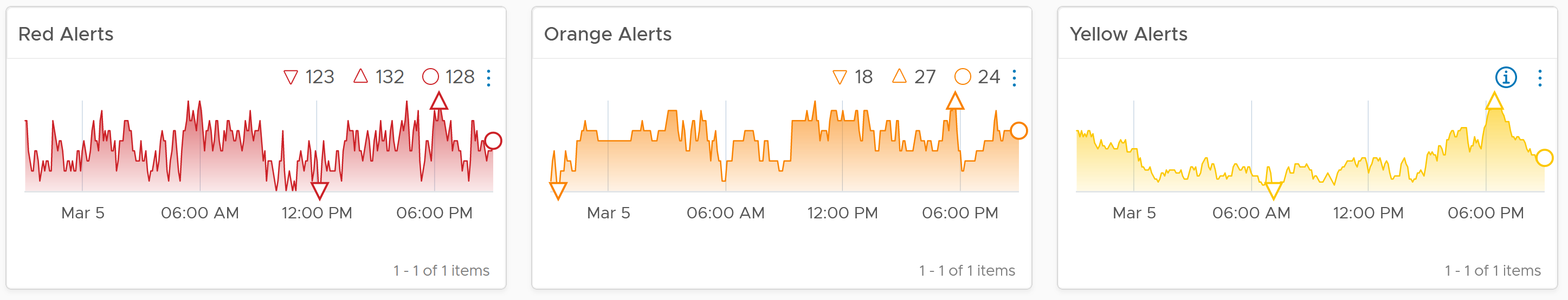
Check both the absolute amount and the pattern. Compare it with your expectation on that day. Is today a special date, where high demand is expected? Any relevant changes approved during last night change window that will impact supply and demand?
Is the trend unusual? Form an expectation of what’s normal for your environment as it develops pattern. Compare it with what’s happening (e.g. DC upgrade, public holiday).
List of Clusters

vSphere Cluster is a logical group where “similar” VMs live together.
The table is sorted by the overall performance, where the least performing cluster is shown at the top.
The columns sport leading indicators, as it uses worst() not average. It checks 9 key performance metrics. Adjust the threshold to your comfort level. 4 utilization metrics are shown to catch abnormal peak.
Performance Trends
What’s the overall IaaS performance among all the VMs? Is it a CPU, memory, disk problem? Expect the numbers to be within your expectations of that day.
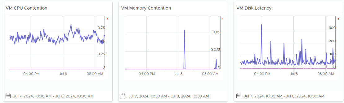
What’s the overall IaaS performance among all the VMs? Is it a CPU, memory, disk problem? To do that, dive into a specific cluster. This section automatically shows its performance in the last 24 hours.
The 3 table covers CPU, memory and disk. Expect CPU contention to be higher and more volatile than memory contention. Add network drop packets if the issue exists in your environment.
Each table shows 2 lines (worst and average). Are they in line with your expectation, both the absolute amount and their pattern over time? Make sure the average is well below your comfort level.
If the worse is far higher, you have an isolated incident. If they are close and the average is not low, you have a widespread issue.
Affected VMs
The distribution charts place all the VMs in 4 levels of performance (green, yellow, orange, red). Attend to the red category first.
They are based on 20-second peak metric, not 5-minute average. This gives you a leading indicator. Each value is based on the highest in the last 24 hours, to enable daily comparison.
Add network drop packets if the issue exists in your environment.
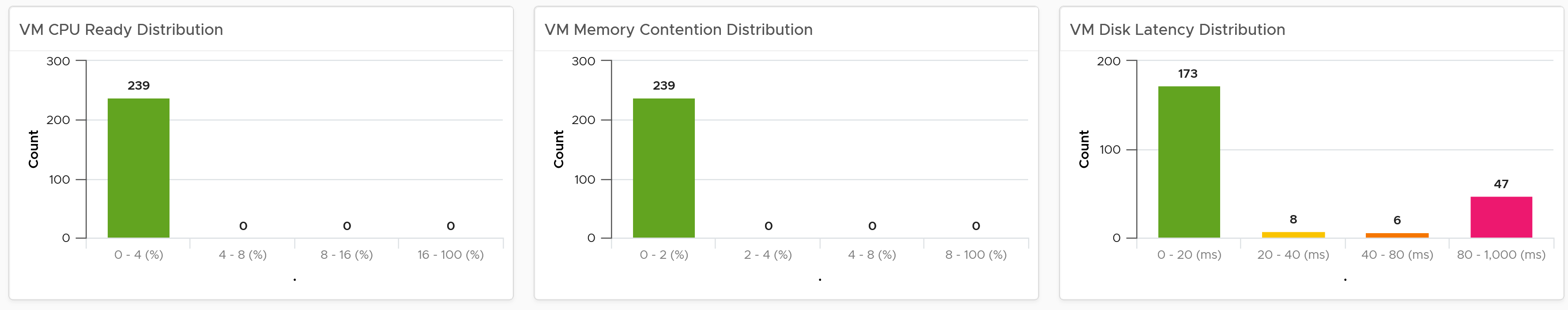
Configuration
Next is configuration. What are typical misconfiguration that cause performance problems?
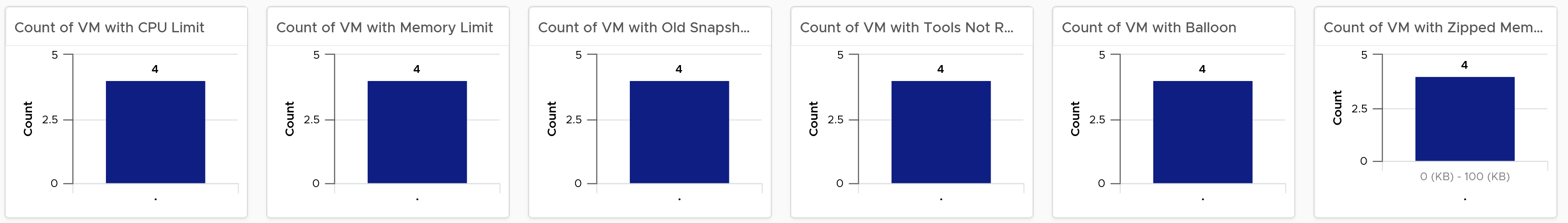
Ideally the above returns 0 VMs.
VM Changes
What are the important changes on VMs? Is the environment more volatile than expected? Ensure they match the expectation of the day.
High volatility increases the chances of alerts.
There are 20 types of VM changes that can happen to a VM. They are grouped into 3 logical sets. For each set, the changes are shown in order of urgency, where the least desired changes are shown first.
Each of the 20 changes are unique. Ensure they match the approved change requests and expected changes of that day.
-
State = VMs power state change. Abnormal changes such as reset, suspend and power off are shown first.
-
Location = VMs are moved to another host or datastore. This can be hot or cold migration. Hot migration is shown first as it might impact performance.
-
Inventory = VMs are added or removed, hence impacting count of inventory.
Utilization
To complement the performance, we need to check utilization. Are they higher than expected? On the other hand, a big drop means the amount of work completed is less, which could indicate availability or performance issues.
We check the 4 elements of infrastructure. Since this is the overall utilization, it should be stable or cyclical overtime. Make sure both the pattern and the amount are in line with your expectation of that day.
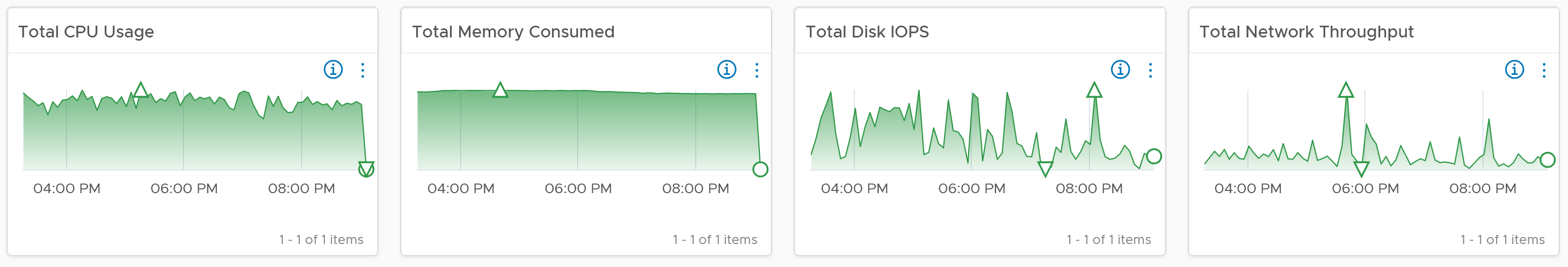
The CPU widget uses Usage metric as it is aware of CPU clock speed. The memory widget uses allocation as memory load is much more stable, reflecting its nature as cache of disk space.
If you have enough screen real estate, add the Memory Balloon and Compresed + Swapped.
Customization Tips
If you operate a large environment, you can add a table of data centers so you can zoom into specific DC. You can even add vSphere Clusters in the table, just take note the table will be longer.
One of the table rows has to be vSphere World object. This lets you see the overall picture.
vSphere Daily Log Check
A lot of information is only available in the form of logs. Use a daily Log Insight dashboard to perform basic hygiene, such as:
-
Undesirable VMs events. Are they in line with your expectation? That means the correct amount and right timing. Harmless events such as VM relocation, snapshot, powered on were filtered out from the dashboard.
-
Undesirable VM changes & Snapshot. Are they in line with your expectation? Harmless changes filtered out. Are changes and snapshot taken during office hours?
-
Issue. vCenter Alarms, vCenter tasks that ended with error, and ESXi potential problems.
-
Security. Any malicious changes? Anyone issuing shell commands at ESXi console? Login by root?
-
vMotion. This is a leading indicator of a larger performance issue. Is the bandwidth lower than expected? Is the downtime longer than expected? Some clusters did a lot more vMotion than usual?
Business Applications
To be proactive, you need to know the critical business applications. They form a small percentage of your VM population. However, they are essential to the company revenue, profit or image. They are your crown jewel system.
Different industries have their own set of mission critical systems. If you are bank, it’s your Internet Banking. If you’re eCommerce, it’s your online portal.
In order to be proactive, you need to monitor these applications closely. Likely a few times a day, not just one time in the morning. The application team is watching their own system throughout the day, so you can’t afford to be blind to what’s happening from infrastructure viewpoint.
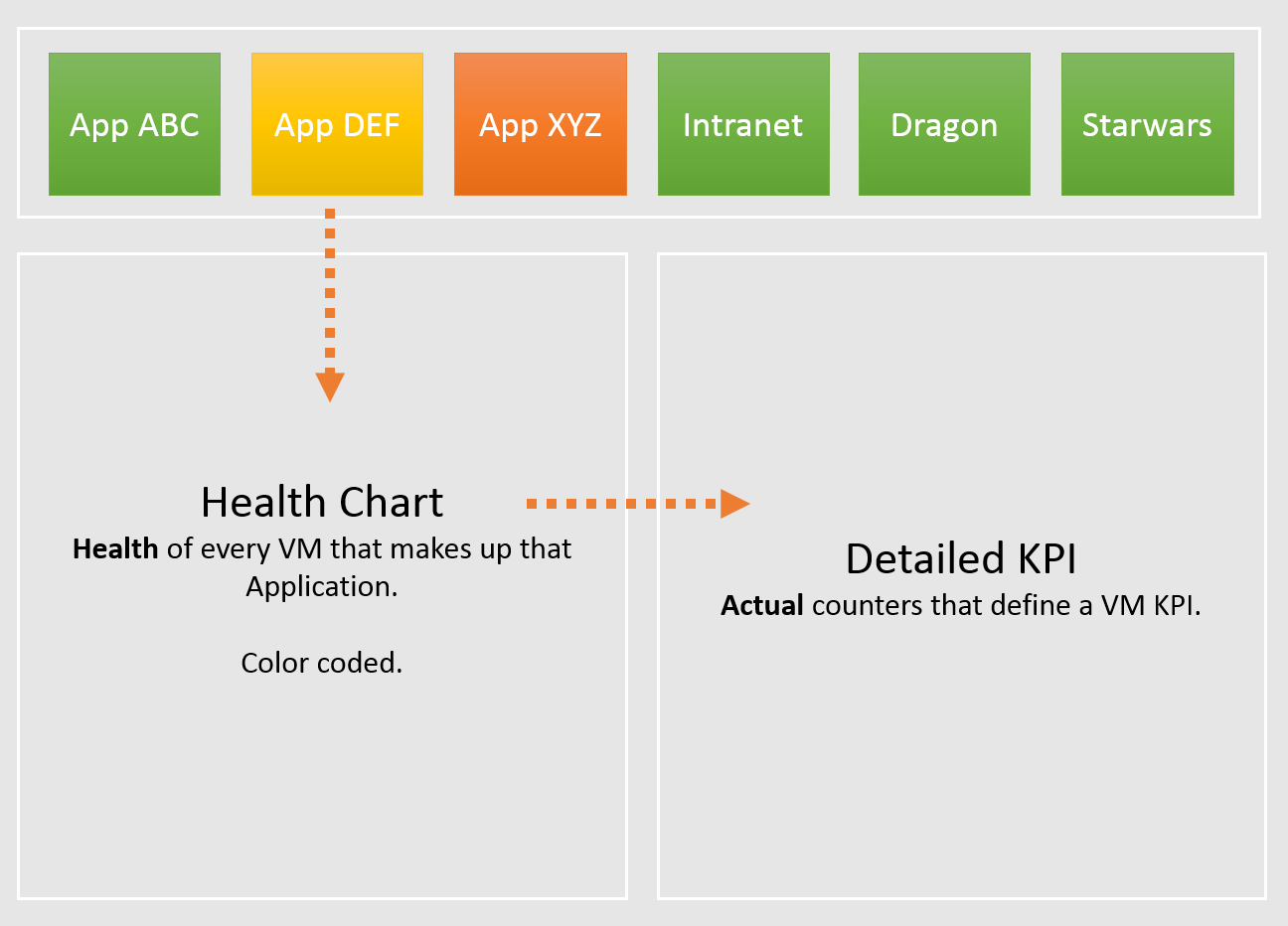
vSphere Folder Structure
The following structure shows Business Unit as the top folder. Each business unit can have 1 or more departments (Business Unit C spans 3 departments in the diagram below). Each department owns multiple business applications. A business application typically consists of multiple tiers (e.g. web tier, application tier, database tier). A tier is a group of VMs performing the same function, running the same set of software and have identical hardware configuration. You expect the VMs are either scale-out (farm) or active/passive.
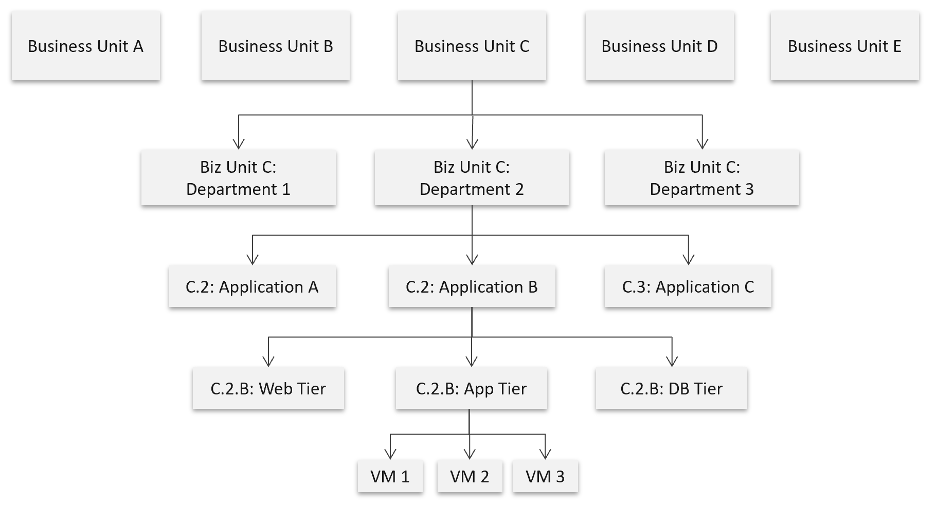
The limitation of the above is reorganisation. You will need to rename, move folders to the new parent folders, and delete folders that are no longer relevant. For example, if Business Unit B merges with Business Unit C and the combined entity has a new name, then you need to rename one of them, and delete the other. This is why I only have 2 levels of organisation in the above. Your goal is to have some level of context, not to replicate the entire organisation chart as that’s the job of HR department😊
The application name should be unique. If not, prefix with the department name.
The folder name needs to be unique, even across vCenter Servers. So, it’s paramount to have the application name as prefix.
If you have multiple vCenter servers, the name should be consistent across all of them.
Alert
What, exactly, is alert?
The 3R of alert:
| Rapid | The issue is urgent; hence you want to know the problem as soon as possible. If time is not an essence, then a daily SOP with dashboard is more effective as you can see the big picture. Avoid sending alerts to people that do not deal with day-to-day operations. Long term actions such as capacity management are best served with dashboard. Do not treat alert as To Do List. It is also not a Reminder |
|---|---|
| Real | Don’t confuse alert with symptom. If there is nothing wrong, there is no need to trigger an alert. That’s why in general you do not set up an alert on inventory changes, as inventory is merely an account of something. |
| Rare | If it happens too frequent, it will numb you. Alert focuses on exception, not the big picture. As a result, you want this to be minimal. If the whole house is on fire, it’s too late for an alert. |
What distinguish red criticality versus orange criticality versus yellow criticality?
The following diagram provides the answer:
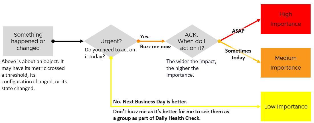
Let’s summarize how the colors translate into day-to-day operations:
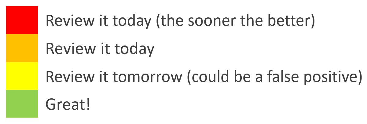
| Yellow | Symptom. Non urgent. Leading Indicators. Symptoms. Could be important, could also be false positive |
|---|---|
| Orange | Alert. Urgent, but importance is not high. Attend by end of day, do not delay until tomorrow. |
| Red | Alert. Urgent and important. However, it does not always mean you must drop everything you do and start firefighting in seconds. Attend within 1-2 hours. |
There is a subset of Red where you need to drop everything. Think of it as emergency. It may not be important, but it’s definitely urgent. If you get the alert at 0200 hours, you attend to it as you do not want to delay. An analogy we can relate in life is you accidently cut yourself. Even though it’s not life threatening, you want to stop the bleeding immediately, not 15 minutes later. The good part is such emergency situation rarely happens. There is no alert defined for it in VCF. |
Alerts Planning
Managing alerts is not the same as minimizing alerts. Managing is dealing with alerts that are already triggered. Minimizing takes us towards preventing alerts to begin with. Use insight to minimize alert definition, as alert should be reserved for urgent and important issue.
Your goal is to minimize alerts storm while providing the broadest coverage. This calls for a careful planning on the alert definition, symptom and threshold.
For each alert, ask yourself: what action must be taken, today, by the person seeing the alert?
-
If the answer is nothing, then why disturb the person today? He will be bombarded with early warnings. Dashboard gives better picture as it shows issues that are yet to breach the threshold.
-
If the answer is something, can that action be automated? If the answer is yes, then why do you want to be alerted? You should automate the response. Be careful of simplified logic as computer has no common sense. An automation that is not fool proof can result in a disaster.
If the answer is escalating to the next level (e.g. Level 2 support) after adding some context and initial analyzis, then it depends on the urgency. Generally speaking, L2 has longer timelines and need to see bigger picture. So the L1 frontliner may group the alerts into 1 instead of escalating each as isolated cases. If this is the case, help the L1 to see the big picture. A dashboard is more effective.
Target Persona: The Who
It is essential to design the alert for each persona. What is relevant for one may be irrelevant to others.
There are at least 3 main personas, with additional sub-personas:
-
Application team
-
Infrastructure team. This is the main persona, but it has at least the following sub-personas:
-
Network Team
-
Storage Team
-
-
Security team. They look at both, but purely from security perspective.
Class of Service: The What
Not all workloads are equal. The mission critical applications are certainly more important than its development version.
Classify your workload into 3:
-
Mission critical applications
-
Standard production
-
Test and Development
Having more than 3 can complicate operations.
Tailor the alerts according to the class of service. The higher the criticality, the lower the threshold. For example:
-
Mission Critical: VM Disk Latency > 30 ms for 5 minutes.
-
Standard Production: VM Disk Latency > 60 ms for 10 minutes.
-
Test and Development: VM Disk Latency > 120 ms for 10 minutes.
What to Alert
What areas do you want to monitor with alerts? What can you do to reduce the noise?
Define the types of problem for each pillar of operations. For each type, classify if an alert is needed or not.
| Availability | Proactive hardware replacement before reaching the manufacturing limit. For example, the SSD disk has limit of number of writes as each write introduces a wear and tear. The manufacturer has a number in mind for the endurance. If you have thousands of disks, you create a weekly dashboard just to track this limit and schedule proactive replacement for those disks nearing their limit. |
|---|---|
| Check the hardware temperature as heat is the #1 enemy of electronics. Okay, if you have water leakage you have a different problem | |
| Ensure software stack compatibility as versions incompatibility is known to cause outage. | |
| Have redundancy, so unplanned downtime triggers non-critical alerts so long it’s within the allowance set in the design. If you design N+1 availability, then a single downtime is not a red alert | |
| Trap soft errors. They are non-critical events that act as early warning. Treat them as insights. | |
| Performance | Minimize reactive operations not by using lower threshold as that will result in noise. Instead, track early warning metrics via insight. |
| For consumption type of alerts, only define red alert. Orange level is best covered by daily dashboard. | |
| For contention, suppress for low utilization, as likely the impact is not felt at the application level. Use CPU as the proxy for application. | |
| Daily check for sustained and high utilization, especially those trending upwards over time. | |
| Separate formal SLA (alert) with internal KPI (insight). | |
| Security | Security attack. If the attack is live, the alert screen needs to be accompanied by NOC screen. |
| Check for undesirable events | |
| Configuration | Only high-risk settings that cause urgent problems such as slow performance, outage, or security hacking. Non-urgent config issues are best managed via daily health check. |
| Compliance | Only the urgent one, where you cannot wait until tomorrow |
| Capacity | Only define red alert as it’s a guard rail. |
Alert should not replace operations best practices. For examples, you should ensure VMware Tools are up to date. If you set an alert for outdated VMware Tools, you become reactive and may get excessive alert. Since it’s not urgent, it’s better to have a daily SOP where you have a list of VMs with outdated VMware Tools. Make sure the list is empty.
Alert should be triggered on all affected objects, both the victims and the villain. It is common that a failure at the lowest ripples through the upper layers. For example, a physical disk failure in a vSAN cluster. This in turn can bring down an entire vSAN disk group. If the ESXi host has only 1 disk group, it can impact the host as it will have no storage.
What not to Alert
Do not set alert on issue that you can review the next day. You’re better off with a daily dashboard, as it lets you see the big picture.
| Availability | Backup failure. For example, you do nightly back up of 1000 VM and 1 fails. Since you still have the previous night backup, you don’t need to troubleshoot at night. The exception here is there are many VMs affected. |
|---|---|
| Cost | Nothing urgent. |
| Inventory | Since there is already a NOC screen tracking inventory volatility, you don’t need an alert here as inventory it’s merely an account of what you have. There is no good or bad. |
| Capacity | Reclamation and downsizing is best done via daily dashboard. This is often mistaken as performance problem, as high utilization is a common alert. |
| Configuration | Non-urgent issue, such as outdated VMware Tools. |
| Compliance | Non-urgent issue, such as non-security compliance to corporate standard. |
Examples of important but not urgent:
-
“Host is in maintenance mode for at least 72 hours” is not urgent as it’s been down for 3 full days. It’s important as that’s not normal.
-
“A recoverable memory error has occurred on the host” is not urgent as the issue has been recovered. You likely need to replace hardware. As the problem can spread, it’s an important one. You need to schedule a hardware scan, which may require a schedule downtime.
-
You notice vMotion has been taking 300% longer in the last 12 hours, going up from the usual 0.2s to 0.6x second in 10 large clusters, where a total of 10K production VMs are running. But it’s a low level issue that none of the app owners have not noticed. Not urgent, but important as it can potentially turn into a big problem.
-
You notice a performance problem that has happens randomly. It went away by itself within 5 minutes, so the owner kind of forgive your IaaS. But the problem hit VMs randomly, and it’s been going on a few times a day for a few days. Different owners are impacted so each does not really complain as each is rarely hit. You feel it’s risky to add more VMs.
Design
Design the alerts as a set.
-
Start with the 4 elements of infrastructure (CPU, memory, disk, and network). The reason is each has their own behaviour.
-
For each element, look at the entire set of objects being monitored, and design top down. Do both consumer objects and provider objects at the same time.
-
For each object, cover the 2 types of metrics: contention and consumption.
Once you have a list of alerts, validate with
-
Consistency check. Run through each object type, and review all the 4 elements of infrastructure to make sure they are correct.
-
Bottom-up scenarios. Ensure all the possibilities are captured.
Once you do the above, you will end up with an alert count for each.
The following shows the overall count of alerts for the top 5 objects in vSphere. The first 2 are consumer objects, and the last 3 are the primary provider objects.
Some objects have 2 alerts as we need to account for different problem (e.g. read vs write latency).
| Guest OS | VM | Res Pool | ESXi | Cluster | ||
|---|---|---|---|---|---|---|
| Contention | CPU | 1 | 1 | 1 | 1 | 1 |
| Memory | Not yet | 1 | 1 | 1 | 1 | |
| Disk | 1 | 2 | N/A | Not yet | Not yet | |
| Network | Not yet | 1 | N/A | 2 | Not yet | |
| Consumption | CPU | Not yet | 1 | N/A | 1 | 1 |
| Memory | Not yet | N/A (Guest OS) | N/A | 1 | 1 | |
| Disk | 1 | N/A | N/A | N/A | ||
| Network | Not yet | Not yet | N/A | Not yet | N/A |
Not yet = I’ve not implemented it yet. Some of the Guest OS alerts requires Telegraf agent.
N/A = alert is not applicable for this object as daily check or live NOC screen is better.
Let’s now add the last 4 objects in vSphere. They provide storage and network resources. Data Center is not included as it’s just a group from alerts design perspective.
| Type of Alerts | Datastore | Datastore Cluster | vSwitch | Port Group | |
|---|---|---|---|---|---|
| Contention | Disk | 0 | 2 | N/A | N/A |
| Network | N/A | N/A | N/A | 1 | |
| Consumption | Disk | 1 | Not yet | N/A | N/A |
| Network | N/A | N/A | N/A | N/A |
Alert Definition
There are 2 main approaches to define an alert.
| Generic Alert | Specific Alert | |
|---|---|---|
| What it is | It covers specific symptoms. The cause could be many. It’s symptom oriented. | It covers specific cause. It’s cause oriented. |
| Examples | VM did not get the CPU time it asked | VM had CPU contention due to CPU Co-stop caused by snapshots |
| VM had CPU contention due to CPU Co-stop caused by too many vCPUs | ||
| Strength | Alert name will be simpler | Alert name is more specific |
| Overall less alert definition | Action is clearer | |
| Weakness | Can’t tell the actual problem. For example, is it read or write latency? But do we need to know at this stage, since alert is just the tip of the iceberg? Can we pass this to Insight, where we can see more? | Very complex to design. It does not cover unknown cause. So we still need the catch all as the last resort. That means designing the alert is complex as the catch all typically contains certain traits. |
| Recommendation becomes a long list of possibilities. Can be solved by having a condition in recommendation itself, so it’s not a long list of irrelevant recommendation. The recommendation should contain live, clickable information instead of just plain text. | Most causes are not known, so this has limited use case. For example, we can’t prove that a snapshot is causing CPU contention or even disk latency. We only know probable cause, so we’re unable to prove the actual. We pray that we make some changes, and the problem goes away magically. | |
| Many known causes are due to misconfiguration. Why wait for an alert to address the incorrect config? Regular health checks should be provided. | ||
| Mostly only for Infrastructure Team. Not so suitable for VM Owner as she does not and should not care about underlying infrastructure problem. |
Threshold Design
Follow industry standard. For compliance, adhere to the relevant industry regulation.
Align with your promised SLA. If you do not have SLA with your customers, use your internal target.
Review the complaints (formal via ticket, or informal via your management chain).
Have many symptoms instead of a single and simple one.
- This sharpens the alert as it becomes narrower.
For contention, make sure the issue is both acute and sustained
-
Acute is sharp, lasting only 20 second but severe.
-
Sustained is average over 300 seconds.
-
Set the acute issue to be 4x higher over the sustained issue.
Make sure the contention alert does not occur at the point of very low utilisation, as there may not be meaningful business workload.
Design a consistent scaling within the context, so the relative urgency of red vs orange is maintained.
For example, Red is always 4x of orange. You can make red 2x as bad by modifying any 2 of the following:
-
2x the threshold. If orange uses 10 ms latency, then red is 20 ms.
-
2x the population. If orange impacts 10% of the VM, then red impacts 20%.
-
2x the time. If orange lasts for 5 minutes, then red is 10 minutes. I’m not in favour of this as I think it 0.5 hour makes more sense to operations team.
####### Wait Cycle
For contention, use 5 minutes. In cases where the metrics tend to have false positive, increase to 10 minutes.
For consumption, use 15 minutes.
####### Conditions
Do not use Symptoms. Instead, use Conditions. Symptoms means lighter or small problems that do not warrant an alert. Think of it as you got a light body ache which would go away after resting.
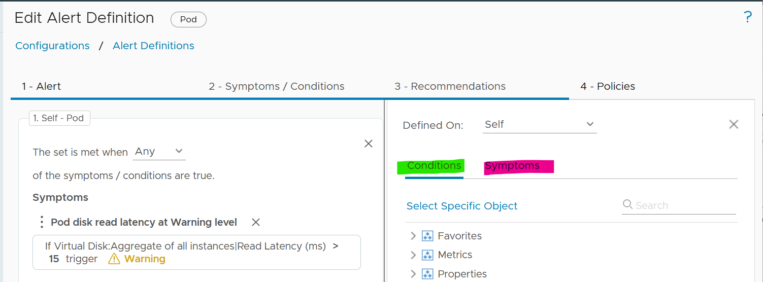
Recommendation | Remediation
Recommendation is just a piece of advice. It does not have ability to change. Remediation, on the other hand, will execute change in your environment. Recommendation is safer as it’s not automated.
It’s hard to develop a great remediation, or complete-yet-concise recommendation. The reason is the root cause is typically far from the alert triggered. There are too many combinations. We need to stop thinking that IT products have good observability. IT systems actually have poor visibility into what happened. Can you troubleshoot when your web browser is slow even though your high-end laptop is fast and overall utilization is low?
No, you can’t. If you can’t troubleshoot a single PC, why do you expect we can troubleshoot something far more complex? Observability is always a second-class citizen in product development. Most products only have few meaningful metrics. Even if they do have the metrics, they don’t provide API. Even if they have, the metrics could be unreliable or buggy.
A good recommendation is clear. It needs to list its assumptions and explain the reason behind the recommendations.
In the ideal world, your alerts are fully automated. The problem is RCA today is largely an exercise of elimination. It is a process that requires human expertise on the architecture. For example, to troubleshoot Tanzu, you need to know K8 + vSphere + Tanzu specific implementation.
The reason why we have to resort to elimination exercise is the lower layer or stack does not carry information from upper stack. For example, ESXi SCSI commands can’t be traced to specific VM.
Maybe one day we can have AI-assisted troubleshooting. I envisage the human expert “records” the steps. This becomes the training dataset.
Application Team
We start with Guest OS as this is the closest layer to the application. This alert is for someone responsible for the application, running on top of Windows or Linux. It is not relevant to the infrastructure team.
Guest OS Alerts
Since performance problem can happen within Guest OS, independently of virtualization, you need to monitor within this layer. The goal is to proactively manage performance before business is affected. The challenge happens when there is no application level or user transaction level monitoring. Another word, the application team simply rely on complaint. The problem with complaint is it’s highly subjective. The correlation to technical counters is both weak and unpredictable.
CPU Contention
| Goal | The CPU Run Queue is relatively less known due to the focus on CPU Utilization. This alert is likely independent of the underlying virtualization layer due to the nature of some applications which spawn excessive threads. Demonstrate to application team or VM owner that the IaaS team has visibility into Windows or Linux. |
|---|---|
| Red Condition | All these conditions must be met for 15 minutes:
|
| Orange Condition | This is not provided to reduce noise. If you need to set, follow these:
|
| Design Consideration | As the CPU Queue counter is known to have false positives, we increase the wait cycle to 15 minutes, and add Net Run to ensure it only happens when there is sufficiently high workload. |
| The alert works together with the VM CPU Utilization alert and VM CPU Contention alert. Use these 3 alerts together. | |
| Remediation1 | If the alert of high VM CPU contention is also triggered, then follow the remediation for this alert. |
| If the alert of high VM CPU consumption is also triggered, then follow the remediation for this alert. | |
If the above 2 are false, look at the application on why it’s creating many threads. Compare the values with other software or code that are part of the larger business applications. Also, compare the value with the same software in other business applications. If the software is a commercial software from IT vendor, ask the vendor for their recommendation as the maker of that product. If you do not get the answer, exclude this application from this alert. |
Thanks Darren Farrer for the collaboration.↩︎
Disk Contention Alert
| Red Condition | All these conditions must be met for 5 minutes:
|
|---|---|
| Orange Condition | All these conditions must be met for 5 minutes:
|
| Design Consideration | There is no official guidance from either operating system. This alert is set at relatively high number, so adjust as you deem appropriate |
| If you have excessive false positive, disable the orange condition. |
Other Contention Alerts
What other performance problems can exist only within the Guest OS, which is not caused by underlying virtualization? There are many possibilities. I’m not creating alerts as their threshold vary wildly by applications.
You should create your own alerts for the following:
-
Check if CPU Context Switch is consistently high. Inform developers that this could cause application performance problem. If the VM CPU Net Run is low, and run queue is low, then reduced the vCPU size.
-
Heavy memory paging, coupled with high amount of page fault.
-
High number of outstanding disk operations.
-
Network dropped packet. Note this requires Telegraf agent.
Consumption
There is no alert defined, as it could result in false positive.
There are, however, proactive check you can do:
-
Check CPU Usage Disparity. If it’s consistently high, discuss with VM Owner on why application unable to use all vCPU equally. Reduce size if not required, especially if CPU Context Switch is high and run queue is low.
-
Check free memory. If it’s consistently near 0 MB, coupled with moderate or high amount of paging, discuss with VM Owner if this impacts performance. Do application-level benchmarking before and after as too much memory can negate performance.
-
Low disk space. Not yet implemented as certain partitions such as swap is always near 100%. This cannot be implemented at VM virtual disk layer.
VM Alerts
In overcommit environment, a VM can experience contention. How do you balance between application team catching this alert, and infrastructure team to address the issue first?
The balancing will minimize blamestorming. Some techniques:
-
Avoid using the orange alert. So it’s only red. You keep the orange for the infrastructure team, so they have a heads up.
-
Use a higher threshold. For example, you set CPU Ready > 8% for application team and > 6% for infrastructure team.
Alert at infrastructure level, such as ESXi, is not relevant.
CPU Alerts
Design the CPU alerts as a set. That means cover all objects, and for each object, cover both contention and consumption. The contention alert and utilization alert should be used together. Especially for consumer, where capacity can be increased at a moment notice, increasing capacity when there is contention will result in inferior performance.
Contention Alerts
VM and IaaS have different perspective. For the shared infrastructure, the alert should focus on population issue, as opposed to just a small subset of VMs. We use 25% of VM population as the overall threshold. As this can mean hundreds of VM, we choose a lower threshold per VM.
This means ESXi, Resource Pool and Cluster. Data Center is not added as it can consists of clusters of different purposes.
VM Contention
| Red Condition | All these conditions must be met:
|
|---|---|
| Orange Condition | All these conditions must be met:
|
| Design Consideration | An absolute unit is used for CPU utilization as opposed to relative (%) as a small percentage of a monster VM could still be sizable |
| Remediation | This is complex. See the diagram at the start of CPU Alert section. |
Infrastructure Contention
| Red Condition | All these conditions must be met:
|
|---|---|
| Orange Condition | All these conditions must be met:
|
| Design Consideration | For cluster, we measure directly at VM level so it’s closer to what we care, which is the application. Aggregating from ESXi is less accurate. |
| For resource pool, the symptom does not work with cascading RP. Stacking RP on top of RP complicates operations. | |
| Remediation | This is complex. See the diagram at the start of CPU Alert section. |
Consumption Alerts
Utilization alert is tricky to define as high utilization could mean good or bad.
VM Consumption
| Goal | High utilization could cause business performance, especially for online workload where end users expect a “real time” response time. |
|---|---|
| Red Condition | All these conditions must be met for 15 minutes:
|
| Orange Condition | There is no orange alert as it will create more false positives. |
| Design Consideration | 15 minutes is used instead of 5 to reduce false positive. Take note this means you will lose 15 minutes. |
| Added Guest OS CPU Queue to ensure that there is actual bottleneck, as opposed to running optimally. This should result in a more meaningful alert. | |
| Remediation | Find out the nature of the application. If it’s batch job, the CPU Net Run could be sustaining at >95% for the entire duration of the batch run. So long the job is completed within the expected window, this is a healthy behaviour. Exclude this application from this alert. |
Find out from application team what metrics at application-layer or business transaction layer are proving that there is queue and latency. If the pattern matches the number at the infrastructure layer, then add vCPU. In the event you decide to add CPU, make sure it’s NUMA compliant. |
Infrastructure Consumption
| Red Condition | All these conditions must be met for 10 minutes:
|
|---|---|
| Orange Condition | There is no orange alert as it will create more false positives. |
| Design Consideration | As this is a provider, the focus is on capacity management, not performance. Space, not speed. That’s why counter such as Usage is not used. |
The threshold is not that high as we need to consider HA. Ideally, we should add the HA buffer into the threshold dynamically. If this results in excessive noise, increase the threshold to 50% and 100%. | |
| It is not set for Resource Pool as its use case varies. | |
| For cluster, it’s simply based on > 25% of ESXi members of the cluster |
Memory Alerts
Design the memory alerts as a set. That means cover all objects, and for each object, cover both contention and consumption.
Contention Alerts
Memory performance is hard to trace. The memory contention can be come from different factors. We can’t distinguish how much each part contributes. For example, VM 001 has 51% memory contention. This could be due to:
-
5 MB was limited Limit.
-
1 MB was swapped.
-
2 MB was compressed.
-
Low shares setting played a part.
VM Contention
| Red Condition | All these conditions must be met:
|
|---|---|
| Orange Condition | All these conditions must be met:
|
| Design Consideration | An absolute unit is used for CPU utilization as opposed to relative (%) as a small percentage of a monster VM could still be sizable |
Infrastructure Contention
| Red Condition | All these conditions must be met:
|
|---|---|
| Orange Condition | All these conditions must be met:
|
| Design Consideration | For cluster, we measure directly at VM level so it’s closer to what we care, which is the application. Aggregating from ESXi is less accurate. |
| For resource pool, the symptom does not work with cascading RP. Stacking RP on top of RP complicates operations. |
Consumption Alerts
There is no alert set at VM level as VM is just a motherboard.
There is no alert set at Guest OS level as it varies per application.
Infrastructure Consumption
| Red Condition | All these conditions must be met:
|
|---|---|
| Orange Condition | There is no orange alert as it will create more false positives. |
| Design Consideration | 10 minutes is used instead of 5 to reduce false positive. Take note this means you get notified later. |
| Balloon is set in an absolute term (10 MB) and not relative to the ESXi memory consumed so the impact is standardized. | |
| Swap and Compressed are not included so that alerts are triggered earlier, as remediation action, such as reducing demand, can take hours or days to complete. | |
| It’s set at 50% of host members as clusters are mostly <20 hosts, and memory functions as cache (so more does not mean it’s slow) |
Storage Alerts
Design the storage alerts as a set. That means cover all objects, and for each object, cover both contention and consumption.
Contention Alerts
Read latency and write latency are separated as their causes are typically different. The remediation actions likely differ as a result.
VM Contention
| Red Condition | For read latency, all these conditions must be met:
|
|---|---|
For write latency, all these conditions must be met:
| |
| Orange Condition | For read latency, all these conditions must be met:
|
For write latency, all these conditions must be met:
| |
| Design Consideration | Due to difference between vendor best practice and reality in customer environment, we set the wait cycle to 10 minutes and increase the threshold. In theory I agree we should pick a lower number, but in reality, there is hardly any complaint. Try to convince your boss to invest when there is no complaint 😉 |
| The 20-second peak cover both read and write. Yes, this is a known limitation. | |
| CPU Usage and Disk IOPS are added to reduce the alerts during low activity. The idea is business impact could be negligible during low disk activity. |
Infrastructure Contention
Not yet implemented. The reason is the many:many relationship between VM and datastore makes it impossible for us to set condition at VM level.
If you create, use these as a guide:
>25% of VM population has latency > 10 ms AND highest VM latency > 40 ms AND Overall Datastore Latency > 5 ms.
Consumption Alerts
Storage consumption covers both capacity (disk space) and performance (IOPS and throughput). Performance is hard to quantify due to the lack of “100%”. The ceiling is hard to define.
| Object | Threshold for Red level |
|----|----|
| Datastore | Used space > 90%. |
| Datastore Cluster | Not yet implemented. It needs to trigger when a member datastore has > 90% used. The remediation is to trigger storage DRS. |
Network Alerts
Consumption alert is hard to quantify due to the lack of “100%”. The ceiling is hard to define.
Contention Alerts
| Object | Threshold for Red level |
|---|---|
| VM | Transmitted packet drop > 4% and |
| In future the threshold should be relative to packets transmitted. 4% is a high threshold as that means 1 in 40 packets were dropped. However, since it happens within a 20-second period, it is set high. | |
| Orange alert is not set to minimize alert storm. Dropped packets are typically retransmitted, so users do not experience problem. So the ratio is always 100%. | |
| ESXi | Transmitted packet drop > 50 packets for virtual network |
| Transmitted packet drop > 50 packets for physical network | |
| Distributed Port Group | Red alert: Dropped packet > 10% Orange alert is not implemented due to false positive. In future I will change to transmit only. |
| Distributed Switch | Likely not applicable, as it’s just a group of ESXi and port groups. |
The Art of Dashboard
Part 2 Chapter 2
Design Consideration
To a few of us who love visualizing information with VCF Operations, we see the dashboard as a canvas. Granted, the widgets have limitation but that’s part of the art 😊
Creating dashboards is an art as you need to balance many conflicting requirements, such as:
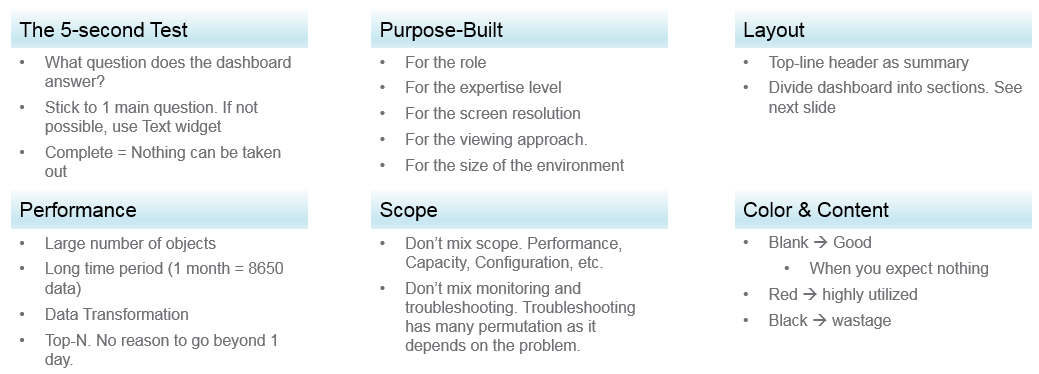
Can the dashboard be understood within 5 seconds? If yes, you buy yourself a few more minutes. The user understands what the dashboard does, and is willing to spend more time mastering it. To pass this test, think of which information, object, metric can you take away from the dashboard? See the KISS Principle, because an uber-dashboard that tries to please everyone and cover all scenarios will end up not being used.
Begin with the end in mind. The purpose dictates the dashboard design. 2 dashboards can have an identical target role, purpose, and use case (e.g. performance), but if the size of the environment differs, the 2 dashboards will be different. An environment with 50,000 VMs is managed differently with an environment of 500 VMs.
A good dashboard answers a set of questions. So jot down the questions. Be specific, including the metric and how it needs to be visualized.
A small environment with 100 VMs in just 8 hosts in 1 cluster (hence 1 data center, 1 vCenter) needs less dashboards than an environment with 10,000 VM spread over 800 ESXi hosts, 100 clusters, 10 data centers and 3 vCenter Servers.
Product wise, the dashboard feature in VCF Operations complement its built-in pages. Each page is hand coded HTML with precision. For customers who need to customize and personalize the information, we’ve provided out of the box dashboards that complement the existing page.
Design Methodology
This section introduces us to a few considerations surrounding dashboard design. We will walk through a method where we are able to understand the user, the activity, the workflow and the other aspects needed to understand the context before we start.
When we create dashboards that are used by others in our team we have to consider a few aspects that are helpful in making information useful, usable and delightful.
| Who | Begin with the end in mind. Who are actually using the dashboards you create? What specific role and persona is going to use it? Start by creating a list of all users who would be accessing and using information in the dashboard Against this list mention the kind of information they would find useful for the specific persona. |
|---|---|
| What | What is the type of activity (granular vs. high level) they will perform? List next to the task if the information needs to be granular or high level. Sometimes users are looking for just a KPI number, sometimes they are looking for trends. Sometimes users might want to interact with the information, create drill downs etc. The complexity of the activity will help you identify if you need a complex widget or a simple one. |
| How | How (workflow) will they use the dashboard? List down what happens after they view the information, do they need to use another application, another visualization. Plan accordingly and place navigation to enable this to happen. |
| When | How often (hourly, daily, weekly, monthly, quarterly) will they use the dashboard? Think about the usage of the dashboard, is it a frequent use case needed for daily use to perform work, or is it for monitoring on an irregular basis. |
| Why | Why (outcome) do they need the dashboard? Also list down outcomes from the dashboard usage. What is the usefulness of using the dashboard and what goals or outcomes the user is likely to achieve. |
Once we get this information we can better design dashboards based on the needs of the users. One way could be to plot it on a grid to understand the impact better. Let’s start with a grid like this one.
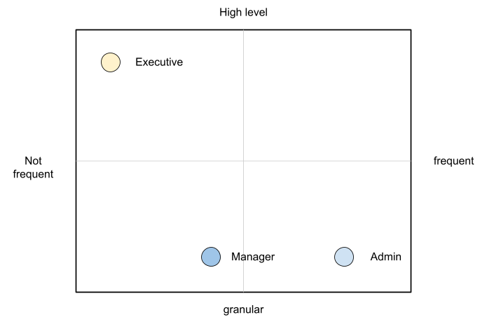
An executive might use the dashboard less frequently and the type of tasks they would perform could be high level. If you make a dashboard that is very granular and requires a lot of effort the executive might not have the time to use the dashboard.
A manager might use the dashboard once a week, or on a monthly timeline, might need information on both granular or high-level.
Similarly an admin agent might use it on a daily basis and might need information at times that needs a lot of effort and at other times just a metric number would do.
Once you have reached a visualisation like this, you can better judge. If it needs to be a single dashboard or multiple based on the persona. What items should you prioritise and what kind of complexity is necessary based on the timeframe and time available with the stakeholder
Clean Layout
Divide the screen into sections visually. This makes the dashboard easier to read. Here are some examples of how you can divide the screen.
Example 1
Here is a good example of layout from Brock Peterson. Notice how simple it is. It is clear that it has 4 layers as layout is consistent among them.
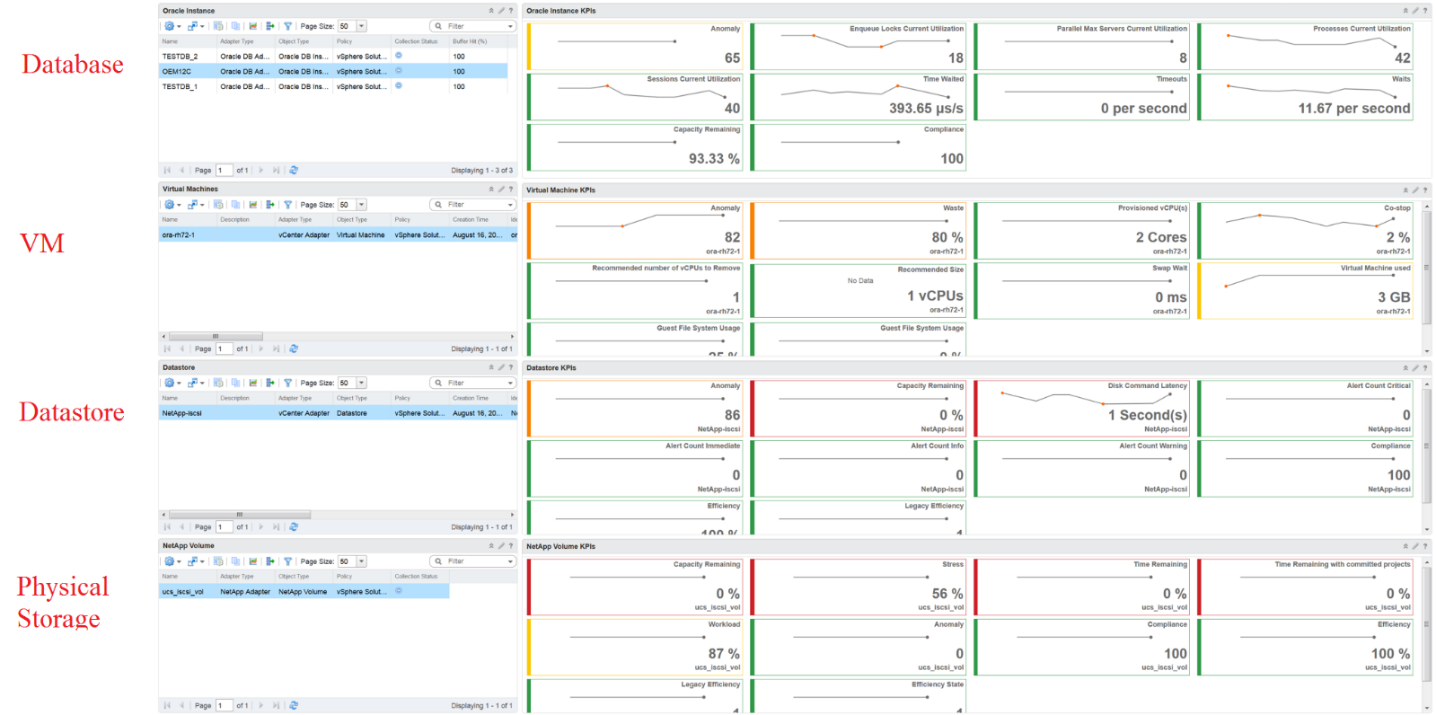
Example 2
You should also play with Dark Mode, and see how that looks. The following shows a clean layout in dark mode. Notice how [Dale Hassinger](https://www.linkedin.com/in/dale-hassinger-5712301b/) has arranged this dashboard well.
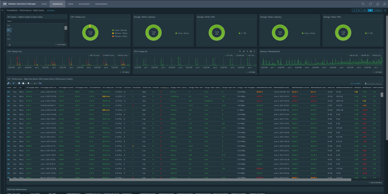
Visually, he has designed the layout “top down”, making it easier to see.
Another technique is to create 2 sections: summary and detail.
-
The summary section is typically placed at the top of the dashboard. It gives the big picture.
-
The detail section is placed below the summary section. It lets you drill down into a specific object. For example, if it’s a VM performance, you can get the detail performance of a specific VM.
This detail section is also designed with quick context switch, as you may want to check the performance of multiple objects during performance troubleshooting. Take for example VM performance. The dashboard gives you all the VM-specific information and allows you to see the KPIs without changing screens. You can move from one VM to another and view the details without opening multiple windows.
Color as Meaning
It’s easier to see color than read numbers, if the color has meaning. There are many occasions in operations that you just need to know if things are good or bad first, before diving into the actual raw value. Color is also easier at a glance, especially if you have read hundreds of numbers inside a large table.
Here is the color I recommend:
| Green –> Yellow–> Orange –> Red | Green means good, and gradually getting worse as it moves toward red. Typically used in performance monitoring and compliance.
|
|---|---|
| Dark Grey –> Green … Red | We use dark grey in Capacity as wastage (unused) is a bigger issue than over utilization. It’s important to show wastage as it can also impact performance. For performance dashboard, you should consider using red to convey that oversized is bad for performance. |
| Blue | Neutral color. Used when it does not have any meaning. |
| Grey | System error. The data is missing due to collection error. Typically happens in heat map. We use a color instead of white as white is hard to read. |
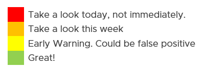
Threshold
At which point do you change the color? This is where threshold comes in.
Try to make the scale easy to remember by adopting a consistent scale
-
Yellow = 2x Green
-
Orange = 2x Yellow
-
Red = 2x Orange
The above also results in red being 8x green.
The above does not work when the scale is small. For example, in Horizon, a user typically has 1 – 4 desktops. It’s rare for users to go beyond that. So in this case, your threshold is as follow:
Gradient
Gradient can be handy in widget where relative comparison among many objects is important. In the following example, the widget is answering the question about the severity of imbalance among vSAN disk groups. What’s your conclusion if you solely rely on the color?
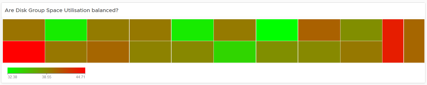
Oh no, they are not balanced. Let’s initiate rebalancing, which can potentially move Terabytes of data!
But wait! We only care about unbalanced when they are significant. Minor unbalance is expected. In fact, if they are perfectly identical, it would be strange.
The problem with the above widget is utilization should only turn red when it reaches 75%.
After fixing the 2 preceding problems, we have a meaningful heat map.
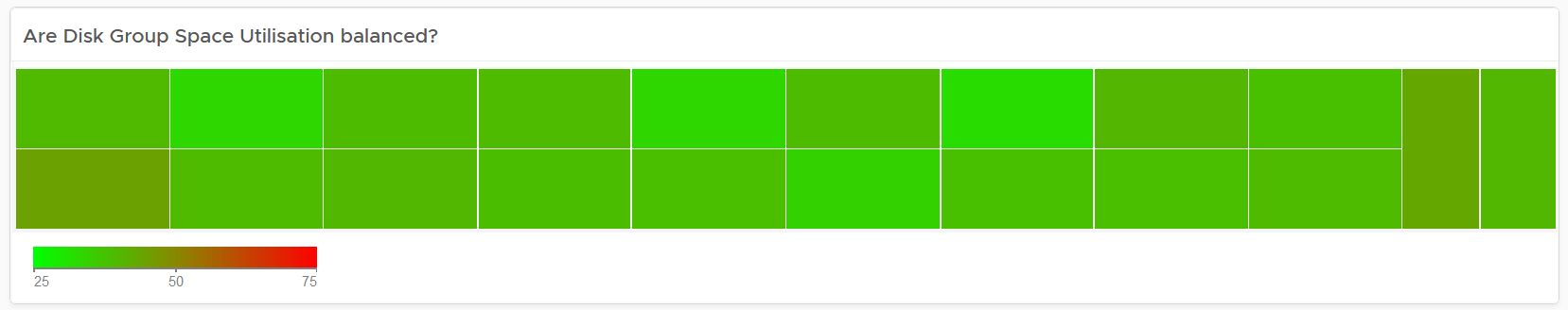
Example Implementation
In the Compliance dashboard below, color is used to quickly show the various level of compliance. If all you see is Green, there is no need to look at the numbers & texts!
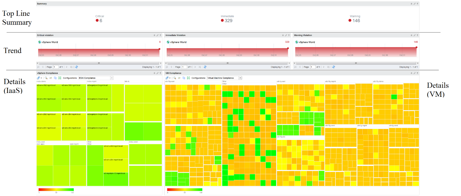
Last but not least, think of users who may not be able to distinguish all the colors. Provide alternative way for them so the functionality is not lost.
Past vs Present
Think of what timeline you need to show, as there are use case for both the present and the past. The past useful when the present data does not tell the full picture as it depends on the time you login and see it. If you login at 8 am in the morning to see what’s happening over night, then the value at 8:00 am is not answering your question.
The past is harder to visualize as it has >1 data points. Ideally, you show the data as a line chart so you can see the trend. Showing a single data such as the maximum or average can miss critical information such as “is it trending upwards or downwards” and “how long did the peak last?”. The problem with line chart is it takes up screen real estate.
If you need to show a lot of objects or metrics, then you need to summarize. As covered in Leading Indicator, you may need to show 2 numbers, especially if one of them is an average.
Summary 🡪 List 🡪 Detail
In large environment, you manage a large number of items (e.g. K8 pods, AWS EC2). This means you need a way to summarize the information, so you can work with a subset of the group. Within this subset, you need to know which particular item to work on.
The flow Summary 🡪 List 🡪 Detail is one common technique to achieve the above.
Summary
The summary shows the overall picture, not a subset.
There are 2 techniques of visualizing:
-
Number oriented. Useful when the absolute value matters.
-
Non number oriented. Useful when relative values of the numbers matter, as the numbers form a set.
The number-oriented uses a scoreboard. I find scoreboard is a good way to start, especially if the numbers are suitable for color coding.
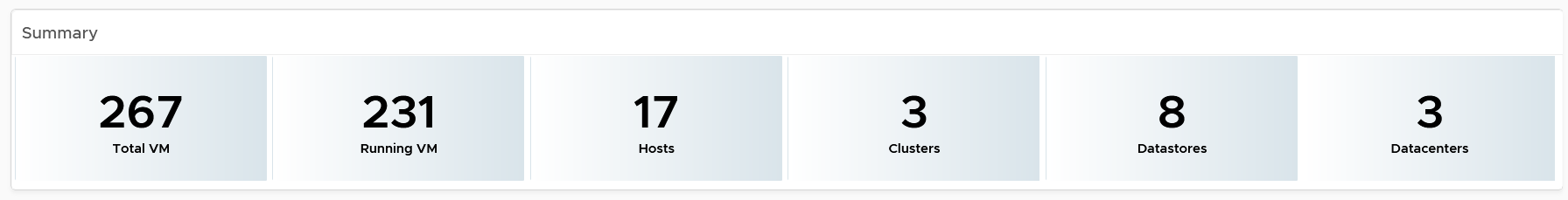
Based on the scoreboard, you may want to drill down to a subset of the environment. Take note that the drill down is based on the object owning the metric.
The non number oriented uses a distribution chart, such as bar chart or pie chart.
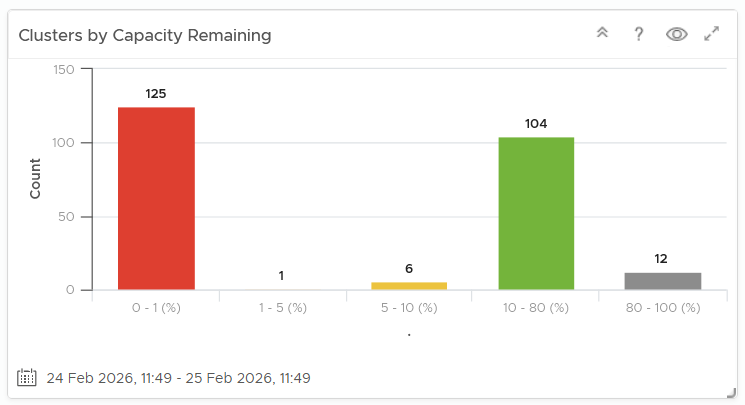
List
The View List widget is a table that lists all the objects. Use a filter if the number of items is large.
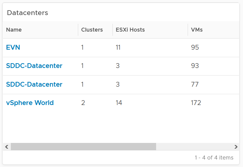
Having a filter also helps the dashboards scalability as showing tens of thousands of objects will impact the dashboard performance. It also improves usability as you can use progressive disclosure, and draw user attention to the big picture first.
Detail
At the detail level, you deal with a single item, such as a Horizon session. If the item has large numbers of metrics to show, you need a way to see them before plotting the trend chart. I found the Scoreboard the most suitable as it can be color coded and supports drills down to see the trend chart.
Interaction
Interaction allows you to build interaction within the widgets. So it is intra-dashboard, while navigation is inter-dashboard. Take advantage of the interaction & navigation, but keep them consistent so they are not too complex.
Logically design the dashboard first using any drawing tools so you can see the flow of information. I typically use PowerPoint, as shown in the following example.
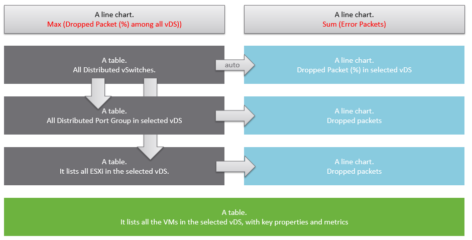
A rich interaction will increase the functionality of the dashboard. Aim for a symmetrical interaction as it’s easier for the dashboard consumer to understand. The following shows 4 heat maps driving 4 line charts in a 4x4 combination. It looks complicated in the screenshot below but feels natural when actually used.
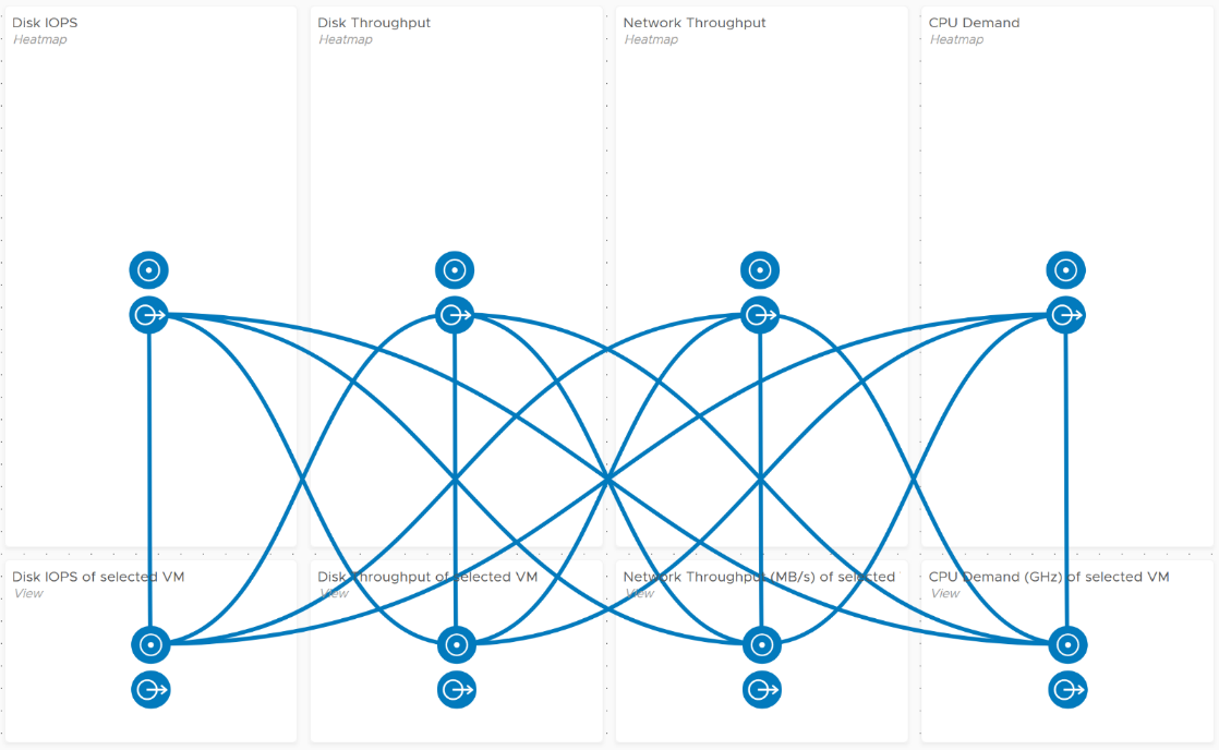
Use progressive disclosure to minimize information overload and ensure the webpage loads fast. On the other hand, so long your browser session remains, it remembers your last selection.
Widgets
Keep the variants of widgets minimal, as it improves usability, especially when you have multiple dashboards or a dashboard with many widgets. You notice that I mostly use the same set of widgets in all the dashboards I have created.
The following lists the widgets I use:
| Scoreboard | Headline or Banner or Summary. To get attention to the key point, I use large text, space out the content and apply a gradient to make it stand out. I may even use color. Object Property. To show relevant configuration of an object, I use small font. I keep the visual plain and simple. Many metrics per object. Being more compact than health chart, it’s handy if you have more metrics than screen real estate. |
|---|---|
| Bar Chart | Absolute distribution. The actual value of each bucket is important to you. I find manual bucket size useful when the bucket range values is important. |
| Pie Chart | Relative distribution. The relative size of each slice is important to you. Look for patterns in the result, such as the number of slices shown matches your design or desired outcome. |
| List | Object List is good for one-time, disposable dashboards as it’s convenient. I use View List for permanent dashboard as it has more features, especially the data transformation and parent values. |
| Heat Map | Use it if there are many objects, and you only need to see the present value. So it’s suitable for capacity, configuration, live NOC, and not suitable for performance (where you need to see trend over time and data older than 5 minutes) |
| Health Chart | Where the color is more important than the value. |
| Trend Chart | I use View Trend Chart as my main line chart. I rarely or do not use other forms of line chart, such as Metric Chart. I rarely use the threshold for visual reason. The thresholds make the chart hard to read. |
| Top N | A table listing for top N numbers within the specified period. |
| Alert List | Use to show relevant alert. For example, for performance, I only show performance alerts as the full alert is available in the object summary page. |
| Relationship | I use the Advance version of the widget as it’s visually more polished and meets all my requirements. I do not use the simpler version. |
| Text Display | I use it as a “Read Me” to either explain the whole dashboard or certain part of it. |
Practitioners like [Dale Hassinger](https://www.linkedin.com/in/dale-hassinger-5712301b/) use a lot of Text Widget, because he creates custom web pages. It certainly makes a functioning and cool dashboard!
I rarely use the following
-
Metric Picker. I’d use it if as a designer I’m unsure of what metrics users will use.
-
Metric Chart. I’d use it if I need to have multiple line charts on a single widget. Using less widget helps simplify the overall dashboard look.
-
Object List. Use View List instead. Functionally it’s a superset.
-
Scoreboard Health. Use heat map instead.
Scoreboard
At the top of the dashboard, it’s useful to provide a banner or headline, giving the big picture or summary. For example, this is what I use for Inventory summary.
The above is not color coded as each number does not have a good or bad meaning. It’s visually less noisy also to have a neutral color.
The limitation is the number you see is the present number.
You can convey meaning by using color. There is also a line chart in the background of each box.
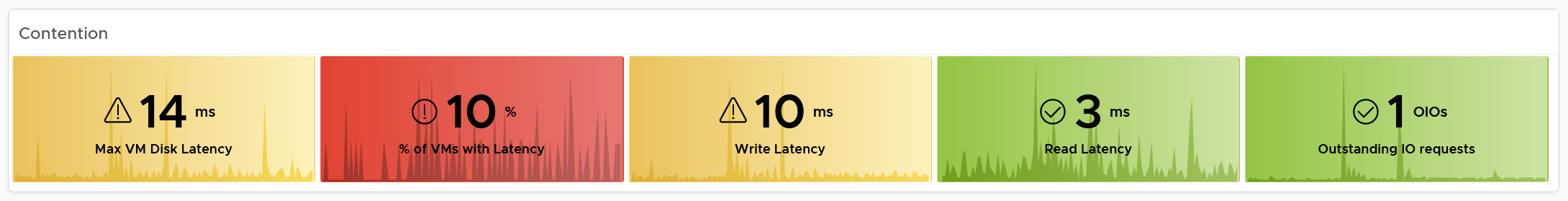
Take note that the background color is also based on this last value, not the average or peak of the monitoring period. Another limitation is the threshold
To see a trend chart, double click on it.
Gauge
This is a variant of scoreboard. It can show relative comparison. You can use another metric as the “total”. This means you do not have to create a super metric.
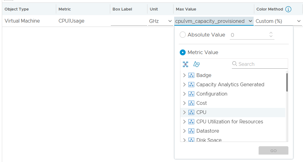
You can also change the color coding of the threshold based on percentage.
Table
A table is simply a list, where each row represents an object, and each column shows a single value. This enables us to list hundreds of rows, with ability to filter and sort. Each cell value can also be color coded.
View List also supports filter. The following screenshot shows Omnissa Horizon hierarchy, so you can drill down into specific area in the world of Horizon.
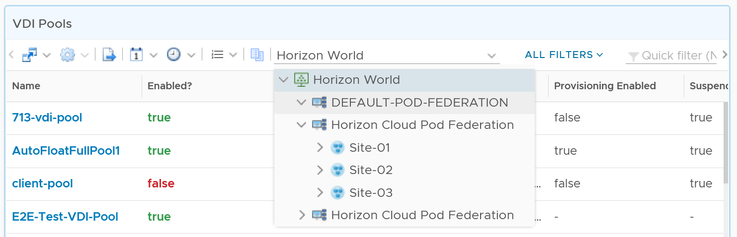
Aggregation
Table is good for details. However, as a summary, its main problem is how to give an insight over time as each cell can only hold 1 value. How to give an insight into what happens in the past? For example, how to see the performance in the last 1 week? There are 2016 datapoints in the last 7 days, which one do you pick to represent?
There are a few possible options for the values:
| Current | This could the present value or the last known value. It’s useful to show the present situation. However, this does not tell what happened 5 minutes ago. Its useful in capacity, compliance, configuration. It’s rather limited in performance. |
|---|---|
| Average | The average of the period. Average is a Lagging Indicator. By the time the average is bad, roughly 50% of the number is unlikely to be good. It is not suitable for proactive monitoring. |
| Worst | The worst of the period. This is suitable for daily average, as there are only 288 data points in 24 hours. If you find that results in outlier, then replace it with 99th percentile. As it only takes 1 peak to set this value, your chance of outlier is 7x higher in a week. It’s great for peak detection, but needs to be complemented with worst 5th percentile when looking at weekly or monthly period |
| Percentile | The worst 5th percentile number. This is a good midpoint between Average and Worst. For performance monitoring, the worst 5th percentile is a better summary than average. BTW, we use the org.apache.commons.math3.stat.StatUtils library. The number differ slightly to Microsoft Excel or Google Sheet in general as they use a different formula. |
From the above, we should choose worst and worst 5th percentile.
The following table implements the above concept.
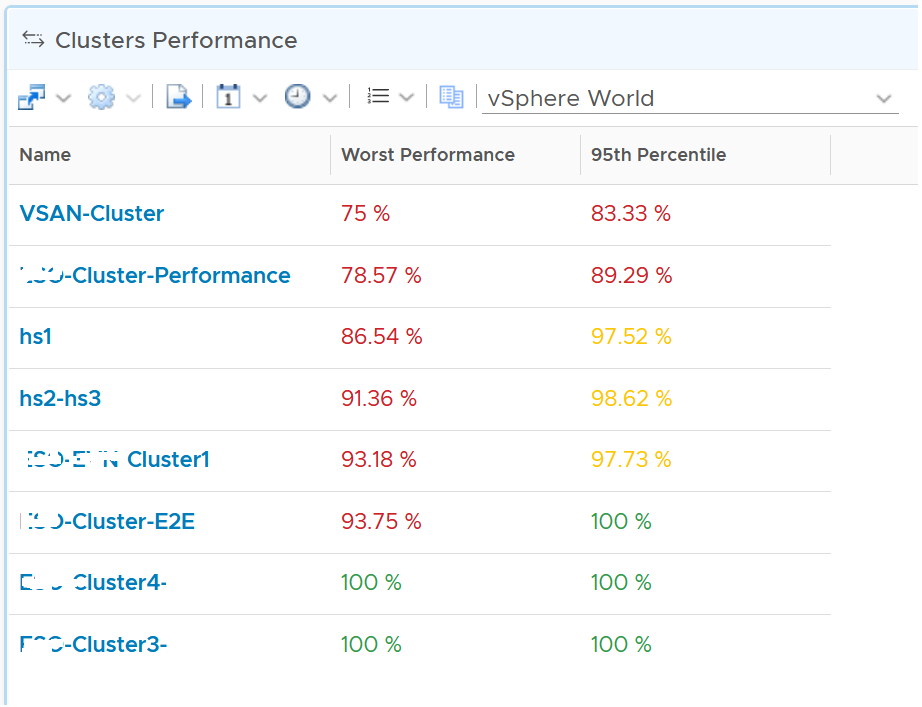
Coloring
BTW, I vrealize that the threshold coloring works on string, so long it contains number. The following table shows that any version higher than 6.7 is green. The rest follows the logic shows next to this table.
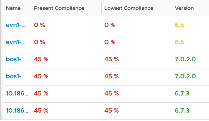
To do that, set the following:
It also works on text.
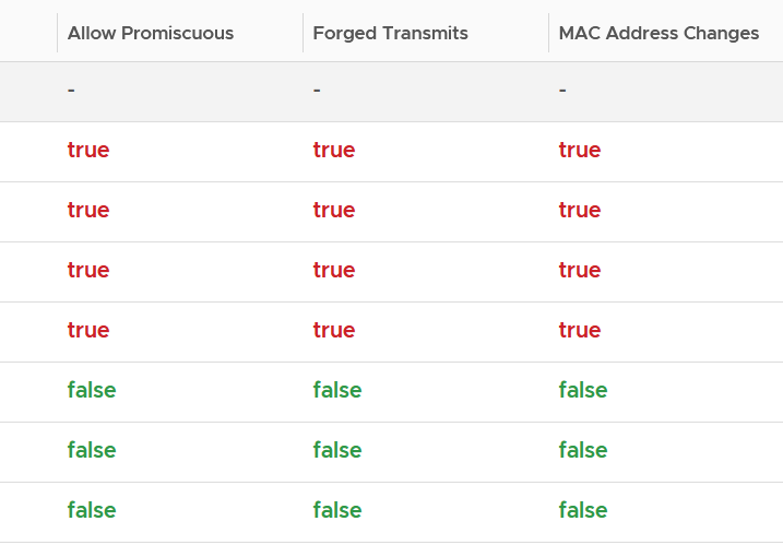
Yes, you do not have to specify every color!
You cannot specify the green color. What is not red is automatically shown as green.
Calendar Summary
By the way, a little trick from Robert Mesropyan. There are times where you need to hide the object name. To do that, export the view, and change the value below to true.
<Property name="hideObjectNameColumn" value="true"/>
Empty or Exist
In configuration check, we can encounter a need to check for exception. This is where the Exist or Not Exist check and Empty and Not Empty check can come in handy.
Distribution Chart
Distribution Charts can be used to give insight to a large dataset, as table will show too many rows.
There are 2 types of distribution charts:
-
Absolute distribution: bar chart.\
It’s called absolute as you care about the actual value of each bar.\
You also call about the order of how they are sequenced. The brackets are linear and follow a step up.
-
Relative distribution: pie chart and donut chart.\
It’s called relative as the number you care is in percentage or ratio. You care about how the numbers are relative to one another. You also do not care about the order they are displayed (the brackets are not in order)
The number of buckets on the chart should be balanced between the available screen estate, ease of use and functionality. Modify the buckets to either reflect your current situation or your desired ideal state.
The chart automatically starts with the largest slice. It ends with “Others”, which aggregates all the remaining buckets.
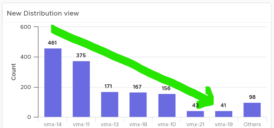
How does it work with a pie chart or donut chart?
Well, it starts at 12 o’clock, goes clockwise and end with “Others”.
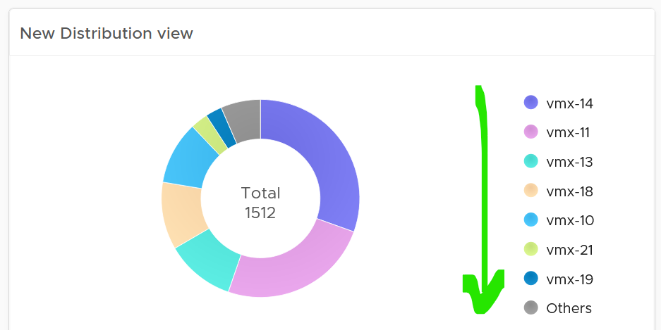
Bar Chart
When the order matters, use bar chart to make sure each bucket is meaningful. Take the following as an example. It shows vSphere shared datastores by their capacity remaining. They are categorised into 5 buckets, from the lowest capacity remaining to the highest. Each bucket is given a color to convey a meaning. Can you guess why >80% is represented by grey, as opposed to even more green?
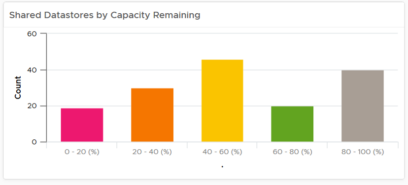
The reason has to do with the reason you bought the capacity in the first place. It’s to be consumed. If the capacity is not well used after months or even years, it’s a wastage. You overbought capacity.
The bar chart is also better at showing the outlier. The following cluster has 79 VM. If you want to know their distribution by size, you can plot all VMs in order of their vCPU size.
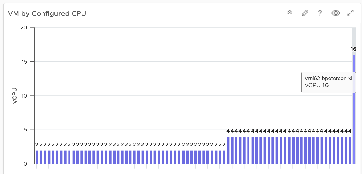
The distribution type is “Summary”, and leave the “Max number of buckets” blank.
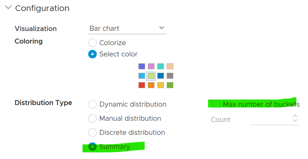
Pie Chart
When the number of variants matters, use pie chart as it does not have space constraint. It’s useful when you have an expectation of what is good or bad. See the following 2 widgets. They show the number of resource pools in a cluster. What does each pie chart tell you?
The first cluster has way too many resource pools. This alone will make performance management difficult.
The second cluster has 4 resource pools, but they are of equal share. What’s the point of having resource pool when they are the same share? It looks like a common mistake of using resource pool as folder.
Summary
This widget can do 2-level of summary
-
First, the data is summarized over time.
-
Second, the data is summarized over members of the group.
The first summarization is optional. In the following example, it simply gets the VM configured size for each VM.
The widget then aggregates 3 numbers: the average size of all VMs, the largest size, and the smallest size.
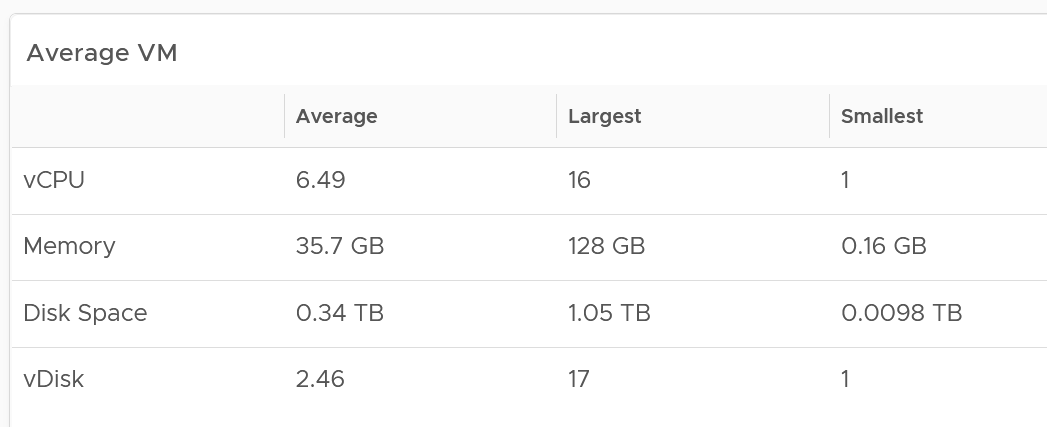
You can also add standard deviation to see the size of the distribution.
Advance Example
You can use the widget to perform advance analysis, such as baseline performance profiling.
In the example below, we first take the 95th percentile of each VM contention. This is then used as the input to get the overall average, and the worst, among all the VMs.
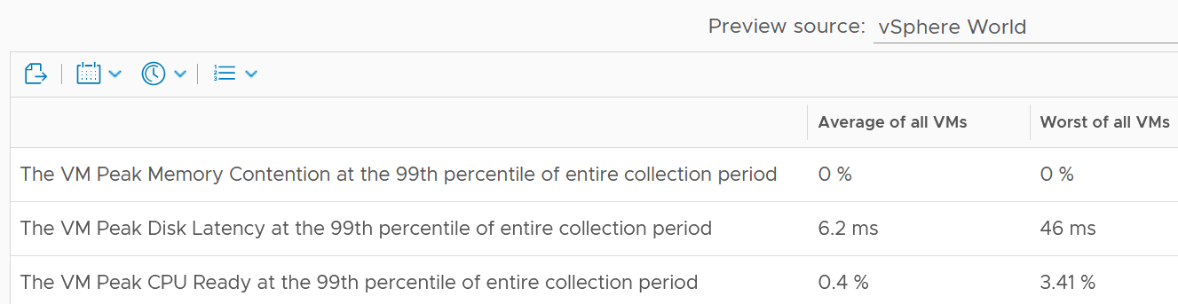
The 99th percentile is set on each row.
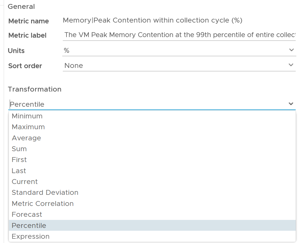
The 2 columns (average and worst) are actually summary
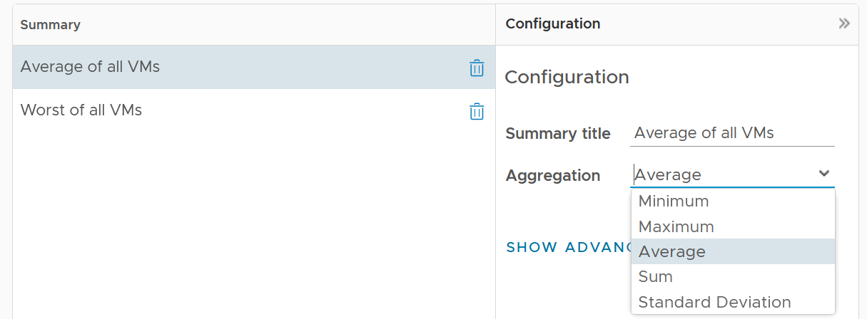
Limitation: there is no function such as count and percentile.
Heat Map
Heat Map lets you vary both the color and the size of each object. Fixing the size can be powerful as it shows a different meaning. From the following example, you can see that there are more red than orange + yellow combined. It also makes the overall layout neater, which is always a nice bonus.
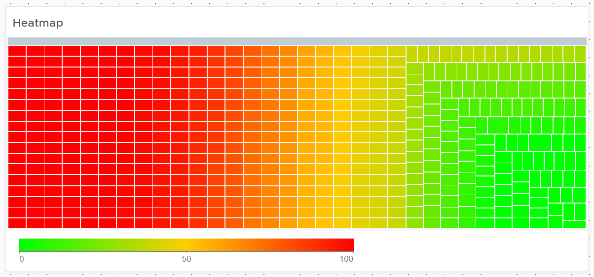
Fixing the size also enable you to use multiple heat map widgets together. The reason is the exact location and shape of each box is identical across widgets. In the following example, the red dot comes from the same ESXi host. This means you can see while this server across the 4 different metrics.
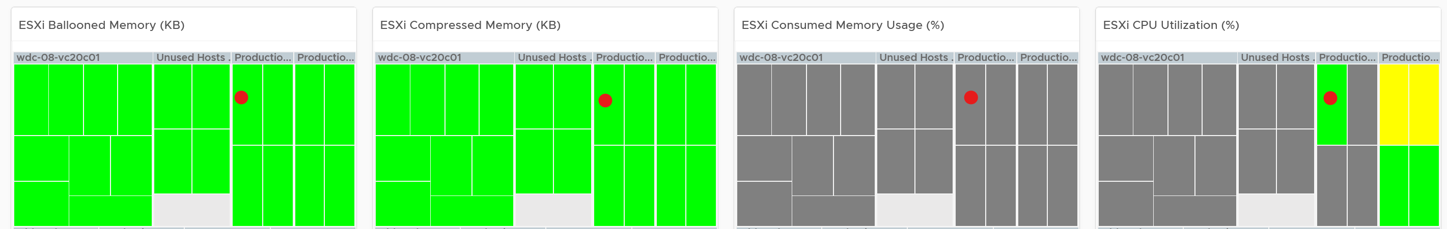
Top N
Top N is a simple list with visual. It is ideal when you need to convey the value before the object name. As you can see below, the presentation is more eye catching than View List table.
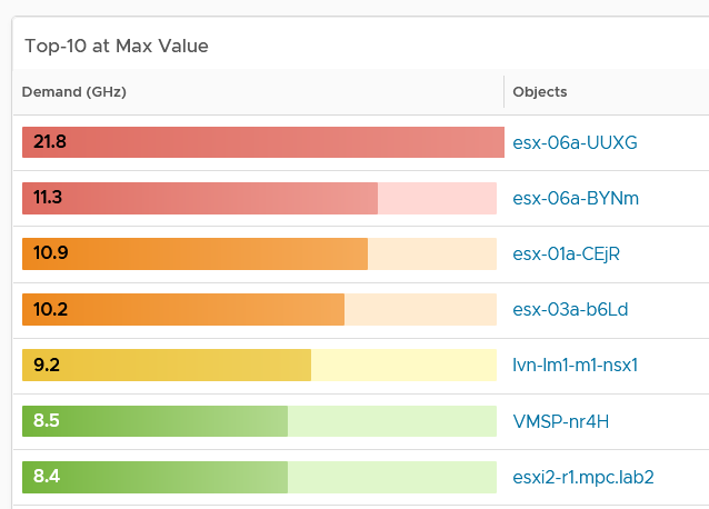
Relative to View List, Top-N has limitation on data transformation. By default, it will average the value. Since average is a lagging indicator, use the percentile function. As a bonus, the percentile is not locked in the design mode. Any user can change the percentile on the fly!
Limitations
Distribution charts (pie chart, donut chart, bar chart) have the following limitations:
-
“No data to display” does not imply that there is something wrong with VCF Operations data collection process. It might signify that none of the objects meets the filtering criteria of the widget, hence there is really nothing to display.
-
To see the content of a slice in a pie-chart or a bucket in a bar-chart, simply click on it. Note that the list cannot be exported.
-
The pie-chart and bar-chart cannot drive other widgets. For example, you cannot select one of the pie-slices or buckets, and expect it to act as a filter to a list or a table. What you can do, is to select one of the object in the slice. I use this technique to allow drill down. You can also click on the object name, which will take you to the object summary page. The page provides key configuration information, alongside other summary information.
-
You can apply a specific color in a pie chart or distribution chart for a specific numeric value, but not string value. For example, you can’t apply a red color to the value “Not Installed”.
The following widget can only show the present data:
-
Heat Map
-
Scoreboard
Log Insight. Unable to specify color in the bar chart. The color is automatically chosen. It can result in “red” in the legend being shown in green.
Implementation
Ok, enough of theory 😊 . How do you apply all those in real world operations management when there are many systems to manage and many roles are involved?
Architecting a suite of dashboards spanning a wide area is complex. To address this, begin with the end in mind. Different team in a large organisation are interested in different things. Once you have the standards, you can personalize as individuals within a team have specific ways of doing his or her job.
Each operation is like a fingerprint. While there are commonalities, each customer runs their operations a little differently. Hence it’s not possible to design one dashboard that meet every customer’s operational needs. A configuration that is important for one may not even be relevant for another. Tailor this dashboard to your unique environment. If needed, widgets can be collapsed or expanded allowing more relevant data to be displayed.
In VCF Operations, the primary role we target in our default dashboards is the VMware team. They are often called the Platform Team, especially if they run vSAN and own the Guest OS that runs on top of vSphere. The team supports the Level 1 Team and performs troubleshooting. That’s why the default dashboards span both monitoring and troubleshooting. They are interested in inventory, performance, availability and configuration.
| Role-based | Platform Team Capacity team: Capacity and Reclamation Compliance team: Compliance and Configuration IT Finance team: Cost and Price Level 1 team: Live NOC, Alerts, Availability, Security IT Leadership: Summary, long term, big picture. |
|---|---|
| Pillar-based | Develop the following set of dashboards, each cover a pillar of operations
|
| System-based | Each system has their own architecture; hence their observability varies. Popular systems are:
|
Overall Design
Once you consider all the above, you will come up with a suite of dashboards that work like one.
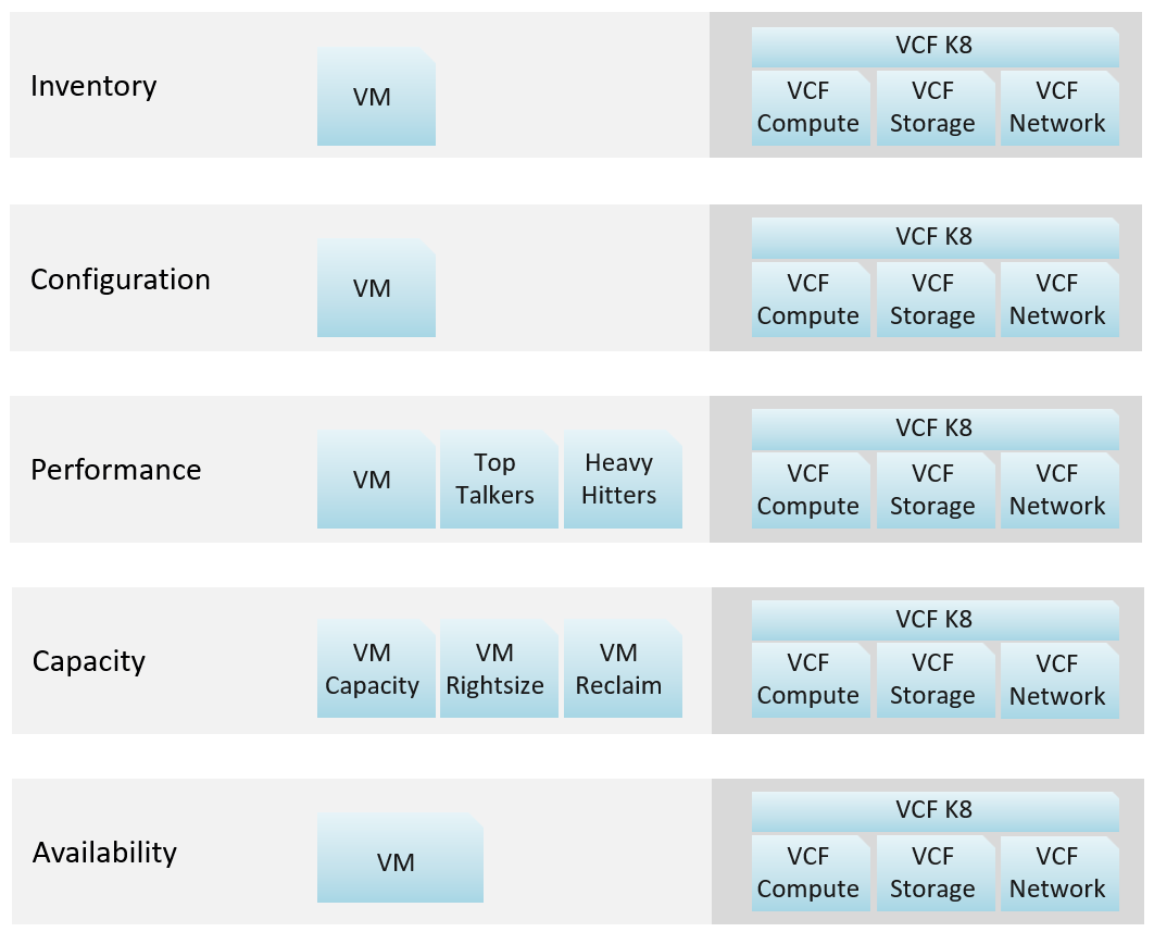
Explanation:
-
VCF Network = NSX + Distributed Switch
-
VCF Storage = vSAN + VMFS + RDM. We keep SRM separate as it's separate SKU.
-
VCF Compute = vSphere Cluster + ESXi + Resource Pool.
-
VCF K8 = vSphere Supervisor.
How about Kubernetes workload?
My take is they need their own set. Just like VDI needs their own set, as these 2 technologies have many object types.
You need to have some consistency for dashboards that covers, so users need not learn repeatedly. It will be confusing if each dashboard looks totally different from one another, considering they have the same objective. Apply some design standards for different pillars of operations. After all, performance is performance, whether it’s Kubernetes or Amazon Web Services is a matter of objects and metrics.
Multi-Dashboard
Dashboard to dashboard (D2D) navigation has to be part of your overall approach. You can drill down in the object hierarchy from one dashboard to another, or move laterally. Note that you cannot go up the parent hierarchy.
D2D capability also helps in avoiding a deep dashboard with many widgets that requires multiple pages of scrolling. They are harder to understand and may suffer from loading time.
Create a set of dashboards that act like one system. This is the principle we use when creating the out of the box dashboards. The following shows an example for Horizon, a VDI solution. It integrates into existing vSphere dashboard by enabling drill down.
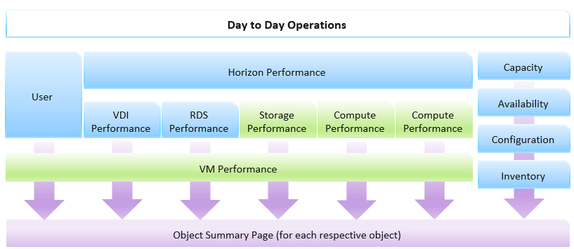
Focus on the pillars of operations, not objects.
Let’s say you’re designing for Capacity management and Performance management, as they often go together. Look at the systems being managed and the major tasks. For the case of vSphere and vSAN, we can group the components into Consumer and Provider. For each, we need to keep the lights on (Operate) and improve (Optimize). Operate covers the capacity and performance management, while Optimize covers reclamation, rightsizing and upgrade. Optimize also applies to infrastructure. You adjust cluster size, upgrade ESXi, migrate from traditional array to vSAN. All these increase efficiencies, reduce cost, increase capacity, etc.
You may end up with something like this as your initial overall design.
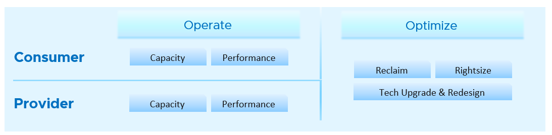
Once you have an overall approach, you can plan your dashboards. Because vSAN has many metrics and components that need further check than a simple datastore, I need to give it its own set of dashboards. There is a drill down from Storage to vSAN as not all datastores are vSAN. By keeping them separate, you can also add physical array dashboards, so your Storage dashboard can drill down to both vSAN and array.
Take time to draw your multi-dashboard solution. I found it helps clarifying my thought. The following example shows an attempt to connect all products, not just vSphere and vSAN. It will be interesting to connect VCF, VMware Clouds on AWS, NSX, Horizon, vSAN and vSphere together!
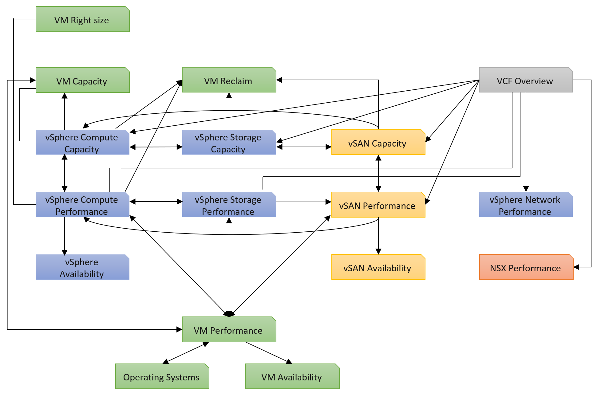
You can and should also organise by function, not just by VMware products. In the following example, I group them into 2 (Provider and Consumer). I added Optimization as the lines became too complex. By working at this logical level, it also helps me spot if there is inconsistency. Having gone multiple rounds, I ended up with something like this.
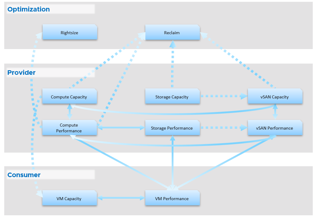
Notice something missing?
I do not have Network. I cover in Part 2 Chapter 5 Network Metric that the nature of network means its capacity model is largely a non issue. You focus more on performance as you do not tolerate network dropped in your data center. I plan to include Network Performance after I consider integrating NSX. If you have an idea on how to enhance the current dashboard, let’s collaborate!
From the above, why are ESXi and Resource Pool missing?
The reason is they are part of cluster. Instead of separate dashboard, I feel adding it into the cluster dashboard will increase usability. The drawback is it does not cover standalone ESXi.
Once you design the overall flow, you implement it on each dashboard. Here is an example, where this dashboard drills down into 6 other dashboards.
The screenshot shows the drilldown 1 dashboard at a time, hence I chose the last dashboard else the first 5 could not be captured.
Logical Design
I find it useful to design my dashboards in Microsoft PowerPoint before I implement them, especially if I need to design a suite of dashboards that work together with back-and-forth relationship. I find it helps me see the big picture, as I can see multiple dashboards on one screen and spot any inconsistency among them. It’s also faster to make changes.
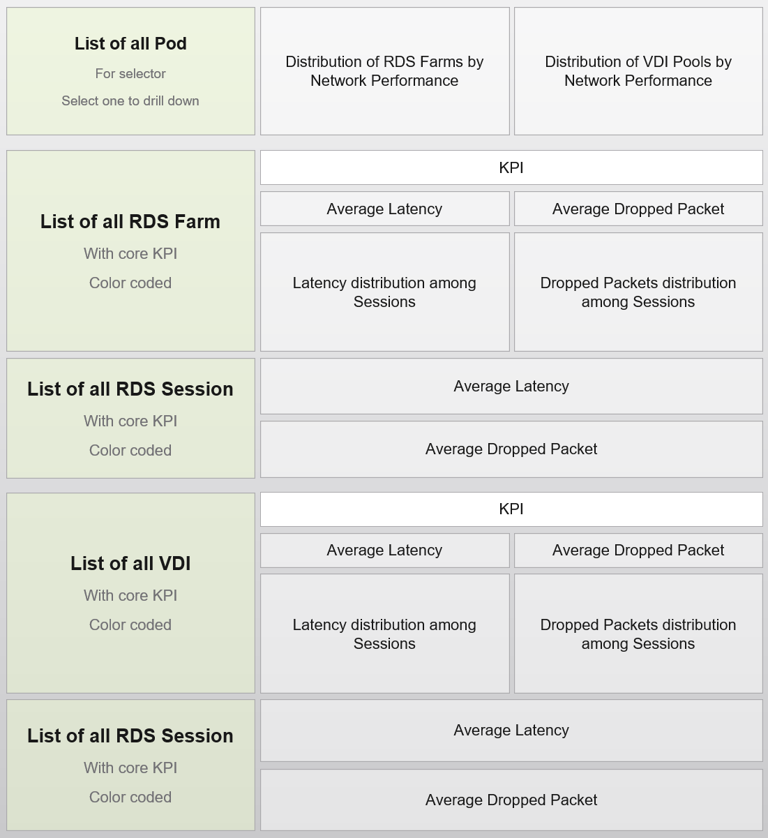
Large Environment
The number of dashboards you will have depends on the size of the environment and the number of people managing it. An environment with 100 VMs in just 5 hosts and 1 cluster will need far fewer dashboards than a global environment with 100,000 VMs spread over 5,000 ESXi, 500 clusters, 20 data centers, and 15 vCenter Servers.
In a large environment, where you have many physical data centers and even more vSphere clusters, you will likely need to display the information per physical data center. There are several reasons for this:
-
Aggregating data at a global level, which spans many physical data centers, will hide too much information. Presenting data at such a level means you are getting an average of thousands of objects. If your environment is generally healthy (and it should be), the average will logically fall within a healthy range.
-
In most cases, the performance in a given physical data center is independent from that of other data centers. For example, your Singapore data center typically does not impact the performance of your London data center. An exception to this case is when you link your data center at the network (stretched L2) and storage layers (synchronous replication). From experience in troubleshooting such a scenario, we recommend you keep the physical layer independent from each other. Assuming your data centers are independent, it makes more sense to display the chart on a per data center basis.
-
VMs typically do not move from one physical data center to another (unless they are paired with storage replication and your network is stretched), so an imbalance among multiple data centers does not translate into a realistic rebalancing action.
Part 2 Chapter 3
The inventory dashboards aims to implement the inventory pages of VCF Operations.
Overall Design
The suite of dashboard works together as one integrated set. They also have similar design.
| Goals | Check if the inventory matches your expectation. Not just the count but also the change. |
|---|---|
| Cover all objects in VCF where inventory matters. | |
| Questions | What VMs do I have? Where are they located? What’s the changes I need to know? |
| Assumptions | To be used with configuration dashboards |
| Target Users | Platform Team |
| Usage frequency | Mostly ad hoc, on a need basis Daily for VM inventory changes. |
| Features | Visual relationship of objects. |
| Ability to traverse the inventory hierarchy quickly | |
| Show the hierarchy and count of objects in the hierarchy. Ideally, it shows the movement of the inventory. |
VM Inventory
VM is more volatile than infrastructure, so it’s important to track their changes.
Template is not counted as VM. From capacity point of view, it does not consume CPU and memory resources. From cost point of view, it does not have a price as it’s considered as part of IT asset.
The dashboard aims to answers questions such as:
-
What do we have in the environment? How does it change over time?
-
What’s the ratio between running and not-running VMs in the environment?
-
What’s the ratio between Windows and Linux in the environment? How does it map to your licensing and ELA?
-
Do you have to many variants of Windows OS and Linux OS? Too many different versions, editions, and updates can complicate operations.
-
The dynamic nature of private cloud means change is constant. Is the volatility matching your expectation and business cycles? For VM, there are 3 types of changes (location, state and inventory). They are tracked in 3 separate health charts. Tailor the threshold accordingly for ease of report analysis.
-
How many VMs were deleted? How many were added?
-
Are you having many large VMs? Are the relative size of CPU and memory balance? A CPU intensive VM should have high CPU:Memory ratio, while a memory intensive VM should have lots of memory relative to its CPU.
-
What’s the average VM size? How does it compare to the largest size? What are the popular CPU size and memory size?
-
What are the largest VMs in your environment? Why do these VMs need that many resources? Is the list matching your expectations?
Summary section
The summary section consists of 2 rows of widgets. It’s designed to help you see the big picture.
Check that these numbers are within your expectation.
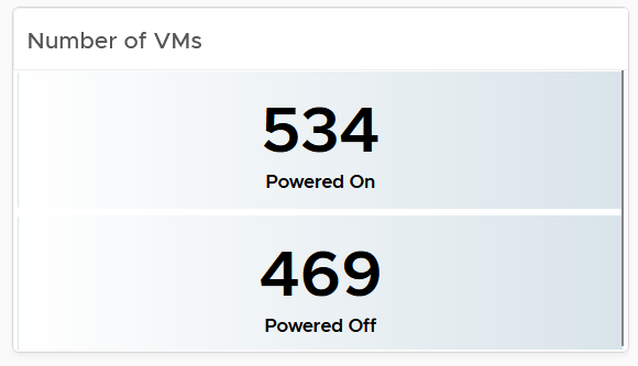
If the number of powered off VM is relatively high, navigate to the VM Reclamation dashboard to see if they can be deleted and taken off the systems.
Review if the numbers over time match your expectation. For example, if there was an activity last night that impacted the number of powered off VM, yet the actual number differs, perhaps the activity was not executed as per plan.
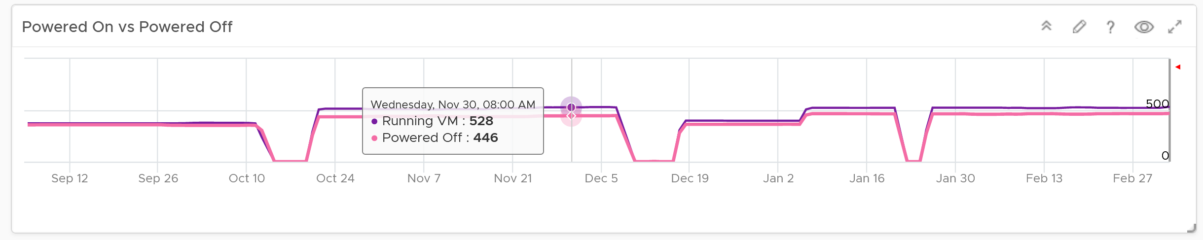
The 2nd row of widget consists of 3 charts. They summarize the overall movement of all the VMs in your environment. Make sure the amount and the pattern both match your expectation.
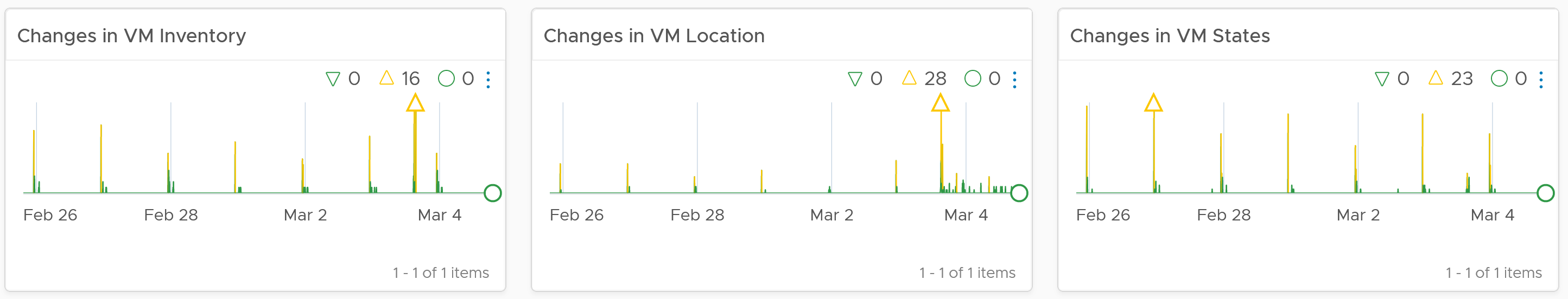
You should customize the thresholds, so it’s easier to see if the values exceed what’s acceptable in your day to day operations. The value is every 5 minutes, so if 100 changes of states is not something you can ignore, set the threshold of yellow, orange and red accordingly.
Detail section
The detail section has interaction where you can zoom into specific data center or clusters.
The first row is always the total. vSphere World object covers all the clusters, so its numbers are the summation of all clusters.
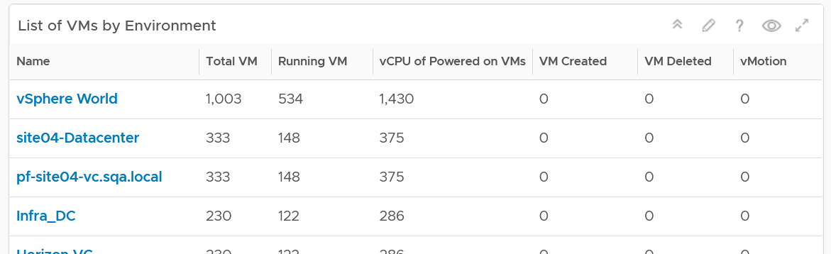
To see a trend, click on any of the row. The 3 sets of scoreboards will automatically show the details.
The first scoreboard is about the availability state. Try to customize the threshold so it’s easier to see at a glance. I’ve set the threshold for the VM Reset as that’s an abnormal operations.
When you customize, consider the steady clusters. They will have a lower threshold as there are relatively less changes or movement. If you set a threshold based on your busy customers, these small clusters will tend to show green.
The next 2 scoreboards cover the location change and inventory change. Again, customize accordingly.
The dashboard lets you see the applications running inside the VM on any part of your environment. This can be handy if you have policy that certain applications should only run on certain clusters, for either cost or compliance reason.
Note: This requires Service Discovery adapter.
Popular VM Size
Since this is about inventory and not configuration, the following pie charts focus on the popular size (most common). If this was a configuration dashboard, we would have ordered them based on the configured size.
Make sure there is no odd sizes. They need to match your underlying CPU and memory.
Customize the pie charts if you need to see more than 5 sizes. I find 5 is a good balance since I can see the details in the next table below the pie charts).
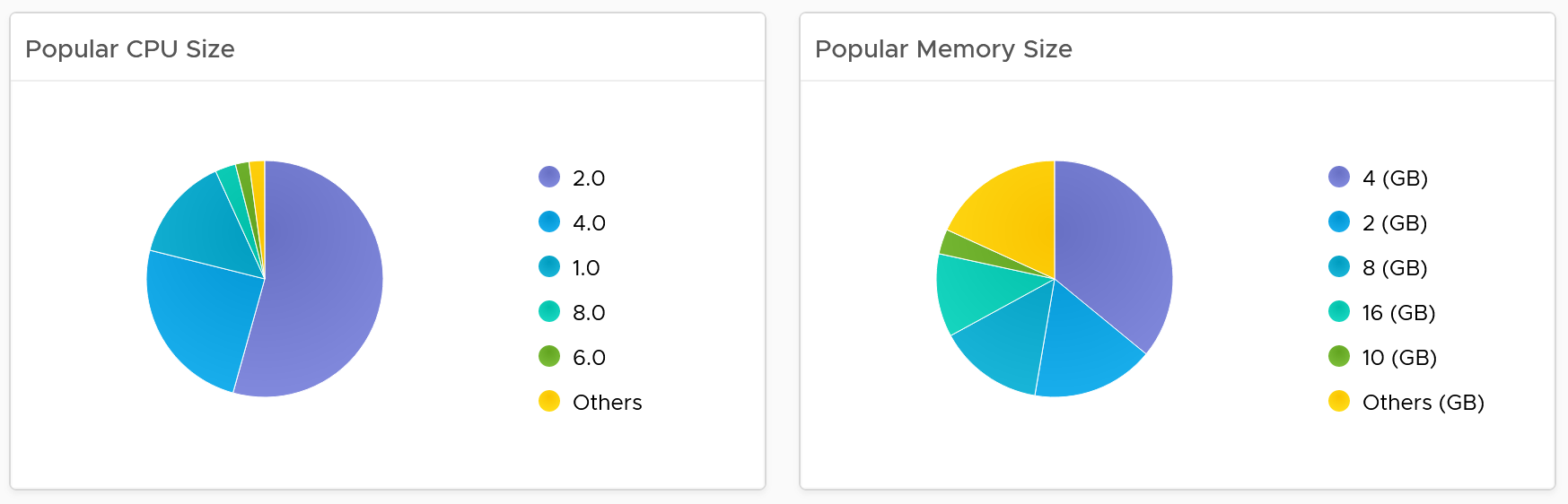
Popular OS Distribution
The next pie chart shows the OS distribution, again sorted by the most popular.
They should match your expectation. For example, if you separate Windows and Red Hat into different clusters, then you expect not to see one of them when you select a particular cluster.
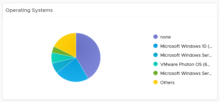
If you see the value “none” under Operating System, that means the VM does not have Tools. I chose the value from Tools instead of vCenter as that’s more accurate.
Virtual Disk
The last pie chart shows by the number of disks.
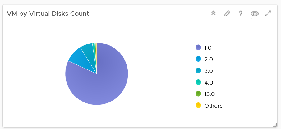
Since a VM needs to have at least 1 disk, I've excluded VM with just 1 virtual disk so those with many are more visible. You’re welcome.
Individual VM Section
The last section shows the individual VMs, and you can drill down to see its details. This is why I keep the pie charts to just show 5 as this table lets me sort in any columns.
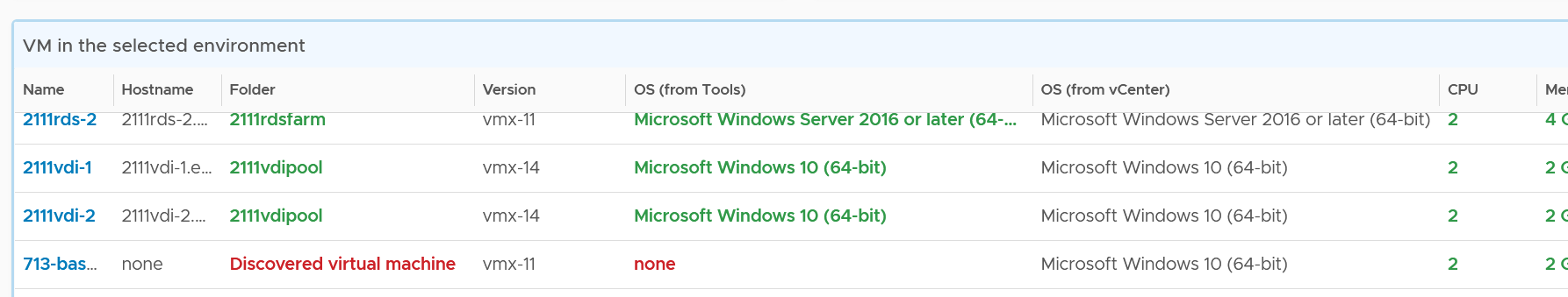
Select a VM, and you can drill down to see its capacity and performance.
Add or remove columns to suit your environment.
Customize the table further by color-coding the values. I’ve color coded the following:
-
VMs that are not properly placed in a folder. They will appear under the “Discovered virtual machine” folder.
-
VMs that are not reporting its operating system. They will report the value “none”.
-
VMs with large CPU, memory or disk. Tailor this to your environment.
Select a VM, and its details of virtual disk, operating system partitions and network cards are automatically shown.
Limitation: It is not possible to see the mapping between virtual disk and partition. A partition or drive can spans multiple virtual disk, and a virtual disk can contain multiple partitions. This is why it’s best to keep the relationship simple (1:1).
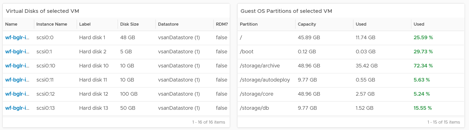
vSphere Inventory
The dashboard aims to answers questions such as:
-
How are the VMs distributed across clusters?
-
What are the largest clusters in your environment? Which clusters have the most VM?
-
What are the largest datastore in your environment?
There are 3 dashboards
-
Compute
-
Storage
-
Network
They have a fairly similar design. The compute has more details because it has more things to manage.
The design has 4 sections, as shown in the following screenshot
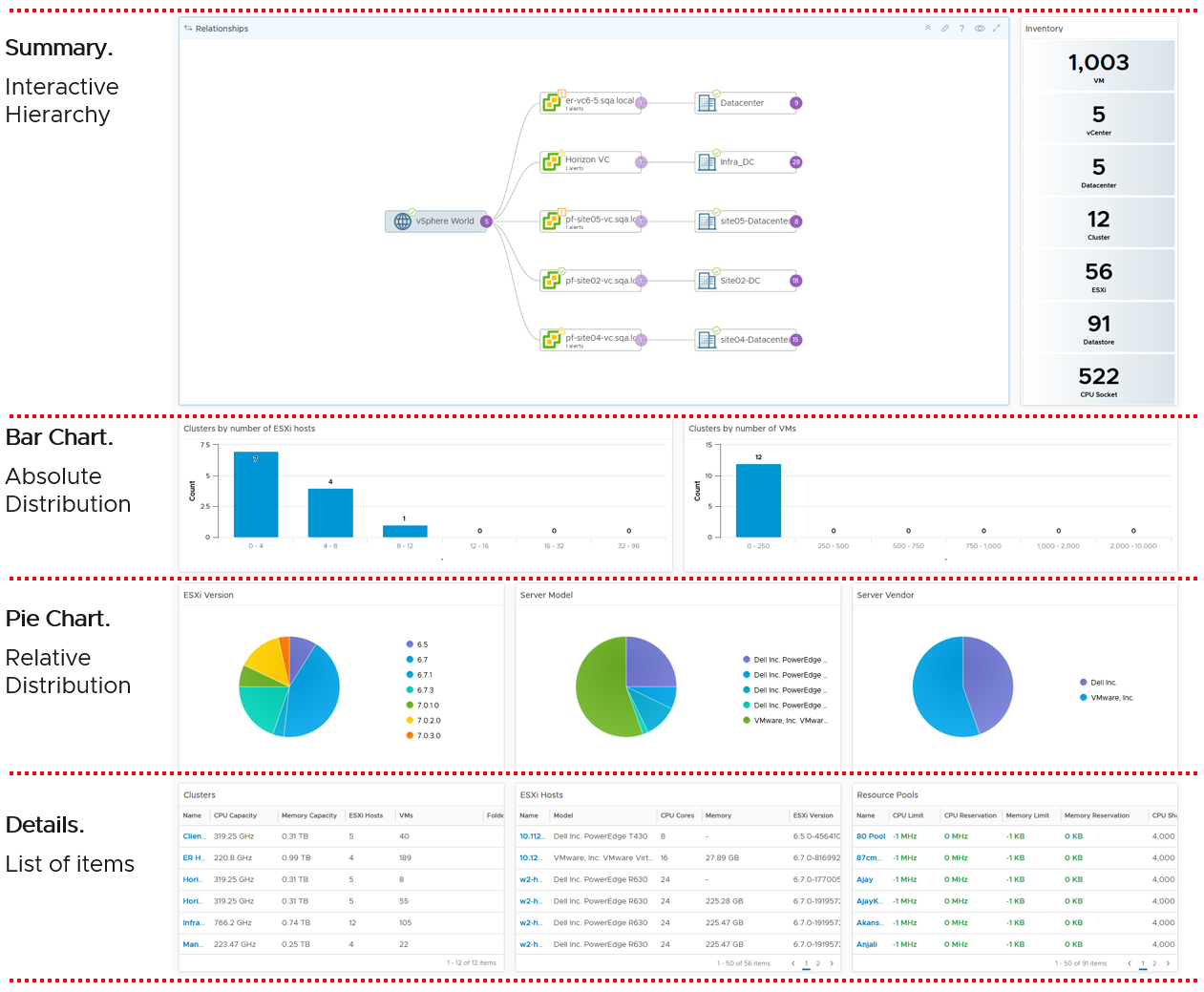
If you think their design copies the Horizon Inventory dashboard, you’re right! That dashboard was basically the 2.0 of the vSphere inventory dashboards, so now you’re seeing vSphere delivers the 3.0.
They can also navigate to one another. The relationship widget below sports the navigation. Pick an object and then choose the dashboard navigation.
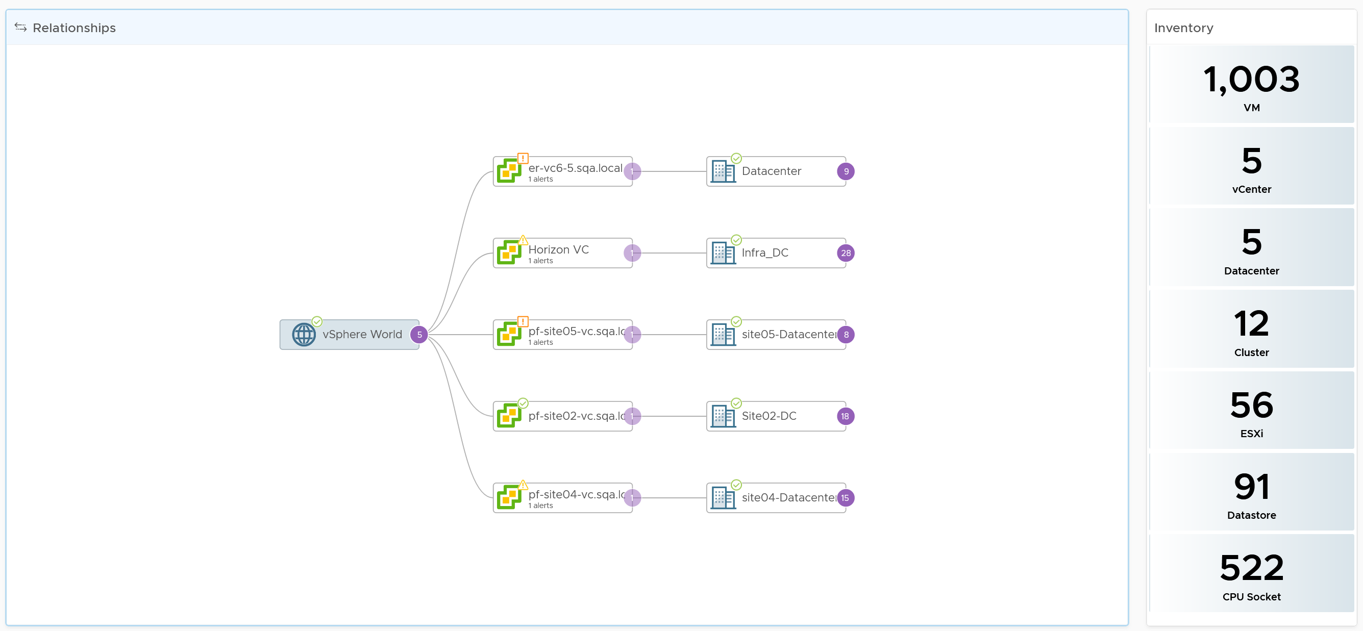
Compute Inventory
Let’s use the Compute Inventory dashboard to represent the 3 dashboards.
The next row is a set of distribution chart. Due to limited space, I’ve provided only 2 charts, focusing on the cluster object. Since this inventory and not configuration, we should focus on the count of members.
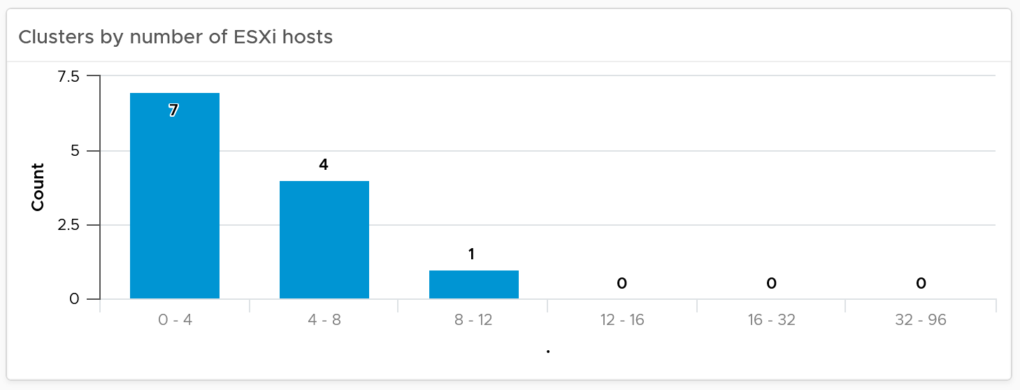
The next row is a set of pie charts. Let me know if you have improvements on what the top 3 things you want to be shown as pie charts.
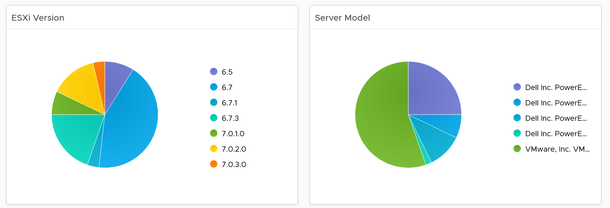
If you have larger screen real estate, add more pie chart for better insight into the type of items you have in your inventory.
Detail Section
The last row is always the lowest level of details, hence a table is chosen. For the compute inventory, we need to cover cluster, ESXi host and resource pools. That’s why you notice 3 tables, one for cluster, one for ESXi and one for resource pools.
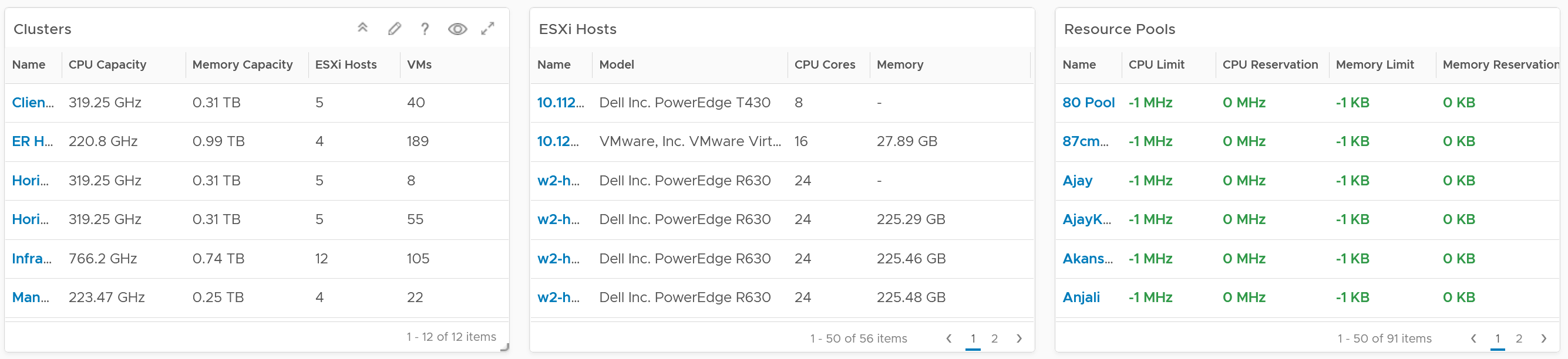
I added a navigation from the cluster table into the cluster performance and cluster capacity dashboard.
Customization tip
- A heat map showing clusters in the report scope. Size by the number of ESXi hosts, color by the number of VM. Alternatively, you fix the size and use the VM:Host ratio as the color.
Hardware Integration
In large environment with hundreds of ESXi, it is useful to be able to locate the physical location. To do that, integrate the hardware management with VCF Operations.
Ensure the rack name is unique, as you will use it to create the rack object in VCF Operations.
Performance
Part 2 Chapter 4
The performance dashboards aims to implement the concept covered in Performance Management chapter.
Overall Design
The suite of dashboards works together as one integrated set. They also have similar design.
| Goals | Monitor performance |
|---|---|
| Troubleshoot performance | |
| Questions | Examples of questions answered by the dashboards: |
| Are the VMs performing well? If not, which pods are affected by what problems (CPU, Disk, RAM, Network)? | |
| Is the VM performance caused by IaaS not serving it, or by contention within the Guest OS? | |
| Are the VMs running high utilization? If yes, which VMs, how high, and what resource (CPU, RAM, Disk, Network)? | |
| Are they really high relative to the underlying IaaS capacity? That can cause strain in the shared infrastructure. | |
| Assumptions | They are designed for both day-to-day operations (proactive monitoring), and ad-hoc reactive troubleshooting. As a result, it’s an advanced dashboard, not designed for Level 1 Support. |
| Target Users | VMware Administrators or Architects |
| Usage frequency | Daily for monitoring. This is to encourage daily usage, as what happens beyond 24 hours ago may be practically irrelevant from performance troubleshooting viewpoint. Hence the views are set to show data in the last 8 - 24 hours. |
| Ad hoc for troubleshooting. Designed to be used within the day of the performance issue, or at most the next day. | |
| Features | Color coded. Each of the color is according to the best practice of that counter. If you are unsure of what suitable numbers to set for your environment, profile the metrics. The Guest OS Performance Profiling dashboard provides an example of how to profile metrics. We also document the steps in Baseline Profiling section of the book. |
| Design to see trend over time, and go back to any point in time. This is important as by the time you have the chance to look at the problem, 5 minutes have passed, or the problem is no longer happening |
There are 2 types of performance troubleshooting
-
Consumer. You focus on a single VM, container or application. Other consumers do not have a problem, or they are independent.
-
Provider. You focus on the shared infrastructure as the problems impact many consumers. It could be hitting them at random, meaning different VMs/Applications got hit at different time.
At the infrastructure layer, we care whether it serves everyone well. Make sure that there is no contention for resource among all the VMs in the platform. Only when the infrastructure is clear from contention can we troubleshoot a particular VM. If the infrastructure is having a hard time serving majority of the VMs, there is no point troubleshooting a particular VM. Notice all the previous sentences are about the VM. Yes, the infrastructure metrics are not that relevant.
Logically split the dashboard into 3 parts:
| Contention | This should be the first part, and most visible. |
|---|---|
| Consumption | Once you determine there is contention, use the Utilization portion to see if the contention is caused by very high utilization. When utilization exceeds 100%, performance can be negatively impacted especially when queue developed inside the Windows or Linux. By default, VCF Operations has a 5-minute collection interval. For 5 minutes, there may be 300 seconds worth of data points. If a spike is experienced for a few seconds, it may not be visible if the remaining of the 300 seconds is low utilization. |
| Configuration | Only include the relevant settings that can impact performance |
This separation keeps each dashboard simple, while emphasizing the concept of contention as the primary counter for performance. You will notice in the dashboard design that contention is color coded, while utilization is not.
Take note that health chart is not ideal when the metrics do not have a “ceiling”, meaning we don’t know what “high value” is, as 100% is hard to define. Example of such metrics are disk IOPS and CPU context switch. If your operations team has a standard that utilization should not exceed a certain threshold, you can add that threshold value into the line chart. The threshold line will help less technical teams as they can see how the real value compares with the threshold.
For large vSphere environment, group the VM by clusters of the same class of service (e.g. Gold), so you can see the profile for each environment. I find the Data Center as good boundary. In general, storage, network and compute do not extend beyond a vSphere Data Center object. Performance problems tend to be isolated in a single physical environment, unless the WAN link connecting the 2 data centers are causing the problem. A performance problem in country A typically does not cause performance problem in country B, especially if they share little in common.
The dashboards share the same design principles, hence they are intentionally designed to be similar. It will be confusing if each dashboard looks totally different from one another, considering they have the same objective. To avoid repeating the explanation, read the VM Performance dashboard before reviewing others.
IaaS Performance Profiling
Why does this chapter begin with this dashboard? Why not start with VM performance dashboard?
Because you want to be proactive. Optimize your environment then it becomes easier to manage.
While performance is about what the VM experience, you can see it from VM perspective or the IaaS perspective.
VM Perspective
We covered how to baseline performance in PART 1 Chapter 2. So in this section, we will go straight into the dashboard.
Metrics to Use
Now that you know how to profile, what metrics do you choose?
| CPU | We chose CPU Ready. It’s good enough to represent the 4 types of CPU contention metrics as we’re taking 20-second peak. I don’t think it’s worth the extra effort to include Co-stop, Overlap and Other Wait. You need to wait for 3 months as you need to create the super metric first. |
|---|---|
| Memory | We chose VM Memory Latency as that’s the only true measurement of performance. |
| Disk | We chose VM Disk Latency. For profiling purpose, there is no need to split Read and Write. Overall is good enough as the improvement will be across the board. |
There is no need to do network as you should not have dropped packets in the data center.
When you have time, profile the following metrics
-
CPU Overlap. I expect the value to be <1%, with >90% of them below 0.25%.
-
CPU Other Wait. I expect the value to be <1%, with >90% of them below 0.25%. Read the documentation of this metric as there is a false positive.
Metrics not to Use
You do not need to profile utilization metrics. For contention metrics, you do not have to profile less important metrics.
| CPU Run Queue | These are Windows or Linux level metrics. They are application dependent, meaning not something the IaaS platform controls. |
|---|---|
| CPU Context Switch | |
| CPU Usage Disparity | This is also application dependent. |
| CPU Co-stop | This typically happens when the VM is oversized. |
| Disk Outstanding IO | This is impacted by IOPS, which is not something the IaaS platform control |
| Disk Queue Length | This depends on the storage driver. I recommend you use PVSCSI |
| Free Memory | It depends on the application. Certain applications such as JVM and DB manage their own memory, not something Windows or Linux can control. |
| Page-in rate | |
| Page-out rate | |
| VM Balloon | Not a VM performance counter, but an ESXi capacity counter. |
| VM Compressed | |
| VM Swapped |
Summary
How to summarize from millions of datapoints?
Here is the technique I use:
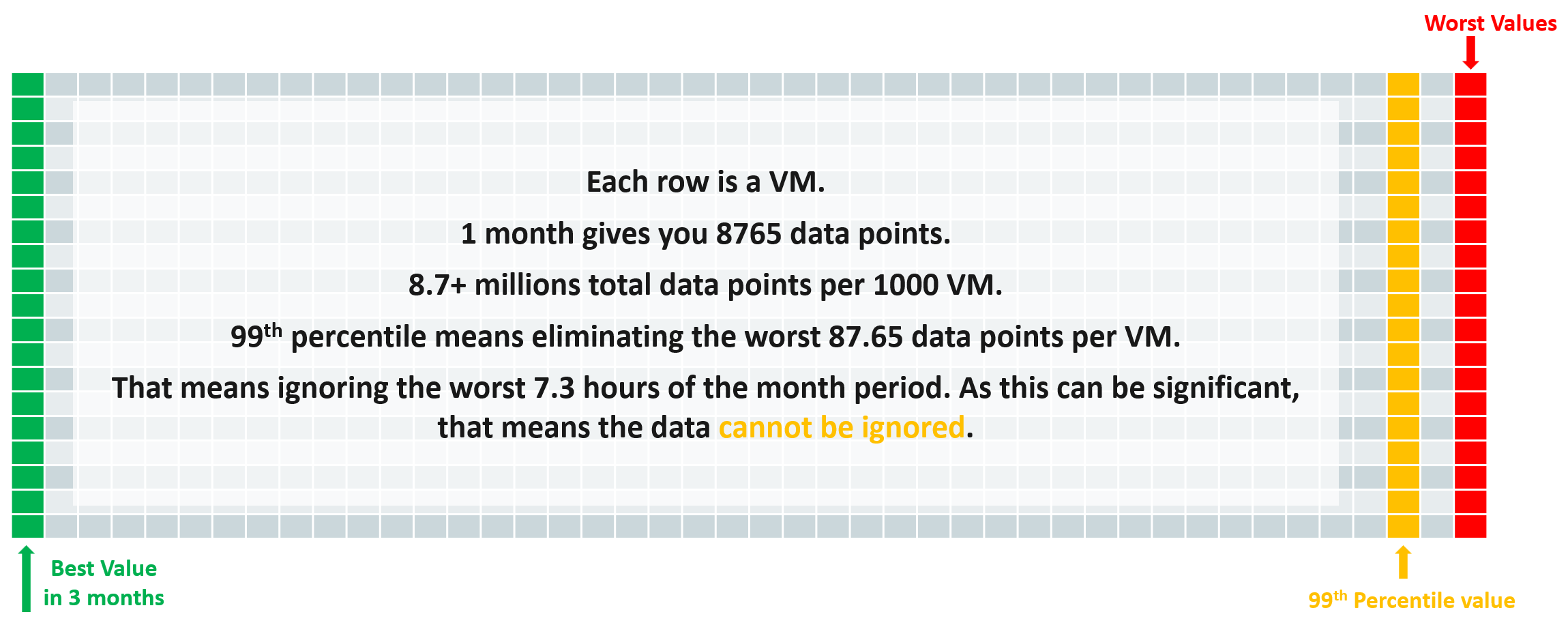
After that, we take the average and worst value among these VMs.
The following screenshot provides an example.
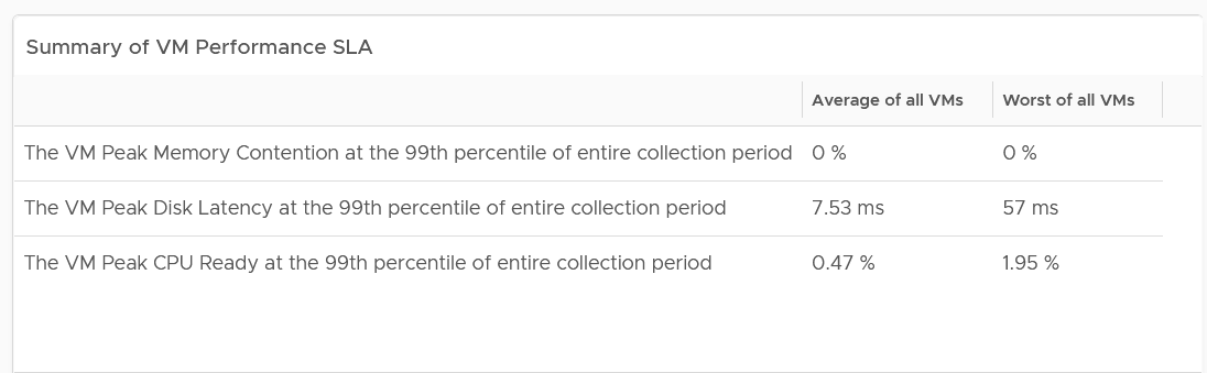
The 2 summary numbers become your Before Optimization numbers. Once you optimize the environment, revisit this table and take the new value.
The average columns should be fairly good. The worst of all them should not be too bad.
Here is my guidance:
| Average of all VMs | Worst of all VMs | ||
|---|---|---|---|
| CPU | Low: | < 2% | < 5% |
| Normal: | 2 – 6% | 5 – 15% | |
| High: | > 6% | > 15% | |
| Memory | Low: | < 1.5% | < 4% |
| Normal: | 1.5 – 4.5% | 4 – 12% | |
| High: | > 4.5% | > 12% | |
| Storage | Low: | < 10 ms | < 50 ms |
| Normal: | 10 – 30 ms | 50 – 150 ms | |
| High: | > 30 ms | > 150 ms |
The guidance is set with High = 3x Low.
The normal range is the widest range, and most environmental will fall here. Naturally, your gold cluster should be closer to the low range, while your bronze cluster will be closer to the high range. If your bronze cluster is showing very good performance, you can put more VMs to lower the overall cost per VM.
Likely, you see that the average is good but the worst is bad.
That means majority of the VMs are being served well, but there is a small percentage that are not getting served. You want to investigate which segment of your IaaS is not performing. It could be due to some configuration, or lack of capacity.
Details
If the summary is good, then there is no need to see the details.
What if the numbers are worse than expected?
One way is to use a bar chart. Design the buckets to represent the ranges from good to bad.
Generally speaking, for environment where performance is number 1, you want the value to be in the green to yellow range since you’re taking the 99th percentile. For environment where cost is number 1, you likely have to lower expectation of your customers.
The following table shows the recommended buckets for CPU and memory.
| Green | Yellow | Orange | Red |
|:------:|:------:|:-------:|:------:|
| 0 – 4% | 4 – 8% | 8 – 16% | > 16% |
Depending on the result, adjust the bucket accordingly. For example, if your environment performance is worse than the above, yet nobody complains, you can adjust the above buckets to something like this:
| Green | Yellow | Orange | Red |
|:------:|:-------:|:--------:|:------:|
| 0 – 6% | 6 – 12% | 12 – 24% | > 24% |
For disk latency, I recommend the following:
| Green | Yellow | Orange | Red |
|:---------:|:----------:|:-----------:|:---------:|
| 0 – 25 ms | 25 – 50 ms | 50 – 100 ms | > 100 ms |
Depending on the result, adjust the bucket accordingly. For example, if your environment performance is worse than the above, yet nobody complains, you can adjust the above buckets to something like this:
| Green | Yellow | Orange | Red |
|:---------:|:-----------:|:------------:|:---------:|
| 0 – 60 ms | 60 – 120 ms | 120 – 240 ms | > 240 ms |
If you have more screen real estate, do a split within each range for more granular visibility. Using the preceding table as example, you may split this way:
| Green | Yellow | Orange | Red |
|---|---|---|---|
| 0 – 30 ms | 60 – 90 ms | 120 – 180 ms | > 240 ms |
| 30 – 60 ms | 90 – 120 ms | 180 – 240 ms |
Compute Profiling
The following screenshot shows a sample profiling. What insight do you get from it?
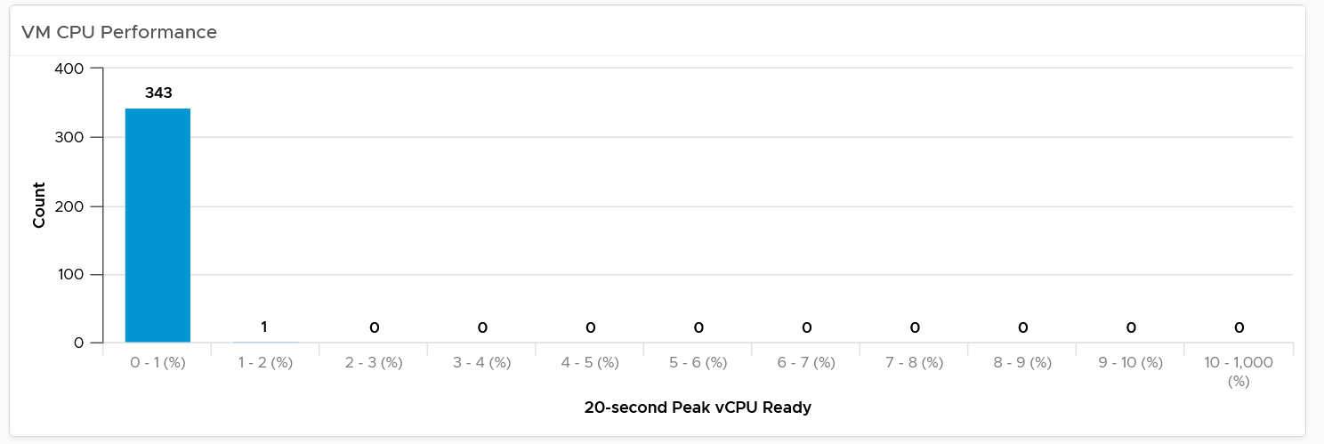
The above shows an example of an ideal environment. All the 343 VMs experienced very low CPU ready time. It is possible that either utilization is too low or no overcommit. This means the relative cost is high.
Let’s take a different example. Obviously, it’s from another environment.
What’s your conclusion from seeing the following chart?
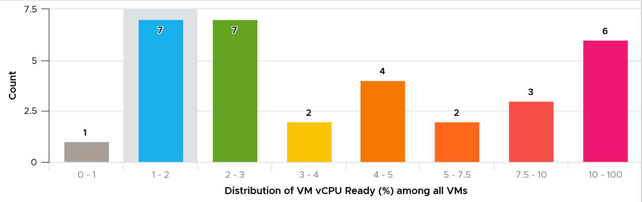
This environment has worse performance. The distribution is evenly spread, meaning many VMs experienced CPU Ready above 5%.
As a general guidance, investigate all those values that are really high, as they are not normal.
For memory, most customers do not overcommit memory. IMHO, this is too conservative for non-production environments. The following is what you can expect is you do not overcommit.
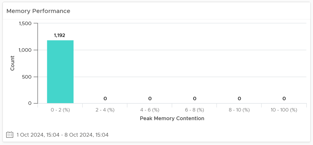
Storage Profiling
The threshold that you set can provide interesting insight. For example, the following looks normal at a glance. There are some bad latency numbers, as shown by the tall red bar at the end.
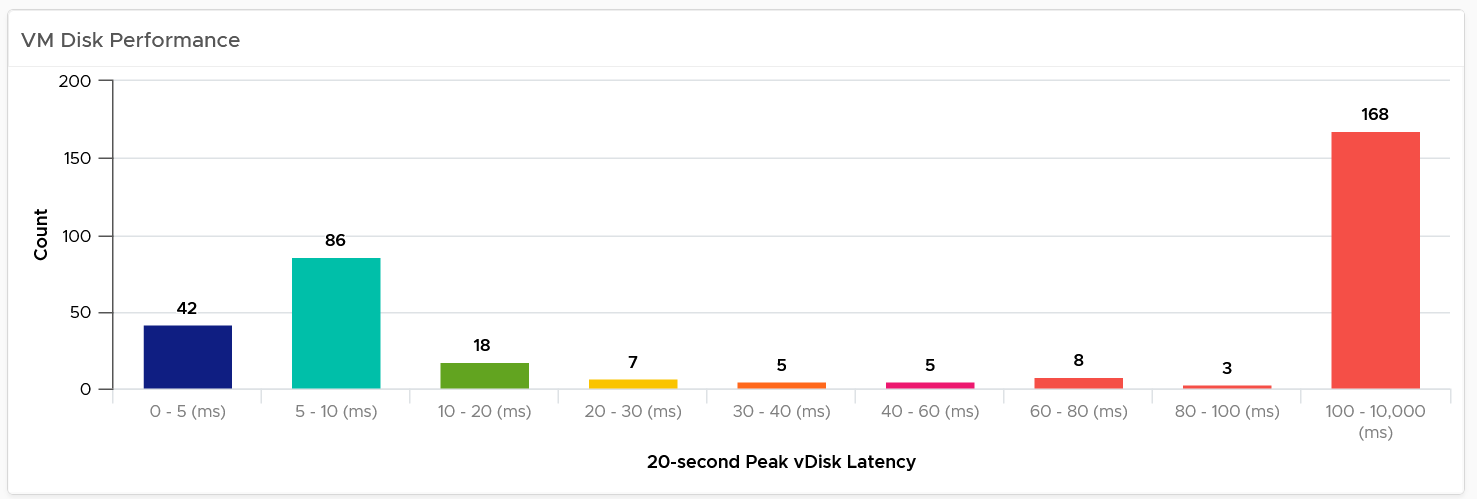
Since the pattern is a bit odd, I decided to make the “shift the buckets” by applying higher threshold. I did it by applying a higher latency bucket. T
The following is what I got!
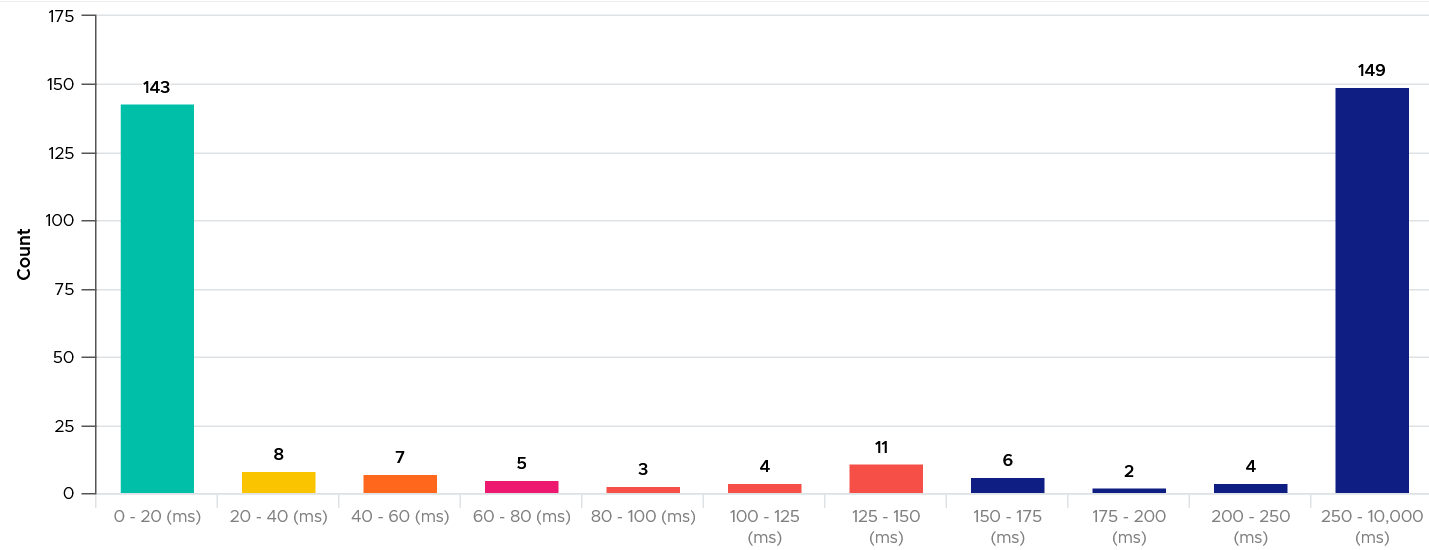
What do you think of the result?
It’s interesting to see the polarizing result! In this case, the lab has 2 different classes of storage. One is SSD the other is magnetic.
Extra Analyzis
If you want to confirm that the worst value is indeed an outlier, compare the value (which is 99th percentile) against the worst value. If the gap is sizable, that means it’s a one-off occurrence.
Export the table into a spreadsheet, and create a scatter chat. The following proves in my environment that CPU Ready tend to be short-lived.
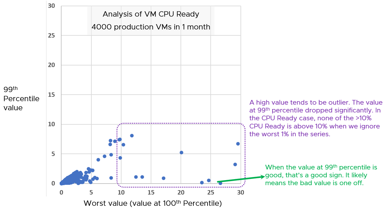
Notice the high values of 99th percentile value are around 5 – 8%, while the high of the worst values are around 15 – 30%.
Infrastructure Perspective
Now that you know the overall picture affecting all the VMs, the next step is to see the performance over time. You also want to quickly compare across clusters or datastores.
In a large environment with many clusters and datastores, you may have a few clusters or datastore that fail to deliver the expected performance.
For each cluster, you want to measure both the depth and the breadth. That means tracking 4 metrics
-
the worst CPU Ready experienced by any VM
-
percentage of VMs experiencing CPU Ready
-
the worst Memory Contention experienced by any VM
-
percentage of VMs experiencing Memory Contention
For datastore, you take VM disk latency, not outstanding IO.
Having the depth and breadth give you better insight.
Just like the case in VM, take 3 months data.
A cluster with 1000 VM will have a metric that represent 1000 VM in any given 5-minute interval. Since there are 8765 instances of 5 minutes in a month, that means you analyze 8,765,000 data points in that one cluster. Taking the worst among millions will likely return you with an outlier.
This is why we use the average of worsts. So it’s the average of all data points, where each datapoint is the Worst VM CPU performance data point.
To implement the above comparison for compute, create 1 view that lists the metrics. Color code the table so you can focus on the red ones.
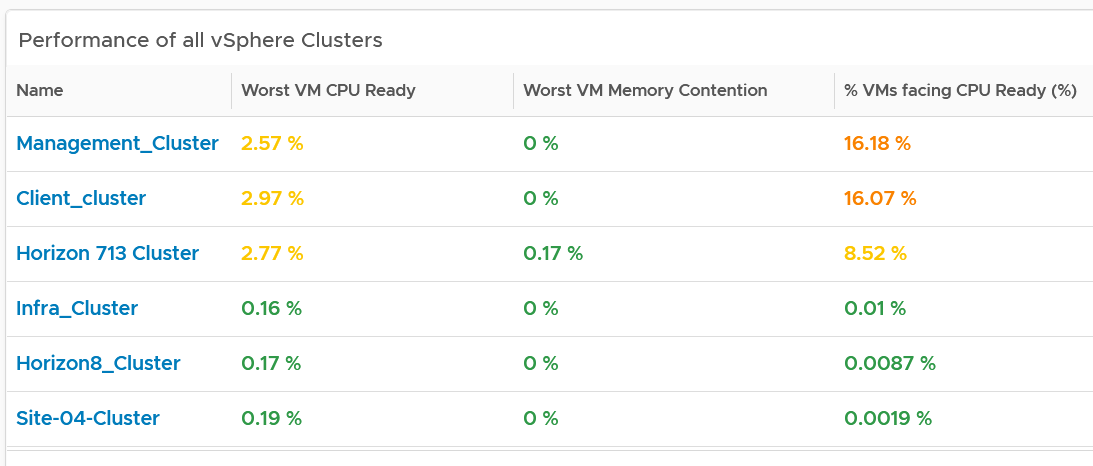
Create a similar table for datastores. I added the percentage of VM facing disk latency just to get some insight into how widespread the problem is.
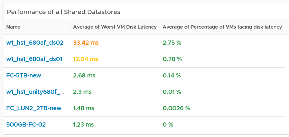
As in the case with VM, compare this with the default threshold used in VCF Operations, as shown previously.
The above covers “how bad the problem is”. We need to cover “how widespread the problem is”. How many percent of the VM population is experiencing the problem? The range used is
-
Green: 0 – 2.5% of the population
-
Yellow: 2.5 – 5%
-
Orange: 5 – 10%
-
Red: more than 10%
Analyzis
Use both the breadth and depth as input to your decision.
| Depth | Breadth | Analyzis Conclusion |
|---|---|---|
| Good | Good | Safe to add more load, assuming the utilization is low and overcommit is below your plan |
| Good | Bad | Performance is good but do not add more load as many VMs are experiencing contention already. |
| Bad | Good | Since it’s not widespread, check for common configurations among the impacted VM |
| Bad | Bad | If there has been no complaint for months and business are not impacted, it is possible that you do not have to do anything. If you have good relationship with the application team, this is the time to set their expectation lower. Otherwise, quietly and proactively plan for improvement as future workload may be more sensitive to latency. As a principle, IT should be ahead of business. |
Using the above as example, you can see that all the clusters can serve their VMs well, as the highest values are 3.6%. If this is what you want to maintain, then use 3.5% as the threshold. The first cluster is already full. It can’t handle anymore VM as it’s already exceeding 3.5%. The second cluster is near full.
For memory, all the clusters are doing well. If this is what you want to maintain, then set 0.1% as the threshold.
If you want to be more aggressive, then you set 5% for CPU Ready and 1% for Memory Contention.
For better analyzis, create a health chart or line chart showing the breadth and depth metric for a selected cluster. This lets you see trend over time. Perhaps the time of performance problem happens during Sunday night where there is hardly any users and you’re doing full back up. In that case, you can adjust your decision.
The following is an example where both CPU and memory are well within the green range.
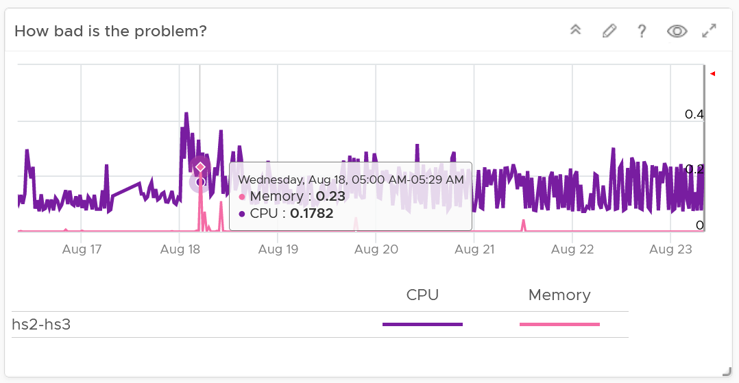
Next, look at the breadth dimension.
In the following example, what problem do you see?
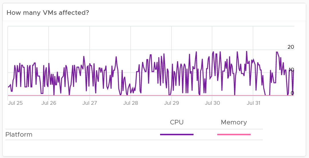
A high percentage of the VM population is experiencing CPU contention. On the other hand, memory is perfect. If it turns out that there is no issue with both the cluster and VM settings, you should consider buying more CPU as your workload turns out to be CPU heavy.
Network Profiling
Network is different due to its nature as an interconnect. We cover this in-depth in vSphere Metrics book. As a result, we need to investigate separately. Instead of investigating per VM, we investigate per network. This means per distributed port group.
We should investigate both the VMkernel network and VM network, as both can impact VM performance.
What metric should we choose?
There is no network latency counter. The proxy for it (network dropped packet) tends to have false positive, which makes profiling inaccurate. Luckily the false positive rarely happens. The false positive can be overcome by using 99th percentile metric, as it removes the outlier. The false positive happens more frequently on received side than transmit side. When profiling, we focus on the transmit side.
As there is fewer network than VM, it’s more effective that we use table instead of distribution chart. List all the networks, and show the received dropped packets at 99.9th percentile. 99th percentile is less suitable as your tolerance for drop packet is higher, and they rarely happen.
Sort the list in descending order so the problematic network appears at the top.
Guest OS Performance Profiling
I’m covering this dashboard next as they reveal performance issue that application team should consider.
There are metrics that directly impact the performance of Windows or Linux, the Operating Systems running inside a VM. These KPIs are outside the control of the hypervisor, meaning ESXi VMkernel is not able to control the increase or decrease of their values. Visibility into these KPIs also requires an agent, such as VMware Tools. As a result, they are typically excluded in performance monitoring.
Because these KPIs are closer to the applications, it is critical to know their values and establish an acceptable range, which will vary in your environment. By profiling the actual performance over time and from of all VMs, you can establish a threshold that is supported by facts. Since there are 8766 instances of 5 minutes in a month, profiling 1000 VM over a month means you are analyzing 8.8 million datapoints, more than enough to draw a conclusion.
Use this dashboard together with application team to determine the acceptable level of these metrics. Once you determine that, add thresholds to the table so you can easily see the VMs that exceed a threshold.
Take note that these guest OS metrics do not appear unless vSphere prerequisites have been met.
How to Use
Select a data center from the data centers list.
-
The three tables listing CPU, memory and Disk will automatically show the VMs in the selected data center or vSphere World.
-
Each table shows the highest value in the last 1 week (2016 datapoints based on 5-minute collection cycles), hence their columns are prefixed with Max.
About the CPU table widget
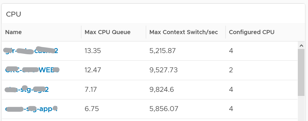
The CPU queue is the sum of all vCPU. A larger VM can tolerate higher queue as it simply has more processors. If you want to compare VMs of different size, create a super metric that calculates the queue per vCPU.
The Max CPU Queue column shows the highest number of processes in the queue during the given period. Best practices indicate you should stay below 3 for each queue. For a VM with 8 CPUs (8 queues), you want to be below 24.
Show the corresponding CPU Run at the peak of CPU Queue. High queue not supported with high run indicates application creating excessive threads.
CPU Context Switch. There is cost associated with context switch. The problem is there is no guidance for this number, and it varies widely. This is the very purpose of this dashboard!
Review the Memory list widget below. Why are the Guest OS Paging metrics chosen, as opposed to In Use, Cache or Free memory?

Because they are measuring rate of change (performance), while the other measures a static disk space consumption (capacity).
Compare the page-in vs page-out. Is that what the application team expect?
Review the Disk list widget below. Why are these 3 metrics chosen?
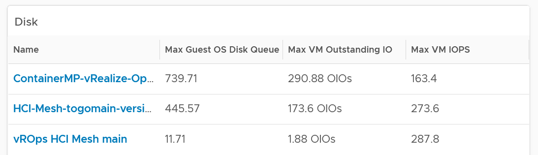
The Guest OS Disk Queue shows potential issue inside Windows or Linux.
The 2 metrics at VM level provides additional contexts. If queue is high inside the Guest, and OIO and IOPS are low at VM level, the problem is at Guest OS layer.
Select any VM from any tables above. The 3 line charts will appear automatically and will show data from the same VM to facilitate correlation.
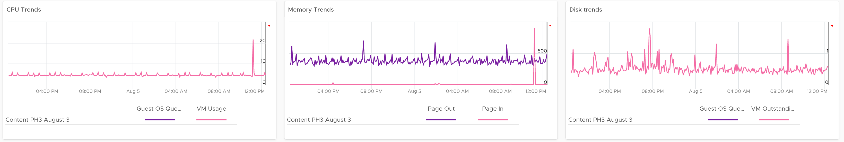
VM Performance
Now that you’ve profiled your environment, you’re ready to monitor specific VM performance.
There are 2 team who have an interest. As a result, we need to cover both Guest OS and VM metrics. In addition, we also need to cover both contention and consumption are they are intertwined. As a result, there are 2 x 2 sets of metrics. The following table shows the matrix.
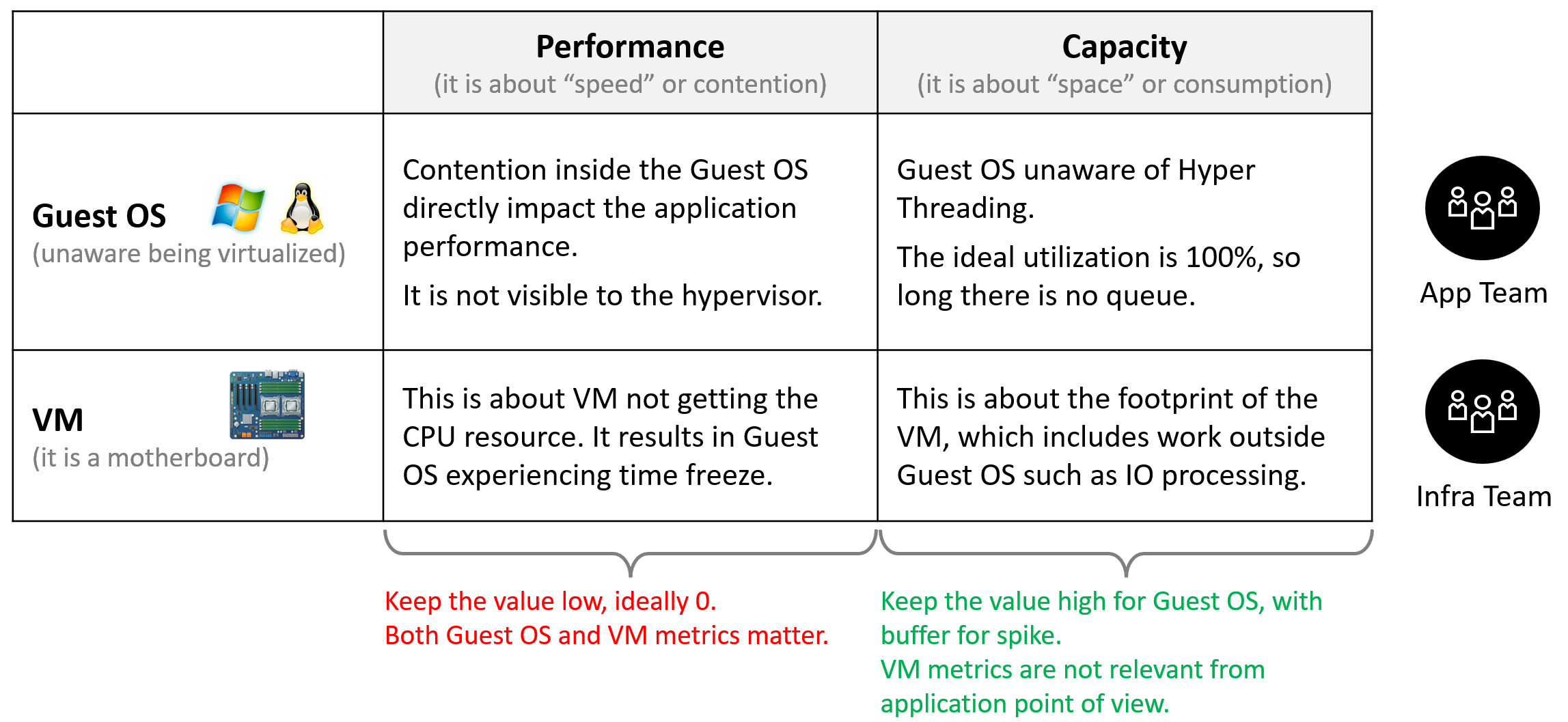
The following diagram is only showing CPU contention. A VM can have CPU, memory, disk, network or system problem.
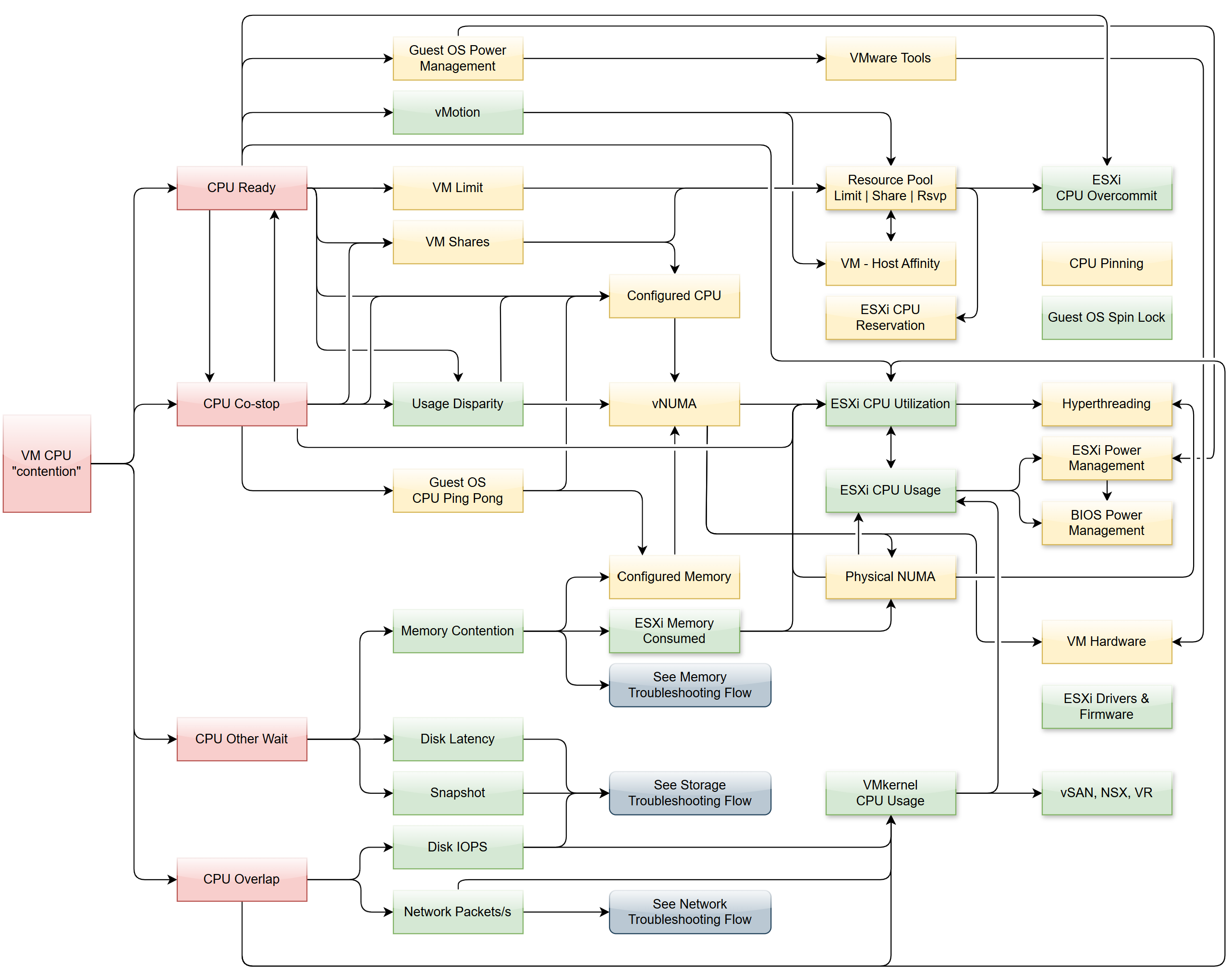
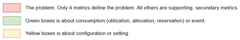
Why doesn’t the preceeding diagram include CPU Latency?
It includes a reduction of CPU efficiency due to hyperthreading. That’s not a performance problem.
There are 4 primary metrics proving that a VM does not get the CPU it demands. If these are low, the VM does not have a CPU performance problem, regardless of what other metrics show.
Primary metrics are explained by secondary metrics. For a single VM troubleshooting, check the VM itself, its parent ESXi, and Cluster-setting such as Resource Pools and VM-Host Affinity. Factors outside the VM is shown with shadow.
This diagram only covers VM. Guest OS has its own troubleshooting flow. Ensure BIOS is optimized for virtualization. Logically, cluster level setting such as DRS plays a part. See the Cluster diagram.
Dashboard
The troubleshooting flow is complex, hence the dashboard is complex.
The dashboard is laid out logically into 3 sections to provide a top-down flow of performance analysis.
| Summary | Quickly see the big picture. The first thing to check when a VM has a performance problem is if other VMs have the same problem. If the problem is widespread the root cause is not with the VM. Hence it’s important to see the big picture, before diving into a specific VM |
|---|---|
| List | A table listing all the VMs. It’s convenient to analyze many VMs. The table supports sorting, filtering and export for further analyzis. |
| Detail | This section is made of multiple widgets |
| Metrics. Only metrics impacting performance are shown. They are grouped logically by category of problems. | |
| Alerts. Only alerts impacting performance are shown. | |
| Configuration. Only settings impacting performance are shown. | |
| Relationship. Navigate into objects related to the selected VM. | |
| Virtual Disk. Drill down into the individual virtual disks. | |
Virtual Network. Drill down into the individual virtual NIC. This is not yet added out of the box. |
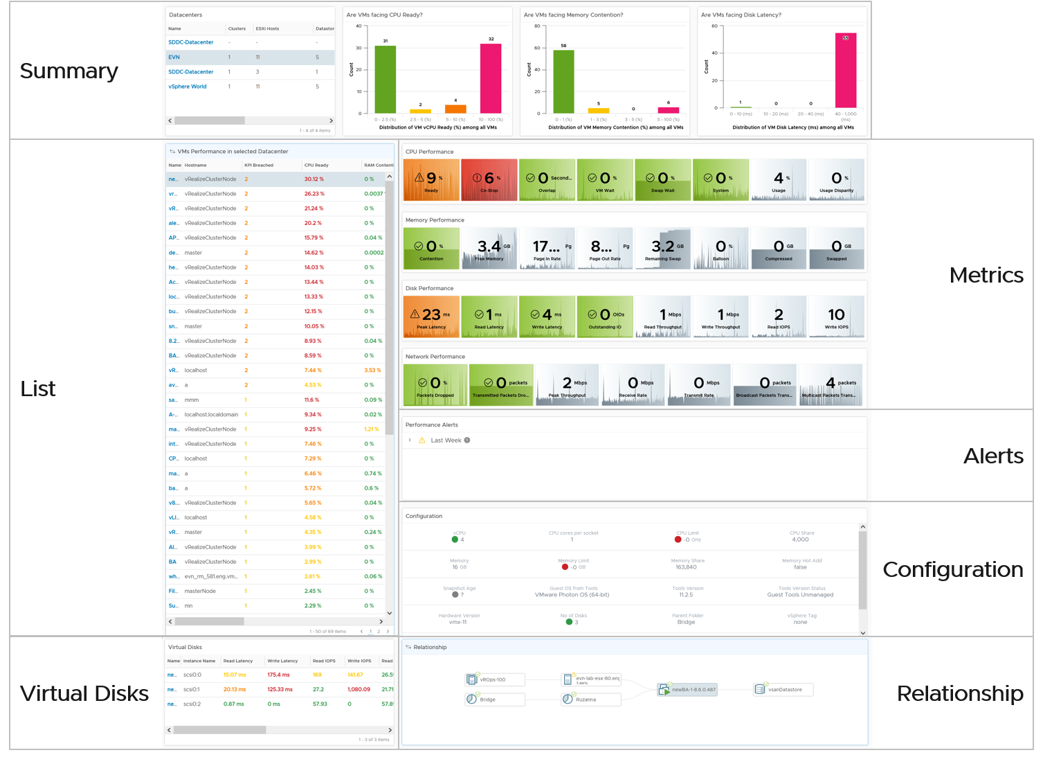
Summary
The dashboard uses a list of Data Center as a selector/filter. Why don’t we use vSphere Cluster as the selector?
Because this is about VM performance, not cluster performance. Multiple clusters can share the same datastore, and they often share the same network. These shared infrastructure can impact the performance of VMs on it.
Select one of the data centers from the table. The following bar charts will be automatically shown.
What does the following 3 bar charts tell you about the environment? They work in tandem to reveal if there is any performance problem, and if yes, what problems and how bad.
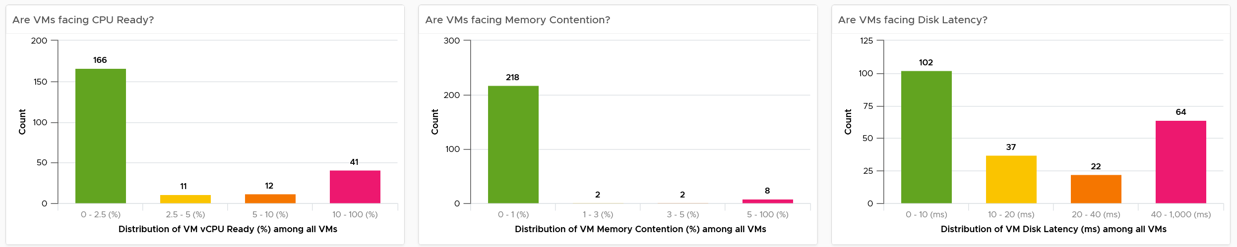
Each chart analyzes how the VMs are served by the cluster. For each VM, it picks the worst metric in the last 24 hours. By default, VCF Operations collects every 5 minutes, so this is the highest value among 288 datapoints. Once it has the value from each VM, the bar charts put each VM in the respective performance buckets. The threshold in the buckets consider best practice, hence they are color coded.
You can change the time period to the period of your interest. The maximum number will be reflected accordingly.
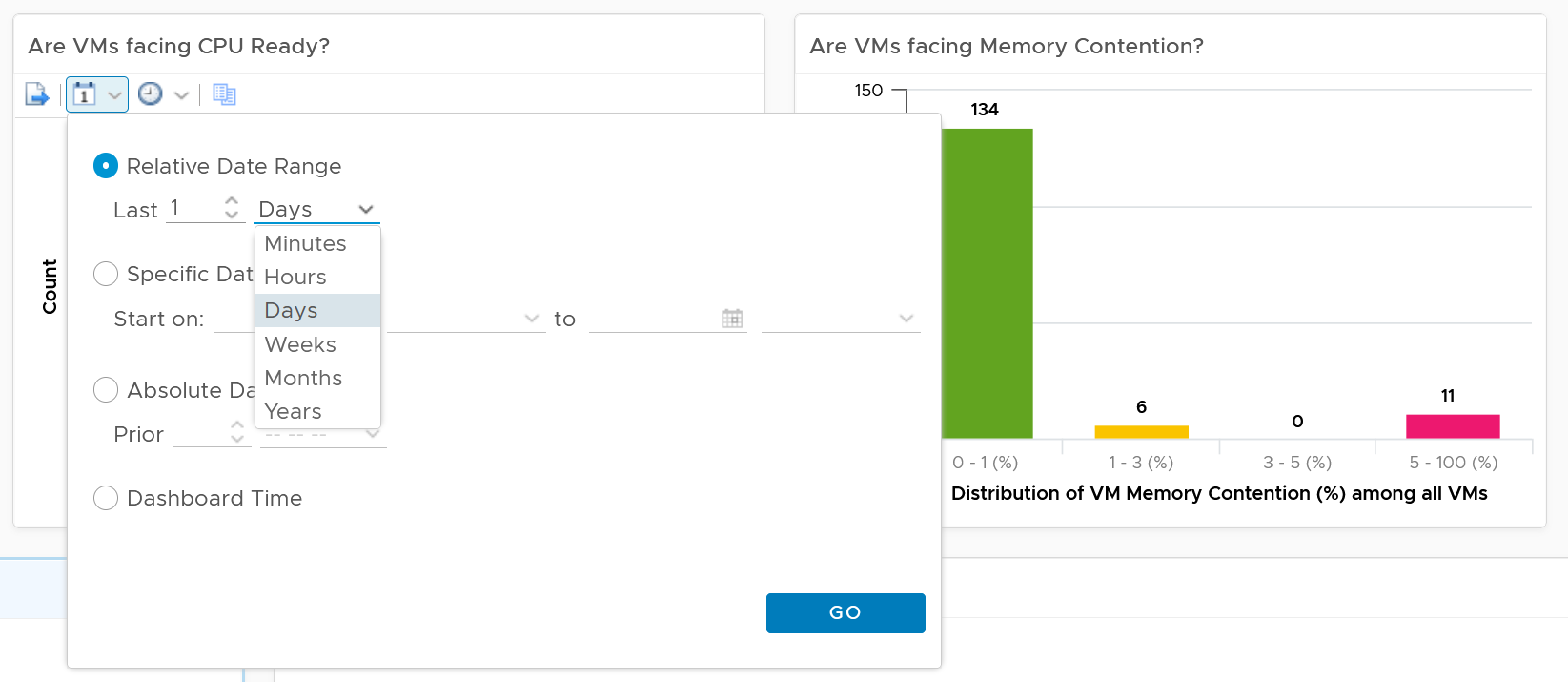
The value is actually the worst 20-second within the 5-minute. Yes, it’s using the peak metrics, covered here in the Troubleshooting Metrics section. Why do I choose the 20-second average instead of the 5-minute average, considering your SLA should be based on 5-minute average?
It’s to give you a heads up. Leading indicators. Otherwise, you get something like this:
Yes, the above shows 3405 VM. And not a single one of them has CPU Ready > 2.5% and memory contention > 1% in the last 24 hours. It’s not so useful in giving you early warning.
For your mission-critical environment, you should expect that all the VMs are being served well by the IaaS. So expect to see green on both distribution chart. If they are, there is no need to analyze further.
For development, you may tolerate a small amount of contention in both CPU and Memory as you need to balance cost.
If it makes more sense for you, change the filter from data center to cluster. Once you are listing cluster, you can then add the cluster performance (%) metric and sort them in an ascending order. This way the cluster that needs immediate attention is on top.
You can click on any of the bar to see the list of VMs under that performance bucket. From there, you can select a VM and have its KPI automatically shown on the lower section of the dashboard.
Multi-VM Analyzis
When you select a data center from the table, the table listing all the VMs in the data center is automatically shown. A portion of the table is shown below.
The table shows the hostname as known by Windows or Linux. This is the name that application team or VM owner know, as they may not be familiar with the VM name.
The table is sorted by KPI column, directing your attention to the VMs that are not performing. The column is based on the super metric VM KPI (%), which we covered in Part 2.
BTW, if the KPI is blank, that means at least one of the metrics is blank. Use the dashboard to check which metrics are blank. If not all the Guest OS metric appear, then the VMware Tools is likely outdated.
The rest of the columns show contention metrics. Notice there is no utilization metrics at all. You should know why by now 😊
Because the goal is proactive monitoring, as opposed to reactive troubleshooting, the metrics show the worst value instead of the average of the monitoring period. You can see from the following screenshot that the Transformation is set to Maximum, instead of Current.
For example, the CPU Ready counter shows the highest CPU ready within the period you specify. The default period is 24 hours, as the dashboard is designed to be part of the daily SOP. The reason 1 week is not chosen is the performance > 24 hours are likely to be less relevant.
Unlike the bar chart, this shows average of 5 minutes. The reason is we’re showing VM, and the VM SLA should be based on 5-minute average.
If you have screen real estate, group the VMs by cluster. In this way, you can quickly see if the problem is in particular cluster. Avoid grouping by ESXi as VMs may relocate.
Per-VM Analyzis
Once you’re down on a specific VM, you need to check both at the Guest OS layer and the VM layer. The following are Windows or Linux metrics to check.
| Metric | Optimize or Fix |
|---|---|
| Runaway process | The process goes into an infinite loop. Remedy is to kill it. In a large VM with many vCPU, this can be impossible to detect if the process is only consuming 1 CPU. |
| CPU Run Queue | Ideally, measure both the queue per CPU and the total queue. A 64 vCPU having 1 queue on each CPU means 64 processes were waiting. Performance could be affected. If utilization is high, then add vCPU. If utilization is not high, check if there is imbalance among the vCPU. Some applications may need to be configured to use all vCPU. |
| CPU Context Switch | IO causes context switch. If utilization is not high, reduce vCPU to minimize ping pong. More on CPU Context Switch is covered here. |
| Network latency | Change driver. More CPU to process network packets |
| Disk Queue Length | Problem could be inside the Guest or outside. Check if VM outstanding IO and VM disk latency is high. If not, then the issue is with Guest OS, not underlying infrastructure. Check if Guest OS latency is high. If yes, change SCSI driver to PVSCSI is one good remediation. If not, leave for now. |
| Driver Queue | Storage driver such as LSI Logic and PVSCSI has their own queue. If you know how to get the value, let me know. |
| Network Buffer | The ring buffer in the virtual NIC card. This can get filled up. |
| Memory Page Fault | Look inside the Guest OS and Process to see if it’s memory settings aligns with configured RAM. It’s common for JVM or DB to have memory settings that don’t match Guest OS configuration. Need Telegraf agent as it is not tracked by Tools. |
At the vSphere VM level, these are the metrics to check:
| Metric | Optimize or Fix |
|---|---|
| CPU Ready | Check config: Limit, Shares (also relative to other VM, not just its absolute amount) Check if it’s caused by resource pool Check ESXi utilization. A sign of ESXi struggling is other VMs are affected too. Check vMotion stun time (requires Log Insight) |
| CPU Co-Stop | As per CPU Ready, but note that VM with many CPU has higher chance of experiencing co-stop. If VM utilization is not high, reduce vCPU. |
| CPU Overlap | VM has high IO (disk or network), causing its own CPU to be interrupted for IO by VMkernel. Check if ESXi cores utilization is balanced. |
| RAM Contention | High ESXi memory utilization. Check ESXi Balloon, ESXi reservation. Check vMotion stun time (this requires Log Insight) |
| CPU IO Wait | High disk latency causes high CPU. Check for snapshot as snapshot requires double IO processing. |
| Network Dropped Packet | After verifying this is not a false positive, check for packet retransmit and underlying infrastructure. If packets are broadcast packets it might be dropped by the network. |
| Network retransmit | When a packet is loss, it needs to be retransmit (unless it’s UDP protocol). |
| Network latency | Latency caused by hops. Optimize the traffic. Note this needs Aria Network Insight |
| Disk Latency | Check VM outstanding disk IO Check if IOPS Limit has been placed. |
| Outstanding Disk IO | Check underlying ESXi or datastore |
| vMotion | Check DRS automation setting If the actual vMotion is too long, check if the active memory. You can use Log Insight to see the throughput. For stunned time, you need Log Insight as it’s not shown in the UI. |
VM KPI (%)
Choose a VM of your interest from the table.
All the CPU, Memory, Disk and Network performance charts are automatically shown, each widget showing the KPIs of that VM.
CPU Metrics
The CPU panel sports the following 8 metrics. Review them. Do you know why we pick these 8, and show them in this specific order?
The metrics are shown in the order of importance or urgency. The most important one for Guest OS is CPU Run Queue, while the most important for VM is CPU Ready.
Peak CPU Run Queue. Ideally we divide by the number of vCPU. Create a super metric for that. Good practice 😉
Peak vCPU Ready (%) tracks if any of the virtual CPU is experiencing high CPU Ready. It takes the highest among the vCPU. This can be useful in large VMs with many vCPU.
Why are the last 3 metrics are not color coded?
-
CPU Context Switch actually impacts performance. I’m just unsure what to put as it varies among customers. For your environment, set it as appropriate after profiling.
-
The CPU Usage (%) is shown grey as it actually has negative corelation with performance. Grey is chosen as it also conveys wastage. Resources that are hardly utilized may not mean performance is at peak. In fact, it could be the opposite. If a VM just need 1+ vCPU, configuring it with 2 CPU will result in better performance than configuring it with 20 CPU.
-
The CPU Usage Disparity (%) metric. Color code it based on your expectation
The following screenshot shows the threshold used:
The Guest OS CPU Queue has a high threshold due to false positive. For details, see the metric documentation in this book.
The Other Wait metric has a high threshold due to false positive. For details, see the metric documentation in this book.
Yes, they are based on the 20-second peak. Read more behind the 20-second metrics here.
The chart also displays the present value, so you know if the problem is still happening or not.
Why none of the metrics have decimal point?
I round all the counter because the decimal is not significant and clutters the dashboard with no real value. There is really no difference between 0.1% and 0.9% in all these metrics.
Why CPU Latency or CPU Contention and CPU System metrics are not shown? Refer to the metric chapter for the reason.
Why is CPU Swap Wait not shown? Its value is a subset of Memory Contention.
Memory Metrics
Now that you know how the widget is designed, let’s move content from CPU to Memory. Review the following screenshot.
Why is contention the only color coded metric? Balloon, page in rate, page out rate, etc are not. See this example of where severe ballooning did not result in much contention at all.
Because memory is a form of storage. Most metrics measure usage of the disk space, not latency of access. Consider the disk space occupied. A utilization at 90% of the space is not slower than 10% utilization. It’s a capacity issue, not performance.
Why are the memory paging shown in color?
Because they are leading indicator and possible cause of memory performance within Windows or Linux.
Why is Balloon placed towards the end?
Because that’s a VM level counter. For memory, you want to measure at Windows or Linux level. The following shows the metrics we use. Guest means it’s coming from the Guest OS, not VM.
Why is ballooned, compressed and swapped not shown in color?
Because there presence do not mean the VM has performance problem. They are not metrics for VM performance. That’s a counter for the underlying ESXi and Cluster. As usual, refer to the metric chapter for details 😊
Storage Metrics
What do you expect to see for disk? What are the contention metrics, and what are the utilization metrics?
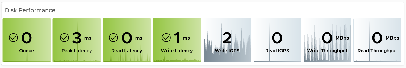
The most important one for Guest OS is Disk Queue, while the most important for VM is the Latency. The latency is based on the 20-second metric. It’s also the highest of read or write.
Peak Virtual Disk Read Latency (ms) and Peak Virtual Disk Write Latency (ms) track whether any of the virtual disks (either VMDK or RDM) is experiencing latency. This can be useful in large VMs with many virtual disks.
I put IOPS before throughput metrics as it’s more popular. Use Disk IOPS and Throughput together, especially for applications that use large block size. An IO with 250x block size (e.g. 1 MB instead of 4 KB) will generate equal throughput at 250x less IOPS, all else being equal.
For throughput, I use byte or bit as it’s the amount of disk space written, not the amount of data travelling in network line.
I use the following threshold. They are based on the profiling result documented in Part 2.
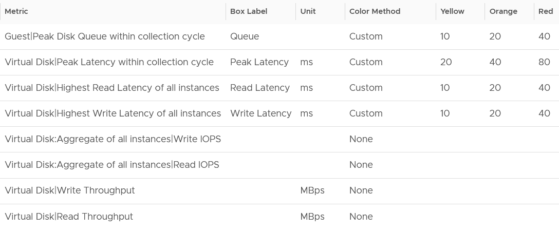
I round all the metrics to the nearest whole number. By now you know why 😊
Why is Outstanding IO metric excluded?
Read the description of the metric in Part 2 😉
Network Metrics
The last component is Network. What metrics do you expect?
These are the metrics I use:
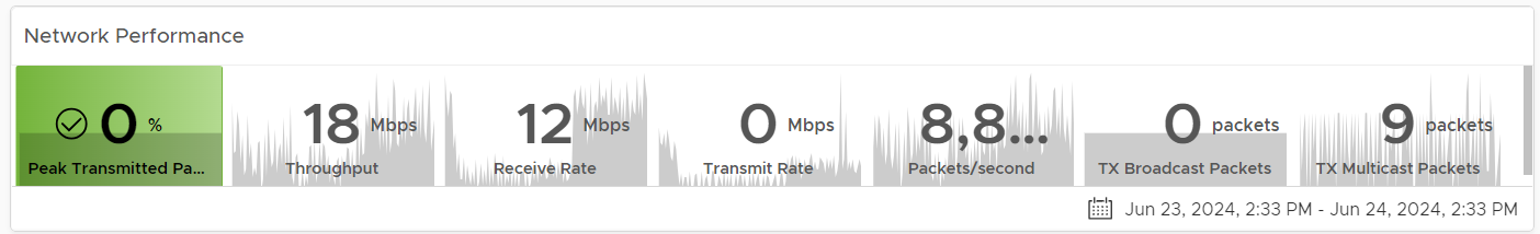
The Packet Dropped (%) formula is (dropped / (dropped + transferred Packets)) * 100%. In a rare case where there is no packet at all, the result shows undefined (blank). This is because the maths of 0 / 0 = undefined.
The following is the threshold I used:
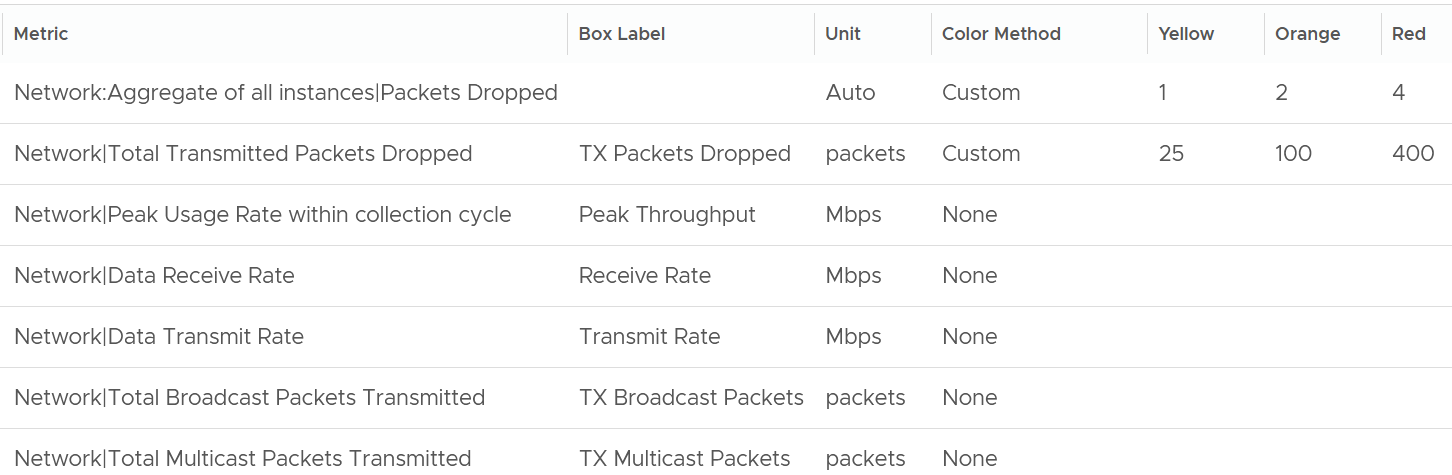
Why did I set the packet drop higher than I set in the super metric? It is in fact 2x higher.
The reason is this includes RX and TX. The RX tends to be several times higher, so setting it at 2x is actually conservative, relatively speaking.
Notice the missing counter?
There is no received packets dropped. The reason is false positive.
If it’s relevant to you, add the packets per second counter.
Broadcast packets and multicast packets metrics are added as most VMs should be unicast. If the number if high, investigate with the application team why the applications are behaving that way.
Alerts
The relevant alerts are also automatically shown. You can see the settings by editing the widget, and adjust them accordingly to fit your operational needs.
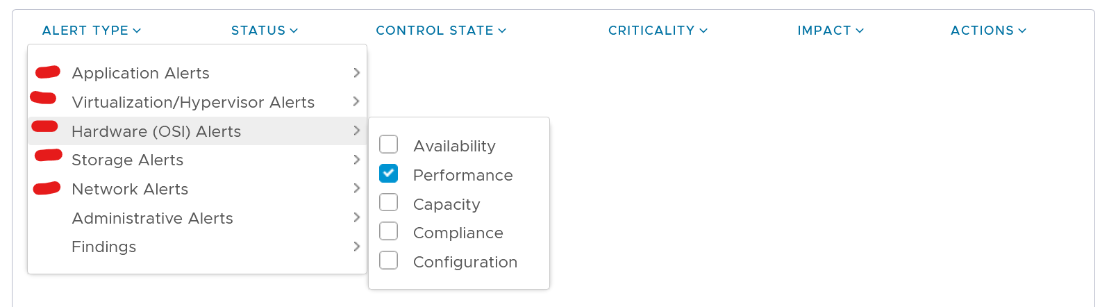
Configuration
This shows the relevant settings of selected VM. Customize as you deem appropriate.
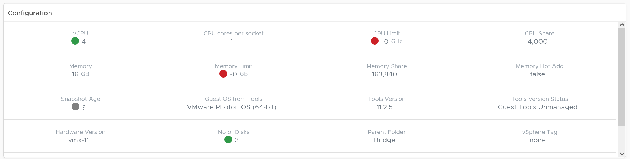
Virtual Disks
A VM can have many disks, and it’s possible that these disks have different performance. The following table lists the individual virtual disks and their contention and utilization metrics. Both read and write are shown.
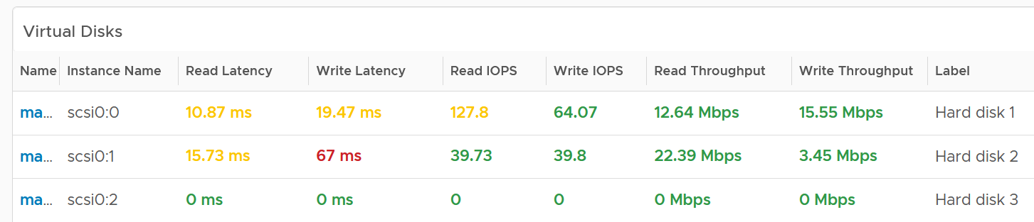
To see a trend over time, click on the VM object, and choose All Metrics.
Relationship
From the VM, you want to navigate to the parent cluster or datastore. Use the relationship widget to navigate and auto select the associated cluster or datastore.
Heavy Hitters VM
IaaS provides four services, CPU, Memory, Disk, and Network.
-
CPU, Memory, and Disk are bound. A VM with 4 vCPU and 16 GB memory cannot consume more than this amount, the same applies to disk space. A VM configured with 100 GB disk space cannot consume more than that.
-
Network and Disk utilization are not bound. An active VM can consume all your network bandwidth, packet per second capacity and storage IOPS capacity.
The Storage Heavy Hitters dashboard forms a pair with the Network Top Talkers dashboard. To understand the IO demands in your environment, use them concurrently. If you are using ethernet based storage, storage traffic will run over the same physical network your network traffic is travelling.
Why not combine into 1 dashboard?
-
The users are different. Network dashboard may be required by Network Team, while storage dashboard by Storage team.
-
The remediation actions are different.
-
The customization is different. You extend each dashboard, going into physical array or NSX.
The dashboards are designed to help you analyze the impact of these VMs on your IaaS. It classifies the workload into two categories: short bursts and sustained hits.
Short burst last for a few minutes, while sustained hits can last much longer. A sustained hit that lasts for an hour can cause serious problems.
A heat map would enable us to visualize the data easier. However, it can’t show the past data, hence it’s not used. If you want see in heat map form, see the Live! Heavy Hitters dashboard.
Points to Note
-
add a line chart to automatically show the selected VM usage. Add the CPU usage also to see correlation between disk and CPU.
-
Group the VM by clusters of the same class of service (e.g. Gold), so you can see the profile for each environment.
-
For smaller environment, change the table from listing data centers to listing clusters.
-
For larger environment, add a distribution chart so you can see the spread of the metrics.
Compute Performance
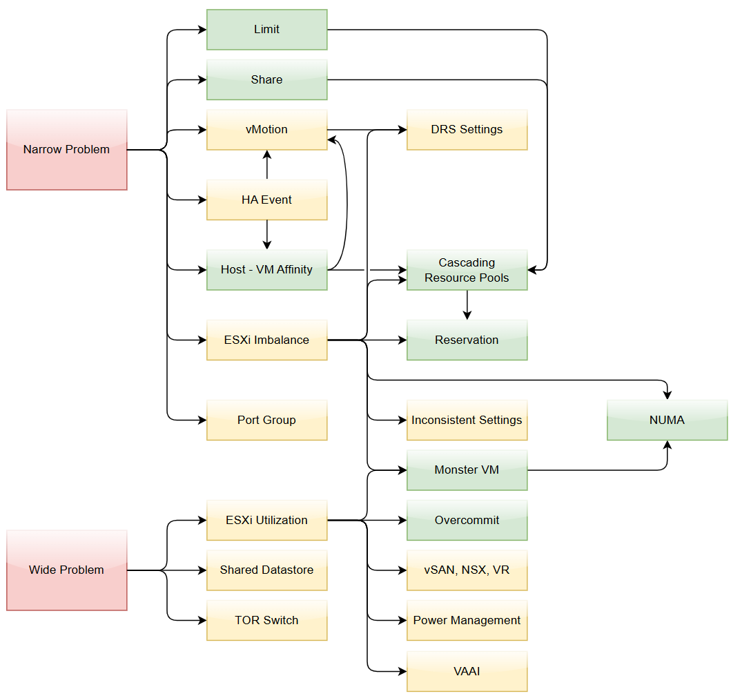
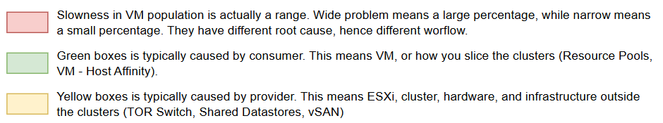
This dashboard covers vSphere Cluster, ESXi host and resource pools, hence the generic name compute is adopted.
Design wise, while we can further add analyzis, I feel it’s not worth the cost of complexity. I understand the very large customers may want to add more analyzis. If you are one of those, drop me a note.
Overall Analyzis
2 color-coded trend charts are provided.
The first one gives the overall performance. Expect this to be steady, especially in a large environment.
The second one complements it by showing the count of clusters that are no longer in the green zone. If your problem is isolated, the first counter may miss.
Average Performance
Look at the “Average Cluster Performance (%)” health chart at the top of the dashboard. In a high performing environment, where all the clusters are doing well, you will see something like this.
There was only one occurrence where the color is not green. At that time, the actual value is also relatively good.
In this case, all is good, and you may not need to look further.
On the other hand, if the clusters are unable to serve the VMs well, you will see something like this.
The average among all the clusters is no longer green, with a few occurrences of reds. The good part is the value does not trend downwards. Check if this is normal in your environment.
As this KPI takes into account every single running VMs in your environment, the number should be steady, especially in a large environment. The analogy in real life is the stock market index. While individual stocks can be volatile on a 5-minute by 5-minute basis, the overall index should be relatively steady. A big drop is called a market crash and that’s not something you want in your environment. So a drop like the following warrants an immediate investigation.
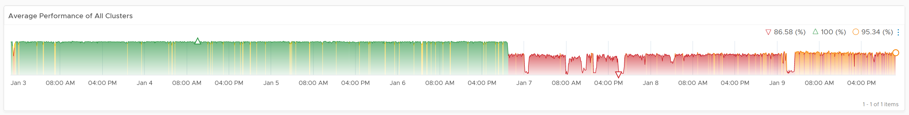
The relative movement of the metric is as important as the absolute value of the metric. Your absolute number may not be as high you wish it to be, but if there have been no complaints for a long time, then perhaps there is no urgent business justification to improve it.
As the chart shows all the clusters, it uses the vSphere World object. This object is the parent of vCenter object, so it will show all clusters from all vCenter, making it suitable when you want to show everything.
The actual metric used is Performance \ Clusters Performance (%), as shown in the following dialog box. This is the primary KPI for your entire IaaS. It plots how your IaaS is performing every 5 minutes, giving you the trend view of overall performance.
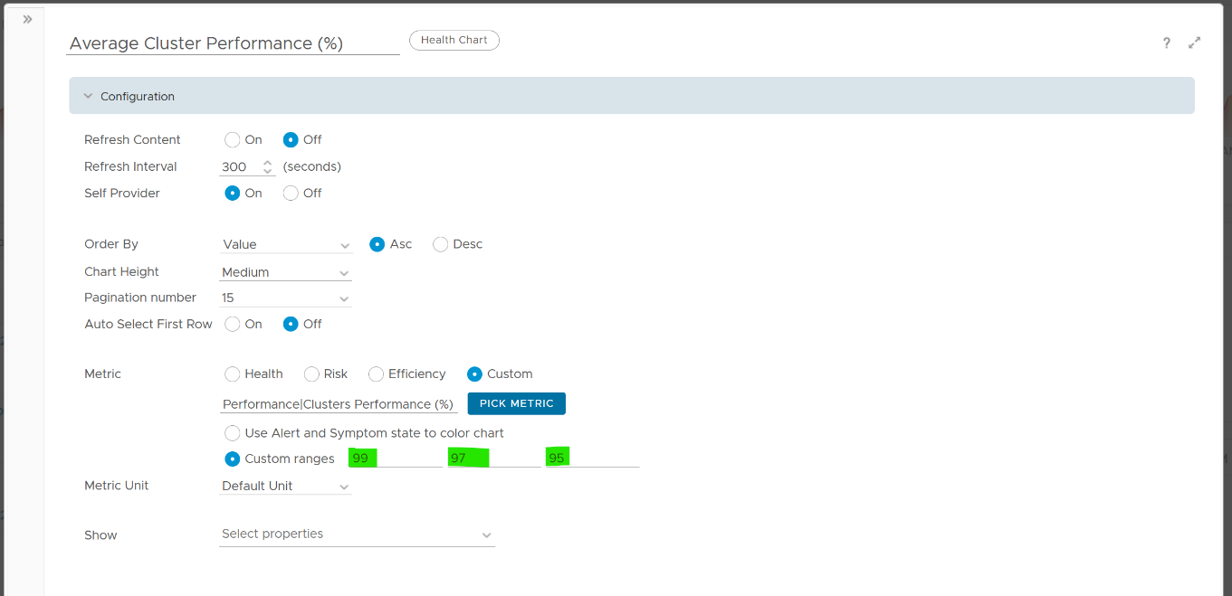
What is this metric based on?
It is simply the average of Cluster KPI \ Performance (%) metric. This performance metric in turn averages the VM Performance \ Number of KPIs Breached metric from all running VMs in the cluster. Hence a value of 100% indicates that every single running VM in the cluster is served well.
More details on the formula were covered earlier here as it’s an important foundation of IaaS performance KPI.
Non Green Clusters
This trend charts shows the number of clusters that are no longer in the green zone. Another word, the value of the Cluster KPI \ Performance (%) metric has gone down below 75%.
Review the following chart. What trend do you spot in the last 1 week?
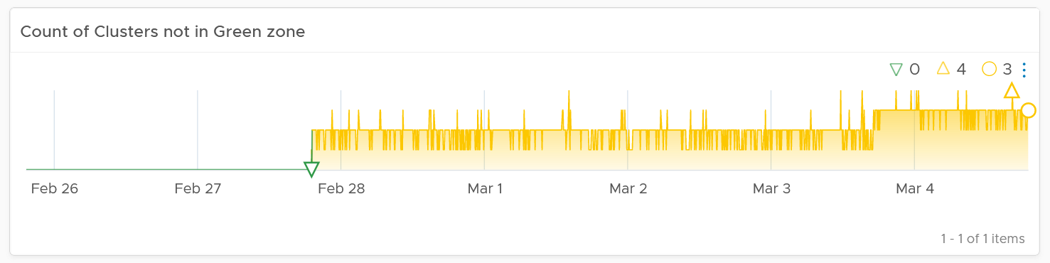
That’s correct, the number of clusters falling below green zone has gone up from 0 to 4.
Earlier, I wrote that this counter complements the first counter. The following chart is what you get from the 1st counter. Notice it’s hard to deduce that 3-4 clusters have fallen below the green zone. In this case, some clusters actually went up as we powered off their VMs, so the overall numbers remain similar.
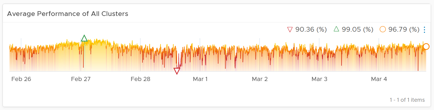
Multi-Cluster Analyzis
If the chart is showing green, then all is good. If not, you want to know which clusters are not performing. This is where the Clusters Performance table comes in.
The table lists all the clusters, starting with the lowest performance. By default, it’s showing data from the last 24 hours as this dashboard is designed to be part of your daily SOP.
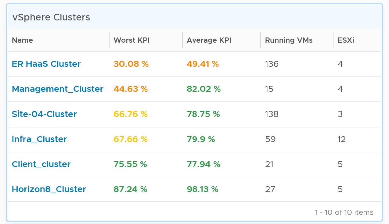
The Worst Performance shows the lowest number in the time period. As VCF Operations collects every 5 minutes, there are 12 x 24 = 288 data points in a day. This column shows the worst point among 288 datapoints.
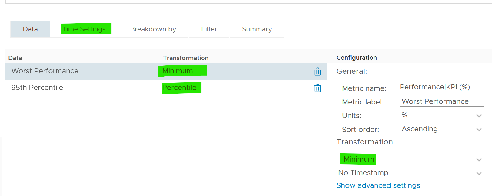
For a very large environment with many clusters, add a grouping to make the list more manageable. Group it by class of service, so you can focus on the more critical clusters. You can then adjust the threshold accordingly. For example, add the column worst 1st percentile to complement the worst and the worst 5th percentile. This is useful if you have clusters with more than 1000 VMs, as 5th can be too late.
You may not be comfortable not seeing utilization metrics. Old habits die hard 😊. Modify the table to add key utilization metrics. The following table shows an example of metrics to add. Notice that I do not color code the disk IOPS and Network Usage.
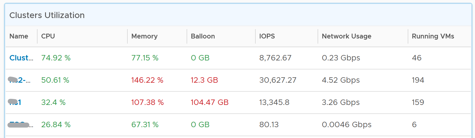
Per-Cluster Analyzis
The table is accompanied by the health chart. It allows for quick toggling among clusters.
Select a cluster to see the trend over time, and see the Performance (%) health chart.
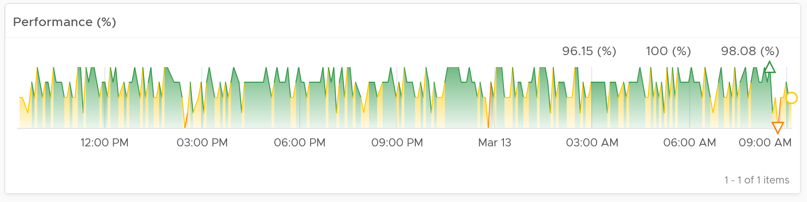
If the cluster has a daily or weekly pattern, increase the dashboard time duration to at least 1 week. Here is an example where the performance problem is clearly shown. You can see the cluster performance has regular drop in the last 7 days.
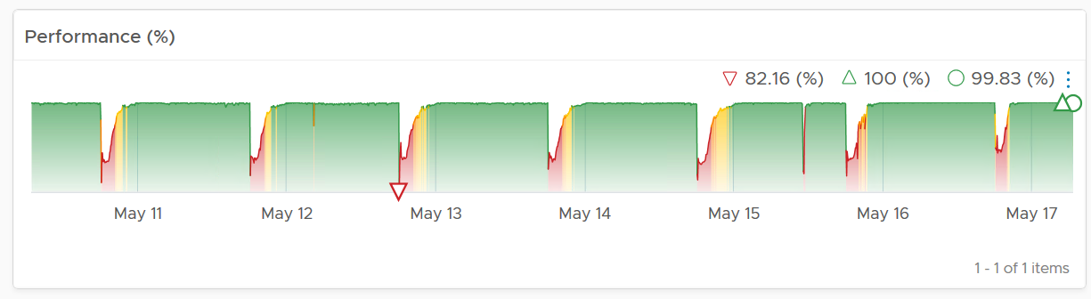
Once you determine the cluster to investigate, review the scoreboards. There are 5 of them:
-
CPU
-
Memory
-
Disk
-
Network
-
Others
They are shown separately, because you can have one problem and not the other. You may also drill down into a different path (e.g. into vSAN dashboard), and talk to different team (e.g. Network team).
CPU problems tend to be more common than Memory problems, due to lower overcommit ratio in memory in practice among customers. It is common to see customers do 4:1 CPU overcommit and only 2:1 memory overcommit. This conservative practice was due to the inherent higher value of memory counter. vSphere cluster shows high memory value as memory, giving the impression the actual utilization is high. And the reason for high value is modern Operating Systems like ESXi VMkernel uses memory as disk cache.
For performance, it’s important to show both the depth and breadth of the performance problem, as explained here. A problem that impacts 1-2 VMs requires a different troubleshooting process than a problem that impacts all VMs in the cluster.
The depth is shown by reporting the worst among any VM counter. So the highest value of VM CPU Ready, VM Memory contention, VM Disk Latency among all the running VMs are shown. If the worst number is good, then you do not need to look at the rest of the VM.
A large cluster with thousands of VM can have a single VM experiencing poor performance while >99.9% of the VM population is fine. The depth counter will not be able to report that most VMs are fine. It only reports the worst. This is there the breadth metrics comes in.
The breadth metrics report the percentage of the VM population that is experiencing performance problems. The threshold is set to be stringent, as the goal is to provide early warning and enable proactive operations.
CPU Metrics
This is the first of a series of performance scoreboards.
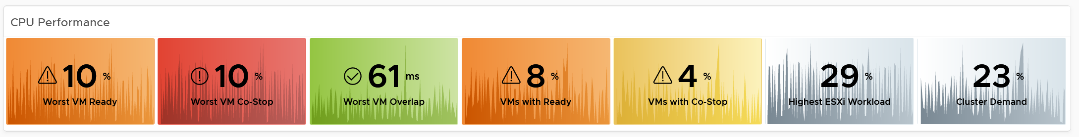
There are 3 metrics measuring the depth of the problem:
-
Worst CPU Ready among all the VMs in the cluster.
-
Worst CPU Co-stop among all the VMs in the cluster.
-
Worst CPU Ready among all the VMs in the cluster.
CPU Ready is the primary counter. Do you why CPU Contention is not used? See CPU Contention metric in Part 2 of the book.
CPU Co-stop is included, but placed at lower priority than Ready because high Co-stop does not mean the ESXi is struggling to serve the VMs. Co-stop can be reduced by right-sizing an oversized VM, so the remediation action is not always on the ESXi Host. CPU Overlap is included as it can happen when there are many active VMs in the cluster.
CPU Overlap is included as it indicates interrupts. A running VM was interrupted because VMkernel needs the physical core to run something else. A high and frequent number of interruptions is not healthy. This can also impact the VM performance. It’s placed third as the value tends to be small.
Here are thresholds used.
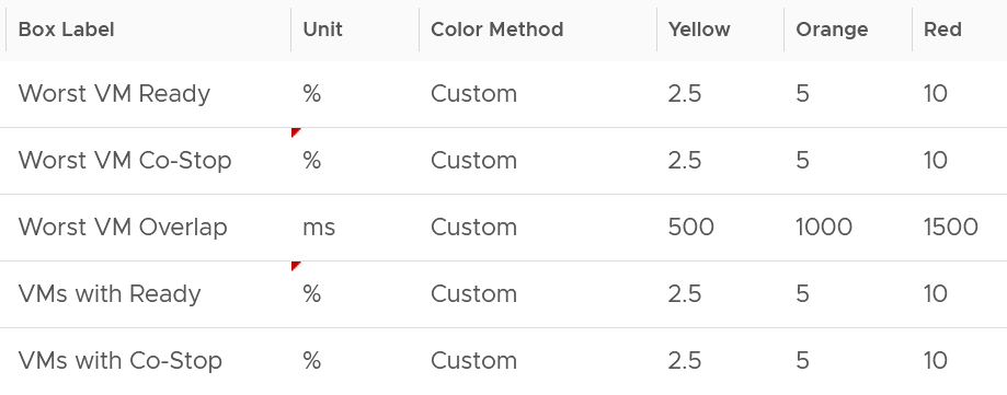
If you find that the CPU Co-Stop values in your environment is much better, adjust it accordingly.
Take note that the Workload metric can exceed 100% because it’s demand / usable capacity * 100. So this could happen if you have 4 hosts in a cluster with each host running at 100% demand and admission control is set to 50%.
If your cluster has many resource pools and Host to VM Affinity, create a super metrics to track the gap between highest and lowest CPU usage among ESXi hosts in the cluster. The reason is imbalance is pretty common, especially in large clusters with many hosts or VMs. There are many settings that can contribute to it (e.g. DRS settings, VM Reservation, VM – Host Affinity, Resource Pool, Stretched Cluster, Large VM).
Memory Metrics
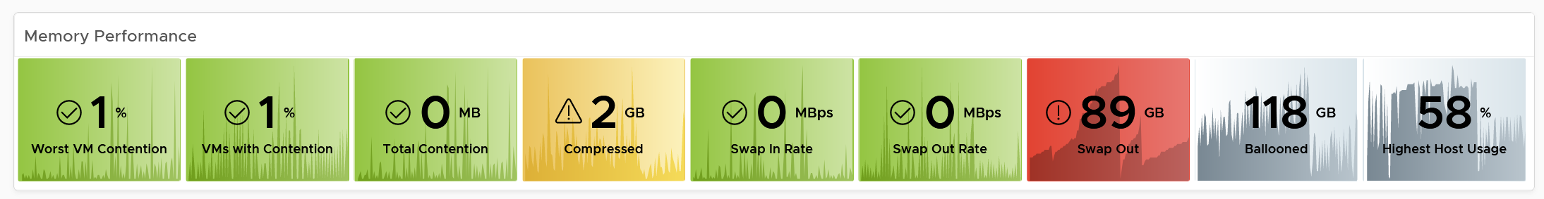
Expect memory utilization to be higher than CPU, as it’s a form of cache. The Memory Consumed counter is used, as it’s more appropriate than the Memory Active counter. If active is low, no need to upgrade RAM as Consumed contains disk cache. For me, it’s fine for Consumed to be 99% so long RAM Contention is 0.
The high utilization metrics are explicitly shown. Balloon, Compressed, Swapped. Notice they can exist even though utilization is not even 90%, indicating there was high pressure in the past. If you look at only utilization, you’d think you are safe!
I use the following settings for the threshold. What do you notice?
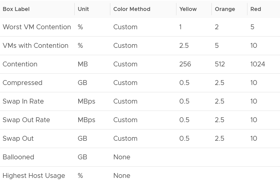
The threshold for contention is much lower than the threshold for other metrics. This is because contention is the only performance metric. The rest is secondary, playing supporting role. You can have 10 GB compressed, so long they are not used, the VM does not experience delay.
Storage Metrics
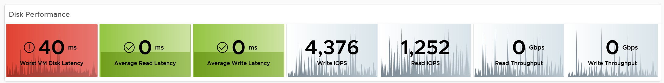
The disk IOPS is split into read & write to gain insight into the behaviour. Look at the values for that cluster. Do they match your expectation?
For throughput, why are the unit set at Gbps? Why not GBps or Mbps?
Because we’re referring to IO commands sent down the cable (your DC is not wireless, yet!). Your ethernet cable or FC cable use bit, such as 16 Gbps or 32 Gbps.
Mbps is too small for a cluster. A cluster doing useful work should easily exceed 1 Gbps as it’s just 128 MB/s. If you have distributed storage like vSAN, you can very well exceed 10 Gbps.
If you use VMFS datastores, add the disk contention metrics such as Bus Reset and Aborted Commands. You should expect they return 0 at all times.
Network Metrics
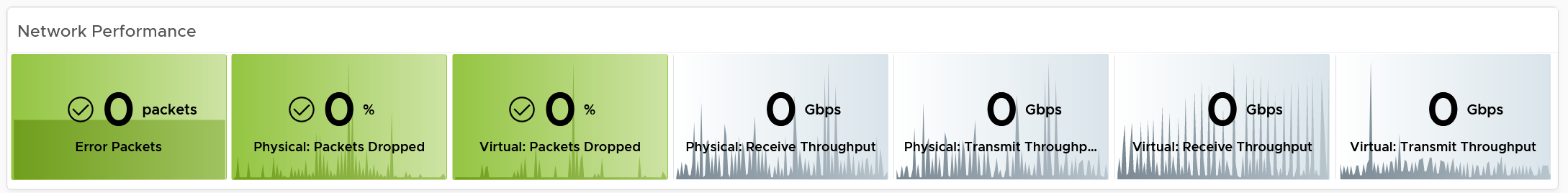
For network dropped packets, there are 2 types: physical (ESXi) and virtual (VM). The physical counter is used as that better represents infrastructure problems. The VM counter may suffer from a false positive. I recommend you customize this dashboard and add it anyway, for completeness.
Expect the network error 1% and dropped packet to be 0 most of the times, if not always. If it’s not, analyze to see if there is any patterns across all ESXi Hosts, and bring it up to your network team.
The network throughput is split into sent (transmit) and received to gain insight into the behaviour. Plus, the total usage can be misleading because it sums send and received traffic. In reality the network pipe is 1x for each direction (due to the full duplex nature of ethernet), not 2x shared by both.
Other KPI Metrics
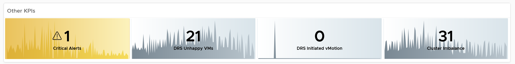
The vMotion line chart is added as a high number of vMotion can indicate the cluster load is volatile, assuming the DRS Automation level is not set to the most sensitive setting.
VM Shares
One common root cause for uneven performance problem is uneven shares. This is easy to make a mistake, as shares are relative. So when you see many slices of the pie, ask yourself why you need that many. Each slice should correspond to a Class of Service. So the entire cluster is serving 1 class, then you should see a simple circle with no pizza slice.
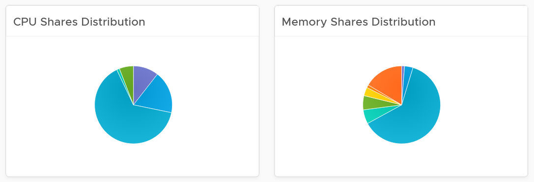
Resource Pool Analyzis
Resource Pool is another common reason behind uneven VM performance. They can also get complicated as you can cascade resource pool. The following example shows a cluster with way too many resource pools. This alone will make performance management difficult.
The second cluster has 4 resource pools. They are sized by their respective share. A pool with 2x share will have 2x the size. With that in mind, can you spot a problem?
Yes, they are of equal share. What’s the point of having resource pool when they are the same share? It looks like a common mistake of using resource pool as folder.
The dashboard also provides a table listing all the resource pool.
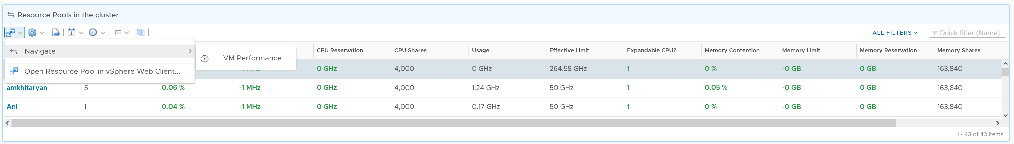
You can navigate to the VM performance dashboard. It will show the VMs in the selected resource pool.
ESXi Analyzis
At the end of the day, a cluster is just a collection of ESXi. The performance can be caused by uneven performance among the member hosts. You can drill down from cluster to ESXi. The following table lists all the ESXi hosts in the cluster, sorted by the worst performance in the last 24 hours.
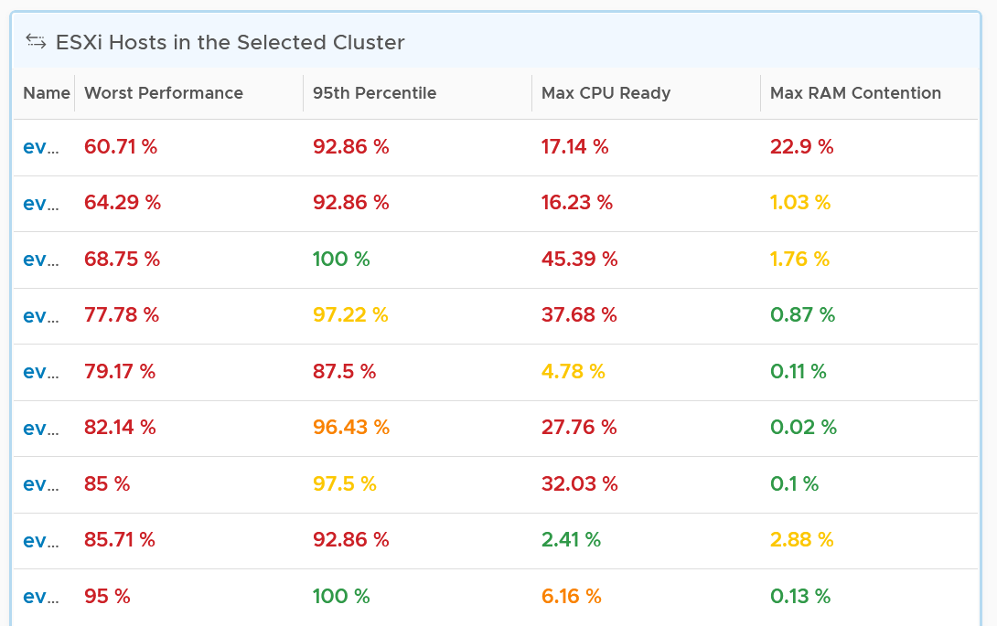
If the table is all showing green, then there is no need to analyze further. The reason 24 hours is chosen instead of 1 week is the performance > 24 hours ago are likely to be irrelevant.
You can change the time period to the period of your interest. The maximum number will be reflected accordingly.
The table helps you quickly compare the performance of each ESXi. You can also see the performance over time, to see a trend. For example, here is the performance of one of the hosts.
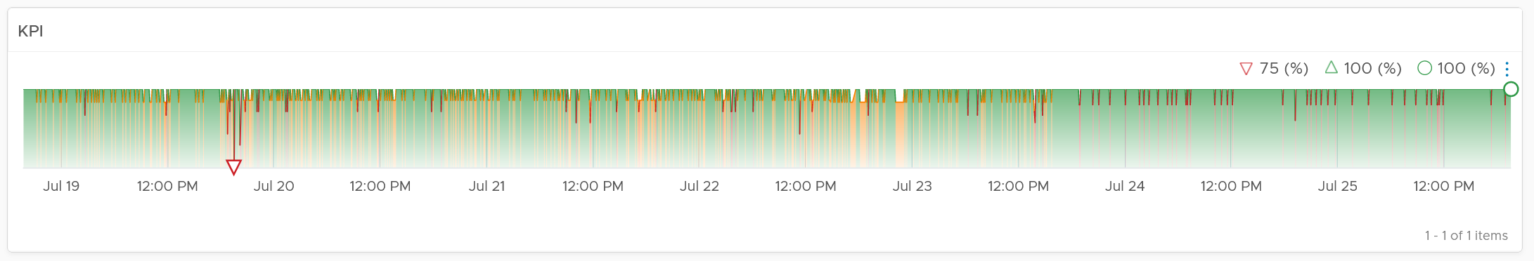
Another ESXi on the same cluster is showing a different experience. What does it tell you?
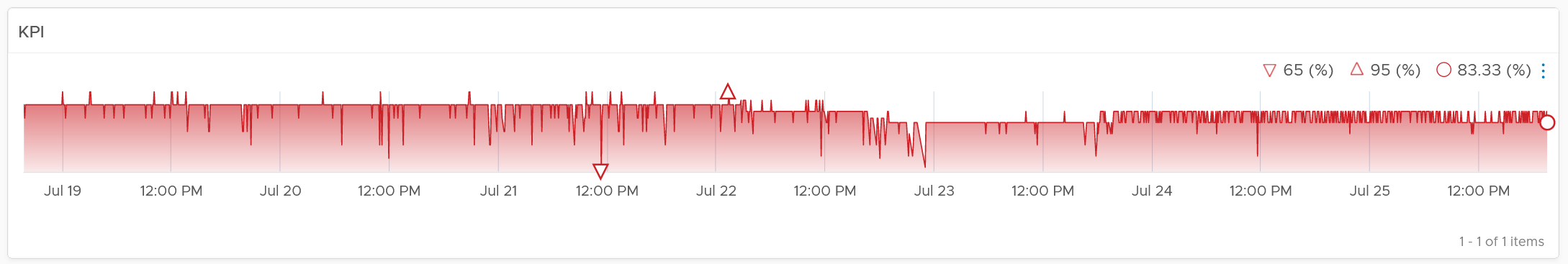
Yes, there is imbalance. A cluster is meant to be balanced, if you enable DRS. The above proves that something has constrained DRS ability.
Just like the cluster KPI, you can also see the KPI of a host. They are similar to the cluster, so to avoid duplication, I’m only covering the difference.
CPU Metrics
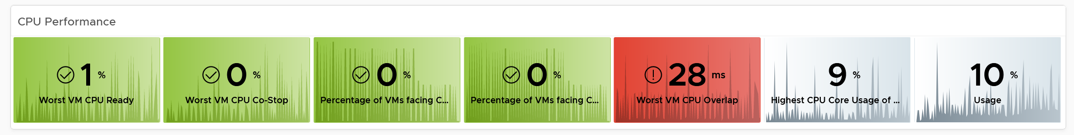
An ESXi typically has a few dozen physical cores, which take turn to run a few dozen VMs. This could create imbalance among the cores. The metric Highest CPU Core Usage tracks the highest utilization among the cores. If this number is consistently near 100%, that indicates at least 1 core is always busy. If this number if much higher than the Usage (%), that indicates imbalance.
Memory Metrics
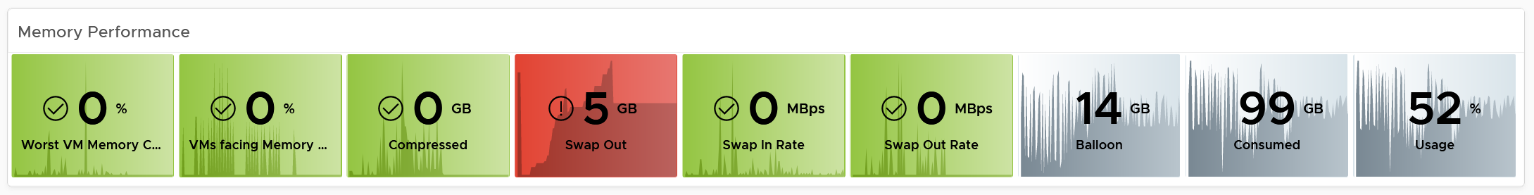
For metrics where the cluster is the sum of its ESXi, the threshold used for ESXi is lower. For example, the red threshold used for cluster for compressed is 10 GB, while the threshold for individual ESXi is 2 GB.
Storage Metrics
It’s likely that the ESXi hosts in a cluster will have different disk IOPS pattern. They could be running VMs with different purpose. Even if all the VMs are the same (e.g. they are all from the same VDI pool), the way the users use the applications are different.
For ESXi, we show both the datastore level and adapter level. Why is that so?
Review the Storage Metrics chapter for the detail. In short, an ESXi can mount datastore and non datastore (e.g. RDM) via its storage adapter.
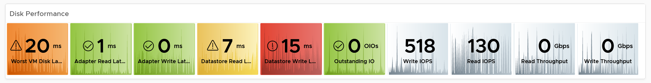
Network Metrics
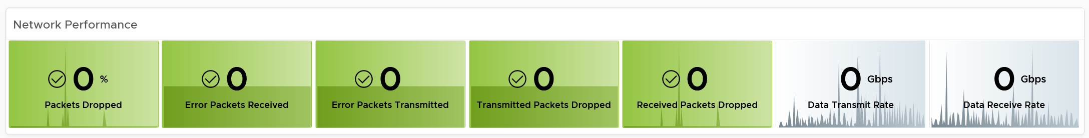
Configuration
Certain settings such as power management and hyper threading can impact performance. The configuration widget shows the relevant property of a selected ESXi Host.
VM Analyzis
Selecting a cluster or ESXi will automatically list the running VMs. Use this table to check if the cluster or host performance problem were caused by VM configuration and usage. Note that it is possible that the VM was not on the same host at the time of problem, due to vMotion.
To drill down into a particular VM, select it and click the double arrow before the widget title. Choose the VM Performance dashboard.
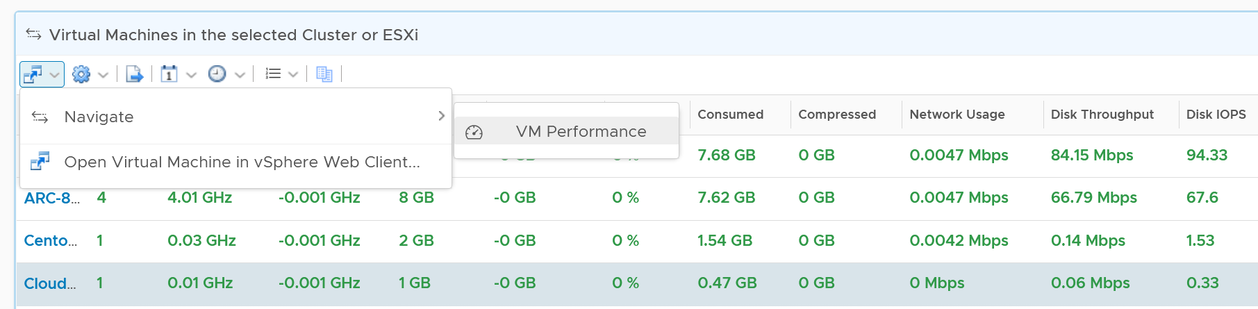
The table is color coded for ease of analyzis, as you can have >1K VM in a cluster. Tailor the threshold to your environment.
Each of the column is showing the maximum value of the time period, so you can spot even if there is a short burst.
Datastore Analyzis
The list of shared datastores accessible by hosts in the cluster is shown. Take note that if your design has M:N relationship between clusters and datastore, then the numbers at datastore level is a number from all clusters.
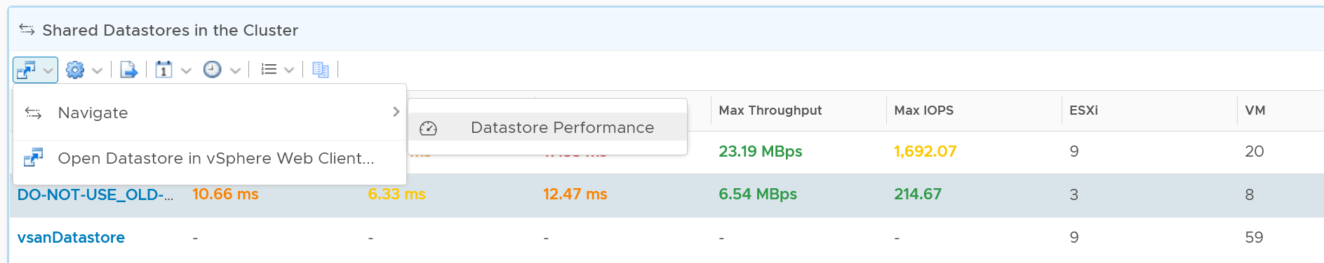
You can also drill down into the selected datastore.
Storage Performance
Use the Datastore Performance dashboard to view performance problems related to storage such as high latency, high outstanding IO, and low utilization. This dashboard is designed for both VMware administrator and Storage administrator, with the goal of fostering closer collaboration between the 2 team.
Local datastores are treated separately, as they have their own use case.
Overall Analyzis
The three bar charts provide the overall analyzis of the datastore performance in a given vCenter DC or World. They work together to give a better insight. Just like other performance charts, the value shown in the worst value during the time period.
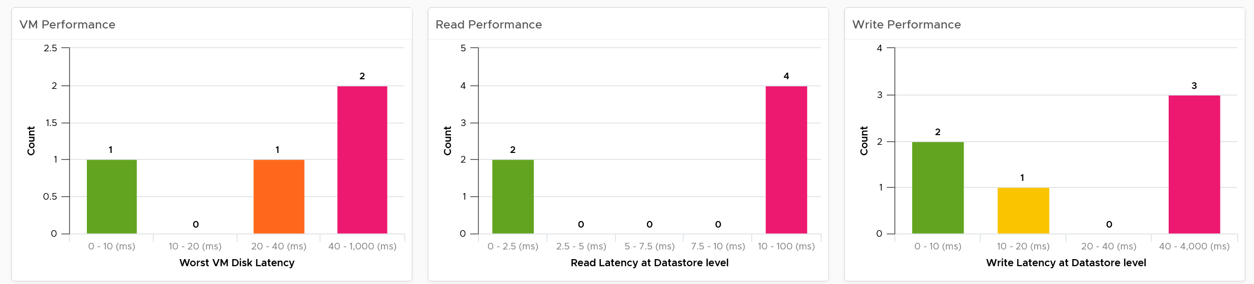
The first one shows how many VMs experience what kind of latency. This is your primary chart as it’s measuring at VM level. The next two charts are measuring at datastore level, which means they are the normalized average of all VMs in that datastore. Expect the first chart to be higher than the last two.
Read and Write latency are shown separately for a better insight. The nature of read and write problem may not be the same so it’s useful to see the difference.
The dashboard does not have datastore clusters. If your environment use it, add a View List right after the list of data center, and have it also drives the Datastore Performance view list.
Datastore Analyzis
A table listing all the shared datastores in the data center or vSphere World will also be automatically shown.
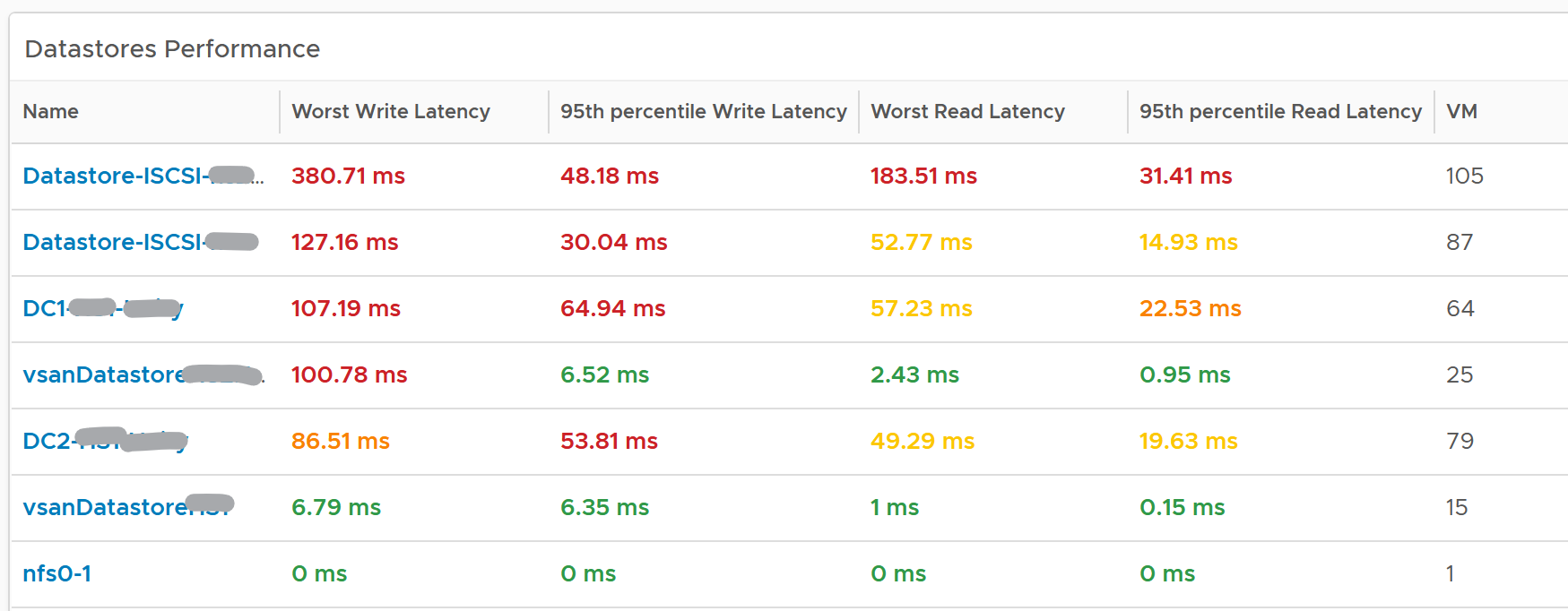
Since it’s a table, we can afford to show multiple numbers. Both the worst (peak) performance and 95thpercentile are shown. If the latter is close to the peak and it’s also high, then it’s a sustained problem. If the latter is low, then it’s a short duration.
The table is color coded. If you require a different threshold, adjust accordingly.
Select a datastore you want to troubleshoot. The relevant metrics and configuration will be shown automatically.
Its latency and outstanding IO is automatically shown.
Note the latency is the normalized average of all VMs in the datastore.
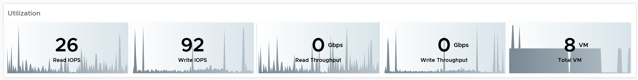
Its IOPS and throughput are also shown. These line charts are not color coded as it varies per customer. Edit the widget and add your expected threshold. It will make it easier for the operations team.
The list of running VMs in the datastore is automatically shown, with the relevant contention and utilization metrics.
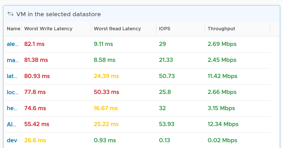
VM Analyzis
Select a VM you want to troubleshoot. Its contention and utilization are automatically shown.
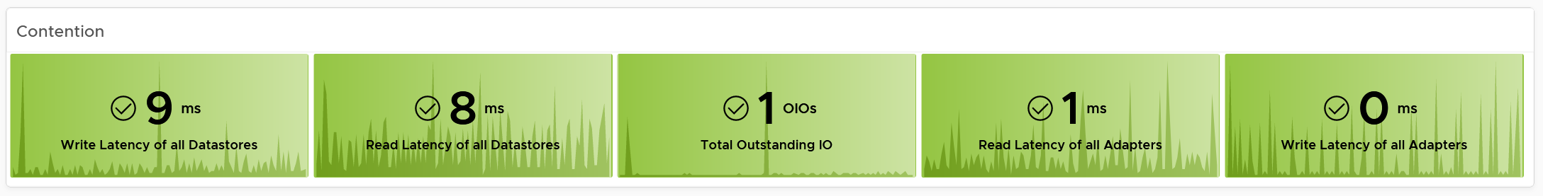
Note that this number is at the VM level. If you suspect one of the virtual disk has high latency, use the counter Peak Virtual Disk Read Latency (ms) and Peak Virtual Disk Write Latency (ms).
For utilization, here are the key metrics.
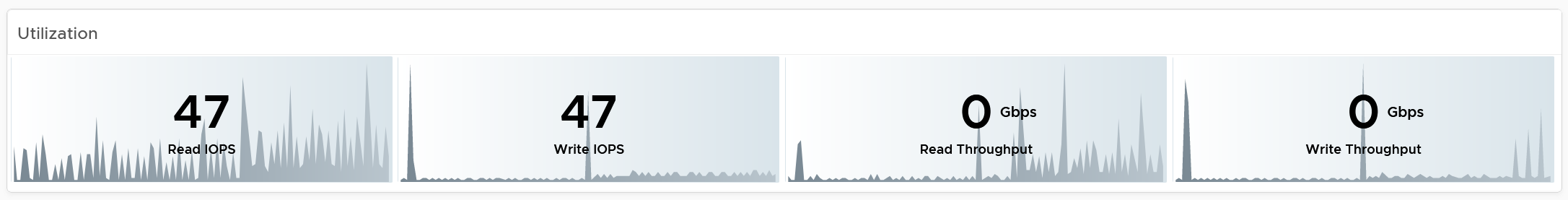
If you have many VMs with virtual disks on multiple datastores, add a View List widget to list the individual virtual disks. Use this list to plot the latency & utilization of individual virtual disk.
Relationship
From the datastore, what if you want to check which clusters or hosts are causing the problems? If it’s a vSAN datastore, what other relevant KPIs should you check?
From the relationship widget, select either an ESXi, a vSphere cluster or a vSAN cluster. It’s relevant contention and utilization metrics will be automatically shown.
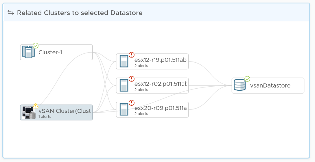
The following table shows the contention metrics for the 3 object types:
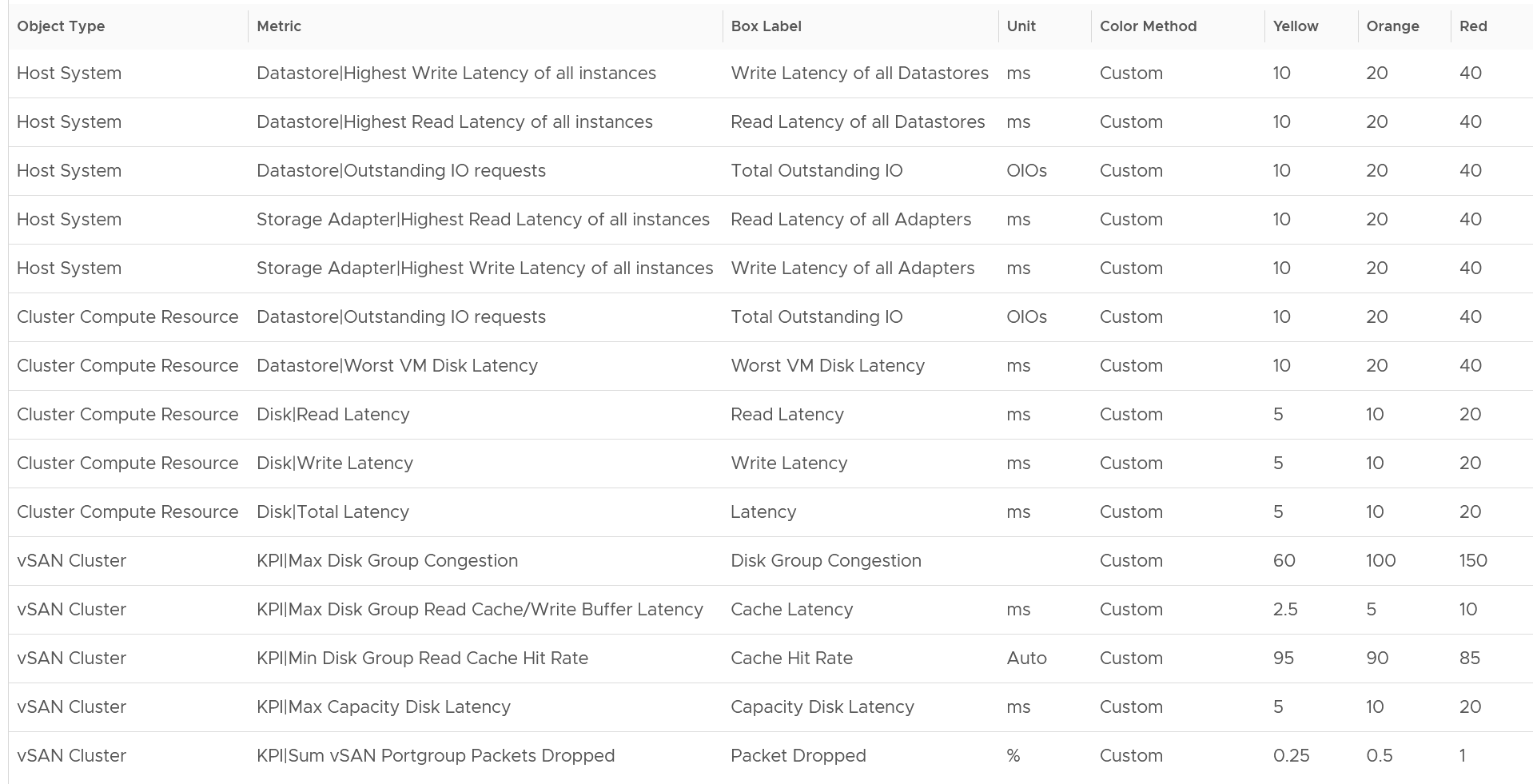
Just like all the contention metrics, they are color coded for ease of analyzis.
The following table shows the utilization metrics.
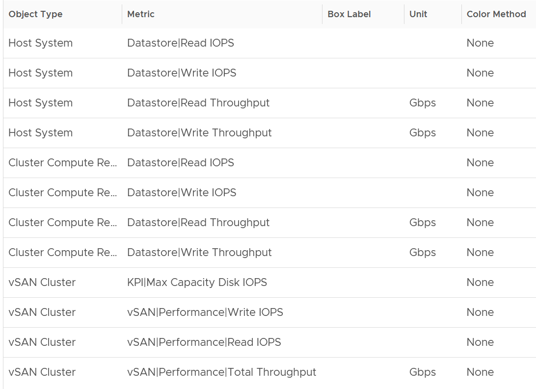
Just like all the utilization metrics, they are not color coded so not to give the wrong conclusion.
vSAN Performance
This dashboard is designed to complement the vSphere Cluster Capacity dashboard. It focuses on the storage and vSAN specific metrics, and does not repeat what’s already covered. It also does not list non vSAN cluster. That’s a long winded way to say you gotta use both dashboards to manage vSAN performance 😊
Cluster Analyzis
The table lists all the vSAN clusters, starting with cluster with the highest VM disk latency. By default, it’s showing data from the last 24 hours as this dashboard is designed to be part of your daily SOP.
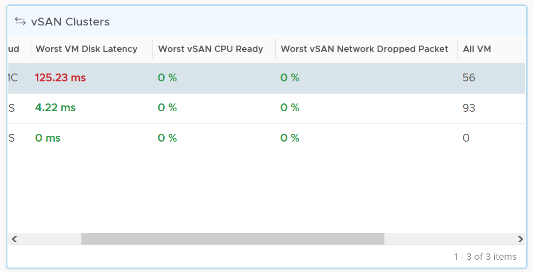
All Flash and Hybrid have different performance. Since there is only 1 benchmark, the all flash will perform better than hybrid, and that’s what you expect to see.
The first column shows if the distribution of disk latency experienced by all the VMs in the cluster. You should expect majority of the VMs to experience latency that matches your expectation. For example, in an all flash systems, the VMs should not be having >10 ms disk latency. If your vSAN environment is all flash, you may need to adjust the distribution bucket to a more stringent set.
The second column shows if any of the vSAN kernel module has to wait for CPU. Expect this number to be near 0% and below 1%, as vSAN should not be waiting for CPU time. vSAN gets higher priority than VM World as it lives in the kernel space.
The third column shows if any of the vSAN cluster is dropping packet in the vSAN network (not the VM network). vSAN relies on network to keep the cluster in-sync. This number should be near 0% and less than 1%.
Select a cluster to investigate further. Its VM latency distribution will be automatically shown.
What can you conclude from the following 2 bar charts?
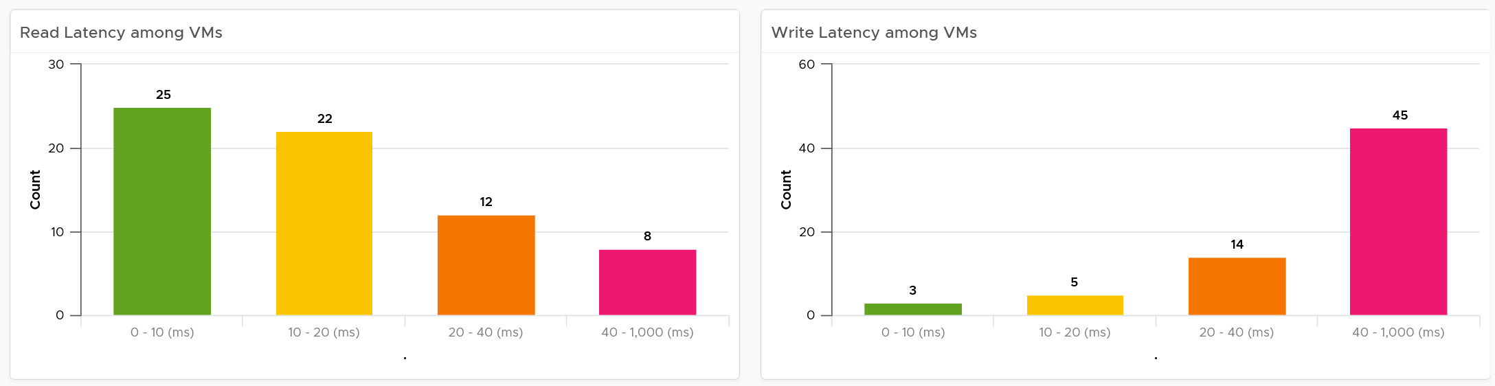
You can tell that most VMs in the selected cluster experience write latency, but not read latency. This helps you choose the right path of investigation.
The latency counter above is not at VM level. It’s at virtual disk level, meaning if a VM has 10 virtual disks, it takes the highest among any of them.
Contention
You can see various disk-related contention metrics of the cluster, as shown below.
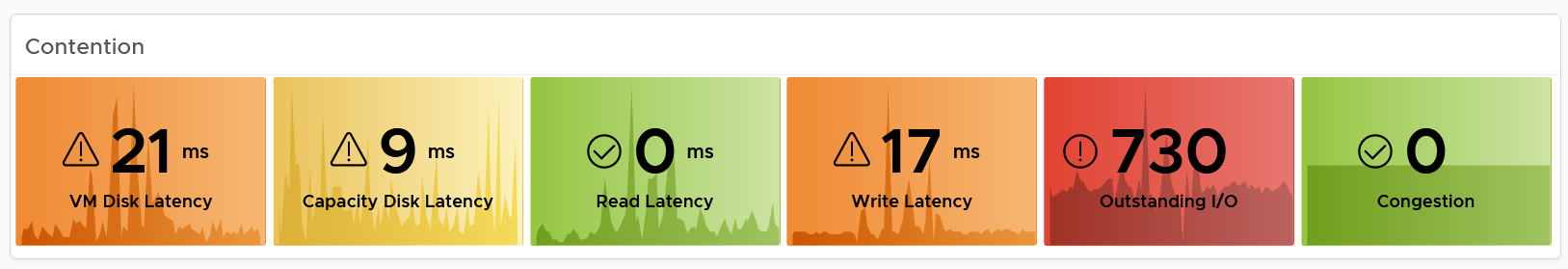
All these metrics are at vSAN cluster level, so there are some roll up involved. Why are the Read Latency and Write Latency not shown as the first metrics?
They are average. By the time the group average is bad, you could have half the population in worse situation. One way to overcome is to use a tighter threshold, as shown in the following table.
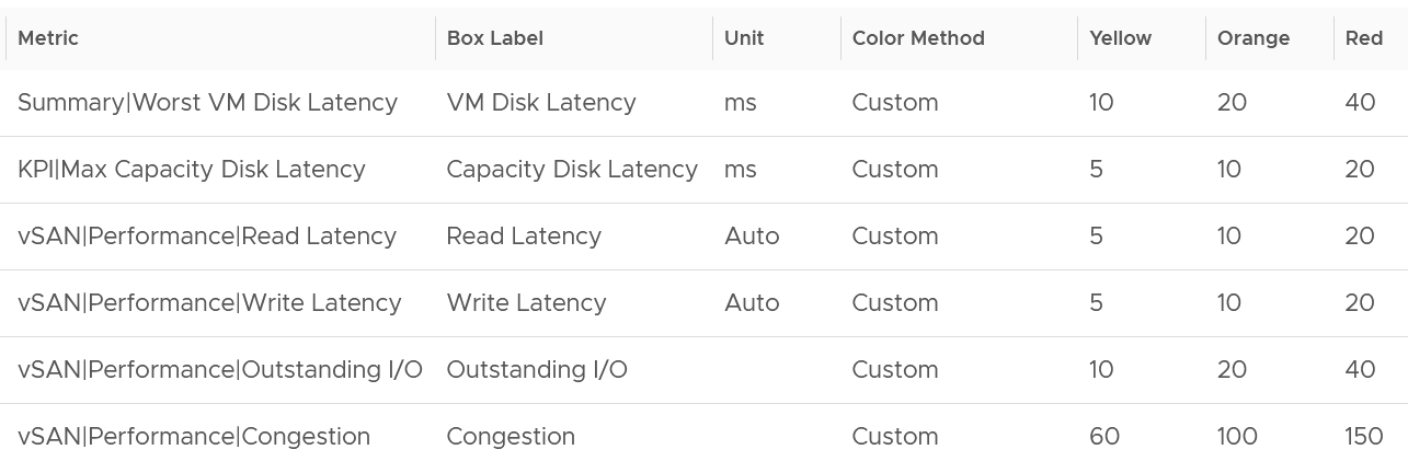
Read and Write are split as they tend to have different patterns.
Utilization
As expected, we complement the contention metrics with utilization metrics.
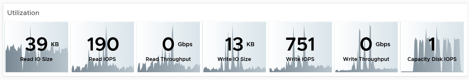
Large block size can result in high throughput in relatively low IOPS. If you are seeing large block size when You are not expecting it, investigate which applications are the using it.
Max IOPS among capacity disk is shown as a disk has a limit, especially magnetic disk. A typical magnetic disk delivers ~200 IOPS, and this can be easily saturated.
Disk Groups
You can drill down to the disk group level. All these metrics are the worst value among the disk groups.
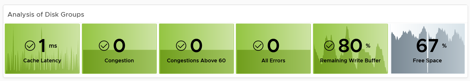
Same thing with the read cache. All the values shown below are the worst value among the disk groups’s read cache.
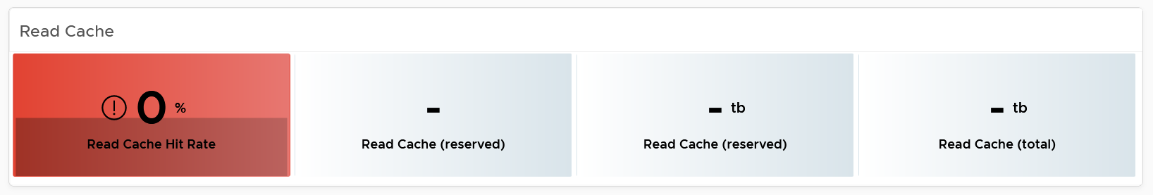
Other KPIs
The performance problem could be caused by non-storage.
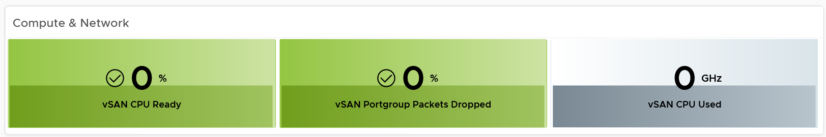
vSAN Resync is a type of utilization metric, but its presence can impact performance. vSAN has two scenarios that trigger rebalance (the reason for resync).
-
Proactive: A large variance among devices disk space utilization.
-
Reactive: When devices reach a critical capacity threshold (typically ~80%). This adjustment can be in the form of object components moving to other disks, disk groups, or hosts, or even splitting of existing large components into smaller components to achieve the desired result.
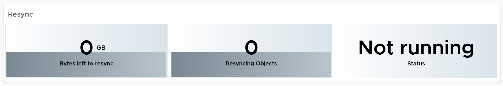
Disk Group Analyzis
You can drill down into individual disk groups.
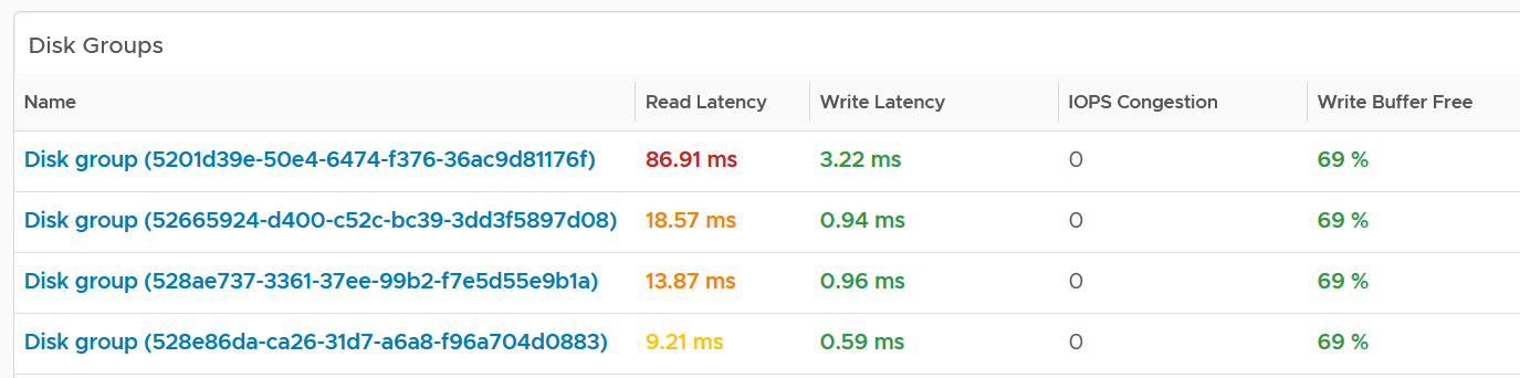
Make sure they are fairly balanced. If not, you have a hot spot.
Select a disk group you want to analyze. Both the contention and utilization metrics are automatically shown.
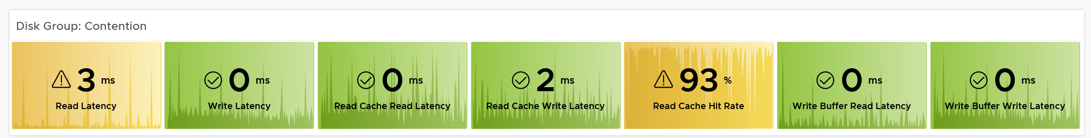
There are more metrics for the utilization. To avoid the name being truncated, I keep them short. To see the full name, simply mouse-hover over the counter name, as shown below.
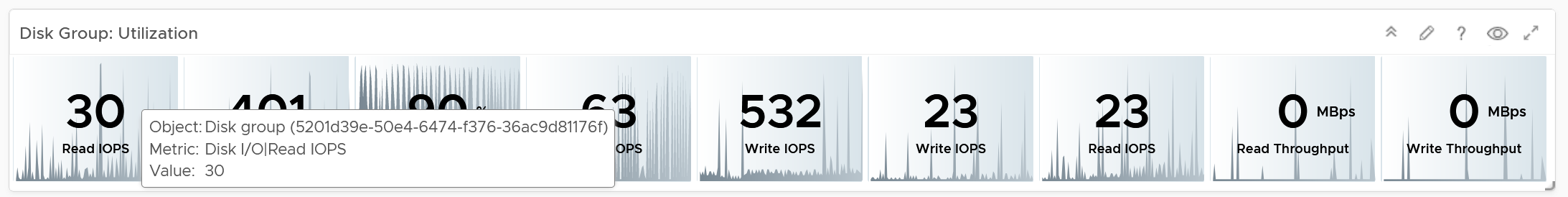
For the throughput metrics, why do I choose bytes instead of bit? I use MBps, not Gbps.
Revisit the vSphere Metrics book for the answer.
Cache Disks
You can drill down into individual disk groups. As this is SSD, you should expect their values to be below 5 ms.
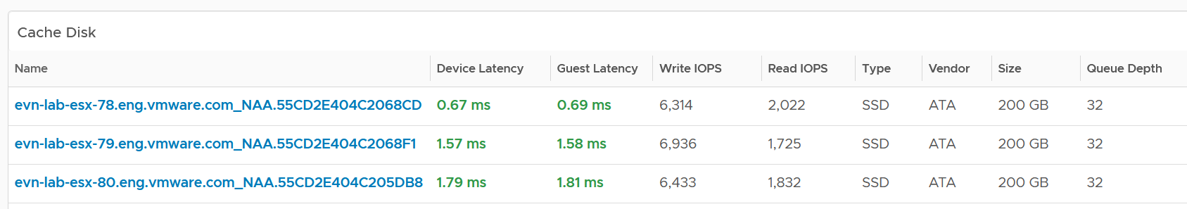
The configuration is also shown. Make sure they are consistent.
Select a cache disk you want to analyze. Both the contention and utilization metrics are automatically shown.
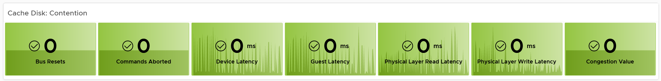
vSAN has various layers, which is covered in Part 2 Chapter 4 Storage Metric.
Congestion is a special derived metric in vSAN.
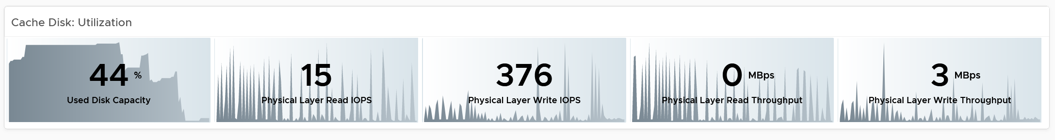
Why is the cache disk space utilization not considered contention?
Because 90% used does not mean it’s faster or slower than 80%. We can’t color code it.
Capacity Disks
You can drill down into individual disk groups. The latency value will vary between magnetic and SSD.
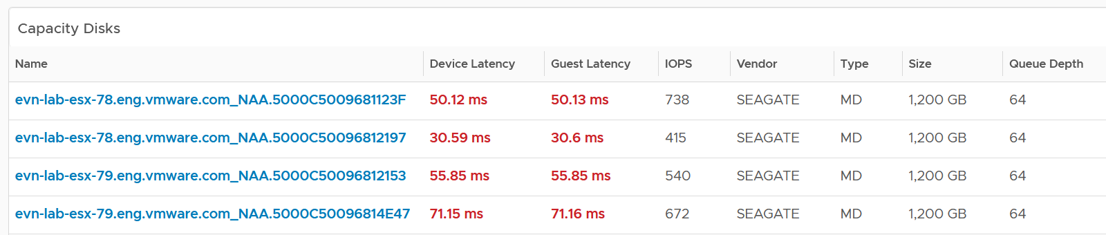
The configuration is also shown. Make sure they are consistent.
Select a capacity disk you want to analyze. Both the contention and utilization metrics are automatically shown.
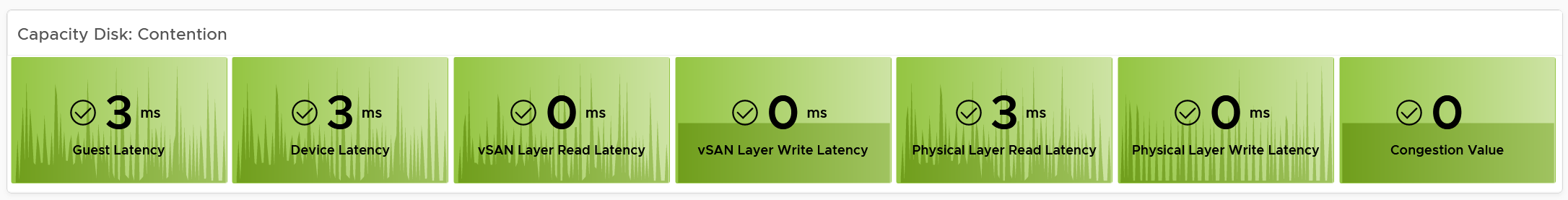
At this level, what you can do is basically observing if there is a hot spot.
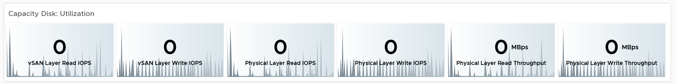
Network Performance
Use the Network Performance dashboard to view performance problems related to network such as high latency, unusual traffic, and many dropped packets. This dashboard is designed for both VMware administrator and Network administrator, with the goal of fostering closer collaboration between the 2 team.
The dashboard enables drill down from distributed switch to the ESXi host and port groups in the switch, and then to the VM.
To prove that Network is performing well:
-
No Errors.
-
Not a single ESXi host is experiencing packet drops in any of its NICs (vmnics). If there are, show the ESXi names.
-
Not a single VM is experiencing packet drops.
-
-
Latency
- Good round trip latency. No network trombone across physical data centers if NSX is used.
-
Utilisation
-
Not a single VM is hitting its limit, be it 1 GE or 10 GE or higher.
-
Not a single ESXi vmnic is hitting its limit.
-
Total bandwidth hitting the physical switches is below capacity.
-
-
Special network
- The broadcast network is minimal. For both ESXi and VM.
How to Use
Review the Distributed Switches table
-
It lists all the switches, sorted by the highest packet dropped. The table splits the incoming traffic and outgoing traffic for better analyzis.
-
As the focus is performance and not capacity, the throughput metrics are not shown.
Select a switch from the table
- The health chart will automatically show the dropped packet trend over time.
-
However, it will not narrow down the list of port groups automatically, as the list of port groups are always showing all the port groups in your environment.
-
If necessary, expand the 2 collapsed widgets. They are showing the network throughput and broadcast packets. Utilization is also shown so you can correlate if the dropped packets are due to higher utilization
Review the port groups and ESXi hosts in the selected switch
-
They are automatically listed when you selected a switch from the table above.
-
Just like the distributed switch, you can also see their relevant counters. The following shows the same chart, except for a single port group.
If your environment has unused network switches, you can filter them out from this list, as this dashboard focuses on performance.
Points to Note
Network latency within a data center should be below one millisecond. Use Aria Network Insight to study the latency or the retransmitting problems, caused by moving into the lateral traffic.
Add a physical network using the appropriate management pack, such as True Visibility Suite.
Most packets are unicast, between a pair of sender and receiver. If your environment has many VMs sending broadcast packets to everyone and multicast packets to many targets, add a Top-N widget to find out which VMs are sending these packets.
Enhance to include analysis of distributed port group. Does any of them hit their limit?
Capacity
Part 2 Chapter 5
The capacity dashboards aims to implement the capacity concept covered in Capacity Management chapter, and complement the existing product pages.
Overall Design
You may notice that the performance dashboards and the capacity dashboards share similar layout. The reason is there is commonality in both pillars of operations.
The suite of dashboards work together as one integrated set. They also have similar design.
| Goals | Determine overall capacity. Cover compute, storage and network. Network covers ESXi physical NIC, NSX Edge and NSX Manager. |
|---|---|
| Optimize capacity. Reclaim, rightsize, and redistribute. | |
| Questions | Examples of questions answered by the dashboards: |
| What’s the overall capacity? Do we have enough CPU, memory, disk and network to meet present demand + demand in the near future? | |
| Any hot spot? Do we need to rebalance? | |
| How severe is the wastage? How much can we easily claim within a month? How much will take much longer to reclaim? | |
| Assumptions | Users will use the built-in pages. These dashboards are designed to complement, not replace. |
| Target Users | Capacity Team. This is the main target. The team responsible for overall capacity life cycle, from planning to upgrade. Not interested in day to day, such as a host goes down or put into maintenance. Keen on long term and top down view, as they are planning future expansion and ageing hardware technological refresh. Their primary focus is the Provider |
Operations Team. The team running the day to day, live operations. Not interested in long term, both the past and the future. Their primary focus is the Consumer, especially oversized VM. | |
Storage Team. Specialist team. Collaboration become critical if the architecture is “thin on thin”. | |
| Usage frequency | Weekly |
| Quarterly | |
| Features | The dashboard is designed “top down”. It has 2 sections: summary and detail. The summary lets you see the big picture. The detail section is placed below the summary section. It lets you drill down into a specific object. For example, if it’s a VM capacity, you can get the detail capacity of a specific VM. |
| Quick context switch. You can cycle through objects quickly without changing screens or opening multiple browser windows. | |
| UI wise, the dashboard uses progressive disclosure to minimize information overload and ensure the webpage loads fast. On the other hand, so long your browser session remains, it remembers your last selection | |
Color coded. A high capacity remaining could indicate wastage. For ease of identifying, wastage is shown by a new color. Dark grey indicates wastage as capacity is not used. In fact, there can be performance problem is the low utilization was caused by bottleneck somewhere else | |
| Complement the out of the box pages by visualizing information differently and giving more choice of customization. For examples, the reclamation size is grouped into buckets so you can focus on the largest reclamation opportunities first, and trend charts are provided so you can quickly see the growth over time, without changing context (e.g. open a new screen). |
There are 2 types of capacity management
-
Consumer. You focus on a single VM, container or application. You want to right size them and reclaim unused portion.
-
Provider. You focus on the shared infrastructure as the problems impact many consumers.
For cluster, special types of cluster alter the capacity model. One example is stretched cluster. It needs its own capacity model and visualization. You will need to have an object or custom group for each site, and then displays them side by side.
Compute Capacity
The compute capacity dashboard covers vSphere clusters with their associated ESXi host and resource pools, as they impact the cluster capacity.
The dashboard is designed for cluster, and not standalone ESXi host. The layout has these sections:
-
Multi Clusters. It should have a table listing all clusters.
-
1 Cluster. What’s the overall utilization. It should show both CPU, memory, and network.
-
Subcluster. Break into the ESXi hosts. This is only needed if there are imbalances.
Overall Analyzis
The 3 bar charts show all the clusters, summarizing the overall situation. The first 2 are shown below.
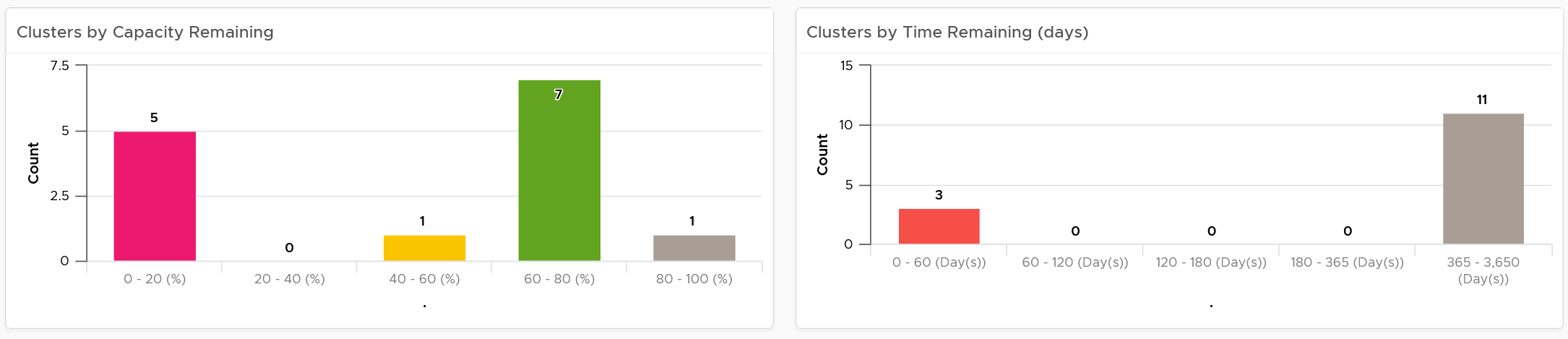
The first two bar charts work together. Just because you are running low on capacity does not mean you are running out of time. Cluster with a cyclical load that hits high utilization but never trends toward 100% will have low capacity remaining, but plenty of time remaining.
Generally speaking, the ideal situation is low Capacity Remaining and high Time Remaining. This means your resources are cost effective and working as expected. For clusters where you intentionally need to run at low utilization (e.g. stretched cluster), increase its buffer accordingly so the capacity metrics will reflect that.
The 3rd bar chart is VM Remaining. It gives more complete contexts, as different clusters can have different VM size.
The bar charts can’t show the parent data centers. It also can’t show all the clusters, individually. For a large environment, a heat map comes in handy.
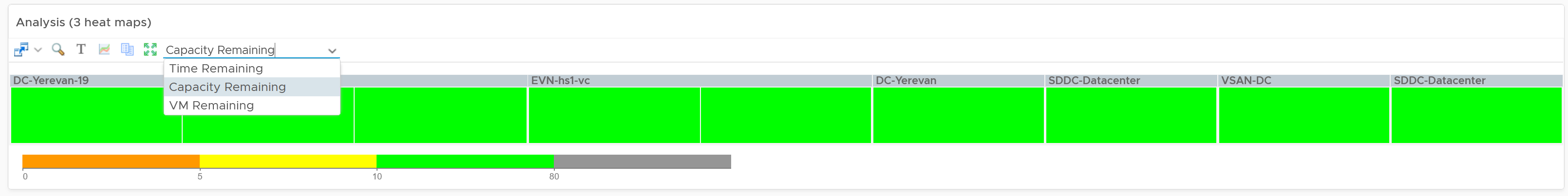
The three heat maps are Time Remaining, Capacity Remaining, and VM Remaining.
The color indicates usage. Low utilization is marked as grey, not green, as it represents waste.
Why is the box size made identical?
For ease of use and better focus on the action to be taken. Otherwise the small clusters will be dwarfed by the large ones.
If your cluster sizes are not standardized, create another heat map, and use the number of ESXi hosts to show the size difference.
A table provides the next level of details.
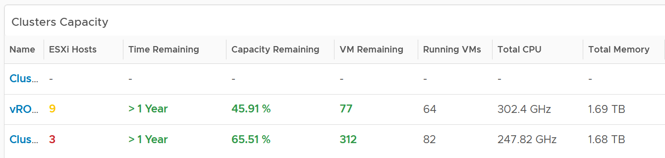
The number of ESXi hosts are color coded as smaller clusters have relatively higher overhead.
Cluster Analyzis
Select a cluster from the table. Its detail capacity will be automatically shown.
Performance
The first thing it shows is the cluster performance. Make sure this is within your expectation.
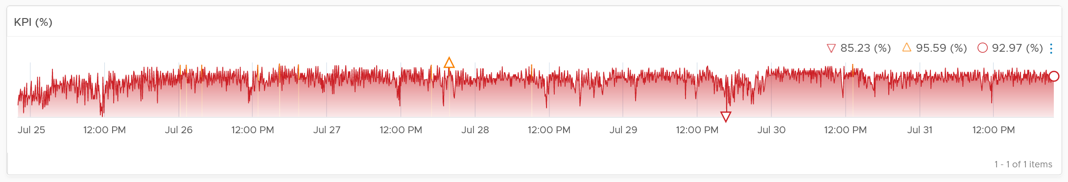
The counter is covered in Performance chapter and Performance dashboard.
Utilization
The next chart is utilization. It’s showing in %, as it’s relative to your usable capacity.
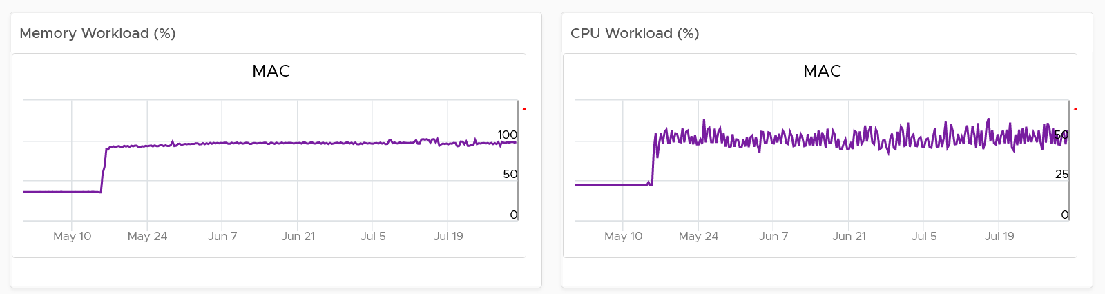
Utilization displayed for three months and not one week. The daily average is displayed and not the hourly average, so you can focus on the overall trend.
For memory, the focus is on consumed memory and not active memory.
If it’s useful to you, add peak to complement average utilization. The peak is defined as the highest among any ESXi hosts. If the peak is higher than the cluster-wide average, then the cluster is imbalance. Find out the cause of imbalance and optimize it.
If you have the screen real estate, add the absolute utilization.
Allocation
Next is Allocation, as not all demand is real. You need to use both models.
Workload can be low, but is overcommit ratio high? Newly provisioned VMs tend to be idle for weeks, and suddenly grow.
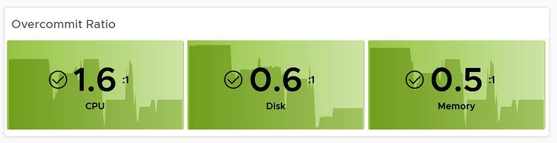
You can see the trend of the 3 components together on a chart if that is relevant to you. In general, your CPU overcommit should be the highest, followed by disk (due to thin provision). Memory overcommit tends to be near 1 due to its nature as cache.
Use the line chart to see the trend. As usual, the data is averaged hourly so you can focus on the big picture.
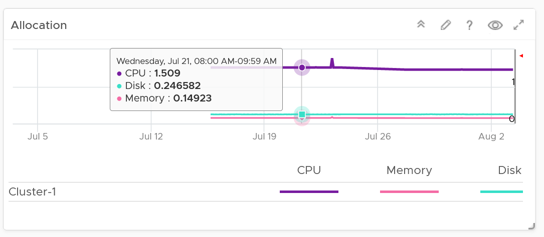
Next is the VM Count. A trend line of number of VM over time is important to spot if there are many newly provisioned VM. If you see VM growing but demand remains low, that's a sign of potential demand coming up in the future.
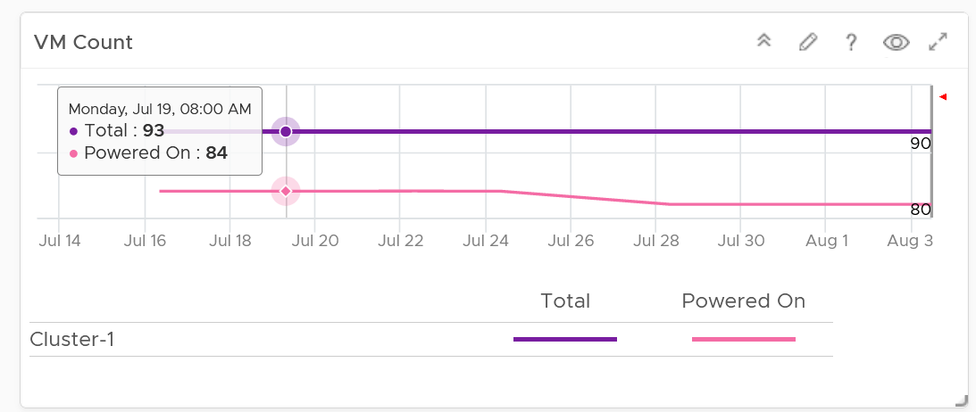
BTW, the overall VM:ESXi ratio is a common number cited to senior management. It’s often measured as cost efficiency proof.
Reservation
Reservation can impact the efficiency of your cluster. Why is the cluster low on capacity? Is it because of real workload, or just reservation?
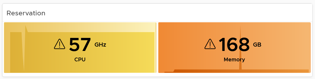
If your cluster size varies, complement the reservation number by showing relative value. Once you have a standardized number, you can visualize them on a heat map! This enhancement requires super metric, good practice! 😊
Reclamation
As covered in the Capacity Management chapter, there are 6 types of reclamation. Some of them are shown below.
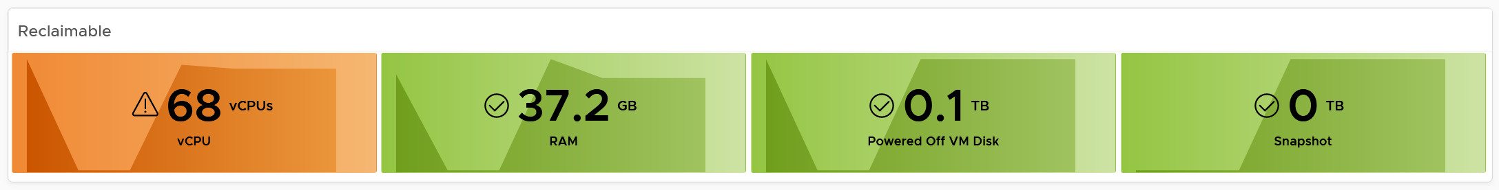
If it’s relevant to your environment, add the number of undersized CPU and undersized memory.
ESXi Analyzis
Just because the cluster capacity is good, does not mean there is no issue at ESXi level. Imbalance is common issue, especially in large cluster and stretched cluster.
The following table shows all the member ESXi. You can see the imbalance clearly, thanks to the color code.
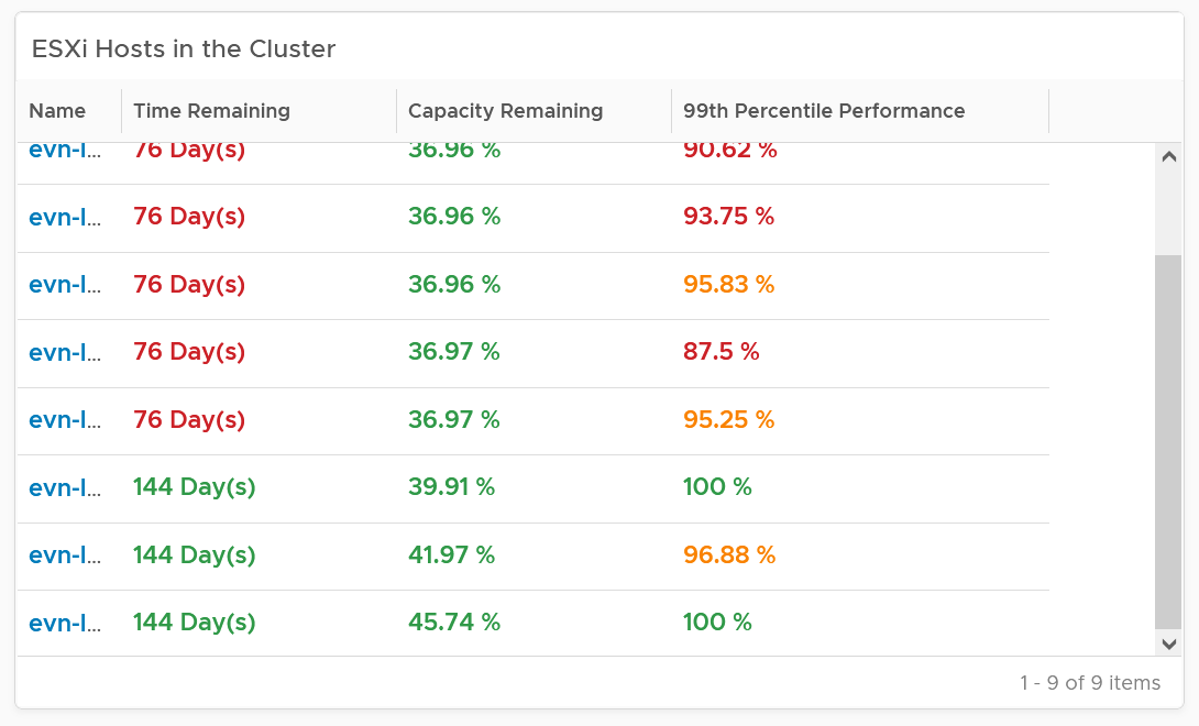
The 99th percentile Performance column takes the 99th percentile value of the ESXi Performance (%) metric. The reason we’re not taking the worst performance (which is equivalent to 100thpercentile) is to rule out outlier. In addition, the performance threshold has been set to be stringent.
Select one of the ESXi. All its detail will be automatically shown.
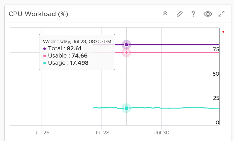
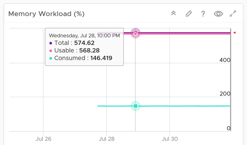
Both CPU and memory trend line charts show if it’s steady demand, cyclical demand, rising demand, or declining demand. The trend is as important as the present value. To see trend, you need to see over longer time. Utilization is displayed for three months and not one week. The daily average is displayed and not the hourly average and the focus is on memory consumed and not memory active. Note that memory consumed includes the total memory consumed, so it includes memory consumed by VMkernel.
Both total and usable utilization in terms of memory and CPU are displayed. This gives you the absolute amount of capacity.
A technology refresh is often used to address capacity shortage. The relevant configuration shows the hardware model and specification to help you determine the age of the hardware.
VM Analyzis
What’s causing the low capacity remaining? Which VMs are impacting what infrastructure resource (CPU, memory, disk space)?
Use the following table to analyze. It lists either the VMs in the cluster or host.
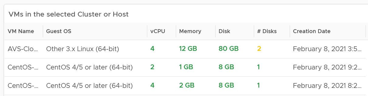
You can select one of the VM, and additional relevant information will be shown.
You can enhance this by using 2 heat maps, one for CPU and one for memory. Shows all the VM, sized by configured and color by capacity remaining. If you see many large VMs running low on capacity, that means you should stop provisioning until you upsize existing VMs first.
Datastore Capacity
This dashboard complements out of the box capacity pages and dashboard. It focuses on storage, provides overall picture, and highlights the datastores that need attention.
Overall Analyzis
“What do I have in terms of capacity?”
The summary banner answer basic questions like this.

If required, customize it. I keep it simple as you don’t actually have 1 contiguous storage pool. Just because you have 100 TB available in South Pole DC does not mean your servers in North Pole DC can use it, unless you tunnel dark fibre over earth core.
Next is the distribution chart. Do they look familiar?
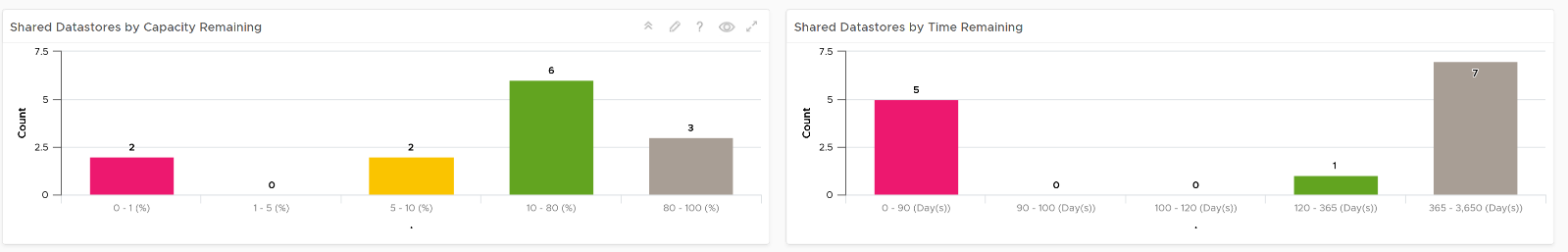
It’s intentionally designed to be consistent with the Cluster Capacity dashboard.
As you can expect by now, next in the dashboard is the heat map.
There are three heat maps, the primary being Remaining Capacity heat map. The 2 other heat maps cover Used Capacity. One of them is designed for environment that use Datastore Clusters.
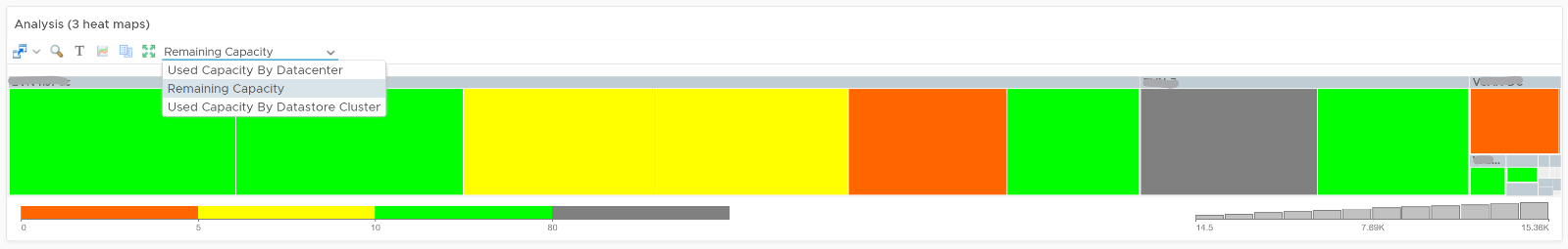
Each box represents a datastore. If you have many datastores, the heat map will group them. You can drill down to see its members. The larger the datastore, the larger its box is. If you have many small datastores, consolidation can make operations easier.
Following the design used in Capacity dashboard, next is the table listing all the Shared Datastores.
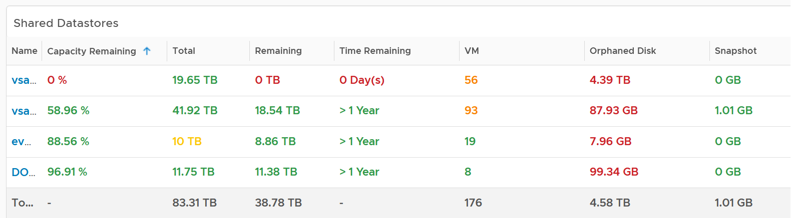
The table provides a summary, showing all datastores a glance. They are grouped by Data center. If you use Datastore Cluster as your standard and it suits you better, replace the grouping with it.
By default, the table is sorted by the least capacity remaining.
There are 3 reclamation opportunities: powered off VM, snapshot, and orphaned VMDK.
Why is Idle VM not included?
Because you should power off first, and let it go through powered off period before deletion.
Datastore Analyzis
Select a datastore from the table. Its detail capacity will be automatically shown.
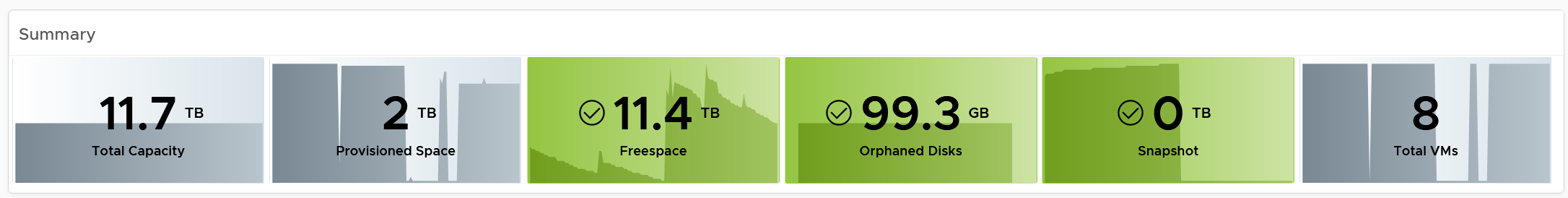
The snapshot should be 0 GB. If it is not 0, then it should be temporary. A snapshot lasting beyond a few days should be investigated.
Orphaned Disks are VMDK files that are not associated to any VM. Expect it to be 0.
For disk space, the total capacity, allocated and actual used are shown. What does it mean when the provisioned disk space metric grow but the actual used does not?
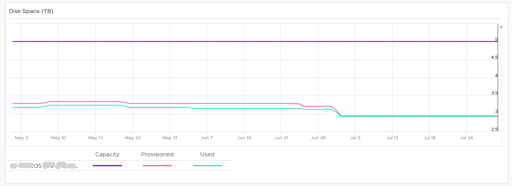
That means the VMs are yet to use it. Watch out, you can run out of space sooner than expected.
The value is daily averaged to show the big picture. Having 5-minute spike can visually make the chart harder to read.
If you use allocation model, add a second line chart showing the allocation over time. Add a threshold so you know how close you are.
VM Analyzis
If you need to analyze at VM level, review the table listing all the VMs in the datastore.
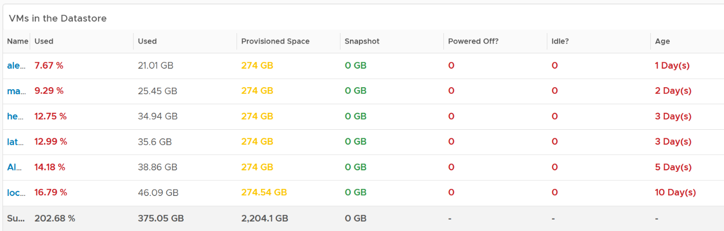
If you have hundreds of VMs, create a heat map showing all the VMs. Color it by the used space so you know if the VM is reaching its full size. Size it by the allocated size so you can see who the big VMs are. If the big VMs have plenty of space to grow, watch out.
Click on the VM you want to investigate further. You get to see its usage over time.
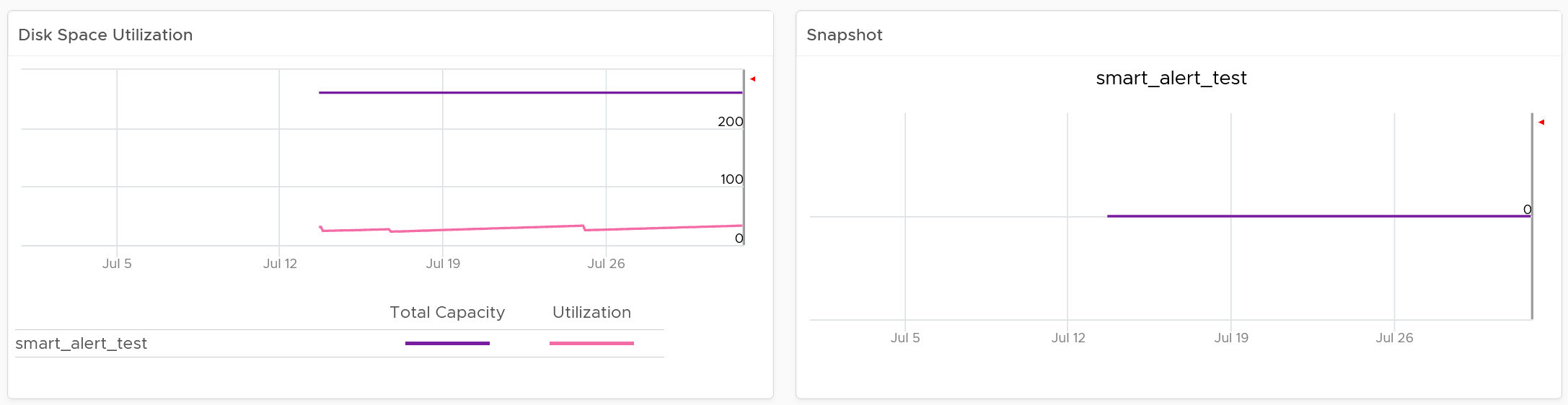
Local Datastores
They are shown separately as a table on its own, at the end of this dashboard. Avoid running VMs on local datastores, unless its storage requirements can be met with a local disk and it does not need vmotion.
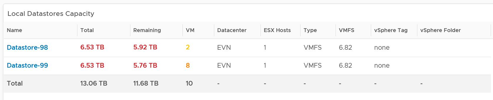
Points to Note
If you are using “thin on thin”, meaning the underlying LUN is also thin provisioned, add visibility into the physical array.
The dashboard does not have datastore clusters. If your environment use it, modify this dashboard or create a new one. In a large environment with many datastores and datastore clusters, add a View List to list the datastore clusters so you get summary information. From this list, drives the datastore view list. Alternatively, create a heat map, listing the datastore clusters.
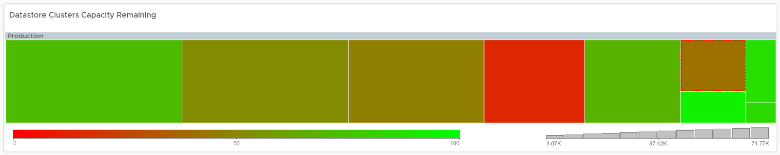
vSAN Capacity
The vSAN Capacity dashboard complements the vSphere Cluster Capacity dashboard by showing vSAN related capacity. It focuses on the storage and vSAN specific metrics, and does not repeat what’s already covered. That’s a long winded way to say you gotta use both dashboards to manage vSAN capacity 😊
Because the metrics are vSAN specific, this dashboard does not list non vSAN cluster.
Overall Analyzis
The dashboard starts with the familiar bar-chart combo that Cluster Capacity dashboard has. The difference is this focuses on the vSAN disk space, not compute and network.
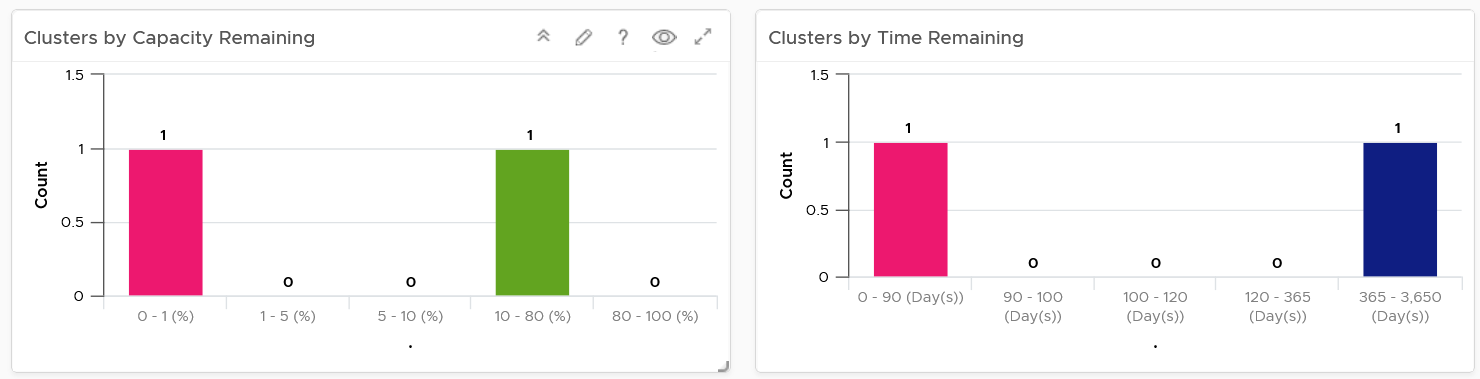
Similar to Cluster Capacity dashboard, next is a heat map. There are 2 heat maps provided.
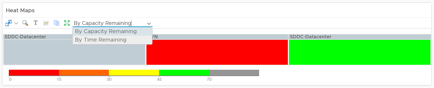
Why is the box size made identical?
Head to the Cluster Capacity dashboard for the explanation.
As you can expect, a table provides the next level of details. The difference is you get vSAN specific metrics.
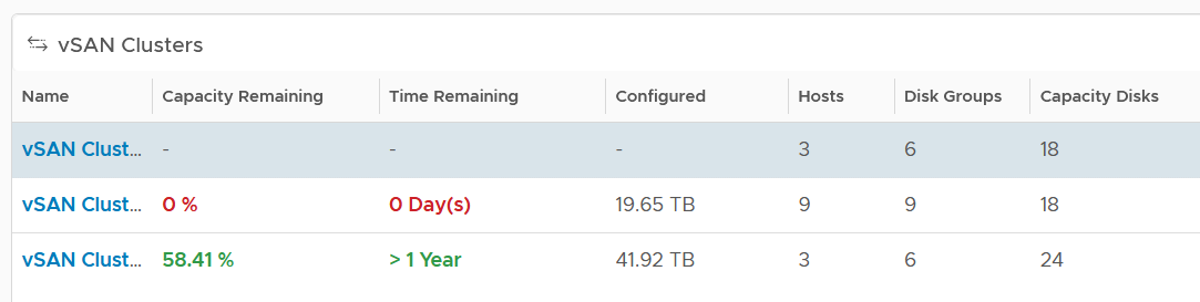
If it’s useful, add metrics such as total disk capacity and used.
Cluster Analyzis
Select a vSAN cluster from the table. Its detail capacity will be automatically shown.
Utilization
It’s showing the utilization for all 3 elements, as you need to consider all three. Network is not shown as typically it’s not an issue and it’s complex to model.
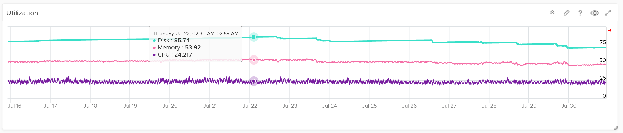
Just like physical array, there can be hot spot and imbalance. The following heat map shows individual disk groups.
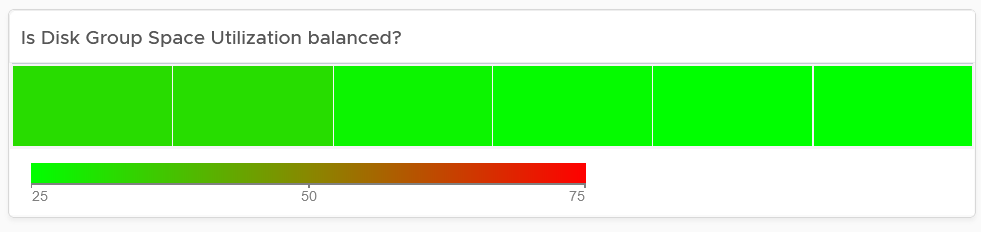
Notice they are all green but not identical. It’s normal for them to have minor variance.
Reclaimable
It’s a key component of proactive capacity management. The dashboard shows you both the VMs and non VMs portion.
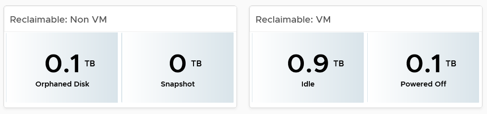
Dedupe and Compressed
The scoreboard shows details on this area.
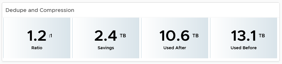
If you are concerned with the CPU usage from the dedupe and compress feature, add a line chart of vSAN CPU usage.
Disk Group Analyzis
If there is imbalance, you can drill down into each disk group. Otherwise, skip this section.
The following table shows all the disk groups in the cluster. Their usage may not be similar but they should not deviate drastically.
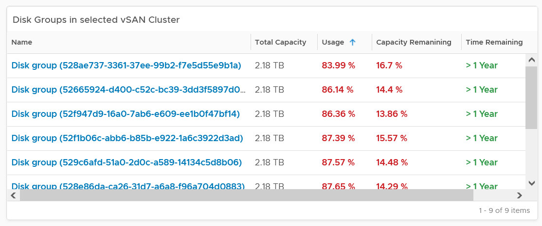
To see any of the disk group usage trend, click on it.
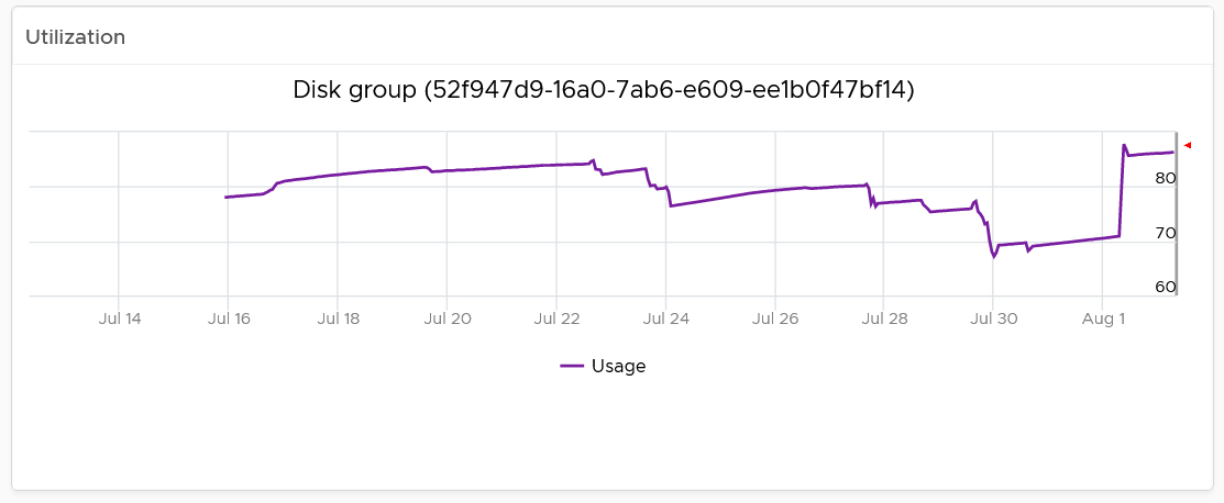
In addition a heat map is provided to see the usage among the capacity disks in the selected disk group. Expect them to be uniformed at this level as it’s RAID striping.
VM Analyzis
You can get down to individual VMs in the selected cluster, and check their usage and snapshot.
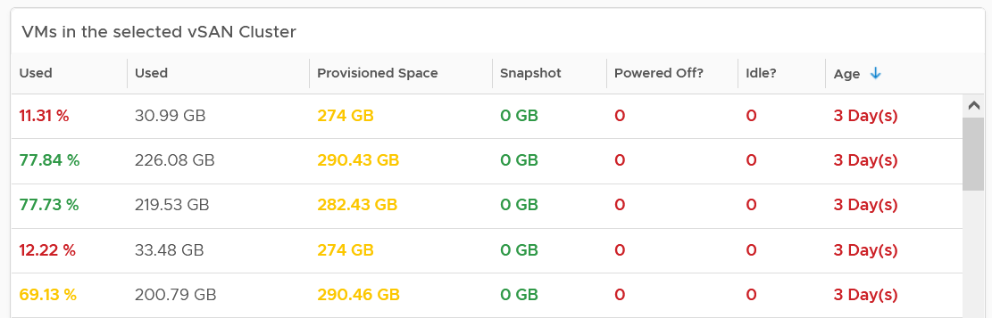
To see the usage trend, select the VM.
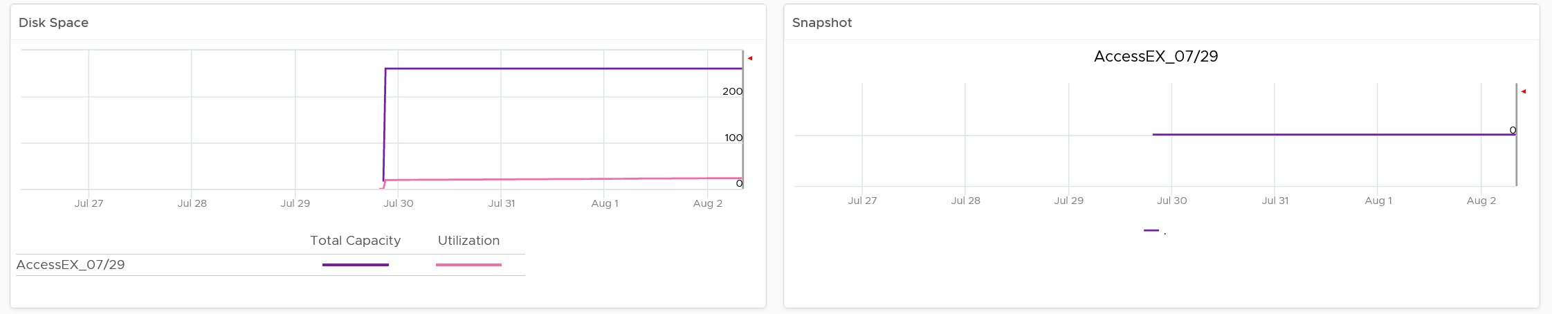
In addition, the relevant configuration of the selected VM is also shown.
VM Capacity
The dashboard helps you analyze the capacity of all the VMs, with ability to drill down into each VM.
Overall Analyzis
The dashboard begins with a table listing all your data centers.
vSphere World is also included so you can see all the VMs from all data centers. Unlike infrastructure objects, there are potentially tens of thousands of VM. So take note that the charts will take longer due to refresh if you select vSphere World.
How do the following 2 charts provide insight into the capacity of all the VMs in your environment? What’s the ideal distribution?
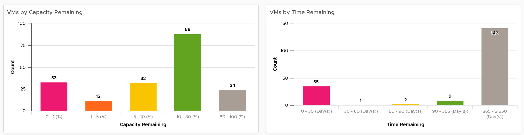
The first chart groups them by capacity remaining, while the second one by time remaining. Ideally, you want all of them to be low on capacity remaining (meaning the given capacity is actually fully used) but high on time remaining (meaning they do not need additional).
The bucket size has been designed to map the default settings in VM capacity policy. If you change it, also change the value in policy so it’s consistent.
The heat map provides additional view by grouping them by cluster. It helps you spot which cluster is at risk (majority of its VMs need more capacity) and which cluster can provide extra resource (majority of its VMs are not using their capacity).
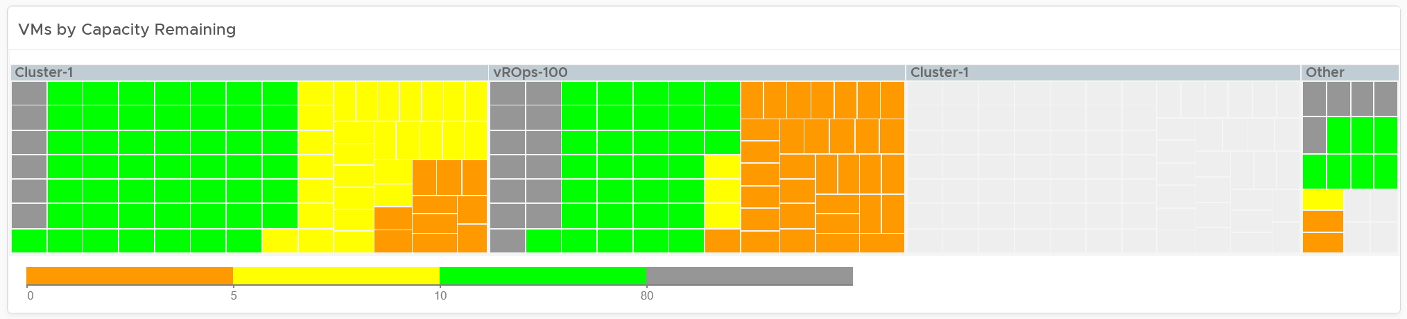
Review the heat map. It provides the next level of details by grouping the VMs by clusters, so you can see which clusters need attention.
Note the VM size has been standardized for better visualization. If it suits your capacity team better, add the size. Note that by doing that you have to pick CPU or Memory, so you may have to create 2 heat maps.
Review the table listing all VMs in the selected data center.
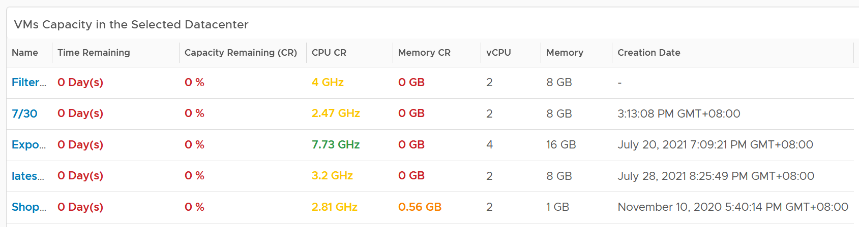
The list is sorted by the VM with the least capacity remaining. If sorting by Time Remaining suits your operations better, modify the dashboard.
The table is also color coded. Take note that the threshold is unable to show the grey (wastage) color.
The creation date is added for the same reason in idle VM case.
VM Analyzis
Select a VM from the table. Its detail capacity will be automatically shown.
You get both the CPU and memory trend over time. 3 months data is shown, and they are averaged to hourly so you can see the overall trend instead of spiky chart.
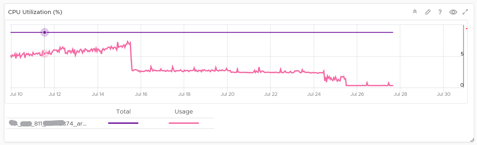
For memory, it uses Guest OS, for the same reason explained in VM Rightsizing dashboard.
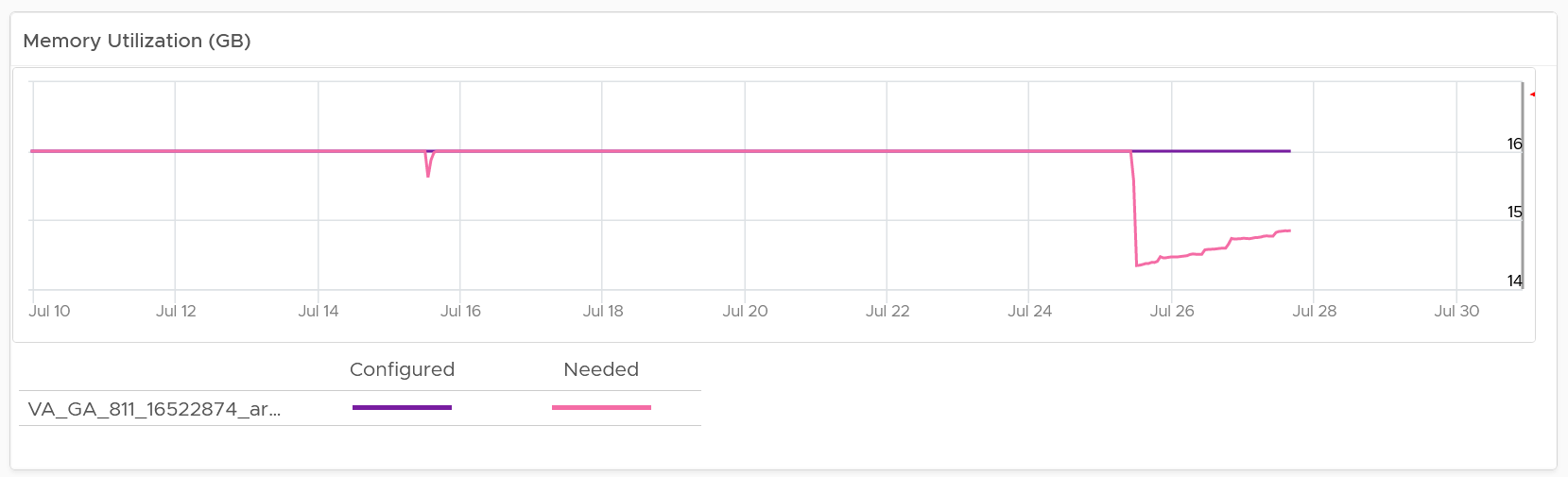
For the disk, it uses the Guest OS partition. Do not use VM virtual disk as there may not be 1:1 mapping to the actual partition.
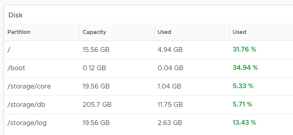
Right-sizing recommendation is also shown for both CPU and Memory. Unlike physical server, it's important to right-size VM for the benefits listed here.
For CPU, the CPU Usage counter is used instead of Demand. Use the knowledge you learned here to figure out why.
For disk, it’s showing at the Guest OS partition level. There is no overall capacity at VM level because different partitions have different capacity.
Relevant Configuration
The relevant configuration is automatically shown to give context to the VM.
Information such as VM Owner and business units can be useful in the analyzis.
Reclamation
The Reclamation dashboard helps you managing various types of reclamation that can be done on VMs and datastore. It is designed for both the Capacity team and the Operations team.
Overall Analyzis
The scoreboard provides a summary of the total reclamation. Guest what infrastructure resource is missing from the scoreboard?
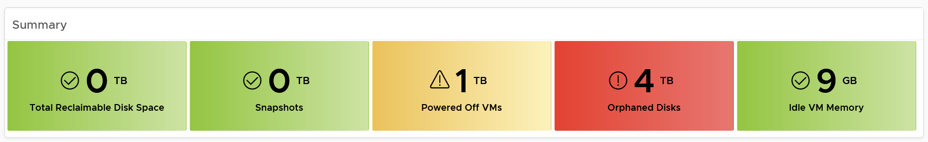
CPU is missing. Because you’re reclaiming blank air.
You can drill down at either Data Center level, cluster level or datastore level. Datastore level is required as orphaned disk does not have VM association, hence it’s not related to any cluster.
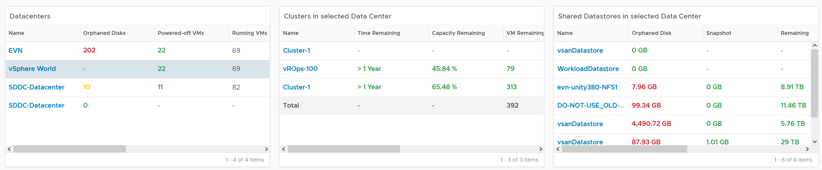
The table above can drive all the charts underneath them, shown below, giving you a flexible way to slice the information. Take note that the datastore table only drives the snapshot table. The reason is traversal spec. The view widget can only use 1 traversal spec.
The summary information will be automatically shown. To show from all clusters, select vSphere World. This object covers all clusters. Take note that the charts will take longer due to refresh due to higher amount of data.
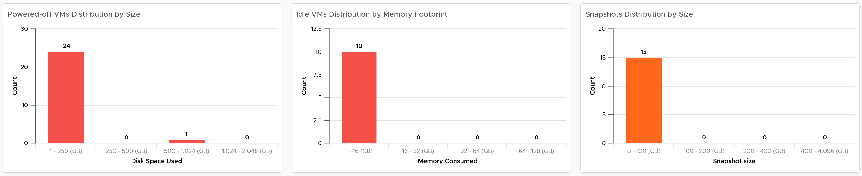
If necessary, adjust the bucket size in the charts to suit your operational requirements.
The reclamation potentials are presented as 3 bar charts, each corresponds to an area you can reclaim:
-
Powered off VMs that are no longer needed contribute to wasted disk usage. Consider deleting them to free up space or moving them to archival storage.
-
Idle VMs are running, but not being used actively. These VMs consume memory that may be used by active VMs. Consider removing these VMs to reduce memory contention. Guess why is VM-level metric used instead of Guest OS metric?\
Memory reclamation is based on the memory footprint at the parent ESXi. The value inside the Guest is not what is being reclaimed, and so it is irrelevant
-
Snapshots are meant to be temporary and can cause performance issues and waste disk space if not deleted after a few days.
Focus on snapshot first, as it does not involve changing VM.
Next is powered off VM. The longer it has been powered off, the lower the risk of deletion. Ideally, you want a confirmation from the owner, and have a back up outside vSphere. This is why it’s important to have meta tag such as VM Owner email address. Note if the VM has snapshot, it’s included in the calculation, so there can be double counting since the VM also appears in the snapshot table.
Idle VM
As the VM is still running, it’s relatively harder to reclaim as shutting it down may require approval from the VM Owner.
BTW, if there is nothing to reclaim, you get a blank table. The following example shows no VM meets the criteria for either powered off or idle. If you suspect the table is wrong, review your criteria.
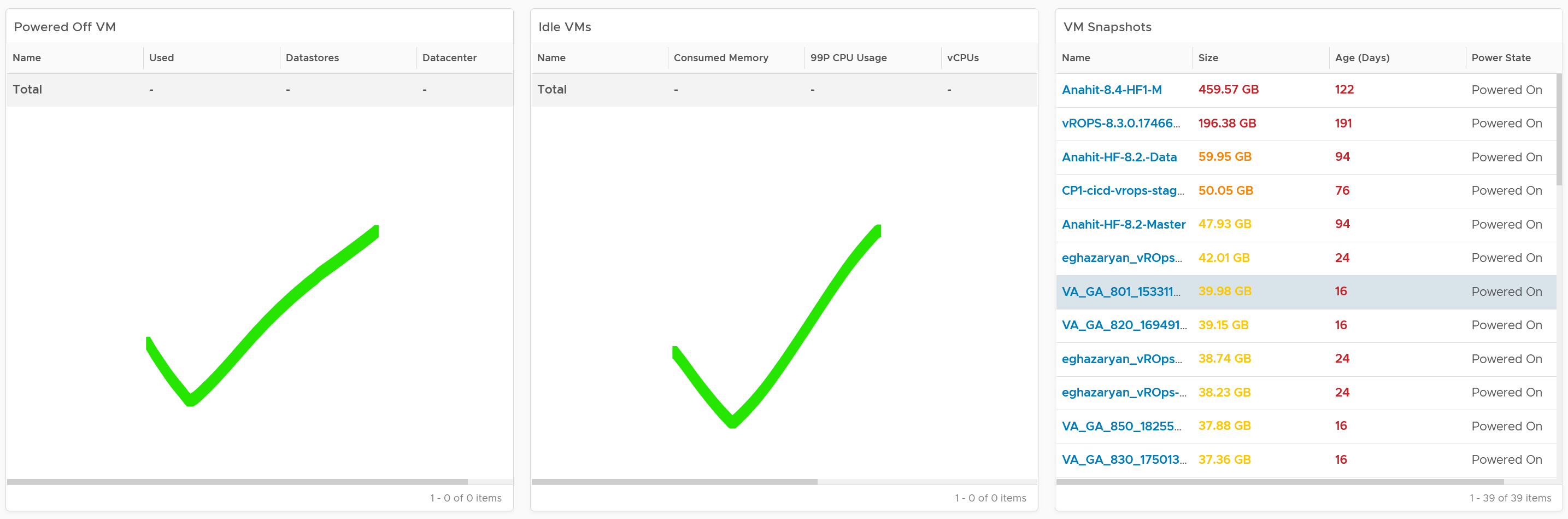
We discussed in Capacity chapter that both metrics need to be true to ensure the list does not contain VMs that has recently become active.
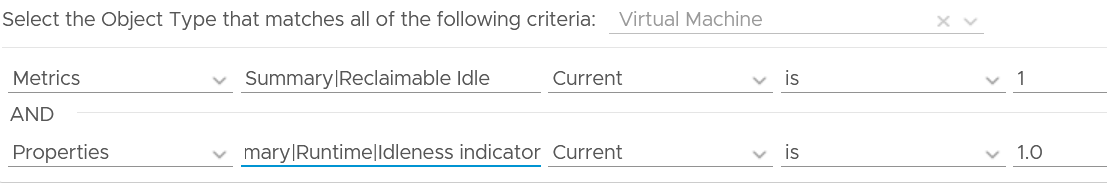
Let’s drill down into idle VM as that’s the most complex part. Guess why we show the 99th percentile CPU usage?
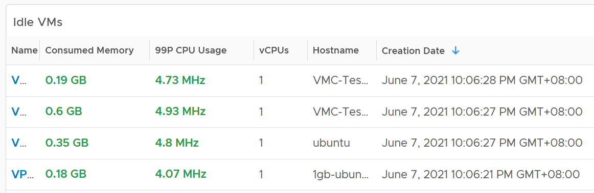
The 99P CPU Usage shows the CPU usage at 99th percentile during the time period. It’s a handy way to check if it’s indeed idle. Essentially, if it the CPU utilization is low for 99% of the time, the VM could indeed be idle.
Why is the Creation Date especially important for Idle VM case?
The answer is newly provisioned VM may remain unused for months. The following show how to set it.
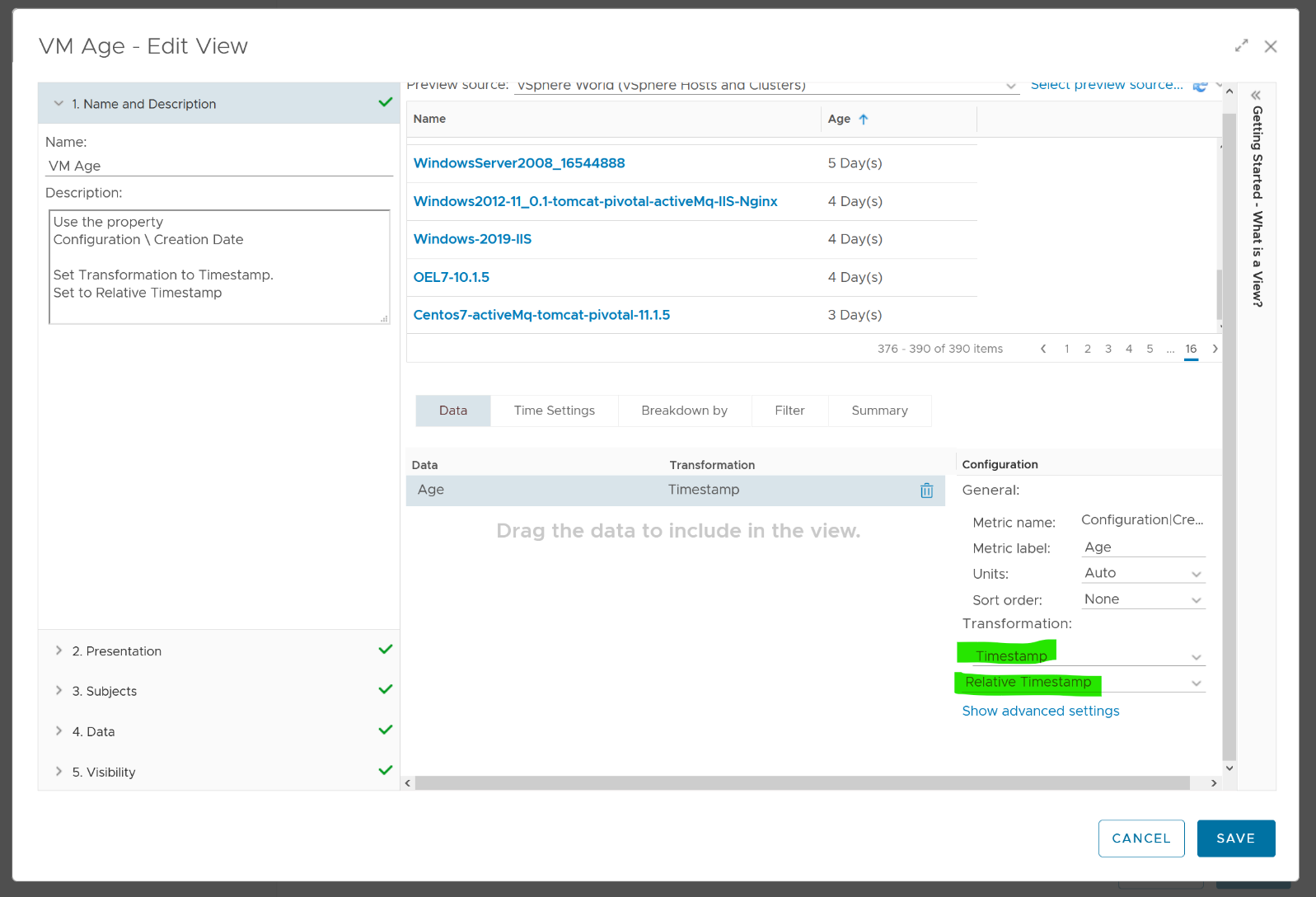
Choose VM property Configuration \ Creation Date, then choose the Transformation: Timestamp and then Relative Timestamp.
VM Analyzis
To analyze VMs for reclamation opportunities, select a VM from one of the three tables (Powered Off VM, Idle VMs or VM Snapshots). Its detail value over time will be automatically shown. Notice the VM name is the same in all the 3 charts.
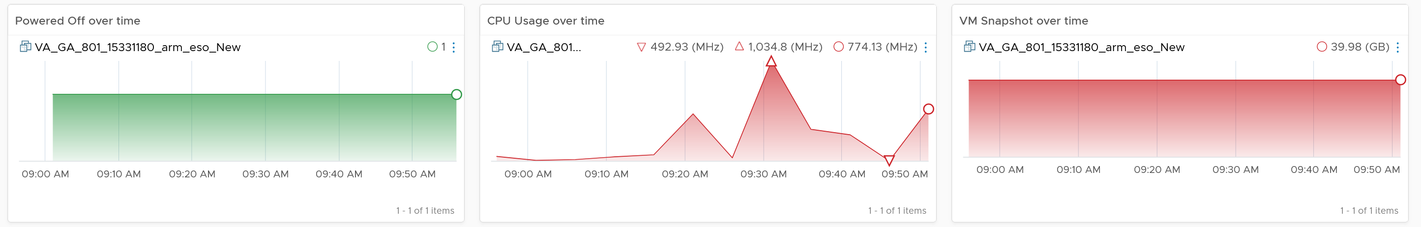
Powered off over time shows VM status (on/off) over time. 1 = true, meaning the machine is powered on.
CPU Usage over time provides insights into the aggregate CPU usage, including peak usage periods. This way you can validate that an idle VM has not had any brief usage. What you want to see is green over a long period of time, as shown in the following example.
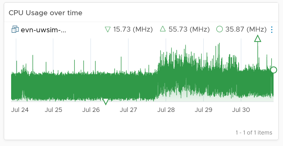
If the snapshot is expanding rapidly, ensure that the VM disk is small (relative to size of the underlying datastore) as it can fill up the datastore.
Lastly, the relevant configuration of the VM is also shown to give context.
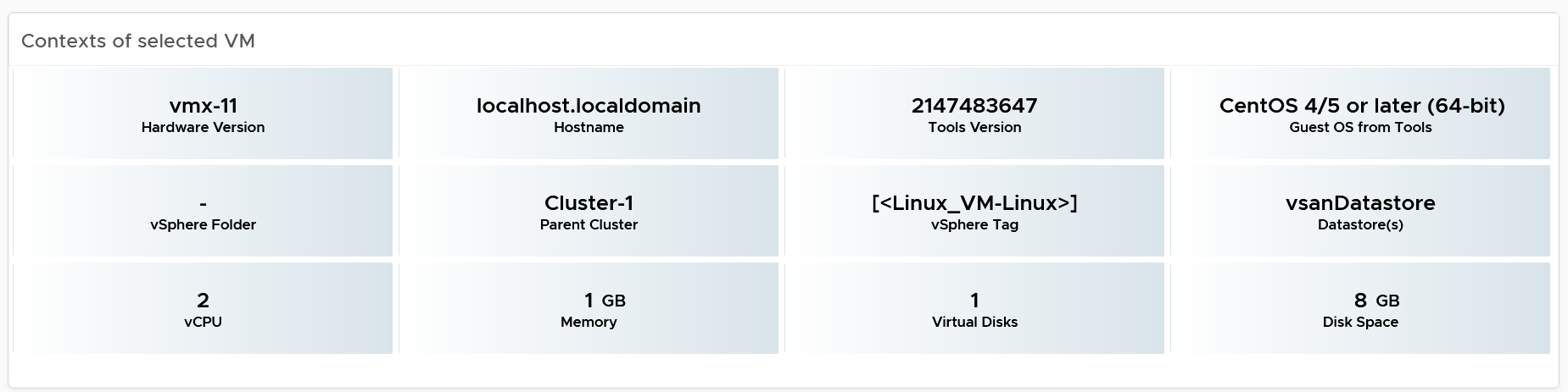
Points to Note
If your environment is large, change the dashboard filter to a functional filter. Group by the class of services such as gold, silver, and bronze and default the selection to the least critical environment. In this way, you can be more active in reclamation.
If reclaiming is a long drawn manual process in your organization, add a filter by department or VM owners. To organize your reclaim efforts it is helpful to create custom groups to make it easier to filter by department or VM owner. This can make it easier to seek approvals and communicate with anyone who may be impacted.
You should enhance this to include Trim and Unmap. Happy to collaborate and make this into the product. We need to check on only the thin provisioned disk. We should also check at the array level, using the TVS adapter.
Rightsizing
The VM Rightsizing dashboard helps you in adjusting the VM size for best long term performance at lowest cost. It covers both undersized and oversized scenarios. It’s not designed for short term, 5-minute performance burst. The reason is high utilization is actually good for performance. As a result, this dashboard is categorized under Capacity and not performance.
It is designed primarily for Capacity team, not day to day operations team.
Overall Analyzis
The scoreboard provides a summary of the total undersized and oversized CPU and memory.
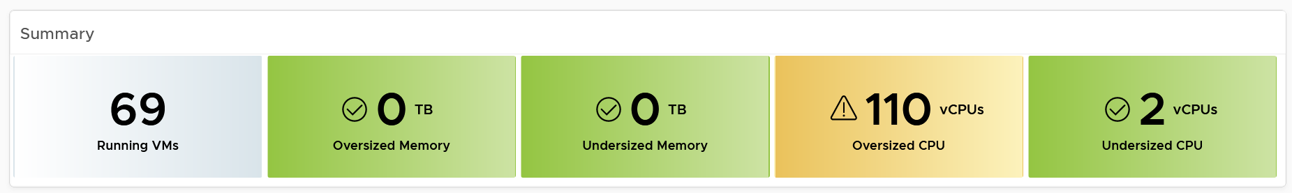
If the number is acceptable to you, that’s it. No need to further analyze.
The reason why I’m not adding the number of VMs that are undersize or oversized is screen real estate. It needs 4 metrics to account for all the combination.
You can drill down at either Data Center level or cluster level. In most cases, rightsizing analyzis should be done at Cluster level as VMs typically do not move inter-cluster. At cluster level, the table looks like the following. Guess why are the cluster capacity metrics shown?
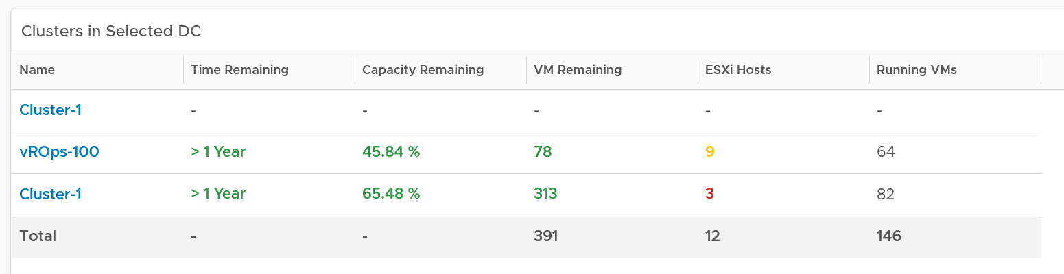
The metrics are shown to give better context. Focus on reclaiming on cluster that is low on capacity remaining. For upsizing VMs, ensure the parent clusters have good capacity remaining.
The distribution charts showing the rightsizing is automatically shown. Let’s dive into the undersized first as it’s more common. Why are the vCPU to add focused on the first 8 vCPU, and memory to add focused on the first 16 GB?
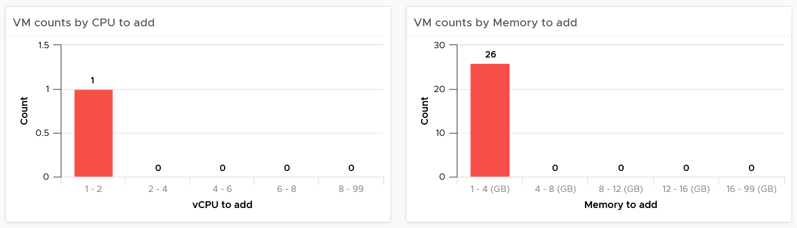
The main reason is you want to avoid adding large amount without strong justification.
For CPU, the primary justification is the CPU run queue counter, not the CPU usage. Even if the CPU Usage is flat out 100%, if the CPU run queue is below 2 per vCPU, you don’t need to add many vCPU.
For memory, Guest OS does not provide deep visibility into the depth of memory shortage. Adding memory may also requires changing application setting so it can take advantage of it.
Do the same capping for oversized VM. To make a drastic reduction, discuss with the VM Owner. Reducing memory may also requires changing application setting, especially application that manage its own memory such as JVM and DB.
Other than the bar charts, you also get the table listing the actual VM. You have 2 tables, one for undersized and one for oversized. Why can’t we just use 1 table?
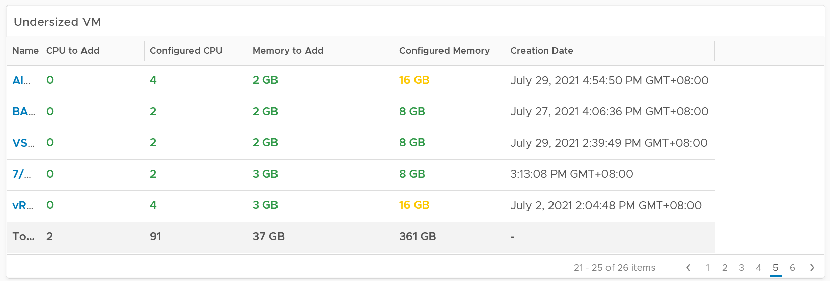
The reason for separate table is the business processes for oversized and undersized VMs are different, as one requires the affected VM to be shut down and the VM Owner to give back resources. For upsize, you want to add incrementally or even automate this process. For downsize, you want to remove in one change window as the effort to reduce is the same and there will be only one downtime.
CPU/Memory to remove is color coded to help you prioritize. Red color means they are excessively oversized.
Configured CPU/Memory is color coded to help you focus on the large VM. They are shown in red.
Take note that a VM can appear in both tables. It can be undersized for CPU, oversized for memory, and vice versa.
Here is the table for oversized.
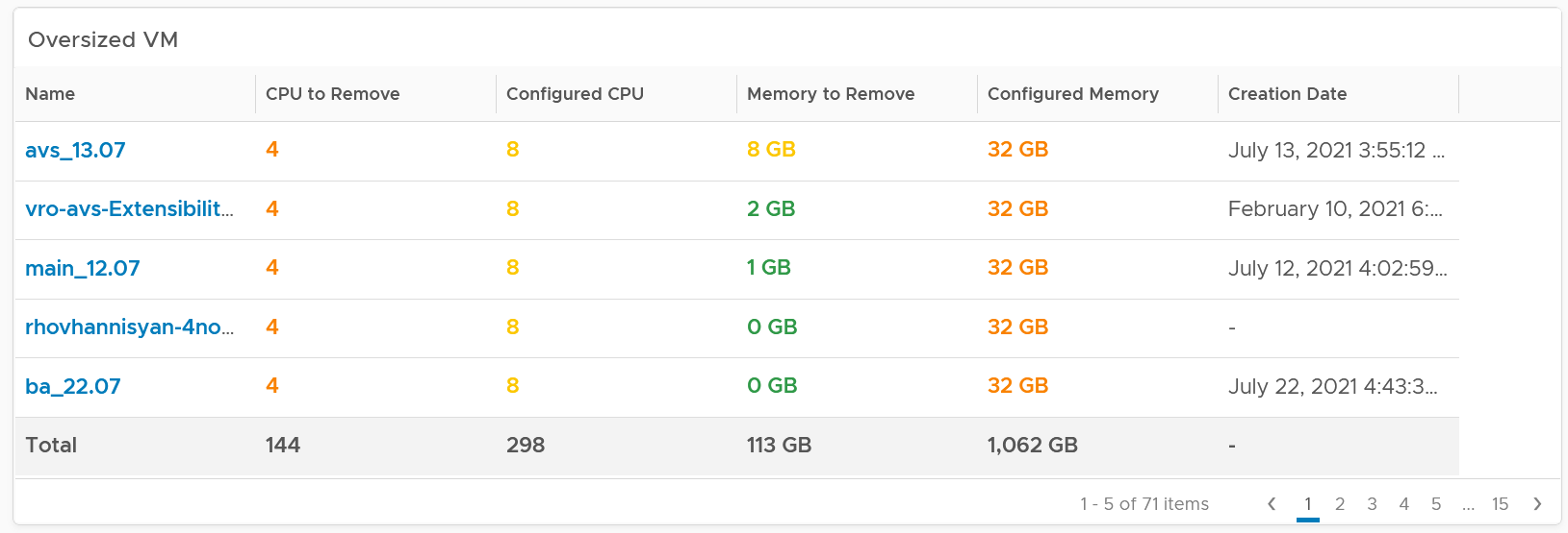
The metrics used are Summary \ Oversized \ Virtual CPUs and Summary \ Undersized \ Virtual CPUs. It stores the capacity engine calculation on recommended number of vCPUs that must be removed or added.
VM Analyzis
Select a VM to investigate further. You get its utilization automatically shown. Naturally, you expect the utilization to go higher if the VM is reduced.
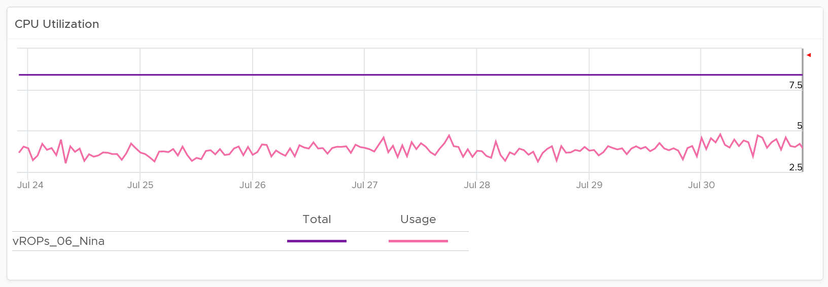
Take note since the purpose here is capacity and not performance, you should not dive into individual vCPU utilization, nor increase collection granularity to shorter than 5 minute (e.g. to 20 second).
Having said that, rightsizing a VM can help improve its performance, or maintain its current performance. How do you prove that?
You show the performance bottlenecks, such as CPU ready and CPU run queue. The following is what you get out of the box.
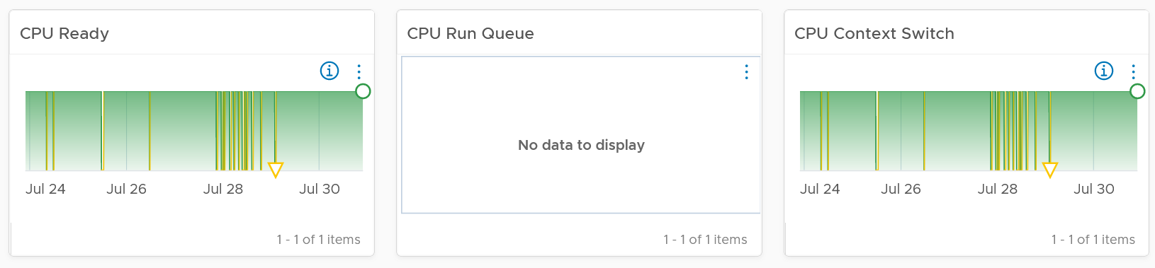
You should expect the VM contention metrics such as CPU Ready and Co-stop to either drop or remain the same.
You should expect the Guest OS CPU Run Queue to remain the same. It might go up a bit, so long it is lower than 3 per vCPU, no need to increase CPU size despite it’s running high. If you want to be safer, modify the widget to use the 20-second counter.
You should expect CPU Context Switch to be less, as there are less CPU to switch. All else being equal, this is a positive change.
If you have the need, add more metrics such as Co-stop.
Memory utilization is collected from the Guest OS. If guest OS metrics are not available, then you will only see the Configured counter. Guess why isn’t there a fall back to VM level memory?
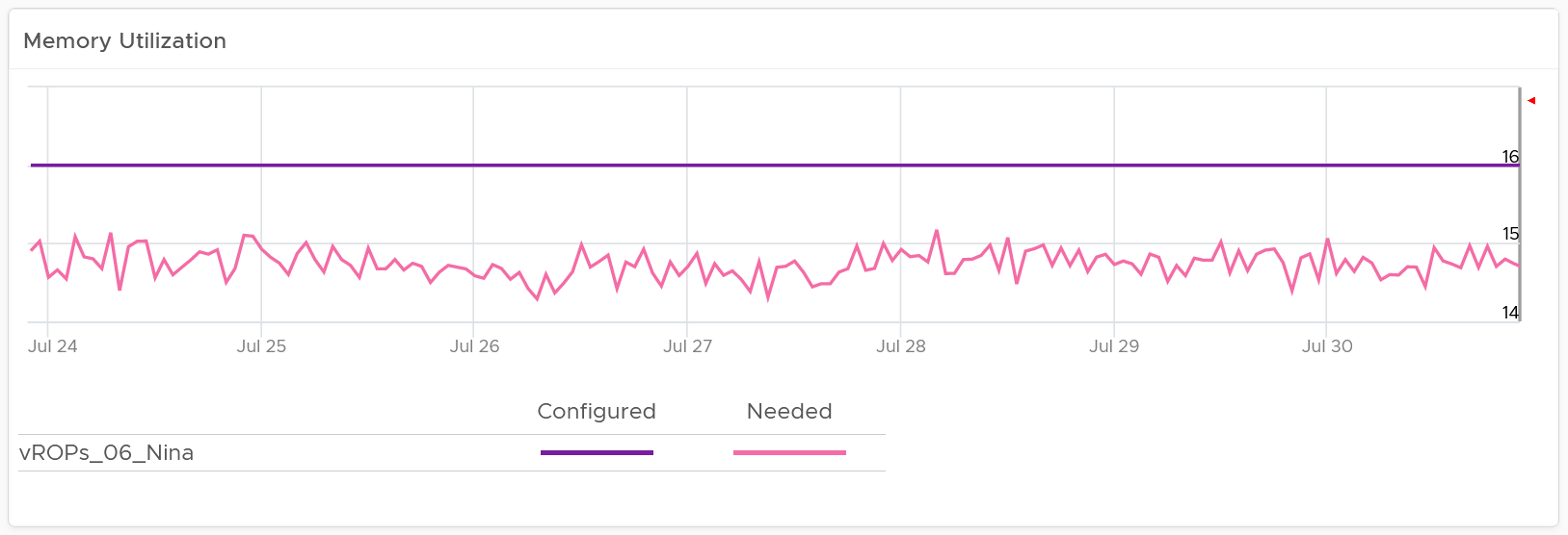
It does not fall back to VM level counter as it’s not a good replacement. See Part 2 Metrics Chapter 3 Memory Metrics.
Rightsizing memory improves performance by reducing memory ballooning and contention. For example, VMs with overprovisioned memory are more likely to experience ballooning
If you want to be conservative, add the free memory counter. If this never touch 0.5 GB, you do not need to add RAM despite its utilization.
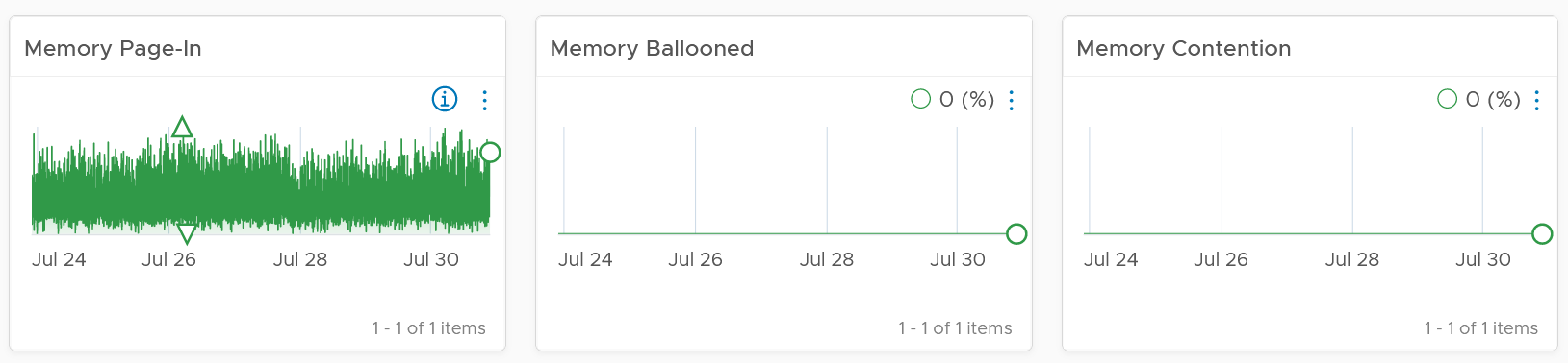
If you have the need, add more metrics such as Page-Out rate.
Relevant configuration for the purpose of right sizing
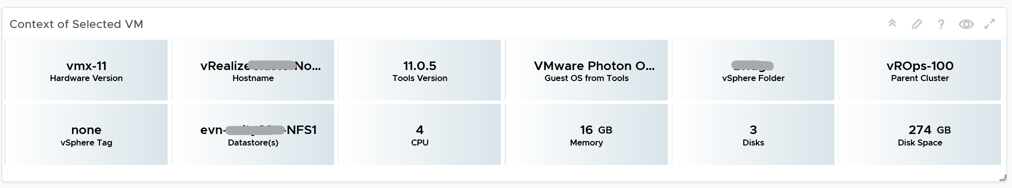
Points to Note
If your environment is large, change the dashboard filter to a functional filter. Group by the class of services such as gold, silver, and bronze and default the selection to the least critical environment. In this way, you can be more active in reducing the oversized VMs.
For another example, see [Dale Hassinger](https://www.linkedin.com/in/dale-hassinger-5712301b/) at code.vmware.com, where he has more data showing the proof that performance can improve with reduced size.
Monster VMs
You can enhance the dashboard if you need to convey the overall situation to senior management. You plot every single powered-on VM in the environment, sized by their vCPU. In this way, the monster VMs will be highlighted. A 64 vCPU VM will appear 64x larger than a single vCPU VM. This is good as the focus should be on the large VM, as discussed here.
The heat map colors the VM by its capacity remaining. A VM with high capacity remaining means it has plenty of wastage resources.
What would it look like on an environment with many monster VMs that are oversized? You get something like this. The grey boxes dominate the space of the heat map. One of the boxes consist of 48 VMs with total > 1000 GHz. All of them have 87.79% capacity remaining. Another word, they are oversized.
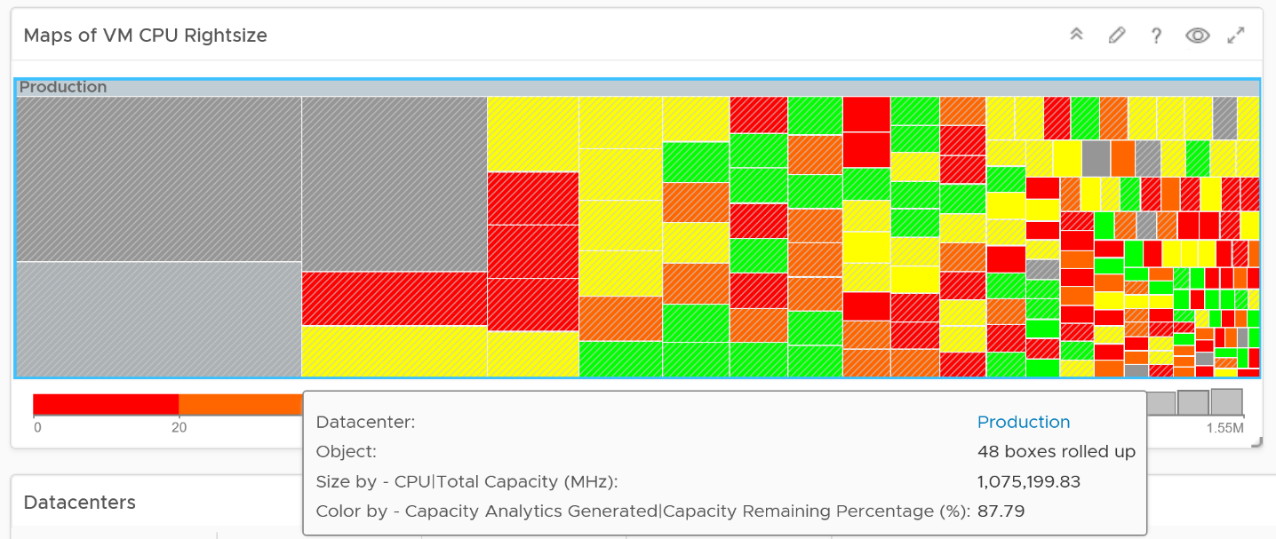
You may want to do the same for memory.
You can also focus on the large VM by specifying a filter. In the following example, I set to 16 vCPU or more, and the VM has to be powered on at present.
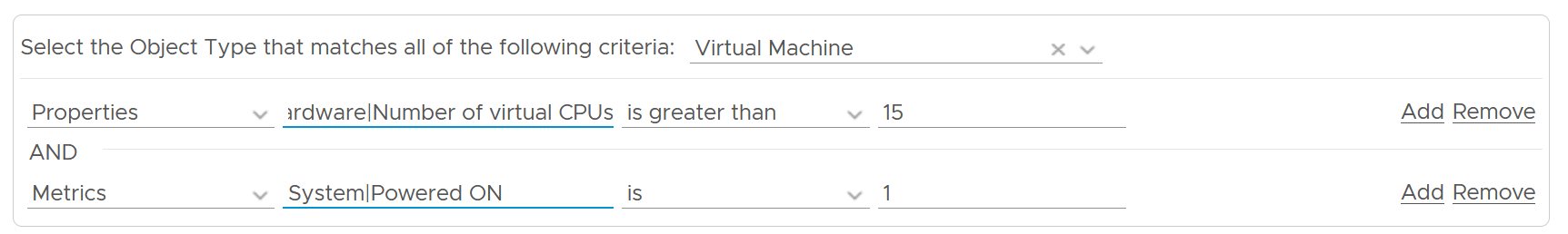
Since we only have the large VM, we can further refine the heat map. The size remains by vCPU size. However, the color changes to the number of oversized vCPU. The more I can reclaim the more red the color shows, and anything above 14 vCPU is red.
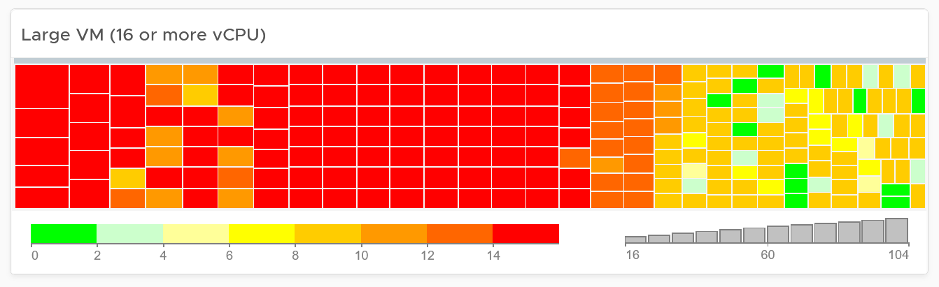
Configuration
Part 2 Chapter 6
The configuration dashboards aims to implement the concept covered in Configuration Management chapter.
Overall Design
Use the Configuration dashboards to view the key configuration in your VCF environment, especially for areas that need attention.
The suite of dashboards works together as one integrated set. They also have similar design.
| Goals | Address configuration issues before they cause impact |
|---|---|
| In the event of issues, check configuration to see if it plays a part. | |
| Questions | Are the configuration matching best practices? |
| Are the settings consistent when they have and up to date as per our plan? | |
| Do we have undesirable drifts? | |
| Assumptions | You have the enterprise standard and policy documented. |
| Target Users | Platform Team |
| Usage frequency | Daily, for urgent settings |
| Weekly, for non-urgent settings. | |
| Features | Show the configuration that needs attention first, before showing overall configuration. The idea is to drive action towards optimizing configuration. |
| Balance ease of use, performance (loading time of the dashboard page) and completeness of configuration check. As a result, you may not be able to show all settings of desired objects. Lack of screen real estate is another consideration behind the design |
The current dashboards are:
| VM Configuration | These 2 dashboards work together. The 2nd dashboard is created as the dashboard was simply too large, impacting usability. |
|---|---|
| VM Storage Configuration | |
| ESXi Configuration | These 2 dashboards work together. The 2nd one is prefixed with vSphere as the word cluster is a generic English word. Ideally, there is a drill down from cluster dashboard to ESXi. However, that will increase complexity in the user interface. |
| vSphere Cluster Configuration | |
| vSphere Resource Management | This needs to be a separate dashboard as the configuration spans VM, resource pool and clusters. The flexibility and complexity warrant a dedicated dashboard to help you optimize. |
| vSphere Network Configuration | These are basic dashboards. In future, I’d enhance them. |
| vSAN Configuration |
In some dashboards, there are simply too many configuration items to check than the screen real estate provides. If you have a larger screen, add the additional check as you deem fit, or add legends to the pie-charts.
In a large environment, create a filter for this dashboard. Group by the class of services such as, Gold, silver, and bronze. Default the selection to Gold. In this way, your monitoring is not cluttered with less critical workloads.
Resource Management
[e1: this section is draft]
Consumer Dashboards
The VM Configuration dashboard and the VM Storage Configuration dashboard were designed to highlight the settings that you need to fix or improve. To balance usability, it does not show every single setting.
How to Use
Select a data center from the Data center table
-
In a large environment, loading thousands of VMs increase the web page loading time. As a result, the VM is grouped by data center. In addition, it may make sense to review the VM configuration per data center.
-
For a small environment, the vSphere World is provided so you can see all the VMs in the environment.
The dashboard is organized into 3 sections for ease of use.
- All 3 sections will automatically display the VM configuration in the selected data center
The first section covers limit, share and reservation
- Limit should not be used, as explained previously here.
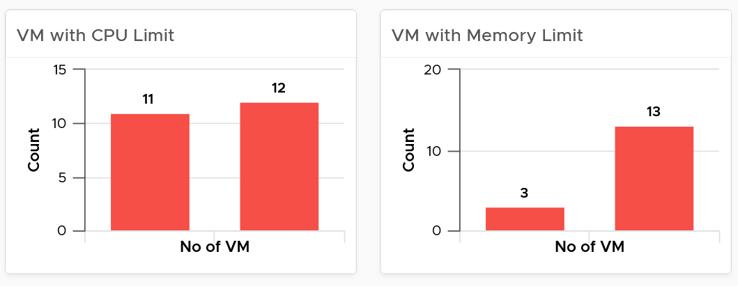
- Their share and reservation values can easily become inconsistent among VMs, especially in an environment with multiple vCenter Servers. The following shows an environment with far too many variations in shares.
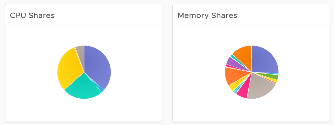
-
Shares should be mapped to a service level, to provide a larger proportion of shared resources to those VMs who pay more. This means that you should only have as many shares as your service levels. If your IaaS provides Gold, silver, and bronze, then you should have only three types of shares.
-
The value of share is relative. If you move a VM from one cluster to another (be it in the same or different vCenter Server), you may have to adjust the shares.
-
Reservation impacts your capacity. Memory reservation works differently from CPU reservation, it’s more permanent.
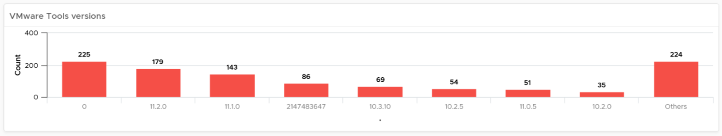
The second section covers VMware Tools
-
Tools is a key component of any VM, and should be kept running and up to date.
-
The distribution chart shows the various versions. You should keep them minimal
The third section covers other VM key configuration
-
Keep the configuration consistent by minimizing variants. This helps to reduce complexity.
-
Pay attention to VMs with many virtual disks or many virtual network cards.
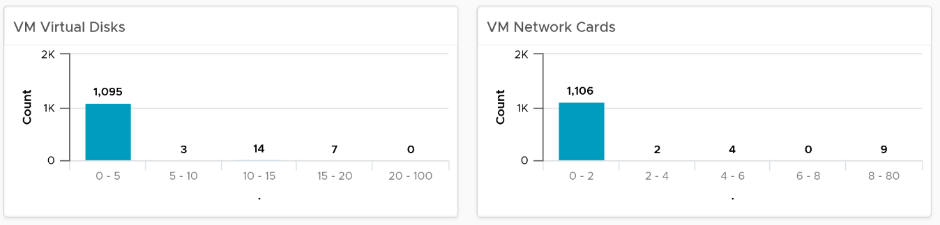
- Keep the number of VM hardware versions minimal, and keep them current.
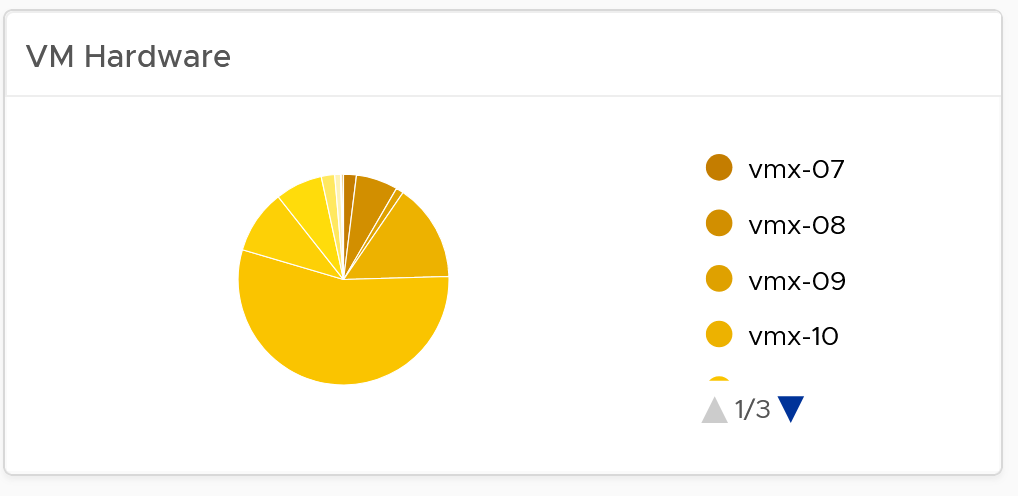
- VM Network Card widget. It you suspect your environment may have VM with no NIC card, consider adding it as dedicated bucket.
The last part of the dashboard is collapsed by default.
-
It shows all the VMs with their key configuration.
-
You can sort the columns and export the result into spreadsheet for further analyzis.
ESXi Configuration
The dashboard is organized into sections for ease of use.
The upper part of the dashboard displays basic ESXi configurations that should be standardized for ease of operations.
-
There are six pie-charts that are displayed as one set because there is a relationship in their values. There should be a correlation between them. Ideally, the ESXi version, the ESXi build, and the BIOS should be identical across all ESXi hosts in a cluster”. Keep the variations of hardware model, NIC speed, and storage path minimal. The more complex the pie chart, the more variants you have. This results in complex operations, potentially resulting in increased OPEX.
-
The configurations should reflect your current architecture standard. Each pie-chart counts the occurrence of a particular value. A large slice signifies that the value is the most common value, and if that is not your current standard, then you must address it.
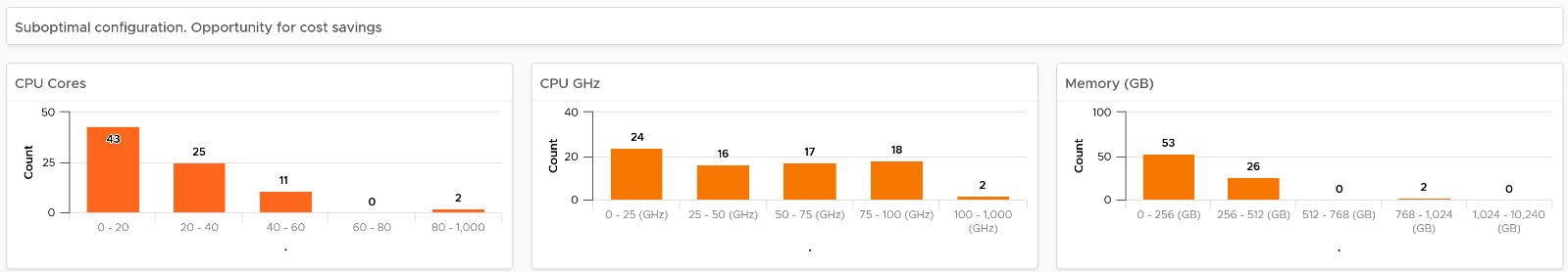
The second section of the dashboard displays configurations that are potentially suboptimal.
-
The three bar-charts display various size dimensions of the ESXi hosts. The bar-charts are designed to be seen as one set. Ensure minimal number of variations to reduce complexity.
-
Smaller ESXi hosts have a relatively higher overhead, and are limited in running larger VMs. If they have a low core count, they could be using outdated CPU. Small ESXi hosts are more expensive on a per core, per GB, per rack unit basis than larger ones if they occupy the same space. On the other hand, a 4-CPU socket ESXi host is likely to be too large, resulting in a concentration risk (too many VMs in a single ESXi host). Maintain a good balance that balance your budget and risk constraints . You should adjust the distribution chart bucket size to fit your environment.
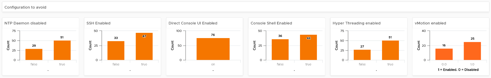
The third section of the dashboard displays configurations that you may want to avoid.
-
The six bar-charts focus on security, availability, and capacity settings that you can set as a standard. For example, you should consider enabling the NTP daemon for consistent time, which is critical for logging and troubleshooting.
-
The three tables list the actual ESXi hosts that are in a non-productive state. They can be in maintenance mode, powered off, or in a disconnected state.
-
BTW, I’ve modified the last one to show information, to show an example if that makes sense for your operations. I do not do it for the out of the box version as visually it will look awkward as the first 5 charts do not need it 😊
The last part displays all the ESXi hosts in your environment.
-
You can sort the columns and export the result into spreadsheet for further analyzis.
-
Some of the columns are color coded to facilitate quick reviews. Adjust their threshold to either reflect your current situation or your desired ideal state
Cluster Configuration
The dashboard is organized into sections for ease of use.
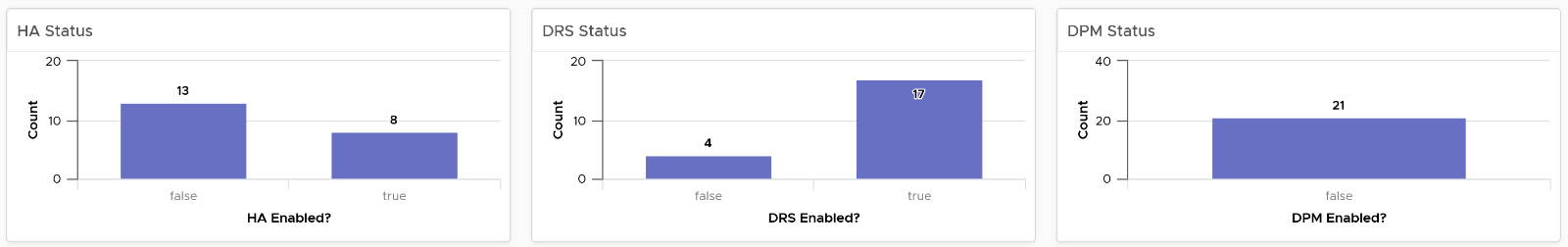
The first section shows 3 bar charts. They correspond to the 3 main features of vSphere clusters, namely High Availability HA, Dynamic Resource Scheduler DRS and Distributed Power Management DPM.
-
HA: The best practice is to enable HA admission control. You can specify the Admission Control Policy in vCenter and the threshold for failover shares.
-
DRS: The best practice is to have DRS enabled. Think of a vSphere cluster as a single logical computer that balance within itself.
-
DPM: The best practice is to enable DPM in an environment where environmental concern is the top priority or the high peak rarely occurs (most of the time You are running very low utilization).
The second section of the dashboard shows 8 pie charts. They show the relative distribution of key configurations.
-
2 bar charts cover Admission Control. You should enable admission control. The pie chart displays the policy code instead of the policy name, as it is based on the property Cluster Configuration | Das Configuration | Active Admission Control Policy.
-
2 bar charts cover the HA Failover Share, one for CPU and one for memory.
-
2 bar charts cover DRS setting. Generally speaking, you want to have DRS fully automated, meaning no operator intervention is required for both initial VM placement and subsequent load balancing, but with a moderate migration threshold (value = 3.0). The value range from 1.0 to 5.0.
-
There are 2 pie charts showing reservation, one for CPU and one for memory. Minimize the total reservation value as it prevents overcommit of resources and hence results in a less optimal utilization. Memory reservation can remain and occupy the memory space of the ESXi host even though the VM does not use the memory anymore. Consider the analogy of unused files that you have not opened for months in your laptop c:\ drive. They still take up space of the hard disk. Keep the number of distinct shares below three (or at a minimum), matching the distinct classes of service.
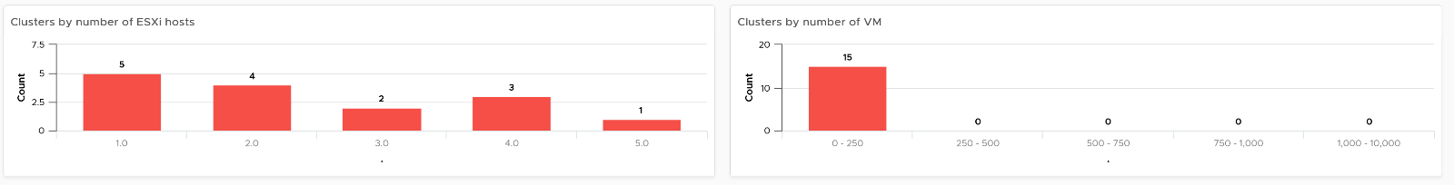
The third section of the dashboard shows 2 bar charts. They show the absolute distribution of cluster.
-
The first shows the cluster grouped by the number of ESXi Hosts. Ensure this matches your plan and cluster sizing standards.
-
Small clusters (defined as having less ESXi hosts) have higher overhead while large clusters have a higher risk in case of cluster-wide outages. For large cluster, have a disaster recovery plan an unexpected cluster-wide outage can impact many VMs.
-
Performance risk is lower in large clusters partly because there are more nodes that DRS can tap on, but if there is an actual problem troubleshooting can be harder (because there are more nodes to analyze).
-
In large environment, small clusters can result in cluster sprawl.
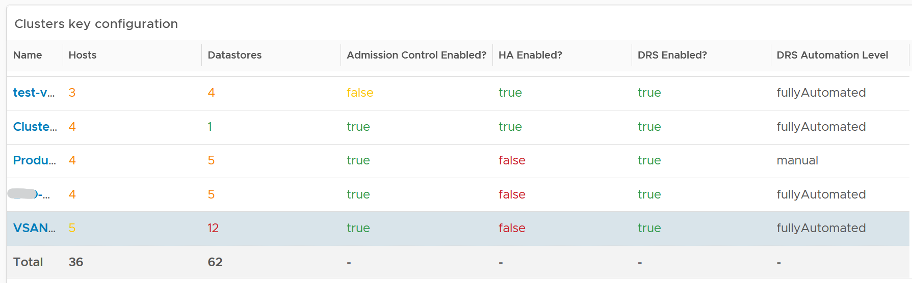
The fourth section of the dashboard lets you drill down into individual cluster.
-
It begins with a table listing all the clusters with their key configuration. You can export this list as a spreadsheet for further analyzis or reporting.
-
Select a cluster. The list of ESXi Hosts under the cluster, along with shares and resource pools information, is automatically filled up. Ensure as all its ESXi Hosts have identical configuration.
-
Keep the number of distinct shares below three (or at minimum), matching the distinct classes of service. You should avoid giving different service level to individual VMs as that increase the complexity of the cluster performance.
-
Verify that Shares are used consistently throughout your entire vSphere environment. Do note that they are relative numbers, not absolute. Ideally, avoid using it altogether as it's easy to overlook. When you move VM to another cluster or vCenter, you may forget to set the new share appropriately.
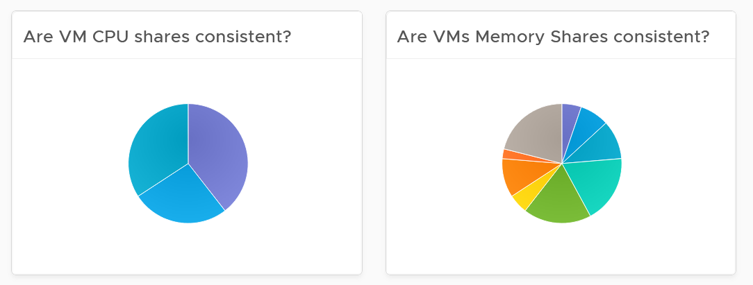
-
Keep the number of resource pools minimal. Resource Pools can impact performance, if the number of VMs in the pool do not match its intended shares. The new Scalable Shares feature in vSphere 7 automates this adjustment, which has to be done in older version. More about it here.
-
Some of the columns are color coded to facilitate quick reviews. Adjust their threshold to either reflect your current situation or your desired ideal state
Points to Note
-
You might notice that the DRS Migration Threshold widget is using the property DRS vMotion Rate. This is the correct property. We will correct the property name so it’s less confusing.
-
The HA Memory Failover Shares widget should be named HA Memory Failover percentage. This is a known typo.
-
The HA CPU Failover Shares widget should be named HA CPU Failover percentage. This is a known typo.
Network Configuration
For a more complete visibility, consider adding physical network device monitoring by using the appropriate management pack. More info here.
The dashboard is organized into 2 sections for ease of use.
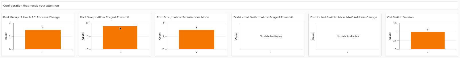
The first section displays network configurations that needs your attention
-
There are 5 bar charts that focuses on critical security settings.
-
The last bar chat shows the version of the vSphere Distribution Switch. Aim to keep the version current, or matching your vSphere version.
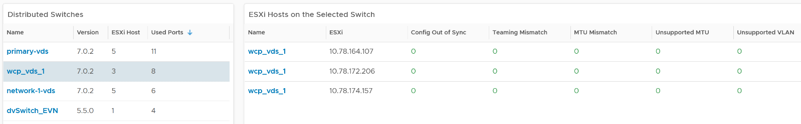
The second section provides overall configuration, with ability to drill down into a particular switch
-
Start by selecting a switch from the list.
-
The ESXi Hosts, port groups and VMs on the switch will automatically be shown.
Review each of the tables. For the ESXi Host table, ensure their settings are consistent.
Some of the columns are color coded to facilitate quick reviews. Adjust their threshold to either reflect your current situation or your desired ideal state.
You can sort the columns and export the result into spreadsheet for further analyzis.
Storage Configuration
The dashboard covers both vSAN and non vSAN.
The dashboard is organized into 3 sections for ease of use.
The first section displays 6 pie charts
-
There are 5 bar charts that focuses on critical security settings. Their values should match your security policy.
-
The last bar chat shows the version of the vSphere Distribution Switch. Aim to keep the version current, or matching your vSphere version.
The second section displays 3 bar charts
- Together, they provide good overview of the vSAN key capacity configuration. By seeing the distribution, you can see if you have capacity configuration that is outside your expectation.
The last part of the dashboard shows all the vSAN clusters with their key configuration.
-
Some of the columns are color coded to facilitate quick reviews. Adjust their threshold to either reflect your current situation or your desired ideal state
-
You can sort the columns and export the result into spreadsheet for further analyzis.
Availability
Part 2 Chapter 7
The availability dashboards aims to implement the capacity concept covered in Availability Management chapter. They are rather limited, hence if you have something let’s collaborate!
VM Availability
Use the VM Availability dashboard to calculate the availability of the Guest OS. The availability of the Guest OS is calculated because the Guest OS might not be running even when the VM is powered on. There are two layers of Availability, that is, the Consumer layer and the Provider layer. This dashboard covers the Consumer layer. You can view VMs in the selected data center, uptime trend for a selected cluster, and so on.
Questions asked:
-
Overall availability over time.
-
What are causes of the availability? How many VMs affected by HA? How many were reset?
-
Tools availability. Which VMs have Tools not running? While technically “tools not installed” is a configuration issue, it impacts availability.
Design Consideration
The dashboard is designed to help check the availability (uptime in percentage) of VMs, as availability is typically a part of services provided by the IaaS provider.
This dashboard does not check the application up time. It is possible that the application (e.g. a database, web server) is down while the underlying Windows or Linus is up. Generally, the service provided by IaaS team is only until Windows or Linux. To check application level, use network ping or application specific agent (e.g. Telegraf).
How to Use
Start in Data centers widget by selecting one of the data centers listed.
-
In small environment, or if you want to see overall, you click the vSphere World object.
-
The above action will update other widgets automatically.
-
Think of creating a filter for this table that reflect your class of service. Group by the class of services such as Gold, silver, and bronze and default the selection to Gold. In this way, the monitoring is not cluttered with less critical workloads, and you can focus on the important VMs. One way to achieve this is by creating a VCF Operations custom group for each class of service
About the VMs by Uptime in the last 30 days bar chart
- It displays the average uptime of VMs grouped by their availability. The bucket distribution is designed to cater for a wide array of environment. If You are monitoring only production VMs, where uptime is expected to be near 100% all the time, edit the bucket to meet your operational need.
About the VMs in the Selected Data center table
-
It lists all VMs currently deployed to the data center. Average Uptime is displayed for the last 1 month of data. Expect this number to be 100% or near there for production VM.
-
Note that the Services column will be blank unless Service Discovery is enabled and services/processes were discovered on a specific VM.
-
The column VMs includes all VMs including powered off VMs.
Select a VM from the above table.
-
The remaining widgets will automatically show the detail of the selected VM.
-
Selected VM Uptime Trend displays the selected VM’s Guest Tool Uptime (%) across the last 30 days.
Expand the 2 collapsed widgets
-
If Guest OS services or processes are discovered inside a VM, their availability is analyzed. Service ‘state’ over time is displayed in Guest OS: Services.
-
The dashboard displays the process or services running inside the Guest OS. This requires the Service Discovery Management Pack.
-
The ESXi Host where the VM has run widget can show historical migration of the VM. This can be useful in determining the cause of a VM downtime.
Points to Note
-
The metric is only tracking the availability of VMware Tools, not the entire Guest OS. If Tools is not up, it assumes the Guest OS is down. To help you check that this is not a false negative, add a few line charts that shows sign of life. A good counter is IO metrics such as Disk IOPS, Disk Throughput and Network Transmit Throughput, because IO requires CPU processing. CPU Usage is not a reliable counter as work by VMkernel on the VM is charged to the CPU metrics.
-
VCF Operations 8.2 sports a new ping adapter. This means you can enhance the accuracy of the uptime measurement by creating a super metric that adds the ping information or checking the process (needs an agent, such as Telegraf).
-
Add a property widget that lists the selected VM properties to give you more context about the VM. In large environment, it is possible that the VM name alone may not be providing enough context.
vSphere Availability
There are two layers of Availability, that is, the Consumer layer and the Provider layer. The vSphere Availability dashboard covers the Provider layer. This dashboard includes a cluster and not an ESXi host because the cluster is operationally a single compute provider. This dashboard considers the N+1 design, where the cluster can withstand one host failure. Logically, a cluster with fewer hosts has a higher risk.
The dashboard is designed to help you analyze and report the uptime, as availability is typically part of official business SLA. It’s also often required in the monthly operational summary report.
The dashboard is not designed for live monitoring of the uptime. An NOC style of dashboard is better suited for that use case. Tools such as Aria Log Insight should also be leveraged as fault is typically preceded with soft errors.
How to Use
The first information shown is the average availability of all vSphere clusters in the environment. It’s a simple average, regardless of the clusters function.
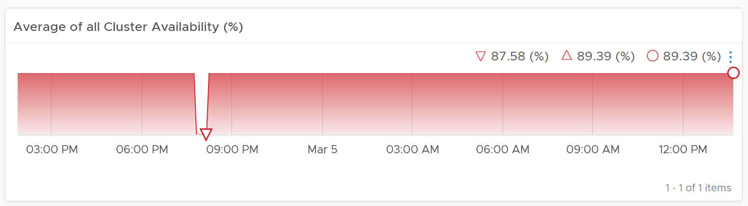
Ideally what you want is something like this:
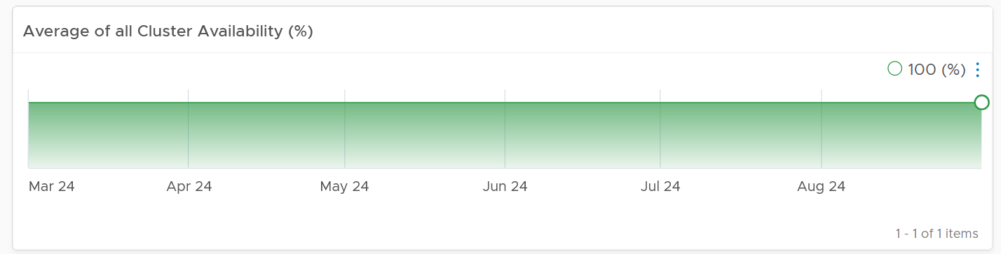
The next health chart shows the count of ESXi hosts that are not available.
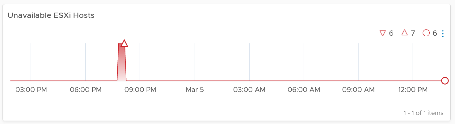
Adjust the threshold accordingly. By default, it’s using 1 for Yellow, 2 for Orange and 4 for Red.
Next is a table showing all vSphere Clusters.
In a very large environment, creating a filter for the list of clusters can make it more manageable. One is to group the clusters by their class of services. Group your clusters into Gold, silver, and bronze and default the selection to Gold. In this way, you can see your Gold clusters more easily.
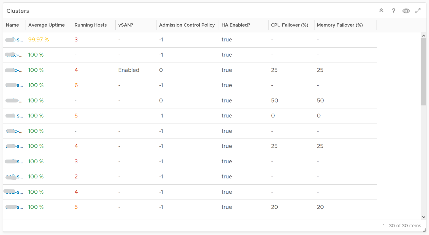
It is sorted by the lowest uptime, so your attention is drawn to the cluster with the lowest uptime in the last 1 month. The column is based on the average of the last 1 month as availability SLA is should be calculated per month (but reported much more frequently)
The metric used is Summary \ Cluster Availability (%), which assumes N+1 design. That means if there is 1 node failure, the metric is still showing 100%.
The column Running Hosts are color coded as logically a smaller cluster has higher risk. A single host failure results in relatively higher capacity degradation.
The column vSAN? Is added as hyper-converged means you need to consider both the compute part and the storage part.
The Admission Control Policy is based on the property Cluster Configuration \ DAS Configuration \ Active. The mapping between code to name is
-
-1 = Disabled
-
0 = Cluster Resource percentage
-
1 = Slot Policy (Powered-on VMs)
-
2 = Dedicated Failover Hosts
The cluster failover percentage columns map to the following values in vCenter client UI.
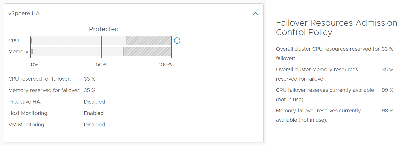
Select a cluster from the above
-
The cluster uptime will be automatically plotted. It’s using 25%, 50%, and 75% as the threshold for red, orange and yellow respectively. The reason for low threshold is the 5 minute window. A complete 5 minute downtime is only 0.0116% when measured against a 30-day SLA. If the uptime was 100%, it will only go down to 99.9884%
-
The ESXi in the selected cluster table will be automatically filled up. For more context, you can add a property widget that lists the selected ESXi Host properties.
-
The 'Connected to vCenter' and 'Maintenance State' columns are not the average values, as both are string. However, they display the last state in the selected period. This allows you to go back to a specific point in time and view availability at that point.
About the “Datastore not available” list
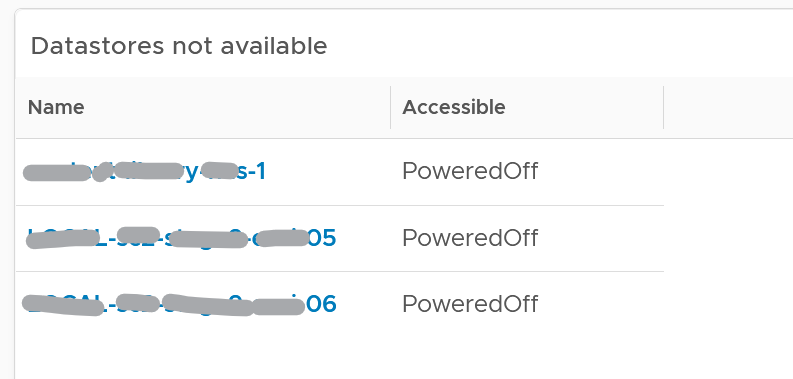
- It filters to only those datastores with status powered off. This covers both local and shared datastore. To add context, consider adding extra column such as the data center where it resides, and the datastore type (e.g. NFS, VMFS)
About the Port Group availability list
-
This lists port groups which at present has uptime of less than 100%.
-
To add context, consider adding extra column such as the data center where it resides, used number of ports and maximum number of ports
Points to Note
Consider adding vCenter Server availability and NSX components availability. This requires the VMware SDDC Health monitoring solution.
Role-based Contents
Part 2 Chapter 8
It is imperative to get other departments to use VCF Operations. Different persona have their own agenda and goals, so take time to sit down with the individuals and understand the why, not just the what.
IT Leadership Team
The most important persona or role is your boss. In large organisation, there can be multiple layers between you and your CIO. Each layer has their own needs. Understand the need of each individual. The nuance matters. Different managers are likely having slightly different requirements. Take time to understand the real needs behind the ask. Learn what questions need to be answered, what answers are expected, and what actions are taken based on the answer.
You also need to think of what you want from them, as they hold decision making authority. Show them problems that you can get help, which is budget and resource. Do this by showing data. By giving visibility into live environment to senior management, you prove that you do need additional hardware. If there is wastage to be reclaim, you also prove on where and how large the wastage is.
Think of what approval you need to do so you can do your work. How do you present the supporting information without burdening them with too many details?
General Requirements
| Summary | Generally, they want summary and the big picture, not details. Or at the very least, the big picture is presented first, and then drill down is provided. |
|---|---|
| As part of showing the big picture, trend should be included. Show the situation in the last few months, ideally coupled with projection. The data should be averaged out, so that a 5-minute spike should not show up. | |
| Exception. Things that they need their attention. Complete means nothing else can be taken out. Which information, object, metric can you take out while preserving the point? | |
| Offline | They prefer information to be emailed so they can access from anywhere easily. They may not want to login to VCF Operations. |
| They appreciate offline access as they tend to be mobile. Some may even ask for the information to fit on a mobile phone screen, or just a single screenshot. For off-line access, verify the screen size. A small screen of 7” can only display a small subset than say a 14” display. | |
| KISS | KISS. Keep it simple solution. Keep the interaction, clicking, zooming, sorting, etc. minimal. Use larger fonts, round numbers (law of significant figure). |
| UI that is easy to understand. So keep each dashboard to a specific question. Make sure the dashboard is easy to use. So keep the interaction, clicking, zooming, sorting, etc. minimal. | |
Can the dashboard be understood within 5 seconds? If yes, you buy yourself a few more minutes. Your IT Management has understood what the dashboard does, and is willing to spend more time appreciating its full capabilities. | |
| No technical info. Ideally, present in business terms, not IT jargons. Terminology such as datastore, distributed switch may need to be replaced with something suitable in your organization. | |
| Take note of the “size” of your dashboard. A dashboard that has many widgets and scrolls deep is harder to understand. |
If they ask for a self-service portal, then make it easy to access. They may not want to login to VCF Operations. If they do, they may forget their password, so the portal should not require a password.
Sample Requirements Analysis
The following table provides an example analyzis of 2 different IT leadership layers. Notice the 2 groups have a different set of requirements, resulting in 2 different approaches.
| Middle IT Management | Senior IT Leadership Team | |
|---|---|---|
| Users | John and Jill | Sam, Andy, and Julia |
| They will read on their laptop. They have access to VCF Operations but only login occasionally in a week. | They expect a 15-minute presentation (live environment), with a copy of the PDF on their inbox for future reference. | |
| Familiarity | High. They know the environment and context well | Low. They need explanation. |
| Focus | Keeping the lights on. | Last month review, especially compared against plan and SLA. Finalize next month plan. |
| Availability, Performance, Security. | Capacity and Cost. How to lower cost while increasing capacity. | |
| Authority | Medium-level changes. Budget up to ___. | Major IT decision that is strategic and long term. Represent IT to Business Leaders |
While you are clear on what they want from you, what do you want from them?
Having analyzed the requirements from each person, and from you to them, you develop the following approach:
| Middle IT Management | Senior IT Leadership Team | |
|---|---|---|
| On Mobile | Daily. First thing in the morning. Forward looking, not about the past. A simple summary. Fits into 1 screen. | Weekly. On Monday. 1 week ahead outlook. A simple summary. Fits into 1 screen. |
| On Desktop | Weekly. 2 pages. They will read all sections. | Monthly. 4 pages. They do not read all sections, as it will be presented to them. Done as part of overall operations review, which includes non VCF |
| Others | On demand login to dashboard. They can login and interact to get richer information. | You place a screen on the wall near their office. No interaction. It’s for at a glance look. |
Business Applications
This is likely the most important, both from their viewpoint and your viewpoint. It proves that your infrastructure is playing its part well.
The report should provide a summary for all the mission critical business applications. As they are of the same level of importance, the list should be grouped by the business units.
| Information | Description |
|---|---|
| Name | The business application name as per what the business or senior IT leaders call it. As business applications span multiple tiers, VM, and K8 Pod, you need to build the structure first in VCF Operations |
| Availability | Average uptime during the reporting period. This shows Actual Availability (%), not Operational Availability (%) as the end customers (which are typically external or public) do not care about your scheduled downtime. Majority of websites has 24 x 7 x 365 days availability expectation, even if your customers are not global. |
| Performance | It shows their average performance over the reporting period. As average can mask out poor performance at specific times, they may ask for worst number also. If there are many business applications, they may ask for the average of all of them. They may ask for the information to be presented over time, like stock market performance. |
| Compliance | This is configuration compliant to both security and master template. |
The above is one example. Another common example is infrastructure-centric report. As usual, understand the reason behind the ask. For example, they may not be familiar with the environment and inventory, and hence they ask for what you think is basic.
Operations Overview
This report summarizes what happened to VCF operations management.
-
Was it a busy week or month? Were the operations hectic and environment volatile with a lot of debates?
-
Was the environment well managed? Was the availability, performance, and compliance meeting the SLA?
| Information | Description |
|---|---|
| Inventory | Summary of the key inventory items. This can be absolute or relative. |
| Changes in the inventory. Was there a lot of items added or removed? | |
| Dynamics of the inventory. Was there a lot of settings changed? | |
| Configuration | Summary or important configuration that either they care, or you want to bring up to their attention |
| Capacity | Is there enough capacity? If not, when should action be taken? What was the change in capacity? |
| Performance | Ideally this is compared with SLA. |
Sample Dashboards
VCF Operations provide two example dashboards to get you started. They are designed for you to present live information to your senior management. They are not designed as self-service.
This dashboard is used by the Ops team to provide the overall picture to the IT Management team. This dashboard works together with the set of inventory dashboards. The inventory provides details on available resources and what is running on these resources.
It also works with the capacity summary dashboard, which provides details on the resources remaining capacity and time remaining to act.
Capacity Summary
This dashboard is used by the Ops team to explain capacity to the IT Management team. It works together with the Inventory Summary dashboard. The inventory provides details on available resources and what is running on these resources. The capacity provides details on the remaining capacity and time.
See the Executive Summary Dashboards page for common design consideration among all the dashboards for IT senior management.
How to Use
The dashboard has 2 sections.
-
The top section provides summary at the vSphere World level.
-
The bottom section enables drill down into individual compute or storage capacity
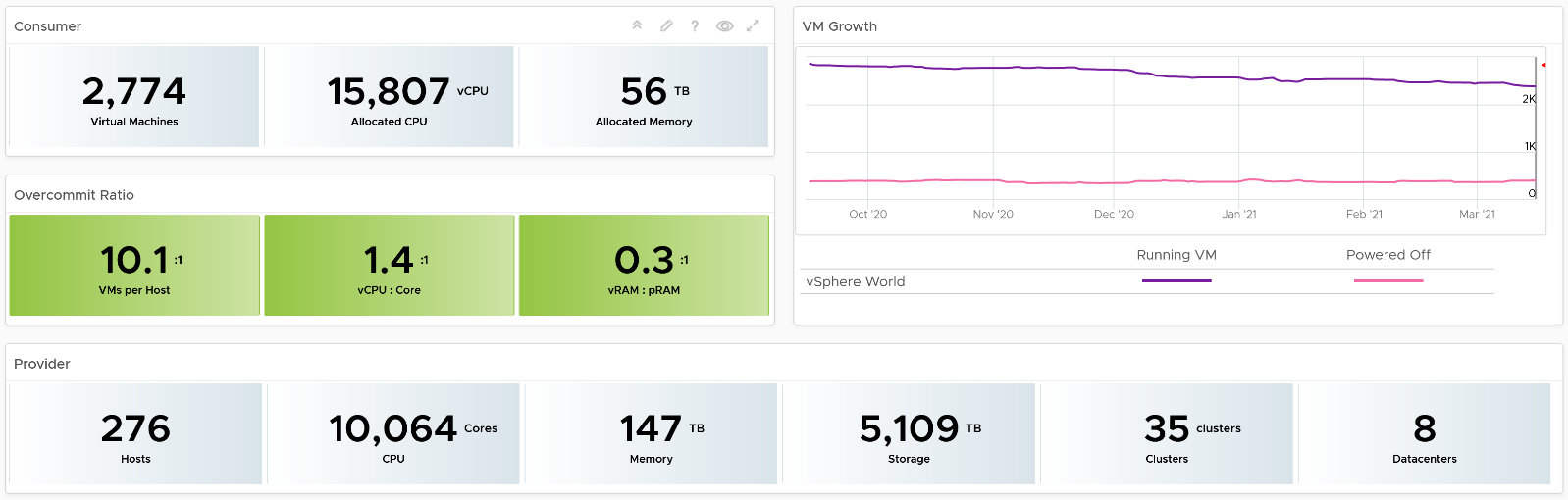
The weekly average of VM growth is displayed to provide holistic visibility of overall growth across all Data centers for both running and powered off workloads. If the increase in VM count is not accompanied by corresponding increase in utilization, these newly provisioned VMs are likely not yet used.
Overcommit Ratio highlights the efficiency gained by vSphere virtualization running multiple workloads on shared infrastructure. It is important to note that overcommitment needs to be further reviewed in conjunction with elevated resource contention (refer to contention dashboards) to understand the performance impact when running VMs competing for resources. In general, Overcommit is required to be financially more economical than the public cloud. As a reference, AWS typically overcommits CPU 2:1 by counting the hyper-threading and does not overcommit memory. Note: VCF Operations uses Physical CPU Cores not Logical Cores (Hyper-threading) for all CPU-based capacity calculations
The bottom part of the dashboard is split into 2 columns:
-
compute
-
storage.
Network is not added due to its nature. It’s an interconnect, not nodes, so capacity is much harder to compute.
The dashboard uses the term compute (and not vSphere Cluster) and storage (and not vSphere datastore) to keep the visual simple.
The two columns have identical design. The heat map displays capacity by size and colored by time remaining. However, for compute the size of each box in the heat map is fixed as there is no single metric to represent the size. A cluster size can be measured in 4 different ways (No of ESXi Hosts, Total CPU GHz, Total CPU cores, and Total Memory).
Here is what the compute portion looks like. The heat map is interactive. By selecting one of the cluster, you can further drill-down to clearly understand remaining capacity and time (in days).
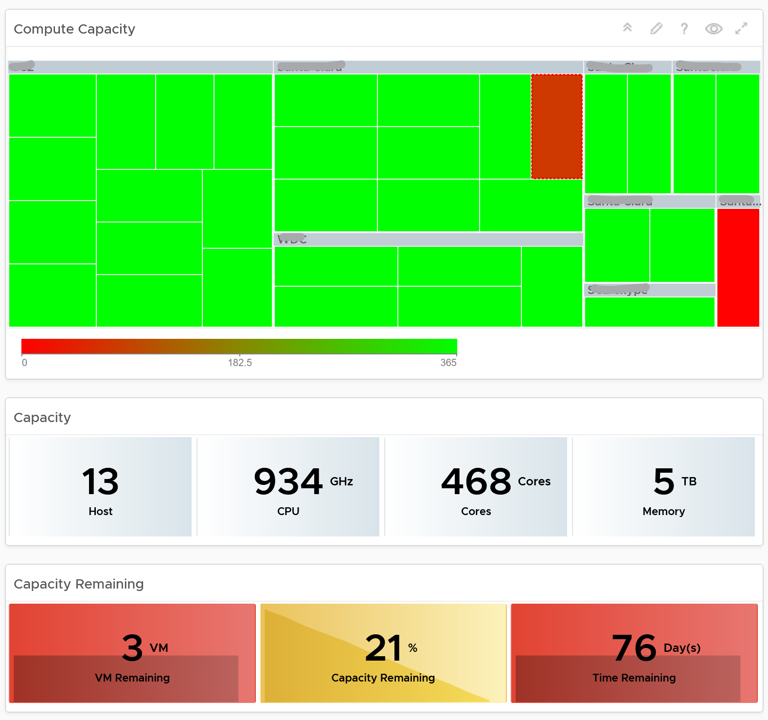
Here is what the storage portion looks like. They are designed to be similar
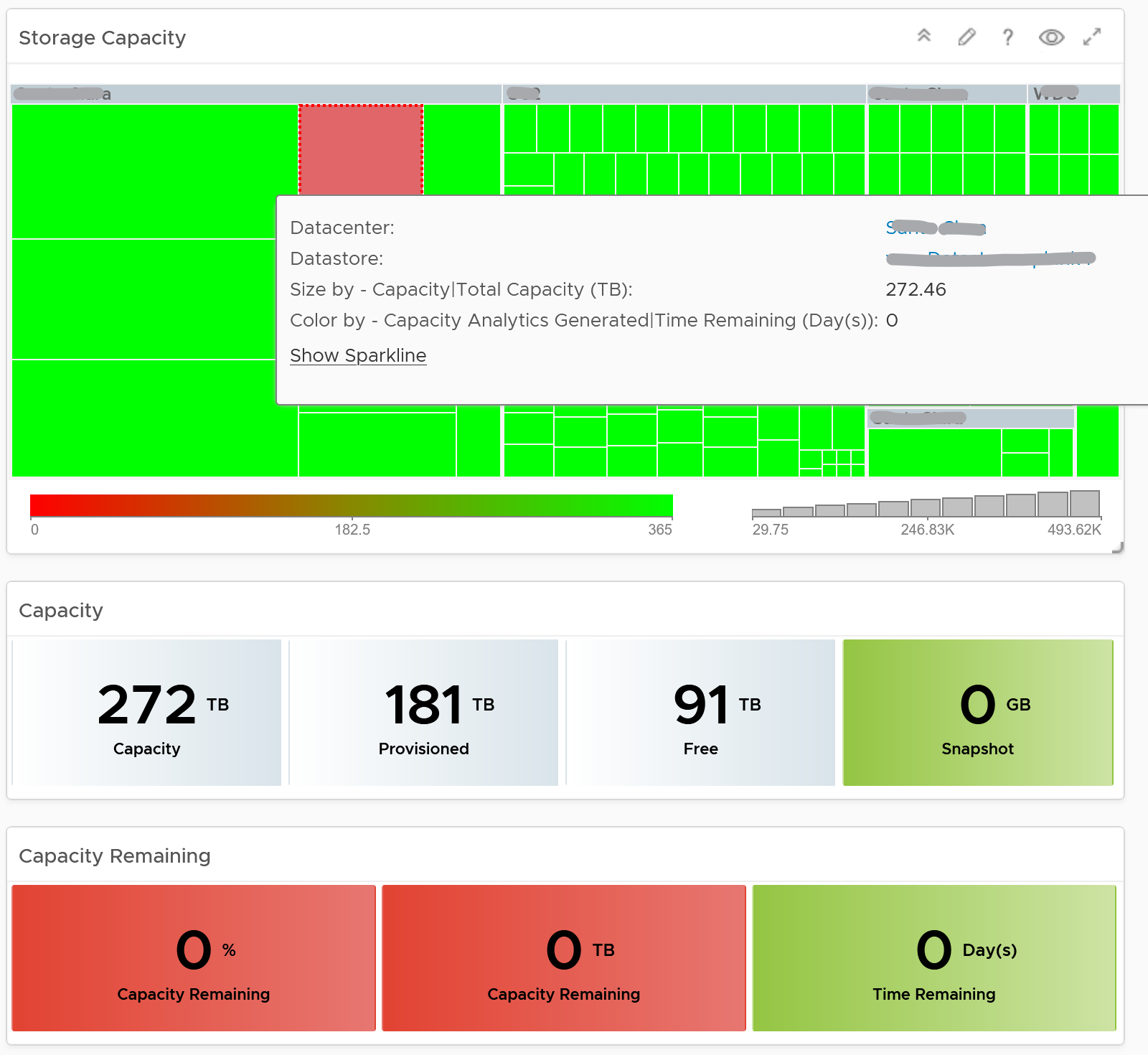
Points to Note
-
Capacity Remaining is not shown at the world level as it could be misleading, especially in global or large infrastructure. Clusters also tend to serve different purpose, and they are not interchangeable.
-
If you are using both on-prem and external cloud, for example, VMware on AWS, consider splitting the dashboard into 2 columns. You would need extra screen real estate though.
Level 1 Team
There are 2 dashboards for VM and 2 dashboards for infrastructure, covering the most common scenarios.
What information do you show? This is a tricky answer. For example, when something is down, it should be shown. But what if it’s part of planned downtime? A planned downtime can last hours, making the NOC screen displaying red for too long. This means you need to exclude them. Create a group called a planned down time, and move the object as part of the process.
Live! vSphere VM Changes
The dashboard starts with a set of summary numbers at the top.
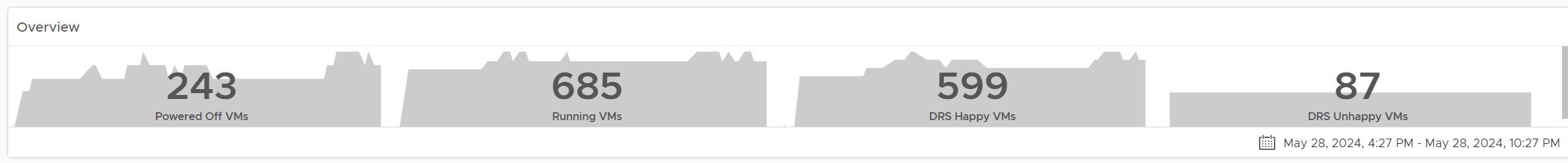
Make sure the numbers match your expectation. Set a threshold for each so it’s easier to see if their values change (drop or increase) to a level that is not within your comfort level.
The changes above is supported with details. There are 3 rows of detail information covering the 20 types of changes. This covers all the possible changes that could happen to a VM, hence providing a real time visibility into the movement or volatility.
Each of the 20 changes are unique. Ensure they match the approved change requests and expected changes of that day.
| Inventory Changes | VMs are added or remove, hence impacting count of inventory. Are VM are added or removed as per your expectation? If yes, are they done the right way (cloning vs free style creation vs template based deployment)? Are the changes matching our change window policy? Why do we have high count of VMs being unregistered or deleted? |
|---|---|
| Location Changes | VMs are moved to another host or datastore. This can be hot or cold migration. Hot migration is shown first as they likely impact performance as it changes both the compute and storage. A change of both parents at the same time is shown first as that’s a relatively more major change. Pay attention to the storage migration as they take the longest amount of time. If it takes longer than expected, something could be wrong. On the other hand, cold migration is typically an activity that should match change request as the VMs are shutdown. |
| State Changes | VMs power state change. Reset is the least desired, hence it’s shown first. It is used as last resort. Suspend and Power Off are least preferred, as these action should be done from within the Guest OS. Expect these numbers to be low. A high number of powered on VMs could lead to high demand. Typically, how many days passes before your New VMs becomes active? It can take days or weeks before the VMs usage grow to its “full size”. |
For each of the 3 types, the dashboard shows 2 widgets:
-
The first is a trend line. Make sure both the absolute amount and the pattern match your expectation.
-
The second is a scoreboard showing the present number of the each of change. The change is sorted from the least desired (most impactful to operations) to the least important.
Threshold Adjustment
The changes are color coded. Since your environment is likely different, adjust the threshold accordingly. Set a different threshold for each while keeping the variations minimal. Different numbers are needed because they are different events. Minimal variants are needed as they make it easier for the NOC room team.
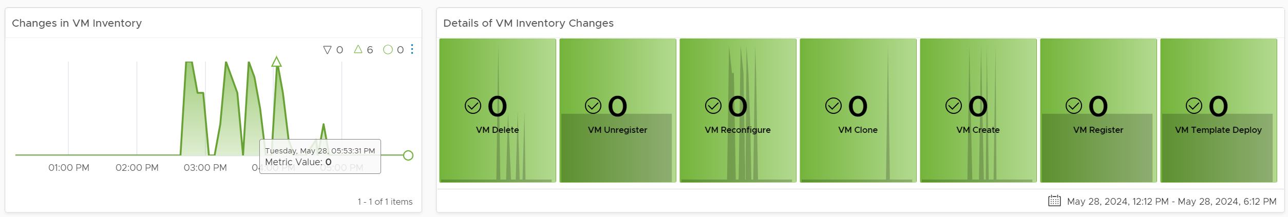
Live! Heavy Hitter VMs
This dashboard helps you analyze the misuse of the shared infrastructure. This dashboard displays details of VMs misusing the shared infrastructure and if that has caused performance problems to the other VMs. The cause for excessive load might be due to security attacks, for example, denial of service, process runaway, or mass activation of agents.
Design Consideration
In shared environment, it is possible to have victim-villain problem. In the heat map, the villain VM is the one with the largest box size, while the victim is the one with red box. If a handful of VMs are dominating the shared infrastructure, their collective size will be highly visible on the dashboard.
There are 4 areas where a monster VM can impact its neighbours.
-
CPU.
-
Disk IOPS. Any VM with PVSCSI can generate very high IOPS. Since this hits the underlying physical storage, the view is grouped by Data Center, not Datastore or Cluster.
-
Disk Throughput. Applications with large block size (e.g. 4 MB) can consume bandwidth without generating high IOPS
-
Network. Network packet/second not shown as dashboard can’t support 5 columns. If you rearrange, it will look odd. It’s added in the trend chart
Memory is not needed as it’s rare for Guest OS to actively read/write from DIMM. It’s mostly cache. Think of it like disk space (passive).
Disk space is not shown for the same reason as memory.
How to Use
The dashboard starts with a set of summary numbers at the top.
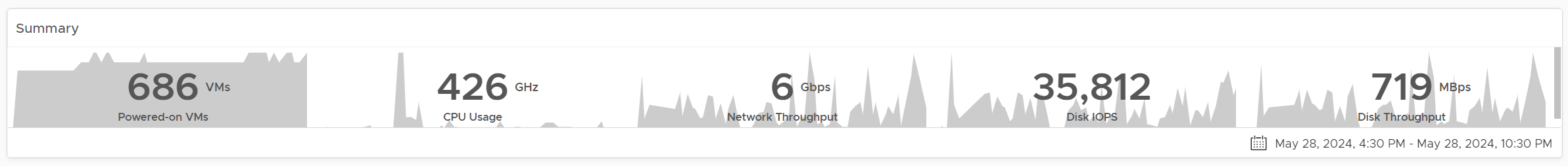
Make sure the numbers match your expectation. Set a threshold for each so it’s easier to see if their values increase to a level that is not within your comfort level.
There are 4 heat maps, showing the 4 different loads that can be excessive. The heat map displays the relative value and not the absolute value. A VM does not generate a high load in the absolute term just because it has large configuration.
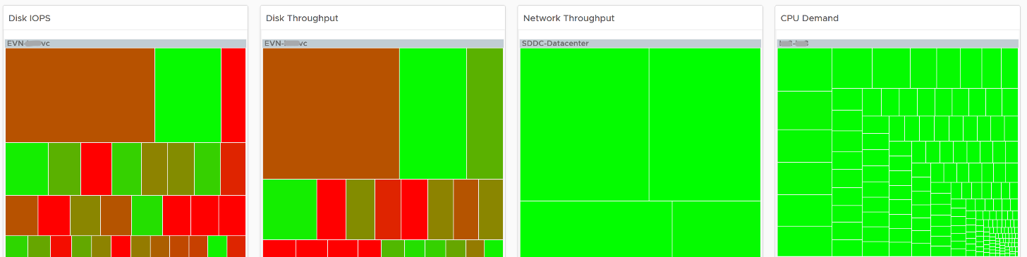
Each heat map has their own color threshold, reflecting the nature of the contention metrics used in each of them.
Remediation Action you should take: Check why the VMs are generating excessive load.
Interactive Section
For NOC Operator, who have access to mouse and keyboard on their desk, they can drill down by selecting one of the VM on the heat map. All the information below is automatically shown, giving user more detail about the VM.
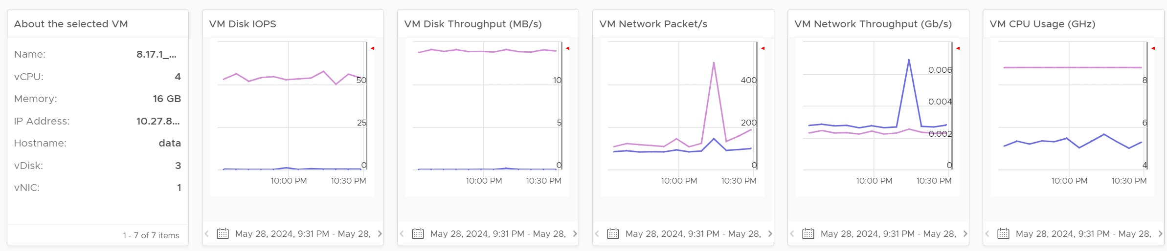
5 types of “hit” on the shared infrastructure are shown. For each, breakdown between read and write, transmit and receive, etc. are provided
Points to Note
Memory is not shown as it’s a form of storage. The memory metrics are space utilization, not speed. Think of disk space instead of IOPS. It can cause capacity problem on the shared ESXi host, but not performance problem to other VMs.
In a large environment, it might be difficult to view a small victim VM. Consider having multiple dashboards and rotate among them.
Cluster Dashboards
There are 2 dashboards working together:
| Live! Cluster Performance | This the primary dashboard for performance. It provides live information on whether the requests of the VMs are met by their underlying ESXi host, which is grouped by the compute clusters. |
|---|---|
| Live! Cluster Utilization | This secondary dashboard complements it by showing if the performance problem (read: contention) was caused by high utilization. |
The primary dashboard answers the question “Is our IaaS performing?”, while the secondary dashboard answers the question “Is our IaaS working hard?”.
The focus of performance is on population, not a single VM. This is not a single VM troubleshooting dashboard. We are looking at infrastructure problem, not a single VM problem. As the infrastructure counter is mathematically an aggregation of VM metrics, we need to pick the right roll up strategy. As the goal is to provide early warning, we’re not using average as the roll up technique, as it is too late as early warning. We use percentage of population exceeding a threshold. The threshold is set to be stringent so we can get early warning.
The 2 dashboards show a set of 4 heat maps side by side. They complement each other and should be used together. The location of each cluster and ESXi hosts within those clusters is identical in all heat maps. This fixed positioning enables viewers to compare if the problem is caused by memory contention, CPU ready or CPU Co-stop.
The size of each cluster and ESXi hosts has to be constant. Variable sizing creates a distraction, as the focus here is not capacity. Variable sizing can potentially result in small boxes, making it hard to read from a far.
Live! Cluster Performance
The dashboard starts with color coded trend chart.
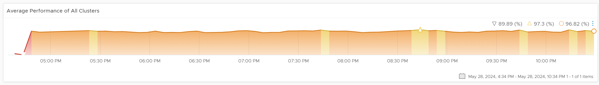
The number is the average of all clusters. If you have 10K VM, this is the average of 40K metrics as each VM has 4 (CPU, memory, disk, network). As a result, it takes a serious degradation to bring this number down. This number should match your business cycle if your environment is mostly virtualized.
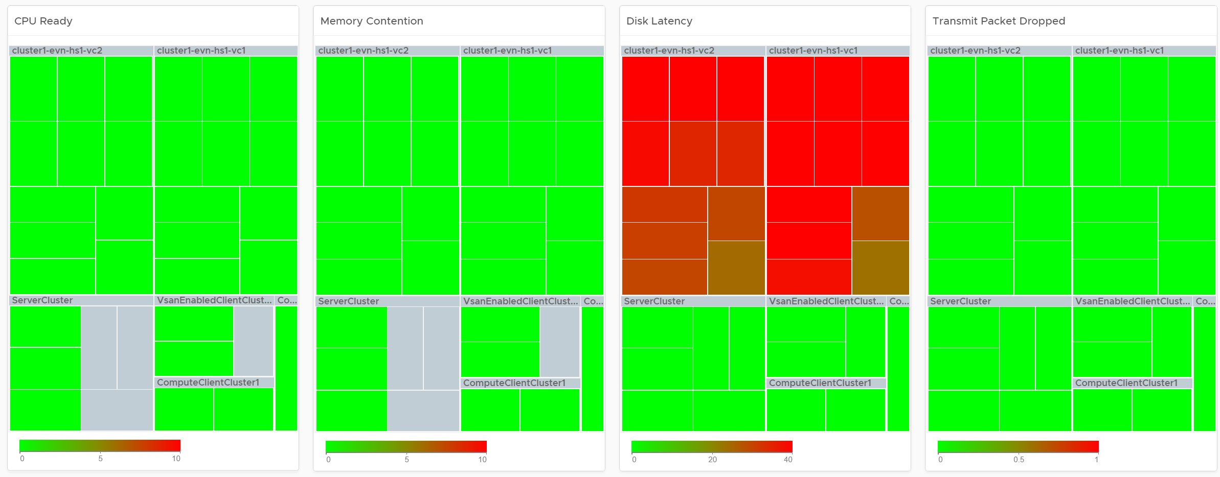
Look at the 4 heat maps and see if there is any color other than green. Since you have HA in the cluster, where at least 1 host can go down without impacting performance, that means no hosts should be running hot when there is no HA.
-
While each box is an ESXi, the counter is coming from all the VM in the host. It’s not taking ESXi level counter at all. The metrics used are % VMs facing CPU Ready, % VMs facing CPU Co-stop, % VMs facing RAM Contention.
-
The color is by percentage of VMs not being served well. We are not using Max among the VM as it's too extreme, placing too much focus on a single VM. On the other hand, we're not doing ESXi wide average, as that will be too late.
-
Green indicates that almost 100% of the VMs are getting the CPU and memory they are asking. The threshold is set such that if 10% of the VM population is not getting the resources they are asking, the heat map will turn full red.
-
Red indicates an early warning. Stringent thresholds are used to enable proactive attention & remediation operations. Because high standard is applied, it is possible that the heat map is showing red, but there is no complaint from VM owner yet.
-
Light grey likely means there is no VM running on the host, hence the metric is not computing.
Check if there is imbalance.
-
There are 2 types of imbalances: cluster imbalance and resource type imbalance
-
The ESXi hosts are grouped together by the cluster, so imbalance within a cluster can be seen easily. Cluster imbalance is a real possibility that is best monitored and not just assumed.
-
If the 4 heat maps are quite different, there is resource imbalance. For example, if the memory contention is mostly red, but the 2 CPU heat maps are green, that means you have imbalance between memory and CPU.
-
If a single ESXi host is displaying a different color across 3 heat maps, it indicates imbalance in the host.
Interactive Section
For NOC Operator, drill down by selecting one of the ESXi on the heat map.
Memory Consumed is used, and not Guest OS metrics, as it better represents the footprint on the VM.
CPU Usage is shown, and not CPU Net Run, as it better represents the footprint on the VM.
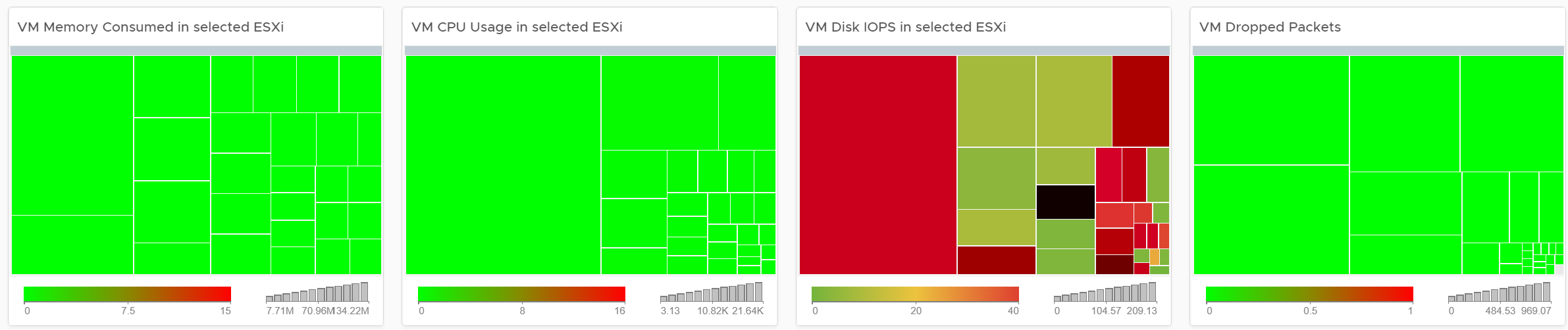
The “Trends of selected ESXi Host” will automatically show the performance metrics
It’s showing from all 3 heat maps, so you can correlate. To hide any metric, simply click on its name on the legend.
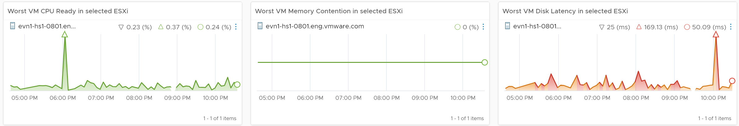
Live! Cluster Utilization
Use it to view the clusters and ESXi hosts within those clusters that are working excessively and are close to their physical limit. This dashboard displays ESXi hosts which have CPU or Memory saturation, and which can lead to performance issues for the VMs running on the host.
2 metrics for Memory are used as Consumed metric alone is not enough. It could be mostly cache or historical data. Balloon also persist (past data), but at least it gives an insight of ESXi under memory pressure.
The dashboard help answer the following questions:
-
Is the IaaS running very high utilization right now? If yes, which cluster? Within the cluster, which ESXi?
-
Do we size ESXi correctly, meaning balanced usage of CPU and Memory?
-
Are the clusters balanced? Are load distributed equally among member ESXi hosts?
-
Is all ESXi contributing? Light grey box indicates that the host is part of the cluster but there is no utilization. It is likely the host is in maintenance mode or is powered off.
How to Use
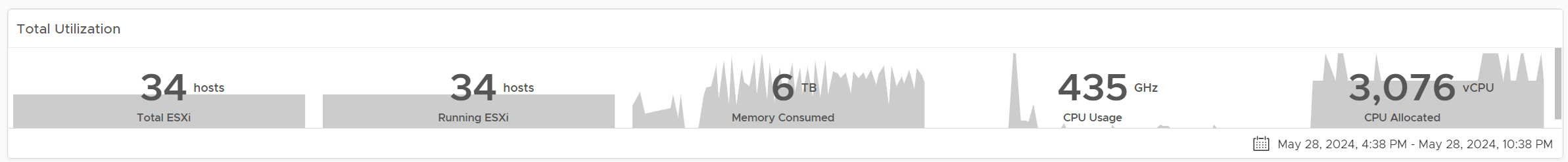
Unlike the heat maps in the Live! Cluster Performance dashboard, the 4 heat maps in this dashboard has a different scale, reflecting the different nature of the metrics.
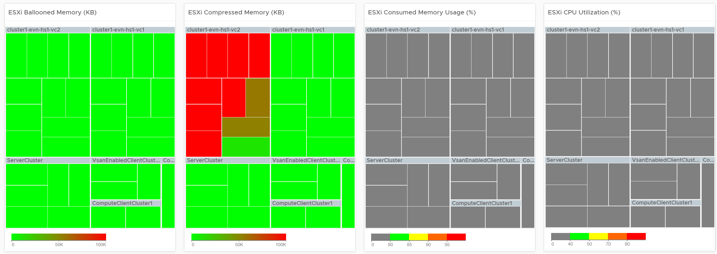
Logically, memory is a form of storage. It acts as a cache to disk as it’s much faster. Hence a high utilization is better, as that means more data is being cached. The ideal situation is when ESXi Consumed metric is red but ESXi Ballooned metric is green. When Ballooned is red and Consumed is grey, it means it was likely high in the past but not anymore. The reason the ballooned stays red because the ballooned pages were never requested back.
Ballooned memory counter was chosen over the swapped or compressed memory metrics as it’s a better leading indicator. Because all 3 can co-exist at the same time, all 3 are shown in the line chart. Ballooned is shown in absolute amount and not percentage, as the higher the size the higher the chance it might impact a VM. If you feel using percentage is easier for your operations, create a super metric to translates the value.
Interactive Section
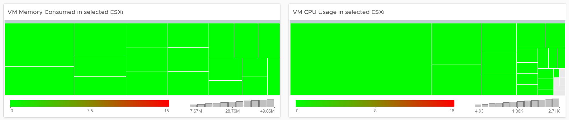
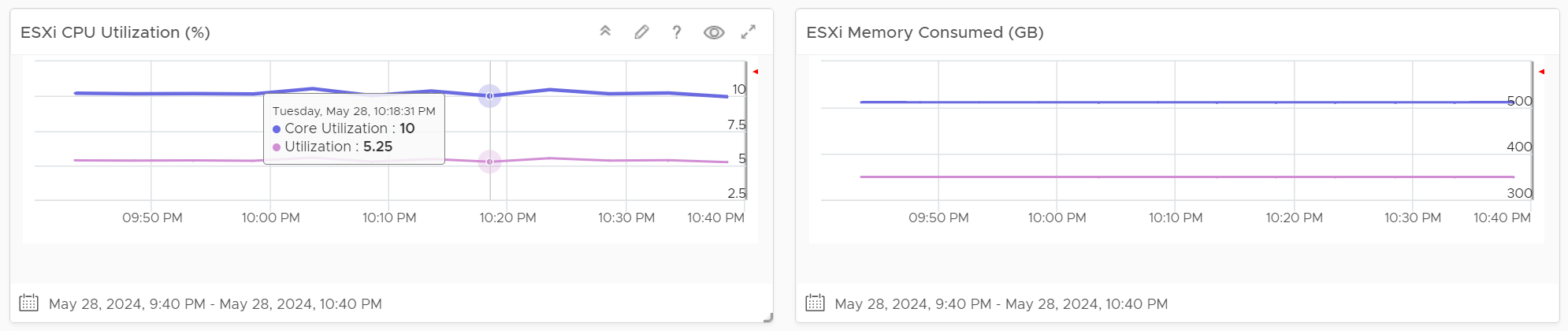
Quiz Time: why is the heat map showing grey and light grey?
The heat map is showing dark grey and light grey to convey wastage and data error, respectively. While the use case is performance, there is a need to educate that oversized VM cause performance issue.
Points to Note
If you have the screen real estate:
-
Add a Heat Map for Disk Latency. Use the counter “Percentage of Consumers facing Disk Latency (%)”. It is part of datastore object, not cluster, as a VM in a cluster can have disks across multiple datastores. Organize this storage performance by data center and not by cluster.
-
Add trend chart of Disk Throughput and Network Packet/second.
-
If your network is highly utilized, add a Heat Map to check the ESXi physical NIC Network Throughput.
Storage Team
Ask any Storage Team and Platform Team whether the collaboration between them can be improved by a mile, and you are likely to get a nod. One reason for this issue is there is lack of common visibility. You need to see the same thing if you want to collaborate. Storage Team do not get always get access vSphere. Even if they do, vCenter UI is not designed for Storage team. It is designed for VMware Admin.
VCF Operations and Log Insight can bridge that providing a set of read-only, purpose-built dashboards, that answer common questions such as:
-
When a VM Owner complains, can we agree if it’s a storage issue within 1 minute? This will help reducing the ping pong game between VM Owner, vSphere Admin, and Storage Admin.
-
Is the Storage serving all the VMs well? If not, who are affected, when and how bad? Read or Write? The answer has to be tier based, as Tier 1 VM expects lower latency than Tier 3.
-
What’s the total demand hitting the array? Are they growing fast and becoming a risk? Who are the heavy hitters among the VMs?
-
When & where are we running out of capacity? How much disk space can be reclaimed? From which VMs?
-
What have we got? Are they consistently configured?
The questions above cover the main areas of SDDC Operations, such as performance, capacity, configuration and availability. They enable joint troubleshooting, capacity planning, performance monitoring. For better collaboration, add physical array monitoring into VCF Operations and Log Insight, so you can analyze physical arrays and fabrics, and then correlate back with vSphere.
The dashboards should provide overall visibility to Storage team. They give insight into the SDDC by showing relevant objects by:
-
quickly showing the summary of key information.
-
showing VM, datastore, datastore clusters, compute cluster, and data center. It shows their relationship, which you can interact and drill down.
-
showing all the VMs, where they are located, how much space they are allocated, and how they are using it.
-
Showing physical arrays inventory and how they map into vSphere.
Storage Heavy Hitters
Interpreting IOPs and throughput metrics depends on your underlying physical storage capability. For visibility into this hardware layer, add physical storage arrays and physical network switches metrics to the dashboard.
See the Network Top Talkers dashboard as they basically have the same design. The main difference is we show IOPS and throughput. They are related, so use both to gain insight, they should display a similar pattern. If not, that indicates varying block sizes. For example, a throughput spike without an accompanying IOPs spike indicates large block sizes.
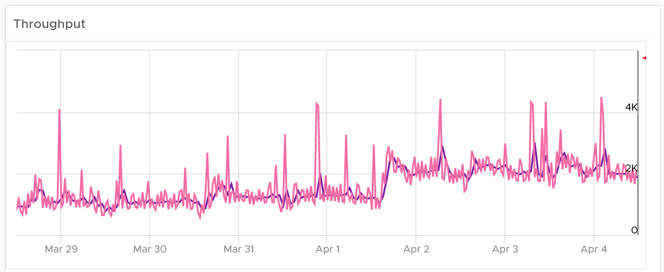
About the “Which VMs hit storage the hardest” table
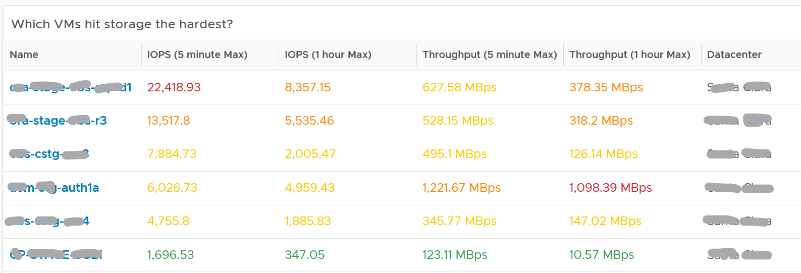
The table shows the most demanding VM. You can identify the villain VM and compare their demands with the capabilities of the underlying IaaS. Knowing the infrastructure capability is important, because different class of SSD have different IOPS and throughput capabilities.
After identifying the villain VM, talk to the VM owners if the numbers are excessive during peak hours and identify the reasons behind the excessive usage. You must ensure that they do not create a hot spot, for example, vSAN cluster with >100 disk can handle numerous IOPS but if the VM objects are only on a few disks, those disks can become a hot spot.
Network Team
Similar to the problem face between Storage Team and Platform Team, VMware Admin needs to reach out to Network Team. A set of purpose-built dashboards will enable both teams to look at issue from the same point of view.
The network covers both the physical and virtual environment
The dashboards must answer the following basic questions for Network Team:
-
What have I got?
-
This
-
What is the virtual network configuration? What are the networks, and how big are they?
-
We have NSX, Distributed Virtual Switches, Distributed Port Group, Data center, Cluster, ESXi, etc. How are they related? Distributed Switch does not span beyond vSphere Data Center. So data center is a logical choice to start analysing the relationship.
-
Who are the consumers of my network? Where are they located?
-
-
Are they healthy?
-
Do we have any errors in our networks? Which port groups see packets dropped? If there is problem, which VMs or ESXi, are affected?
-
Do we have too many special packets? Broadcast, multicast and unknown packets. Who generates them and when?
-
The two primary metrics are bandwidth and latency. Bruce Davie explains both in this book11, specifically this page, that the two metrics work together. The reason is some applications are latency sensitive, while others are bandwidth hungry.
-
-
Are they optimized?
- Just because something is healthy does not mean they are optimized. Look for opportunity to right size.
Once Network Admin know what they are facing, they are in better position to analyze:
-
Performance
- When VM Owner thinks Network is the culprit, can both Network Team and Platform verify that quickly?
-
Configuration
-
Is the configuration consistent across objects of the same kind? Do they follow best practice?
-
What are the virtual networks, and how do they map into the physical top-of-rack switches?
-
-
Capacity
-
Is any VM or ESXi near its peak in network? Which VXLAN is the busiest? Does it match their expectation?
-
Who are the top consumers for each physical data center? What’s their workload pattern?
-
How is the workload distributed in this shared environment?
-
Which networks are not being used? Why? Could we decommission them as they could become security risk?
-
Network Top Talkers
Use the Network Top Talkers dashboard to monitor network demand in your IaaS. In a shared environment, a few VMs generating excessive activity can impact the entire data center. While a single VM might not cause a serious problem, a few of them can. Understanding high demand helps you monitor IaaS and allows you to plan capacity.
Network throughput, disk throughput, and disk IOPS can spike as their physical limit is generally very high per VM. This means that IaaS has enough capacity for all workloads and performs well until VMs start consuming abnormally high amounts of network and disk bandwidth.
The dashboard shows the big picture, while allowing you to see the individual VM. It is important to see the VM utilization in the larger context.
The dashboard begins by showing the current workload. This is the total network load (received and transmit) from all vSphere environments monitored by VCF Operations. The idea is to give you an indicator on how hard the overall load is.
Select a data center from the data centers list.
-
The columns show the number of clusters, ESXi Hosts and VM for each Data center. The VM count includes powered off VM. If you need to show only the running VM count, edit the widget.
-
If you want to see from all Data center, select the vSphere World row.
-
Upon selection, the Total Demand line chart and the Top Talkers table will be automatically filled up.
About the Total Demand line chart:
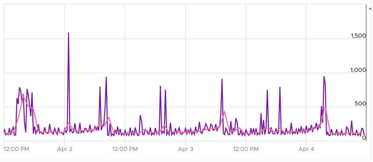
This shows the total throughput (received and transmit) in the selected data center.
It shows both the 5-minute peak and the hourly average into 1 line chart. You would expect that the 5-minute peak is much higher than the hourly average, indicating it is just a short burst. You can click on the metric name to hide the corresponding line chart.
About the Top Talkers table:
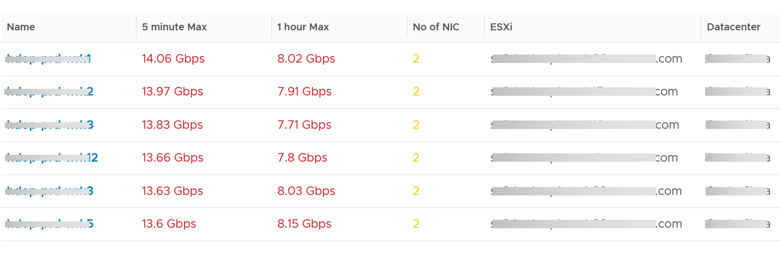
The table shows the most demanding VM. To help you focus on the VMs that hit the network hard, VMs that are not hitting the network hard are filtered out. The threshold used is 1 Megabyte/second sustained in the last collection cycle. You can change the filter to average of all time if that makes more sense to you.
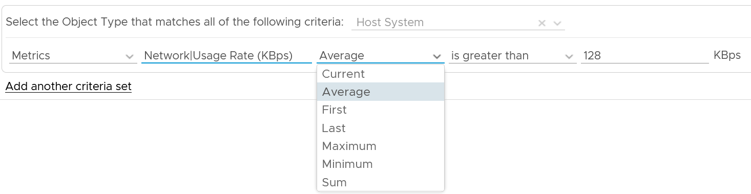
You can identify the villain VM and compare their demands with the capabilities of the underlying IaaS. Knowing the infrastructure capability is important so you know the absolute limit.
After identifying the villain VM, talk to the VM owners if the numbers are excessive during peak hours and identify the reasons behind the excessive usage. You must ensure that they do not create a hot spot, for example, vSAN cluster with >100 disk can handle numerous IOPS but if the VM objects are only on a few disks, those disks can become a hot spot.
Migration Team
Workload migration from one infrastructure to another need to be tracked and monitored.
| Migration Sign Off | Purpose is to get a sign off from VM Owner. |
|----|----|
| Migration Tracking | Purpose is to show overall progress of a long migration project to senior IT leaders |
Migration Sign Off
Since we do not know which VMs are being migrated, we need to use VCF Operations group. Since the dashboard needs to know the group ID, I need to create the group in advance. You have to import the group, and not create your own. If you do, then you need to modify the dashboard to use yours.
Migration Groups
The purpose of the groups is to get a sign off from VM Owner, preferably a bulk sign off if you’re migrating a large number of VMs in one migration window.
Create 1 group for each batch. Batch means VMs that will be migrated together. Ideally they are from the same owner or they have high dependency.
Create the group as early as possible. In this way, you get the longest historical data. This can be useful if there are many VMs with monthly or quarterly workload.
Make sure the group members do not change when comparing Before and After, as it makes comparison invalid. This includes any configuration change at both application and infrastructure level. For example, if after migration the workload increases due to whatever reason, it’s unfair to compare with before migration as it’s no longer apple to apple.
Have a deadline to minimize risk of changes. I recommend 1 week as your migration schedule is probably over the weekend. This enables you to move on and focus on the next batch.
Avoid very large group. Keep it below 100 VM. A large group can mask details. For example, a group of 1000 VM can have 50 VM performing worse. If the remaining VMs are performing better, the average number may not reveal that.
The group KPI is simply the average of its VM KPIs. Expect this to remain good or improve post migration.
The following screenshot shows the group. Notice the Group Type is Location. That’s the object type used in the super metric.
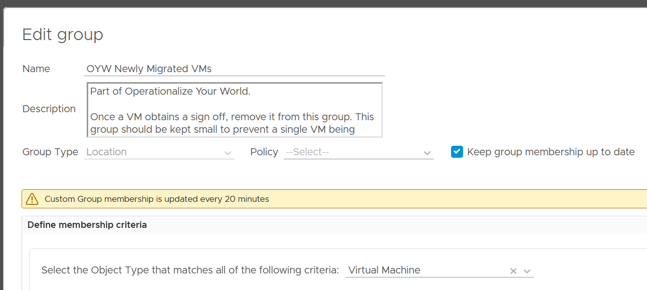
The group needs to have super metrics to summarize the overall performance.
The following screenshot shows the 2 super metrics used.
-
The super metric “Migration Group Performance” is simply the average of the “VM Migration KPI”. Average is a suitable function as it represents all the members VM in the group.
-
The super metric “VM Migration KPI” takes a subset of the VM KPI metrics. It excludes the utilization metrics as they can create confusion when comparing before and after.
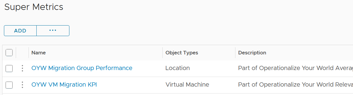
Migration KPI (%)
How do you compare the performance of a VM since there are many metrics? One way is to plot multiple line charts per VM.
This is time consuming since there are at least 9 metrics to check:
-
Guest OS CPU Run Queue
-
Guest OS Disk Queue Length
-
Guest OS RAM page-out rate
-
VM CPU Co-Stop
-
VM CPU Ready
-
VM CPU Overlap
-
VM Memory Contention
-
VM Disk Latency
-
VM Network Dropped Transmitted Packet
Notice the above focuses on contention. No consumption metrics are used as their values are expected to go up.
The group KPI is simply the average of its VM KPIs. Expect this to remain good or improve post migration.
The solution is to create a metric. It’s basically the same KPI used to calculate VM Performance (%) minus the consumption metrics.
To be Migrated VMs
This is an optional group as it does not involve VM Owner.
This group only contains VMs that are scheduled for the next migration window. Do not put VMs that are not going in the next schedule, as their load changes the group value.
If the VMs in the group are going to multiple destination, then you need to create 1 group per destination.
Once a VM is migrated, remove it from this group.
Summary Section
The dashboard section starts with a list of all the migration VM groups.
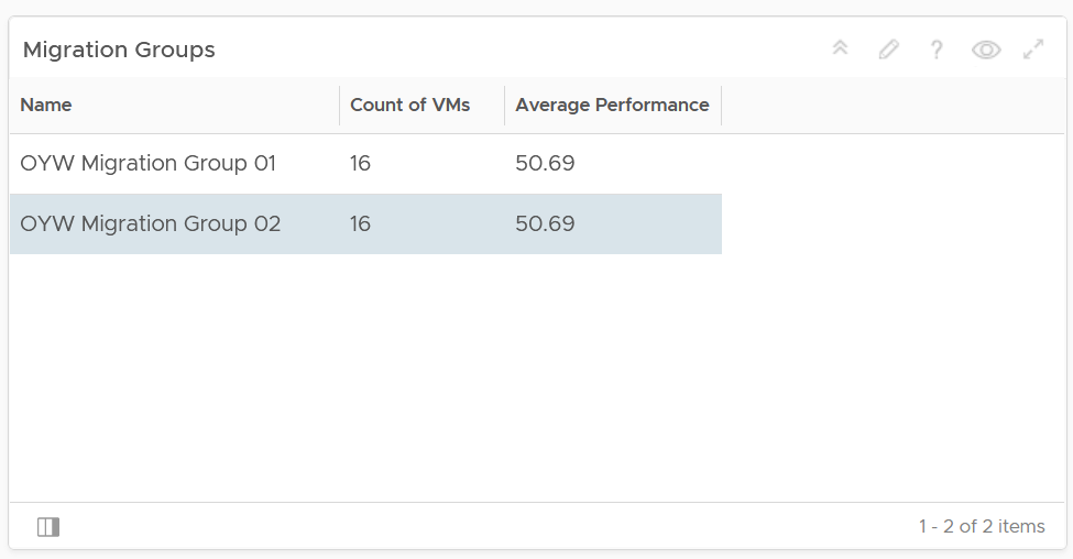
To see a group details, select the row. All the other widgets will be automatically refreshed.
The first thing to check is the health chart. As we need something to show over time that the migration is successful, we pick a color coded chart. The chart shows the average performance of all VMs in the group. You should expect the value to be same or better after migration.
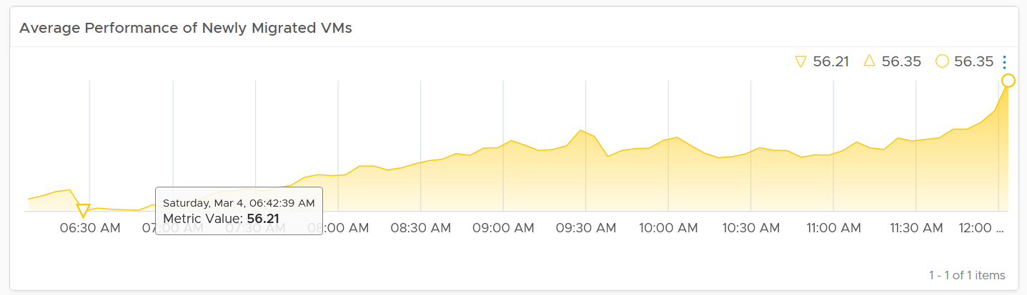
In migration, you want to have visibility into the application of services. I added a bar chart to show the services discovered by the Service Discovery adapter.
Ideally, install Telegraf agent so you have process-level metrics.
Detail Section
We need to use 2 separate tables due to limitation. You need to set the 2 dates manually as different migration groups have different migration dates.
The tables list all the VMs in the selected migration group, along with their relevant contention metrics, consumption metrics and business context.
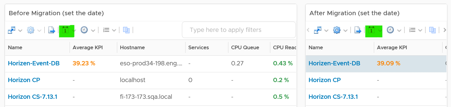
CPU Ready, CPU Co-Stop and Memory Contention should go down, unless the numbers are already very good to begin with. The numbers are taken at 20-second average, so they report much higher number than the 5-minute average. Any numbers less than 2% is not something to worry about. Disk Latency and Disk Queue should remain low even with more IOPS, assuming the new DC has much better storage subsystem. CPU Context Switch could go up if the CPU Usage goes up, as there are more threads or execution to be done. CPU Queue could go up if the CPU Usage goes up. So long the value is less than 3 per vCPU, there is no need to add more vCPU | 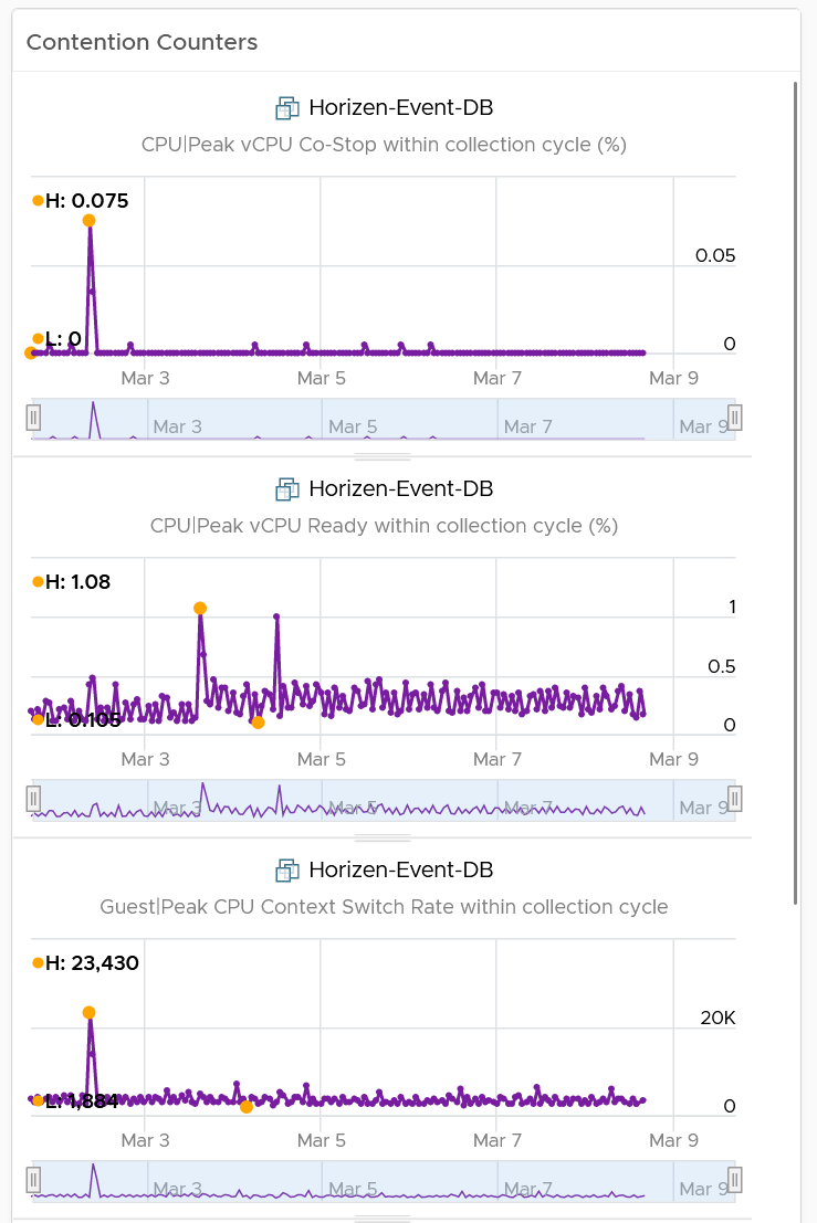 |
|---|---|
I added a set of consumption metrics as we expect the consumption to go up. For CPU, we need to use GHz and not percentage as the 2 data centers could use a different CPU speed. CPU Usage could be tricky to compare if the new data center uses a different CPU architecture, meaning 1 GHz in the old DC does not equate to same amount of CPU processing with 1 GHz in the new DC. For memory, we have to use the one inside Guest OS. The counter at VM level is not relevant. For details, refer to the memory chapter. For disk, we use both IOPS and throughput. For network, we use network throughput. You can add packets per second if you think the behaviour changes. | 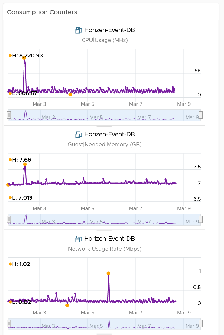 |
Migration Tracking
The dashboard should compare both data centers. The layout should be 2 equal columns (Old DC and New DC). This is relevant in the case of 1:1 migration and a huge chunk of the VMs in the old DC are being migrated. If the old DC will continue having new VMs, then the comparison will be invalid.
The first row shows a summary
-
Number of running VM. This shows you the overall progress. You expect the number on the old DC to go down over time. I exclude powered off VMs as you may not be keen on migrating them.
-
Overall CPU Utilization. You should expect the number in the new DC to go up while the number in the old DC to go down
-
Overall Memory Utilization
-
Overall Disk IOPS
-
Overall Disk Throughput
-
Overall Network Throughput
-
Overall Network Packets/second.
The second row shows the list of clusters
- If you select a cluster, you can drill down into its performance and capacity.
The third row shows the list of VMs
- If you select a VM, you can drill down into its performance and capacity.
The fourth row shows the list of datastores
- If you select a datastore, you can drill down into its performance and capacity.
The following table shows a sample design of a comparison dashboard. It has two identical columns, allowing you to do show before vs after comparison.
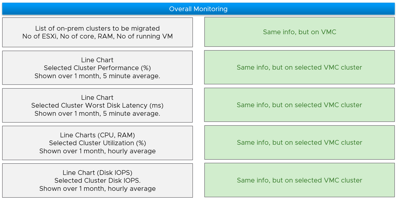
Logs Analyzis
Part 2 Chapter 9
Having said that, >99% of the logs are not useful, especially after a couple of days. So how do you minimize the cost while maximizing the benefit?
vSphere
Log Insight provides the ability to slice and dice vCenter events, tasks and alarms. This can be handy in audit investigation.
vCenter Events Analyzis
To see all the vCenter events, all we need is to select a built-in variable called VC Event Type. A log entry that has this field exist will appear.
From the following chart, we can see there are steady stream of events every 10 minutes. You can change the data granularity.
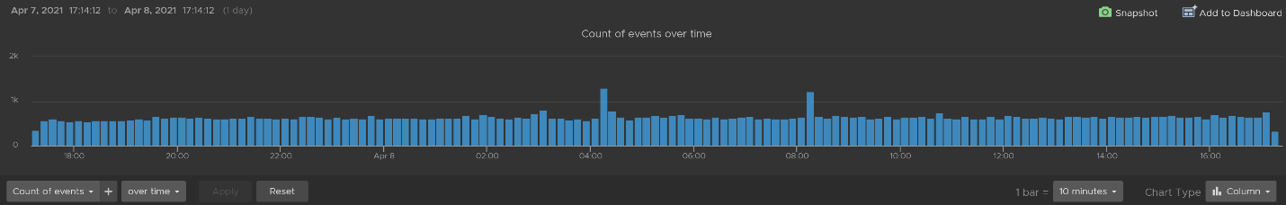
We can see actual event names by changing into a table. We can sort it to show the top events if required.
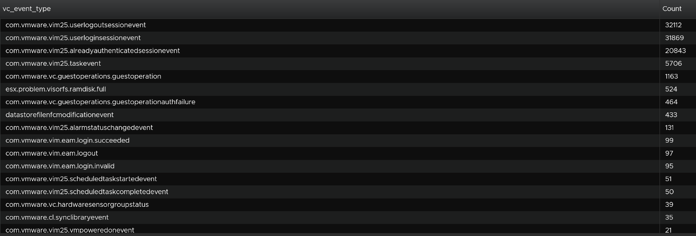
We are interested in events impacting our consumer (VMs), so let’s filter it out. The filter is vim25.vm* as that is what vCenter shows in its log as we can see from the above table. I did not know that vCenter uses vim25.vm*, but looking at the table above I could make an educated guess.
Once the above filter is set, I rerun the search and get all events impacting VM.
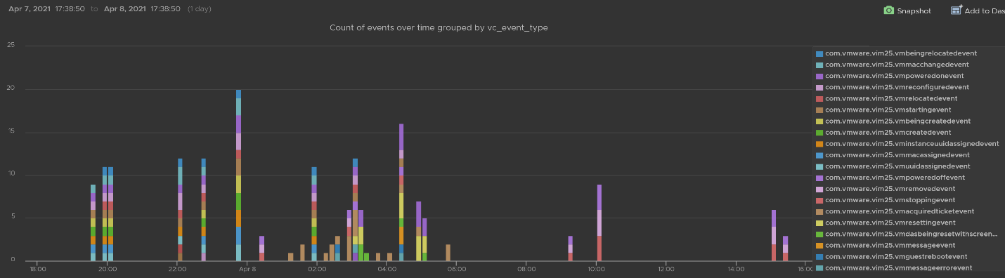
Let’s zoom into one of the events. Let’s say we’re interested in VM configuration event and want to know what exactly was changed. So let’s zoom into that event and group it by the user who changed it. We get the following chart, showing the user in the legend.
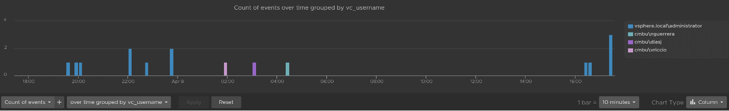
You can group the data by VM name to see which VM were changed when. I’ve cropped the VM name in the legend.
You can see the result in tabular format. You have the VM name, user name and additional context such as the parent ESXi host at the time of the change.
Last but not least, you can see the actual change, as highlighted in green.
vCenter Tasks Analyzis
To see all the vCenter Tasks, all we need is to select a built-in variable called VC Task Type. A log entry that has this field exist will appear.
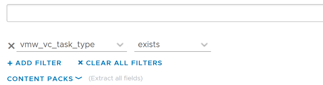
We can see that there is a regular stream of events throughout the day. The pattern looks normal.
Let’s show the top tasks by showing the result in table format.
To zoom into any of the tasks, we specify the task name. I only specify one below, but it can take multiple.
Using the above, and limiting the result to a narrower time window, we can zoom into the nearest minute.
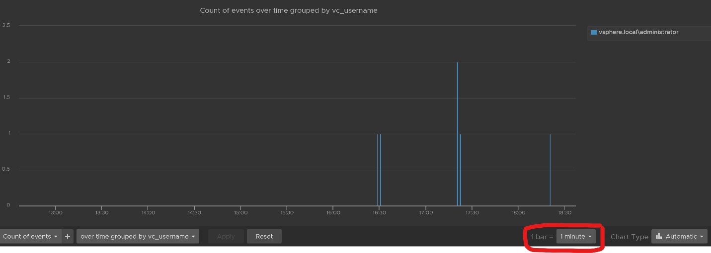
Snapshot Analyzis
You can visually see all the snapshot operations with a single filter vmw_esxi_snapshot_operation. Just use the exist operator.
Group the data by the operations and you will get something like this. I can see there are 3 snapshots created but only two were removed. So one of the VM still has a snapshot.
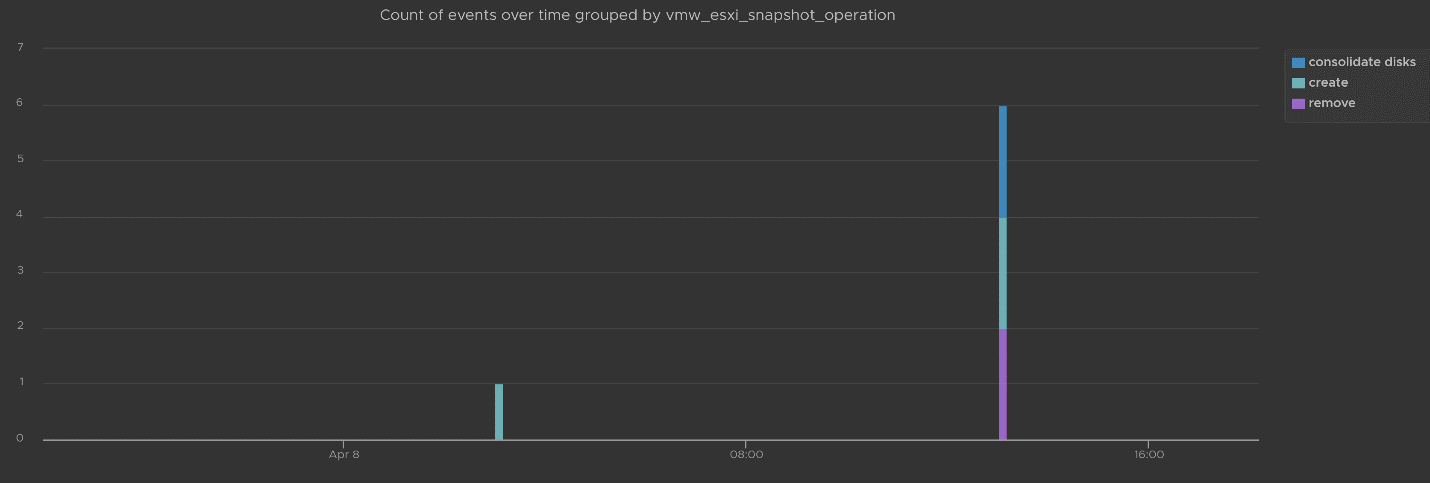
The above shows the time too. In production, you should not take snapshot during busy hours, especially on mission critical VM. So if you run the query in the last 1 week, you should expect no data during the busy hours, and all the daily back up should appear within the backup window.
You can see the details such as the VM name and other context, so see which VM did not have its snapshot removed.
You can check the snapshot name (partially masked out in grey) and whether the snapshot include memory.

Template Analyzis
How do you prove to auditor that your VM templates have not been modified by unauthorised person. If a template has been modified, you want to know who did it.
The good thing is there are only a few things you can change to a template. You can rename the template, change the permission, and convert it into a VM. All other changes require the template to be converted into a VM first. That means we can focus on this conversion.
The vCenter logs the entry as “mark virtual machine as template” when you convert a VM into a template. When it is converted back to, it writes “mark as virtual machine”. So it’s a matter of tracking these 2 entries.
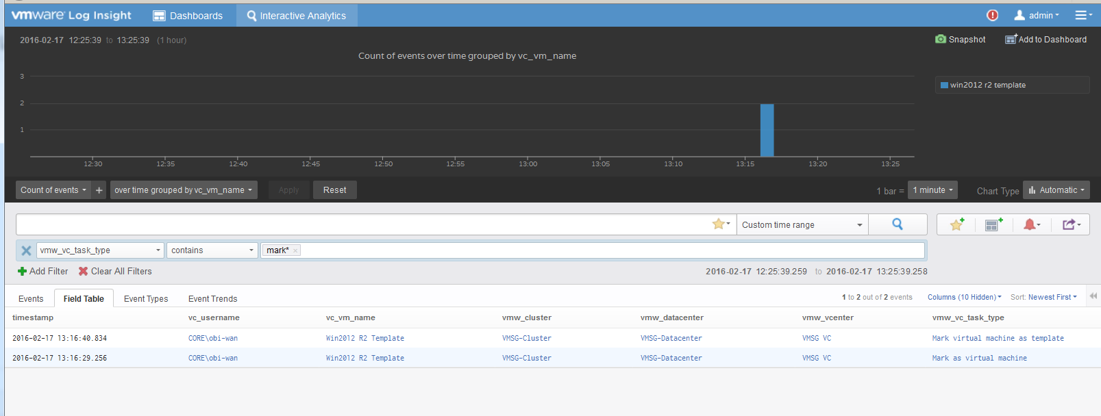
vSphere Health
In general, you know that you did a good job with your vSphere IaaS as the VM owners are happy with the performance of their VMs. The business is powered by the VMware infrastructure that you design and operate. However, there is a chance that the vSphere, NSX, vSAN logs bear evidence of hidden issues which are not visible from the UI.
As VMware professionals, we know vSphere well and probably have years of experience working with vSphere. We can architect, design, implement, upgrade, and troubleshoot it.
The same thing cannot be said about the logs. Generally speaking, deep knowledge of vSphere logs belongs to VMware GSS engineers, as they read logs on a daily basis, and perform all kinds of troubleshooting activities. That knowledge has been transitioned to Log Insight release after release in the form of a vSphere content pack.
One common question I get from customers is how to prove that there is not hidden warning lurking around in the log files. As you know, vSphere produces a lot of logs.
Your first stop should be the General Problems dashboard in Log Insight. This dashboard checks the health of your vSphere using 8 queries. You expect a flying color, meaning it should be blank like this. That means vSphere has not logged any issues.
BTW, by the default the detail log files of individual VM is not collected. The file vmware.log contains detailed VM activity messages including reconfiguration events, vmotions, VMware tools messages, memory state, power on/off events, features enabled, API requests, etc. It can be used to troubleshoot events leading up to core dumps or kernel panics. For more information, read this blog by Julie Roman.
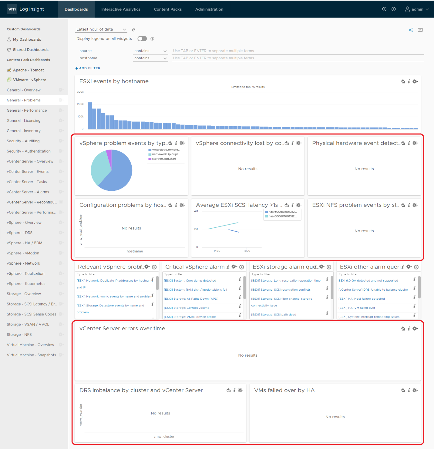
Let’s look at some of the queries that Log Insight runs. The SCSI latency is based on 1 second, which is 1,000,000 microseconds. Here is what the query looks like:
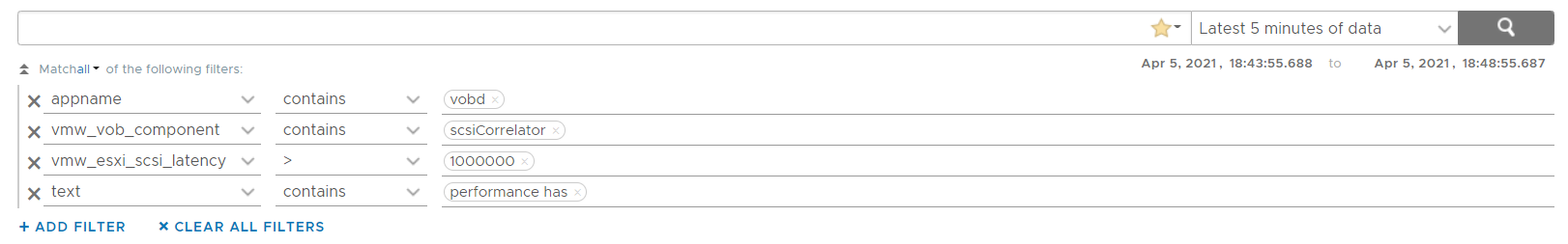
1 second is on the high side; you can change it to a lower number. Do note that this is from VMkernel viewpoint and it’s taking 1 SCSI operation (1 read or 1 write), so the number will be much higher than vCenter average. I’ve seen 12 ms value in vCenter (from the real time chart, so it is a 20 second average) became 600 ms.
The above query is simple, as it’s looking for a specific item. Here is a much broader health check.
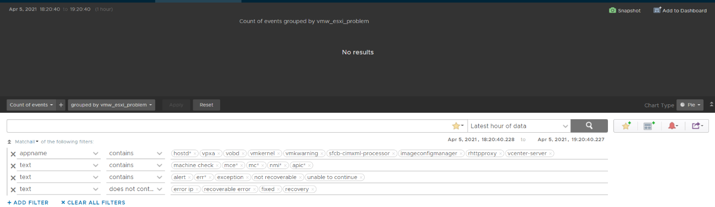
The example below checks for any errors in the vCenter which have not yet been reported as an alarm.
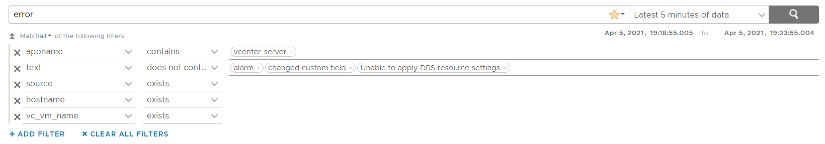
This query below checks for cluster imbalance.

And this query tracks for VM which were rebooted due to HA.

All the above widgets are what you would check out first. You might also want to ensure that there are no errors across major vSphere components.
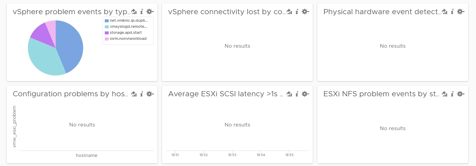
Aria Operations
Log Insight sports out of the box dashboards that visualizes security-related activities in your Aria Operations. It also has a dashboard to help you watch and troubleshoot upgrade.
Authentication Analysis
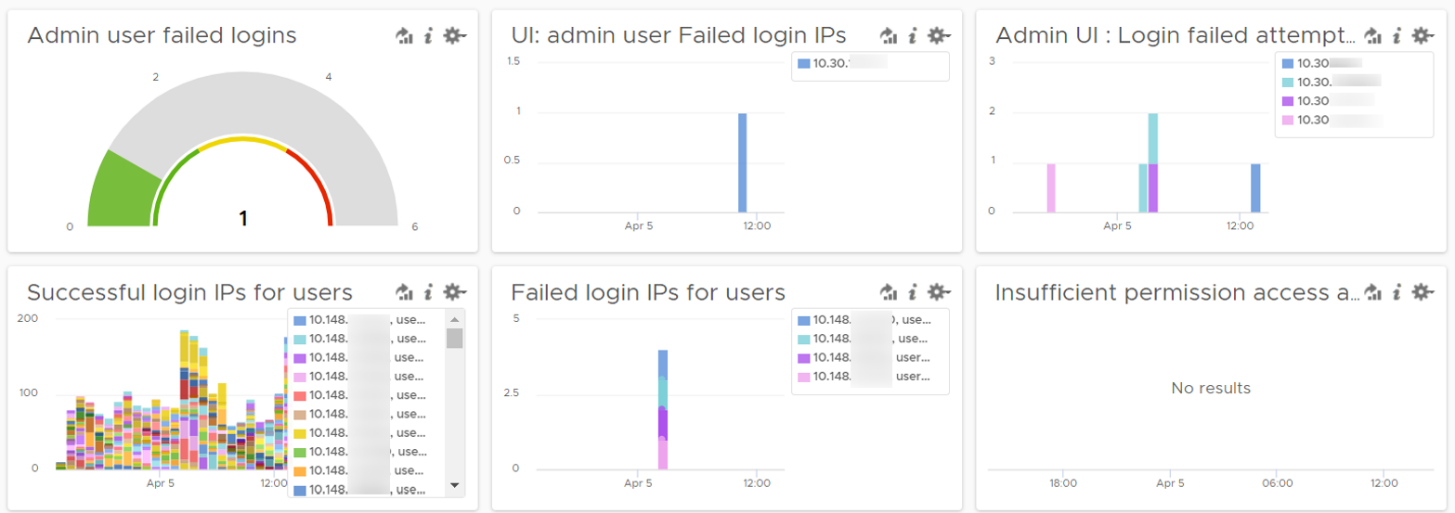
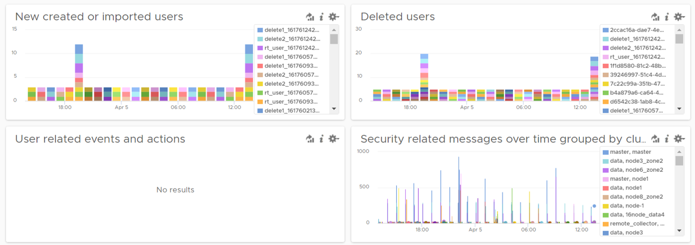
Let’s go through some of its contents in-depth.
There are two privileged login IDs that customers have access that audit requires compliance reporting: root and admin. Other privileged account such as MaintenanceAdmin is not accessible. How many times do admin ID login with the wrong passwords in a specific period? The following chart counts each time a login failure happens.
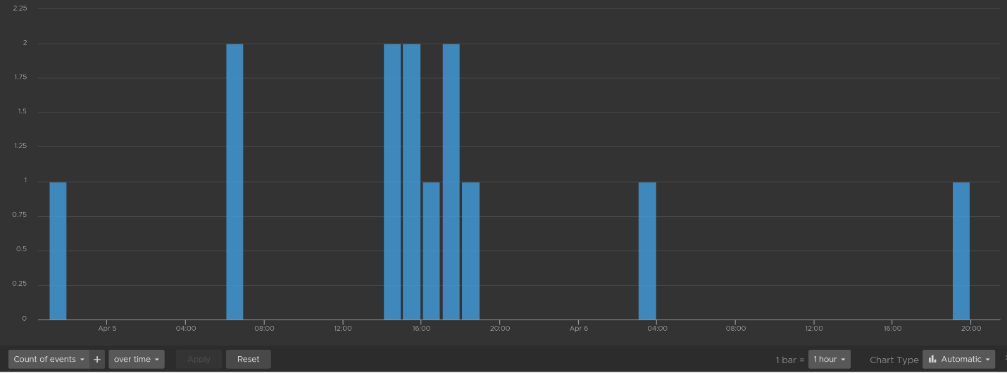
The count is possible because Log Insights create a field out of the log entries. The field is named vmw_vr_ops_admin_attempt and that’s what plotted over time. I’m showing two examples of actual log entries, with value added context by Log Insight.
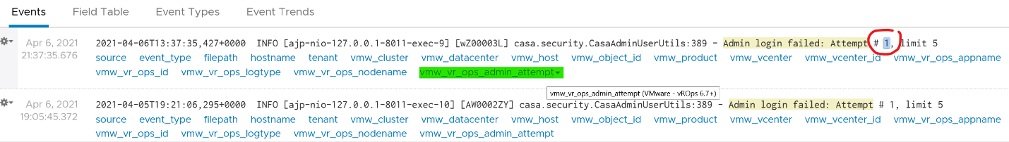
The log entries themselves are in turn filtered using the following query. Log Insight has awareness of Aria Operations via the variable vmw_vr_ops_appname.
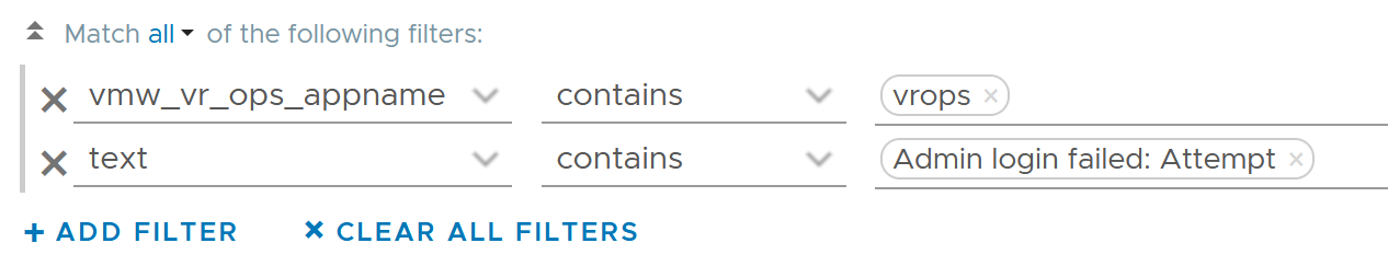
Aria Operations has 2 UI that are accessed via separate URLs. The Admin UI is for platform administration such as upgrading Aria Operations, so it’s important to track login activities. How many failed login attempts made in the Admin UI is also provided out of the box.
We’ve covered admin. How about root? As this is a Linux account as opposed to Aria Operations account, check the Linux content pack. The concept is the same.
What IP address do they login from? This helps you trace the location of the user who used the account. The following chart shows 6 different users and when they log in. We can drill down to any of them to see the exact time and the IP address used.
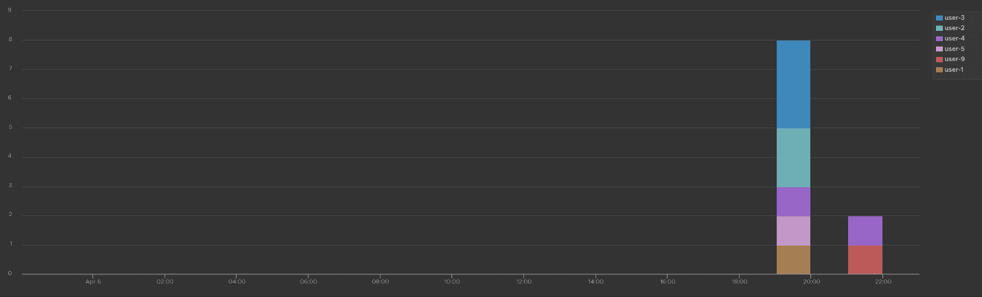
Alternatively, you can present in table format to show the IP address information. If you want the time stamp, use the Field Table feature.
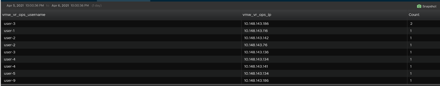
Users addition, especially unexpected ones, can be a cause of security concern. Audit team may ask for the lists of users added in certain period. Users deletion is typically not an audit concern, but could be useful in troubleshooting. You can figure who deleted the user account and when.
The widgets in the third row of the dashboard covers users creation, import and deletion. By now you can guess that we can plot this event over time too. The following shows the list of user accounts that got deleted and when. I cut the full name as that’s part of actual product validation.
The query that produces the above chart is the following. To some extent, it’s actually human-readable!
Insufficient permission access logs events where users tried performing activities that they do not have sufficient privilege. The following shows some example where users were denied access.
If user has the access, you will see something like this

The widget “Security related message” is my personal favourite, as it demonstrate the adhoc troubleshooting ability of Log Insight. The following shows the many security related messages. They are grouped by the Aria Operations nodes, so you can exclude certain types or zoom into a particular type.
How was the above achieved? The following shows the actual query. Log Insight automatically group log entries of similar type and give them a unique event_type. This means you can filter out the types that are not relevant, like what I have done below.
Activity Audit
Use this dashboard to select a user and audit that user’s actions. The type of actions you can audit are
-
Dashboards, Views and Reports. This covers creation, update, deletion, import, schedule (report) and generate (report).
-
Alerts. This covers alert definition, symptom definition, notification rules and recommendation.
-
Environment. This covers Application, Custom Data Center and Custom Group activities
-
Inventory. This covers resource creation, resource deletion, resource changes, collection start, collection stop, maintenance mode start, maintenance mode end.
-
Configuration. This covers changes in global setting, cost settings, credential, collector groups, etc.
The widgets are separated as in the menu of Aria Operations Manager UI, so you can easily to orientate.
Let’s go through some of its contents in-depth.
The query that produces the above chart is the following. I’ve excluded dashboard_add_tab from the category as it dominates the chart.
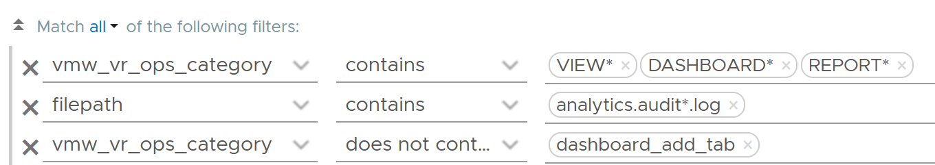
Let’s drill down into a specific task. Let’s say we have some views deleted and we need to know who deleted them and when. For that, we select the view_definition_delete and add it. Log Insight will automatically add the field name and operator. No need to manually type!
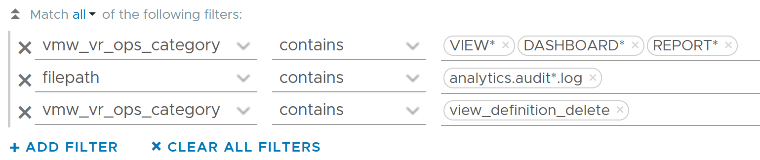
Since we’re down into a single activity, we can now plot the chart over time, grouped by the user. We can see here that the user is the system account maintenanceadmin.
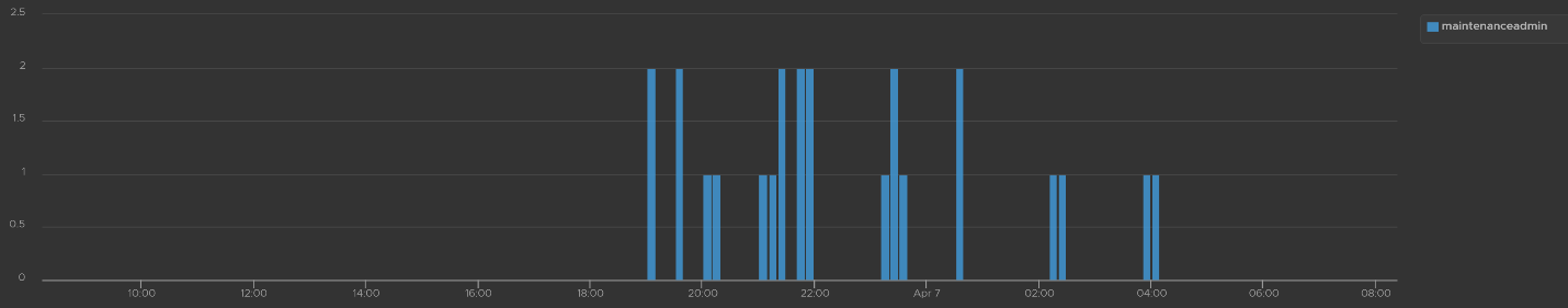
Let’s take another example from the dashboard. This time we will take user management, where you can track things like user deletion, role creation, user password change and many others. The following shows some of those activities.
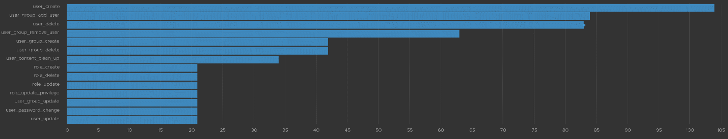
I’ve filtered out user_archive event as its value dominates the chart. As mentioned earlier, no need to manually type. Simply click on one of the log entries, choose a filter from the pop-up menu and that’s it!
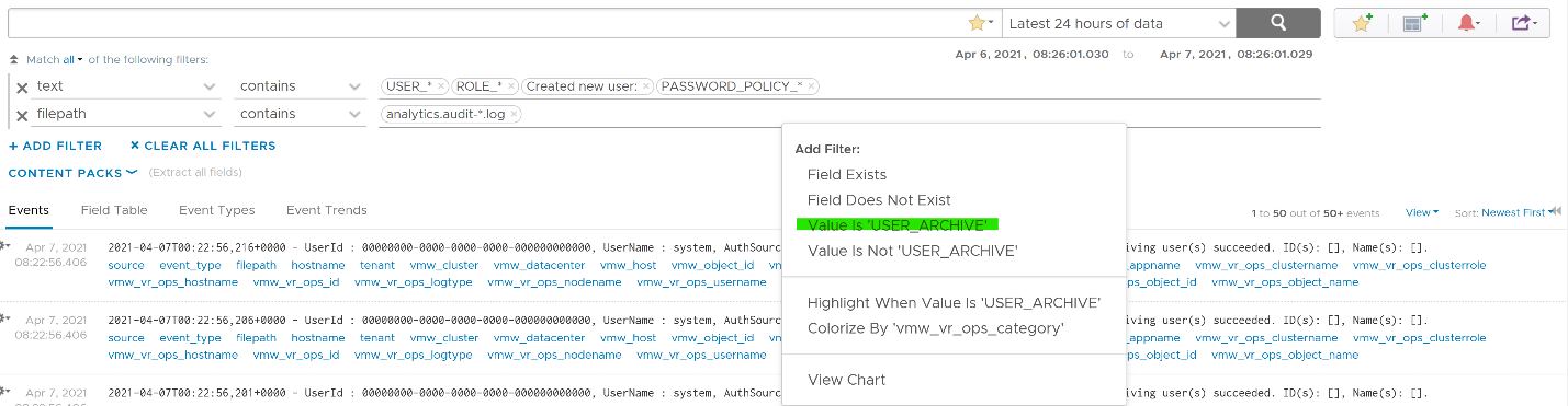
As usual, you can have a table of who did what when.
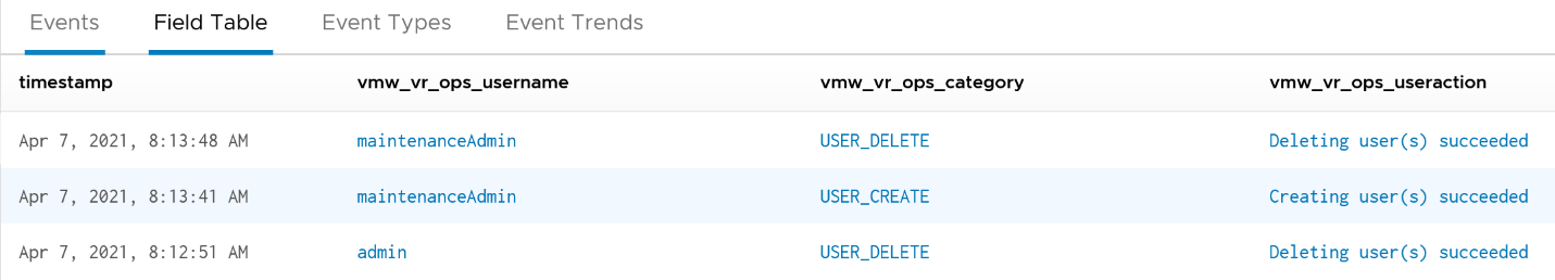
Let’s take one last example. I will take the configuration activity as it shows a range of interesting events. As usual, I started with a bar chart as it lets me see the activity name. We can see that changes in global settings dominate the result.
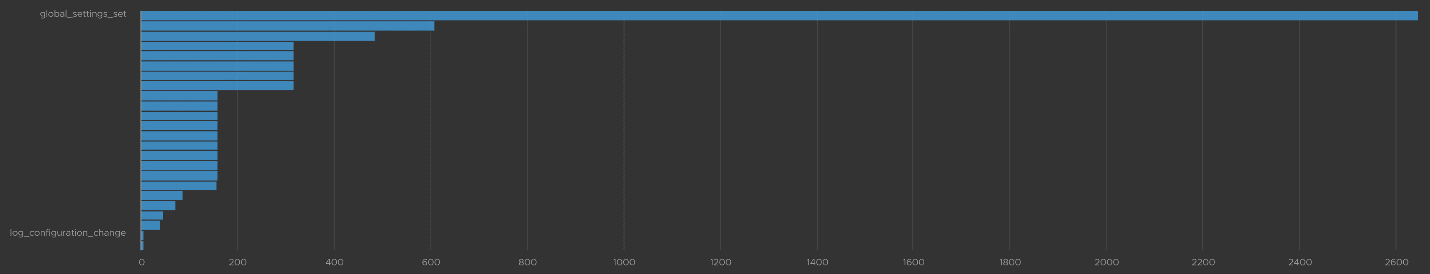
We already know how to filter it, so I’ll show you another way. Go to the Event Types. You’ll see the log entries grouped by type of events. To filter out, simply click on the X icon.
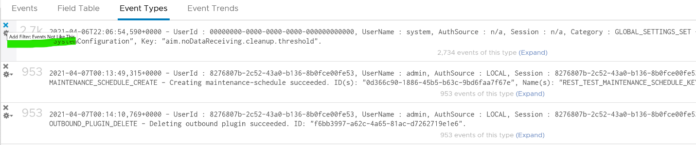
Once filtered out, the following is what I get. Let us know if there are events that you need to be logged that’s not trapped.
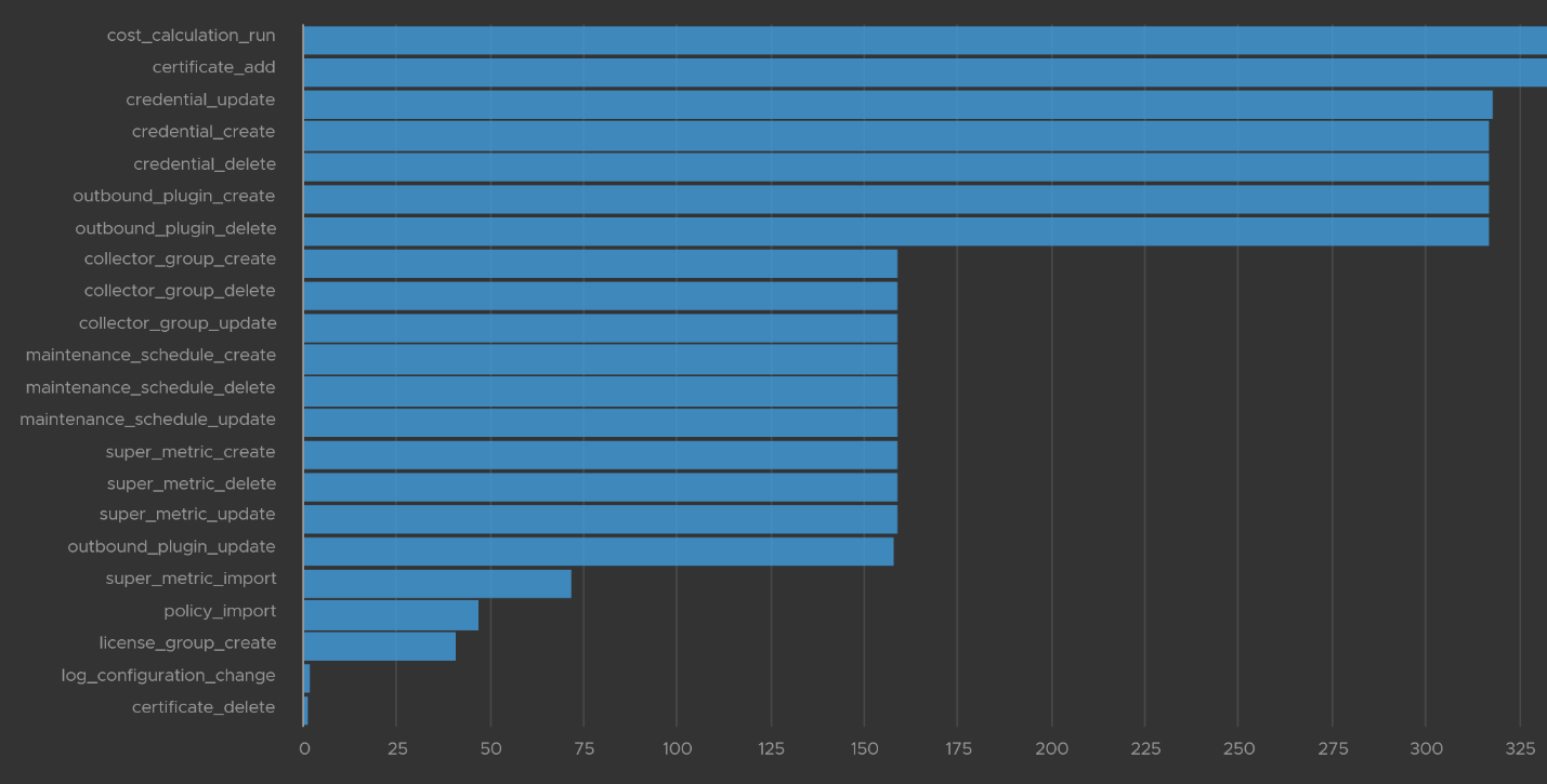
The query to get the above is complex
.*POLICY.*|super_metric_.*|disk_rebalance|collector_group.*|global_settings_set|GLOBAL_SETTINGS_OVERRIDE|dynamic_threshold_.*|license.*|DESCRIBE|CREDENTIAL_.*|CERTIFICATE_.*|MAINTENANCE_SCHEDULE_.*|WLP_.*|SCHEDULE_.*|RIGHTSIZING_.*|RECLAIM.*|OUTBOUND_.*|LOG_CONFIGURATION_.*|COST_.*|REFLIB_UPDATE
Delete Activity Audit
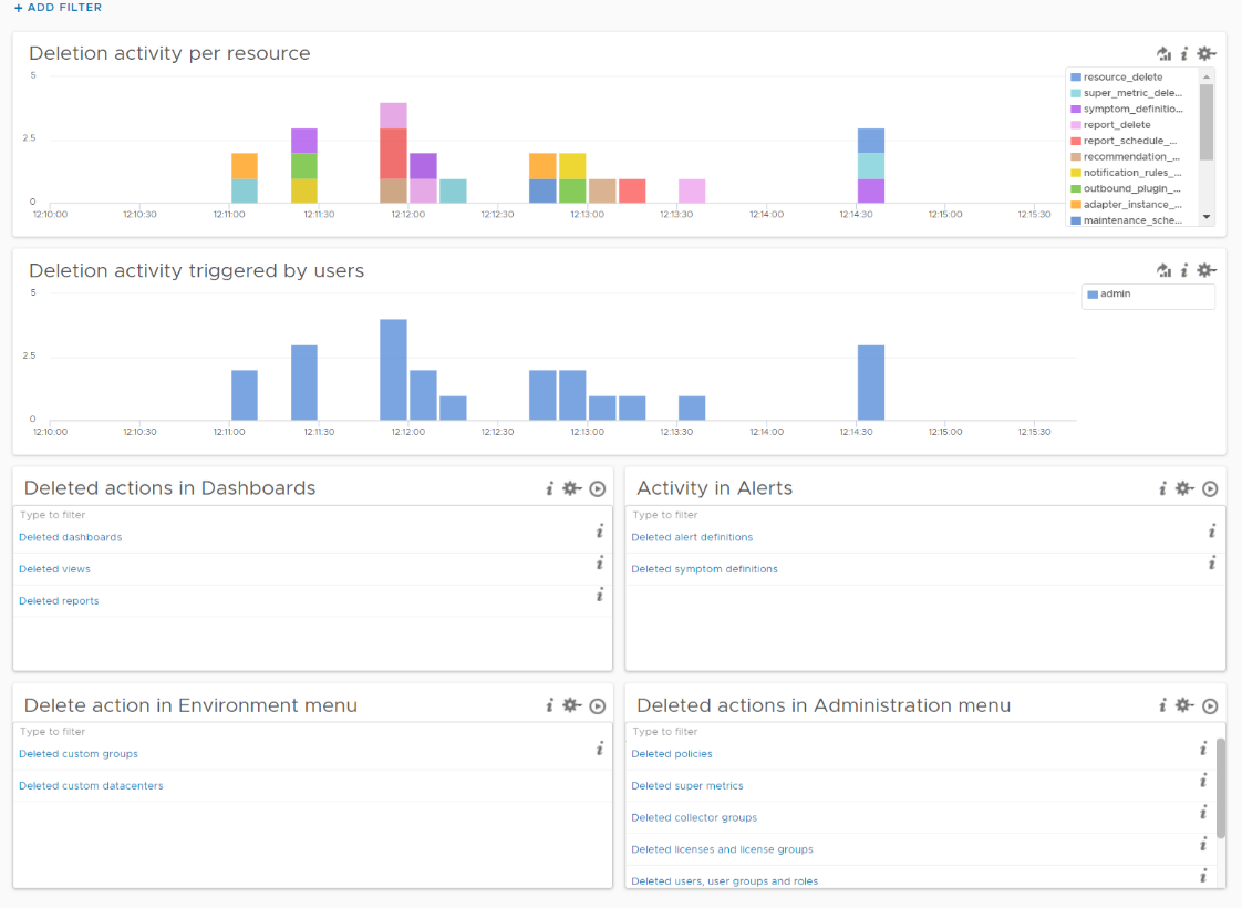
Let’s dive into “Deletion activity per resource” widget by opening it in Interactive Analytics page. You get the same information shown on the widget, but this time you can adjust it. I’ve made each time block to be 10 minute instead of 1 hour so I can see the changes better.
Note that not all activities show the actual resource name being added/modified/deleted. In the following screenshot, I’ve highlighted in green where the affected resource name being shown, and in orange where it is not captured.
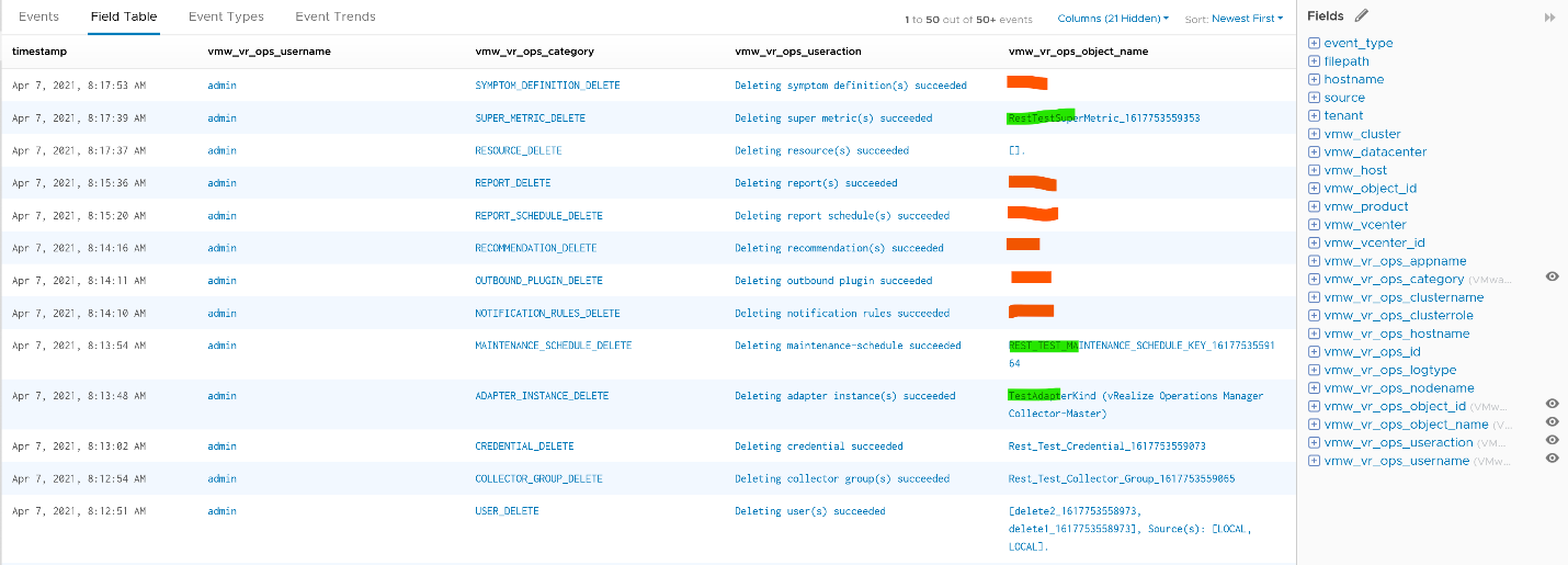
All the columns above are Log Insight field, a type of variable. Each extracted field has its own rules for extraction. Log Insight scans events and extracts fields whenever predefined patterns get matched. Let’s take vmw_vr_ops_username as an example, and shows its extraction formula.
|  |
|  |
|
|----|----|
All the VMware extracted fields are prefixed with vmw_ followed by the product name.
We’re now ready to evaluate the filters used in the preceding chart. It requires three filters working together, meaning they all must be true. It’s an AND operator, not an OR operator.
The first filter uses vmw_vr_ops_category field to filter out the events which were generated as a result to some kind of deletion.
The second filter uses filepath filter, a special system wide filter, to track the name and the path of the file from where events are collected. In Aria Operations, all audit related events are collected from analytics.audit log files.
The last filter uses vmw_vr_ops_username field to exclude logs generated by service and system users. We have to exclude automation admin, maintenance admin, migration admin and system as they are not accessible by users.
Upgrade Monitoring
You can monitor the above stages as they progress via Log Insight. Yup, pretty much like watching a live streaming, as the logs are streamed into the Log Insight dashboard. The dashboard sports 9 widgets arranged in 4 rows.
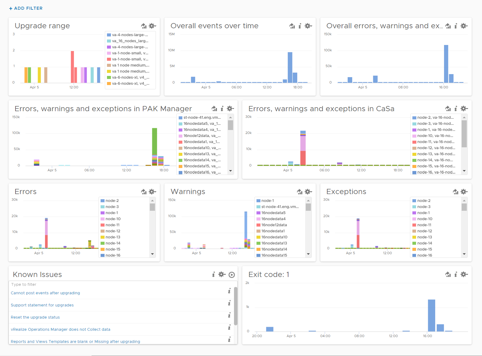
The “Upgrade Range” widget shows when the upgrade started and when it completed. It covers the time range of the upgrade process. If the process was successful, you’ll see two columns, one marking the start and one marking the end, as shown in the following.
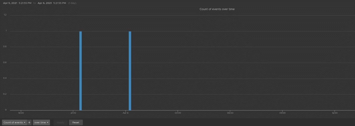
This widget is actually capable of monitoring multiple upgrades running in parallel. You can filter to only show the environment or nodes you are going to monitor by specifying their values in the fields vmw_vr_ops_clustername, vmw_vr_ops_hostname, and vmw_vr_ops_nodename.
The actual query to produce the chart is this.
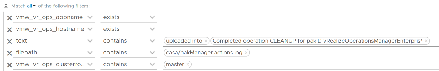
When you see “uploaded into reserved” that means the upgrade process has started. When you see “Completed operation CLEANUP for pakID” that means the upgrade process for that node has been completed successfully. The following shows examples of actual messages you should expect to see.
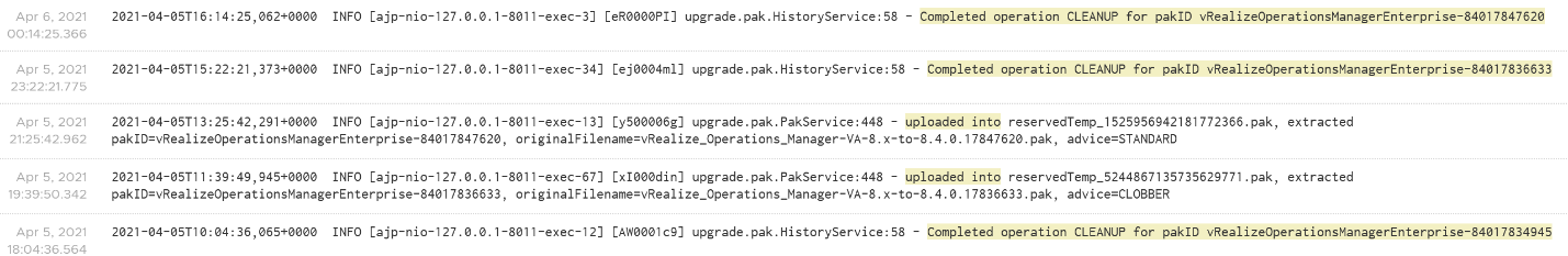
The “Overall events over time” widget is showing the proportion of all logs generated during the upgrade.
The “Overall errors, warnings and exceptions” widget is showing the proportion of all logs with errors, warnings and exceptions generated during the upgrade.
The second row of the dashboard shows 2 widgets. They cover the main two services responsible for upgrade: PAK Manager and CaSa. The widget monitoring errors, warnings and exceptions generated from that services.
The query is as the following:
The third row of the dashboard covers errors, warning and exceptions separately. Ensure that the spikes here are not unusual high.
An example of the errors during the upgrade:

Some examples of warnings during the upgrade:
An example of the exceptions:

Note that the errors, warnings and exceptions may be not critical in this case and upgrade process may not be affected.
The last row contains the list of queries which are based on known Knowledge Base articles. Use it to check if a particular KB article is relevant in your environment. The last widget covers all log entries with exit code: 1. This is typically the reason for the failure of the upgrade process.
Report
Part 2 Chapter 10
How can report, which is static, complement dashboard?
Report | Dashboard
The nature of report means it is better than dashboards in certain situation or use case, such as:
| Offline | A typical example is the user is travelling, such as in a plane. If the user is not offline, but has limited network bandwidth, a text-based AI-powered chat could be better than report. |
|---|---|
| Typical audience: Senior IT Leaders. | |
| No access | The users don’t have network access or security clearance to login to VCF Operations. |
| Typical audience: external users who cannot reach VCF Operations | |
| Casual User | Both PDF files and CSV files require less training to users than a system. There is no login required, and usage is generally much simpler. |
| Export | Export into spreadsheet for further analyzis & reporting. Typically, the Finance team or Audit Team want the data as part of their spreadsheet report or PowerPoint presentation. If it makes sense, educate and empower users on using a dashboard instead. They will need to know how to filter a table and do data transformation. |
| Legal requirement | Legal requirement may dictate that the information is pushed to the user. Politically, in some situations you can say you’ve done your job when the report is delivered to the user inbox, regardless whether the user actually reads it or not. |
| Typical audience: different legal entity. Paying customer. | |
| Printed document | In some meetings, stack of printed documents can complement laptop as it’s easier to pass around. |
| In some situations, government policy may require the report to be signed. | |
| Limitation: you need to manually design the widget size to fit the paper. | |
| Historical copies | You need to keep an external copy of the data. This is applicable for functions such as capacity management and compliance management. If you want to compare at fixed and regular intervals, such as every week from Monday 00:00 hours to Sunday 00:00 hours, then it’s more convenient via report. Comparing a specific date (e.g. each month of the year) is also easier on a report. This is best done via a simple CSV file as files can be compared in a spreadsheet if they have identical layout. Since many historical data is stored, be specific on the information as changing the format makes comparison difficult. |
| Attachment | A file can easily be attached to email or other system. |
Suitability
Report is not suitable for:
-
Daily consumption.\
If you need the information daily, you’re better off using interactive dashboard. You get richer experience this way. Even if you login once a week, consider using personalized dashboard with rich interactivity. It’s way more adaptive to your needs, which can have variations over time.
-
Details.\
Vast amount of data that requires analysis is better served via a set of interactive dashboards. The exception is you need free style analysis on spreadsheet.
-
Dynamic time period.\
Unlike dashboard, in which users can change the date and time being covered, report is fixed. To change the coverage from say 1 day to 1 week, you need to have design access and change of each widget one by one.
Because of the limitations above, report is not where you do management. However, it’s great for planning and overall review, especially long-term planning where you don’t want to be distracted with details.
Unlike dashboard, report has 2 models of consumption:
-
To be read.
-
To be explained.
If a report is to be read, then it must be self-explanatory.
If a report is to be presented and explained, keep the content for strategic conversations. The inability to drill down help your goal to focus on the big picture. If what you need is details, you’re better off using dashboard. In this way, you can drill down as needed to answer questions from your senior management.
| Inventory | Focus on the big picture. |
|---|---|
| Availability | The goal is just to capture overall availability. Focus on the big picture. As a result, individual ESXi host availability is not suitable for reports. |
| Performance | Not for monitoring or troubleshooting. The goal is just to report (proof) that performance was good. So capture the overall performance. Focus on the big picture. As a result, individual VM level performance is not suitable for reports. |
| Compliance | Not for remediation. The goal is simply reporting for compliance purpose. |
| Capacity | The goal is for planning, not managing the capacity. Focus on the big picture. Look ahead, preferably 1 quarter ahead. |
| Configuration | Use it as a backdrop on why you have configuration issues, and what can be done to address them. |
| Security | Not for remediation. The goal is simply reporting. |
Target Audience
Report should be purpose-built, designed specifically for a persona and use case. A persona may need multiple reports, with different frequency and contents. Avoid lumping these different reports into a single report. Find out the actual, end persona.
In the product, it’s impossible to cater for everyone in all customers, so we’re providing the building block approach. You may need to combine the reports, and perhaps even customize the input and output. As a convenience, we provide some examples out of the box.
Once you know the actual human being reading the report, schedule a meet to understand the need well.
| Purpose | Is it for action or just FYI? Senior management may just want to receive, but not actually open the report on time and everytime. The report is just there for “just in case” additional details are needed. |
|---|---|
| Next Step | If it’s for action, it must not be time sensitive (within the day). For daily information, the users are better off served by dashboard. Exception is they need to export to spreadsheet for further integration |
| Timeline | How frequent do they need it? The longer the timeline, the less fresh the information becomes, so the focus needs to shift towards the bigger picture. The longer the timeline, the higher the chance the recipient forgets the previous value, so you might have to repeat and compare current and previous. |
Past focus or future focus? This requires brainstorming as users typically ask for historical data, while their intent is for future. | |
| The main limitation in report is the time period needs to be hardcoded in the widget. Unlike dashboard, report does not have date control at the report level. |
The most common persona for report is IT senior management. As their requirements are comprehensive, they are documented separately in the Role-based Contents chapter.
Auditor
Majority of their needs are better addressed by dashboard.
This role is interested in knowing that the environment is kept secured. They also want to know if there are unauthorised changes, especially by privileged users (read: system administrators, yes, that means you and your team).
Report Frequency: Weekly – Monthly.
Capacity Planning Team
Majority of their needs are better addressed by dashboard.
There are several use cases where report is better than dashboard. They may need to keep historical data for years, to enable more accurate long-term planning. Having the record of each data center, cluster and datastore can be handy. This should be provided as simple CSV files.
Report Frequency: Weekly – Monthly.
Finance Department
They typically prefer information in a spreadsheet, so they can use it as part of their financial analyzis and reporting.
As they care about asset, only information about hardware is relevant. For example, a list of ESXi host with their purchase date, end of warranty, and cost.
Report Frequency: Weekly – Quarterly.
Tenant
In some organisations, it can be effective to send regular emails on reclamation to the respective owner. While the owner has access to a self-service portal, they may react differently as the email is cc-ed to their senior leadership and Office of the CFO.
It’s also useful and make actionable request highly visible to the broader team. The email can consist of Top 10 VMs, with the VM owner name, with the largest cost savings potential.
Report Frequency: Weekly – Monthly.
Consultant
This is a special kind of report for 2 reasons:
-
The nature is comprehensive, covering all aspects of operations management.
-
Typically, the consultant conducts an assessment and need to produce report. This assessment is done rarely, such as once a year.
Technical Considerations
Once the target audience and purpose are defined, the report design consideration comes into play:
| Scope | Is it the whole environment or a subset? The amount of data can impact your choice of visualization. For example, while a table can handle 100 rows well, 10K rows results in endless pages. In a large environment with thousands of vSphere Clusters and datastores, the data at world level may be too high. The scope impacts the type of information shown. One way to address is to focus on the exception or important. For example, when listing VM to downsize, only focus on large VMs. |
|---|---|
| The above translates into what objects to use. In general, we use vSphere World, vCenter and vCenter DC as the scope. This means the content is from lower-level objects. | |
| Layout | For consumption on a laptop or desktop, a landscape will suit user better. This is why the default report is all landscape. |
For consumption on a mobile phone, a portrait fits how a user holds her phone. For consumption on a tablet, it depends on the size of the tablet. | |
| Color | A report that is color coded will be easier to read. |
| Data Recency | Present value vs past value. There are use cases for both. |
| The present data point is relevant when you need to know the current or latest situation. | |
| The historical data points are more relevant when you need to analyse over a period. Since there are more than 1 data points, you need to pick 1 to represent them. Typically you take the maximum, average, or percentile. If you need to present a pattern or trend, you plot a line chart. |
Output
There are 2 types of outputs:
-
PDF
-
CSV
| CSV | Only the view list is suitable. While Summary List can produce CSV output, the content lacks details for further analysis. So use it in PDF output, as you likely need another widget to show detail |
|---|---|
| The page orientation is also not relevant. You can go as deep and as wide as you want. | |
| 1 report per object. CSV file cannot support tab. 1 file only has 1 table or list. | |
| Do not color code as it will be ignored by the plain CSV format. | |
| Do not group the output, as it’s better to use a spreadsheet to group. | |
| While you can add a summary row at the end, it’s more flexible to use spreadsheets as you can have different formula for each column. | |
| There is a limit of 50 columns. For object with many metrics and properties, logically separate them. | |
| For utilization and contention, show at 95th percentile. Maximum will likely show outlier while average is “too late” as the goal is to serve everyone almost all the time. | |
| For event, sum the numbers. For example, the number of Guest OS rebooted. | |
| Design the report to use landscape orientation. This makes it suitable for laptop, tablet and printed paper. | |
| Just like mobile phone friendly app is best designed separately, the same goes for report. The small screen requires a purpose-built design. |
Context
Put a context. It helps when the CSV file contains thousands of rows. For example, for VM, add the following columns. I put them at the end as the first few columns should be more important information and used for sorting.
| Column 1 | The parent vCenter Data Center. This is the first column, so the VM is “grouped” by DC. |
|---|---|
| Column 2 | The parent vSphere Cluster. This is the second column, so the VM is “grouped” by cluster. |
| Column 3 | The parent folder. This is the third column, so the VM is “grouped” by cluster |
Widgets
Only a handful of widgets are suitable for PDF printed report, because reports have no interaction and fixed height.
A report should flow from summary to details.
-
Start with headline numbers. This shows large, eye-catching number.
-
Break down the headline numbers by groups. The focus is on the groups, especially their relative size or value.
-
Show trend over time, if the pattern is important.
-
Last is show the individual members. To focus on the important ones, limit to say top 10.
The following shows the various section and the widgets suitable for it.
By being aware of the limitations of each widget in PDF layout format, you avoid redoing your report. Measure twice, cut once.
| Purpose | Description |
|---|---|
| Headline | Large font, eye catching. 3 – 5 numbers shown on portrait paper visualize the summary well. If you put too many it will look crammed. If you put 1 – 2 numbers it will look sparse. |
Widget: Score Board. Limitation: score board can only show present value, hence not suitable for performance. | |
| Summary | A simple table. Use when you need to summarize values of many members at the parent level. It complements the score board widget as you can do computation. |
Widget: Summary View. Limitation: The filter applies to all rows in the table, despite the fact each row has different metrics. There is no count function. Only sum, maximum, minimum, average and standard deviation | |
| Grouping | Show objects by group. Focus is on the group, not the individual members. |
Use Pie Chart when you don’t know how many slices as it’s dynamic. Value wise, pie chart is good for relative distribution. Its focus on relative means it’s less suitable for performance management. Limitation: Legend gets truncated easily unless it’s short. | |
| Use Bar Chart when you need to control the range of each slice, or focus on the quantity of each slice. Value wise, bar chart is good for absolute distribution. Limitation: Need to manually set the number of buckets for best visualization | |
| Use Heat Map when you need to show relative size and intensity. For the color, heat map is the only widget capable of showing continuous gradient of values. Limitation: The group name is hard to read if there are too many groups | |
| Trend | Shows trend line. Focus on pattern over time. |
Health Chart. Use when you can color code the value. Limitation: The shortest height is too small. Use the medium or tall option instead. It is less suitable if the number of objects is not fixed. Visually, there is no control for the y-axis minimum and maximum value. | |
View Trend. When values can’t be color coded, and you need multiple lines on the same y-axis for comparison. Limitation: Quite tall, taking up sizeable page. Since your report is landscape, try to put 2 side by side. | |
| Individual | Individual means listing each object on the report, with their names. |
Top-N. This is a simplified table. Focus on the value of 1 metric. Best when the relative values among them matter and you can color code. Use the Percentile function as the default roll up is average Limitation: Set the number of rows, so it’s only suitable for items when this number can be capped without losing meaning | |
View List. This is a multi-column table. Focus on the object name. View can show before vs after. The limitation is the time setting is hardcoded in the view. User without designer access cannot modify it. |
Functional Considerations
Let’s summarise the applicability of present value vs past value.
| | Present Data | Past Data |
|---------------|--------------|-----------|
| Inventory | Yes | Yes |
| Availability | No | Yes |
| Performance | No | Yes |
| Compliance | Yes | Yes |
| Capacity | Yes | Yes |
| Configuration | Yes | Yes |
| Cost | Yes | Yes |
For historical data, you need to hardcode the time period on each widget.
Since Performance and Availability requires data across time, not all widgets can be used. Specifically, the following widgets are not suitable:
-
Scoreboard
-
Heat Map
Synergy
The reports were designed together as one suite. As a result, none of them is independent as we minimize overlapping content. Run the reports as a set.
Let’s take an example on how they synergise. Inventory, Configuration, and Capacity synergize to provide complete coverage.
-
Configuration is about settings of that object.
-
Capacity is about size. It also tends to use line chart, so it can show changes or pattern over time.
-
Inventory is about count. It focuses on the type of sizes, not the actual size. It’s showing the most common ones. The goal is to know the variation.
Let’s take VM configured size for example.
| Inventory | It reports how many sizes you have, and which ones are the most popular size. Are the common sizes larger or smaller than your expectation? It’s using pie chart as it’s about relative distribution and the number of the variations. |
|---|---|
| Configuration | It reports the sizes in order, so you focus on the monster VMs. It’s using bar chart, with buckets filtering out the small ones, focusing on the large configuration. |
| Capacity | It reports the undersized and oversized VMs. It’s using bar chart, but the bucket shows the range of undersized – rightsized – oversized. For details, you can use a table to show the top 10 VMs to be acted upon. |
Let’s take ESXi host for example:
| Inventory | Relative distribution of ESXi by vendors, server type (blade, rack mount), server generation. |
|----|----|
| Configuration | Absolute distribution of ESXi by version, by CPU model and generation. |
| Capacity | Absolute distribution of ESXi by CPU Size, by memory size. |
Let’s take vSphere Cluster for example:
| Inventory | Bar chart of clusters, grouped by number of VM. You determine the value of each bar. |
|---|---|
| Configuration | Bar chart of clusters, grouped by number of ESXi host The number of VM is not part of a cluster configuration. |
| Capacity | Bar chart of clusters, grouped by size. For example, you group them into 5 buckets of size based on total memory capacity. |
Overall Design
| Executive Summary | 1 summary report. Designed to be presented by someone familiar with the environment, not self-reading by the IT leaders. The content focuses on the big picture. It is to facilitate discussion on major initiative. It does not contain detail. |
|---|---|
| Operations Management | 1 set of reports, covering inventory, capacity, performance and configuration. Run them as a set. |
| Spreadsheet Export | 1 CSV export per vSphere object type. Run as needed. |
Executive Report
They may not be familiar with the environment, so the report starts with key inventory.
It avoids the use of technical jargon, unless the generic term causes confusion.
It does not have details. As a result, it does not cover individual items. This means it does not list the names of any VM, clusters, datastore, etc.
Customisation tips:
- If the context allows, put items you want their approval at the top. For example, you need to get budget for technology refresh on ageing hardware.
Operations Management
For the Operations Management, the 4 reports have similar table of content.
-
Consumer: VM
-
Provider: Compute
-
Provider: Storage
-
Provider: Network
Depending on the number of pages, the above maybe further split or combined.
Based on the above, we end up with the following “section” across 4 reports. Each section, which is technically a dashboard, may span multiple pages.
| Report | Consumer | Provider |
|---|---|---|
| Inventory | VM Inventory | vSphere Inventory |
| Performance | VM Performance | vSphere Compute Performance |
| vSphere Storage Performance | ||
| Capacity | VM Capacity | vSphere Compute Capacity |
| Reclaimable Capacity | vSphere Storage Capacity | |
| Configuration | Guest OS Configuration | ESXi Hardware Configuration |
| VM Configuration | ESXi Software Configuration | |
| VM Size Distribution | vSphere Cluster Configuration | |
| vSphere Network Configuration |
END OF PART 2\
Part 3 covers metrics. It has been made as standalone book as Microsoft Word became slow at 1K page.
PART 4
Miscellaneous
This part is the place for a variety of stuff. Some of them may grow into their own chapters or parts in the future. It also covers basic knowledge that maybe useful for those without computer science background. Lastly, there are some personal sharing from me about the life of an infrastructure architect.
Business Applications
Part 4 Chapter 1
Introduction
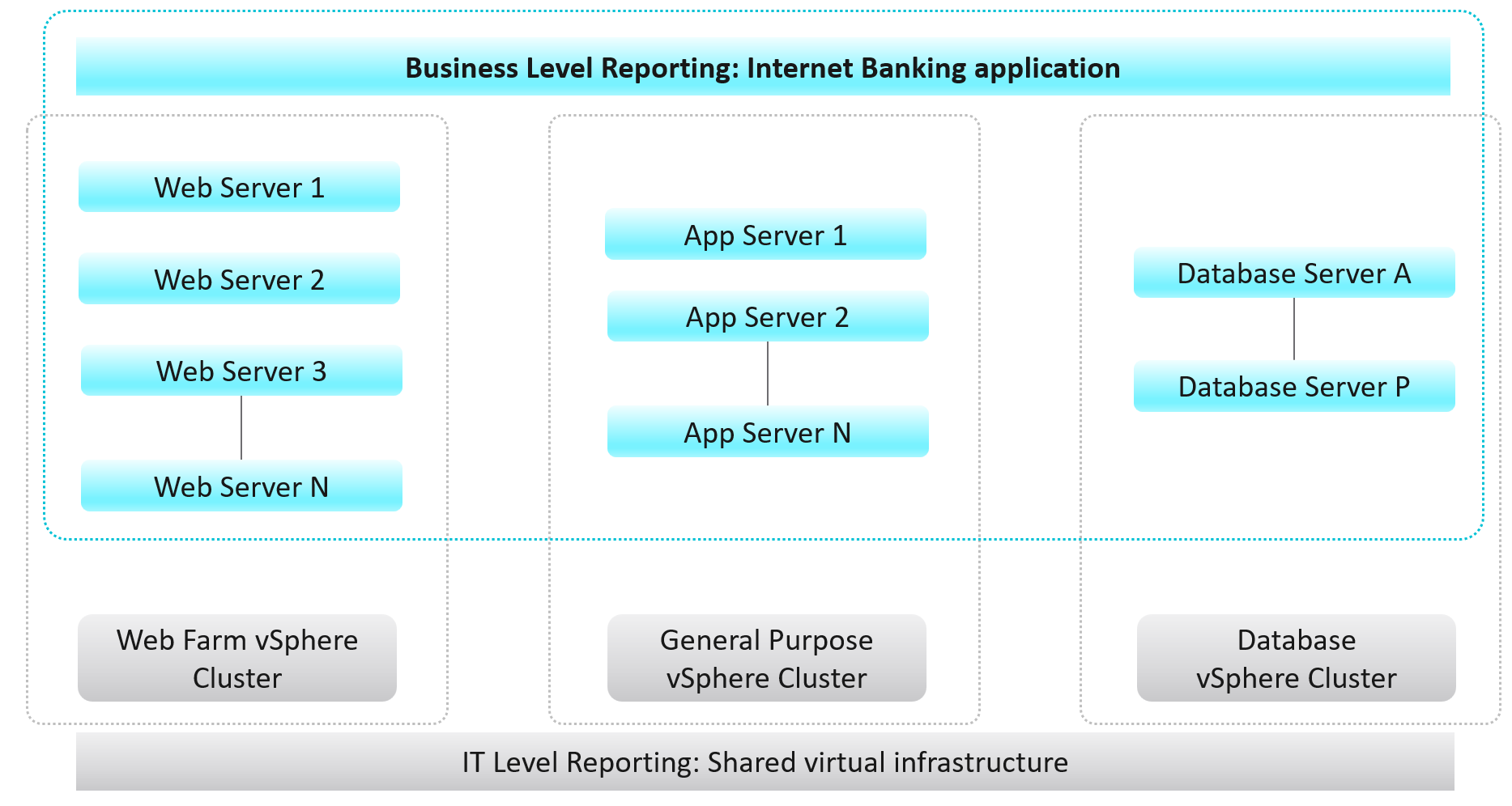
While VCF Operations maps the hierarchical infrastructure relationships out-of-the-box, there is a need for more in-depth business-oriented reporting focused on logical business constructs such as services, applications, departments, divisions, teams, groups, or any other type of logical business structure. Quantifying performance, capacity, and cost at the logical business unit level makes more relevant information to business leaders. This is because services, applications, and business units can span multiple infrastructures from private, through hybrid, to public. Not only is business-oriented reporting more intuitive for a business to consume, it also makes the IT more transparent and aligned with actual business outcomes.
Frequently, business unit stakeholders will ask IT to provide reporting around their workload’s performance, capacity, configuration, and cost. For example, a business owner may ask the following questions:
-
What is the infrastructure cost for an application, service, or department?
-
What can we do to reduce the infrastructure costs of our service/application?
-
How much compute and storage are our application/service consuming?
-
What are the poorly performing VMs in an Application Stack and why?
These questions are mostly about the underlying infrastructure, but instead of being posed at a vSphere level, they are positioned around the business applications. Traditionally, it has been very difficult for IT to answer these types of questions because typical Element Managers used by IT, represent various objects in a very rigid hierarchical fashion that does not translate well to the elastic business structure.
A different approach is necessary to address these challenges to empower business stakeholders with more accurate information. VCF Operations enables IT to analyze the underlying infrastructure and present the information in a context consumable by business decision makers.
To implement the above, the first step is to design a vSphere folder structure that reflects the organisation structure. These folders and their relationships are then used by VCF Operations groups and business applications.
Implementation
|  | . |
| . |
|----|----|
Business application is not an object that belongs to vSphere or VMware. It can potentially contain objects outside VMware objects. So the parent object is different. It’s called Entire Enterprise Applications, as shown on the following screenshot.
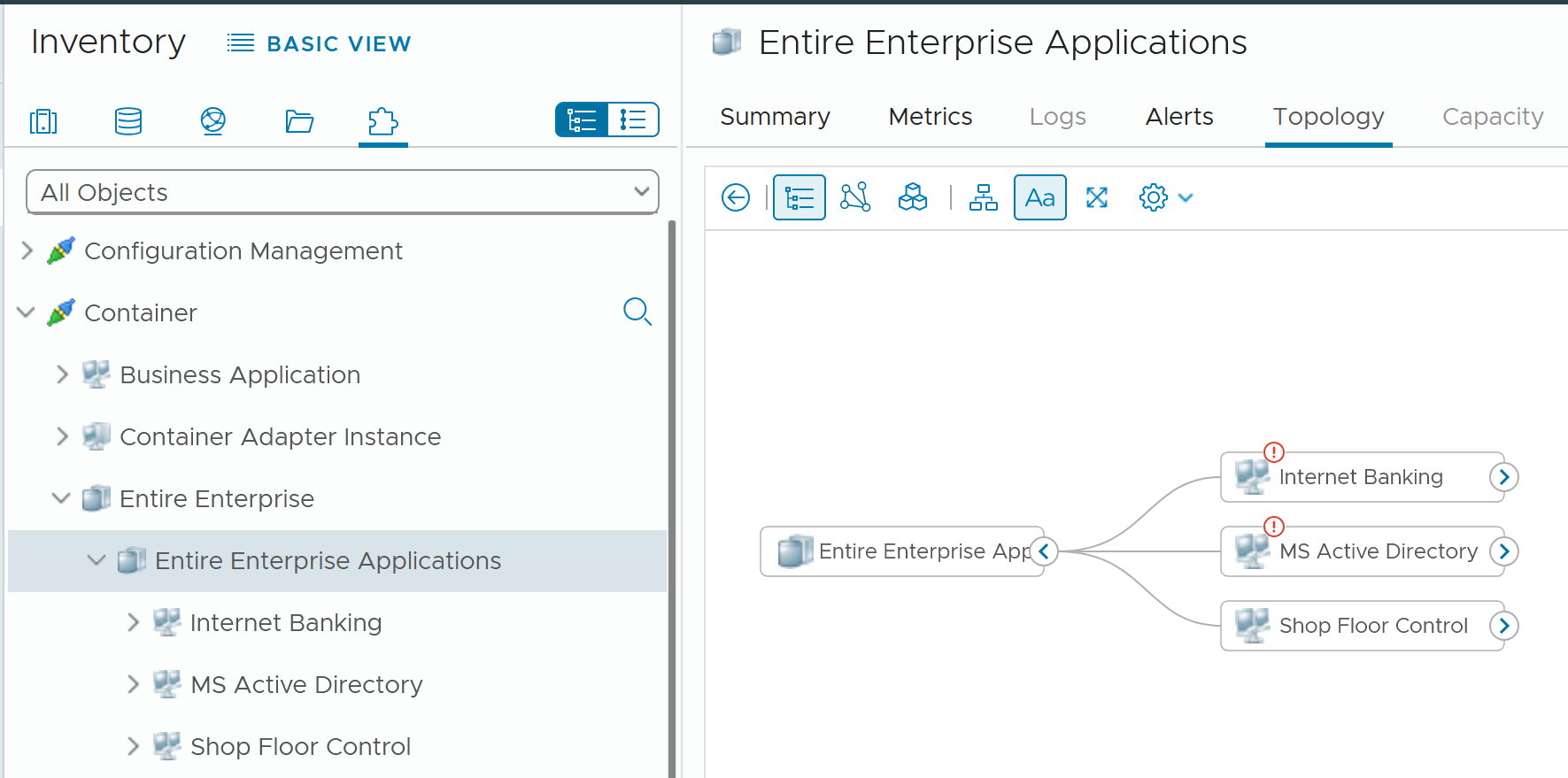
In the screenshot, you can see the structure that it’s a parent of 3 business applications
Limitation**:** The tiers are manually added. It has no dynamic membership the way Custom Groups has.
Dashboard Design
The dashboard focuses on Performance. To some extent, if the Guest OS is down, the dashboard below will detect it. If you enhance it to include availability and compliance, let me know!
The top part of the dashboard shows the overall trend.
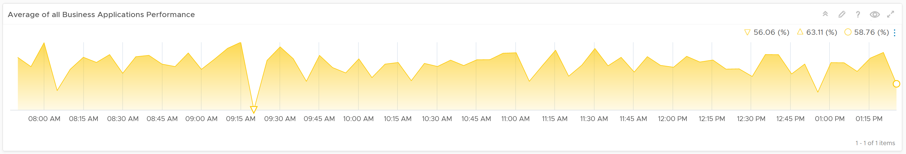
Assuming you only list your mission critical applications, you should expect the value to be good and match business reality.
The problem with average is it might mask a problem. For example, you have 2 mission critical applications. 1 has is value goes up (for whatever reason) while the other goes down. The average will fail to show it.
This is why the next row on the dashboard complements the overall picture. It has 3 columns
-
The 1st column shows all the business applications. It’s sorted by the worst performing app, judged from the most recent value.
-
The 2nd column shows the tiers within the selected business application.
-
The 3rd column shows the VMs within the tiers.
Business Applications 🡪 Tier 🡪 VM
The columns also support drill down into VM Performance dashboard and VM Capacity dashboard.
The last column, because it’s a list of virtual machines, also sports a drill down into the guest operating systems. Take note this requires Telegraf agent.
The 3 columns also drive the table underneath them. The table lists all the VMs for ease of analyzis.
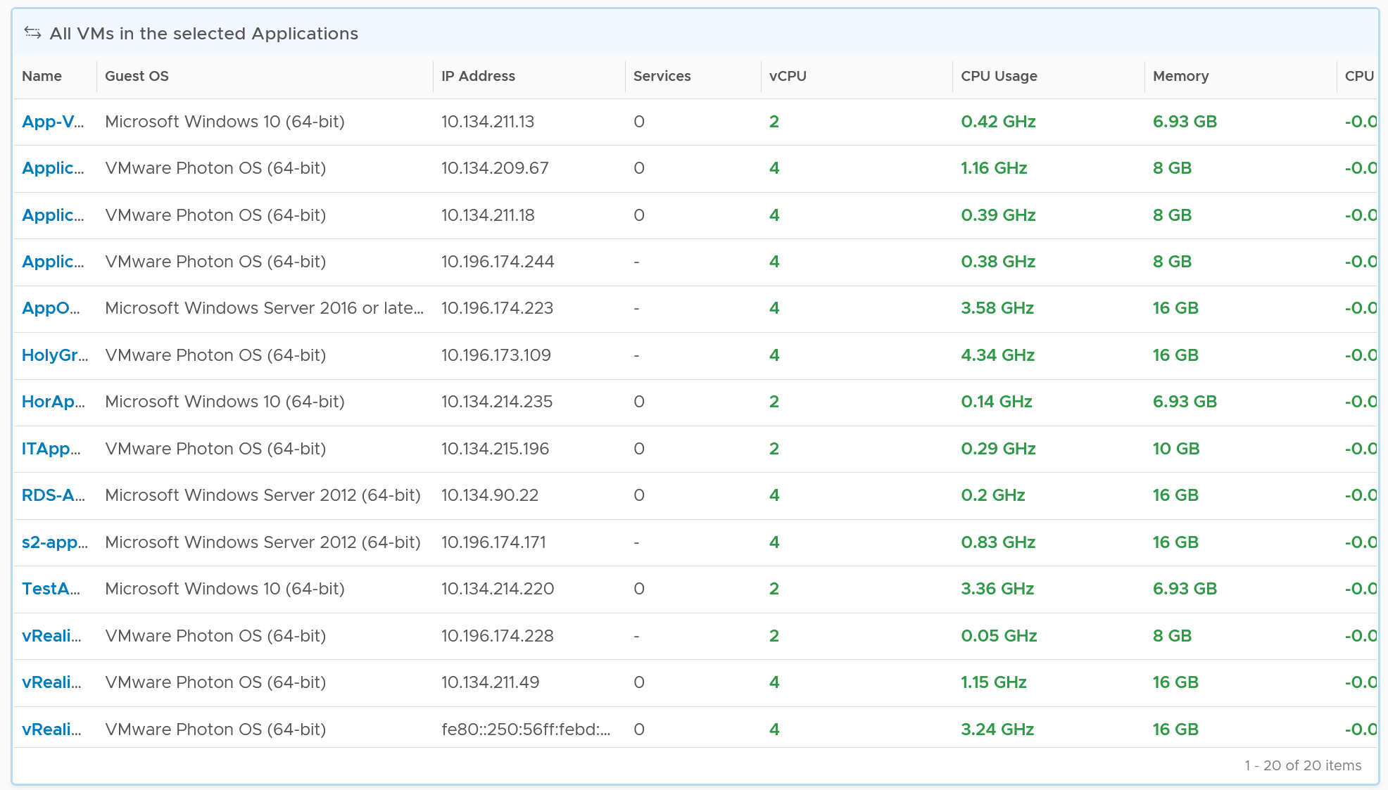
Customization
You can enhance the visibility by corelation. For example, you can compare the application-level metric with infrastructure metric. CPU is a good general candidate. For example, you compare the number of web server session with the CPU Usage in GHz. If application developer releases an improved code that enable the web server to serve more users with the same resource, but the reality is the opposite, then they have something to troubleshoot.
You can enhance this by adding process-level metric. This requires you to install Telegraf agent.
A common request among VMware Admin is to give their customers a self-service access to their own VMs. The VM Owners should be given a simple portal, where they can easily see all their VMs and its performance. You can use the dashboard sharing feature of VCF Operations for a login-less access.
But what if your tenants are from different companies? They are not allowed to see one another VMs.
You don’t want to create a dashboard for each of them one by one. The challenge here is how to use the same dashboard for multiple applications teams. This requires a security mapping. Each tenant needs to have a login ID, which must be mapped to their VM.
| Role | The first step is to create a role and give it limited access. All tenants user accounts will be mapped to this role. This role should not be able to browse the inventory. Its only access is to the group of tenants. |
|----|----|
| Dashboard | Create a common dashboard and map to the role. This role can’t see any other dashboards |
| Tenant | For each tenant, you need to create a user ID. This ID is then mapped to a group. The group has the tenant VMs. In this way, the tenant ID will not be able to see other VMs. |
Capacity
In order to calculate the capacity demand, you need to know whether it is active-passive or active-active set up.
CPU Consumption =
(
If Active-Active then Average (VM Member CPU Usage) Else Max (VM Member CPU Usage)
)
/
Min (VM Member Total Capacity) * 100%
The above gives you a number in percentage, making it easier to see across many tiers. Let me know if you find a use case for absolute numbers (in GHz for CPU and GB for memory)
For total capacity, we take the lowest value among the members VM.
Part 4 Chapter 2
I’ve used the product since 1.0. When I first saw super metrics, it was one of those “is this created for me?” moments. The ability to analyze hundreds of metrics by creating my own metrics enabled me to do my job better. I was a pre-sales engineer but I spent a lot of time helping my customers troubleshooting and optimizing their environment.
Introduction
Super metrics are derived metrics that can be used to measure performance, utilization, and cost by different business units and applications, or in this case, the Custom Group into which the VMs are placed. Super metrics contain simple algebraic formulas that allow Aria Operations to measure various aspects of the Custom Groups, which contain business unit–related VMs.
At the most basic level, super metrics enable the ability to extend built-in metrics by adding new metrics that provide additional insight. This is especially important for Custom Groups as they only come with basic badge and population metrics. Having a set of more comprehensive predefined metrics is not optimal since Custom Groups can contain a mix of vastly different objects such Hosts and Datastores. For example: CPU related metrics would not be applicable to the Datastores.
This is also where the not-so-obvious power of super metrics becomes apparent. The super metrics employed to quantify Custom Groups use the concept of Relative Reference, or Depth, which allows Aria Operations to look inside of a container/bucket, measure what is in it, and return the value at the container level rather than the object being measured. This ability empowers the user to create a number of algorithms leveraging the built-in functions and collected time-series data.
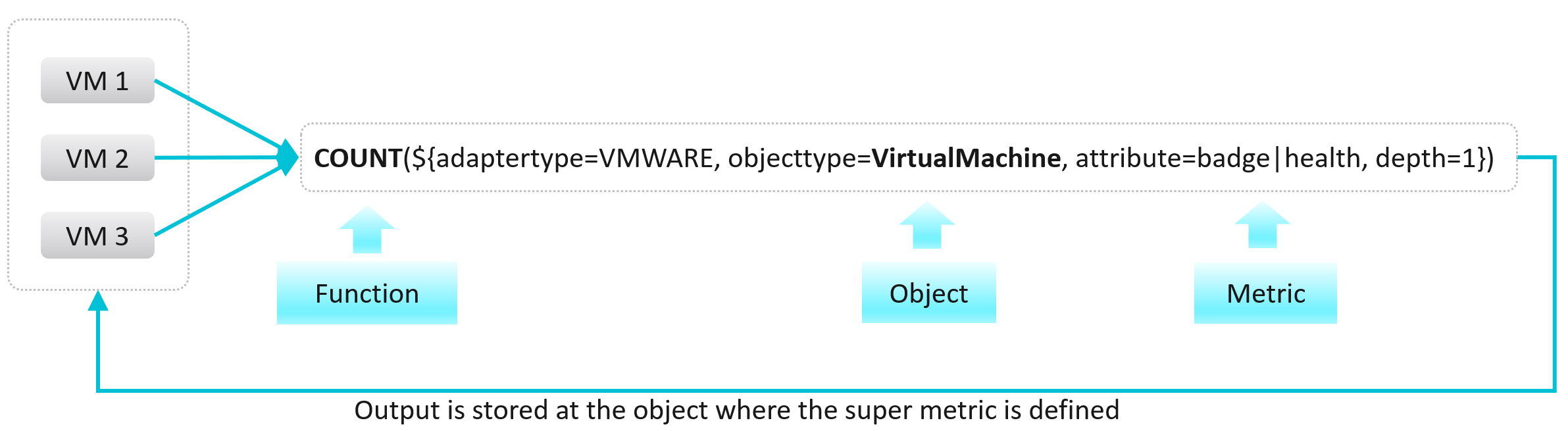
It is a programming language with mathematical formula that contains a combination of one or more metrics for one or more objects. Once you create a super metric, it persists over time and can be used for different interactions just like any other metric. It can be used in views, reports, dashboards and symptom definitions.
Super metrics are created with a list of operators and functions. These can be further combined and operated using several conditional expressions like ‘where’ or ‘if-else’.
Note that it calculates the present value. You can’t compare against historical data. That means you can’t do things such as counting the number of times an object crosses a particular threshold. You can only set the value to 1 if the threshold is crossed. To see the total over time, use the summation feature in View List.
Before starting to create a super metric, make sure you identify the following:
-
Objects or object types that are involved
-
Metrics which will need to be used.
-
How to combine the metrics? Which operator, function or expression to use?
-
Which object type will be used to assign super metric?
-
Policy in which super metric will need to be enabled
Basic Functions
The maximum, minimum, average and sum functions are simple functions that can quickly summarize a large number of objects. I will provide some examples demonstrating the various features of super metrics functions and operators. More is covered in the manual.
There are also many examples in the repository of super metrics.
Example 1
Maximum CPU Ready (%) among VMs within a group of clusters providing same class of service.
max( ${ adaptertype=VMWARE, objecttype=VirtualMachine, metric=cpu|readyPct, depth=3 } )
Maximum Memory Balloon (%) among VMs within a group of clusters providing same class of service.
max( ${ adaptertype=VMWARE, objecttype=VirtualMachine, metric=mem|balloonPct, depth=3 } )
Depth=3 is used since the super metric is applied at a custom group level which is 3 levels up the VM object whose metric is used. The hierarchy is Group 🡪 Cluster 🡪 ESXi Host 🡪 VM.
Tip: If you use the same super metric for different levels, specify the deepest one.
Example 2
Sum of vCPUs provisioned on all VMs in a group of VM.
sum( ${ adaptertype=VMWARE, objecttype=VirtualMachine, metric=cpu|corecount_provisioned, depth=1 } )
Depth=1 is sufficient as the VM is directly under the group. No need to manually change the depth.
Average of CPU Usage with all VMs in a custom group:
avg( ${ adaptertype=VMWARE, objecttype=VirtualMachine, metric=cpu|usage_average, depth=3 } )
Default Value
Return CO2 Emission if the metric exists. If not, return 0.744 by default.
${this, metric=CustomProperty|CO2 Emission, defval=0.744}
The above is handy if the metric may not exist and you want to specify a default value.
‘Where’ Clause
Things get more powerful and complex once you need to specify a condition.
Use Case: Count of all VMs in the environment which has CPU usage greater than 60% at that time.
count(
${ adaptertype=VMWARE, objecttype=VirtualMachine, metric=cpu|usage_average, depth=5,
where=($value > 60)
}
)
Note: you specify 60 not 60% or 0.6. It has to match the metric value.
Use Case: Count of all Microsoft Windows VMs.
That means you need to do a string comparison. You also need to know the actual values used by the property field.
count(
${ adaptertype=VMWARE, objecttype=VirtualMachine, attribute=summary|guest|fullName, depth=5,
where="summary|guest|fullName startsWith ‘Microsoft Windows’"
}
)
Another example
sum(
${ adaptertype=VMWARE, objecttype=HostSystem, attribute=mem|host_provisioned, depth=1,
where="runtime|connectionState equals connected"
}
)
The choice for string comparison is
equals
contains
startsWith
endsWith
!equals
!contains
!startsWith
!endsWith
Use Case: Compute the percentage of VMs with CPU Ready > 1%.
That means you need to divide the number of VM against the total number of running VM.
count(
${ adaptertype=VMWARE, objecttype=VirtualMachine, metric=cpu|readyPct, depth=8, where=”>1” }
)
/
${ this, metric=summary|running_vms }
* 100
The last line in the code is to manually convert into percentage.
Use Case: Count of all VMs with CPU usage > 70% OR memory usage > 60%
This is a double comparison, with an OR clause. The formula gets complex as super metric is actually a run time code that gets executed directly. There is no translation!
count(
${ adaptertype=VMWARE, objecttype=VirtualMachine, metric=cpu|usage_average, depth=8,
where= ( $value > 70
||
${metric=mem|usage_average } > 60
)
}
)
Notice the first comparison simply uses the variable $value, because it’s actually defined in the metric=.
Use Case: Count of all VMs which are not Windows based or Redhat based.
This means you need to negate the comparison. The negation has to be done outside the two comparison.
count(
${ adaptertype=VMWARE, objecttype=VirtualMachine, metric=summary|guest|fullName, depth=5,
where= (! ($value contains 'Microsoft Windows' || $value contains 'Redhat') )
}
)
If Then Else
This takes you deeper into Java programming 😊
Use Case: Count of provisioned vCPUs and if it is equal to 4, return value “1” and if it is not equal to 4, return a value “0”.
count( ${this, metric=cpu|corecount_provisioned, depth=1, where= ($value == 4)} )
? 1
: 0
Use Case: Find the “Actual Recommended vCPU” for a VM.
While using the rightsizing feature, VCF Operations provide the vCPUs to be removed or added based on if it is an oversized or undersized VM. The following logic can be used find the actual recommended values:
If the value of Recommended vCPUs to add is 0,
then Actual Recommended vCPU = Provisioned vCPUs – Recommended vCPUs to remove (as an Oversized VM ),
else Actual Recommended vCPU = Provisioned vCPUs + Recommended vCPUs to add ( as an Undersized VM ).
${this, metric=summary|undersized|vcpus} == 0
?
( ${this, metric=cpu|corecount_provisioned} - ${this, metric=summary|oversized|vcpus} )
:
( ${this, metric=cpu|corecount_provisioned} + ${this, metric=summary|undersized|vcpus} )
This formula uses the $this, a reference to the object itself. So the context is not other object.
For completeness, let’s do the same for memory. Since the default unit is KB, we would like to convert into GB.
If the value of Recommended Memory to add is 0,
then Actual Recommended Memory = Provisioned memory – Recommended Memory to remove (as an Oversized VM),
else Actual Recommended Memory = Provisioned Memory + Recommended Memory to add (as an Undersized VM)
(
${this, metric=summary|undersized|memory} == 0
?
( ${this, metric=mem|guest_provisioned} - ${this, metric=summary|oversized|memory} )
:
( ${this, metric=mem|guest_provisioned} + ${this, metric=summary|undersized|memory} )
)
/ 1048576
Take note there is no Case Statement. So you gotta use Nested IF as workaround.
Instanced Value
Some metrics and properties in VCF Operations exist as instance value, meaning they are repeated for each instance. The advantage of this it reduces the number of children object. The disadvantage is in visualization, as the metrics need to be accessed via the instance and not just the object.
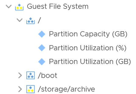
One way to make reporting or dashboarding easier is to aggregate the values to the object. You do this via the attribute option.
The following code adds all virtual disks space of a VM.
Sum (${adaptertype=VMWARE, objecttype=VirtualMachine, attribute=virtualDisk|configuredGB, depth=5})
Note that where clause can be done with metric only and not attribute. You can add instanced metrics but cannot apply where clause to that.
Advanced Examples
This is where you vrealize the full capability of super metric. It’s actually a programming language that gets executed as a straight line. That means it can’t loop. Think of it as a mathematical formula.
RDM Disk Capacity
How do you sum the total capacity of RDM disks in a virtual machine, since the VM typically has VMDK disk also?
In this super metric, we check the virtual disk for the property “IsRDM” and if it is true, add that disk capacity, else set the capacity value as zero. We do it for each scsciN:N, and sum all the answers.
Limitation: you need to keep adding the disks as required.
(sum
(${this, metric=virtualDisk:scsi0:0|configuredGB, where= "virtualDisk:scsi0:0|isRDM equals true"}) ?
(${this, metric=virtualDisk:scsi0:0|configuredGB}) : 0
)
+
(sum
(${this, metric=virtualDisk:scsi0:1|configuredGB, where= "virtualDisk:scsi0:1|isRDM equals true"}) ?
(${this, metric=virtualDisk:scsi0:1|configuredGB}) : 0
)
+
(sum
(${this, metric=virtualDisk:scsi0:2|configuredGB, where= "virtualDisk:scsi0:2|isRDM equals true"}) ?
(${this, metric=virtualDisk:scsi0:2|configuredGB}) : 0
)

Tools Status
Use Case: check the VM Tools running status. If it is running, return the value of OS uptime, else return the value zero.
In this example, we’re combining where clause and If Then Else.
count( ${this, metric=summary|guest|toolsRunningStatus, where= (!($value contains 'Not Running'))}) != 0
?
( ${this, metric=sys|osUptime_latest} )
:
0
Weighted KPI
Use Case: define Performance (%) of an object. The requirement is defined in the Performance Modelling section of vSphere Metrics book.
Let’s say you have the following metrics that you want to combine into a single KPI
Take Other Wait for example.
-
The green range is only from 0% - 1%
-
That means 0% Other Wait equals to 100%, while 1% Other Wait translates into 75%.
-
That means 0.8% Other Wait is 80%.
-
The yellow range is 2x wider than the green range. 2% Other Wait gets translated into 62.5% as it’s in between 50% and 75%.
The overall code maps to the table above. The following code snippet shows the blocks for green, yellow, orange and red. No need to zoom this picture, as we will dive into the actual code line by line.
Summary
Super metric does not have a Case statement, so we have to use nested IF. The logic looks something like this
If it’s in the green range
then calculate for green range
else if it’s in the yellow range
then calculate for yellow range
else if in the orange range
then calculate for orange range
else calculate for red range
In addition to the above, you also need to assign weightage. This is critical if you have many metrics forming a KPI. for example, if there are 10 metrics, then a single red will not have enough weight to change the overall KPI red. To solve this, you assign the following weightage:
-
yellow 2x the weight of green
-
Orange 4x the weight of green
-
Red 8x the weight of green.
Let’s see first part of the code. I’m using CPU Other Wait as the example:
(${this, metric=cpu|iowaitAvg} as ioWait < 1
? (100 - ( (ioWait - 0) / 1 * 25 ) ) * 1
: ioWait < 2
? ( 75 - ( (ioWait - 1) / 1 * 25 ) ) * 2
: ioWait < 4
? ( 50 – ( (ioWait - 2) / 2 * 25 ) ) * 4
: ( 25 – ( min([ ioWait - 4 ,4 ]) / 4 * 25 ) ) * 8
Let’s step through it.
The code “as ioWait” defines an alias. Don’t think of Alias as variable. All it does is giving a short or friendly name to a metric. They don't work for expressions.
We need to do the following translation:
| IO Wait | 0% | 1% | 2% | 4% | 8% or more |
|-----------------|:---:|:---:|:---:|:---:|:----------:|
| Translation | 100 | 75 | 50 | 25 | 0 |
The values in between need to follow the range of each bracket. Notice the width of green bracket is only 1% but the yellow is 2%. The red is special as anything above 7% needs to be capped to 0.
Using the above, let’s show a few examples of translation:
-
0.2% Other Wait 🡪 95.0
-
0.5% Other Wait 🡪 87.5
-
2.0% IO Wait 🡪 67.5
-
3.4% IO Wait 🡪 45.0
Green Range
In a perfect score, the logic will basically do 100 – 0, hence returning 100%.
In a non-perfect score, we need to prorate the value, so they land somewhere between 75 and 100.
Now let’s see how the translation is done for the Other Wait metric. The (1-0) is the range of green.
As the range is going downward, meaning the higher the IO Wait, the lower the result, it’s more intuitive to deduct from 100 than to add from 75.
If the IO Wait < 1 it performs the following
100 - ( (ioWait - 0) / (1 - 0) ) * 25
Assuming IO Wait = 0.2%, we get
100 - ( ( 0.2 - 0) / 1 ) * 25
100 - ( 0.2 ) * 25
100 - 5
You get 95, which is correct.
Yellow Range
The yellow has 2x weightage of green. So we need to multiply the final value by 2x.
( ioWait < 3 ? ( 75 - ((ioWait - 1) / (3 - 1) * 25) * 2
The line : ioWait < 3 is the ELSE branch of IF IO Wait < 1%. So we just need to check for < 3% and can safely assume it’s larger than 1%.
The (3-1) is the range of yellow. We can replace it with just the number 2 for more efficient code.
( 75 – ((ioWait - 1) / 2 * 25) ) * 2
Assuming IO Wait = 1.4%, we get
( 75 - ( (1.4 - 1) / 2 * 25) ) * 2
( 75 - ( 0.4 / 2 * 25) ) * 2
( 75 - 5 ) * 2
70 * 2
You get 140, which is correct.
The constant 50 is required to bump up the value as yellow starts at 50.
Notice you don’t need to do that funky flipping anymore 😊
Orange Range
The same logic applies for orange. The only difference is you Orange range is 50 - 25. You then multiply by 4 as it’s 4x green.
The (5-3) is the range of yellow. We can replace it with just the number 2 for more efficient code.
( 50 – ((ioWait - 3) / (5-3) * 25) ) * 4
50 - 3 – 3 / 2 * 25
50 0 / 2 * 25
50 - 0
Red Range
The red range is 5 – 7%. So 5% translates into 25%, while anything 7% or more becomes 0%.
As red is at the end of the range, we need to deal with corner case by capping any value above 7% and return 0.
The portion min([ (ioWait - 5),2 ]) caps the value to maximum 2 when IO Wait is 7% or more.
For IO Wait just above 5%, we want to return value near 2, so we get larger multiplier.
( 25 – ( min([ ioWait - 5 ,2 ]) / (7 - 5) * 25 ) ) * 8
Assuming IO Wait = 5.4%, we get
( 25 – ( min([ 5.4 - 5 ,2 ]) / 2 * 25) ) * 8
( 25 – ( min([ 0.4 ,2 ]) / 2 * 25) ) * 8
( 25 – ( 0.4 / 2 * 25) ) * 8
( 25 – 5 ) * 8
20 * 8
You get 160, which is correct.
Weightage
Can you spot a missing logic in the above?
Yes, the multiplier creates a problem. When you multiply by 2x, 4x, 8x, you need to normalize it back to the values fall within 0 – 100%.
To normalize the value back to 100%, you need to divide by the multiplier.
But how do you normalize, since each metric can have their own multiplier?
You need to have another set of nested IF statement, this time you increase the denominator correspondingly. The following shows the logic for 2 of the metrics. The multiplier is shown in red.
Sum ([
( ioWait < 1 ? 1 : ( ioWait < 2 ? 2 : ( ioWait < 4 ? 4 : 8 ) ) ) ,
( Co-stop < 1 ? 1 : ( Co-stop < 2 ? 2 : ( Co-stop < 4 ? 4 : 8 ) ) )
])
Once you have the above 2 sets, it’s a matter of dividing one over the other. The following shows part of the logic, as I want to focus on the 2 sum statements.
The complete multiplier part of the code looks like this
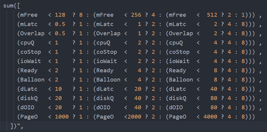
Note the entire super metric does not have error handling. If a metric does not collect, the entire super metric will return blank.
Pretty cool isn’t it? If you agree, send your thanks to Gautam Kumar and Artavazd Amirkhanyan.
VM Uptime
Use Case: calculate the VM uptime within the 5-minute collection cycle.
This particular super metric wasn’t fully implemented in the product due to the false positive from the raw vCenter counter that was discovered during validation. So I’m providing as an example of what you can do with super metric.
The up time of a VM is more complex than that of a physical machine. Just because the VM is powered on, does not mean the Guest OS is up and running. The VM could be stuck at BIOS, Windows hits BSOD or Guest OS simply hang. This means we need to check the Guest OS. If we have VMware Tools, we can check for heartbeat. But what if VMware Tools is not running or not even installed? Then we need to check for sign of life. Does the VM generate network packets, issue disk IOPS, consume RAM?
Another challenge is the frequency of reporting. If you report every 5 minutes, what if the VM was rebooted within that 5 minute, and it comes back up before the 5th minute ends? You will miss the fact that it was down within that 5 minutes.
From the above, we can build a logic:
If VM Powered Off then Return 0. VM is definitely down.
Else Calculate up time within the 300 seconds period.
In the above logic, to calculate the up time, we need first to decide if the Guest OS is indeed up, since the VM is powered on.
We can deduce that Guest OS is up is it’s showing any sign of life. We can take Heartbeat from Tools. What if there no Tools or Tools not returning heartbeat? In this case, none of the metrics from Windows/Linux will be available in VCF Operations, unless we install another agent (e.g. Telegraf). We need to have fail back plan. So we check memory usage, network usage and Disk IOPS.
Can you guess why we can’t use CPU Usage?
VM does generate CPU even though it’s stuck at BIOS. We need a counter that shows 0, and not a very low number. An idle VM is up, not down.
So we need to know if the Guest OS is up or down. We are expecting binary, 1 or 0. Can you see the challenge here?
Yes, none of the metrics above is giving you binary. Disk IOPS for example, can vary from 0.01 to 10000. The “sign of life” is not coming as binary.
We need to convert them into 0 or 1. 0 is the easy part, as they will be 0 if they are down.
I’d take Network Usage as example.
-
What if Network Usage is >1? We can use Min (Network Usage, 1) to return 1.
-
What if Network Usage is <1? We can use Round up (Network Usage, 1) to return 1.
So we can combine the above formula to get us 0 or 1.
The last part is to account for partial up time, when the VM was rebooted within the 300 seconds sampling period. The good thing is VCF Operations tracks the OS up time every second. So every 5 minutes, the value goes up by 300 seconds. As VM normally runs >5 minutes, you end up with a very large number. Our formula becomes:
If the up time is >300 seconds then return 300 else return it as it is.
Let’s now put the formula together. Here is the logical formula:
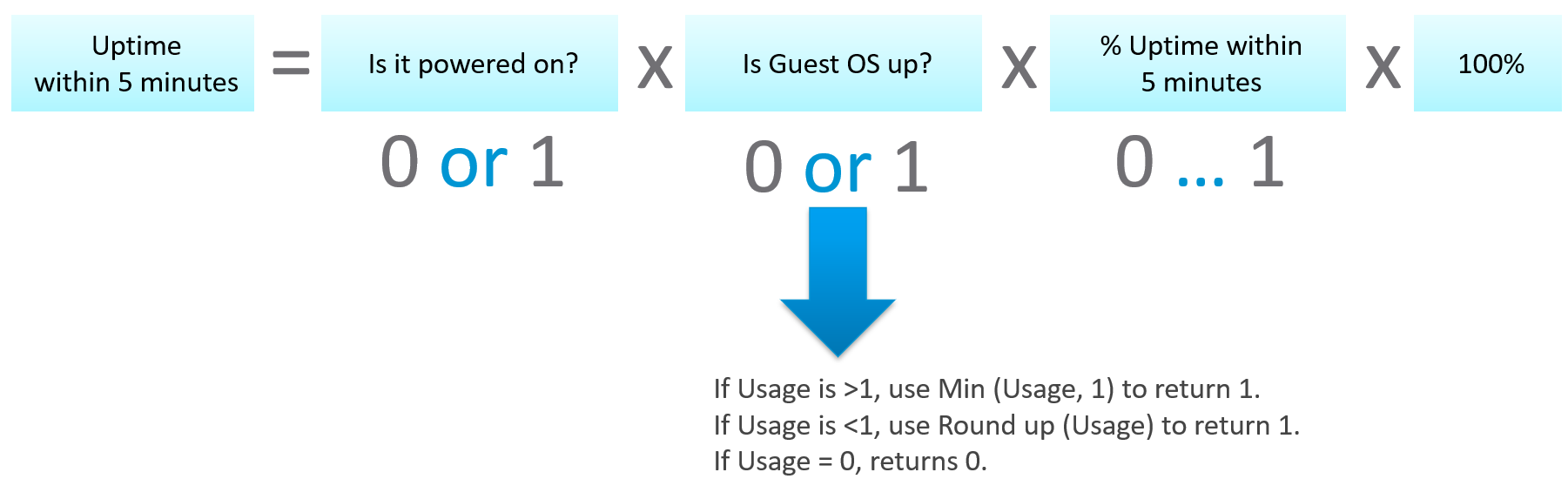
Can you write the above formula differently? Yes, you can use If Then Else. I do not use it as it makes the formula harder to read. It’s also more resource intensive.
Let’s translate the above into a pseudocode.
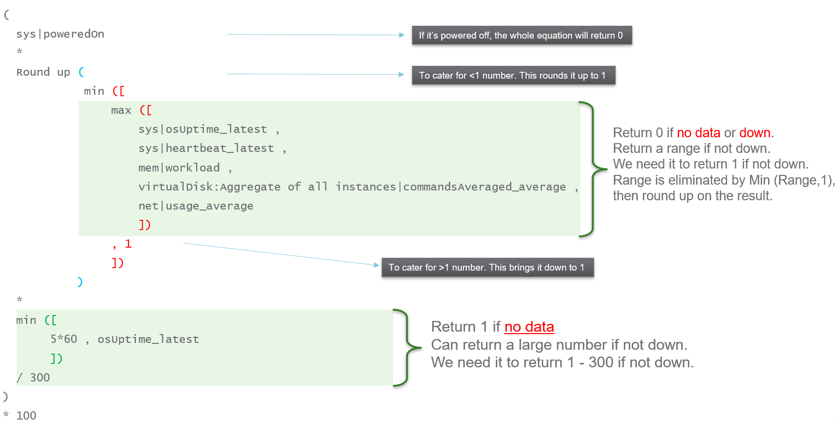
Lastly, here is what it looks like in actual code. I’ve optimized the last bit to /3. No point multiply by 100 then divide by 300.
NUMA Sizing
After VM vCPU is sized, it needs to be validated against the underlying ESXi to consider NUMA. John Diaz explains the use case here, so please read it first if you are unaware of the need for NUMA-compliant sizing.
What I’d like to highlight is John took the time to create a logical design. He visualized it on a flowchart, which I think it’s useful to ensure that the logic is bullet proof before you start coding.
John also uses a code editor to help check the syntax. I myself have applied the same technique for long super metric.
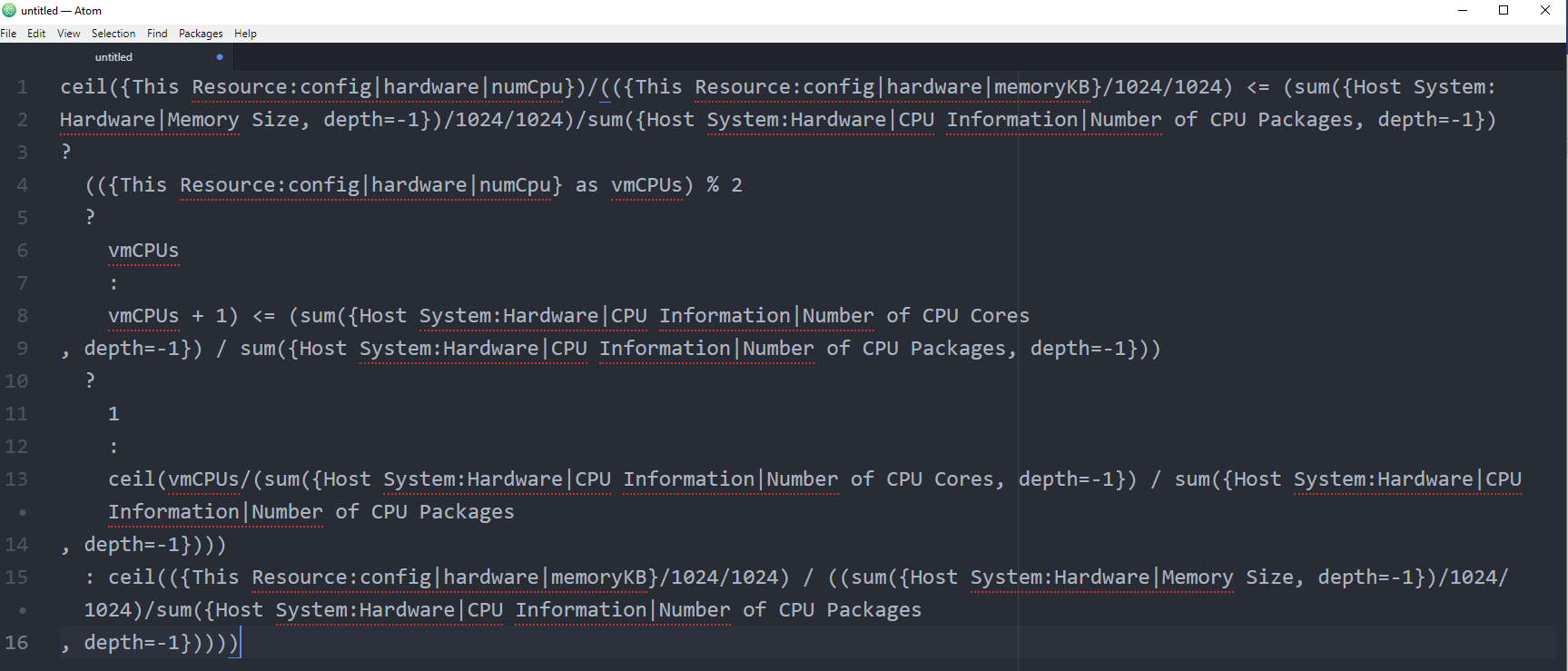
Automation
Part 4 Chapter 3
In other words, what you can operate should be automated.
It might surprise you but Aria Operations is doing automation out of the box in the form of automated control routines; Aria Operations is “automatically” monitoring the environment through predefined or custom Symptoms, Alert Definitions and Compliance Packs. These routines control triggering of Alarms and provide information presented through Dashboards and Reports.
Continuous Performance Optimization cares for best possible performance at minimal cost, driven by Operational Intent and Business Intent settings with ML supported predictive analytics driving actions to balance workloads and proactively avoid contention. The Automated Workload Balancing may help reduce software license costs, optimize performance based on performance or enforce compliance.
Various Compliance Packs help reduce risk and enforce IT and regulatory standards for VMware VCF based private clouds through continuous checks and automated drift remediation.
But there is more.
And this is exactly how you should operate your environment.
Why Automation?
Automation has profoundly impacted the industry since the advent of industrial robotics in the 1950s and 60s. But why is automation important, and what justifies the introduction of a seemingly complex and potentially costly technology?
Indeed, implementing automation requires an initial time investment, which translates to increased CAPEX. However, the benefits are substantial:
-
Reduction in OPEX: Repetitive tasks no longer need manual intervention, leading to operational cost savings.
-
Resource Optimization: Automation frees up time, allowing focus on more critical business activities.
-
Consistency and Accuracy: Automated processes follow a predefined procedure, minimizing human errors (excluding procedural errors).
-
Ease of Auditing: Automation simplifies or even enables the auditing process.
-
Enhanced Productivity, Reliability, and Performance: Automation drives improvements across these key areas.
Understanding these benefits highlights why automation is a valuable investment for any business.
Basic Principles of Automation
Before diving into the essentials of this chapter, let's briefly examine the typical components of automated systems. The following image illustrates the four fundamental elements of an automated system: a controller, sensors, actuators, and the plant we want to automate, all forming a closed loop.
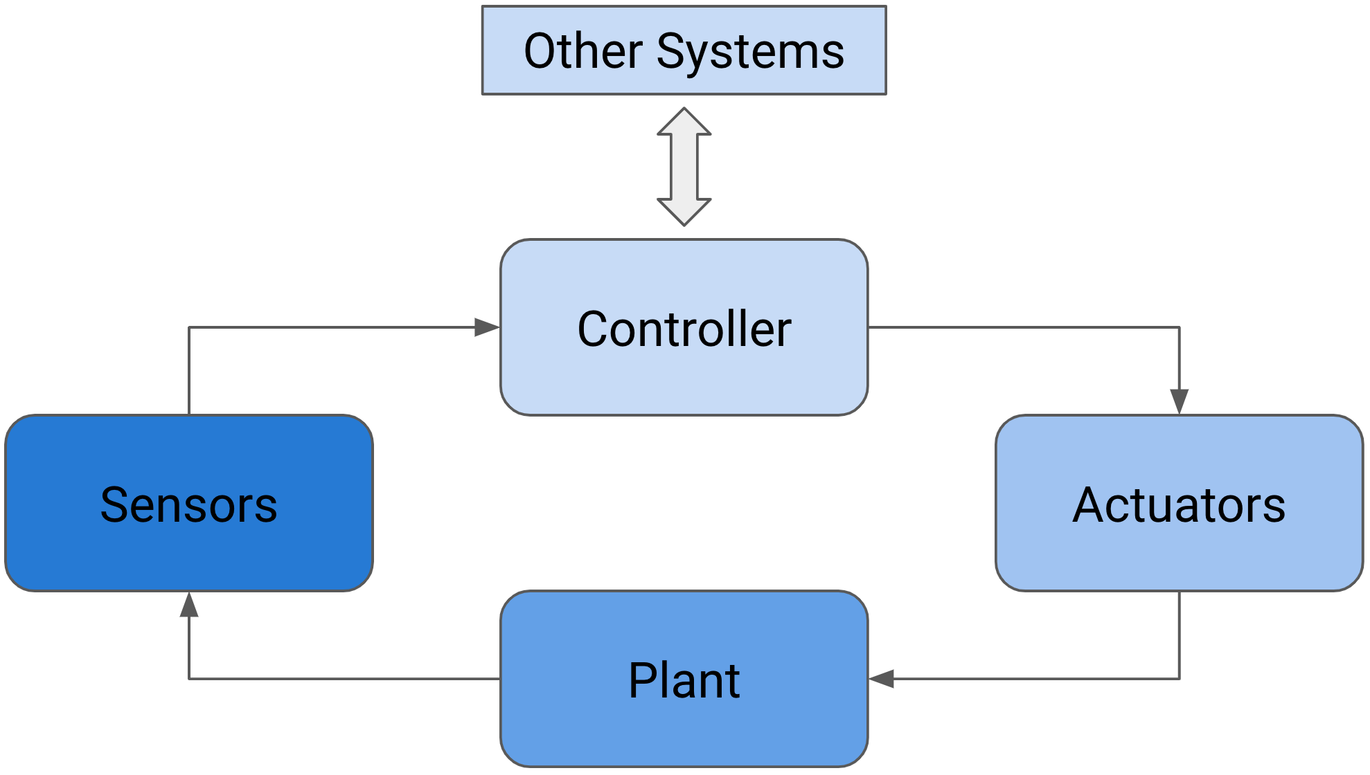
Figure 1: Components of an automated system in a closed-loop feedback control system.
This is example of a closed loop is also called closed-loop feedback control. Another, less complex kind of automated system is shown in the next picture. It is a so-called open-loop control.
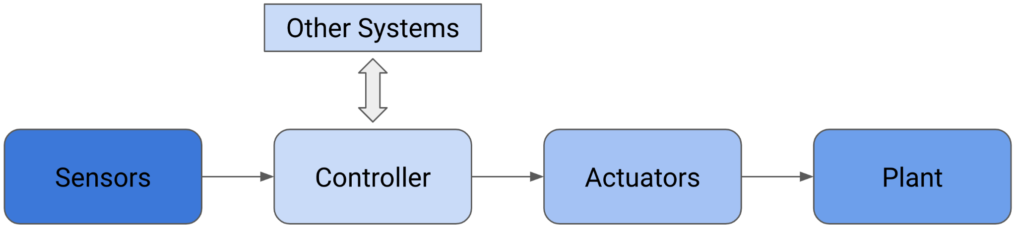
Figure 2: Open-loop control system.
How does this apply to an environment managed by Aria Operations? Let's begin with a simpler example, as the core components remain consistent in both cases. As shown in the next figure, certain parts can be easily mapped to components found in your Software-Defined Data Center (SDDC) run on VMware VCF.
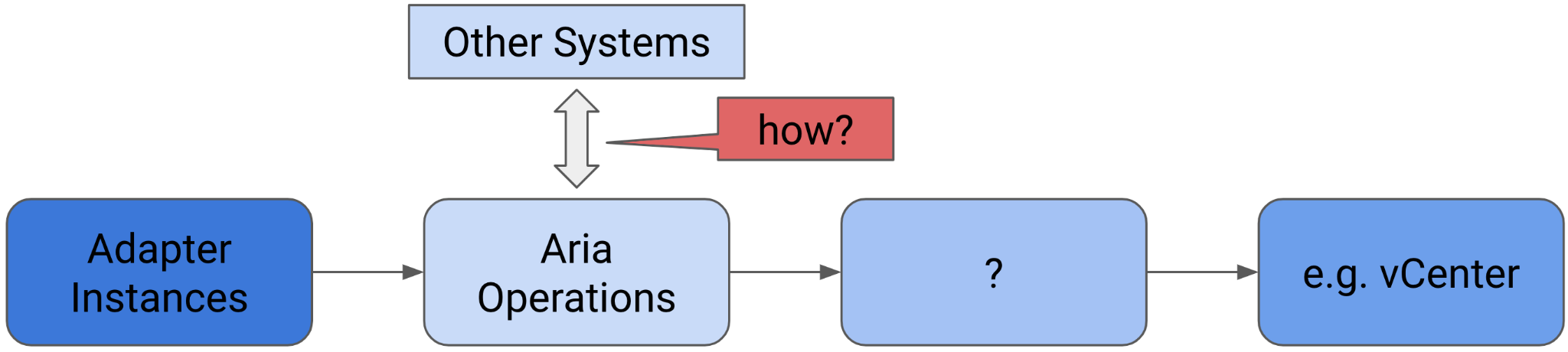
Figure 3: Aria Operations in an open-loop control system.
In this context, the sensors are our adapter instances that collect metrics and properties, the controller is Aria Operations itself, and the plant we aim to control or automate is, for example, our VMware vCenter instance or instances managing ESXi hosts, VMs, and Datastores.
But what are the actuators, and how can the controller (the Aria Operations instance) interact with other systems?
I will address both questions in the following subsections. So keep reading—you've made it through the theoretical part.
Aria Operations and Automation
Let's delve into the second part of the question: how can Aria Operations interface with other systems?
When referring to "other systems," I mean systems that contribute to automation but are not necessarily the target plant for control. It's not surprising that Aria Operations can interact with other systems using interfaces provided by those systems. In the realm of automation, we commonly utilize Application Programming Interfaces (APIs). Interacting with other systems involves both outbound and inbound communication from the perspective of Aria Operations.
Outgoing Communication
In this section I will describe the available options to communicate with 3rd party APIs and send information from Aria Operations to another, so called north-bound, systems.
When speaking about north-bound systems we usually refer to services like mail servers or SNMP trap receivers. Since the advent of 8.x versions of Aria Operations, the product supports more REST services like ServiceNow and Slack natively.
In the next subsection, I will describe the configuration of the commonly used north-bound outgoing connectivity.
Automated Action Plugin
In Aria Operations, there is a selection of Outbound Plugins designed for creating Outbound Instances. The following image displays the available plugins. To illustrate this concept, the Standard Email Plugin is utilized to configure Aria Operations for sending emails via SMTP. An Outbound Instance based on this plugin specifies a particular mail server for sending emails, along with various delivery parameters.
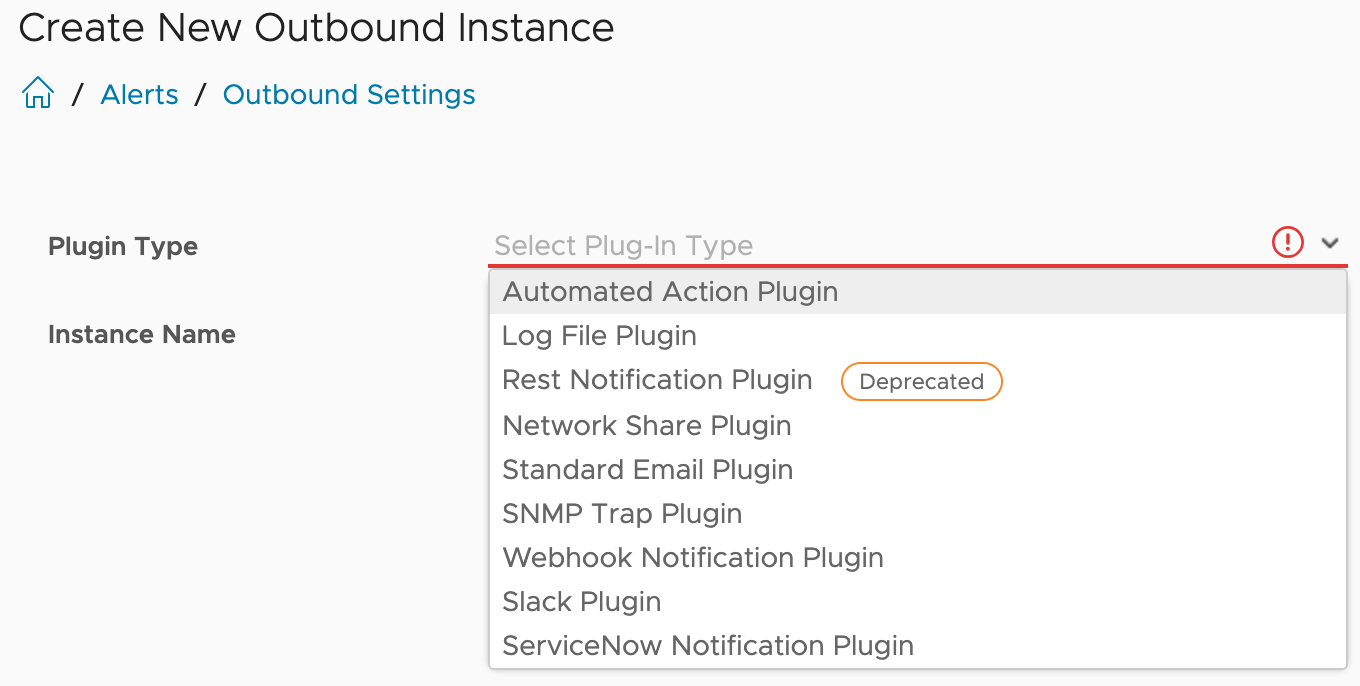
Figure 4: Aria Operations Outbound Plugins.
A configured Outbound Instance provides a one-way communication towards another system.
The first plugin type in this list is the Automated Actions Plugin. After initial installation and configuration of Aria Operations, an Outbound Instance based on this plugin is automatically available for consumption.
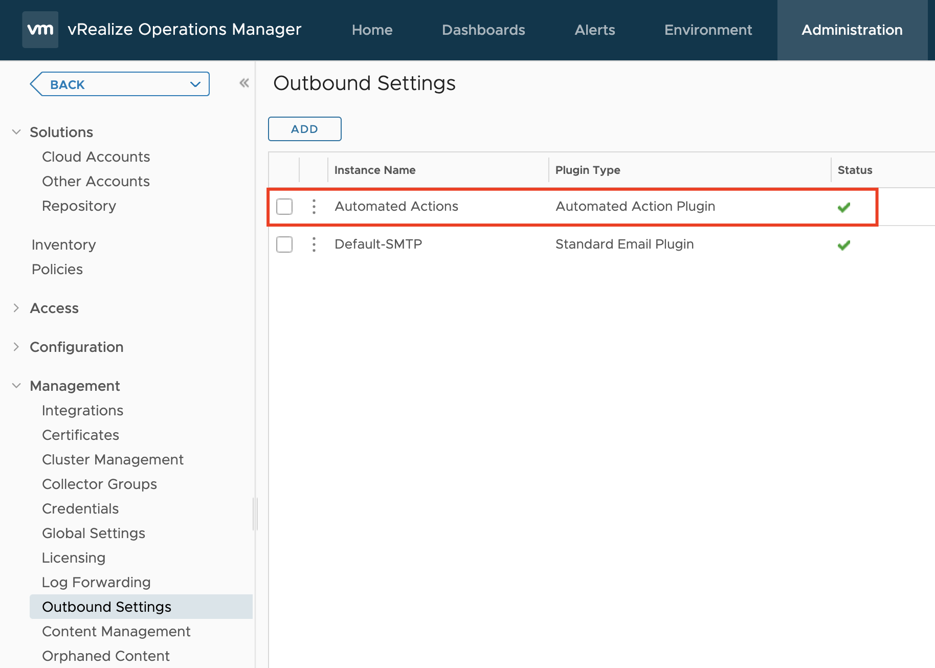
Figure 5: Automated Actions Outbound Instance.
This particular Outbound Instance enables Aria Operations users to perform actions on managed objects living in the connected vCenter instances directly from Aria Operations, as shown in the next screenshot. The actions available to us after the installation are part of the respective Management Packs.
The available actions in the Actions drop-down menu depend on the currently selected object and its type. The list varies, for example, between virtual machines and datastore objects.
In the following image, the actions marked with a small yellow icon are Aria Automation Orchestrator workflows that have been configured out-of-the-box.
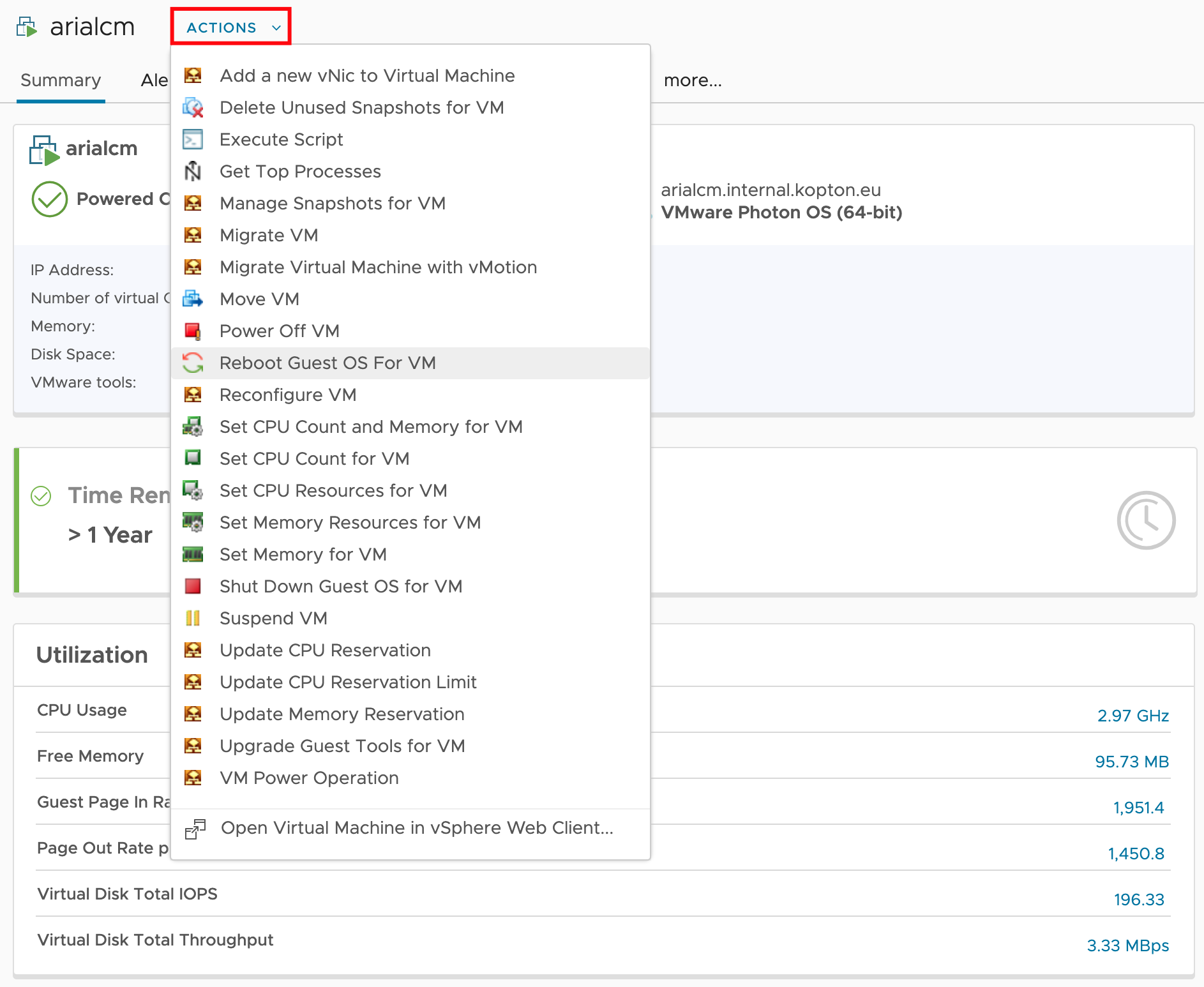
Figure 6: Available Automated Actions.
A prerequisite to enable such automated actions is enabling the Operational Actions setting in the configuration of the corresponding vCenter Cloud Account adapter instance and sufficient permissions granted to the account used for the vCenter connection.
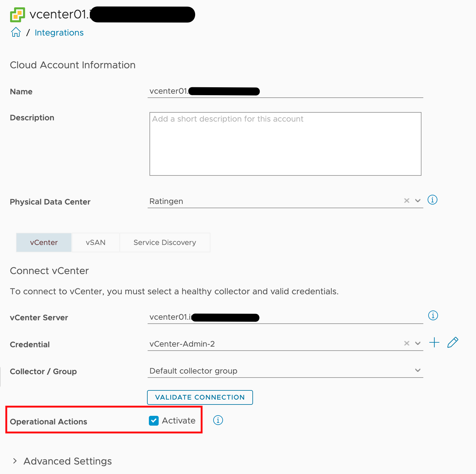
Figure 7: Operational Actions option of vCenter Adapter Instance.
Automated Actions, as the name implies, can be used to automate execution of tasks as part of a Recommendation within an Aria Operations Alert Definition.
Out-of-the-box Aria Operations provides several Recommendations containing vCenter actions, like shown in the following picture. The automated execution of such actions is enabled through Aria Operations Policies.
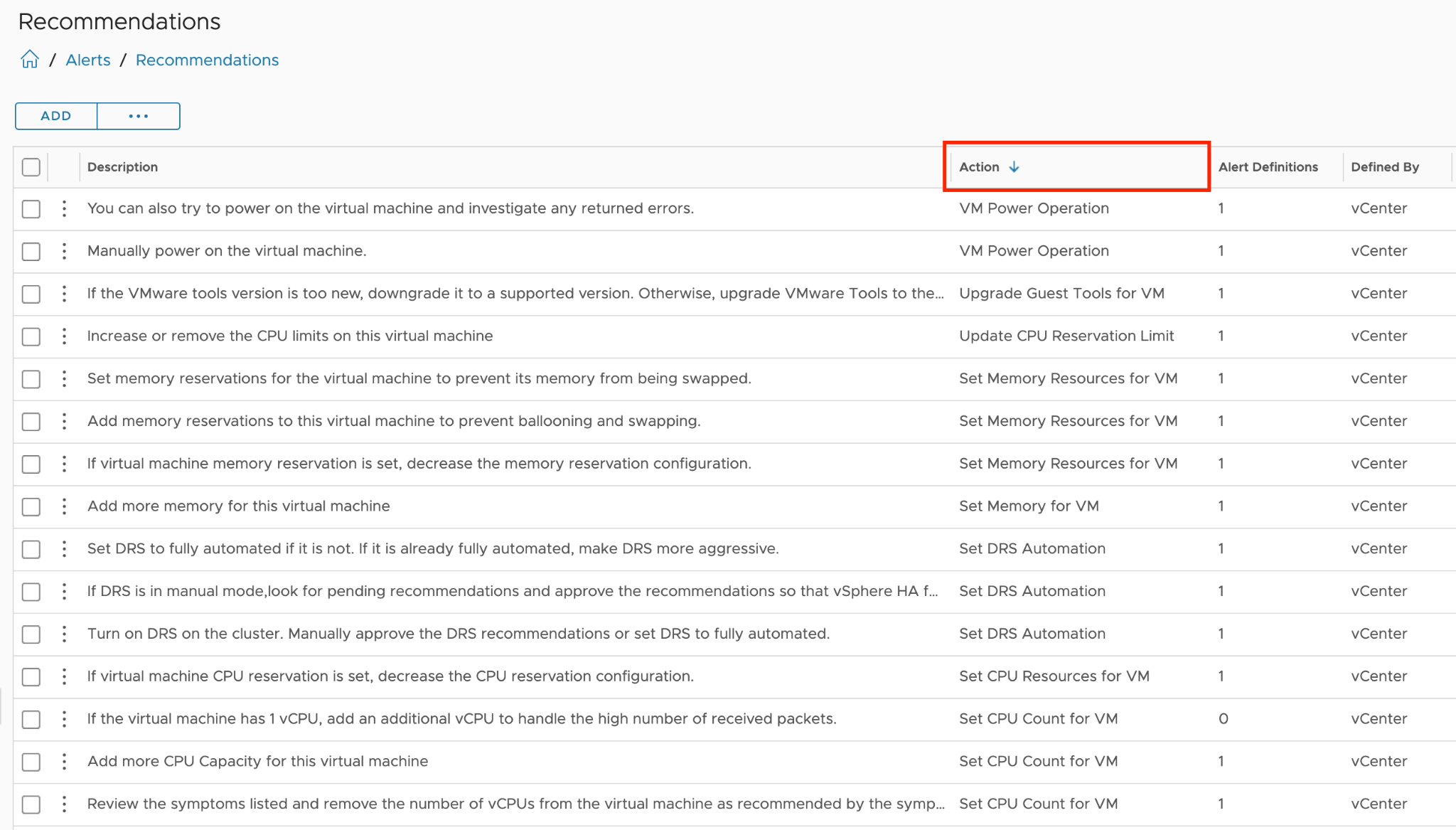
Figure 8: Actions and part of Recommendations.
The initial step towards achieving a Self-Healing Software-Defined Data Center involves automating these actions. However, in an SDDC, simply enabling automation is not sufficient. For instance, compliance with change management processes, involvement of VM owners, or obtaining approvals are necessary considerations. How to exactly address these requirements is not covered in this chapter, but you will explore the available options.
Now, before I provide a brief guide on enabling action automation with a simple example, let me briefly explain the Alert Definition concept in simplified terms.
The following diagram illustrates the relationships between the relevant objects. An Alert Definition can have one or multiple Recommendations. Each Recommendation may include an Action, which becomes accessible within the Recommendation and can be executed manually from the details view of an alert.
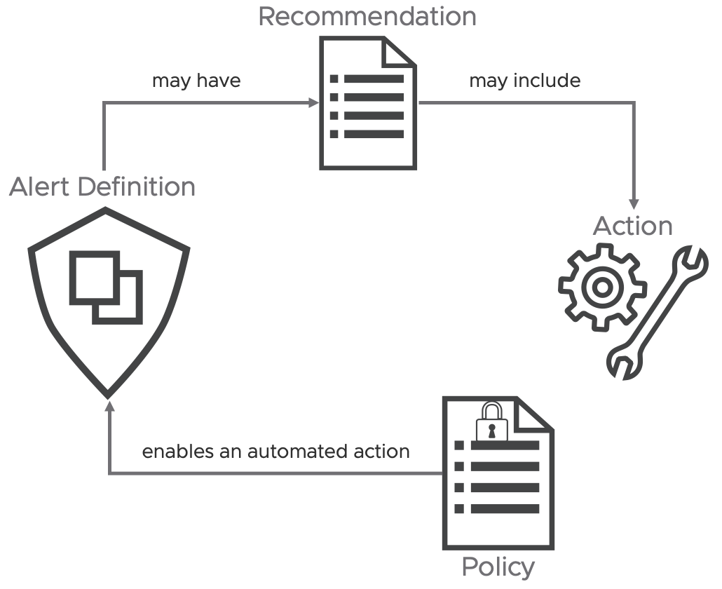
Figure 9: Simplified Alert Definition concept.
Now, there's just one more step needed to implement automation: enabling the automated execution of the action within the corresponding Aria Operations Policy that governs the behavior of each object. The following image illustrates this within my default policy, specifically in the Alert Definition section.
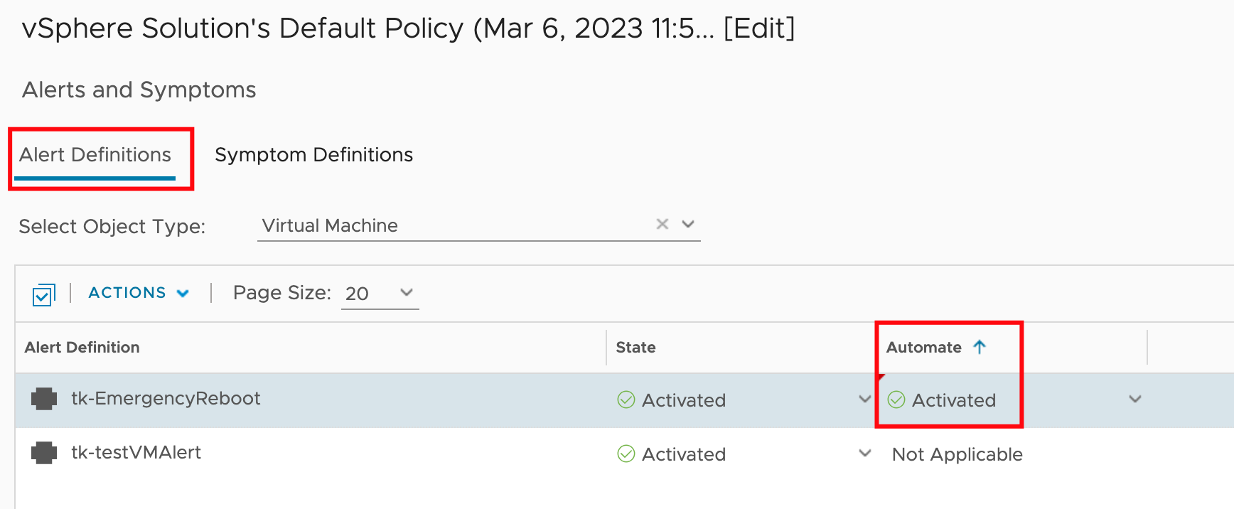
Figure 10: Enabling automated Actions in a Policy.
The next time this specific alert is triggered, Aria Operations will attempt to automatically execute the configured action. I use "attempt" because certain actions may require specific inputs and cannot run without interaction from the administrator.
Over time, the process of creating an Alert Definition in Aria Operations has become significantly clearer. The following image shows the individual steps, including the (optional) configuration of Alert Recommendations which may include Recommendations Actions.
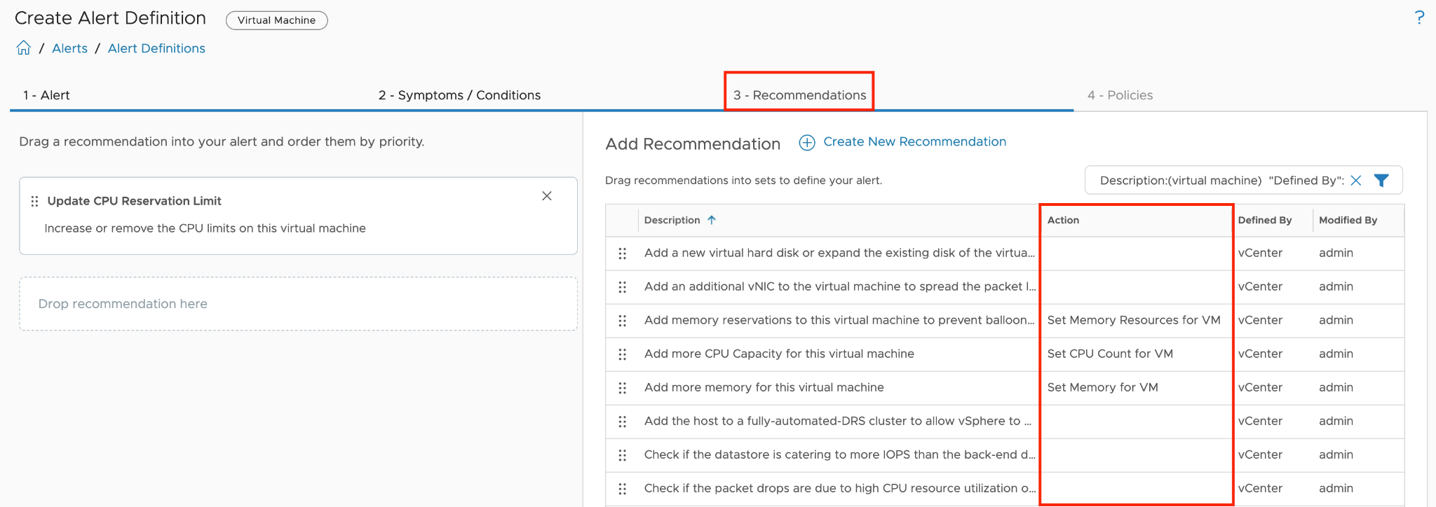
Figure 11: Recommendations option in Alert Definition.
The Automated Action Plugin is a convenient and user-friendly option for automating tasks triggered by Aria Operations alerts, but it has its limitations. The available actions are pre-configured and cannot be customized to address more complex scenarios or additional object types.
I will describe later in detail how to "overcome" the lack of flexibility of the pre-configured actions.
SNMP Trap Plugin
Another plugin that can automate tasks triggered by Aria Operations is the SNMP Trap Plugin. SNMP traps are typically set up to trigger alerts or open tickets through systems equipped with an SNMP receiver. By leveraging VMware Aria Automation Orchestrator as an SNMP Trap receiver, you can incorporate SNMP traps into your automation workflows. In the following image, you can view the configuration of an SNMP Outbound Instance, which is used to send SNMP traps to a VMware Aria Automation Orchestrator endpoint. In this example, the endpoint is the integrated Aria Automation Orchestrator instance.
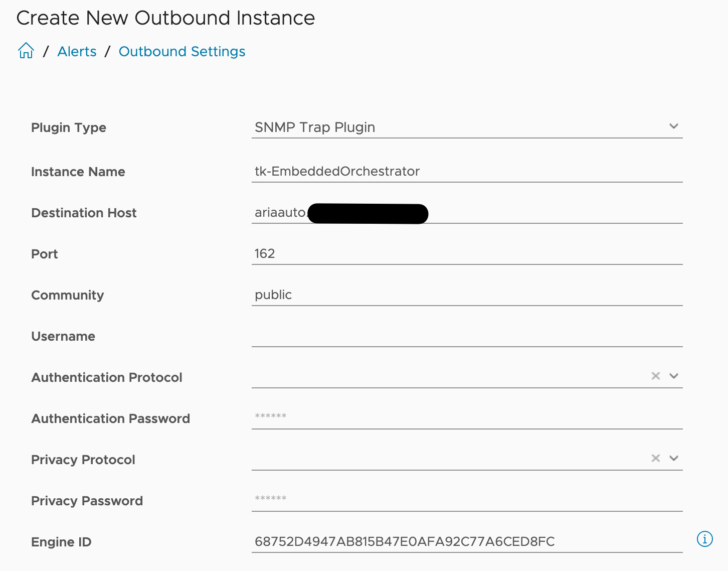
Figure 12: SNMP-Plugin Outbound Instance.
This link describes how to configure a SNMP Trap Receiver Policy in VMware Aria Automation Orchestrator which will be able to start scripts or workflows anytime a SNMP trap has been received. You can also learn how to set up all needed components to start an automated workflow using the SNMP Trap Plugin reading this blog post
Webhook Notification Plugin
The new Webhook Notification Plugin offers a versatile method to integrate with any REST API endpoint.
As we have already learned, we must first create a suitable Outbound Instance to establish a connection with a 3rd party REST API in order to invoke the methods provided there.
We'll look at an example that one of my esteemed colleagues worked on.
John Dias developed a sample Webhook for integrating with Microsoft Teams. To use MS Teams as a target for Aria Operations Notifications, you must first create an incoming Webhook connector for your Teams channel. The configuration of the Webhook in MS Teams is not covered in this chapter, but it is thoroughly explained in John’s post.
To utilize the MS Teams connector in Aria Operations, simply create an Outbound Notification Plugin Instance in Aria Operations with the complete URL of the MS Teams incoming webhook as a parameter, as demonstrated in the following image:
Figure 13: Webhook Notification Outbound Instance for MS Teams.
The supplied payload example simplifies the creation of a Notification. The Payload Template defines the information that Aria Operations will transmit to the target when the specified notification rules are met. The following figure displays the template that John created for the MS Teams integration.
Figure 14: Webhook Payload Template for MS Teams.
Utilizing Notifications, the Webhook Notification Outbound Instance, and the new Payload Templates, you can finely tune the desired outbound payload down to specific metric levels. The following image demonstrates an example of the payload configuration applicable to a webhook outbound connection.
Figure 15: Webhook Payload Template general example.
The enhanced Webhook capabilities enable Aria Operations to integrate with systems that were previously not within our scope, such as for example message queues.
By configuring a Webhook Notification Plugin Instance to connect to a RabbitMQ endpoint and using an appropriate payload template, Aria Operations now supports creating notifications that send data to RabbitMQ queues based on specific events. For instance, this example demonstrates RabbitMQ queues for opened and cancelled alerts.
The prerequisite for this use case is, of course, a functional RabbitMQ instance with the following queues that will receive our messages.
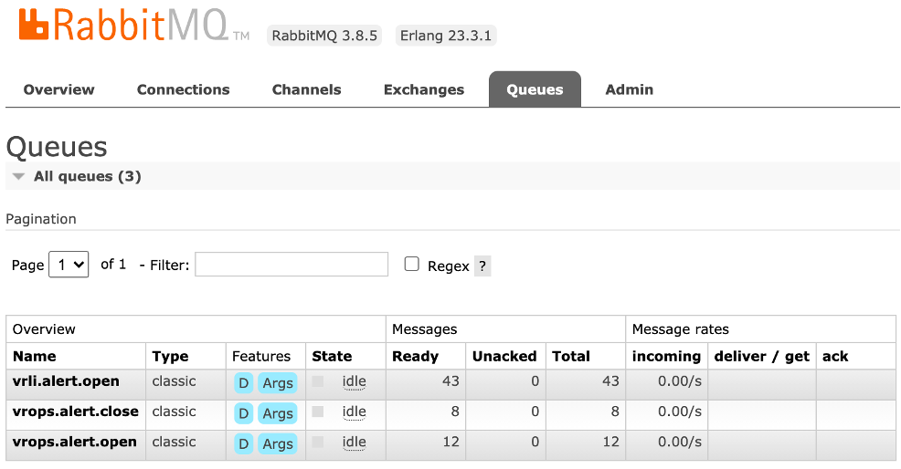
Figure 16: RabbitMQ queues.
The entire process is described in more detail here.
Basically, on the Aria Operations side, we need an Outbound Instance based on the Webhook Notification Plugin and suitable Payload Templates that will be used in Aria Operations Notifications.
In this context, although technically not necessary we could have different notifications for opening and closing an alert, both using the same Outbound Instance but employing different Payload Templates.
The next picture shows the Outbound Instance I have created to connect to my RabbitMQ server.
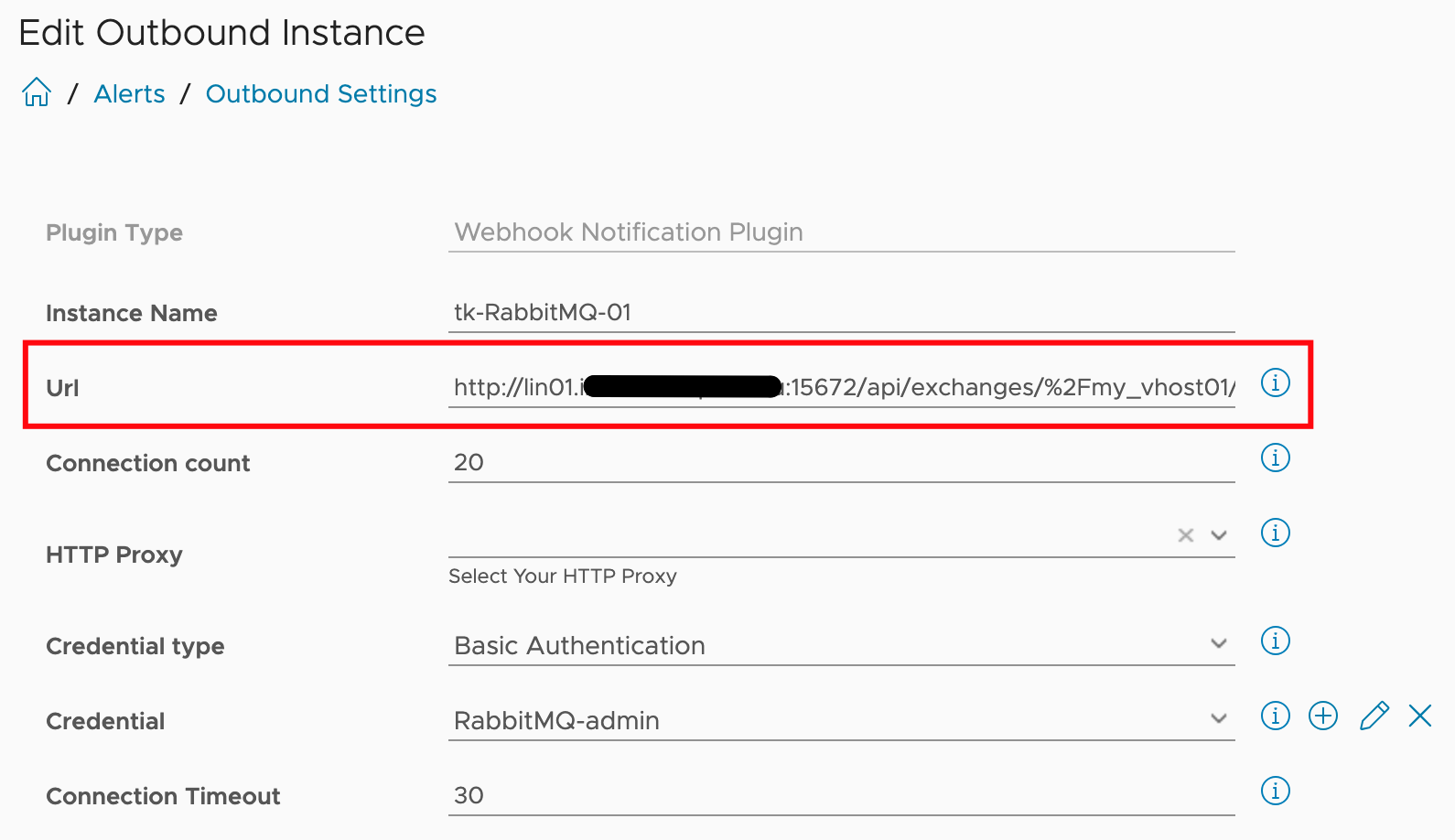
Figure 17: RabbitMQ Outbound Instance configuration.
Please notify that you have to specify the correct host and hosts configured in your RabbitMQ system.
The next image exemplifies the payload template used to place a message into the open queue using an Aria Operations Notification.
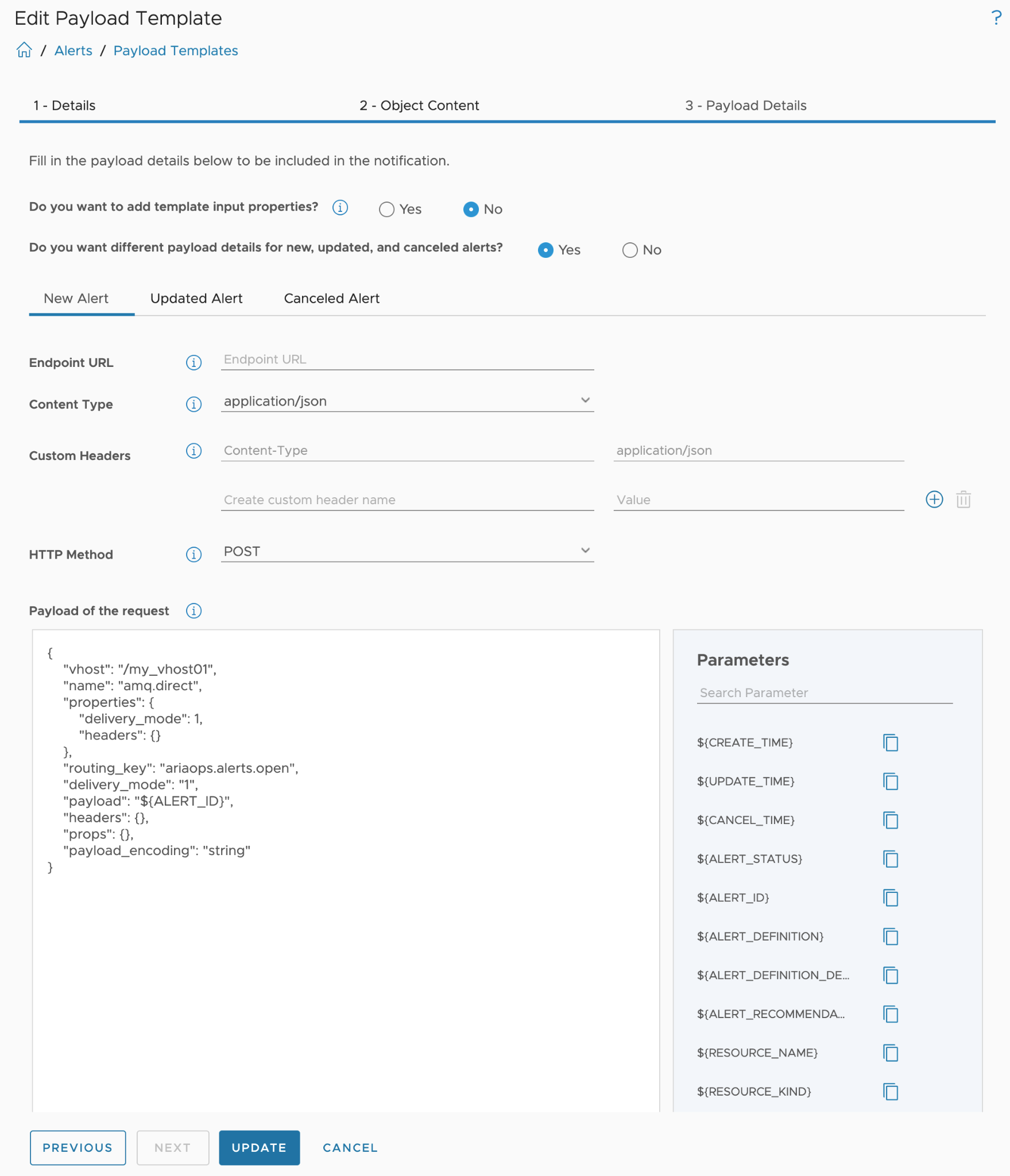
Figure 18: Payload Template for RabbitMQ Outbound Instance.
The payload template offers many configuration options, with the most important being the actual JSON body, especially when discussing REST POST calls. As shown in the last image, in addition to the body, we can configure headers, variables, and other elements typical for REST endpoints.
Notifications
I have mentioned the Aria Operations Notifications construct very often without describing what it actually is and how it is configured. I will address that now.
If you look again at the images of an open or closed-loop control system shown at the beginning, you will probably wonder what the role of the Actuators in Aria Operations is supposed to be. That is precisely the task of the Aria Operations Notifications.
The Notification element provides the required functionality to connect the sensors with the Actuators. The configuration of Notifications includes not only the rules or criteria for when a Notification should be triggered but also the Outbound Instance to be used and the appropriate Payload for the selected type of Outbound Instance.
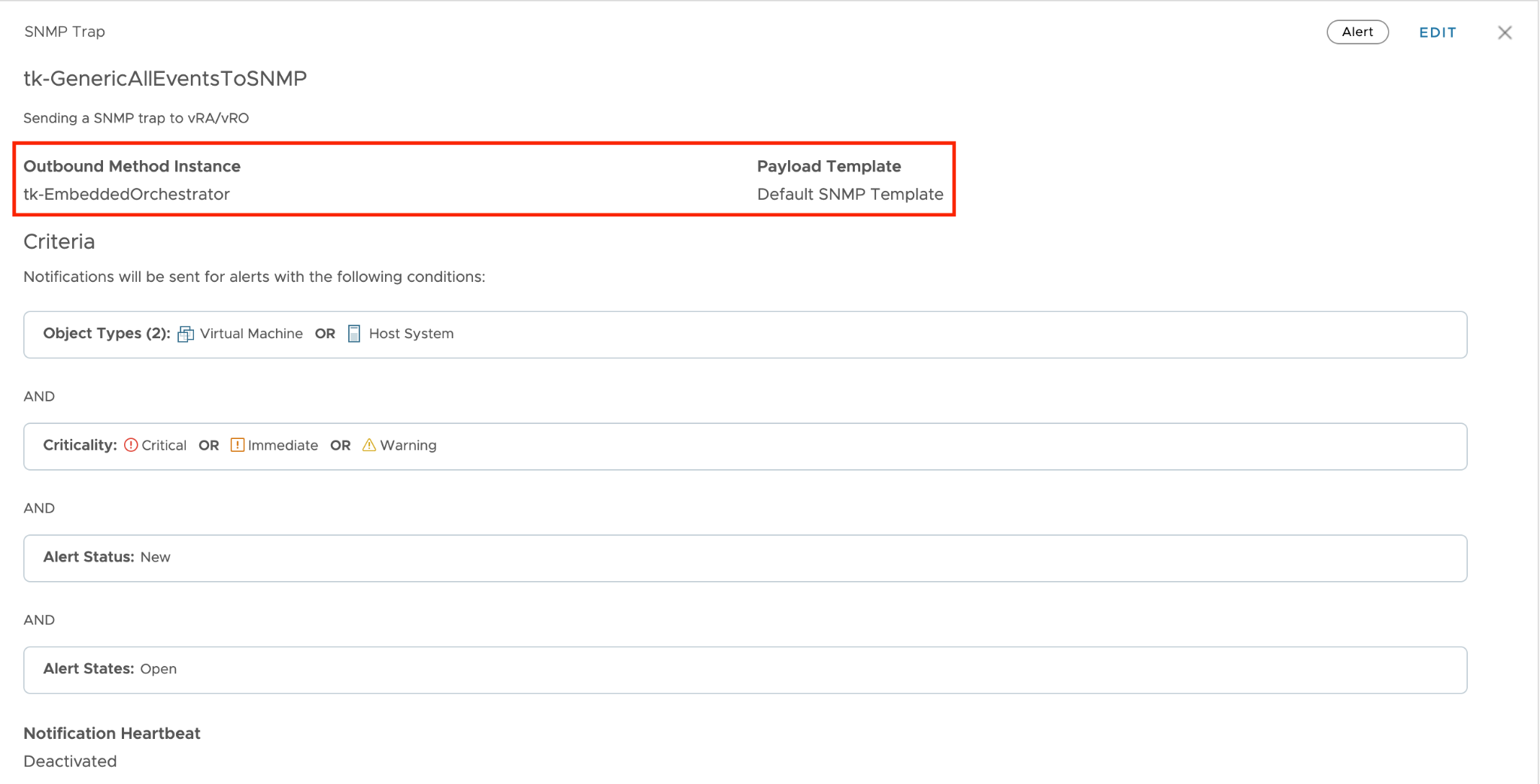
Figure 19: Notification using a SNMP Trap Outbound Instance.
With this information we can extend the model introduced in figure 9 to also include Notifications and Outbound Instances as possible building blocks of automated operations.
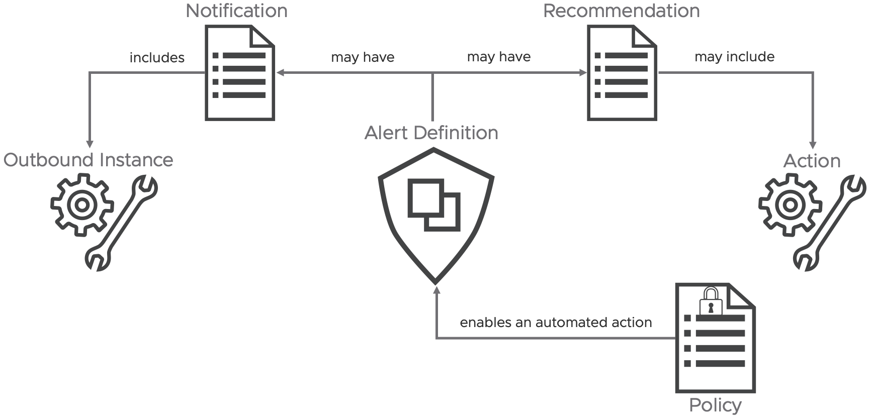
Figure 20: Extended Alert Definition concept.
In the context of automation using Aria Operations, both Automated Actions and Notifications using Outbound Instances exemplify what I would refer to as "fire-and-forget" or, as discussed earlier in this chapter, the open-loop approach to executing automation tasks. If your use cases demand more, such as retrieving additional data from Aria Operations to make more informed decisions, continue reading to discover how to effectively tackle these challenges.
Aria Operations Management Pack for Aria Automation Orchestrator
At the end of the "Automated Actions Plugin" chapter, I promised to discuss how the limited flexibility of Automated Actions can be overcome using other methods. In this chapter, I will describe how this can be achieved through the Aria Operations Management Pack for Aria Automation Orchestrator. It opens up completely new opportunities for automating your operational tasks and provides real self-healing capabilities. In particular, this Management Pack provides following features:
-
Insights into Aria Automation Orchestrator including various metrics, properties and predefined dashboards and alert definitions.
-
Aria Automation Orchestrator workflows available as Actions and within Recommendations.
With this solution it is easy to implement sophisticated self-healing and self-driving SDDC, managed by Aria Operations.
The ingredients are:
-
VMware Aria Automation Orchestrator instance. You can use a stand-alone Aria Automation Orchestrator instance or the instance deployed as part of the Aria Automation installation.
-
Aria Operations.
-
In Aria Operations the **Aria Operations Management Pack for Aria Automation Orchestrator **installed and configured.
To explain the individual configuration steps, I will use a use case that could occur in real operation.
“If a VM (the OS) crashes, this VM should be hard-reset.”
As the determination of whether a VM has actually crashed or the specific process for identifying this is not the focus of this chapter, we will assume that we have appropriate symptom and alert definitions established.
The general approach from use case to automated remediation or any other task is broadly applicable in most scenarios:
-
Develop an VMware Aria Automation Orchestrator workflow tailored to your specific use case.
-
Create or modify an Aria Automation Orchestrator package to include your workflow or workflows.
-
Incorporate the required workflows into Aria Operations by discovering or re-discovering the Aria Automation Orchestrator package created or modified in the previous step.
-
Configure the workflow or workflows within Aria Operations, this is an important step in the entire process.
-
Create or refine Aria Operations Recommendations.
-
Integrate Aria Operations Recommendations into an Aria Operations Alert Definition.
-
(Optional) Undertake manual remediation steps if necessary.
-
(Optional) Activate automated remediation processes for enhanced efficiency.
In this post, I won't delve into the specifics of the workflow content or coding in Aria Automation Orchestrator. Instead, I'll concentrate on how to seamlessly integrate any workflow into Aria Operations, enabling it to execute automatically as part of the alert remediation process.
For our use case, which focuses on a Virtual Machine, the Aria Automation Orchestrator workflow requires at least one input parameter, in my example it is the vm input parameter, to pass the vCenter VM object reference from Aria Operations to Aria Automation Orchestrator. In the image below, you'll also see a second input parameter, vrops_alert_id. When this parameter is available, Aria Operations will pass the internal Aria Operations Alert ID to Aria Automation Orchestrator. This ID can be used for callbacks to retrieve more information from Aria Operations. The next subsection of this chapter will explain how to achieve this.
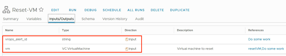
Figure 21: Aria Automation Orchestrator workflow and its input parameters.
The workflow inputs are:
-
vm as VC:<Datatype>, it will be populated with the reference to the VM object which triggered the alert.
-
vrops_alert_id as String, it will be populated with the actual Aria Operations Alert ID for further callbacks.
To use workflows in Aria Operations, they need to be included in a new or existing Aria Automation Orchestrator package. Remember, all workflows within the package that we import in the next step will be visible in Aria Operations. I recommend creating a dedicated package specifically for workflows used in Aria Operations. The next image illustrates a package containing the Reset-VM workflow.
Figure 22: Aria Automation Orchestrator package content.
To make Aria Operations aware of the available workflows, we need to discover the package created or modified in the previous step. This process is straightforward. Navigate to "Environment," then "VMware Aria Automation Orchestrator," and finally "Aria Automation Orchestrator Workflows," as illustrated in the next image.
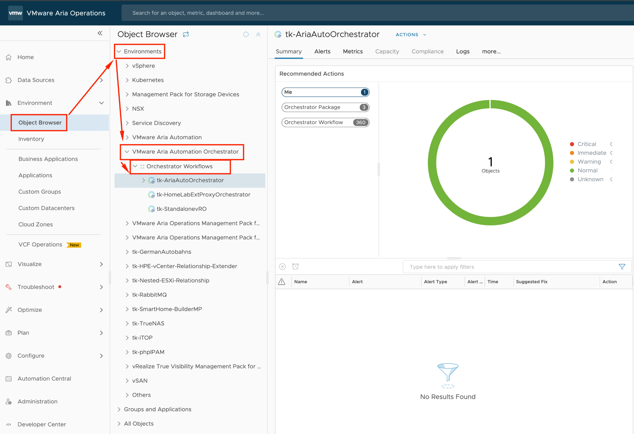
Figure 23: Aria Automation Orchestrator package discovery process.
The next step involves selecting your Aria Automation Orchestrator adapter instance. In my example, this is the integrated Aria Automation Orchestrator, followed by running the "Configure Package Discovery" action from the Actions menu. The subsequent figure illustrates this process.
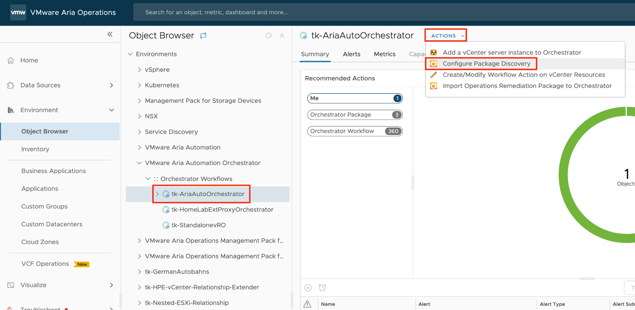
Figure 24: Configure package discovery in Aria Operations.
To initiate the discovery, you'll need to include the relevant package or packages in the list of all packages to inspect. Of course you can remove any package you do not want to be discovered by Aria Operations. Before you remove any package, make sure that none of the included workflows is being used in any of your recommendations. In my example the package I want to scan for workflows is represented by com.vmware.tkopton.vrops.actions. The process begins with the "Begin Action," illustrated in the following figure.
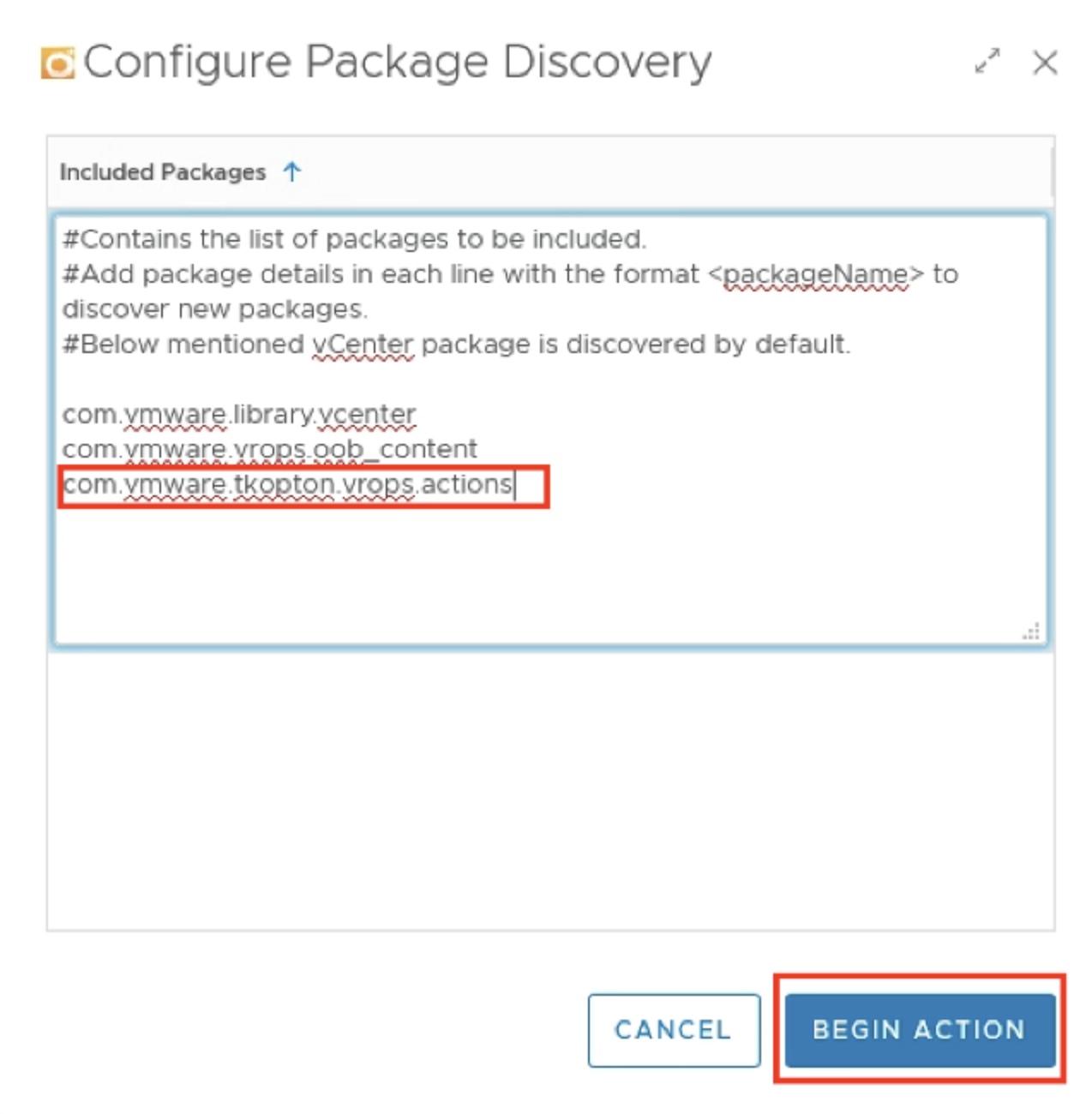
Figure 25: Running the package discovery.
Next picture shows the package and the included workflows after successful completion of the discovery process.
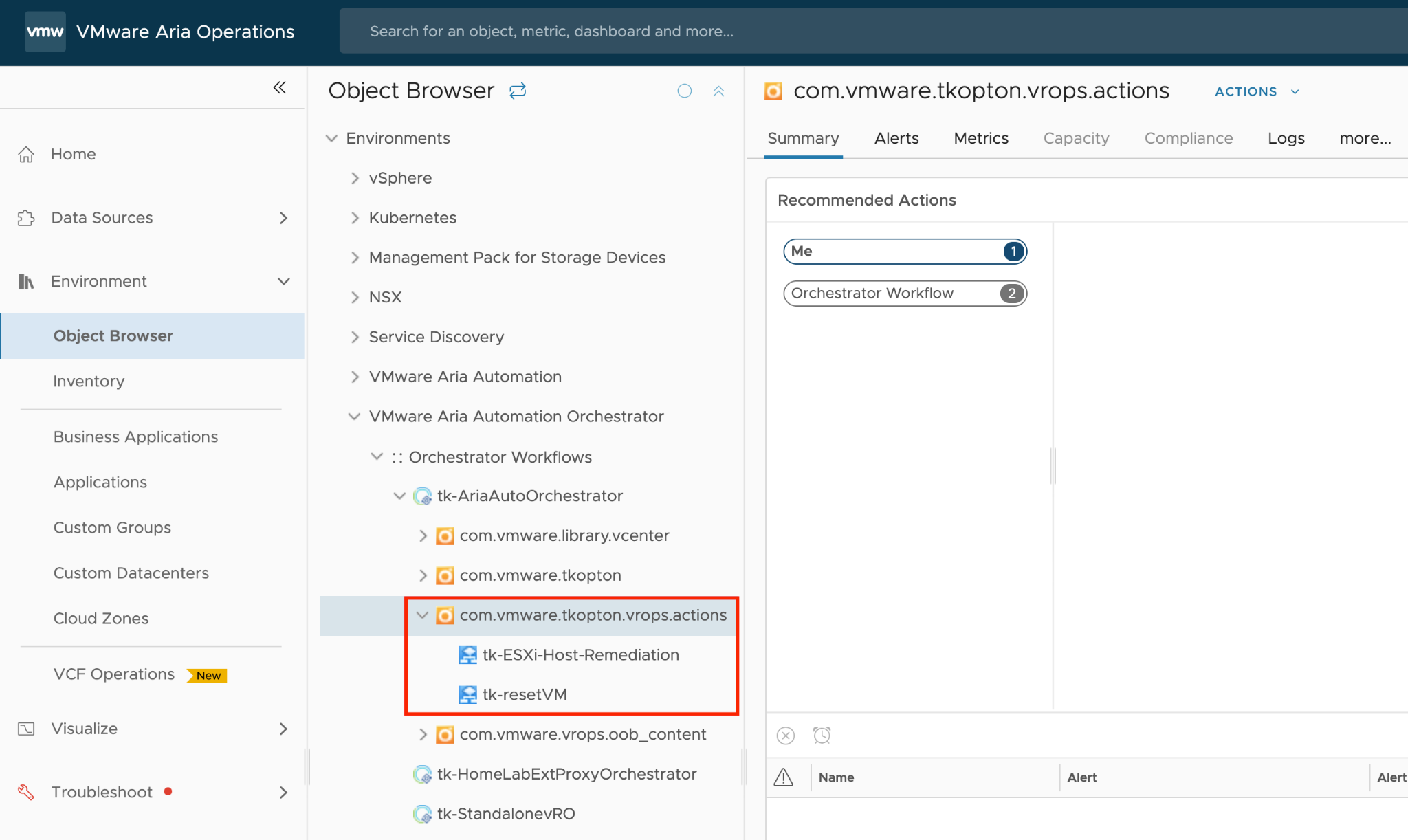
Figure 26: Discovered workflows.
If the use case necessitates executing the workflow on a specific vCenter object, such as a Virtual Machine in this example, it must be properly configured in Aria Operations. Aria Operations-driven automation needs to identify the resource types within an alert definition that will trigger the alert, and the resource type in Aria Automation Orchestrator on which the configured workflow can be executed. These two object types are usually the same but they do not have to be identical.
Furthermore, a workflow can have several different resource types for which it will be available. The target type is, of course, always the same, as it is the input expected by the workflow.
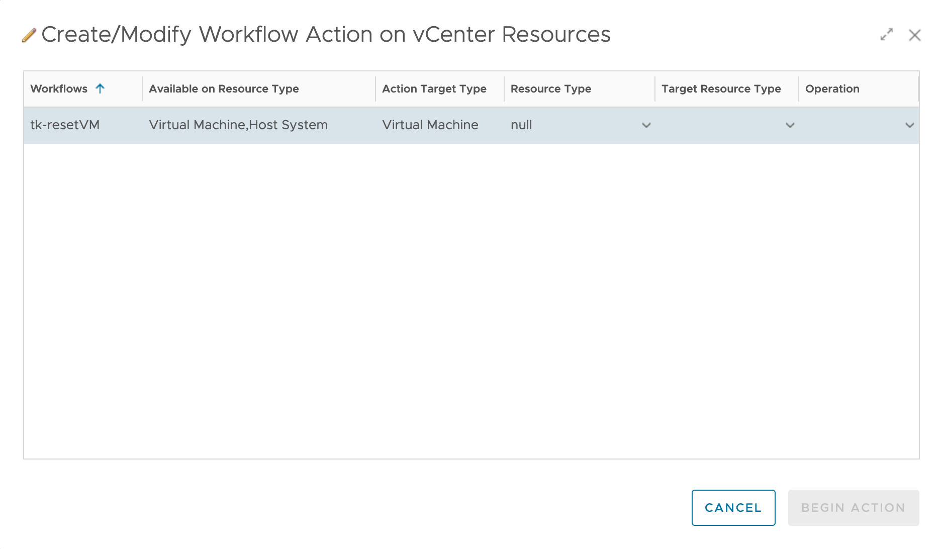
Figure 27: Workflow Action configuration with multiple Resource Types.
To configure this, run the “Create/Modify Workflow Action on vCenter Resources” from the “Actions” menu in the context of the specific workflow, as shown in the following figure.
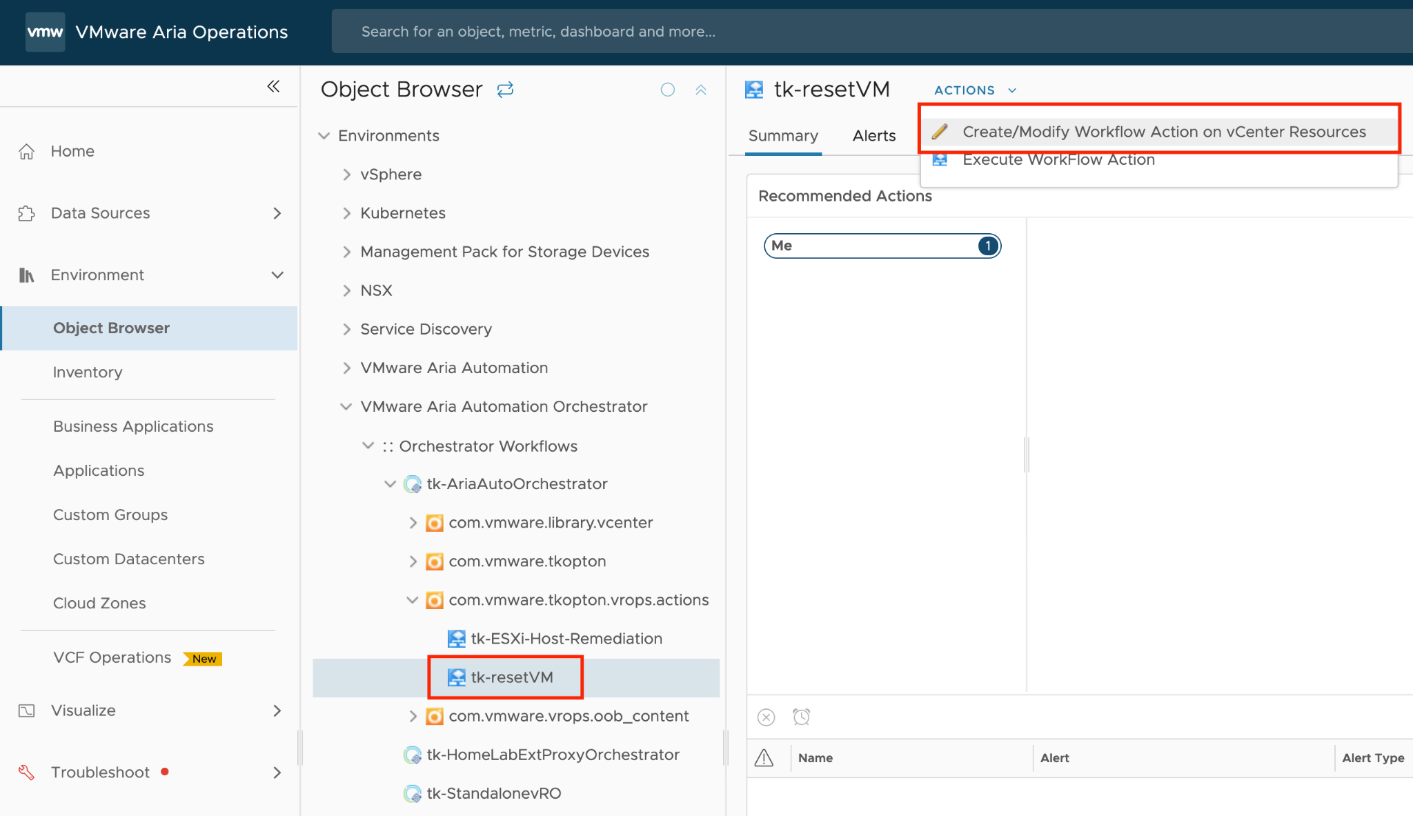
Figure 28: Configuring the workflow for specific resource type.
The parent object is the Resource Type, while the Target Type refers to the specific vCenter object for which the workflow is intended. The workflow takes the target object as its input parameter. For instance, if you want to map a workflow called “Change Ram” to a host system and run this workflow on multiple virtual machines under that host, you should select the Resource Type as Host System and the Target Type as Virtual Machine.
In the example use case, the alert will be triggered on a Virtual Machine resource type and executed on a Virtual Machine resource in vCenter. To achieve this, configure the Virtual Machine as shown in the following picture. The final step is to click “Add” to configure the workflow as a usable action.
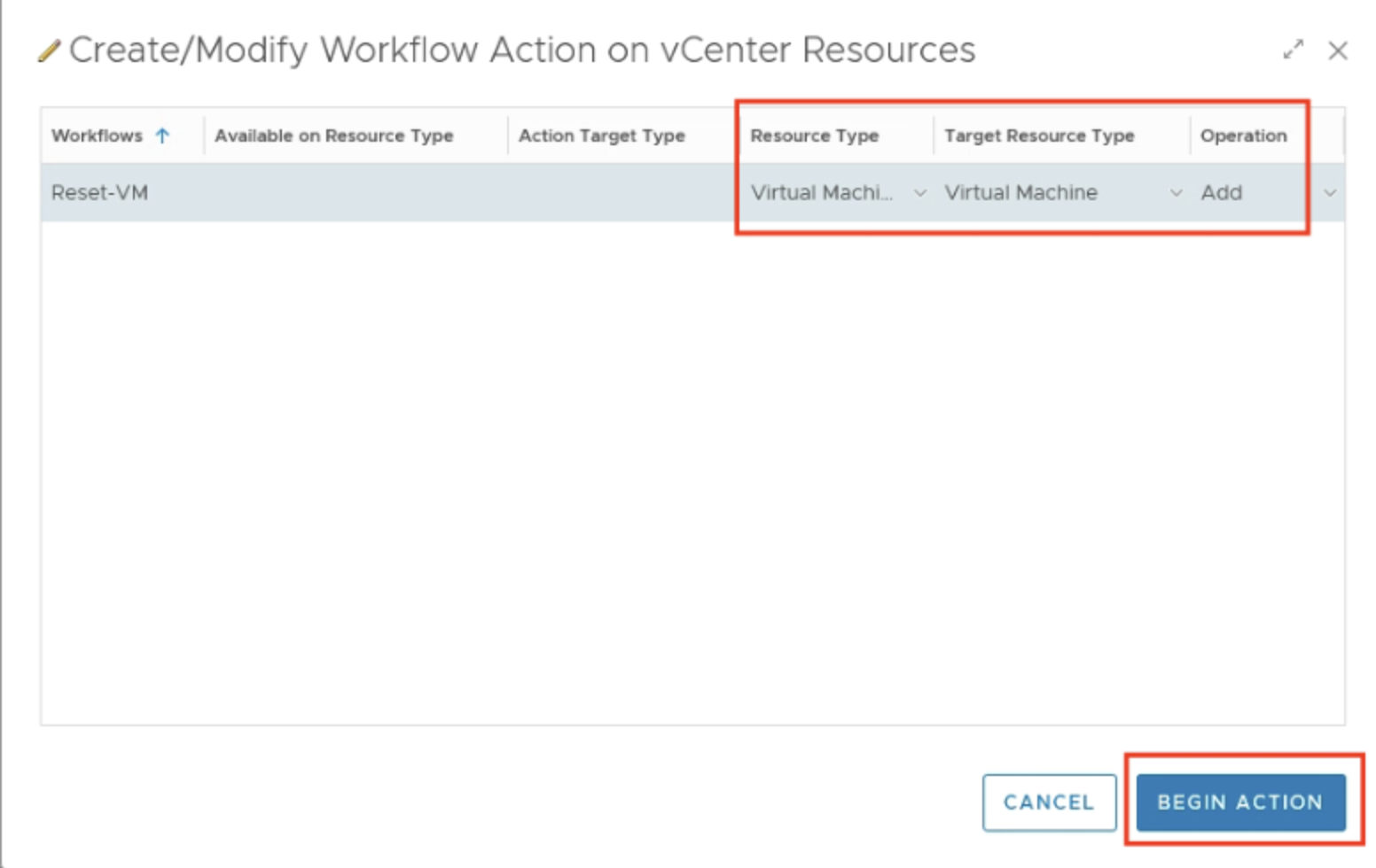
Figure 29: Workflow Action parameters configuration.
With this configuration, Aria Operations has all the necessary information to automate tasks using Aria Automation Orchestrator workflows. The final step is to configure these workflow-based actions within the appropriate Recommendation definition and enable the automation within the respective policy.
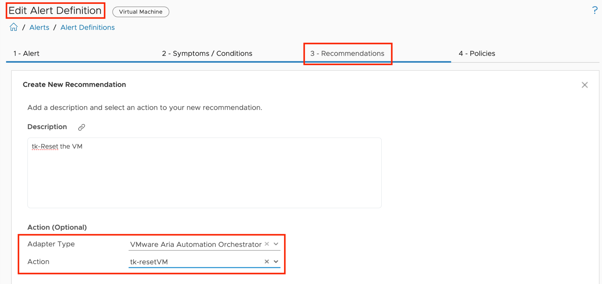
Figure 30: Alert Definition with a Recommendation containing a Workflow Action.
Upon execution, the properly configured Aria Automation Orchestrator workflow will receive the Aria Operations alert ID and a reference to the affected Virtual Machine, as shown in the next figure. This ID can be used to further enhance the automated actions.
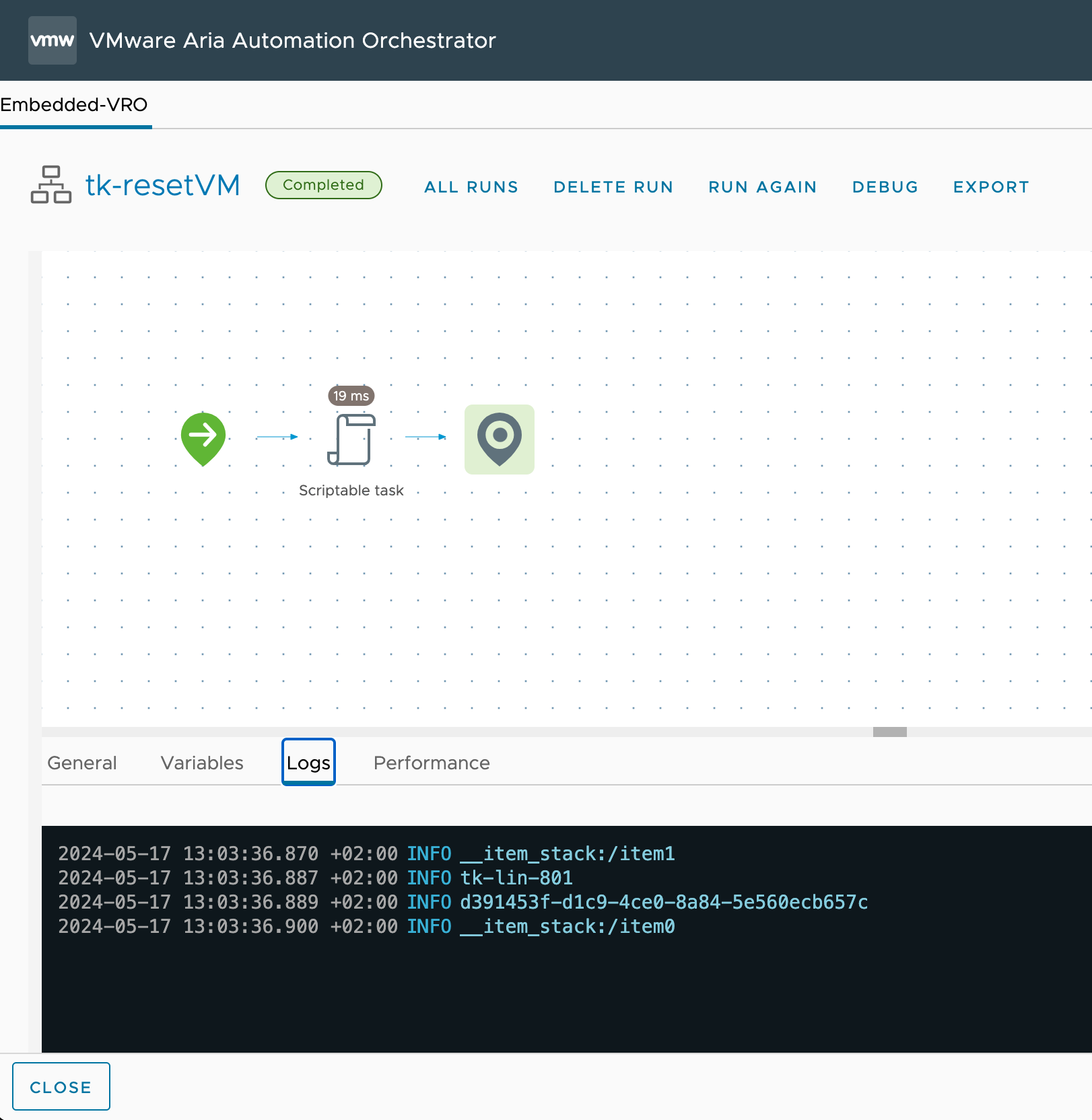
Figure 31: Workflow output in Aria Automation Orchestrator.
With the management pack for Aria Automation Orchestrator we have almost unlimited possibilities to extend Aria Operations actions and implement self-healing operations.
Automation Central
Automation Central is a powerful feature within Aria Operations that enables IT administrators to create, manage, and schedule automated jobs for optimizing virtual environments. This centralized hub allows users to automate various optimization actions, including reclaiming resources, rightsizing VMs, and performing routine maintenance tasks across vCenter and public cloud environments.
Automation Central serves as a cornerstone for efficient infrastructure management. It provides a user-friendly interface where administrators can set up recurring jobs, track their execution, and obtain detailed reports on the impact of these automated actions. By leveraging Automation Central, organizations can significantly reduce manual workload, improve resource utilization, and maintain a more optimized and cost-effective virtual infrastructure.
Key capabilities of Automation Central include scheduling actions like deleting old snapshots, powering off idle VMs, rightsizing oversized VMs, and even performing operations across multiple cloud platforms. This chapter will delve into the features, benefits, and best practices for utilizing Automation Central to streamline your VMware environment management.
Let's start with a look at the main page of Automation Central. Here we see at a glance all currently scheduled jobs in a calendar overview. As is typical in a calendar, we can navigate through the months, view the details of existing jobs, and start creating new jobs with just a click on "Add Job".
On the Automation Central Home Screen, we can also view Reclamation and Rightsizing Reports, which give us a quick overview of the outcome of our jobs in terms of optimized resources.
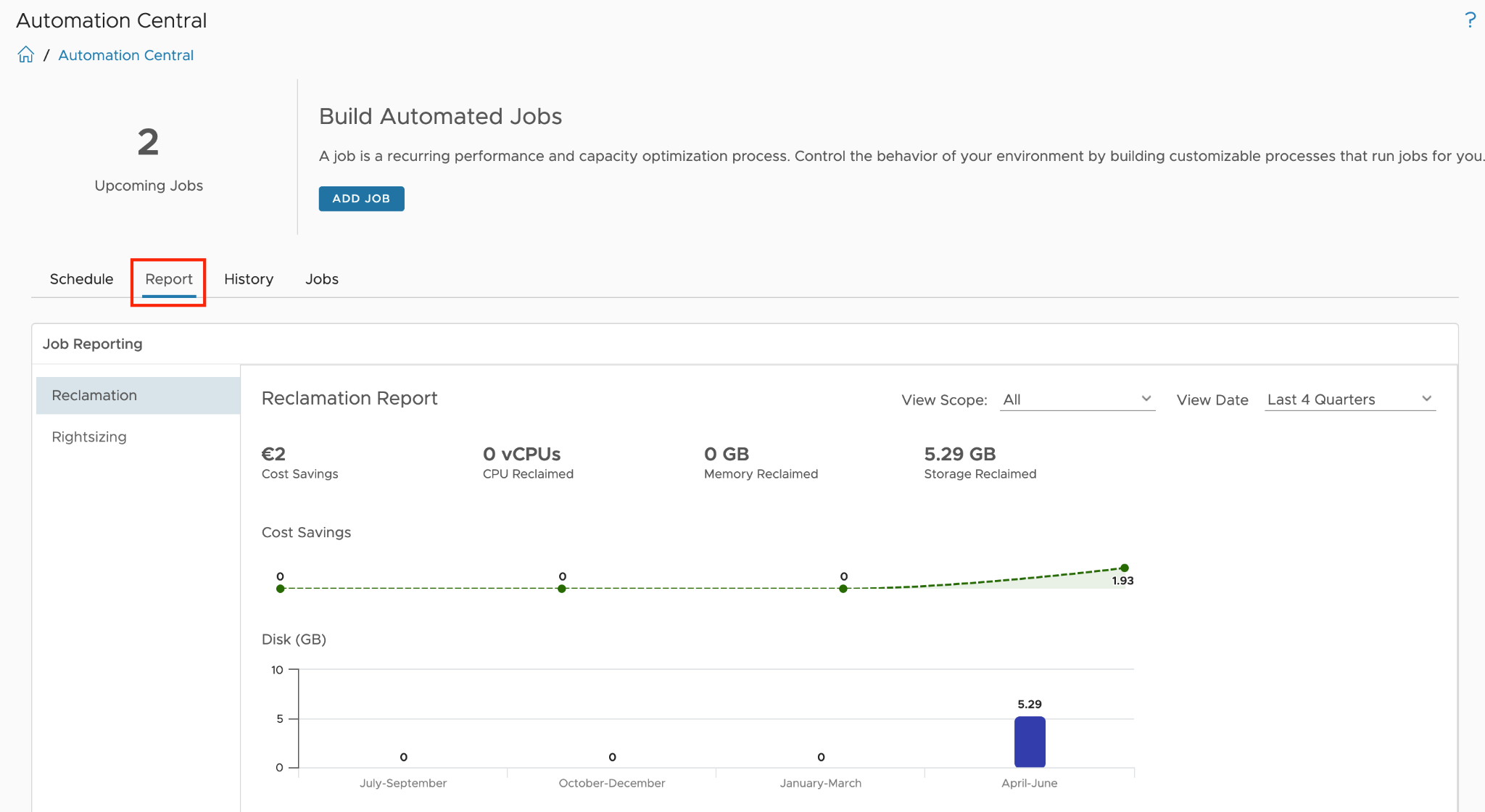
Figure 32: Automation Central - Reclamation Report
To review the History of configured jobs that have run, navigate to the History tab above the calendar. This tab provides a tabular view of job names and details. You can use the search function to find specific jobs or VMs, and the drop-down in the search box allows for advanced search options. Note that the job history page only displays the status of jobs.
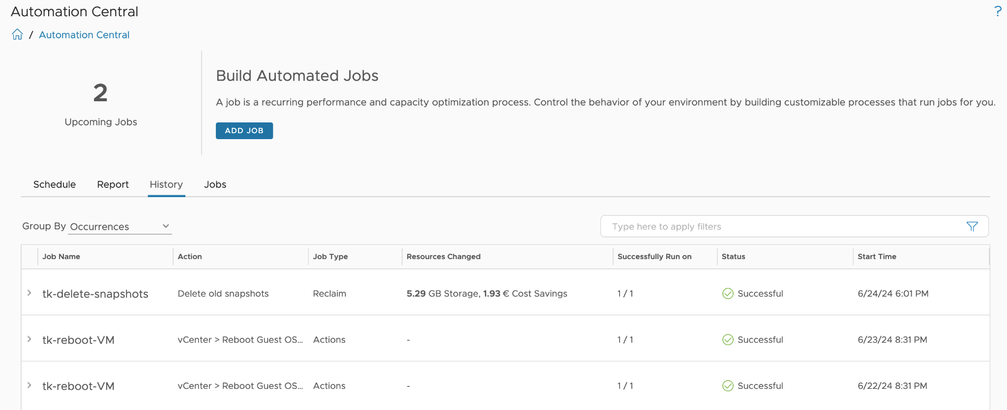
Figure 33: Automation Central - Job History
The Jobs tab displays a list of all configured jobs. For each job, clicking the ellipses icon brings up a menu where you can edit, delete, clone, or deactivate the job. If a job you created is not visible in the list, you can search for it by entering the name in the search box. Alternatively, you can check the job status by using the advanced search options available in the drop-down menu of the search box.
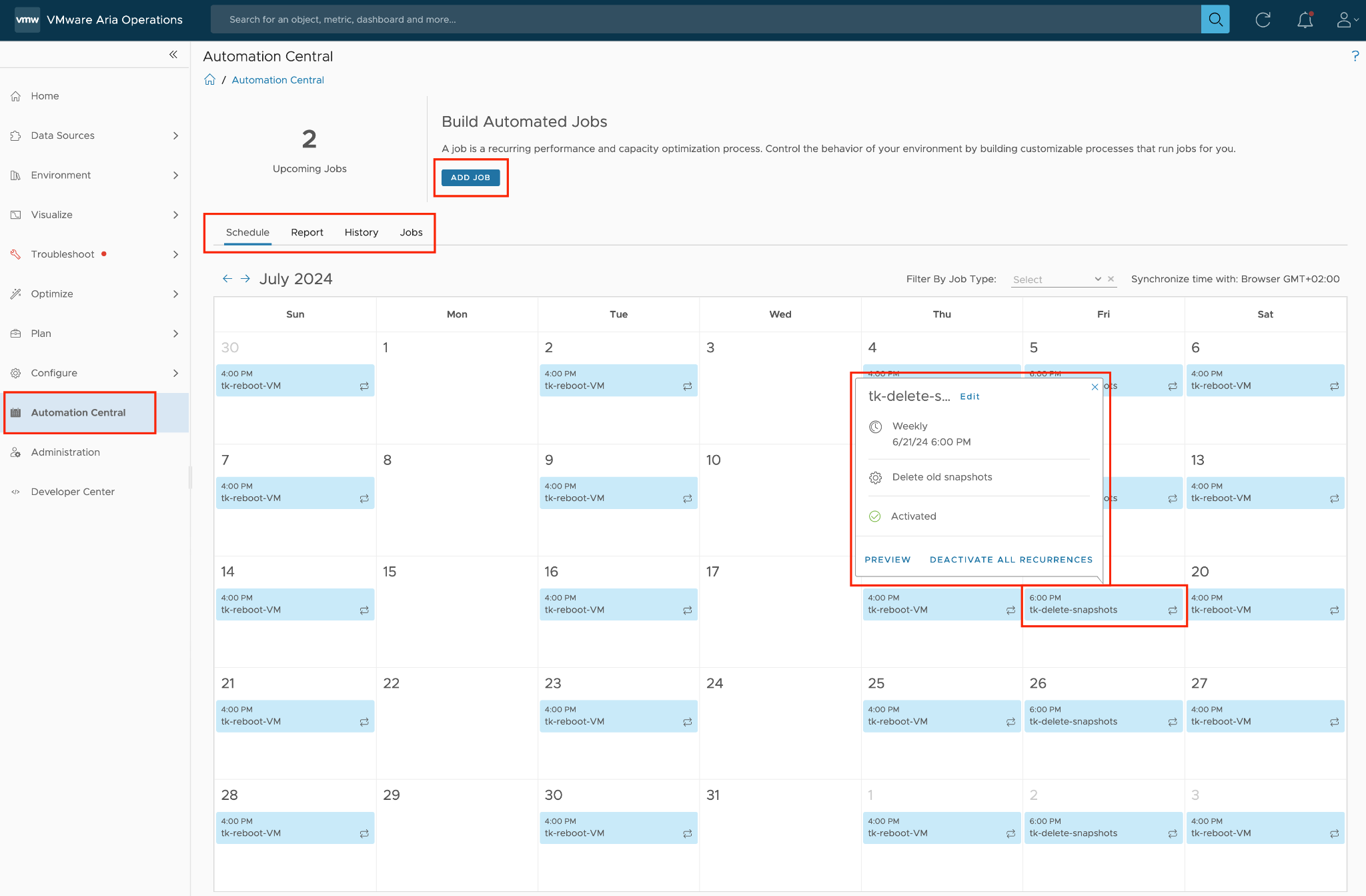
Figure 34: Automation Central - Schedule overview
Creating new fully automated jobs begins with selecting the action to be performed in the job. At the time of writing this chapter, the following three options are available:
-
Reclaim: to optimize unused resources. This action may include one of the following options: Delete old snapshots, Delete idle VMs, Power off idle VMs, Delete powered off VMs.
-
Rightsize: to optimize the configuration of VMs. This action may include one of the two options: Downsize oversized VMs or Scale-up undersized VMs
-
Actions: to schedule reboots or power cycles in a multi-cloud environment including Public Cloud offerings.
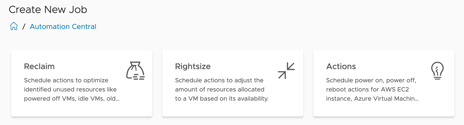
Figure 35: Automation Central - Three types of automated jobs
Creating an automated job is a four-step process. The following screenshots illustrate each step using a Rightsizing job as an example.
In the first step, "1-Rightsize Information", we define the specific action to be performed. In the case of Rightsizing, we have the choice between Downsize and Scale-Up. In this step, the parameters for the selected action are also specified.
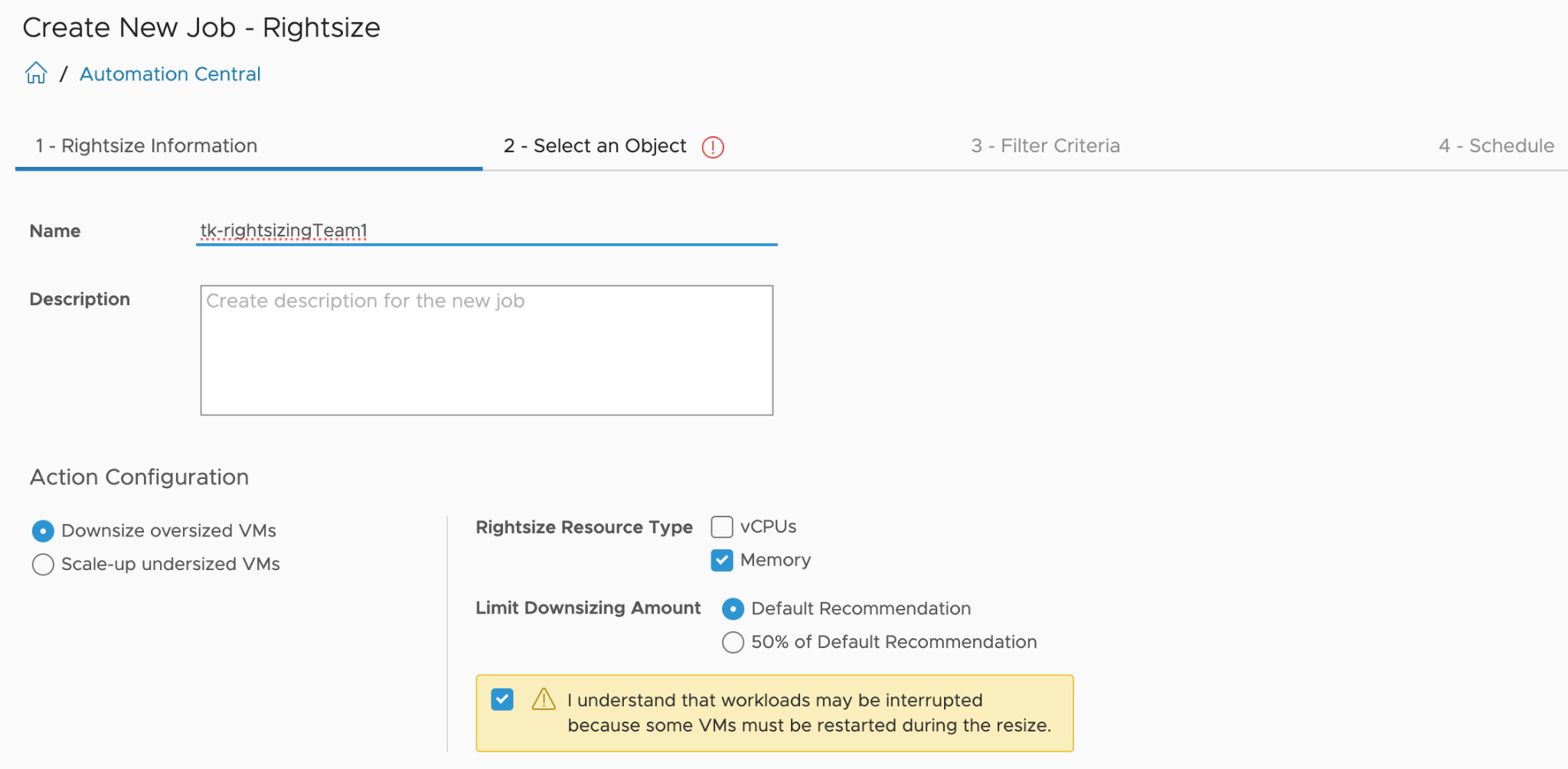
Figure 36: Automation Central - Creating a new job, step 1
In the second step, we define which objects the job should be executed on. Special caution is required here to ensure that the scope is not set too broadly, potentially affecting VMs that were not intended for automation.
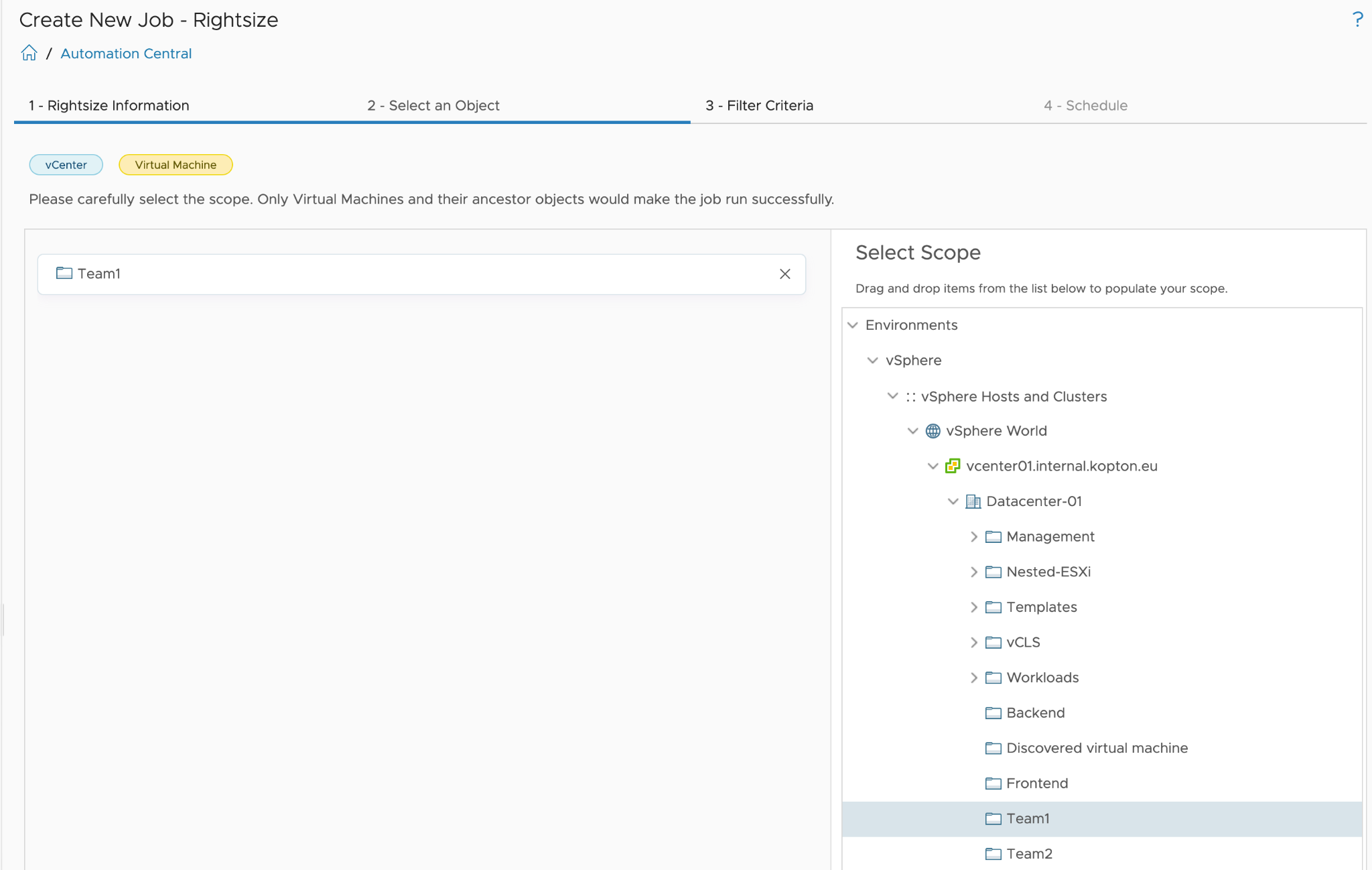
Figure 37: Automation Central - Creating a new job, step 2, selecting object(s)
In the third step, we can set filters to further refine the scope defined in the previous step. For example, a filter could be configured here to capture only VMs with a specific tag within the parent scope.
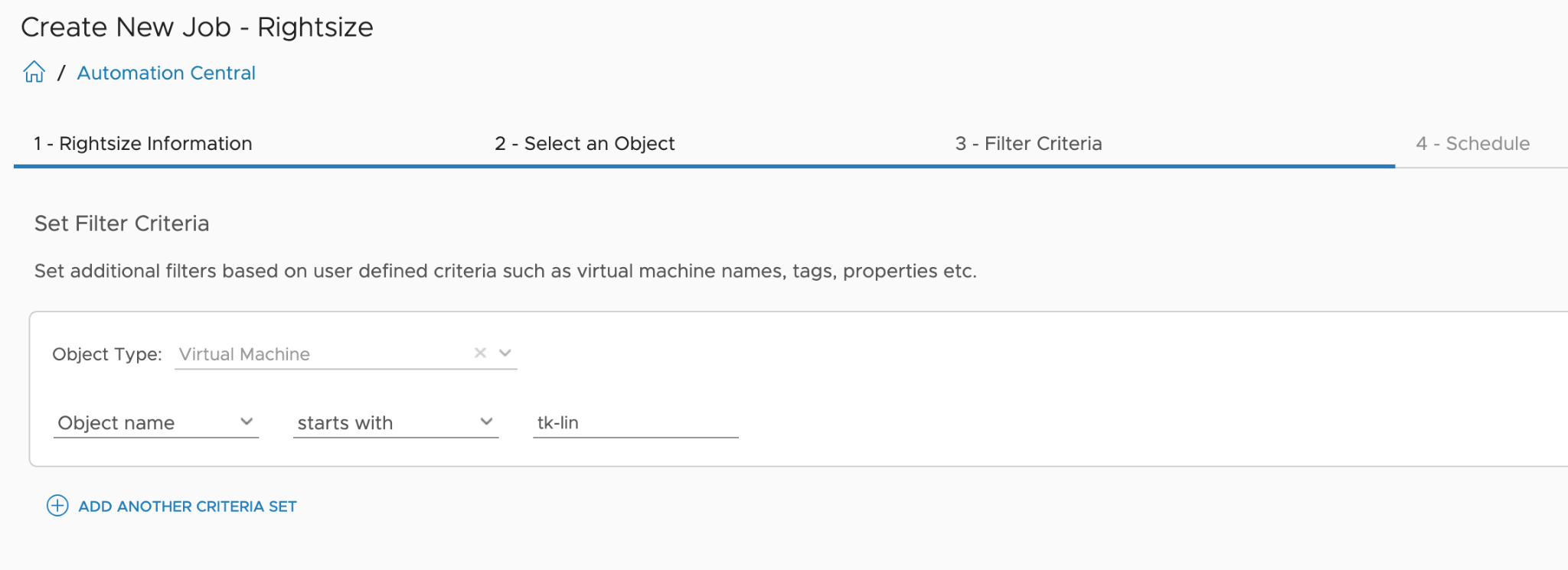
Figure 38: Automation Central - Creating a new job, step 3, filtering criteria
Finally, in the fourth step, the schedule is defined to determine when the job should be executed.
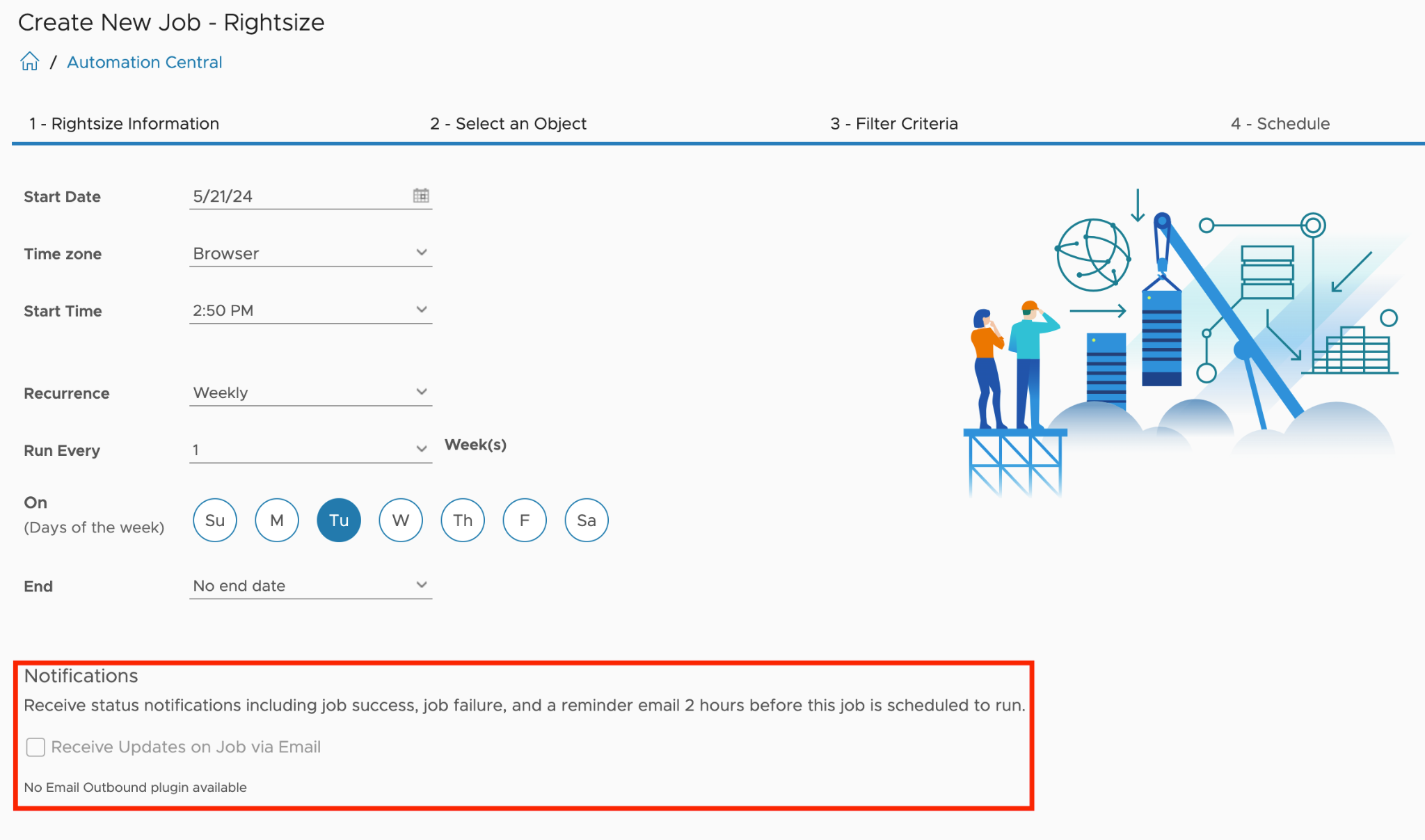
Figure 39: Automation Central - Creating a new job, final step 4, the schedule
While Automation Central provides a convenient way to schedule routine VM operations, its capabilities are currently limited compared to more advanced automation tools like Aria Automation Orchestrator. However, as already stated, it offers a simple and centralized interface within Aria Operations for common VM lifecycle management tasks.
Incoming Communication
Even though Aria Operations offers extensive possibilities with the Management Pack for Aria Automation Orchestrator and the Aria Operations Webhooks to control various systems and perform diverse automation tasks, these solutions are fundamentally 'fire-and-forget' or open-loop approaches as depicted in the following figure. This means that once an automation task is initiated, it runs to completion without ongoing feedback or adjustments based on real-time conditions.
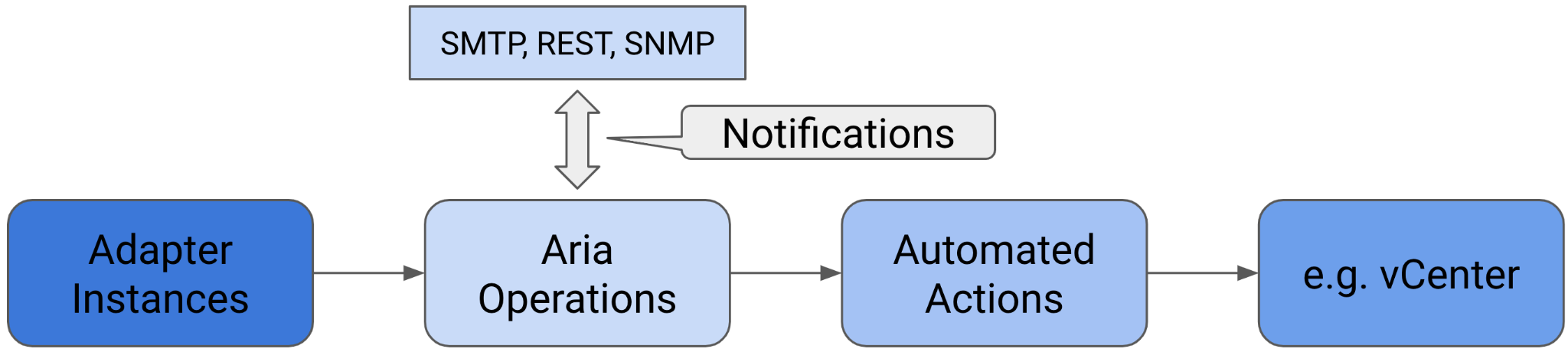
Figure 40: Open Control Loop
Naturally, we can design the primary workflow to execute other workflows and integrate additional systems to enhance the overall automation process. However, the question arises: how do we close the loop back to Aria Operations? What mechanisms are available to return to Aria Operations and obtain further information? Is it possible to extend Aria Operations with custom object types and metrics? The answer is straightforward: yes, it is possible.
By leveraging the Application Programming Interface (API), we can create a feedback loop that allows automated tasks to receive data from Aria Operations and make informed decisions based on the latest information. This capability enables more dynamic and responsive automation, ensuring that the system can adapt to changing conditions.
REST API
Aria Operations, in line with contemporary enterprise solutions, provides a comprehensive REST API for programmatic interaction with the platform. Since the release of version 8.2, VMware has enhanced accessibility to the REST API documentation by integrating Swagger UI. This interactive documentation is now available on every Aria Operations instance, offering developers and administrators direct access to API specifications and testing capabilities.
The REST API documentation can be accessed through the following URL on any Aria Operations deployment:
https://<AriaOps FQDN>/suite-api/doc/swagger-ui.html
This integration of Swagger UI not only simplifies API exploration but also promotes more efficient development and integration processes, allowing users to interact with the API directly from the documentation interface.
The next image shows the landing page of the Suite API Swagger documentation, which offers very simple navigation and an overview of the available methods.
Figure 41: Aria Operations Swagger UI Suite-API documentation.
The Aria Operations REST API provides comprehensive programmatic access to all entities managed by the platform, including their associated metrics, properties, and Aria Operations constructs such as Alert and Symptom Definitions and Recommendations. With appropriate authorization, users can not only extract data from Aria Operations but also introduce new information into the system.
This capability extends to the creation of entirely new custom objects, either of existing or new types, complete with their unique sets of metrics and properties. Furthermore, users can enhance existing objects already collected by Aria Operations adapter instances with custom metrics and properties.
The API offers methods to programmatically manipulate, create, or delete various Aria Operations constructs, including but not limited to Alert and Symptom Definitions, Adapter Configurations, and Super Metrics.
As of the current release, the API supports both XML and JSON formats for data exchange, with JSON being the preferred and recommended format due to its efficiency and widespread adoption in modern web services.
This robust API framework enables developers and administrators to integrate Aria Operations seamlessly with other systems, automate complex workflows, and extend the platform's capabilities to meet specific organizational requirements.
Swagger UI provides an intuitive interface for testing available API methods before implementing them in code. Whether utilizing Swagger UI or working directly within the codebase, the initial step involves authentication. In the context of programmatic access, Aria Operations requires the use of the 'acquire' POST method to obtain an object containing an authentication token and its associated validity period. This token is then utilized in subsequent REST API calls to maintain a secure session.
The authentication process can be visualized and tested through Swagger UI, which offers a user-friendly representation of the 'acquire token' method. This interactive documentation not only facilitates understanding of the API structure but also allows for real-time testing of API endpoints, ensuring developers can validate their authentication approach before full implementation.
Figure 42 illustrates the 'acquire token' method as presented in Swagger UI, demonstrating the required parameters and expected responses for successful authentication.
Figure 42: Acquire token REST API call.
This approach to API exploration and authentication setup exemplifies the robust and developer-friendly nature of Aria Operations' API infrastructure, enabling efficient integration and custom solution development.
The Swagger UI provides an efficient mechanism for identifying the appropriate API function. Users can utilize the search functionality by entering relevant keywords, which then filters and displays the available options. Figure 43 illustrates a curated list (shortened) of accessible methods pertaining to Aria Operations Alerts, demonstrating the intuitive nature of the Swagger interface.
Figure 43: Finding method in the Swagger UI documentation.
This search-driven approach to API exploration not only streamlines the development process but also enhances the overall user experience, allowing developers to quickly locate and understand the specific endpoints required for their integration or automation tasks. The Swagger UI's interactive documentation serves as a valuable resource, bridging the gap between API specification and practical implementation in the context of Aria Operations.
The Swagger UI provides a straightforward method for identifying the appropriate function. By simply entering your search term, you can observe the available options. The following illustration presents a condensed list of accessible methods related to Aria Operations Alerts.
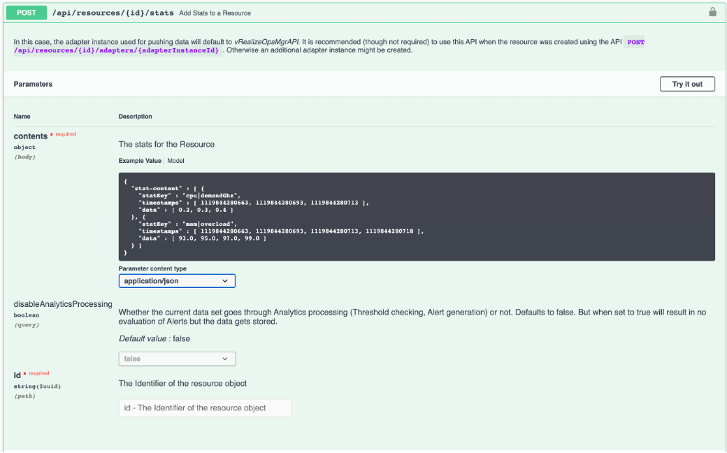
Figure 44: Add Stats REST POST call example.
In a concise example, we will examine the structure of a JSON payload, also referred to as the body, required to append a new metric and a new property to an existing object, in this case, an ESXi host, via the API.
{
"stat-content": [
{
"statKey": "CustomMetrics|Fan01|Speed",
"timestamps": [
{{epoch}}
],
"data": [
1700.0
],
"others": [],
"otherAttributes": {}
}
]
}
Please note that this example was executed in Postman, utilizing an {{epoch}} variable for determining the current timestamp. This variable contains the result of a pre-request script executed at runtime.
The script code in Postman:
var epoch = (new Date).getTime();
postman.setEnvironmentVariable("epoch", epoch);
The corresponding curl command (FQDN, ObjectID and the Token have been shortened):
curl --location 'https://vrops/suite-api/api/resources/18xxx2/stats' \
--header 'Content-Type: application/json' \
--header 'Accept: application/json' \
--header 'Authorization: vRealizeOpsToken f0xxx1' \
--data '{
"stat-content": [
{
"statKey": "CustomMetrics|Fan01|Speed",
"timestamps": [
1720088952741
],
"data": [
1700.0
],
"others": [],
"otherAttributes": {}
}
]
}'
And this is how the result looks like in the Aria Operations UI.
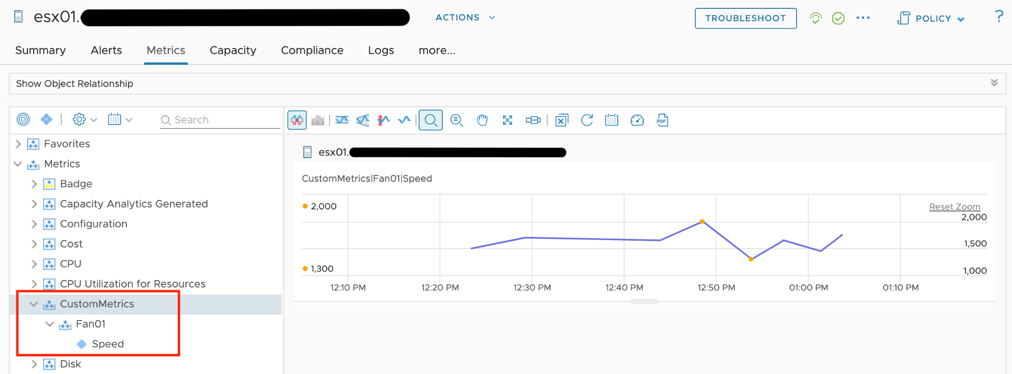
Figure 45: Custom Metrics in Aria Operations UI
Example of a JSON body showing how to add a custom property:
{
"property-content": [
{
"statKey": "CustomProps|Fan01|Status",
"timestamps": [
{{epoch}}
],
"values": [
"ON"
],
"others": [],
"otherAttributes": {}
}
]
}
The corresponding curl command (FQDN, ObjectID and the Token have been shortened):
curl --location 'https://vrops/suite-api/api/resources/18xxx2/properties' \
--header 'Content-Type: application/json' \
--header 'Accept: application/json' \
--header 'Authorization: vRealizeOpsToken f0xxx1' \
--data '{
"property-content": [
{
"statKey": "CustomProps|Fan01|Status",
"timestamps": [
1720099341117
],
"values": [
"ON"
],
"others": [],
"otherAttributes": {}
}
]
}'
And the representation in the UI:
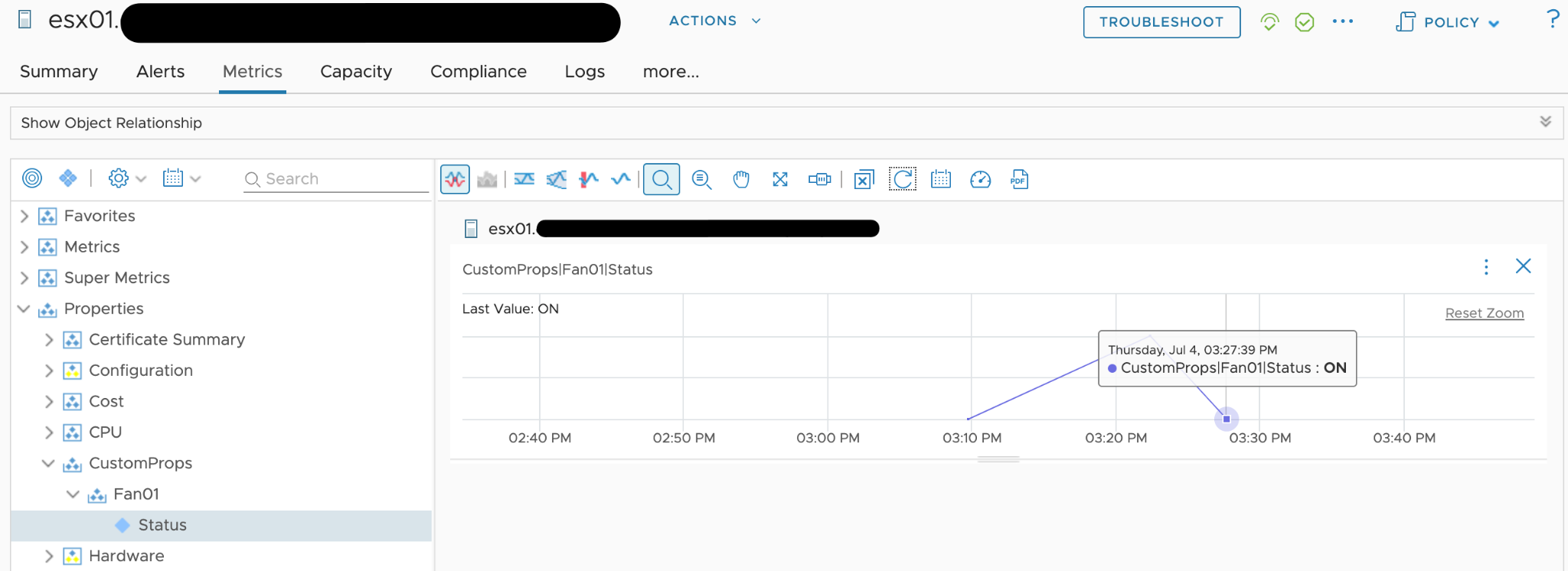
Figure 46: Custom Property in Aria Operations UI
The available API methods are divided into two distinct groups: the public API definitions and the internal API.
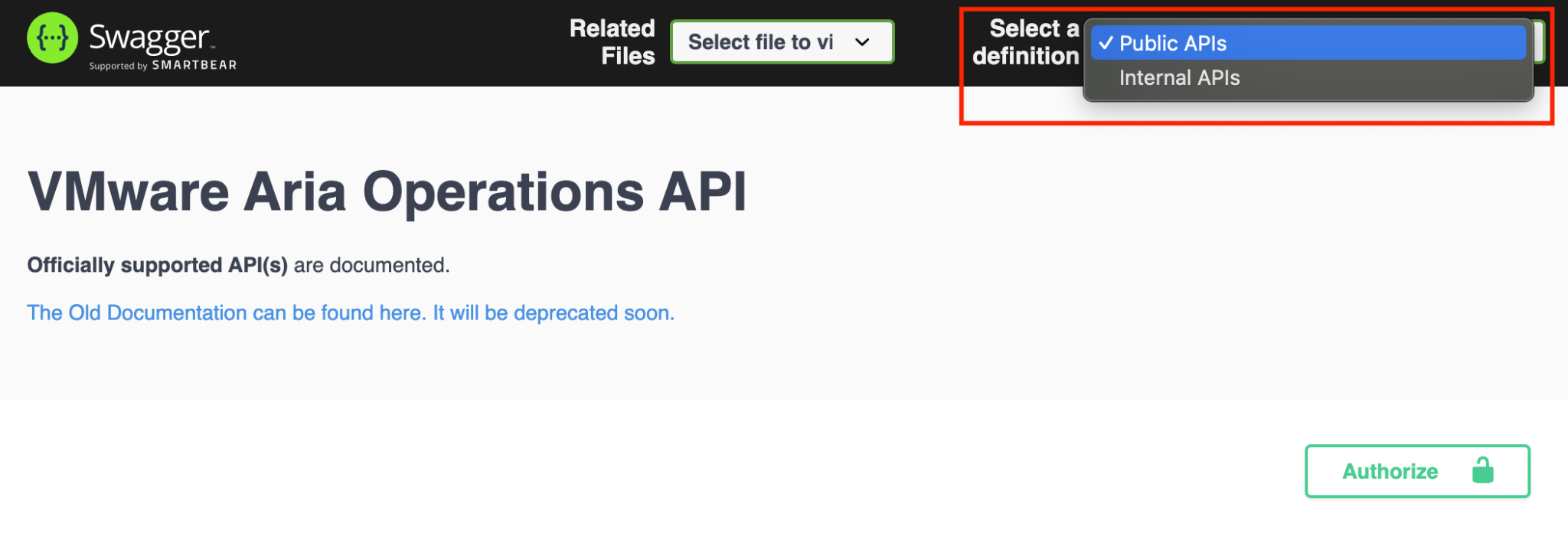
Figure 47: Public and Internal API
While the public API is considered stable and supported, the internal API methods should be used with caution. Please note that the internal API methods may be subject to change or removal in future releases without prior notice. Utilizing the internal API is done at the user's own risk.
One remarkable use case leveraging the Aria Operations REST API is the vRealize Operations Export Tool (vrops-export), developed by Pontus Rydin. This utility facilitates the export of data from Aria Operations.
The latest version, as of the time of writing these words, can be found here.
Closing the Loop - Callbacks
With the ability to connect back to Aria Operations to retrieve data or push custom information, we can finally close the loop to achieve a fully featured closed-control loop. The following diagram represents our closed-loop control system, incorporating all concepts we have learned in the previous sections of this chapter.
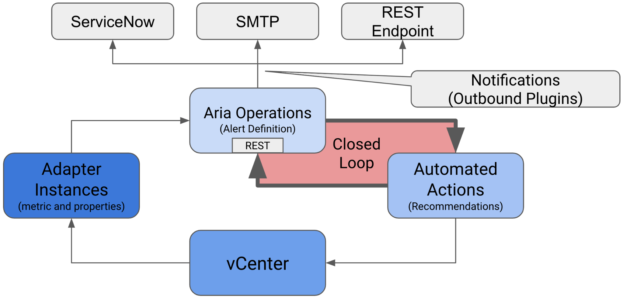
Figure 48: Closed Control Loop
Upon comparing the diagram to Figure 2 “Open Control Loop”, you will notice that we now have a continuous and closed-loop between the entity executing our automated actions and the entity collecting the data that reflect the behavior of objects we control. We are no longer limited to the "fire and forget, until the sensors do something" method. With the possibility to execute callbacks to the REST API, Aria Operations becomes an integral part of an automated SDDC solution.
Let us revisit our initial use case: "If a VM (the OS) crashes, this VM should be hard-reset." We can expand this use case to achieve a sophisticated and automated remediation process leveraging all the concepts presented in this chapter. Let us revisit the diagram xy and extract the possible components of the automation.
The central control point is, of course, Aria Operations itself. This platform provides the necessary tools and integrations to automate and manage VMs and other objects effectively.
Within Aria Operations, we have an Alert Definition that leverages specific symptoms to trigger an alarm when the symptoms indicate that something is amiss, such as a VM crash. This alarm is based on symptom evaluation, which may not directly point to a root cause.
Upon alarm generation, the configured Notification:
-
Creates a problem ticket in ServiceNow.
-
Sends a notification email to the admin team.
Simultaneously, the Action configured within the Recommendation initiates a Aria Automation Orchestrator Workflow. This workflow may:
-
Attempt to connect to the VM via RDP or SSH.
-
Execute ping or TCP connect checks.
-
Reset the VM if the configured checks support the initial assumption.
-
Verify the VM's availability.
-
Update the alert status in Aria Operations if necessary.
-
Push additional properties (e.g., count of Aria Automation Orchestrator-initiated reset events) to the VM object.
When the alarm status changes, the configured Notification:
-
Updates the problem ticket in ServiceNow.
-
Sends another notification email to the admin team.
With Aria Operations, its comprehensive REST API, the wide range of Management Packs, integrated Notification Plugins, and the capability to run Actions using Aria Automation Orchestrator, you have extensive possibilities to automate your SDDC management and elevate it to become a Self-Driving SDDC.
SDDC vs IaaS
Part 4 Chapter 4
This chapter provides an introduction to how IaaS management differ to the physical infrastructure management. It is placed at the end as this is now considered a basic knowledge. I still find it useful in explaining why the complexity goes up significantly. IDC actually predicts this back in 2012. The link from APM Digest website states that “operational complexity in virtualized, scale-out, and cloud environments and composite Web-based applications will drive demand” for a new type of tools that can “rapidly sort through hundreds of thousands of monitor variables, alerts and events”.
VM, it is not what you think!
In this chapter, we will dive into why seemingly simple technology, an X86 machine virtualized, has a large ramification for the IT industry. In fact, it is turning a lot of things upside down and breaking down silos that have existed for decades in large IT organizations. We will cover the following topics:
-
Why virtualization is not what we think it is
-
Virtualization vs Partitioning
-
A comparison between a physical server and a virtual machine
Journey into the Virtual World
It is the era of the cloud. Who does not know what a VM is? Even a business user who has never seen one knows what it is. It is just a physical server, virtualized. Nothing more.
Wise men say that small leaks sink the ship. We think that’s a good way to explain why IT departments who manage physical servers well struggle when the same servers were virtualized.
We can also use Pareto principle (80/20) rule. 80% of a VM is identical to physical server. But it’s the 20% differences that hit you. We will highlight some of this “20% portion”, focusing on areas that impact data center management.
The change caused by virtualization is much larger than the changes brought forward by previous technologies. In the past two or more decades, we transitioned from mainframes to the client/server-based model to the web-based model. These are commonly agreed upon as the main evolutions in IT architecture. However, all of these are just technological changes. It changes the architecture, yes, but it does not change the operation in a fundamental way. Both the client-server and web shifts did not talk about the "journey". There was no journey to the client-server based model. However, with virtualization, we talk about the virtualization journey. It is a journey because the changes are massive and involve a lot of people. That’s why the evolution toward multi-cloud operations is also called a journey.
Gartner correctly predicted the impact of virtualization in 2007. More than 1 decade later we still have not completed the journey. Proving how pervasive the change is, here is the following summary on the article12 from Gartner:
Notice how Gartner talks about change in culture. So, virtualization has a cultural impact too. In fact, if your virtualization journey is not fast enough, look at your organization's structure and culture. Have you broken the silos? Do you empower your people to take risk and do things that have never been done before? Are you willing to flatten the organization chart?
The siloes that have served you well is likely your #1 barrier to multi-cloud.
So why exactly is virtualization causing such a fundamental shift? To understand this, we need to go back to the basics, which is what exactly virtualization is. It's pretty common that senior IT management have a misconception about what this actually is.
Take a look at the following comments. Have you seen them in your organization?
-
"VM is just Physical Machine virtualized. Even VMware said the Guest OS is not aware it's virtualized and it does not run differently."
-
"It is still about monitoring CPU, RAM, Disk, Network. No difference."
-
"It is a technology change. Our management process does not have to change."
-
"All of these VMs must still feed into our main Enterprise IT Management system. This is how we have run our business for decades and it works."
If only life was that simple, we would all be 100 percent virtualized and have no headaches! Virtualization has been around for decades, and yet most organizations have not mastered it. The proof of mastering if you have completed the journey and have reached the highest level of virtualization maturity model.
Although virtualization looks similar on the cover to a physical world, it is completely re-architected under the hood.
Virtual Machine vs Physical Machine
VM is not just a physical server virtualized. Yes, there is a P2V process. However, once it is virtualized, it takes on a new shape. That shape has many new and changed properties, and some old properties are no longer applicable or available. The following is an old screenshot, taken years ago. Can you spot properties that do not exist in physical server?
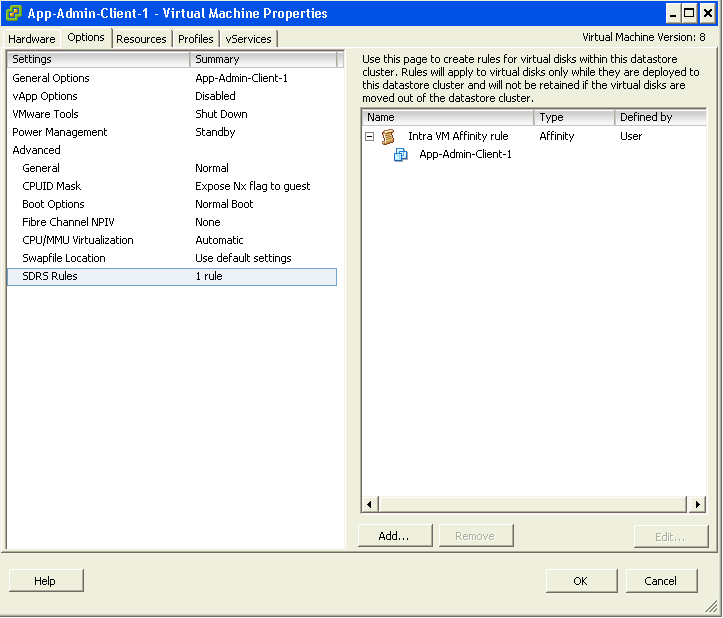
Let’s highlight some of the properties that do not exist in a physical server. I'll focus on those properties that have an impact on management, as management is the topic of this book.
| Properties | Physical Server | VM |
|---|---|---|
| BIOS | A unique BIOS for every brand and model. Even the same model (for example, HP DL 380 Generation 9) can have multiple versions of BIOS. BIOS needs updates and management, often with physical access to a data center. This requires downtime. | This is standardized in a VM. There is only one type, which is the VMware motherboard. This is independent from the ESXi motherboard. VM BIOS needs far less updates and management. The inventory management system no longer needs the BIOS management module. |
| Virtual HW | Not applicable | This is a new layer below BIOS. It needs an update on every vSphere release. A data center management system needs to be aware of this as it requires a deep knowledge of vSphere. For example, to upgrade the Virtual Hardware, the VM has to be in the power-off stage. |
| Drivers | Many drivers are loaded and bundled with the OS. Often, you need to get from respective hardware vendors for the latest drivers. All these drivers need to be managed. This can be complex operation, as they vary from model to model and brand to brand. The management tool has rich functionalities, such as checking compatibility, rolling out drivers, rolling back if there is an issue, and so on. | Relatively fewer drivers are loaded with the Guest OS; some drivers are replaced by the ones provided by VMware Tools. Even with NPIV, the VM does not need the FC HBA driver. VMware Tools needs to be managed, with vCenter being the most common management tool. |
With all the above differences, how does it impact the hardware upgrade process?
| Physical Server | VM |
|---|---|
Downtime required. It is done offline and is complex. OS reinstallation and updates are required, hence it is a complex project in the physical world. Sometimes, a hardware upgrade is not even possible without upgrading the application. | It is done online and is simple. Virtualization decouples the application from hardware dependency. A VM can be upgraded from a 5-year-old hardware to a new one, moving from the local SCSI disk to 40 Gb FCoE, from dual core to a 24-core CPU. So yes, MS-DOS can run on 100 Gb Ethernet accessing SSD storage via the PCIe lane. You just need to perform vMotion to the new hardware. As a result, the operation is drastically simplified. |
Storage
In the preceding table, we compared the core properties of a physical server with a VM. Every server needs storage, so let’s compare the storage properties.
| Physical Server | VM |
|---|---|
For servers connected to SAN, they can see the SAN and FC fabric. They need HBA drivers and have FC PCI cards, and have multipathing software installed. Normally needs an advanced filesystem or volume manager to RAID local disk. | No VM is connected to FC fabric or the SAN. VM only sees the local disk. Even with N_Port ID Virtualization (NPIV) and physical RDM, the VM does not send FC frames. Multipathing is provided by vSphere, transparent to VM. There is no need for RAID local disk. It is one virtual disk, not two. Availability is provided at the hardware layer. |
| Backup agent and backup LAN are needed in the majority of cases. | They are not needed in the majority of cases, as backup is done via vSphere VADP API. Agent is only required for application-level backup. |
Network and Security
Big difference in storage. How about Network and Security?
In vSphere, a VM is connected to a distributed virtual switch. It is not directly connected to the physical NIC in your ESXi host. The ESXi host’s physical NICs become the virtual switch's uplinks instead. This means that the traditional top-of-rack (TOR) switch has been entirely virtualized. It runs completely as software. This means the management software needs to understand the distributed vSwitch and its features.
| Physical Server | VM |
|---|---|
| NIC teaming is common. Typically needs two cables per server. | NIC teaming provided by ESXi. VM is not aware and only sees one vNIC. |
| Guest OS is VLAN aware. It is configured inside the OS. Moving VLAN requires reconfiguration. | VLAN is generally provided by vSphere, and not done inside the Guest OS. This means VM can be moved from one VLAN to another with no downtime. With network virtualization, VM is moving from VLAN to VXLAN. |
| The AV agent is installed on Guest, and can be seen by the attacker. | An AV agent runs on the ESXi host as a VM (one per ESXi). It cannot be seen by the attacker from inside the Guest OS. |
| AV consumes OS resources. AV signature updates cause high storage throughput. | AV consumes minimal Guest OS resources as it is offloaded to the ESXi Agent VM. AV signature updates do not require high IOPS inside the Guest OS. The total IOPS is also lower at the ESXi host level as it is not done per VM. |
Management
Lastly, let's take a look at the impact on management. As can be seen next, even the way we manage a server changes once it is converted into a VMs
| Property | Physical Server | VM |
|---|---|---|
| Approach on Monitoring | An agent is commonly deployed. It is typical for a server to have multiple agents. In-Guest metrics are accurate as the OS can see the physical hardware. A physical server has an average of 5 percent CPU utilization due to the multicore chip. As a result, there is no need to monitor it closely. | An agent is typically not deployed. Certain areas such as application and Guest OS monitoring are still best served by an agent. The key in-Guest metrics are not accurate as Guest OS does not see the physical hardware. A VM has an average of 50 percent CPU utilization as it is right sized. This is 10 times higher when compared with a physical server. As a result, there is a need to monitor closely, especially when physical resources are oversubscribed. Capacity management becomes a discipline in itself. |
| Approach on Availability | HA is provided by clusterware such as Microsoft Windows Server Failover Clusters (WSFC) and Veritas Cluster Server (VCS). Clusterware tends to be complex and expensive. Cloning a physical server is a complex task and requires the boot drive to be on the SAN or LAN, which is not typical. Snapshot is rarely done, due to cost and complexity. We find only very large IT departments practice physical server snapshot. | HA is a built-in core component of vSphere. From what we see, most clustered physical servers end up as just a single VM as vSphere HA is good enough. Cloning can be done easily. It can even be done live. The drawback is that the clone becomes a new area of management. Snapshot can be done easily. In fact, this is done every time as part of backup process. Snapshot also becomes a new area of management as they tend to be forgotten. |
| Company Asset | The physical server is a company asset and it has book value in the accounting system. It needs proper asset management as components vary among servers. Here, the annual stock-take process is required. | VM is not an asset as it has no accounting value. A VM is like a document. It is technically a folder with files in it. Stock-take process is no longer required as the VM cannot exist outside vSphere. |
SDDC vs HDDC
We covered how a VM differs drastically to a physical server. Now let's take a look at the big picture, which is at the data center level. A data center consists of three major functions—compute, network, and storage. Security is not a function on its own, but a key property that each function has to deliver. We use the term compute to represent processing power namely CPU and Memory. In today’s data centers Compute is also used when referencing converged infrastructure, where the server and storage have physically converged into one box. The industry term for this is Hyper-Converged Infrastructure (HCI). You will see later in the book that this convergence impacts how you architect and operate SDDC.
VMware has moved to virtualize the network and storage functions as well, resulting in a data center that is fully virtualized and thus defined in the software. The software is the data center. This has resulted in the term SDDC. The book will make extensive comparison with the physical data center. For ease of reference, let’s call the physical data center Hardware-Defined Data Center (HDDC).
In SDDC, we no longer define the architecture in the physical layer. The physical layer is just there to provide resources. These resources are not aware of one another. The stickiness is reduced, and they become a commodity. In many cases, the hardware can even be replaced without incurring downtime to the VMs running on top.
The next diagram shows one possibility of a data center that is defined in the software. We have drawn the diagram to state a point, so don't take this as the best practice for SDDC architecture. In the diagram, there are many virtual data centers (we draw three due to space in the book). Each virtual data center has its own set of virtual infrastructure (server, storage, network and security). They are independent of one another.
A virtual data center is no longer contained in a single building bound by a physical boundary. Although long distance WAN bandwidth and latency are still limiting factors in 2021, the main thing here is you can architect your physical data centers as one or more logical data centers. You should be able to automatically, with just a few clicks in VMware Site Recovery Manager, move thousands of servers from data center A to data center B; alternatively, you can perform DR from four branch sites to a common HQ data center.
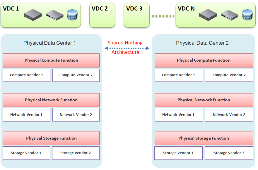
In our example, the virtual data centers run on top of two physical data centers. Large enterprises will probably have more than that (whether it is outsourced or not is a different matter). The two physical data centers are completely independent. Their hardware is not dependent on one another.
-
In the Compute function, there is no stretched cluster between 2 physical sites. Each site has its own vCenter. There is no need to protect vCenter with DR.
-
In the Network function, there is no stretched VLAN between 2 physical sites. You do not have to worry about spanning tree or broadcast storm hitting multiple data centers. The physical sites can even be on a different network. Site 1 might be 10.10.x.x network, while Site 2 might be 20.20.x.x.
-
In the Storage function, there is no array-based replication. Replication can be done independently from a storage protocol (FC, iSCSI, or NFS) and VMDK type (thick or thin). vSphere has built-in host-based replication via TCP/IP, named simply vSphere Replication. It can replicate individual VMs, and provides finer granularity than LUN-based replication. You might decide to keep the same storage vendor and protocol, but that's your choice, not something forced upon you.
We have drawn two vendors for each layer to show the message that hardware does not define the architecture. They are there to support the function of that layer (for example, Compute Function). So, you can have 10 vSphere clusters: 3 clusters could be Vendor A, and 7 clusters could be Vendor B.
We are taking the “shared-nothing architecture” approach. This is a good thing, because you contain the failure domain. Ivan Pepelnjak, an authority on data center networking architecture, states here that “Interconnected things tend to fail at the same time.”
Let’s summarize the key differences between SDDC and HDDC. To highlight the differences, We’re assuming in this comparison the physical data center is 0% virtualized and the virtual data center is 100% virtualized. For the virtual data center, we’re assuming you have also adjusted your operation, because operating a virtual data center with a physical operation mindset results in a lot of frustration and suboptimal virtualization. This means your processes and organization chart have been adapted to a virtual data center.
Disaster Recovery
As data center wide Disaster Recovery (DR) is the litmus test that defines whether your data center is HDDC or SDDC, let’s start with this.
| HDDC | SDDC |
|----|----|
| Data center migration is a major and expensive project. | The entire Virtual DC can be replicated and migrated. We have a customer who performed long distance vMotion over 8 weekends, hence achieving data center migration with 0 downtime. |
| Architecturally, DR is done on a per-application basis. Every application has its own bespoke solution. | DR is provided as a service by the platform. It is one solution for all applications. This enables data center-wide DR. |
| The standby server on the DR site is required. This increases the cost. Because the server has to be compatible with the associated production server, this increases complexity in a large environment. | No need for a standby server. The vSphere cluster on the DR site typically runs the non-production workload, which can be suspended (hibernate mode) during DR. The DR site can be of a different server brand and CPU. |
| DR is a manual process, relying on a run book written manually. It also requires all hands on deck. An unavailability of key IT resources when disaster strikes can impact the organization's ability to recover. | The entire DR steps can be automated. Once management decides to trigger DR, all that needs to be done is to execute the right recovery process in VMware Site Recovery Manager (SRM). No manual intervention. |
| A complete DR dry run is rarely done, as it is time consuming and requires production to be down. | A DR dry run can be done frequently, as it does not impact the production system. This is made by possible by having a virtual network that isolate the VMs participating in DR dry run. As a result, the dry run can even be done on the day before the actual planned DR. |
| The report produced after a DR exercise is manually typed. It is not possible to prove that what is documented in the Microsoft Word or Excel document is what actually happened in the data center. | The report is automatically generated, with no human intervention. It timestamps every step, and provides a status whether it was successful or not. The report can be used as audit proof |
Compute Function
| HDDC | SDDC |
|---|---|
| 1,000 physical servers (just an example, so we can provide a comparison). | The number of VM will be more than 1,000. It may even reach 2,000 VMs . The number of VMs is higher for multiple reasons: VM sprawl; the physical server tends to run multiple applications or instances whereas VM runs only one; DR is much easier and hence, more VMs are protected. |
| Growth is relatively static and predictable, and normally it is just one way (adding more servers). | The number of VMs can go up and down due to dynamic provisioning. |
| Downtime for hardware maintenance or a technology refresh is a common job in a large environment due to component failure. | Planned downtime is eliminated with vMotion and storage vMotion. |
| 5% to 10% average CPU utilization, especially in the CPU with a high core count. | ~50% utilization for both VM and ESXi. |
| Racks of physical boxes, often with a top-of-rack access switch and UPS. The data center is a large consumer of power. | Rack space requirements shrink drastically as servers are consolidated and the infrastructure is converged. There is a drastic reduction in overall space and power, although power consumption per rack is higher. |
| Low complexity. Lots of repetitive work and coordination work, but not a lot of expertise required. | High complexity. Less quantity, but deep expertise required. A lot less number of people, but each one is an expert. |
| Availability and performance monitored by management tools, which normally uses an agent. It is typical for a server to have many agents. | Availability and performance monitoring happens via vCenter Server, and it's agentless for the infrastructure. All other management tools get their data from vCenter Server, not individual ESXi or VM. Application-level monitoring is typically done using agents within the Guest OS. |
The word cluster generally means two or more servers joined with a heartbeat and shared storage, which is typically SAN. In another context, the word cluster means a single application using shared-nothing hardware. A typical example here is Hadoop cluster. | The word cluster has a different meaning. It's a group of ESXi hosts sharing the workload. Normally, 8 to 16 hosts, not 2 - 4. |
| High Availability (HA) is provided by clusterware, such as Microsoft MSCS and Veritas. Every cluster pair needs a shared storage, which is typically SAN. Typically, one service needs two physical servers with a physical network heartbeat; hence, most servers are not clustered as the cost and complexity is high. | HA is provided by vSphere HA. All VMs are protected, not just a small percentage. The need for traditional clustering software has reduced, and a new kind of clustering software emerges. It has full awareness of virtualization, and integrates with vSphere using vSphere API. |
| Fault Tolerance is rarely used due to cost and complexity. You need specialized hardware to achieve it. | Fault tolerance is an on-demand feature as it is software-based. For example, you can temporarily turn it on during batch jobs run. |
| Anti-Virus is installed on every server. Management is harder in a large environment. | Anti-Virus runs as an Agent VM per ESXi Host. It is agentless to the Guest OS and hence, is no longer visible by malware. A popular solution is Trend Micro Deep Security. |
Storage Function
| HDDC | SDDC |
|----|----|
| 1,000 physical servers (just an example, so we can provide a comparison), where IOPS and capacity do not impact each another. A relatively static environment from a storage point of view because normally, only 10 percent of these machines are on SAN/NAS due to cost. | It can have thousands of interdependent VMs, which impact one another. A very dynamic environment where management becomes critical because almost all VMs are on a shared storage, including distributed storage. |
| Every server on SAN has its own dedicated LUN. Some data centers, such as databases, may have multiple LUNs. | Most VMs do not use RDM. They use VMDK and share the VMFS or NFS datastore. The VMDK files may reside in different datastores. |
| Storage migration is a major downtime, even within the same array. A lot of manual work is required. | Storage migration is live with storage vMotion. Intra-array is faster due to VAAI API. |
| Backup, especially in the x64 architecture, is done with backup agents. As SAN is relatively more expensive and SAN boot is complex at scale, backup is done via the backup LAN and with the agent installed. This creates its own problem as the backup agents have to be deployed, patched, upgraded, and managed. | The backup service is provided by the hypervisor. It is agentless as far as the VM is concerned. Most backup software use VMware VADP API to back up by taking snapshot. Windows Volume Shadow Services (VSS) provides application-consistent backups through quiesing application during backup execution. Non-VSS environments can use pre-post thaw scripts to stop necessary services prior to VM snapshot to provide crash-consistent backups of applications and underlying OS. |
| The backup process creates high disk I/O, impacting the application performance. Because the backup traffic is network intensive and carries sensitive data, an entire network is born for backup purposes. | Because backup is performed outside the VM, there is no performance impact on the application or Guest OS. There is also no security risk, as the Guest OS Admin cannot see the backup network. |
| Storage's QoS is taken care of by an array, although the array has no control over the demand of IOPS coming from servers. | Storage's QoS is taken care of by vSphere Storage I/O Control, which has full control over every VM. |
Network Function
| HDDC | SDDC |
|----|----|
| The access network is typically 1 GE, as it is sufficient for most servers. Typically, it is a top-of-rack entry-level switch. | The top-of-rack switch is generally replaced with the end-of-row distribution switch, as the access switch is completely virtualized. ESXi typically uses 25 GE x 2, plus an isolated ILO cable. |
| VLAN is normally used for segregation. This results in VLAN complexity. | VLAN is not required (traffic within the same VLAN can be controlled) for segregation by NSX. |
| Impacted by the spanning tree. | No Spanning Tree. |
| A switch must learn the MAC address as it comes with the server. | No need to learn the MAC address as it's given by vSphere. |
| Network QoS is provided by core switches. | Network QoS by vSphere and NSX. |
| DMZ Zone is physically separate. Separation is done at the IP layer. IDS/IPS deployment is normally limited in DMZ due to cost and complexity. | DMZ Zone is logically separate. Separation is not limited to IP and done at the hypervisor layer. IDS/IPS is deployed in all zones as it is also hypervisor-based. |
| No DR Test network is required. As a result, the same hostname cannot exist on DR Site, making a true DR Test impossible without shutting down production servers. | DR Test Network is required. The same hostname can exist on any site as a result. This means DR Test can be done anytime as it does not impact production. |
| Firewall is not part of the server. It is typically centrally located. It is not aware of the servers as it's completely independent from it. | Firewall becomes a built-in property of the VM. The firewall policy follows the VM. When a VM is vMotion-ed to another host, the policy follows it and is enforced by the hypervisor. |
| Firewall scales vertically and independently from the workload (demand from servers). This makes sizing difficult. IT ends up buying the biggest firewall they can afford, hence increasing the cost. | Firewall scales horizontally. It grows with demand, since it is deployed as part of the hypervisor (using NSX). Upfront cost is lower as there is no need to buy a pair of high-end firewall upfront. |
| Traffic has to be deliberately directed to the firewall. Without it, the traffic "escapes" the firewall. | All traffic passes the firewall as it's embedded into the VM and hypervisor. It cannot "escape" the firewall. |
| Firewall rules are typically based on the IP address. Changing the IP address equals changing the rules. This results in a database of long and complicated rules. After a while, the firewall admin dare not delete any rules as the database becomes huge and unmanageable. | Rules are not tied to the IP address or hostname. This makes rules much easier. For example, we can say that all VMs in the Contractor Desktop pool cannot talk to each other. This is just one rule. When a VM gets added to this pool, the rule is applied to it. |
| Load Balancer is typically centrally located. Just like the firewall, sizing becomes difficult and the cost goes higher. | Load Balancer is distributed. It scales with the demand. Adding hypervisor means adding load balancer capacity. |
People & Process
How many people does it take to manage 1 rack worth of hardware?
Your answer is likely “not many.” After all, it is just 1 standard rack. The entire thing barely occupies a small server room.
If your entire data center can fit inside just a few racks of equipment, that makes a small operation. It is indeed a small operation in physical world. However, in SDDC, you can achieve 3000 VM per rack from performance point of view. We are using a standard 30:1 consolidation ratio, which is possible with the latest Intel or AMD. From networking viewpoint, Ivan Pepelnjak has in fact shared back in October 2014 that “2000 VMs can easily fit onto 40 servers”. He elaborates the calculation here. He further updates that in November 2015.
The above calculation takes into account your Infrastructure VM. Infrastructure functions that used to be provided by hardware (e.g. storage replication, firewall, load balancer) are now delivered as VM. You may run 100 of such VMs, depending on the type of services that your SDDC needs to provide.
| HDDC | SDDC |
|----|----|
| There's a clear silo between the compute, storage, and network teams. In organizations where the IT team is big, the DR team, Windows team, and Linux team could also be separate teams. There is also a separation between the engineering, integration (projects), and operations (business as usual) teams. The team, in turn, needs layers of management. This results in rigidity in IT. | With virtualization, IT is taking the game to the next level. It's a lot more powerful than the previous architecture. When you take the game to the next level, the enemy is also stronger. In this case, the expertise required is deeper and the experience requirement is more extensive. |
| Relatively more headcount required in IT, with lower skills set. | Earlier, you may have needed 10 people to manage 1,000 physical servers. With virtualization, you might only need 3 people to manage 3000 VMs on 50 ESXi hosts. However, these 3 people have deeper expertise and longer experience than the 10 people combined. |
| DevOps is a concept that applies to developers or application team. It does not apply to Infrastructure team. | The IaaS team needs to have its own “DevOps” too. As the infrastructure becomes software, there is a need for continuous flow from Architect 🡪 Engineer 🡪 Implement 🡪 Operate 🡪 Upgrade |
Terminology
Part 4 Chapter 5
Health
The English word Health is used extensively in IT industry for decades, but nobody takes the time to define it subjectively.
You certainly want your environment to be healthy. The desire to achieve that nirvana state results in a definition that is too broad as you try to cover everything. When the health metric covers too many things, you can end up with low score and yet everything is running well!
Health is hard to define, as it depends on the context and object. The English word health itself is subject to interpretation. How healthy are you? For example, I exercise regularly and can perform many rounds of pull ups, push up, deadlift and squats. I’m physically healthy. Biologically though, I’ve been suffering from irritable bowel syndrome and sleep disorder. As for mental health, my wife thinks I have a big problem 😊
Let’s try another real-life context. How healthy is your country? Let’s take the world superpowers (USA and China). Both are well accepted as superpowers, in both economy and military. But how healthy are they?
The answer depends on which aspect and which provinces you’re talking about. It needs to have more context. That’s why you do not have a single score for health.
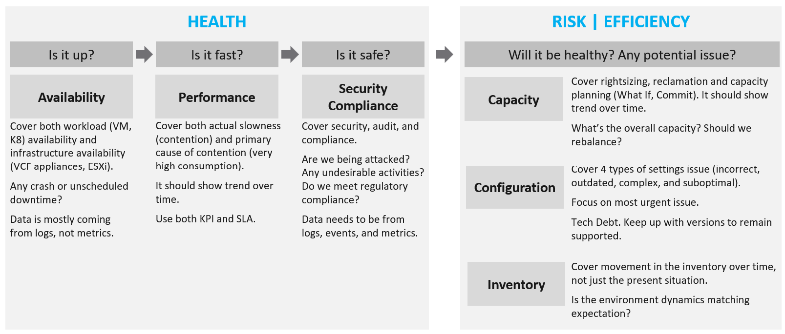
If you insist on defining “health”, then my recommendation is map it to the pillars of operations. When you do that, you vrealize that there are 3 sides of health, not 1. Since there are 3, you need to have 3 different metrics.
| Present Health | Your health in the present time, especially right now. It covers real problem that has happened and/or is still ongoing. The present health only includes reality. It does not include possibility. That’s covered under Risk. Just because you have security risks does not mean you’re being hacked. | |
|---|---|---|
There are 3 problems that impact the present health:
Availability and Performance are related, which means they are not the same thing. Your environment can be 100% up but slow. Security has 2 parts: present and future. The present health only covers actual security issues. For example, your environment is running fine, but you notice unauthorized access & suspicious commands being issued in your ESXi consoles. | ||
| Future Health | It covers potential problems. There is no problem at this moment, but if you do not act on it, you increase the risk of it becoming a problem. Using a day-to-day life analogy, you are healthy now but have a risk of heart problems if you do not stop smoking, are lacking sleep, consuming unhealthy diet, and are overweight. | |
There are 4 problems that create risk in operations:
| ||
In all the above problems, the present health is not impacted as there is neither slowness, downtime, nor security breach. What you have is a risk, as your applications and operations continue as if nothing happens. Your data has not been stolen. Your customers do not notice, and your business is not affected. Let’s take an example. You do not configure HA in a vSphere cluster. If all ESXi hosts are running, your availability is 100%. Your performance is also not impacted. However, you have an availability risk. | ||
| Better Health | This is about effectiveness and efficiency. Effectiveness is about doing the right things. Efficiency is about doing things right. You can operate the wrong architecture correctly. Efficiency is about optimization. There is no health problem at present, nor is there a health risk for future problems. You want to increase efficiency as it lowers cost, reduces complexity, reduce capacity footprint and improve application performance. | |
There are multiple ways to increase efficiency, hence the definition varies among objects.
Green Operations fits efficiency as sustainable operations call for lean operations. | ||
Observability
Observability needs to be built-in, not bolted-on, in your system architecture. That means ensuring it can be monitored clearly, down to the smallest component. Do not deploy system into production that can’t be properly monitored. Unfortunately, this is typically the last thing in our IT industry, especially with tight deadlines, limited skills and low budgets. Many applications, software, and hardware do not systematically leave trails for post-mortem analysis.
To “solve” the above problem, our IT industry came up with new buzzwords and make them larger than life. You hear jargons such as observability, unknown unknown, golden signal, SLO, SLI, and reliability. Observability is pitched as more than monitoring + troubleshooting, although it’s just a nature of a system.
It is certainly important to elevate the proactive work to detect unknown problems that you are not even aware of. I love slicing and dicing millions of data points (metrics, logs, events, traces, NetFlow) and discover new insights. It also helps me understanding the behaviour of low-level metrics better. Many times, they are not what the manual says as documentation on metrics is often not deep. I’ve discovered a few dozen bugs in metrics in the last 1+ decade.
CIOs should not only encourage, but also require the subject matter experts to allocate time to this proactive exploration. It should be part of a regular cadence to share work and findings. It’s both a good exercise to keep the knowledge deep, plus you never know what you will discover!
Having said that, do we need a new term? I don’t think so since it has caused confusion. Lots of software can do this, along with many other things. It’s all part of monitoring and troubleshooting. There is no need to invent a new category of software. This is the classic “old wine in a new bottle” trick.
If we really want a new term, the word debuggability carries more value as just because a system is observable does not mean you can do something to fix it, let alone intervening to debug it. It is painful watching your system deteriorate with nothing you can do about it. In modern days, debugging is no longer limited to slow and manual process of stepping through code. It can involve in-line analytics as the codes processing. This certainly requires the system to be built with debuggability in mind.
It is as if observability and monitoring are not confusing, there are other English words used to monitor a system:
-
Finding
-
Insight
-
Issue
-
Alert
-
Symptom
-
Notification
The following diagram shows how they are related.
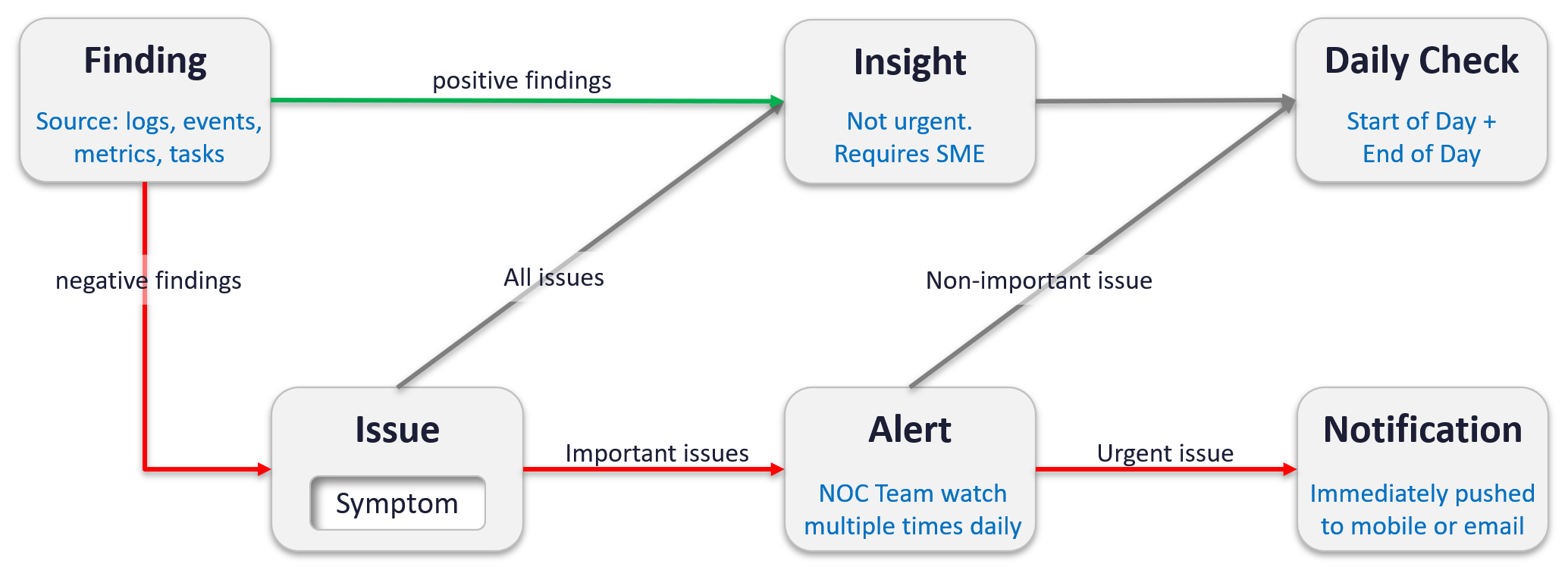
| Finding | Finding is what is found. It is the result of diagnostic or analysis. It can be bad things or good things. Bad = Issue. Since the sources of finding (logs, events, metrics and tasks) focus on negative, a no entry typically means it’s a good day. For example, you find no login to a confidential cluster. Findings are input to Insight. Generally speaking, it takes someone who is familiar with the environment to derive an insight from findings. |
|---|---|
| Insight | A useful observation with real business benefit. This typically requires someone with both technology expertise and familiarity of the environment. Findings are input to Insight. An expert can derive an insight from findings. |
| Issue | An issue is identified by its 1 or more Symptom. No symptom simply means no issue, you are healthy. |
Type of Issues:
| |
| Alert | It’s an urgent Issue with Symptom crossing threshold. An issue that is urgent (may not be important) needs to reach Admin fast. Admin wants to be notified. An issue that is not urgent (but important) can be analysed after Admin are done with time-sensitive issue |
| Notification | A mechanism for VCF Operations to inform users of insights or alerts that need their attention. This takes different format:
|
Infrastructure Architect
Part 4 Chapter 6
Rise of The Private Cloud Architect

This is a story of the life of a VMware Admin that I shared as an impromptu presentation at our VMUG Singapore back in 2014 and it still resonates until today.
The restaurant business provides a good analogy to your IaaS business. You, the private cloud architect, are the Chef. In that end-user environment where you work, you are the expert in producing what your customers want. You architect and design a solid platform, where your customers can confidently run their VMs. If there is an issue, you often get involved, restoring their confidence in your creation. You are seen as the VMware expert, or the virtualization expert. Yes, you may engage VMware Professional Services or Support, but they are not employees of you company. You are the employee. As far as your customers concern, the buck stops at you.
You do not sell hardware nor software; you charge your customers per VM. In fact, to ensure that your customers order the right kind of VM, you need to charge per vCPU, per vRAM and per vDisk. The chargeback model is something that I very rarely see discussed. We tend to stay in technical discussions. We need to realise we are no longer just a System Builder. We are Service Provider. By not extending our circle of influence into how Application Teams should pay for our service, we created the issue we have today (Oversized VMs, dormant VMs, VM sprawl). We need to “step out from the kitchen” from time to time. We need to be like the Chef who steps out into the dining area, building relationships with his customers, explaining the reason behind his cooking.
As the Architect, we are the best person to determine how much to charge for these. We built this environment. We know the costs, and we know the capacity. Not convinced? Put it this way, would you rather someone else determine how much your creation is worth?
We all know that IT exists because of Business. It starts with the Business. Some of the issues we have are caused by unsuitable chargeback models and incorrect Service Tiering. The VM in Tier 1 (mission critical) platform cannot cost the same as the VM in Tier 3 (non-production). I’d make sure there is distinct difference in quality between Tier 1, Tier 2 and Tier 3, so it’s easy for business to choose.
Need a good example? Using the restaurant analogy, say you cook fried rice. It’s your dish. You need to determine the price of the fried rice. You also need to be able to justify why you have normal fried rice and special fried rice, and why the special one costs a lot more for the same amount of food.
To me, the Chargeback model and the Service Tiering serve as Key Drivers to our Architecture. I will not consider my architecture complete unless I include these 2 in my design. We are architecting to meet the business requirements, which are “defined” in the chargeback model (e.g. the business wants a $100 VM per month, not a $100K VM per month), and service tiering (e.g. the business wants 99.999% and 3% CPU Ready).
As shared, I see a chance for us to step up and step out.
-
Step out of the kitchen and network with your customers (the Application team). Educate and fix the problem at the source.
-
Step up from pure IT architecture to business architecture. Architect your pricing strategy and service tiering.
The good thing about pricing is…. your benchmark is already set.
Azure, AWS, Google, and many Service Providers have already set the benchmark. Your private cloud cannot be too far from it. Too low and you will likely make a loss (it’s almost impossible to beat their efficiency). Too high and you will get a complain. Another source of benchmark is to consider what it would cost to run the same applications on physical servers.
Is that all the opportunity for you?
No, you can collaborate with the Enterprise Architecture (EA) team, contributing your domain expertise. EA and Business Transformation Architect tend to look at the big picture. They are more business-centric and more strategic in their perspective.
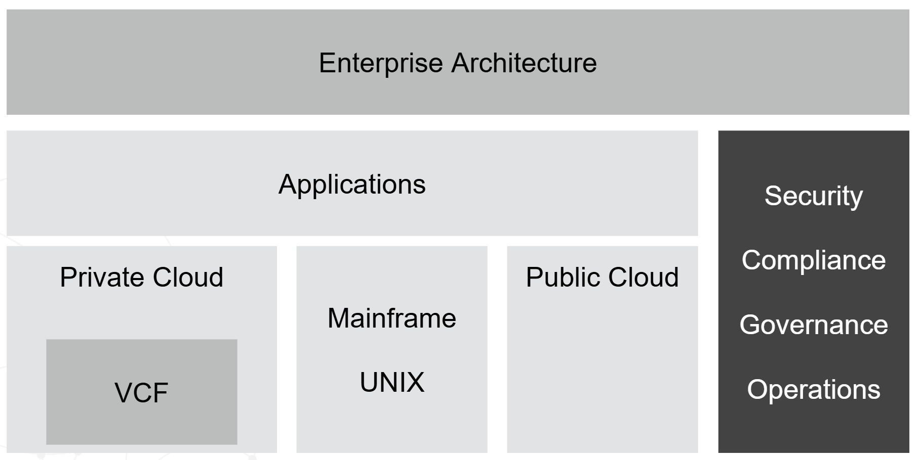
There are also departments such as security and operations. Reach out to them and collaborate.
I hope you enjoyed this perspective of your role.
Do share your life story with fellow vCommunity in various VMUG events.
History of The Books
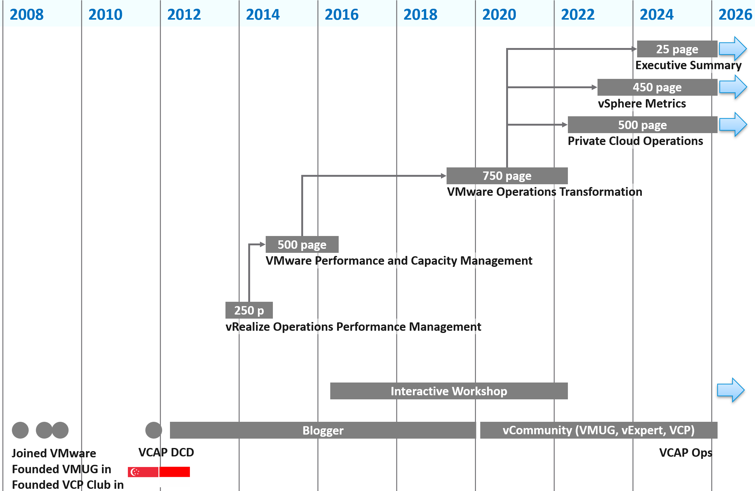
The book you’re reading has its origin on May 2008, when I joined VMware as the first Account SE for global accounts for Asia. Since all my customers had only started ESX adoption, I founded the user group in Singapore. In 2009 I founded the user group in Indonesia. As the community grew, I founded VCP Club so we could do deeper discussion.
In 2011, I was one of the first to pass the VCAP DCD exam globally as beta exam participants. In 2012 I began blogging. That knowledge from VCAP and articles from my blog set the foundation for my first book, which got published in 2014. It was ~250 pages. A good chunk of material was deferred to the second edition, hence the 2nd edition followed within 2 years. At ~500 pages, the scope was broadened and becomes less product-centric, a strategy that becomes clearer over the years.
I took a long break as the effort from writing 2 books as the 3 years of total duration were taxing, and I wanted to leapfrog the next edition. I continued blogging to gain deeper and broader knowledge. I still do a lot of researching and validating even until today, which is why the content evolves every year.
In 2019, I decided to revamp the book. It focused on overall operations management, while deepening on metrics. The 3rd edition was written in the open, meaning an update was released every month or so. After 2 years of writing, the book was finalized at ~750 pages.
In 2022, the chapters on vSphere Metrics became matured enough to be released as a separate book. My hope is we can evolve it to become VCF Metrics in the future.
The continuous release strategy worked well, and the book eventually resulted in 3 books. The goal change from operations management to operations transformation. With Broadcom’s focus on private cloud, the book changed accordingly.
Footnotes
-
For explanation of the terminology, refer to the Terminology section at the end of this book. ↩
-
Sunny and I went back a long way. We both came from the field before joining product team. ↩
-
Marketing architecture. A jovial reference to beautiful PowerPoint based diagram that hides implementation complexity. Amazon jungle looks green and beautiful from 10 thousand feet, but on the ground it’s a different matter. ↩
-
Day 2 will eventually hit technology refresh, which could be major overhaul in architecture. This will take you back to Day 0 as you need to plan for the new world. ↩
-
For consistency with other VCDX certifications, we should call it VCDX Operations Management. I use VCMX to drive a point. Certification wise, it can start at VCP level, such as VCP Operations Management. ↩
-
I don’t use MELT as Property is more fundamental than Trace. It also misses NetFlow. ↩
-
There are other frameworks, such as eTOM and BIAN. Since they are domain specific, they are not suitable for VCF. ↩
-
Thanks Tyson Then for this idea. ↩
-
I’m TOGAF Certified, but it’s a long time ago in a galaxy far away. I believe in the principle of enterprise architecture, but not its heavy implementation. ↩
-
You see, I’m not allergic to jargons so long they are actually needed in live operations. If it’s just an objective, then no need to label it with jargon, else we have to create jargon for every single type of goals. ↩
-
The book is freely available, and that’s part of the reason why I decided to make mine free. ↩
-
The link from Gartner no longer works, so I guess you gotta trust me now 😉 ↩